

Web Design & UI/UX
Web design principles, UI patterns, UX methodology, and the craft of building interfaces people actually want to use.
All Web Design & UI/UX articles
Figma Source of Truth Has Moved: Figma Is Now Documentation
More teams now treat the codebase as the single source of truth and Figma as documentation that describes it. Here is what changed, what Figma is still for, and how to run a code-first design system without losing the team.
Navigation Design Patterns: 9 Menu Layouts for Web and Mobile
Nine navigation design patterns every designer should know, from the top bar to the command palette, with real examples and a clear call on when to use each.
Design Tokens: How Real Design Systems Stay Consistent
What design tokens are, the three-tier model real systems use (Shopify Polaris, IBM Carbon, GitHub Primer), how to name them, theming for dark mode, and when tokens are overkill.
Hero Section Design: 8 Patterns That Convert in 2026
Eight production hero section patterns teardown with Apple, Webflow, Hex, Mux, Klim, Loops, Liveblocks, Are.na, plus a stage-fit framework.

Form Design Best Practices: 10 Rules for Web and Mobile
The 10 rules for designing forms that convert. Real teardowns of Notion, Tally, and Mercury sign-up flows, plus mobile-first patterns that actually work.

SaaS Landing Page Design: 9 Sections That Convert in 2026
The 2026 SaaS landing page design anatomy. Nine sections, why each earns its place, with live teardowns of Stripe, Arc, Resend, Clerk, and Railway.

The End of the Dashboard: What Replaces the 2015 SaaS UI
The classic SaaS dashboard is dead. Here are the five patterns replacing it, the real products already shipping them, and the failure modes you must avoid.

The Empty State Is Your Product, Not An Afterthought
The empty state is the most important screen in your product, and most teams ship it last. A canonical guide to designing every variant, with examples.

The Death of the Sidebar in Modern SaaS App Design
Why the persistent left rail is dying, the five patterns replacing it, and how to design app shells in 2026 without falling back on a rectangle of links.
Negative Space: The Designer's Cheat Code
Negative space is not leftover. It is the most underused tool in design. Active vs passive, micro vs macro, the audit, the anti-patterns, and why every great brand uses it ruthlessly.
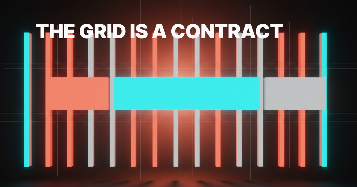
Grid Systems: A Designer's Guide
From Müller-Brockmann to CSS Grid, the working designer's guide to grid systems. Five grid types, the 12-column system, baseline rhythm, plus real implementations from Linear, Vercel, Stripe, Apple, NYT, and Figma.
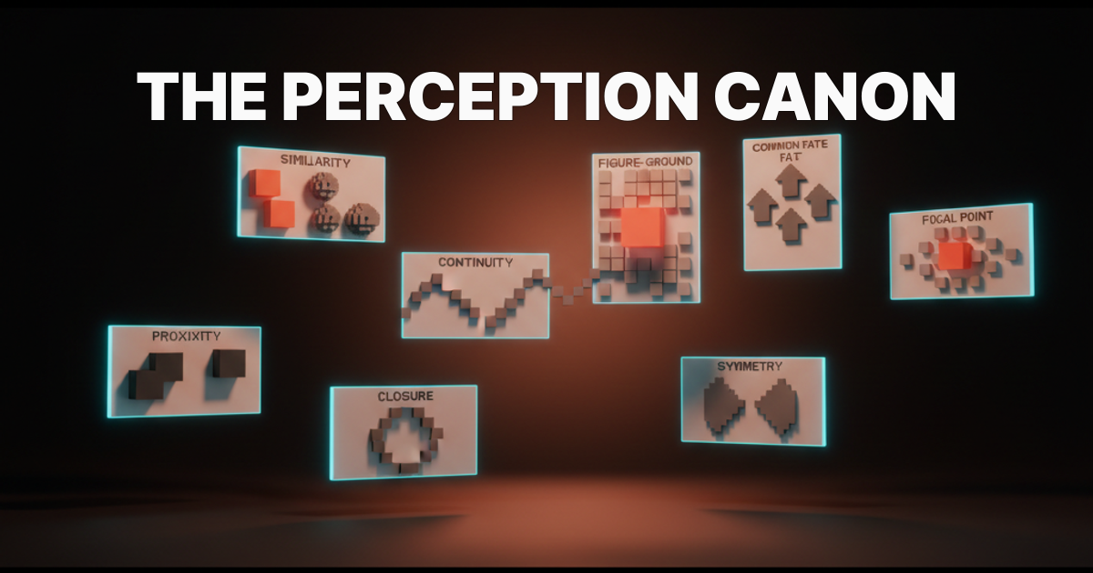
Gestalt Principles for Designers
The perception canon for modern UI. Eight Gestalt principles, one rule each, with real examples from Linear, Stripe, Vercel, Figma, Notion, Apple, Cursor, and Anthropic, plus an audit you can run on any screen.

You Don't Need a Design System
Most teams shipping a design system are LARP-ing maturity. The maintenance cost outpaces the payoff, AI generation collapses the math, and a tokens plus primitives plus taste stack beats a fully-specced system for 95% of orgs.
The Loading State Is the Product
Loading states are the most-watched screen you ship. Five archetypes, real examples from Linear, Vercel, Stripe, Cursor, Claude, and Figma, plus a six-question audit you can run today.
Design for Power Users
Most products design for the first-time user and abandon the returning expert. The five layers of power-user UX, the rules that hold the line, and an audit you can ship from.
The Pricing Page Problem
Most pricing pages are conversion theater built by growth teams who never had to design anything else. The pricing page is the most honest screen on the site. Here is what the clear ones get right and what the bloated ones get wrong.

The Anti-Dashboard
Most dashboards are data graveyards built by teams afraid to choose. The anti-dashboard is opinionated, action-first, and answers one question. Here is what that looks like.
The Settings Page Problem
Settings pages are where product integrity goes to die. Five archetypes, six rules, real examples from Linear, Notion, Vercel, and an audit you can ship from.
Empty States Are the Product
Empty states are not polish. They are the activation surface, the first impression, and the screen that decides whether your retention curve breaks before users see real data.

Speed Is the Brand: Why Performance Became the Most Visible Design Decision in 2026
A slow site looks worse than an ugly one. In 2026, web performance is the most visible brand signal a site carries. Core Web Vitals as design metrics, the brands that won by treating speed as identity, and the perf budget designers should bring to every brief.

Visual Hierarchy in Web Design: A Practical Framework With Examples
A working framework for visual hierarchy in web design. Five levers, six real landing pages from Linear, Vercel, Stripe, Figma, Arc, and Apple, and a Figma audit checklist you can run in twenty minutes.

Data Visualization for Designers: How to Make Charts That Actually Communicate
A working designer's guide to data visualization. Chart selection, color, hierarchy, accessibility, and the principles that turn data into a chart a real user can read in three seconds.
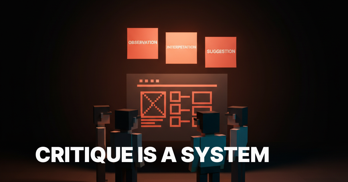
Design Critique Frameworks: How to Run Reviews That Actually Improve the Work
A working designer's guide to running and surviving design critique. The frameworks, the rules, and the structure that turns reviews from ego defense into actual feedback.
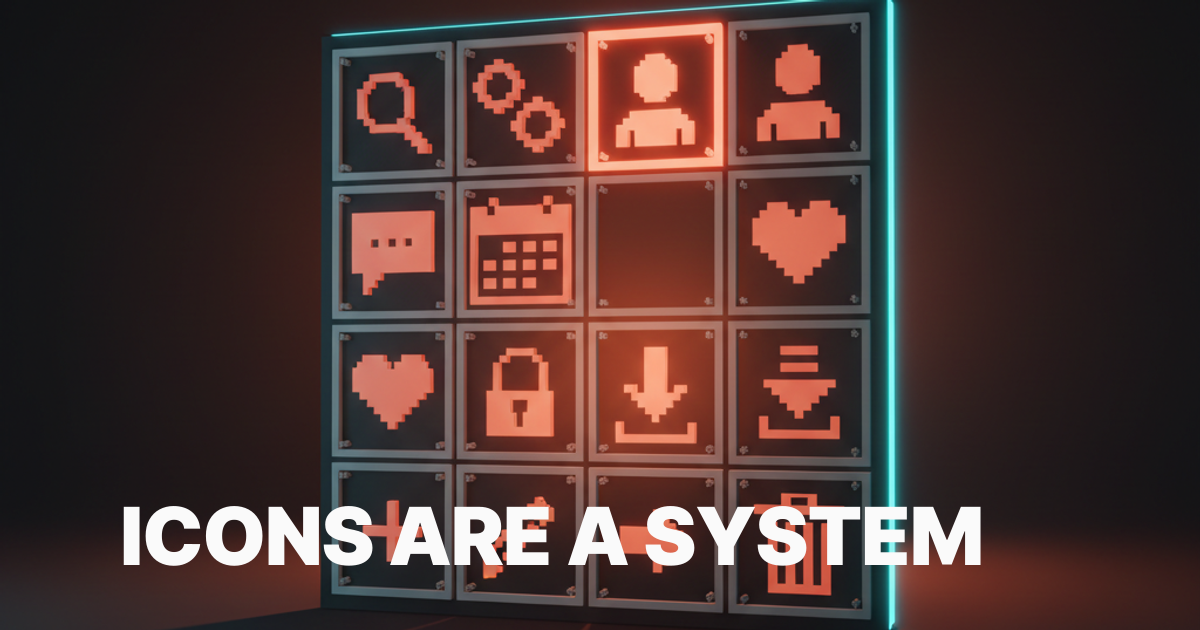
Icon System Design: Building Iconography That Scales Past 50 Symbols
A working designer's guide to icon systems. Grid, weight, optical correction, naming, governance, and the rules that keep an icon library from rotting after the third designer touches it.
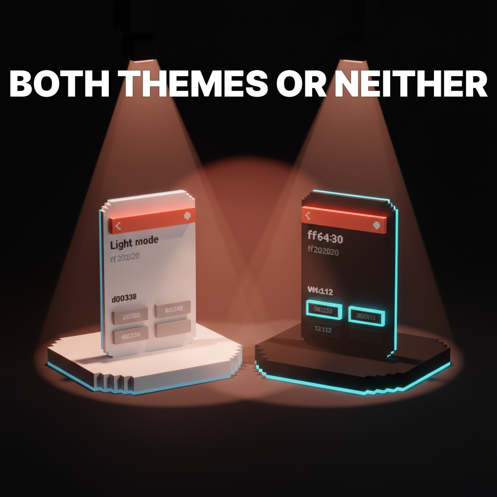
Dark Mode Design: How to Ship a Second Theme Without Breaking the First
A working designer's guide to dark mode. The color math that actually works, the component traps to avoid, and how to ship a dark theme that looks designed instead of inverted.
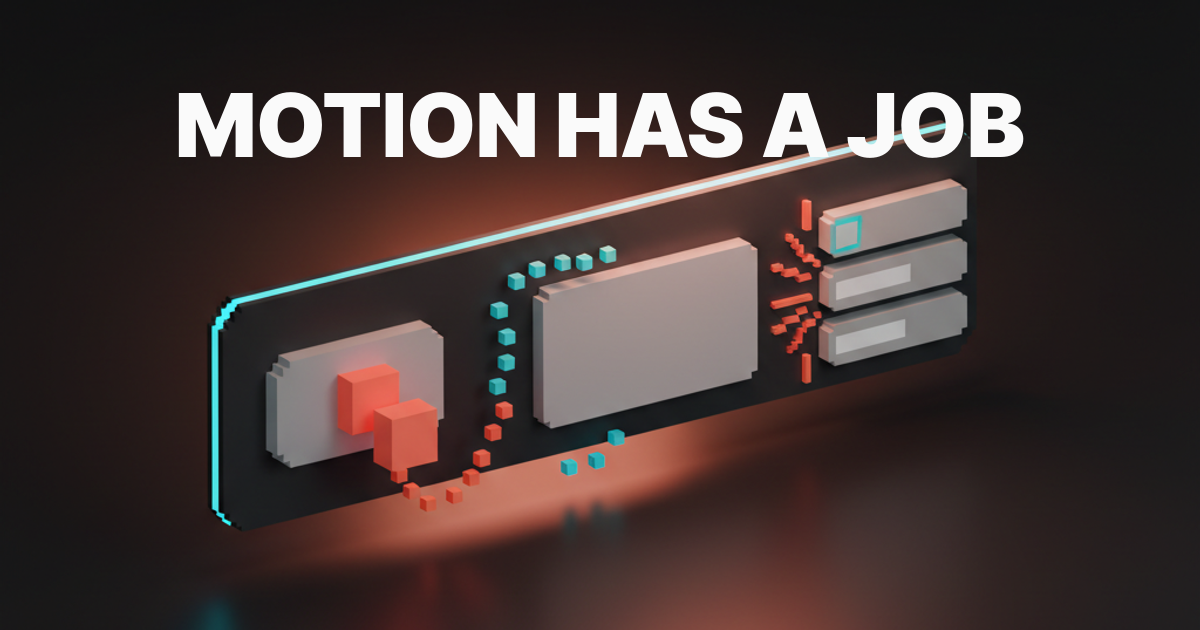
Motion Design Principles: How Interfaces Should Actually Move in 2026
A working designer's guide to UI motion. The seven principles that separate purposeful motion from decoration, the duration table, and how to ship animations that survive a real product.

UI vs UX: The Real Difference (and Why Most Explanations Are Wrong)
UI is not the wrapping paper. UX is not the gift. The real difference between UI and UX, what each role actually does, and who to hire for what.
Web Accessibility Checklist: WCAG 2.2 for Working Designers
A WCAG 2.2 accessibility checklist organized by where the work happens: Figma, browser, post-ship. Plus a designer-mistake-to-criterion map.
Web Design Principles: The Complete Guide for 2026
The eight foundational principles still matter. The eight new 2026 principles matter more. A pillar guide with a conflict-resolution framework and a before and after case study.

Landing Page Design: 12 Principles for High-Converting Pages in 2026
Twelve principles that separate landing pages that convert from pages that just exist. Above-the-fold clarity, social proof, CTA hierarchy, form friction, and the 2026 patterns worth stealing.
Landing Page Design: What the Best Converting Pages Have in Common
The best landing pages share the same structural decisions. What they are, why they work, and what to steal for your own page.
Design Systems: Why Most Fail and How to Build One That Works
Most design systems die within a year. Here is why they fail, what the survivors have in common, and how to build one that your team will actually use.
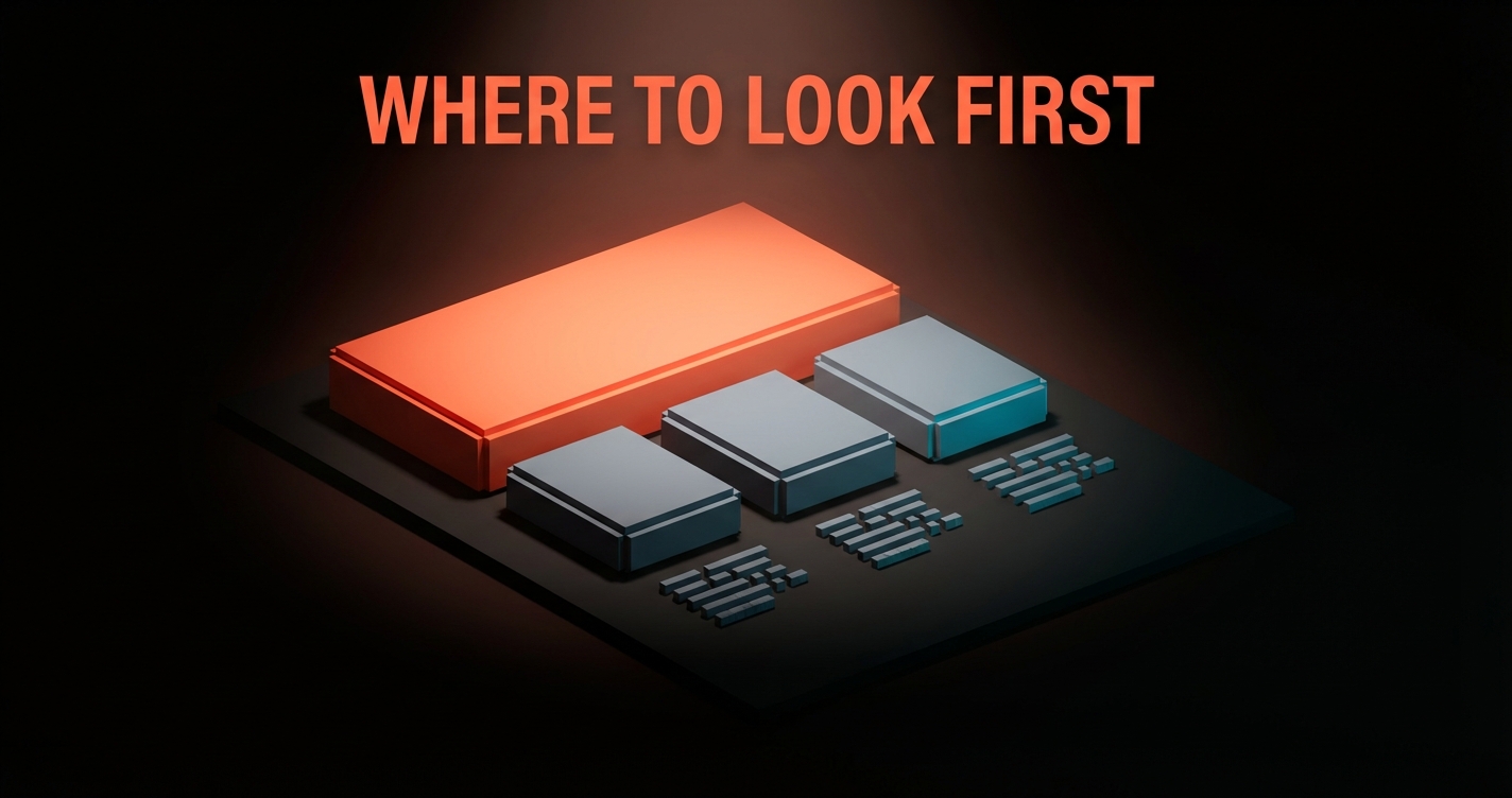
Visual Hierarchy in Design: How to Control Where People Look
Visual hierarchy controls the order the eye processes information. Five levers, one framework, and the squint test that catches 80% of layout problems.