

Design for Power Users
Most products design for the first-time user and abandon the returning expert. The five layers of power-user UX, the rules that hold the line, and an audit you can ship from.
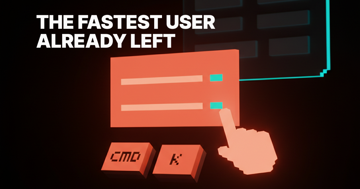
The user who clicks every button has already left. The one who lives inside your product opens it twenty times a day and has memorized a hidden interface you may not have designed. If somebody else's product has a better hidden interface, the expert is gone, and the expert is the cohort that pays.
Mainstream UX talks about first-run and activation. The expert never sees any of it. They opened your product for the eight-hundredth time, hit Cmd-K, and either flew through the work or rage-quit because your palette returns five irrelevant results. Power-user UX is the second product, and most teams have not shipped one yet.
The hidden product behind the visible one
Every great product has two products inside it. The visible one for the new user, and the hidden one for the user who already knows.
The visible product is buttons, menus, tooltips, and tours. The hidden product is keystrokes, command palettes, saved views, multi-select, and route-addressable state. The first makes the first session legible. The second makes the next thousand sessions fast.
Linear ships both, on purpose. The new user sees a clean inbox with a clear primary action. The expert hits g then i to jump to inbox, c to create an issue, shift-click to multi-select, and every saved view is a shareable URL. Same product. Two products. Both designed.
Power users are the cohort you cannot afford to lose
The first-time user is loud and the expert is silent, so most teams optimize for the loud one. Power users open the product more days per month, generate more revenue per seat, and recruit more new users than every other cohort combined. They also leave the loudest, because they know what fast feels like in three competing products.
The fix is not "add shortcuts." The fix is to treat the power-user surface as a first-class product with its own design budget and roadmap.
The five layers of power-user UX
Power-user UX is not one feature. It is five layers that compound. Most products ship one or two. The best ship all five and the layers reinforce each other.
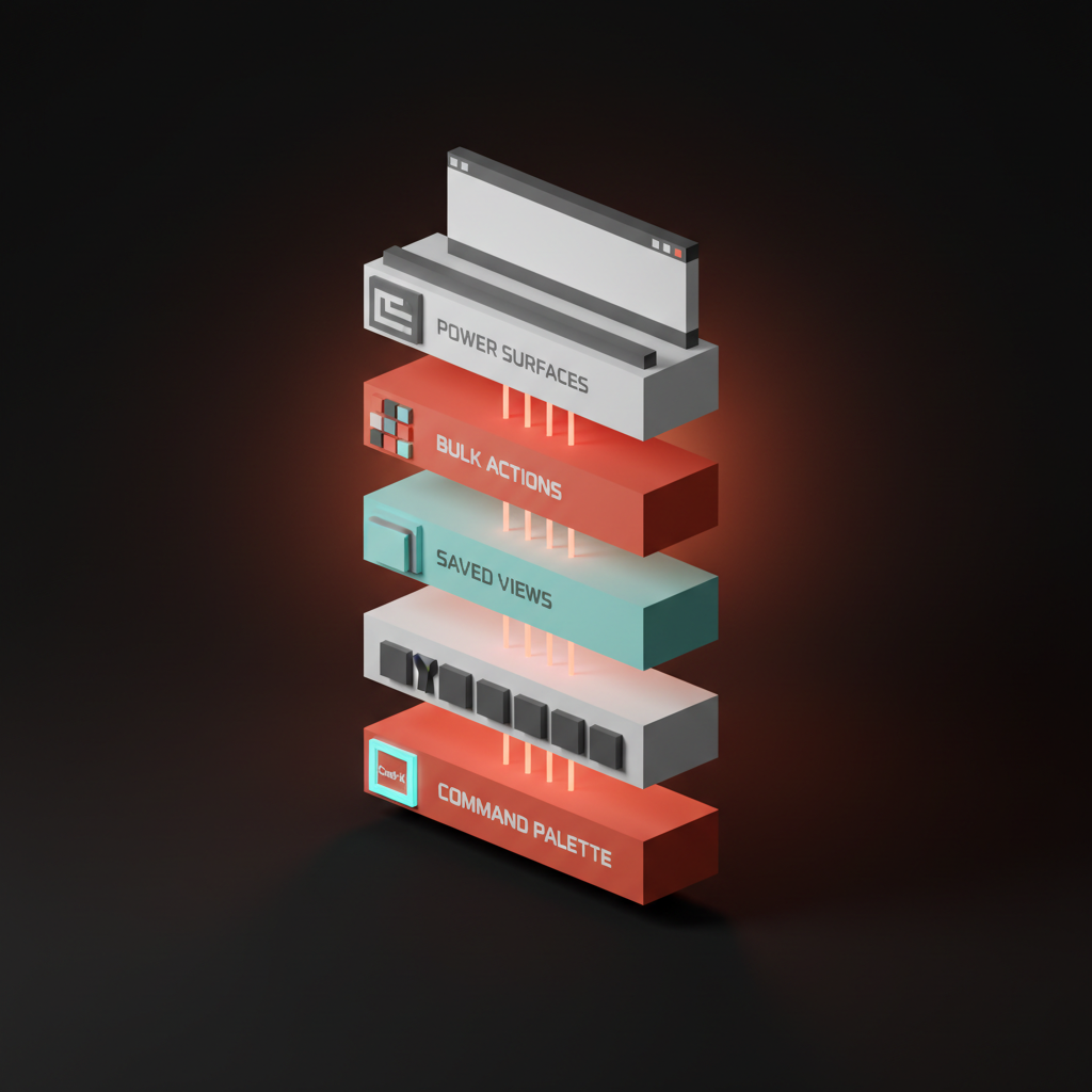
1. The command palette
The Cmd-K palette is the unified search-and-act surface. One keystroke summons every action, route, and object in the product, ranked by recency and frequency. Linear's palette is the bar. Raycast built an entire OS layer around the same primitive. Notion, Vercel, GitHub, and Slack all ship their own.
A real palette searches content and actions in the same input, surfaces keystroke hints next to every result, and accepts arguments inline. "Move issue to in progress" works as a single command instead of a four-click chain. The failure mode is the search-only palette: a box that finds documents but cannot trigger actions is a search bar with delusions. The point of Cmd-K is find-and-act. The empty states are the product breakdown covers why the palette's default state matters.
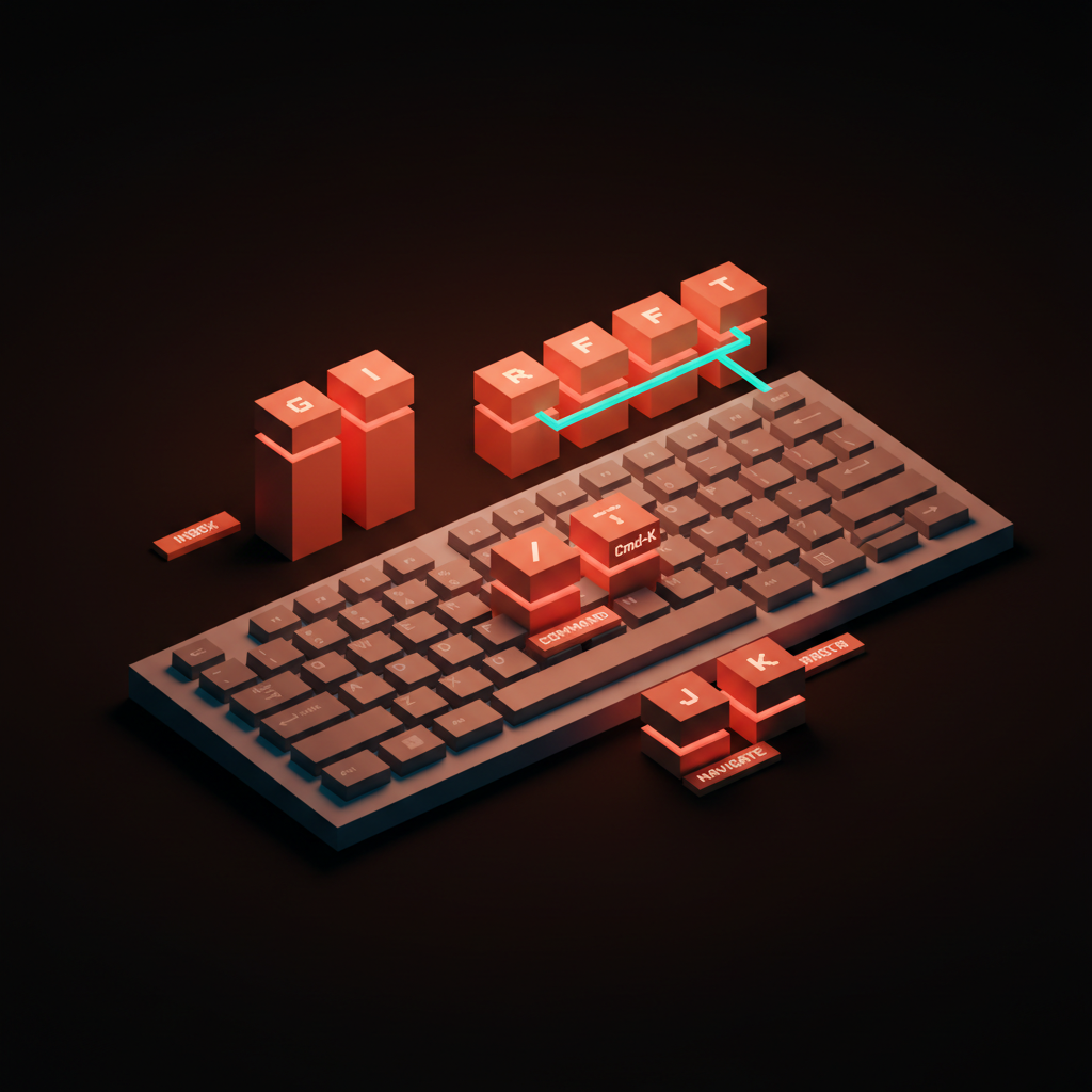
2. Keyboard shortcuts as a first-class system
Shortcuts are not a list of bindings hidden in a help modal. They are a system with discoverability, consistency, and progressive depth. Superhuman is the gold standard. Every action has a key, the cheatsheet ships in product, and the onboarding teaches the keyboard before the mouse.
Linear runs a letter-pair system that scales. The first letter names the surface (g for go), the second names the destination (i for inbox, p for project, m for my issues). The user learns one rule and unlocks fifty shortcuts. Notion ships slash for command and Cmd-K for palette. Figma ships single-letter tools (V for move, R for rectangle, F for frame, T for text). Gmail's keyboard shortcuts are still the gold standard for email, twenty years in.
The system is the product. A pile of one-off shortcuts is not a system, it is a backlog the team forgot to delete.
3. Saved views, filters, bookmarks
The expert builds the product around their workflow. Linear's saved views show up in the sidebar, survive logout, share by URL, and update live. Notion's filtered database views do the same for content. Stripe's saved searches store the exact filter that catches anomalies. Vercel pins team and project per-bookmark so the right dashboard is one keystroke away.
The non-negotiable: saved state must be addressable. Every saved view should have a URL that survives a logout, a device switch, and a share to a teammate. State that lives only in localStorage disappears the moment the user opens the product on a different laptop.
4. Bulk operations
The expert touches a hundred objects a day. The product either supports that or punishes them for it. Linear's multi-select with shift-click, then bulk update with B, is canonical. Notion's multi-select on databases lets you change status, assignee, and tags across thirty rows in one move. Gmail's shortcuts plus shift-J are the reason the inbox is bearable at scale.
Bulk operations need three properties. The selection has to be obvious. The action has to be reachable from the keyboard. The undo has to be real. A bulk action behind a right-click menu is a bulk action you will not use, and a bulk action without a one-keystroke undo destroys trust the first time it goes wrong.
5. Power-only surfaces
Some surfaces exist only for the expert. The Figma API console, the Raycast extensions library, the Notion database admin view, the Vercel CLI, Cron and Notion Calendar's keyboard-only time-block layer. These are the depth layer the expert lives inside.
Raycast is the cleanest version. The base product is a command palette. The expert installs extensions and custom scripts that turn the palette into a personal OS layer. Notion's databases are the same shape: a beginner sees a list, an expert sees a relational data model with rollups and formulas.
The pattern is progressive depth. The progressive disclosure principle is the load-bearing idea: depth lives one keystroke away, not on the home screen.
Inside the command palette
The Cmd-K palette is the most important power-user surface, and most teams ship a weak one. Five elements separate the strong palettes from search bars wearing a costume.
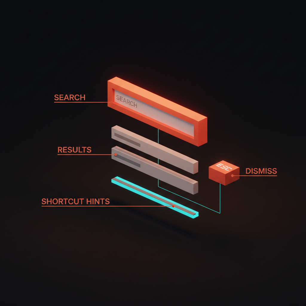
A great palette ranks results by recency and frequency, surfaces a keystroke hint next to every result, accepts arguments inline, scopes to context, and dismisses with a single Esc. Linear's does all five. Raycast does all five and turns the palette into the entire product. Most palettes do two, and the user learns to ignore them.
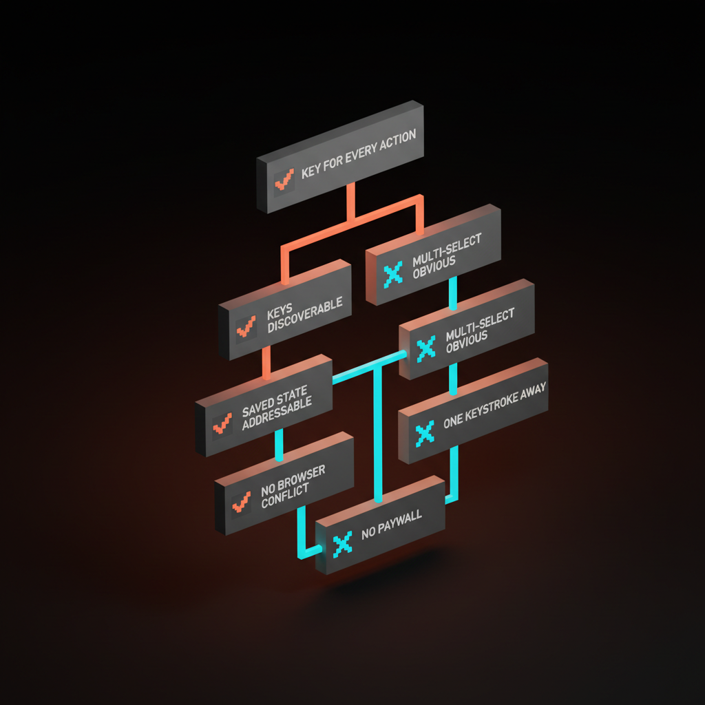
Five rules for designing power-user UX
Five rules separate a real power-user surface from a list of shortcuts dumped in a help footer. Hit four and the surface usually works. Hit two and the expert leaves.
- Every action has a key. If the user can do it with the mouse, they should be able to do it from the keyboard.
- Surface the keys without showing them. Keystroke hints in the palette, in tooltips, in menu rows. The shortcut should be visible at the moment the user reaches for the mouse, not buried in a settings page.
- Multi-select must be obvious. Visible checkboxes or a clear shift-click pattern. A bulk action the user does not know exists is a bulk action that does not exist.
- Saved state must be addressable. URL-based, persistent, shareable. State that lives only in the browser is state that vanishes.
- The power surface lives one keystroke away. Cmd-K, slash, or a single letter. If the expert has to navigate to it, it is a feature page, not a power surface.
A product that lands four of five feels alive under the expert's hands. A product that lands two feels like a website with a few keyboard tricks bolted on.
Anti-patterns that signal the team forgot the expert
Five patterns kill more power-user surfaces than anything else.
Shortcuts that conflict with the browser. Ctrl-W or Ctrl-T rebound inside a webapp closes the tab and the user loses unsaved work. Namespace inside Cmd-K instead.
Shortcuts only documented in a help modal three clicks deep. A cheatsheet behind Settings, Help, Keyboard Shortcuts is one the user will never see. Surface the keys at the moment of the action. Superhuman ships the cheatsheet as a first-class screen. Most products ship it as a footer link they hope nobody clicks.
Multi-select that requires right-click. A bulk action inside a context menu exists for the changelog, not for the user.
Pro-tier paywalls on basic shortcuts. Some products lock keyboard shortcuts, palettes, or saved views behind a "Pro" plan. The shortcut is not the feature, it is how the feature gets used. Gating it is gating the product itself.
Saved views that do not survive logout. A filter that lives only in localStorage erases itself when the user opens the product on a different device. Persist on the server, attach to the user, let the URL carry it.
The power-user audit
Run any product through these seven questions. Fail two or more and the expert is on someone else's product by the end of the quarter.
- Does every primary action have a keyboard shortcut? List the top twenty actions and check. If more than three require the mouse, the keyboard layer is incomplete.
- Is there a Cmd-K palette that searches and acts? Not a search bar. A palette that runs commands, accepts arguments, and surfaces shortcut hints.
- Are shortcuts discoverable in context? Tooltips, palette hints, menu labels. The user should learn the shortcut while doing the action, not by reading docs.
- Does multi-select work from the keyboard, with a clear undo? Shift-click, then a keystroke action, then a one-key undo. Any missing link breaks the chain.
- Are saved views URL-addressable and persistent? Copy the URL, paste it into a different browser, log in. If the view does not load, saved state is theater.
- Are power surfaces one keystroke from anywhere? The console, the API surface, the extensions library. If the expert has to navigate to reach them, they are feature pages, not power surfaces.
- Does the product treat the keyboard as a first-class citizen? No browser-conflict shortcuts. No paywalled shortcuts. No mouse-only bulk actions.
A product that passes all seven retains the expert by default. One that fails three or more loses them to Linear, Raycast, or whichever competitor shipped the second product on purpose. The anti-dashboard covers the layout side of the same discipline, the visual hierarchy piece covers how the expert reads density.
Where this fits in the product
Power-user UX is the counterpart to first-run UX. The onboarding without onboarding breakdown handles the user who has never seen the product. This piece handles the user who has seen it nine hundred times. The designing friction on purpose idea applies in reverse here: for the new user, friction at the right moment teaches the product. For the expert, every unnecessary friction is a tax. The landing page design principles and web design principles breakdowns cover the marketing-page and product-wide versions of the same discipline.
Build the hidden product on purpose
The visible product gets the launch post and the demo video. The hidden product gets the renewal and the word-of-mouth. Linear, Raycast, Superhuman, Notion, Cron, Figma, Gmail, Vercel, Slack, GitHub, Stripe, and Cursor all share one trait. They shipped a real second product for the user who already knows.
Most teams ship the first product and let the second one happen by accident. That is the choice that costs the expert. Pick the keyboard layer. Pick the palette. Pick the saved-view system. Pick the bulk action. Pick the power surface. The compound effect is the difference between a product the expert tolerates and a product the expert evangelizes.
FAQ
What is power-user UX?
Power-user UX is the design layer aimed at the user who already knows the product. It includes the command palette, the keyboard layer, saved views and filters, bulk operations, and power-only surfaces. The new user does not need it. The expert lives inside it.
Should every product have a Cmd-K command palette?
Almost every productivity product should. A palette becomes the unified search-and-act surface and gives the expert one keystroke that opens every action. Linear, Raycast, Notion, Vercel, GitHub, and Slack all ship one. Consumer products with a single primary action can skip it. Most B2B and prosumer tools cannot.
How do you teach keyboard shortcuts without a tour?
Surface the shortcut next to the action, every time. Tooltip hints, palette hints, menu labels. Superhuman ships the cheatsheet as a first-class screen the user can summon. Linear surfaces every shortcut in the palette and the menus. The user learns the keyboard by doing the work.
Ship the second product
If you want a team that designs the keyboard layer, the command palette, and the saved-state system as part of the product instead of as cleanup at the end, hire Brainy. We build the hidden product on purpose, so the expert opens your tool tomorrow and feels faster than they did yesterday.
Want a product where the expert user gets a real surface instead of a help-menu footer? Brainy designs the keyboard layer, the command palette, and the saved-state system as part of the product, not as cleanup.
Get Started


