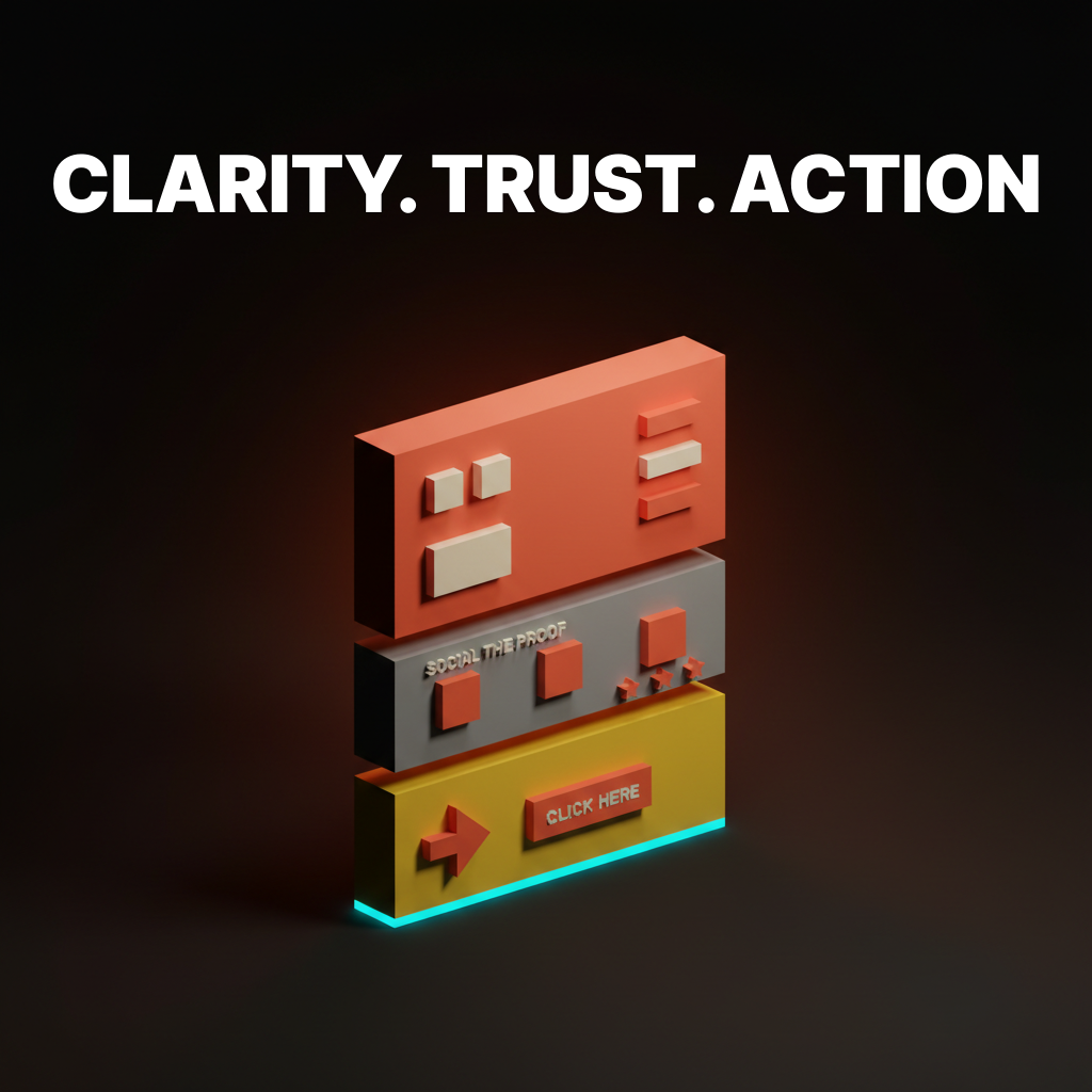
Visual Hierarchy in Design: How to Control Where People Look
Visual hierarchy controls the order the eye processes information. Five levers, one framework, and the squint test that catches 80% of layout problems.

Your design has three seconds to tell someone where to look. If everything screams for attention equally, nothing gets read, nothing gets clicked, and the user leaves. That is not a design opinion. It is how vision works.
Visual hierarchy is the system that controls that three-second window. Here is how to build one that actually guides people.
What Visual Hierarchy Really Is
Visual hierarchy is the arrangement of elements so the eye processes them in a deliberate order. Not randomly, not all at once, but in sequence: this first, then this, then this.
The brain does not read a page top to bottom like a book. It scans for signals. Size, contrast, color, spacing, and position all tell the eye what matters most. A well-built hierarchy makes the most important element impossible to miss and the least important element easy to ignore.
The Five Controls
Every visual hierarchy is built from five levers. You do not need all five at once. You need the right combination for your specific layout.
1. Size
Bigger elements get seen first. This is the most obvious lever and the most reliable. A 48px headline will always pull attention before a 14px paragraph. The ratio between sizes creates the hierarchy, not the absolute numbers.
The mistake: making everything large. When the headline, the subhead, the body, and the CTA are all oversized, the hierarchy flattens and nothing leads.
2. Contrast
High contrast draws the eye. A dark element on a light page, a bright button on a muted background, a colored badge on a grayscale layout. Contrast is the fastest way to make one element pop without changing its size.
This works in reverse too. Low contrast pushes elements back. Metadata, timestamps, and secondary labels should have low contrast so they do not compete with the primary content.
3. Color
Color creates emotional weight. A single red badge in a sea of gray will always pull attention, not because red is special but because it is the only element with chromatic energy in its context. The color palette serves hierarchy when each color has a defined role: primary for CTAs, neutral for body, dim for metadata.
4. Spacing
White space is not empty space. It is a signal. An element surrounded by generous space reads as important because the space isolates it and gives it room to breathe. Elements crammed together read as secondary because nothing stands out.
The most common hierarchy failure in web design is not enough spacing between sections. When every section bleeds into the next, the eye cannot tell where one idea ends and another begins.
5. Position
The eye naturally starts at the top-left in LTR languages and follows predictable patterns from there. Placing the most important element in the natural starting position gives it an advantage before any other lever is applied.
Position alone is weak. A small, low-contrast element in the top-left will still lose to a large, high-contrast element in the center. Position works best when it reinforces the other four controls.
The Squint Test
Here is the fastest way to check if your hierarchy works. Squint at your design until everything blurs. The elements that remain visible are the ones your hierarchy is prioritizing.
If the first thing you see when squinting is the CTA, the headline, or the hero image, your hierarchy is working. If the first thing you see is a decorative sidebar or a navigation bar, it is not.
This takes five seconds and catches 80% of hierarchy problems before any user testing.
Common Hierarchy Failures
Everything is bold. If every paragraph starts with bold text, nothing is emphasized. Bold works when it is rare.
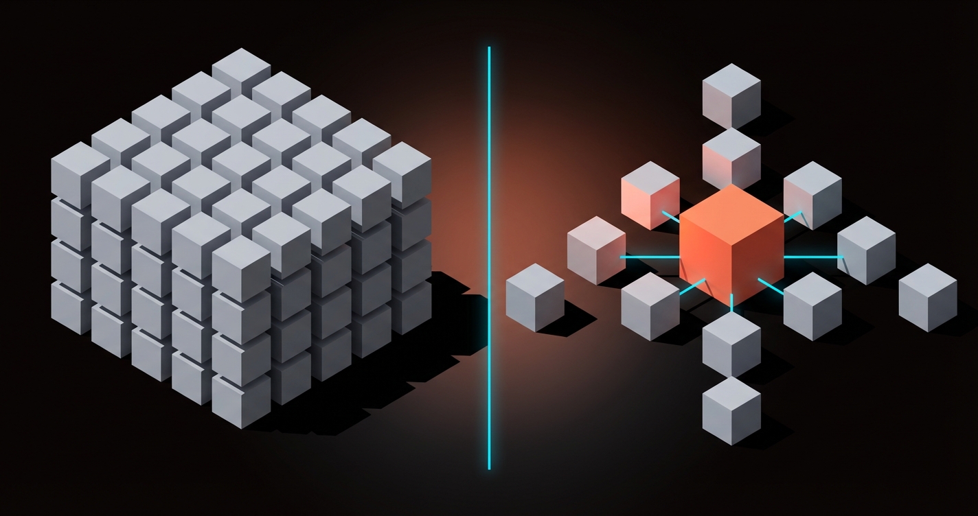
Too many focal points. A page with three equally sized, equally colorful elements has no hierarchy. It has three competitors. Pick one winner per viewport.
Ignoring mobile. A hierarchy designed for a 1440px screen often collapses on a 375px phone. The five controls need to be re-evaluated for each breakpoint because the spatial relationships change completely.
Color without contrast. A colored button on a colorful background disappears. The hierarchy only works when the color contrast ratio between the focal element and its surroundings is high enough to create separation.
Building Hierarchy in Practice
Here is a concrete framework for any page layout:
- Decide the one thing. What is the single most important action or message on this page? That element gets the most size, the most contrast, and the best position.
- Rank everything else. Create a numbered list of every element on the page, ordered by importance. The ranking determines which lever each element gets.
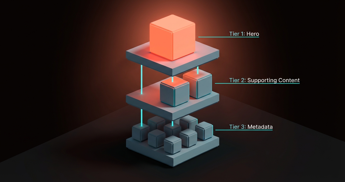
- Apply at least two controls per tier. The top-tier element gets large size + high contrast. Second-tier elements get medium size + color. Third-tier elements get small size + low contrast.
- Remove until it breaks. Delete elements until the hierarchy suffers. The last element you removed before things broke was probably unnecessary.
This framework works for landing pages, dashboards, articles, emails, and any layout where the user needs to know where to look first.
FAQ
What is visual hierarchy in design?
Visual hierarchy is the arrangement of design elements in order of importance. It uses size, contrast, color, spacing, and position to control the sequence in which the eye processes information on a page.
Why does visual hierarchy matter?
Because users do not read, they scan. Without a clear hierarchy, every element competes equally for attention, the user gets overwhelmed, and they leave. Hierarchy turns a collection of elements into a guided experience.
How do I test visual hierarchy?
The squint test is the fastest method. Blur or squint at your design and check which elements remain visible. Those are the elements your hierarchy prioritizes. If the wrong elements dominate, adjust size, contrast, or spacing until the right ones lead.
Need layouts that guide the eye? Brainy builds interfaces with hierarchy baked in.
Get StartedNot ready to hire? Run the free Business Genome, an 11-dimension diagnostic for your venture.
Get your free GenomeGet new papers by email
New Brainy papers in your inbox. Confirm once, unsubscribe anytime.