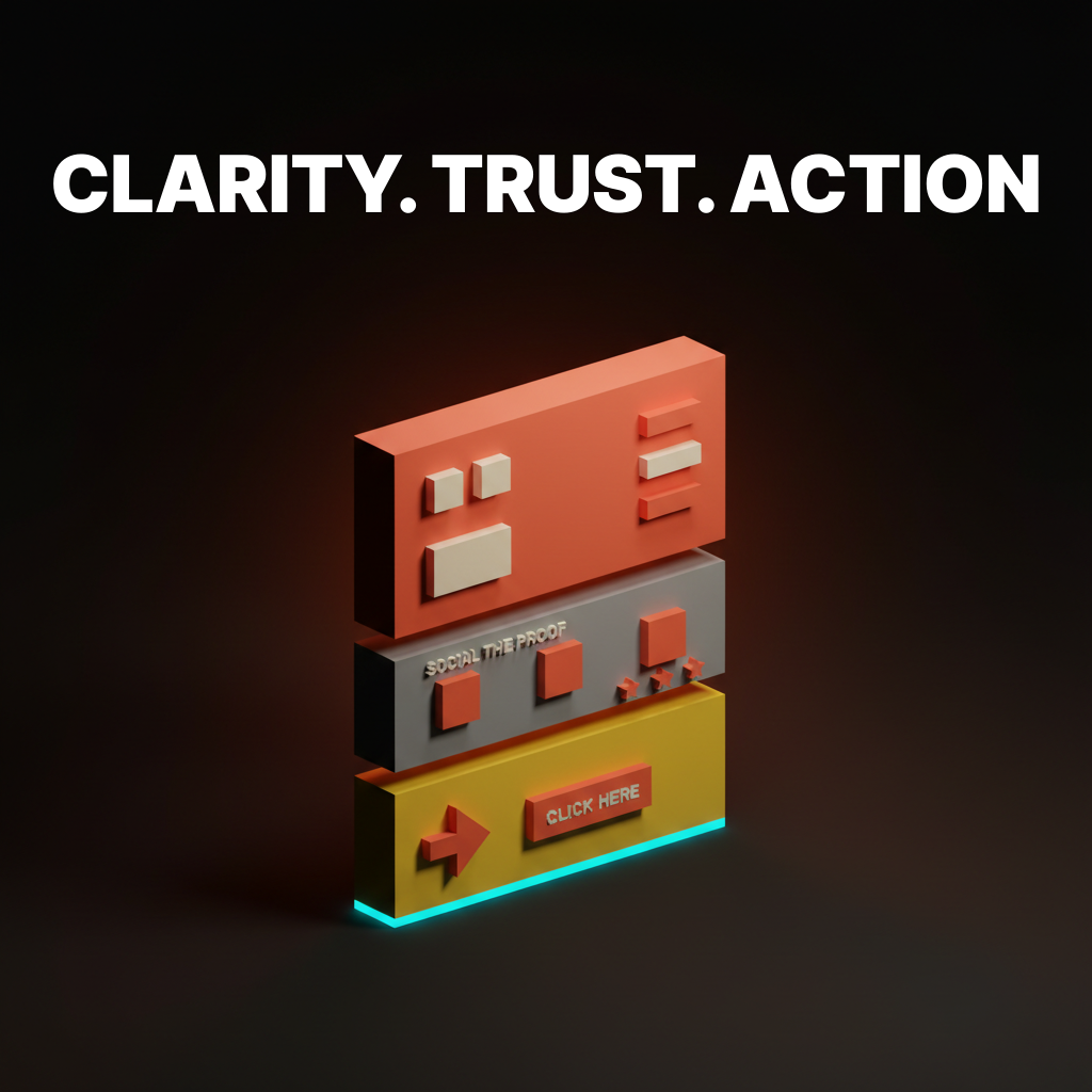
Design Systems: Why Most Fail and How to Build One That Works
Most design systems die within a year. Here is why they fail, what the survivors have in common, and how to build one that your team will actually use.

Every team that reaches a certain size eventually says the same thing: "We need a design system." Then most of them spend six months building one that nobody uses, and a year later they are back to the same inconsistency they started with.
The problem is never the components. The problem is treating a design system like a project instead of a product. Projects end. Products evolve. A design system that stops evolving starts dying on the day it launches.
What a Design System Actually Is
A design system is not a component library. A component library is a folder of reusable UI pieces. A design system is the complete set of standards, documentation, and tools that govern how a product is designed and built.
It includes:
- Design tokens. The atomic values (colors, spacing, typography, shadows) that everything else references.
- Components. Reusable UI elements built from tokens.
- Patterns. Documented solutions for recurring design problems (forms, navigation, error states).
- Guidelines. The rules for when and how to use each piece.
- Governance. Who owns the system, how changes get proposed, and how decisions are made.
Strip any of these away and you have a partial system. Partial systems create partial adoption. Partial adoption creates the same inconsistency you were trying to solve.
Why Most Design Systems Fail
Failure 1: Built in isolation. A small team disappears for three months, builds a beautiful system, and presents it to an organization that had no input. The system reflects the builders' assumptions, not the users' reality. Adoption is polite at first, then quietly abandoned.
Failure 2: Too rigid too early. The system launches with strict rules for every scenario. Designers and engineers who encounter a case the system did not anticipate have two options: fight the system or work around it. Most choose the workaround. The system becomes a reference nobody references.
Failure 3: No dedicated ownership. The system was built during a sprint. Nobody is assigned to maintain it. Tokens drift from the codebase. Components fall behind the product. Documentation goes stale. Six months later, the system is a snapshot of what the product looked like last year.
Failure 4: Component-first thinking. The team builds 47 components before defining a single token or writing a single guideline. The components work in the Figma file but break in production because the underlying values were never systematized.
Failure 5: Perfection paralysis. The team tries to solve every edge case before launching anything. The system never ships. Meanwhile, the product ships daily without it.
What Surviving Systems Have in Common
After studying the systems that actually last (Shopify Polaris, Atlassian Design System, IBM Carbon, GitHub Primer), three patterns emerge:
They started small and grew. None of them launched with 200 components. They launched with tokens, a handful of core components, and clear documentation. Then they expanded based on actual product needs, not theoretical completeness.
They have dedicated teams. Not one person. A team. Design systems at scale require a designer, an engineer, a documentation writer, and a product owner at minimum. Shopify has dozens of people working on Polaris. You do not need dozens, but you need more than zero.
They treat contributions as a feature. The best systems make it easy for product teams to propose additions, flag issues, and contribute components. The system grows from the edges, not just the center. A system that only grows from one team's decisions will always lag behind the product.
Design Tokens Are the Real Foundation
Tokens are the primitive values that everything else inherits from. Change a token, and every component that references it updates automatically. This is what makes a system a system instead of a collection.
Token levels:
| Level | Example | Purpose |
|---|---|---|
| Global | color-blue-500: #3B82F6 | Raw palette values |
| Semantic | color-primary: {color-blue-500} | Meaning-based aliases |
| Component | button-bg: {color-primary} | Component-specific bindings |
Global tokens define the raw values. Semantic tokens assign meaning (primary, danger, surface). Component tokens bind those meanings to specific UI elements. This three-layer structure means you can rebrand by changing semantic tokens without touching a single component.
Token types to define first:
- Colors (background, text, border, interactive states)
- Spacing (4px grid: 4, 8, 12, 16, 24, 32, 48, 64)
- Typography (family, size scale, weight, line height)
- Border radius (none, small, medium, large, full)
- Shadows (elevation levels)
- Motion (duration, easing curves)
If you define nothing else, define these. They cover 90% of the visual decisions your team makes daily.

Building Components That Last
Components built on tokens are inherently more resilient than components built on hardcoded values. But even token-based components fail if they are built wrong.
Rules for components that survive:
Composition over configuration. A button with 14 props is not flexible. It is fragile. Instead of building a mega-component that handles every variant through props, build small composable pieces that combine into patterns. A card is not one component. It is a card container, a card header, a card body, and a card footer that compose together.
States are not optional. Every interactive component needs: default, hover, active, focus, disabled, loading, and error states. Shipping a component without all seven states means someone will build those states ad hoc, and they will not match.
Document the "when" not just the "what." Your button documentation should not just show what it looks like. It should say when to use a primary button versus a secondary button versus a ghost button. The decision framework matters more than the visual reference.
Patterns Solve What Components Cannot
A dropdown component tells you how a dropdown looks. It does not tell you when to use a dropdown versus a radio group versus a segmented control. That decision is a pattern.
Patterns to document early:
- Form layouts. Label placement, error display, required field indication, multi-step flows.
- Navigation. When to use tabs versus sidebar versus breadcrumbs. Mobile navigation collapse behavior.
- Empty states. What shows when there is no data. Illustration? CTA? Educational content?
- Loading states. Skeleton screens versus spinners versus progressive loading. When each is appropriate.
- Error handling. Inline validation versus toast notifications versus full-page error states.
These patterns prevent the "we built the same form five different ways" problem that plagues teams without a system.
Governance Makes or Breaks Adoption
A design system without governance is a suggestion. Governance answers three questions:
- Who decides? Is there a review board? A single owner? A democratic vote? Whatever you choose, make it explicit.
- How do changes happen? RFC process? GitHub issue? Slack thread? Define the path from "I think we need a new component" to "it is in the system."
- What is the versioning strategy? Semantic versioning for the token package? Changelog per release? Breaking change policy?
The teams that skip governance end up with a system that forks. Design uses version 2.3. Engineering uses version 1.8. The marketing site uses version 2.0 with local overrides. At that point, you have three design systems and zero consistency.

FAQ
How long does it take to build a design system?
The initial foundation (tokens, 10-15 core components, basic documentation) takes 2-4 months with a dedicated team. But a design system is never "done." Plan for ongoing investment of 15-25% of a design engineering team's capacity.
Do small teams need a design system?
Yes, but a proportional one. A 3-person team does not need Polaris. They need a shared Figma library with tokens, 8-10 core components, and a one-page decision guide. Start with what hurts most (usually inconsistent spacing and color usage) and grow from there.
What is the difference between a design system and a component library?
A component library is a collection of reusable UI elements. A design system includes the component library plus design tokens, usage guidelines, patterns, documentation, and governance. The library is one layer of the system.
Start With Pain, Not Ambition
Do not build a design system because it sounds professional. Build one because your team is wasting time solving the same problems repeatedly. Start with the three things that cause the most inconsistency right now. Systematize those. Ship them. Then expand based on what the team asks for next, not what looks impressive in a case study.
Need a design system that scales with your product? We build those.
Get StartedNot ready to hire? Run the free Business Genome, an 11-dimension diagnostic for your venture.
Get your free GenomeGet new papers by email
New Brainy papers in your inbox. Confirm once, unsubscribe anytime.