

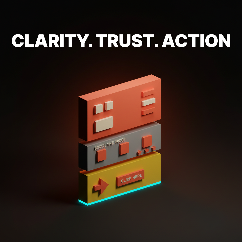
Landing Page Design: 12 Principles for High-Converting Pages in 2026
Twelve principles that separate landing pages that convert from pages that just exist. Above-the-fold clarity, social proof, CTA hierarchy, form friction, and the 2026 patterns worth stealing.
Most landing pages lose the visitor in the first two seconds. Not because the design is ugly. Because the page does not answer the question the visitor came to ask, fast enough, in the place they are looking.
The pages that convert in 2026 are not prettier than the pages that do not. They are clearer. They load faster, they lead with the claim, they show proof before they ask for anything, and they remove every input the visitor does not strictly need to provide. This paper breaks the rules behind that into 12 principles, with real examples from Linear, Stripe, Vercel, Ramp, Notion, Framer, and a few others that keep showing up because they keep getting it right.
If you want the teardown version (six pages dissected top to bottom), the existing landing page design paper covers it. This one is the principle layer. Steal what fits, skip what does not.
Clarity above the fold
The top of the page does all the work. If the hero is unclear, nothing below it will save you.
1. The hero earns the click in one sentence
Visitors decide whether to keep scrolling in under three seconds. The hero headline has to answer one question: what is this, and who is it for. Nothing else.
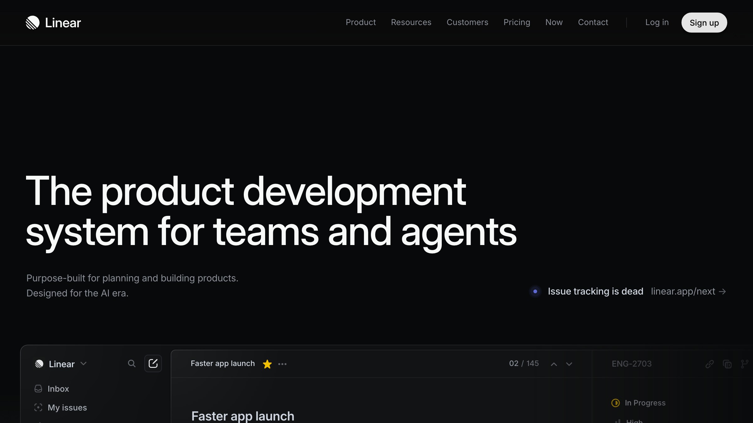
Linear's hero is "Linear is a purpose-built tool for planning and building products." No adjectives, no metaphors, no "reimagined for the AI era." The second line names the user. That is the whole job.
Stripe's homepage has evolved a dozen times in five years. The headline has not. It is always a variant of "Financial infrastructure for the internet." Specific noun, specific audience, zero ornament.
The rule: if a visitor cannot explain what your product is after reading your headline out loud, the headline is wrong. Subheadlines can add context, never rescue a broken hero.
2. The visual anchors the claim
A hero without a visual is a press release. A hero with the wrong visual is a mood board. The visual has to prove the claim the headline just made.
Ramp's hero shows the actual product, a dashboard with real transaction rows, not a floating iPhone with fake UI. Notion shows the page you would actually build in it. Vercel shows a deployment in progress. Framer shows an editor with a canvas in motion.
The pattern: the hero visual is the product doing the thing the headline promised. Not an abstraction of it. Not a 3D render of it. The thing.
3. One primary CTA, period
Every landing page has one job. The hero has one CTA that reflects that job. Everything else is secondary.
Stripe's hero has "Start now" as primary and "Contact sales" as a quieter secondary link, not a button. Linear's is "Sign up" and a "Watch demo" text link. Ramp picks "Get started" and downgrades "See pricing" to a ghost button.
Primary CTAs in 2026 are high-contrast, single-verb, action-forward. "Start your 14-day trial" is not a CTA, it is a marketing sentence with a border. Good hero CTAs are two or three words. "Start free." "Get started." "Try it." Read them out loud. If they sound like a sentence, cut words.
Trust before you ask for anything
The middle of the page builds belief. Visitors will not give you their email or their credit card until the page earns it.
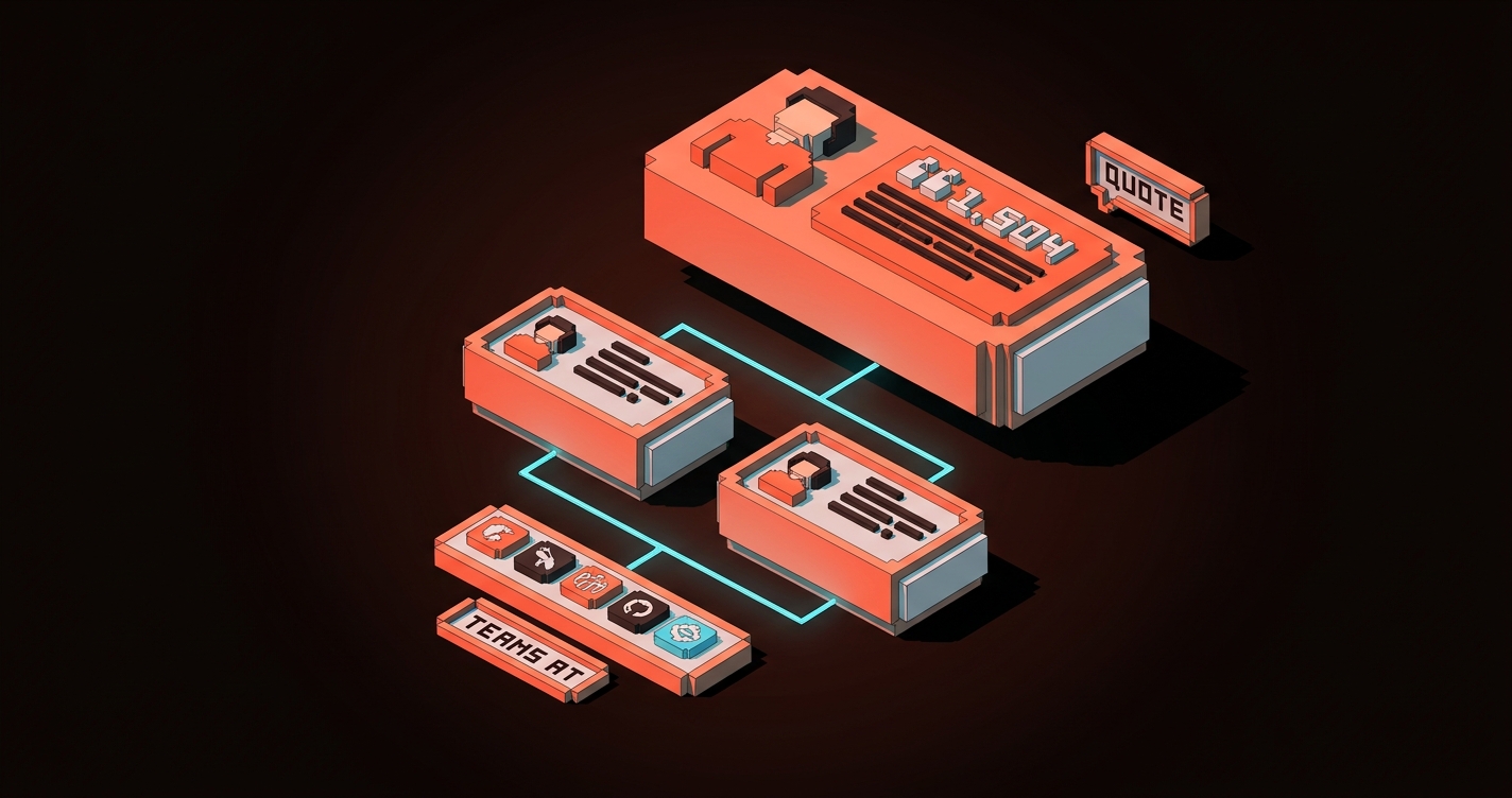
4. Social proof is specific, not decorative
A marquee of logos proves nothing. Twelve gray icons at 40% opacity look like every SaaS page built since 2019 and the visitor now tunes them out. You know the reader has stopped seeing them because you have stopped seeing them.
Specific proof works. One real customer with a real outcome. A named testimonial with a role and a company. A measurable result ("reduced onboarding time by 60%"). A case study link under the quote. These are harder to fake and visitors know the difference.
The hierarchy to steal:
- One named customer quote with a real result at the top of the trust section
- Two or three supporting quotes, shorter, with photos and roles
- A compact logo strip at the bottom, if at all, with a caption like "Teams at..."
- A link to the full case study library under everything
Ramp and Linear both do this well. Logos are the dessert, not the main course.
5. Show the product, do not describe it
Every feature section should include a visual of the product performing the feature. Copy describes. Visuals prove.
Notion's landing page is 80% product screenshots. Framer's is a live, running design editor embedded in the page. Vercel's features page shows terminal output, real deploy previews, actual metrics.
The rule: for every feature bullet, ask "what is the smallest visual that shows this happening?" If the answer is "a stock illustration," replace it with a screenshot. If the answer is "a 3D icon," replace it with a product shot. If the feature cannot be shown, rewrite the feature.
6. Hierarchy is doing the selling
A landing page with no visual hierarchy is a wall of equal-weight sections and the reader bounces before they find the point. Hierarchy controls reading order, visual hierarchy is how you direct attention without writing longer copy.
Three hierarchy moves that carry their weight in 2026:
- Bigger hero type than you think. 72 to 96px on desktop is normal now, and the reader's eye needs that anchor to start.
- One accent color used sparingly. The CTA color appears three or four times on the page, maximum. If it shows up ten times, it stops meaning "act here" and starts meaning "we picked a color."
- Dense sections broken with white space. Every content section needs breathing room around it or the reader reads none of them.
CTA discipline
The button is where conversion happens. Most pages get the button wrong because they treat it as a label instead of a decision point.
7. The CTA ladder matches buyer readiness
Not every visitor is ready to buy. Pages that convert give each reader the next step that matches where they are, without cluttering the primary path.
A clean CTA ladder in 2026:
- Ready to buy: primary hero CTA, sticky on scroll
- Needs more info: a contextual secondary CTA inside the relevant feature section ("See how it works")
- Needs proof: a case study link inside the trust block
- Not ready but interested: a newsletter or a guide download in the footer or the exit-intent
Each CTA has one job. None of them compete with the primary. Ramp and Stripe both ladder this way, with the primary never losing dominance.
8. Sticky CTAs earn attention on long pages
If your landing page is longer than two viewports, the primary CTA should follow the reader. Not as an aggressive popup. As a quiet sticky element that appears after the hero exits and stays available until the visitor converts or leaves.
The 2026 sticky CTA is minimal: a thin bar at the bottom of the viewport on desktop, or a pill in the bottom-right on mobile, with the primary action and one secondary link. It fades on scroll direction changes so it never feels like it is blocking content.
Linear and Framer both ship sticky CTAs on marketing pages now. Neither of them is aggressive. Both of them work.
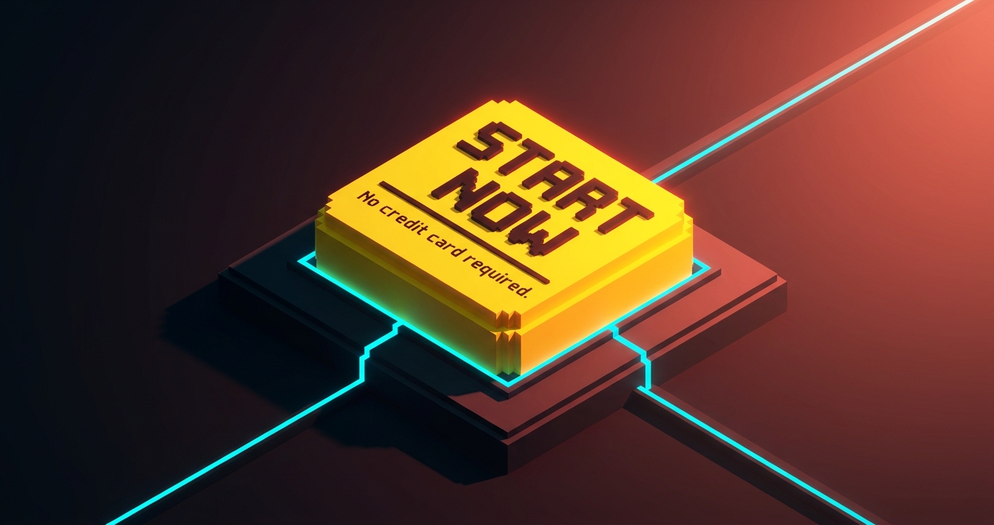
9. CTA micro-copy removes doubt, not adds urgency
Under every primary CTA there is a two-to-six word line of micro-copy. The best versions handle the visitor's last objection before they click.
Good examples:
- "No credit card required."
- "Free forever for up to 10 users."
- "Cancel anytime."
- "Setup in under five minutes."
Bad examples:
- "Limited time offer!"
- "Join 50,000+ happy customers!"
- "Don't miss out!"
The good ones reduce friction. The bad ones add noise that sophisticated buyers in 2026 have already learned to ignore. If your micro-copy reads like a game show, delete it.
Friction engineering
Every input you ask for is a cost. The best landing pages in 2026 are ruthless about removing inputs that do not pay for themselves.
10. Forms ask for the minimum viable data
The SaaS industry standard for sign-up forms was seven to nine fields as recently as 2020. The conversion data has been clear for a decade: every additional field costs conversion, and most of the fields were never used by the marketing team asking for them.
The 2026 baseline is one to three fields on the initial form. Everything else happens after the user is inside the product.
- Trial sign-up: email and password, or "Continue with Google." That is it.
- Demo request: work email, company name, nothing else. Enrichment tools handle the rest.
- Newsletter: one field, email.
Ramp's sign-up is two fields plus SSO. Linear's is SSO-first with email as a fallback. Stripe's is email and password. Every field after that exists inside the product, where the user is already committed.
If your form has a "Company size" dropdown on step one, delete it. It is a tax on conversion that you are paying for a dashboard metric.
11. Progressive disclosure replaces the wall of features
The old pattern was to list every feature on the landing page. The 2026 pattern is to show the three features that matter most, with an expandable "See all capabilities" beneath.
Bento grids are the current dominant shape for this. The hero feature gets a large cell, three or four supporting features get smaller cells, and anything more granular hides inside a link to the full features page.
Progressive disclosure also applies to pricing. Stripe does not show the full fee table on the homepage. They show the headline number ("2.9% + 30 cents") and let the visitor click through for the complete breakdown. The visitor who cares about fee structure gets to it in one click. The visitor who does not was never going to read the full table anyway.
| Old pattern | 2026 pattern |
|---|---|
| Feature wall with 12+ bullets | Bento with 3-5 hero features, rest behind a link |
| Full pricing table on landing page | Headline price, full table on pricing page |
| Every integration logo at once | Top 6, then "View all integrations" |
| Every FAQ on the page | 3-5 on page, rest on support/help |
12. Performance is the final conversion lever
A landing page that takes 4 seconds to paint is a landing page that has already lost half its visitors. Google's Core Web Vitals are a diagnostic, not a goal. The real number is time to the hero being readable and the CTA being clickable.
The best landing pages in 2026 hit a first paint under 800ms on mid-tier mobile. Vercel, Linear, and Stripe all benchmark well under a second on a 4G connection. They get there by doing less: a single variable font subset, a static hero image, one primary script, no third-party tracking in the critical path.
If your page uses four webfonts, a chat widget, an analytics script, and a hero video, you are not designing for conversion, you are designing for the Figma file. Every 100ms of load time is measurable conversion loss. Performance is a design decision, not an engineering one.
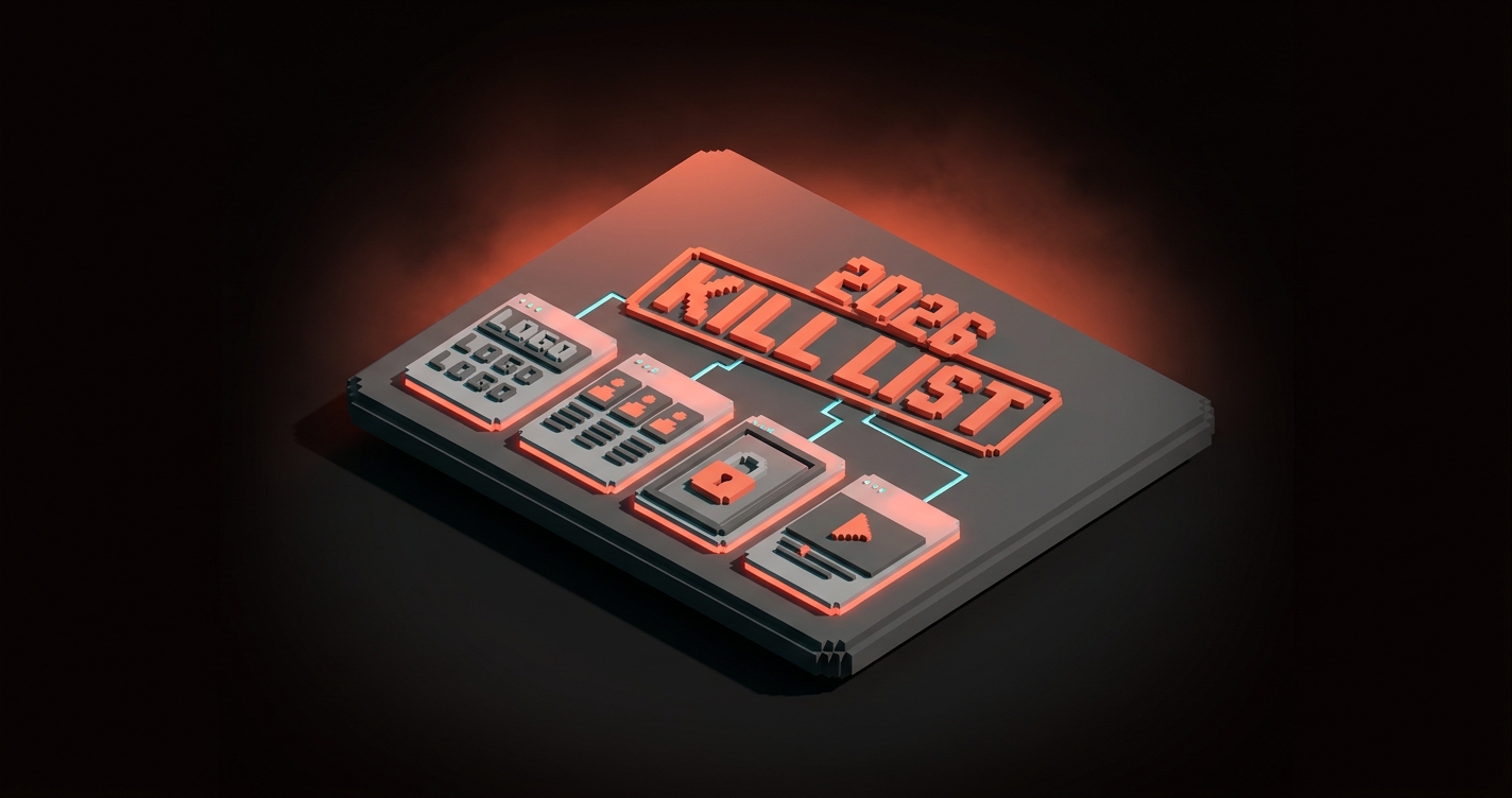
The 2026 kill list
Some patterns are not principles, they are leftovers. If your current landing page still uses these, it is dating itself.
- Marquee logo strips with no context. One case study beats ten logos, every time.
- Three-column feature rows with equal weight. Replace with a bento grid or a prioritized stack.
- Hero sections with four CTAs. Pick one. The rest are navigation.
- "Trusted by" with no names. If you cannot name the customer, do not claim trust.
- Autoplay hero videos. Heavy, distracting, worse converting than a static hero with motion on scroll.
- Gated content as the primary CTA. Unless your product is gated content, do not hide value behind an email field.
- Low-contrast CTAs. If the button does not pop in a 5-second squint test, it is not a button.
- "AI-powered" in the hero headline. The reader does not care how it is built. They care what it does.
- Cookie modals that block the hero. A design that starts with a consent wall has already lost the visitor.
- Accessibility failures on the CTA. Low color contrast is a design bug, see the accessible color contrast guide, and fix your ratios before you ship.
If three or more of these are on your current page, you are not running a landing page, you are running a museum exhibit of 2022 decisions.
The pattern behind every principle
Scroll back through the 12. Every one of them is a restraint.
- Cut the adjectives in the hero.
- Cut the logos without names.
- Cut the form fields.
- Cut the CTAs that are not primary.
- Cut the features that do not earn a cell.
- Cut the load time.
High-converting landing pages in 2026 are the ones designed by subtraction. Every element that survives earns its place. Every element that does not gets deleted. The page is a collection of decisions the designer refused to make easy.
The measurable stuff follows from that. Clarity lifts scroll depth. Proof lifts time on page. Discipline on CTAs lifts click rate. Minimum viable forms lift completion rate. Performance lifts every funnel metric at once. None of them require a redesign. All of them require ruthlessness.
Pick one section on your current landing page. The one you like least. Apply three of these principles to it, in order, without adding anything new. Ship it this week. Watch the numbers move.
If you want your brand color palette and your landing page working together instead of fighting, or if you want the page you already have rebuilt against 2026 patterns instead of 2022 templates, hire Brainy. We ship landing pages that convert because they respect the principles, not because they look like the Figma file the designer fell in love with. Related reading: web design trends 2026 for the broader pattern shift this sits inside.
FAQ
What is the most important principle in landing page design?
Clarity in the hero. If the visitor cannot explain what your product is, who it is for, and why they should care after reading your hero section out loud, nothing below the fold will save you. Every other principle on this list is in service of that one. Fix the hero first.
How many CTAs should a landing page have?
One primary, used three or four times at most. Every secondary CTA should be clearly quieter (a ghost button, a text link, or contextual inside a feature block) and serve a different visitor intent than the primary. Pages with four or more competing CTAs convert worse than pages with one strong one, every time.
Are long landing pages better than short ones?
Neither. The right length is however long it takes to make the claim, prove it, and remove the last objection. A $19 tool needs less proof than a $19,000 platform. Start with the buyer's readiness level and work back from there. If your product is a trial sign-up, you probably need one viewport. If it is a six-figure enterprise sale, you probably need six.
Stop designing landing pages by taste
Most landing pages get designed the way most articles get written: the author starts at the top, keeps going, and stops when they run out of things to say. That is how you end up with a page that loses the visitor by scroll two.
Design the page by principle instead. Start with the one sentence the hero has to land. Pick the one piece of proof strong enough to live at the top of the trust block. Pick the one CTA that reflects the one action you want. Cut everything else until what is left is load-bearing.
The pages that convert in 2026 are not the creative ones. They are the ones designed by someone who knew the difference between the work the page was doing and the work the designer wanted to do. Pick the page. Pick the principles. Ship the cuts.
Need a landing page built on principles, not templates? Brainy ships landing pages that convert.
Get StartedNot ready to hire? Run the free Business Genome, an 11-dimension diagnostic for your venture.
Get your free GenomeGet new papers by email
New Brainy papers in your inbox. Confirm once, unsubscribe anytime.


