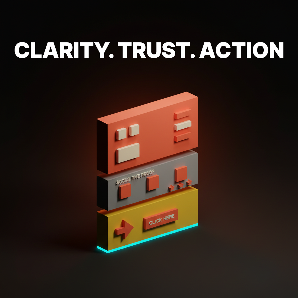
Landing Page Design: What the Best Converting Pages Have in Common
The best landing pages share the same structural decisions. What they are, why they work, and what to steal for your own page.

High-converting landing pages are not creative accidents. They share a structural pattern that earns attention, builds trust, and removes friction in a specific order. The brands that figure this out stop redesigning every six months and start compounding results instead.
This paper breaks down the anatomy, six real pages worth dissecting, and the rules that separate pages that convert from pages that just exist.
The Anatomy of a Page That Converts
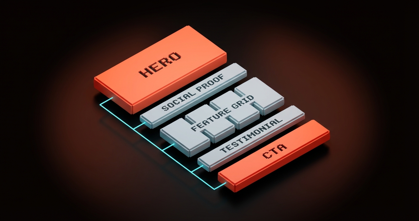
Every high-converting landing page solves the same three problems in the same order: attention, trust, action.
Most designers skip to aesthetics before confirming the structure works. The order matters. A beautiful CTA that nobody reaches because the hero lost them is a very expensive button.
| Layer | What it does | Where it lives |
|---|---|---|
| Attention | Explains what this is and who it's for | Hero (above the fold) |
| Trust | Proves the claim is credible | Social proof, feature evidence, testimonials |
| Action | Removes friction from the next step | CTA placement, form design, micro-copy |
Every section maps to one of those three jobs. If a section doesn't serve attention, trust, or action, it is friction. Cut it or collapse it.
The sequence is also non-negotiable. You cannot ask for action before you've built trust, and you cannot build trust with someone who hasn't paid attention. The best pages feel inevitable because they respect this order.
Visual hierarchy is the tool that makes the sequence scannable. If you want a deeper read on how hierarchy controls reading order, the Brainy Paper on visual hierarchy covers the mechanics.
6 Landing Pages Worth Studying
These pages print money, and the structural decisions behind them are not proprietary. Each one solves the attention-trust-action sequence differently, and each one has something concrete worth stealing.
Stripe
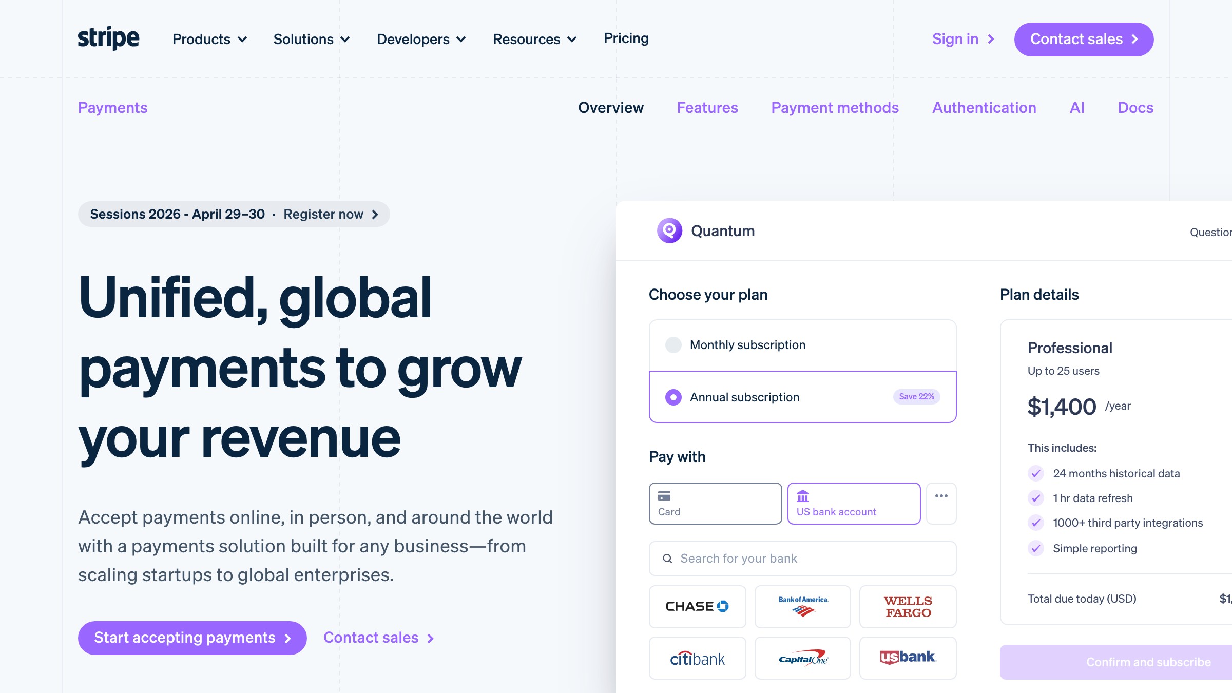
Stripe's page leads with a single declarative headline ("Financial infrastructure for the internet") that filters the audience immediately. No hedging, no comma-separated value list, no "powerful and flexible." One claim. One job.
Below the fold, Stripe uses a developer-focused feature grid that functions as proof, not description. They show API snippets and live charts because their buyer is technical. The social proof is institutional (logos from Amazon, Google, Lyft) placed early to establish enterprise credibility before any feature is read.
What to steal: a filter headline in the hero paired with proof-by-showing rather than proof-by-claiming in the feature section.
Linear
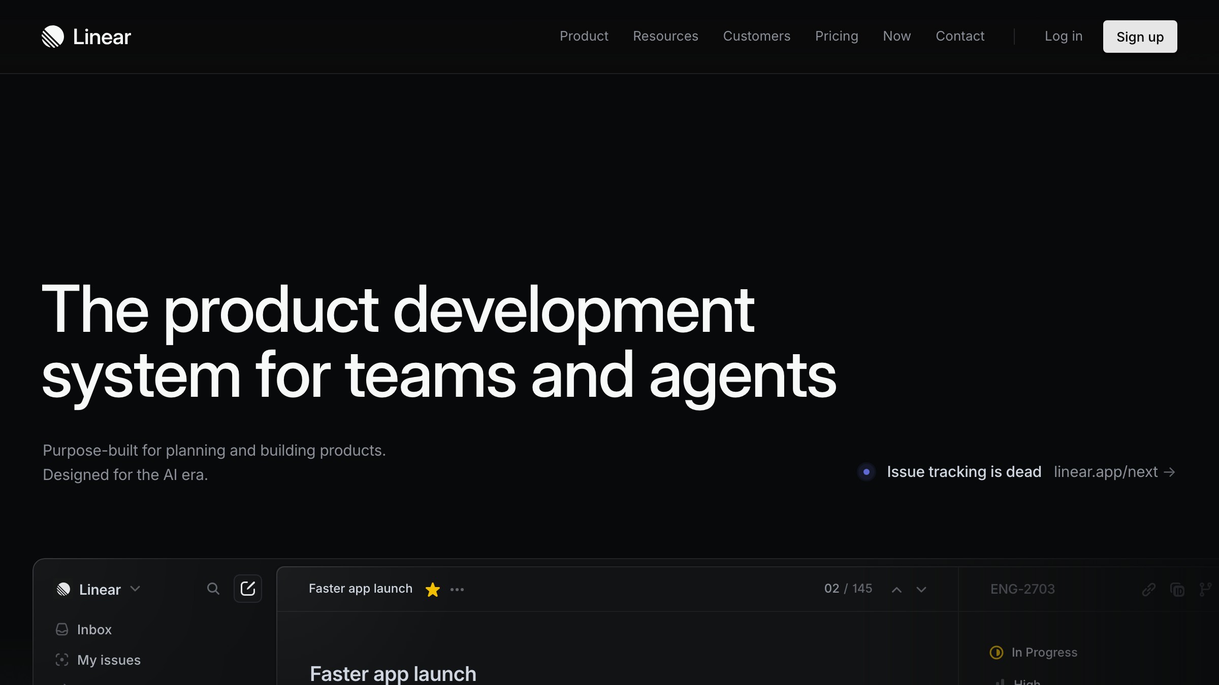
Linear strips the page down to almost nothing and lets the product carry the weight. The hero has a two-line headline, one subheadline, one CTA, and a product screenshot that dominates the viewport. No nav clutter. No secondary CTA. No distracting testimonial carousel.
The visual quality of the UI screenshot is doing structural work. Linear's audience is design-conscious engineers who can tell quality from a glance. Showing a precise, beautiful interface IS the social proof. The page trusts the product.
What to steal: resistance to feature creep in the hero. Linear proves that removing every non-essential element is a conversion decision, not a minimalism preference.
Notion
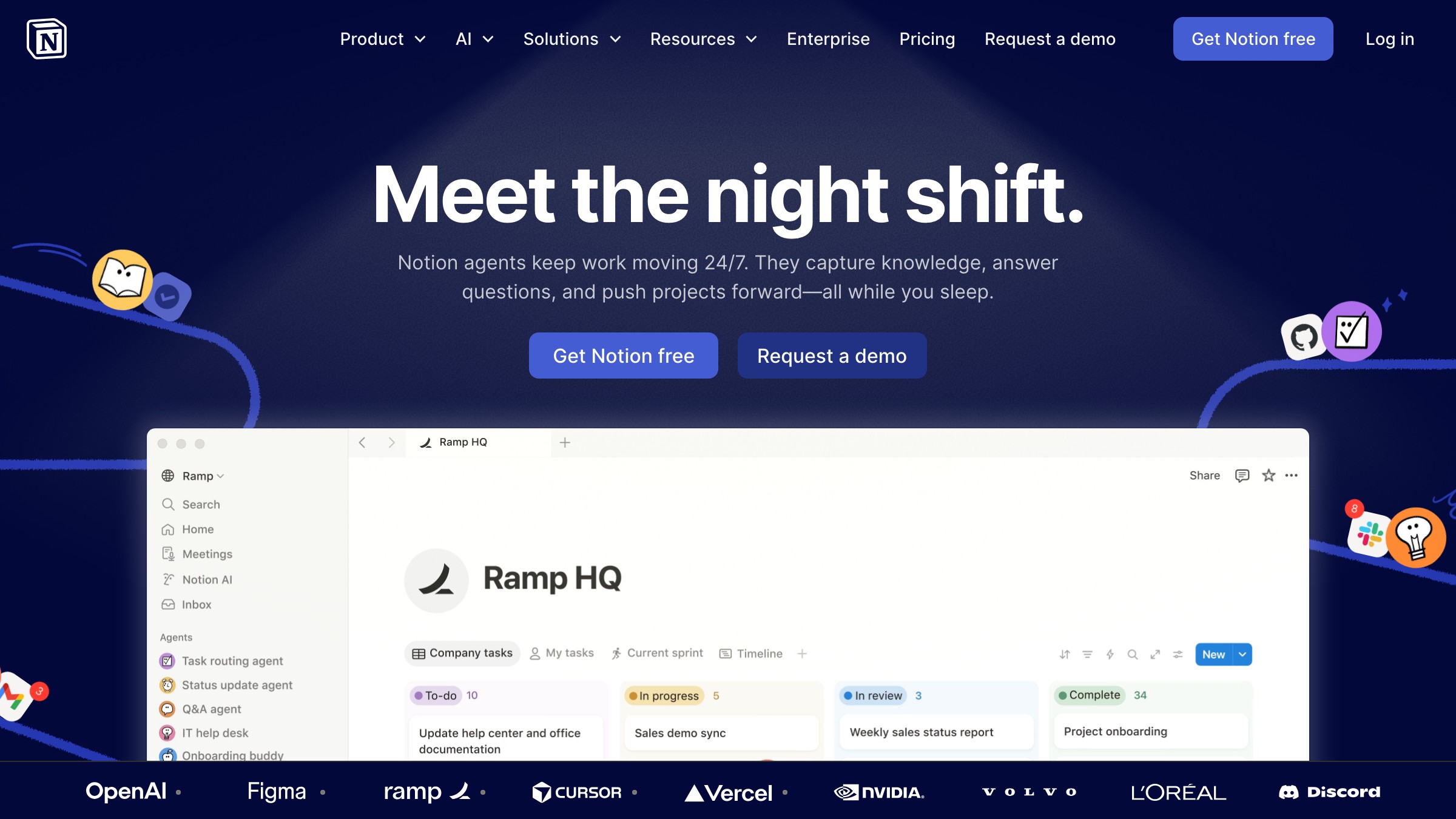
Notion faces a harder problem than most: a product that does everything for everyone tends to communicate nothing to anyone. Their solution is a flexible hero headline anchored by an enormous logo wall placed directly under the fold.
The logo wall does the heavy lifting. Before a visitor reads a single feature, they've seen their own company's logo or a company they respect. Social proof placed that early converts skepticism into curiosity. Notion then uses tab-based feature navigation to serve multiple audiences without making the page feel like a brochure.
What to steal: the logo wall as the second thing a visitor sees, not the fifth.
Vercel
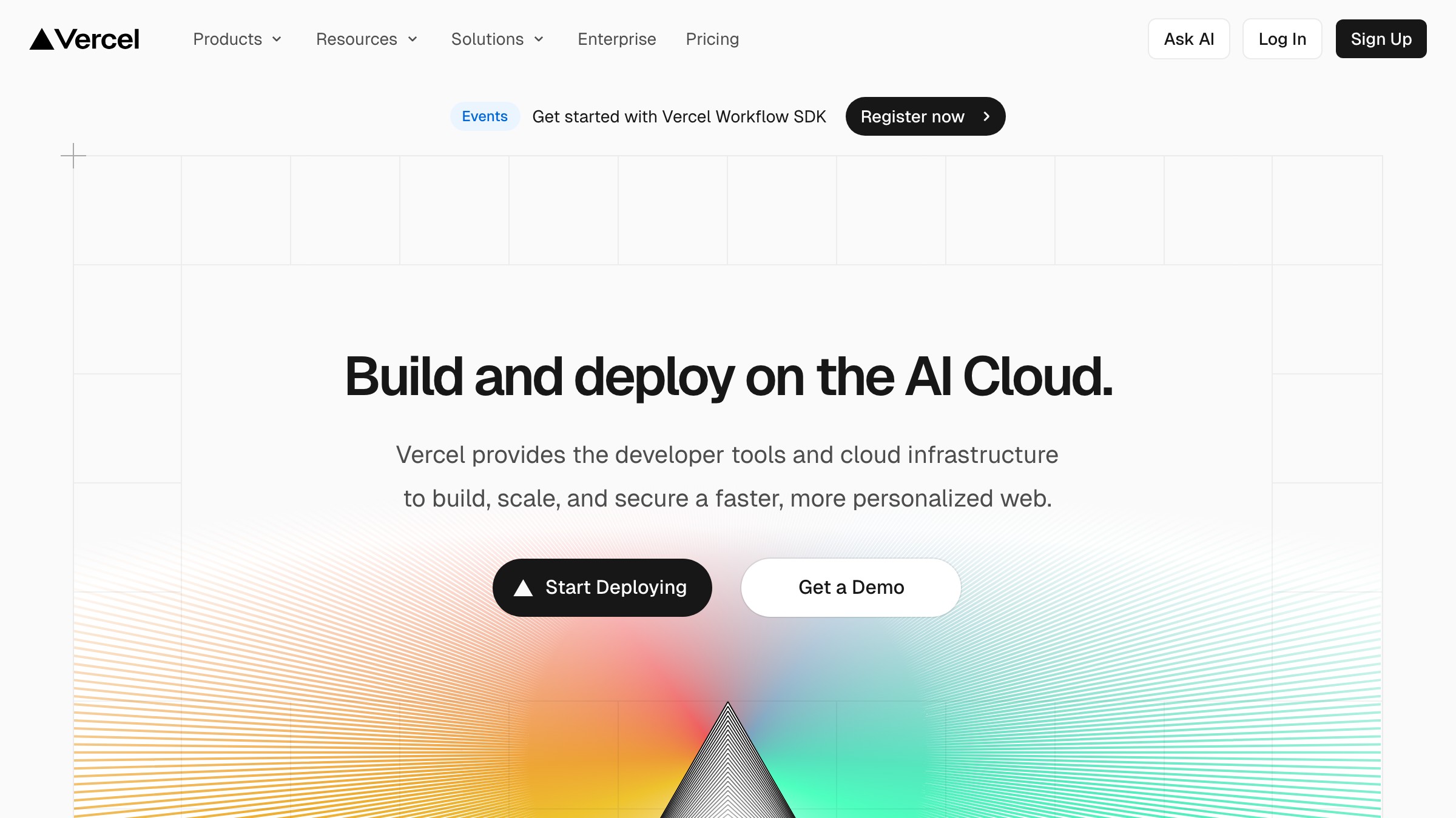
Vercel skips the generic "deploy faster" pitch and leads with a live demo. The hero integrates real deploy data and code previews, which means the proof is embedded in the page itself. For a developer audience, this is exponentially more persuasive than customer quotes.
Their CTA strategy is also worth noting. "Start Deploying" sits alongside "Get a Demo," but the hierarchy is explicit. Self-serve is primary and dominant. The enterprise path is visually subordinate. Two audiences, one page, clean hierarchy.
What to steal: proof-of-work in the hero instead of description. If you can show your product working on the page that sells it, do that.
Arc Browser
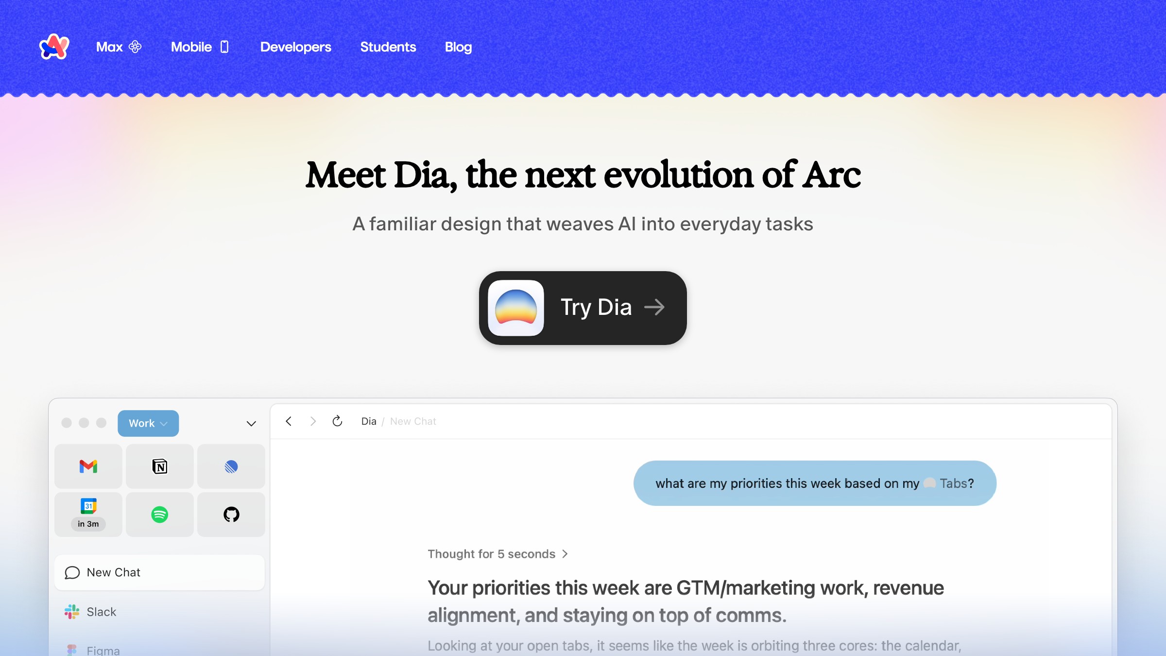
Arc's page is built on personality, which is rare and risky. The hero doesn't explain the browser with a feature list. It communicates a feeling. "A better way to use the Internet" is almost aggressively vague, but it works because the visual design and product video underneath it immediately establish that this is a different kind of product.
The page earns trust through design credibility, not logos. Arc's audience is early adopters already burned by bloated browsers. Showing an interface that looks nothing like Chrome is the entire argument.
What to steal: if your product has a distinct point of view, let the design communicate it before the copy tries to explain it.
Loom
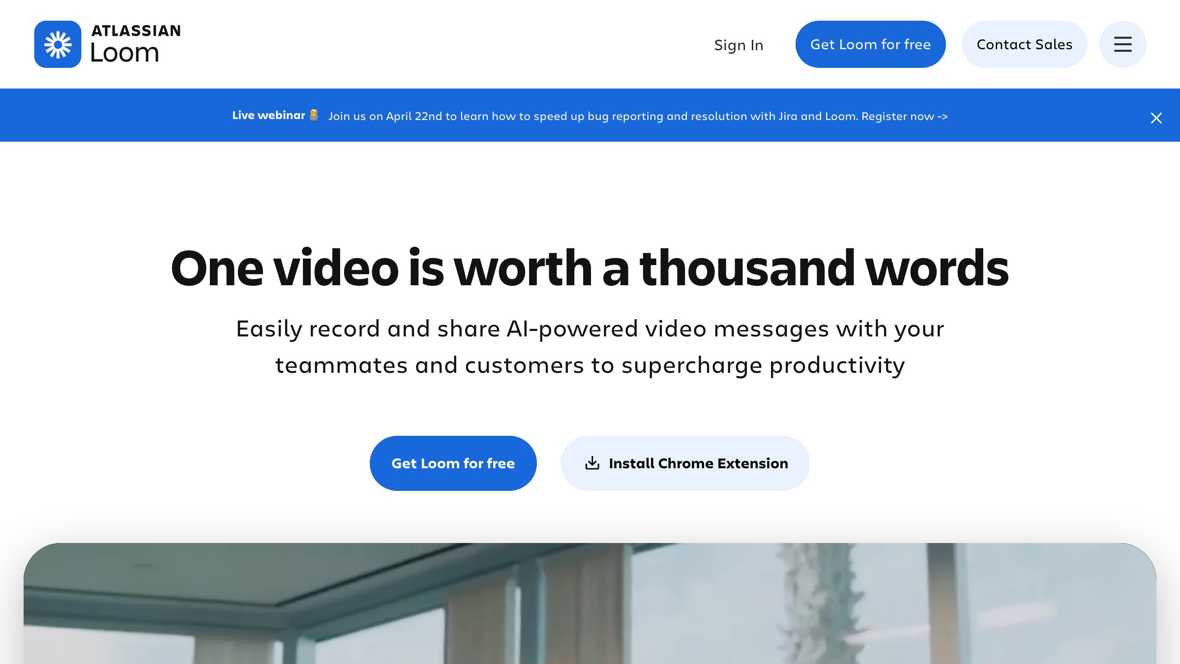
Loom's hero plays a product demo video automatically above the fold. While you read about Loom, you are watching Loom work. This removes the biggest friction point in any buyer journey: the gap between "sounds useful" and "I can actually picture myself using this."
The copy on Loom's page is almost secondary. The video does the persuasion. The text provides the rational justification visitors use to convince their team. This is exactly right for a video tool. The medium is the message.
What to steal: match your demonstration format to your product's core value. Loom sells async video. Of course the page leads with video.
Need a landing page that actually converts? Brainy builds pages with structure, not hope.
The Hero Section Decides Everything
If your hero does not answer "what is this and why should I care" in under 5 seconds, the rest of the page is irrelevant.
The hero has one job: make the visitor decide to keep reading. Features, pricing, testimonials are only seen by people your hero convinced to stay. The hero is the bouncer, the billboard, and the first handshake simultaneously.
A functional hero has four elements. Not three, not six. Four.
| Element | What it does | Common mistake |
|---|---|---|
| Headline | States the core value proposition | Too clever, not clear |
| Subheadline | Clarifies who it's for and what changes | Repeats the headline in different words |
| CTA | Gives one clear next step | Multiple options, vague labels like "Learn More" |
| Visual | Shows the product or outcome | Stock photo, illustration with no actual product |
The headline has to pass the "so what?" test. Read your headline. Ask "so what?" If the answer is not immediately obvious, the headline is doing copy work instead of conversion work.
Subheadlines fail when they describe the product instead of the outcome. "A project management tool with AI" is a description. "Ship projects on time without the 9am standup" is an outcome. Visitors buy outcomes, not tools.
Social Proof Is Architecture, Not Decoration
Logos, testimonials, and case study links are structural load-bearing elements, not afterthoughts you scatter where they fit.
Most pages treat social proof like seasoning. Finish the page, sprinkle a testimonial section near the bottom because that's where it "fits." This is backwards. Social proof should appear at every point where trust is being asked for.
| Proof type | Where it converts best | Why |
|---|---|---|
| Logo bar | Immediately below the hero | Establishes credibility before the sell begins |
| Testimonials | Adjacent to the feature claims they validate | Proves the specific claim, not just general satisfaction |
| Case studies | Near the primary CTA | Removes last-moment doubt before action |
| Star ratings / numbers | Hero or CTA proximity | Social volume creates urgency |
A testimonial at the bottom of your pricing section is doing nothing. That same testimonial placed next to the specific feature it validates is doing structural work.
For building the visual language that makes social proof feel native to your brand rather than bolted on, the Brainy Paper on brand identity has the foundation covered.
One Page, One Action
The best landing pages are ruthlessly focused on a single conversion action.
Every additional CTA you add doesn't increase conversion. It splits attention, introduces decision paralysis, and dilutes the message. The pages that consistently outperform are the ones that decided what they want the visitor to do and refused to hedge on it.
This doesn't mean a single button on the entire page. It means one primary conversion goal. You can repeat that CTA multiple times (hero, mid-page, footer) and test different labels. What you cannot do is stack "Start Free Trial," "Book a Demo," "Watch a Video," "Read the Case Study," and "Download the Guide" on the same page and expect any of them to work.
The one legitimate exception is a tiered audience. Vercel's "Deploy Now" alongside "Get a Demo" works because the hierarchy is explicit. Self-serve is primary. Enterprise is secondary and visually smaller. If you have two distinct audiences, you can have two paths. One must be clearly dominant.
FAQ
What makes a good landing page design?
A good landing page design solves the attention-trust-action sequence in order. The hero earns attention with a clear value proposition. Social proof builds trust throughout the page, placed at points of doubt rather than as an afterthought. The CTA removes friction from a single focused action. Visual hierarchy controls reading order so visitors don't have to work to find what matters.
How many sections should a landing page have?
The right number is the minimum needed to take a skeptical visitor to a confident conversion. For most products, that is five to seven sections: hero, social proof bar, core features, deeper proof (testimonials or case studies), objection handling, and CTA. Adding sections beyond that tends to hurt conversion by adding reading time without adding trust.
What is the most important element of a landing page?
The hero headline. Every other section is only seen by visitors who decided the hero was worth staying for. If your headline doesn't communicate the core value and filter for the right audience in under five seconds, the rest of the page is invisible.
Build the Structure Before the Style
Landing page design is a structural discipline before it is a visual one.
The brands with the highest-converting pages, Stripe, Linear, Vercel, Notion, didn't win because their color palettes were better. They won because their structural decisions were sound. They answered who this is for, placed proof where doubt lived, committed to a single action, and let the design serve that logic rather than override it.
The temptation is to design the page first and retrofit the strategy. That produces beautiful pages that don't convert. The process that works runs the other way: lock the structure, validate the hierarchy, design into it.
If your landing page isn't converting, don't reach for a new font. Audit the structure. Rebuild from the anatomy up. Then style it.
Need a landing page that actually converts? Brainy builds pages with structure, not hope.
Need a landing page that actually converts? Brainy builds pages with structure, not hope.
Get StartedNot ready to hire? Run the free Business Genome, an 11-dimension diagnostic for your venture.
Get your free GenomeGet new papers by email
New Brainy papers in your inbox. Confirm once, unsubscribe anytime.