15 Brand Identity Examples That Actually Convert (And Why They Work)
Real brand identity examples broken down by a team that builds them. What makes these 15 identities work, and what you can steal for your own brand.
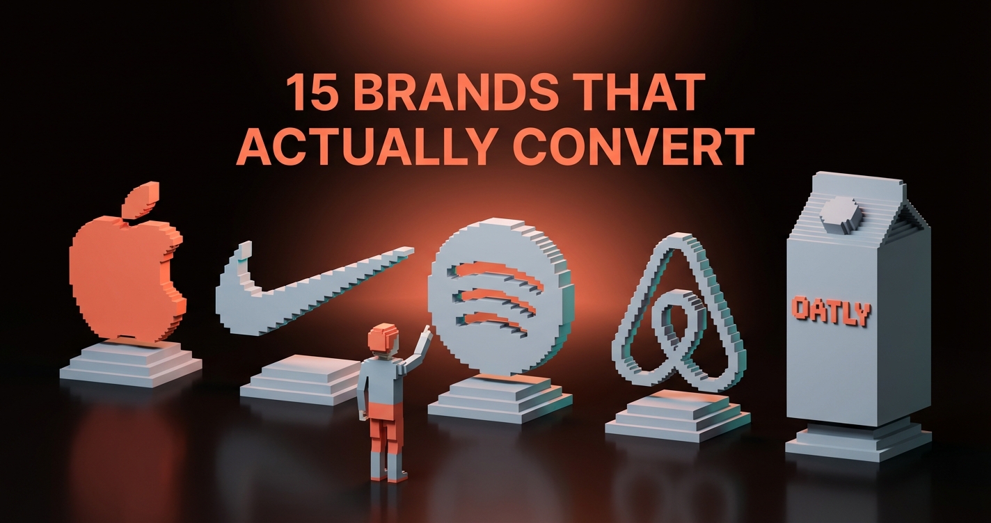
You can identify the best brand identities on this list in under a second. Apple. Nike. Patagonia. Stripe. Their marks are etched into muscle memory so deep that the logo is almost beside the point.
What those brands share is not a design choice. It is a commitment. Every touchpoint tells the same story, and the story sits behind every visual decision. The logo is just the part that made it into the world.
Here are 15 identities that earned that recognition, and the exact lesson you can steal from each one.
Brand Identity Is Not a Logo
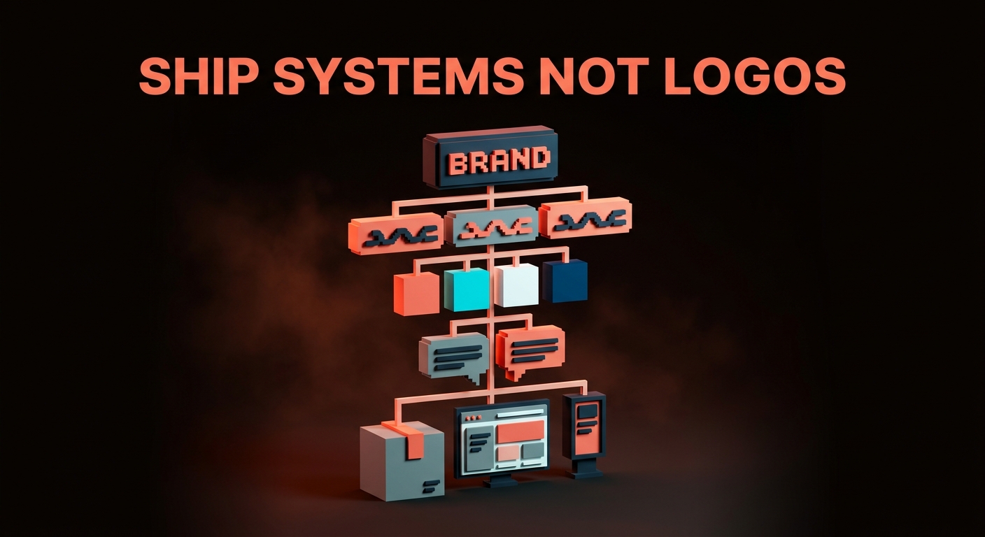
A brand identity is the complete system that makes you recognizable, consistent, and impossible to confuse with anyone else. Not a logo. Not a color palette. Not a font choice. A system.
Every identity on this list shares three traits:
- Consistency without rigidity. Same everywhere, never boring.
- A clear point of view. You know what they believe before you read a word.
- Systematic thinking. Every element connects. Nothing is random.
Miss any one of these and you do not have a brand identity. You have a collection of graphics.
15 Brand Identities Worth Studying
Each section gives you the brand, why it works, and the exact lesson you can steal.

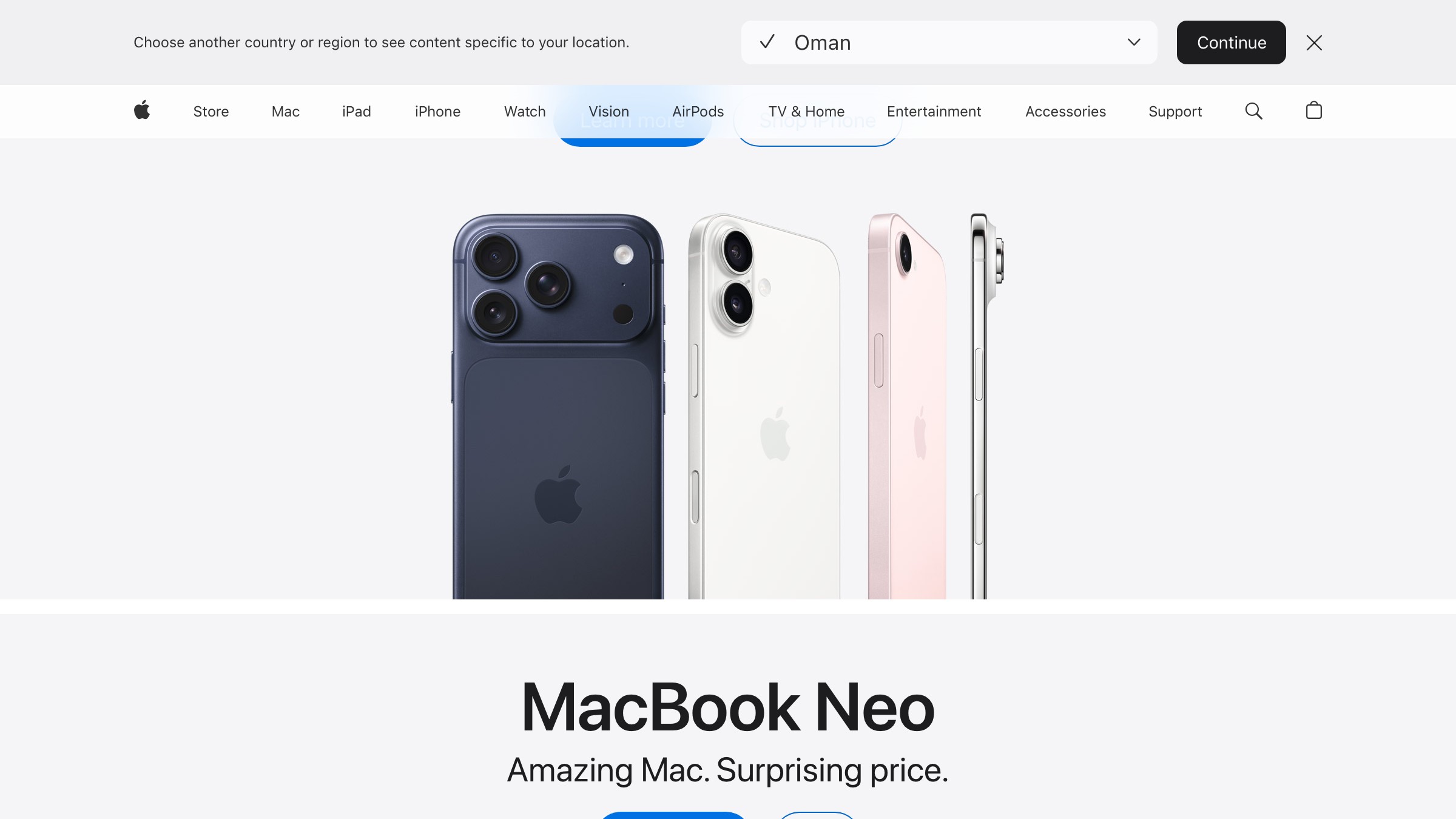
Apple's identity is built on subtraction, not addition. The product IS the identity. No gradients on the logo, no busy patterns, no visual noise.
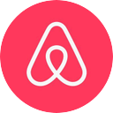
The Belo means four things at once: people, places, love, and the letter A. It does all that without being clever about any of them. The real genius is the custom typeface and illustration system that makes every Airbnb touchpoint feel like the same conversation.
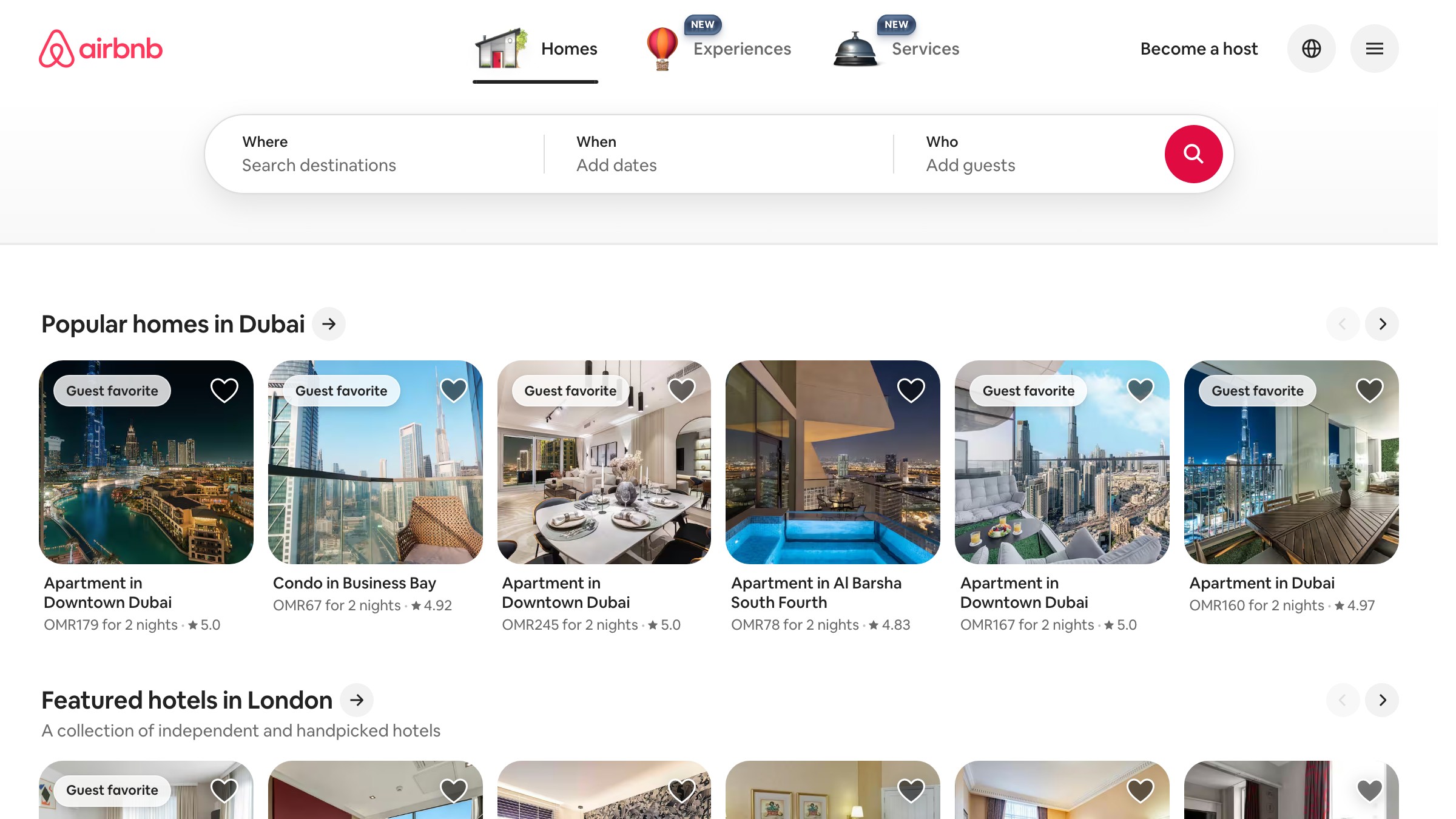

Stripe is what happens when engineers and designers actually respect each other. The gradient system is technically sophisticated but visually simple. The typography is confident without being loud. Every piece of their identity says "we are serious about craft" without ever using those words.
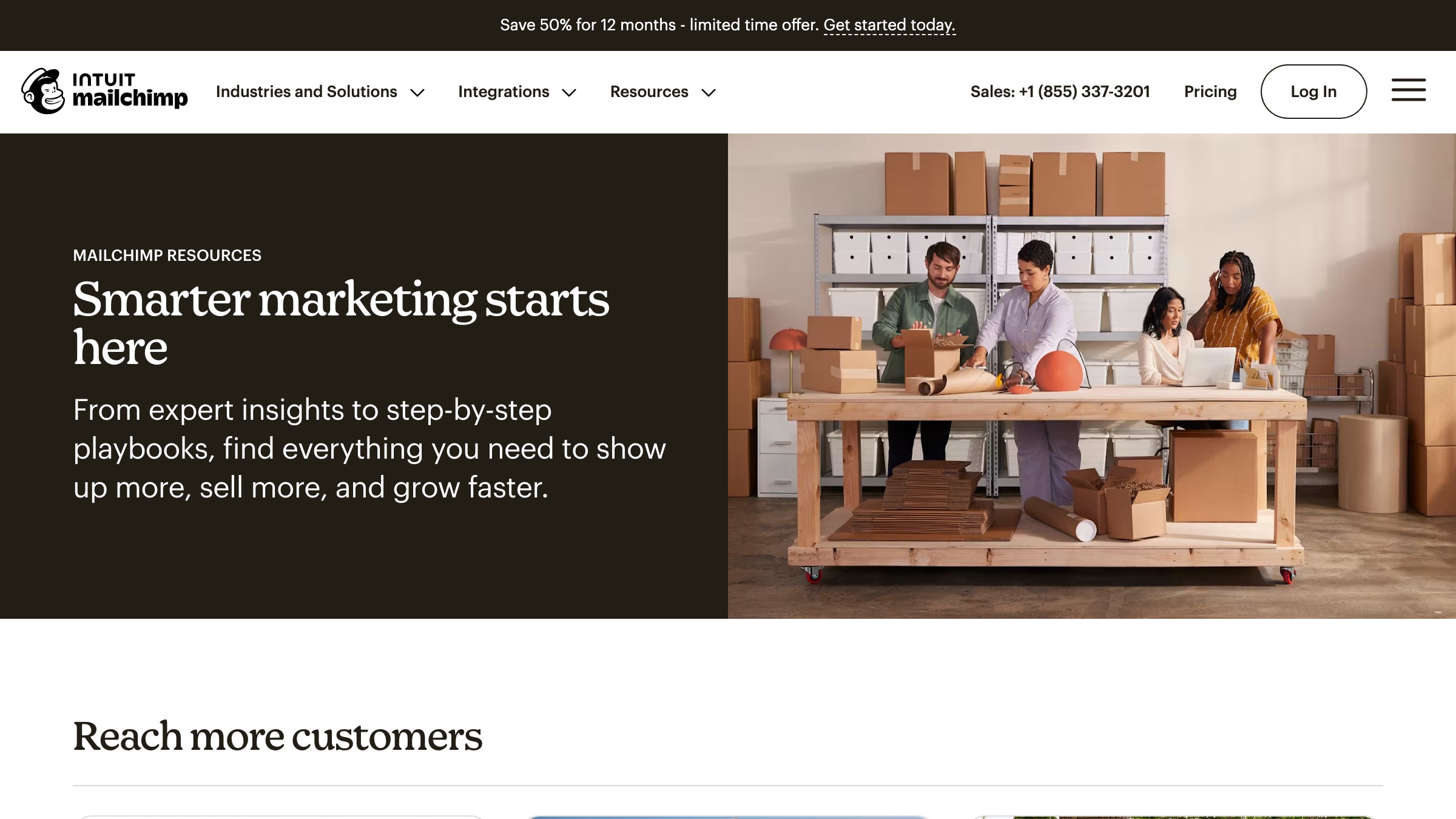
B2B brands do not have to look like B2B brands. Mailchimp committed to hand-drawn illustrations, playful yellow, and a slightly weird mascot, and they never backed down. Most brands would have softened Freddie into something safer. Mailchimp let him stay weird.
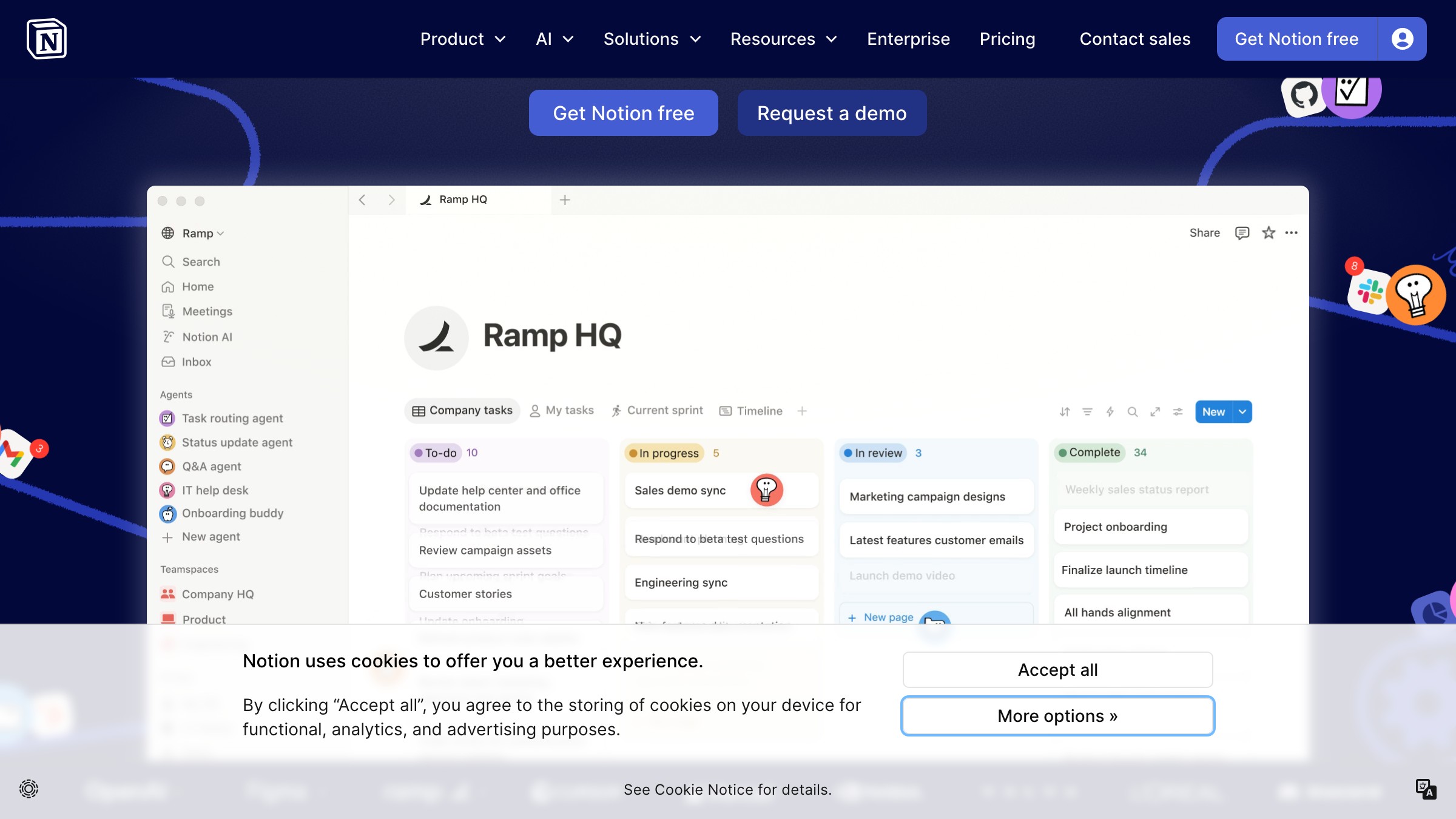
Notion's visual identity looks exactly like the Notion experience. Clean, restrained, sketch-like illustrations. The identity and the product are the same idea expressed twice.

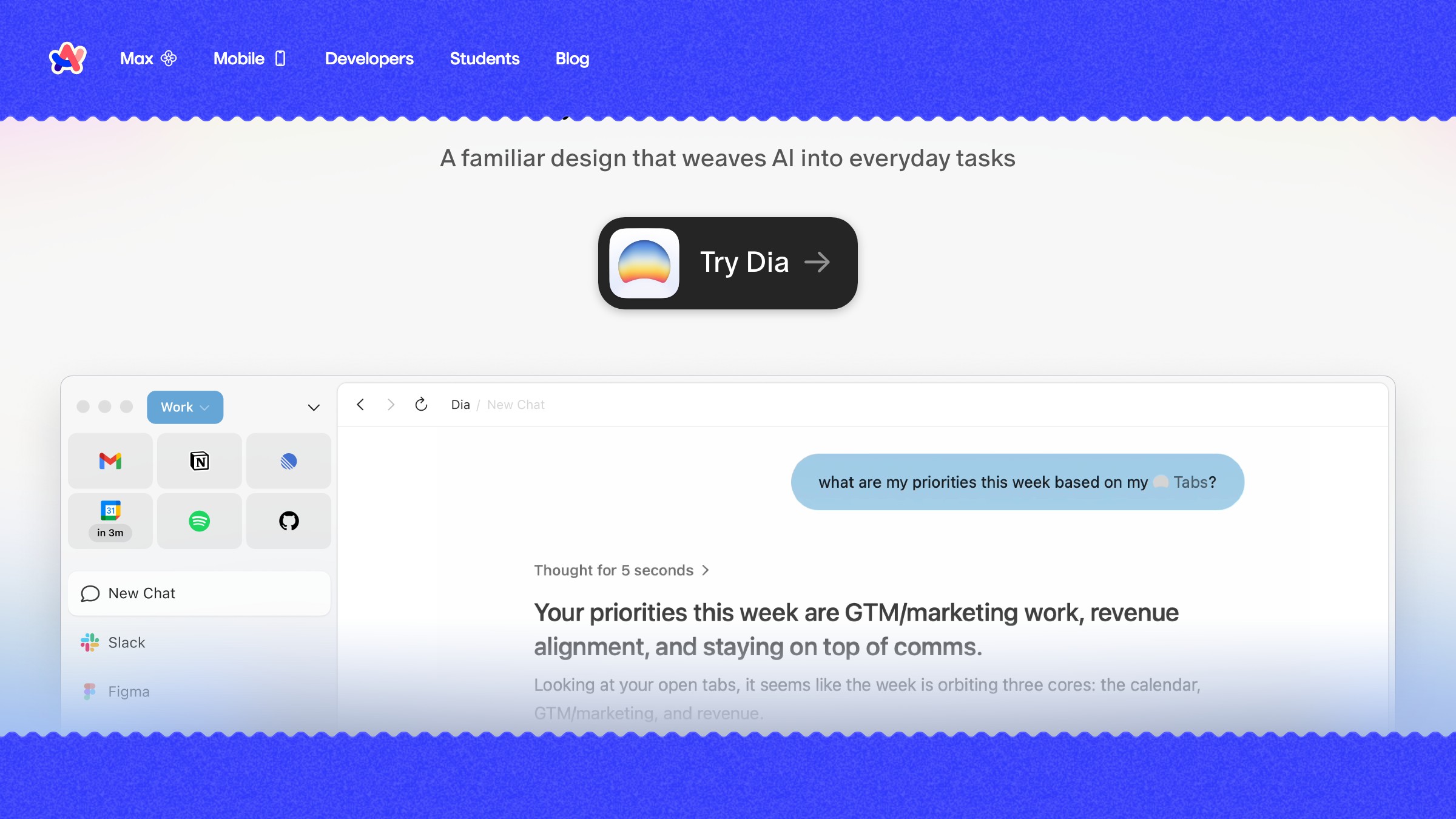
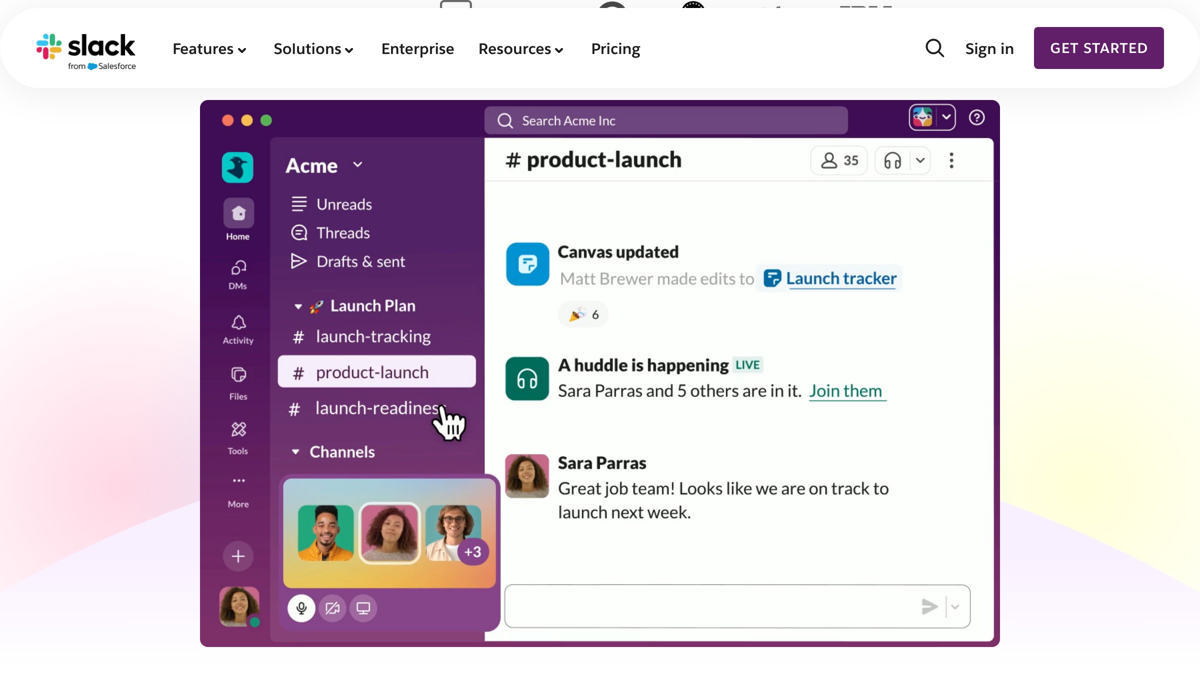
Linear's brand lives in its changelog, its docs, its error states. Every screenshot, every feature announcement, every email looks like it came from the same brain. That is where real identity lives.


Arc made a browser feel like a lifestyle brand, but the brand language is not slapped on top. It is embedded in how the product works. Color is not decoration, it is organization.

Figma's multi-colored logo, Config conference branding, and community-first asset strategy built a brand that users feel ownership over. That is the hardest thing to do and the most valuable.
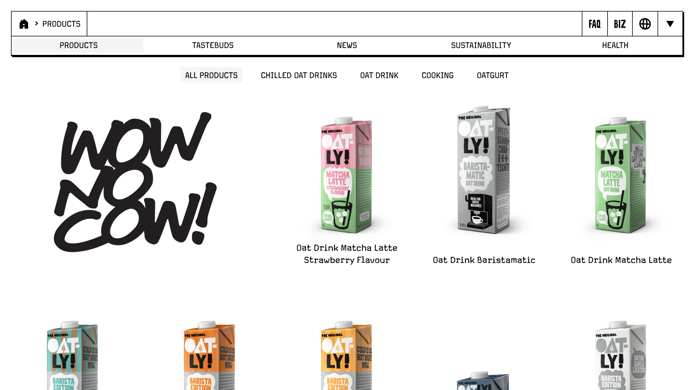
Oatly's hand-drawn typography and confrontational copy look like a person wrote them on the carton. None of it follows best practices. All of it is instantly recognizable.

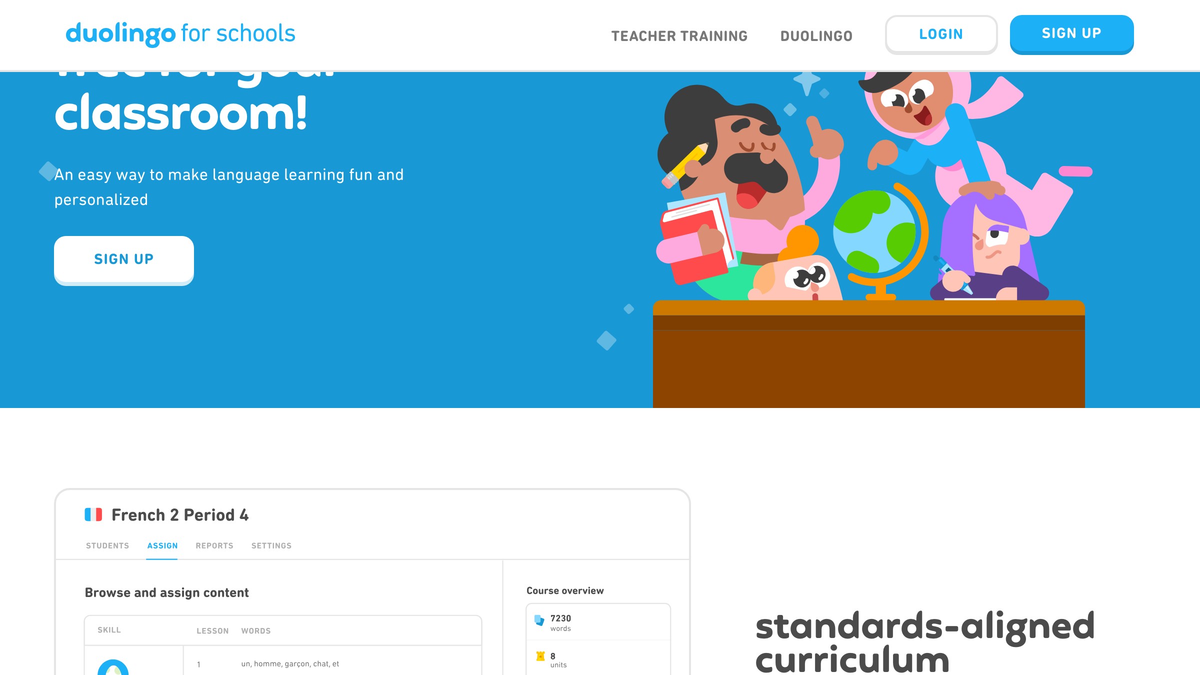
Duo is not just a mascot. Duo is a content strategy. The green is not just a color. It is a notification you cannot ignore. Every element does double duty as brand recognition AND user engagement.
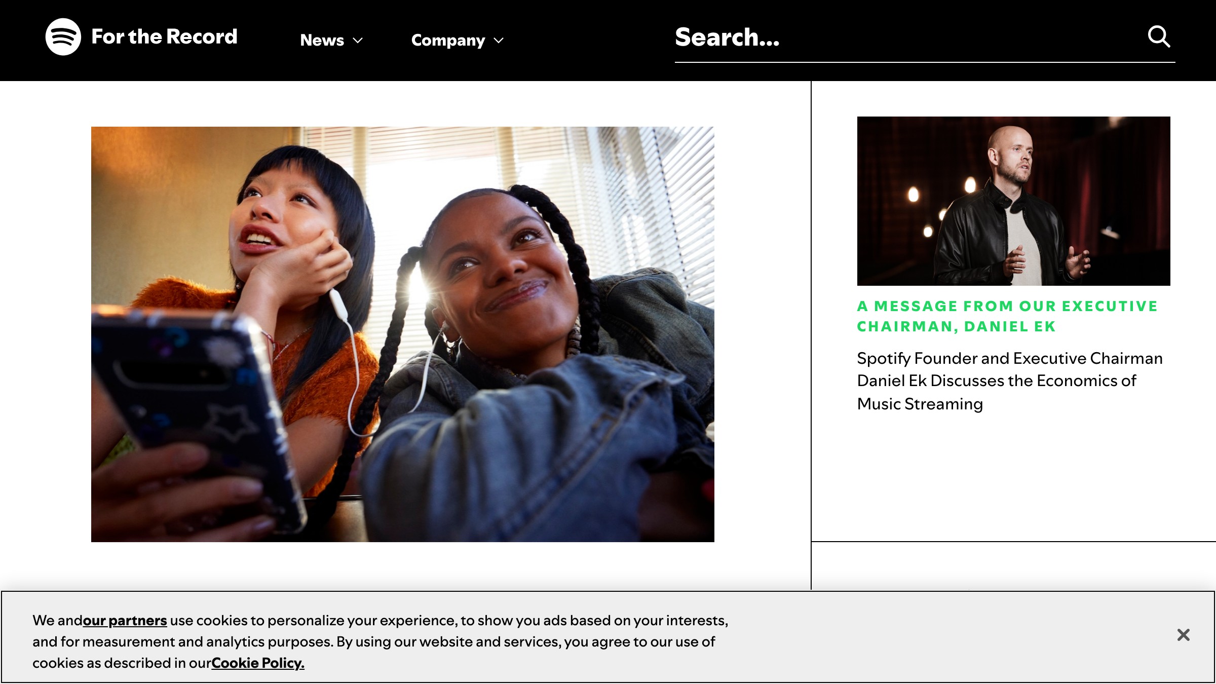
Spotify does not use a brand template. They use a brand framework. Duotone imagery, bold typography, data-as-design. Every year, Wrapped proves they can flex without losing coherence.
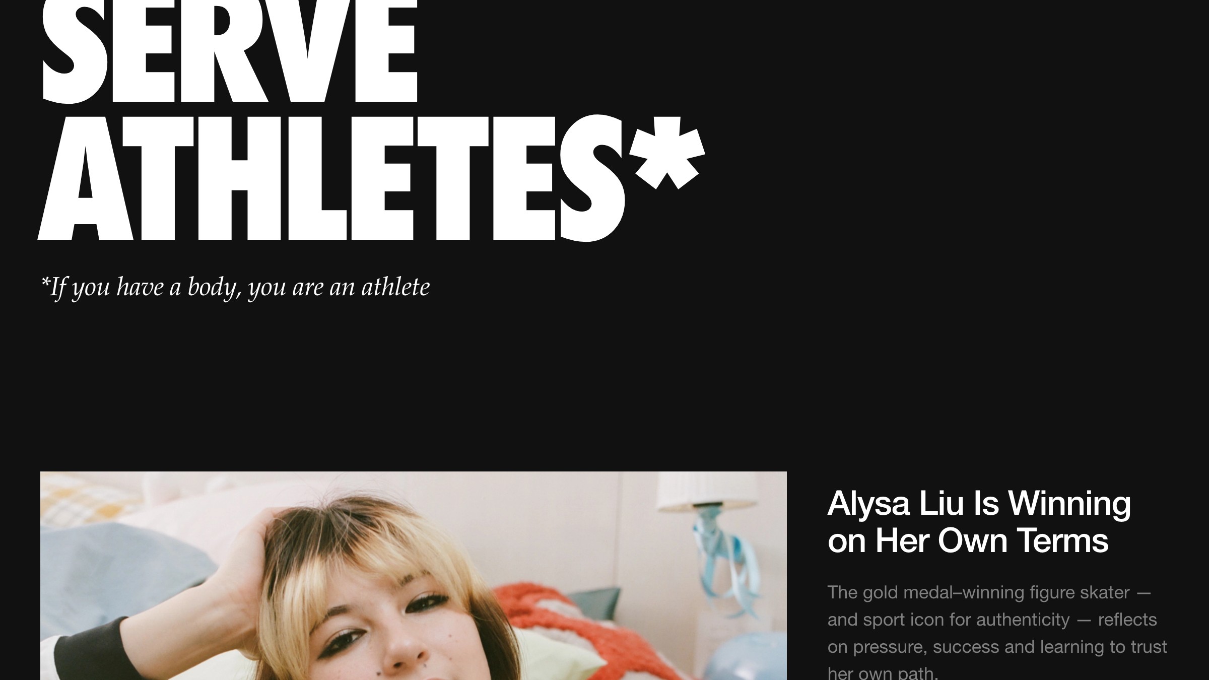
The Swoosh has 97% global recognition, but Nike's real identity is not the logo. It is the attitude. "Just Do It" is not a tagline, it is a worldview that every touchpoint reinforces.
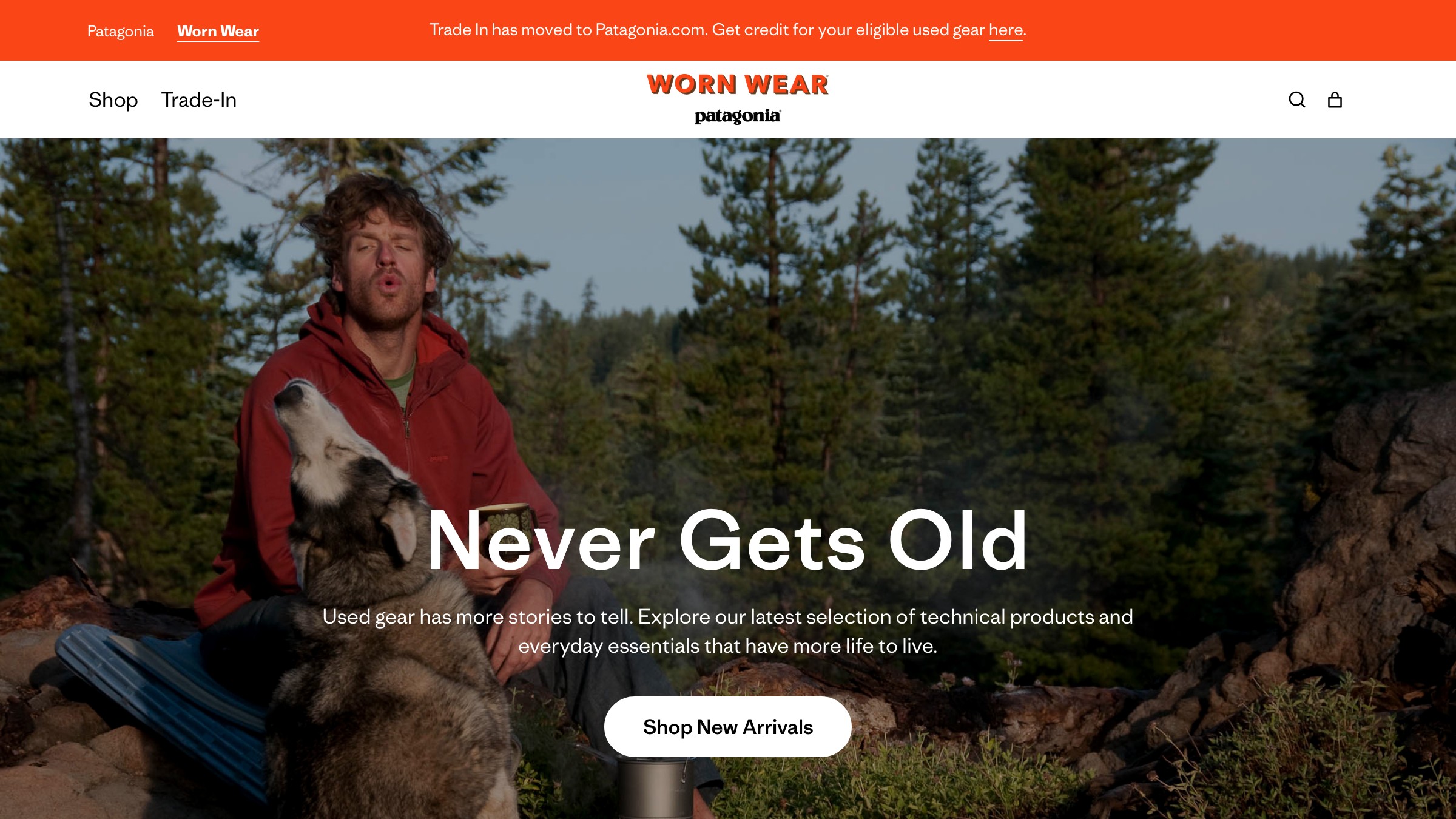
Patagonia's "Don't Buy This Jacket" campaign is the most on-brand advertising ever made. They put values ahead of sales, and every visual choice (the mountain silhouette, the earth tones, the worn-in photography) reinforces that conviction.

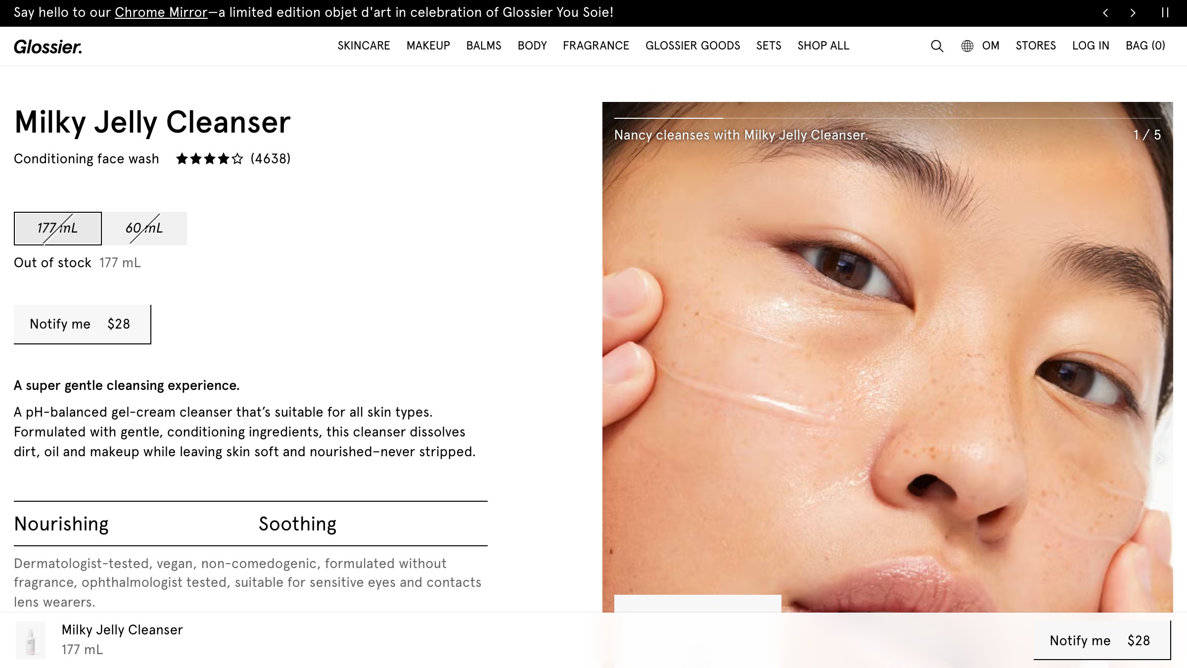
Glossier made their customers the face of the brand instead of models. Every visual decision (the millennial pink, the minimal packaging, the UGC strategy) serves that philosophy. The identity feels accessible because it was designed to be.
Slack took a productivity tool and made it feel friendly. Saturated colors, rounded shapes, playful loading messages. The identity says "work does not have to be miserable," which is exactly what the product promises.
The Pattern Nobody Talks About
Look at the list again. The brands that stick are not the ones with the most polished logos or the biggest design budgets. They are the ones where every touchpoint tells the same story.
Apple's story is "less." Oatly's story is "weird is honest." Nike's story is "just do it." Patagonia's story is "the planet matters more than the sale."
Your brand identity is not a deliverable. It is a decision about what you believe and the discipline to express it the same way everywhere.
That is the whole game.
FAQ
What are the key elements of a brand identity?
Logo and variations, a color system, typography (primary and secondary), imagery style, voice and tone guide, and rules for how all of them work together. The rules matter more than the individual elements.
How much does brand identity design cost?
Freelancers charge $2,000 to $15,000. Agencies start at $10,000 and go up to $100,000+ for enterprise systems. You are not paying for a logo file. You are paying for strategic thinking, system design, and consistency rules.
How long does it take to create a brand identity?
Four to twelve weeks depending on scope. Anyone promising a full brand identity in a week is cutting corners. The research and strategy phase alone should take one to three weeks.
Ready to build a brand identity that actually works? Brainy has built identities for brands across every industry. Let us talk.
Get StartedNot ready to hire? Run the free Business Genome, an 11-dimension diagnostic for your venture.
Get your free GenomeGet new papers by email
New Brainy papers in your inbox. Confirm once, unsubscribe anytime.