
Design Tokens: How Real Design Systems Stay Consistent
What design tokens are, the three-tier model real systems use (Shopify Polaris, IBM Carbon, GitHub Primer), how to name them, theming for dark mode, and when tokens are overkill.
Design Tokens: How Real Design Systems Stay Consistent
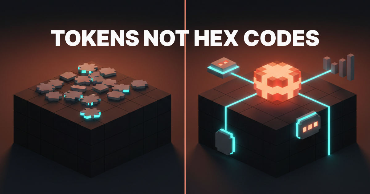
A hex code is a value. A token is a decision with a name. Design systems are made of decisions, not values.
That distinction is the entire point. Hardcode #0EA5E9 into fourteen Figma components, get asked for dark mode, and you are facing a week of find-and-replace. Name it color-interactive-primary and you change one value while every surface updates. That is not magic, just named decisions.
What a design token actually is
A design token is a named variable that stores a design decision. It can hold a color, a spacing value, a font size, a border radius, a shadow, a duration. The name is the contract. The value behind the name can change without breaking anything that uses the token.
The classic non-token approach starts when a designer picks #1D4ED8 for primary buttons, hardcodes it in the button component, then copies that hex into the card, the badge, and the link. Six months later, the brand updates. Now you have a maintenance problem that scales with every component you shipped.
Tokens flip that. You name the decision (color-action-default), assign the value once, and everything referencing the token stays in sync. The value is implementation detail. The name is the system.
The three tiers that make tokens work
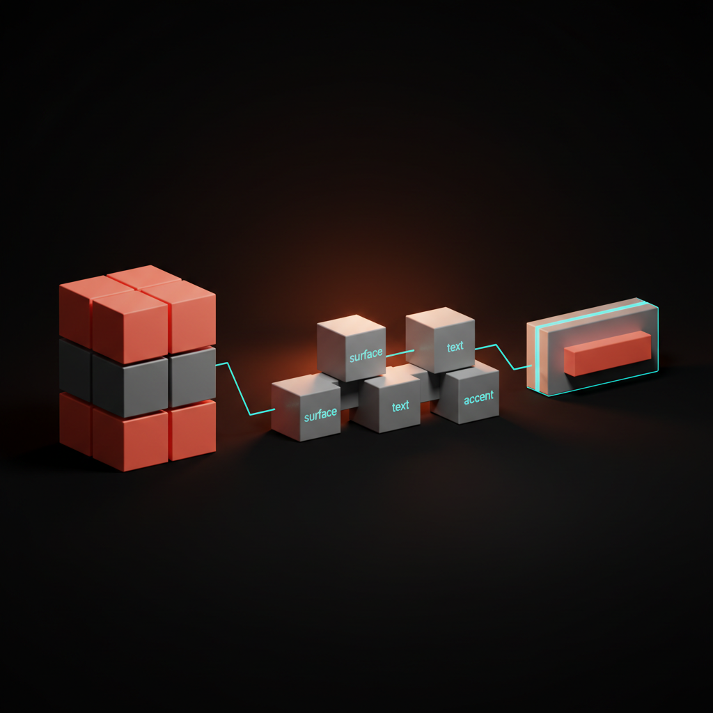
Raw tokens are just variables. What makes a token system actually useful is hierarchy. Every production system worth studying uses three tiers.
| Tier | Also Called | What It Stores | Example |
|---|---|---|---|
| Primitive | Global, Base | Raw values, no meaning | color.blue.500 = #3B82F6 |
| Semantic | Alias, Role | Named roles mapped to primitives | color.interactive.default = color.blue.500 |
| Component | Specific | Component-scoped decisions | button.background.default = color.interactive.default |
Primitives are your palette. Every blue, every spacing step, and every radius lives here as a named value with no opinion about where it is used. You do not consume primitives in components directly.
Semantic tokens map roles to primitives. The token color-surface-default might point to near-white in light mode and near-black in dark mode, and the component never knows which raw value it gets. It only knows the role.
Component tokens are the most specific. They exist when a component needs a decision that is intentionally different from the semantic default. A danger button points its background at a critical-feedback role instead of the default interactive one. Most components do not need their own tokens; they consume semantic ones directly.
Why tokens beat hardcoded values
Speed of change is the obvious argument, but it is not the real one. The real argument is precision.
When a designer hands off a file full of raw hex codes, the developer has no idea which ones are intentional and which are accidental. Is #1A1A2E the background, or did someone eyedrop the wrong layer? Tokens remove the ambiguity. A semantic token name is documentation that travels with the value.
Tokens are also the handoff contract between design tools and code in 2026. Figma variables map directly to CSS custom properties. A token defined in a Figma file can be exported, committed, and consumed in code without a single manual step. The gap between design and implementation collapses when both sides speak the same token names.
For teams doing accessibility work, tokens add another layer of safety. You audit the semantic palette in one place and guarantee that color-text-default always clears 4.5:1 contrast against color-surface-default, no matter which theme is active.
How real design systems structure their tokens
Three systems are worth knowing: Shopify Polaris, IBM Carbon, and GitHub Primer. They handle the three-tier model differently, and the differences are instructive.
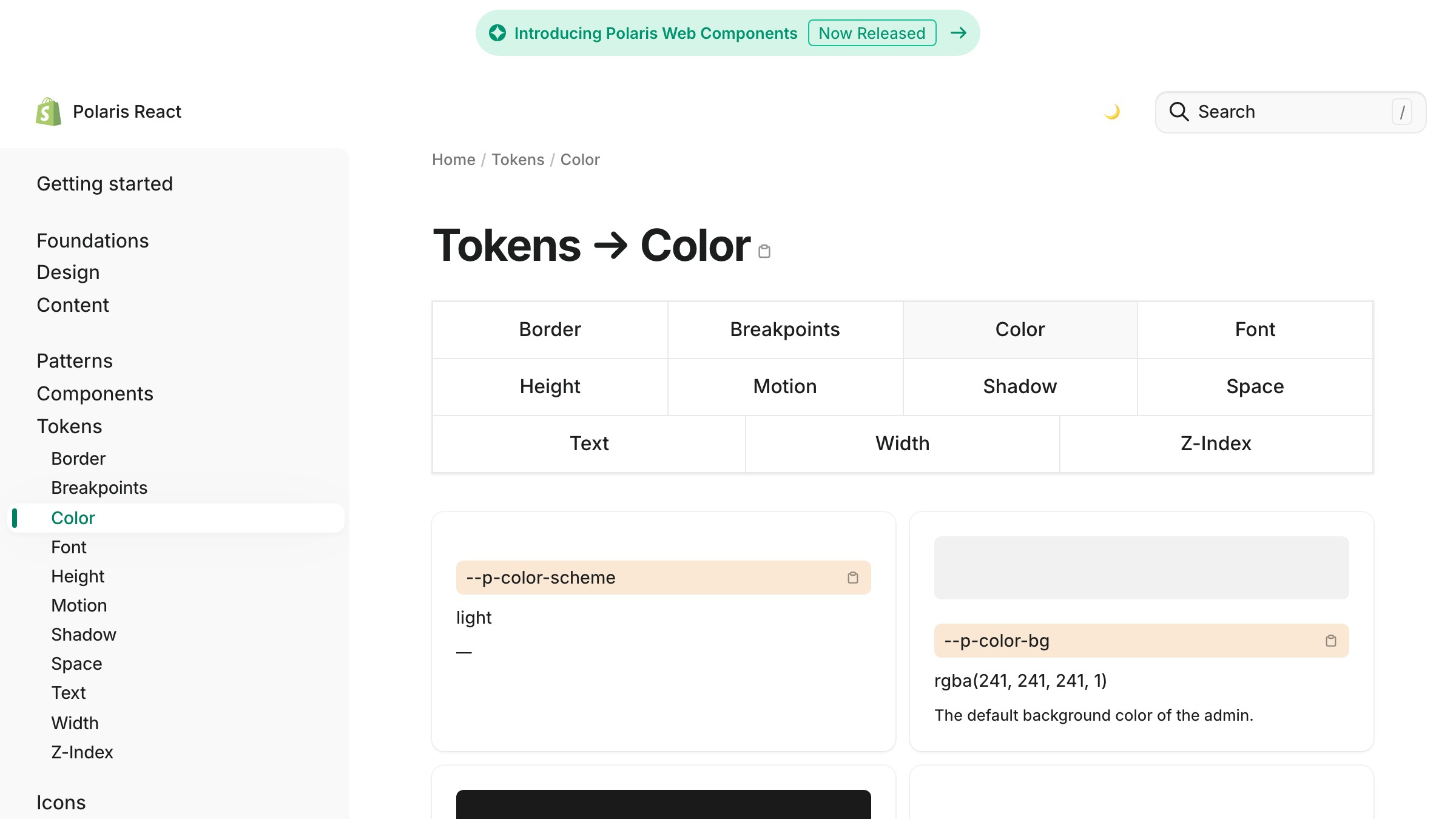
Shopify Polaris keeps primitives in a color scale (color-sky-100 through color-sky-900) and aliases them to semantic roles like --p-color-bg-fill-active. Component tokens are sparse, so most components consume semantic tokens. The convention is role-then-state, which reads naturally in code, since you know what bg-fill-disabled is for without extra context.
See it live on polaris.shopify.com
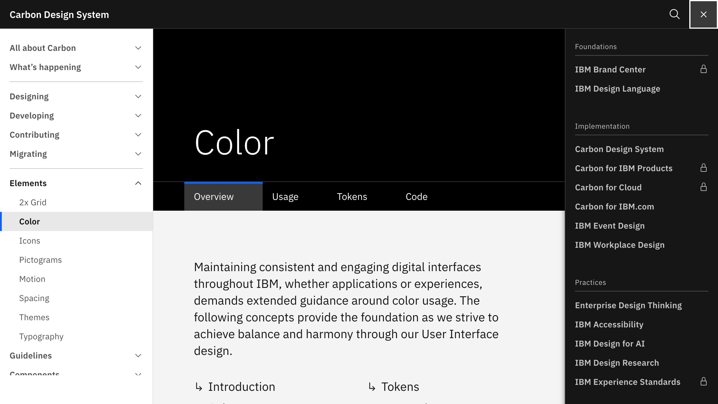
IBM Carbon goes deep on semantic layers. Its color set includes explicit feedback tokens like support-error and support-success, interactive state tokens, and layer tokens for nested surfaces (a component on a panel on a page each need a different surface value). It is more complex, but IBM ships enterprise software where every nested state matters.
See it live on carbondesignsystem.com
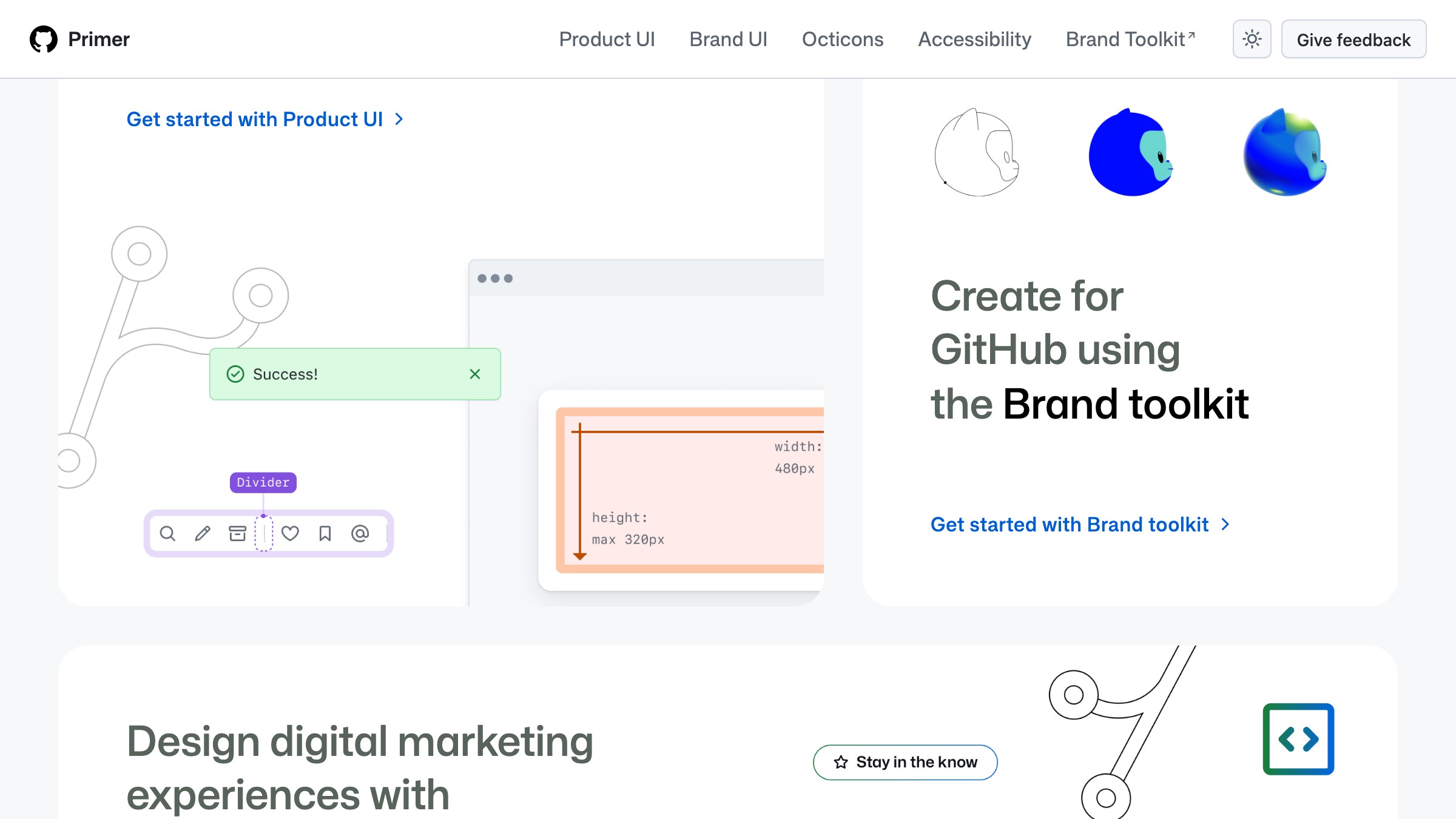
GitHub Primer exposes its primitive layer as "primitives" and its semantic layer as "functional tokens," documented publicly at primer.style. Primer's theming lets GitHub ship light, dark, light high contrast, and dark dimmed from a single component set. Every theme is a different value assignment to the same token names.
The pattern across all three is consistent: primitives as a scale, semantic tokens as role names, and theming as a value swap at the semantic layer. The components stay untouched.
Brainy helps designers build systems that scale, not one-off screens. See what we are building for creators at /creators.
Naming tokens without losing your mind
Token naming breaks teams. Too generic and the names carry no information. Too specific and you write a new token for every component.
A naming convention that works names four parts: category, role, variant, and state. You will not use all four every time, but the structure prevents ad-hoc chaos.
| Part | What It Captures | Examples |
|---|---|---|
| Category | The design property | color, spacing, radius, shadow, font |
| Role | The semantic purpose | surface, text, border, interactive, feedback |
| Variant | Sub-role or modifier | primary, secondary, danger, subtle |
| State | Interactive condition | default, hover, active, disabled, focus |
Working examples, written as the CSS custom properties a developer actually consumes:
color-surface-defaultsets the default page backgroundcolor-text-subtleis secondary text at lower contrastcolor-interactive-primary-hoveris the hover state of a primary actionspacing-component-mdis medium internal padding for componentsradius-interactiveis the corner radius for clickable elements
Two rules save the most arguments. Never encode the raw value in the name, because color-blue-500 tells you nothing about role. Never name by component at the semantic layer, because button-primary-color in the semantic tier means you skipped the semantic layer entirely.
For type systems that scale, the same convention applies, and font-size-body-lg beats text-18px every time.

One token set, light and dark mode
Dark mode is where token systems pay off most visibly. If you named your tokens by role, dark mode is a value swap, not a redesign.
The mechanism is straightforward. Your semantic token color-surface-default points to a primitive that is near-white in light mode and near-black in dark mode. The component consuming it never changes. You switch themes by swapping the value mapping at the semantic layer.
CSS custom properties make this mechanical:
:root {
  --color-surface-default: #ffffff;
  --color-text-primary: #111827;
}

[data-theme="dark"] {
  --color-surface-default: #0f172a;
  --color-text-primary: #f8fafc;
}
Every component referencing var(--color-surface-default) now responds to the theme attribute with zero additional code. Shopify Polaris, GitHub Primer, and IBM Carbon all use this pattern at production scale.
The failure mode is mixing semantic and primitive tokens in components. When a component references color-blue-600 directly instead of color-interactive-primary, that component stops responding to theming. One careless primitive reference breaks the whole model. Lint rules that flag direct primitive consumption in component code are worth the setup time.
Understanding how color choices land gives you the conceptual grounding, and tokens give you the structure to act on it across every theme.
When design tokens are overkill
Tokens add indirection. Indirection has costs. Be honest about when those costs are worth paying.
| Situation | Tokens? | Reason |
|---|---|---|
| Design system serving 3+ products | Yes | Shared tokens pay for themselves instantly |
| Single product, 5+ designers | Yes | Prevents palette drift across the team |
| Single product, 1-2 designers, active iteration | Maybe | Semantic layer only, skip component tokens |
| Marketing site, no component library | No | One stylesheet is faster to change |
| Prototype or MVP under 3 months | No | Abstract after the design stabilizes |
| Adding dark mode to an existing system | Yes | This is exactly what tokens are for |
Small teams move faster without tokens. A three-person startup chasing product-market fit does not need a three-tier hierarchy. When you change the visual direction every two weeks, a single Figma style library is enough.
The anti-pattern to avoid is premature semantic naming. Tokens named color-blue and color-gray add indirection without meaning. Either name by role with color-surface and color-text, or stick with primitives until you have enough components to know what the roles actually are.
Bad token naming is worse than no tokens. A token named button-color-for-the-checkout-page in the semantic layer is a maintenance trap. The naming discipline is not optional, it is the reason tokens work at all.

FAQ
Do design tokens replace Figma styles?
No, but they extend them. Figma variables, released in 2023, are the closest native equivalent inside Figma, and they map to code tokens when you share naming conventions across both. Figma styles handle typography and color fills, while variables handle the full token hierarchy including states and component-level decisions.
Do tokens work without a design system?
Tokens are most valuable inside a design system, but even a single product benefits from semantic naming at the CSS custom property level. You do not need a formal system to stop hardcoding hex values.
What tool should I use to manage tokens?
For small teams, Figma variables plus a JSON export are enough. For larger teams, Style Dictionary (open source, by Amazon) is the standard build tool. It takes a token JSON structure and outputs CSS custom properties, iOS Swift constants, and Android XML. Tokens Studio for Figma is the popular plugin bridge between Figma and Style Dictionary.
How granular should component tokens be?
Only as granular as you need. Most components can consume semantic tokens directly. Component-specific tokens make sense when a component diverges from the semantic layer on purpose, like a destructive action button or a banner with an unusual surface. When in doubt, consume semantic and create component tokens only when you find yourself writing exceptions.
Can tokens handle spacing and typography, or just color?
Tokens work for anything with a discrete value: color, spacing, typography, border radius, box shadow, motion duration, motion easing, and z-index. The most mature systems, like IBM Carbon and Atlassian Design System, have tokens for all of these. Start with color and spacing, then add others as the system matures.
Stop hardcoding values
The practical path is not complicated:
- Name your primitives as a scale
- Map those primitives to semantic roles
- Have every component consume semantic tokens, never primitives
- Export token values from one source (Figma variables, a JSON file, or a design system package) and let build tools distribute them to CSS, iOS, and Android
You do not need a three-month migration to start. Pick one component, name its decisions, and feel the difference when you change a value once and watch everything update. That experience is the argument.
For more design systems writing, see what else Brainy covers at /paper.
Brainy helps designers build systems that scale, not one-off screens. See what we are building for creators.
Get StartedGet new papers by email
New Brainy papers in your inbox. Confirm once, unsubscribe anytime.