Typography System Design: How to Build Type That Scales
How to design a typography system that stays consistent from mobile to billboard. The scales, pairings, and rules that separate professional type from amateur font picking.
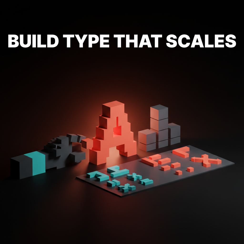
Picking a font is not designing a typography system. Picking two fonts that look nice together is still not designing a typography system. A typography system is the set of rules that determines how every piece of text in your product, brand, or interface behaves across every context it will ever appear in.
Most designers skip this step. They choose a heading font and a body font, eyeball the sizes, and call it done. Then six months later, the marketing site uses one scale, the app uses another, the pitch deck uses a third, and nobody can explain why the brand feels inconsistent even though the logo has not changed.
That inconsistency is a type system problem. And it is fixable.
What a Typography System Actually Contains
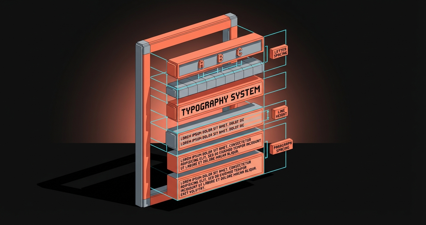
A real typography system defines five things:
- A type scale. The mathematical relationship between your text sizes.
- Font pairings. Which typefaces play which roles and why.
- Weight and style rules. When to use bold, italic, medium, and what each weight signals.
- Spacing standards. Line height, letter spacing, and paragraph spacing for every size.
- Responsive behavior. How every element above adapts across screen sizes.
If your "type system" is missing any of these, you have font choices, not a system.
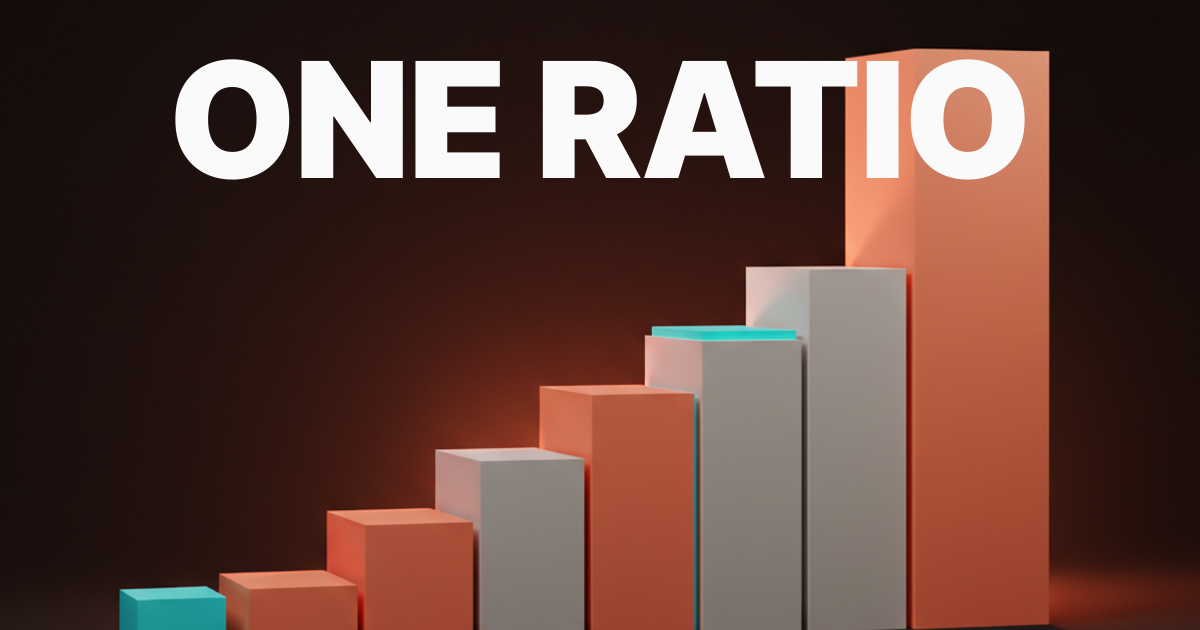
The Type Scale Is the Foundation
A type scale is a set of font sizes generated from a consistent mathematical ratio. Instead of picking sizes by feel (16px here, 24px there, maybe 36px for the hero), you pick a base size and a ratio, and every other size flows from that.
Common ratios that work:
| Ratio | Name | Feel | Best for |
|---|---|---|---|
| 1.125 | Major Second | Tight, dense | Data-heavy dashboards, small screens |
| 1.200 | Minor Third | Balanced, calm | Editorial, documentation |
| 1.250 | Major Third | Clear hierarchy | Marketing sites, portfolios |
| 1.333 | Perfect Fourth | Strong contrast | Landing pages, headlines |
| 1.618 | Golden Ratio | Dramatic | Print, poster design, hero sections |
Start with a 16px base (the browser default, accessible, readable) and multiply up for headings, divide down for captions and labels. A Major Third scale from 16px gives you: 10px, 12.8px, 16px, 20px, 25px, 31.25px, 39px. Round to clean values and you have a scale that feels intentional instead of arbitrary.

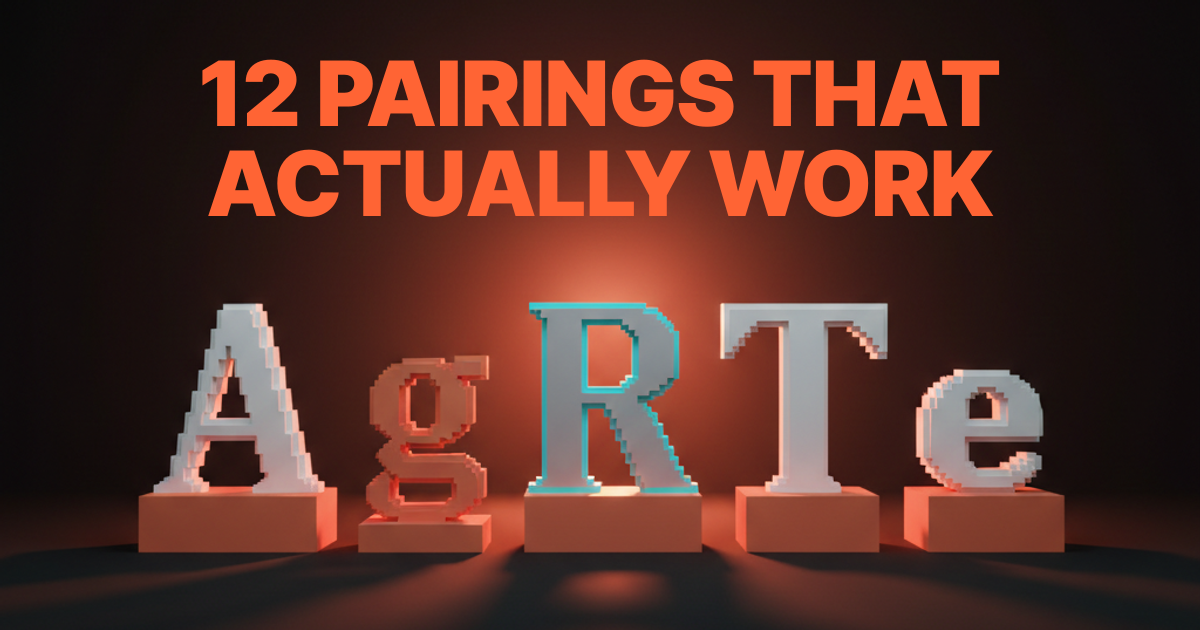
Font Pairing Is Strategy
The internet is full of "best font pairing" lists. Most of them are decoration advice disguised as design advice. Real font pairing is strategic.
The rules that actually work:
Contrast in structure, harmony in proportion. Pair a geometric sans with a humanist serif. The structural contrast creates visual interest. The shared x-height and proportion keep them feeling like they belong together. Inter + Merriweather. DM Sans + Lora. Satoshi + Source Serif.
One voice per role. Your heading typeface carries personality. Your body typeface carries content. Your UI typeface carries function. Trying to make one font do all three is how you end up with a system that feels generic or strained.
Two fonts is almost always enough. Three is the maximum for any system that needs to stay manageable. Every additional typeface multiplies the number of pairing decisions, weight decisions, and responsive decisions you need to make. If you think you need four fonts, you probably need to use two fonts better.
Test the pairing in context, not in a specimen. A pairing that looks beautiful on a type specimen poster can fall apart inside a card component or a navigation bar. Test in the actual layout before committing.
Weight and Style Rules
Weight is hierarchy. Bold means important. Medium means supporting. Regular means body. Light means decorative or secondary. These associations are baked into how people read.
The mistake is using weight inconsistently. If your H2 is semibold in the marketing site but bold in the app, the brand feels different even though the font is the same. A type system locks this down:
- H1: Bold (700). Always. This is your loudest voice.
- H2: Semibold (600) or Bold (700). Pick one, use it everywhere.
- H3: Medium (500). Enough contrast to register without competing with H2.
- Body: Regular (400). Readable, neutral, no friction.
- Captions and labels: Regular (400) or Medium (500) at smaller sizes.
Italic has one job: emphasis within body text. Using italic for decorative purposes (pull quotes, section labels) dilutes its meaning and makes actual emphasis invisible.
Spacing Is Where Systems Break
Line height, letter spacing, and paragraph spacing are where most "type systems" quietly fall apart. The font sizes match across products, the weights match, but the text feels different because the spacing is inconsistent.
Line height rules:
Headings need tighter line height (1.1 to 1.3) because large text creates too much vertical space at body-text ratios. Body text needs looser line height (1.5 to 1.8) for comfortable reading. The common mistake is applying 1.5 to everything, which makes headings float and body text feel cramped at the wrong size.
Letter spacing rules:
Large text (headings, display) benefits from slightly negative letter spacing (-0.01em to -0.02em). The optical spacing at large sizes creates gaps that feel wider than intended. Small text (captions, labels, uppercase) benefits from slightly positive letter spacing (+0.02em to +0.05em) because tight tracking at small sizes reduces legibility.
Paragraph spacing:
Use a consistent multiplier of your base unit. If your base is 16px with a 4px grid, paragraph spacing should be 16px or 24px, not an arbitrary value. This keeps vertical rhythm consistent across every page.
Responsive Behavior
A type system that works at one breakpoint is not a system. It is a screenshot.
Fluid typography scales font sizes smoothly between breakpoints using CSS clamp(). Instead of jumping from 16px to 14px at a breakpoint, the size interpolates. This eliminates the layout jank that comes from hard breakpoint changes.
font-size: clamp(1rem, 0.5rem + 2vw, 2.5rem);
Scale compression on mobile. Your desktop scale ratio (say 1.250) creates too much contrast on a small screen. A 39px H1 on desktop works. A 39px H1 on a 375px phone does not. The solution: compress the ratio on mobile (drop to 1.125 or 1.150) while keeping the base size the same. The hierarchy stays, the sizes adapt.
Minimum readable sizes. Never go below 16px for body text on mobile. Never go below 12px for any text. Accessibility is not optional, and small text on small screens fails real users.
Common Type System Failures
The font buffet. Five typefaces, no rationale. Every page feels like a different brand.
The orphan weight. Using Thin (100) or Black (900) for one decorative element and nothing else. It adds visual noise without adding system value.
The spacing guess. Line heights and letter spacing that change between components because nobody defined the rules.
The desktop-only scale. Looks great on a 1440px mockup. Falls apart on anything smaller because nobody tested responsive behavior.
The missing tokens. A type system defined in a Figma file but not translated into design tokens or CSS custom properties. The system exists in theory but not in code, so engineers reinvent it every sprint.
FAQ
What is a typography system in design?
A typography system is the complete set of rules governing font selection, sizing, weight, spacing, and responsive behavior across a brand or product. It goes beyond choosing fonts to define how every piece of text scales and maintains consistency.
How many fonts should a design system have?
Two is the standard. Three is the maximum for most systems. One display or heading typeface and one body typeface handles the vast majority of design needs. Adding more creates exponential complexity in pairing, weight, and responsive decisions.
What is the best type scale ratio?
There is no single best ratio. Major Third (1.250) works well for marketing and editorial. Minor Third (1.200) suits dense interfaces. Perfect Fourth (1.333) creates strong heading contrast. Choose the ratio that matches your content density and hierarchy needs.
Build the System Before You Pick the Font
The font is the last decision, not the first. Define your scale, your spacing rules, your weight hierarchy, and your responsive behavior. Then pick the typeface that fits those constraints. A mediocre font inside a great system will outperform a great font with no system every single time.
Need a typography system that holds up across every touchpoint? Let's build it.
Get StartedNot ready to hire? Run the free Business Genome, an 11-dimension diagnostic for your venture.
Get your free GenomeGet new papers by email
New Brainy papers in your inbox. Confirm once, unsubscribe anytime.