Modular Type Scale: How to Build a Consistent Typography System
A step-by-step build of a modular type scale, translated into design tokens, Figma variables, and Tailwind CSS. Real ratios, real implementations, and the rules that keep a scale from collapsing once the team starts shipping.

A modular type scale is one ratio applied to one base size that generates every font size in the product. That is the whole idea. You pick the ratio, you lock the base, you generate the steps, you ship them as tokens, and you use those tokens everywhere instead of one-off pixel values. Done well, every size in the product feels related to every other size, because mathematically they are.
Done badly, you end up with seventeen font sizes that nobody can defend, headings that fight body copy for hierarchy, and a redesign meeting every quarter where someone proposes "let's just standardize the sizes" and no one knows what to standardize toward. The scale is the thing you standardize toward. This piece is how to build one that survives a real product, with real ratios, a real token structure, and the Figma and Tailwind translations that make it executable.
What a modular type scale actually is
A modular type scale is a single ratio applied to a base size that generates every font size in the product, and that single ratio is the whole point.
Pick a base size, say 16 pixels, and a ratio, say 1.25. Multiply 16 by 1.25 and you get 20. Multiply 20 by 1.25 and you get 25. Keep going and you get 31, 39, 49, 61. Divide 16 by 1.25 and you get 12.8. Divide that by 1.25 and you get 10.24. That is the scale. Eight sizes, one base, one ratio, total mathematical consistency.
The reason this works is psychophysical. Human visual perception responds to ratios, not absolute differences. A jump from 12 to 14 reads about the same as a jump from 24 to 28, because both are roughly the same multiplicative step. A linear scale (12, 14, 16, 18, 20, 22) feels cramped at the top and overspaced at the bottom. A modular scale feels even, because relatively, it is.
The same logic underwrites musical intervals (octaves are 2x, fifths are 1.5x, fourths are 1.333x), photographic apertures, and most of architectural proportion theory. Type just borrowed it. The named ratios you will see in this article (minor second, perfect fourth, golden ratio) are imported from music for a reason: they describe the same kind of perceptual relationship.
The five ratios that cover real products
Most products live between 1.125 and 1.618, and each ratio carries a specific density signal.
The five ratios that cover almost every real interface:
| Ratio | Name | Density signal | Real implementation |
|---|---|---|---|
| 1.125 | Minor second | Tight, dense, data-heavy | Vercel, Geist, most admin dashboards |
| 1.2 | Minor third | Compact, balanced | Tailwind default scale |
| 1.25 | Major third | Standard editorial | Stripe, Material 3 body roles |
| 1.333 | Perfect fourth | Generous, magazine-feel | Editorial sites, long-form blogs |
| 1.618 | Golden ratio | Dramatic, display-led | Marketing pages, hero-driven sites |
Two more sometimes show up. 1.414 (the augmented fourth, which is the square root of 2 and the proportion behind A4 paper) sits between the perfect fourth and the perfect fifth and is a reasonable choice for magazine-feel products that want one more step of drama than 1.333 gives. 1.5 (the perfect fifth) is louder than 1.333 and quieter than 1.618 and is the default on a lot of marketing-page generators.
You can use ratios outside this range, but you usually should not. Below 1.1, the steps are so small they collapse into each other, you cannot tell heading 3 from heading 4 at a glance. Above 1.7, the scale escalates so fast that you run out of usable middle sizes. Designers who want a wider range than 1.618 gives are usually solving the wrong problem, they want two scales, not one bigger one.

Pick the ratio your density needs
A dense data app wants a tight ratio, an editorial site wants a wide one, and the wrong call shows up everywhere downstream.
If the product is a dashboard, an admin panel, a CRM, an analytics tool, or anything where the user is reading rows of dense information for hours, default to 1.125 or 1.2. The tight ratio means heading sizes do not pull attention away from the data. The hierarchy still works because the hierarchy at this scale comes mostly from weight, color, and spacing, not from size.
If the product is a SaaS marketing page, a content site, a product page, or a documentation surface, default to 1.25 or 1.333. The middle ratios give enough headline drama to set sections apart without making the body copy feel small by comparison. This is where most B2B products live, and it is where Tailwind, Material, and Stripe have all converged.
If the product is editorial, magazine-style, or display-led, like a long-form publication, a fashion site, or a campaign microsite, default to 1.414 or 1.618. The wide ratio means the headlines feel like headlines, the kind that earn a full hero block. Body copy can stay reasonable because the gap between hero and body is doing the work.
The mistake is picking a ratio because it sounds impressive (golden ratio is a famous one) and forcing it onto a product that does not need that drama. A 1.618 ratio on a CRM is unreadable noise. A 1.125 ratio on an editorial site looks anemic. Pick the ratio your product actually needs, then commit.
Lock the base size before you scale
The base font size is the anchor every step is measured from, get it wrong and every step is wrong.
Default to 16 pixels for body text on the web. The browser default is 16, the user agent stylesheet is 16, the median preferred reading size for adults is 16, and accessibility guidance from WCAG and the Apple Human Interface Guidelines both treat 16 as the floor for body copy. You can go to 17 or 18 if the audience skews older or if the product is reading-heavy, but you should not go below 16, ever, on body text.
That base is the multiplier point. Every step above is base times ratio to some power. Every step below is base divided by ratio to some power. If you change the base, every step shifts. That is fine, that is the system working. But it means changing the base is a structural change, not a per-screen tweak, and it should be done once, deliberately, before the scale ships.
For mobile, you can scale the base down (15 or 16) and rely on relative units. For print, the base is usually 11 or 12 points and the ratios stay the same. For documentation surfaces with code blocks, set the body to 16 and the code mono to 14 with the same ratio applied to the code scale. The base is per-medium, the ratio is per-product, and both are decisions you make once.
One more rule. Set the base in rem, not px, on the web. The whole scale should be expressed in rems so that user font-size preferences and accessibility tools (zoom, reading mode, browser scaling) propagate correctly. Tailwind already does this. Material does this. Apple's iOS dynamic type does the equivalent. If your scale is hard-coded in pixels, you are fighting the platform.
Generate the steps, label them by role
A scale of seven to nine steps covers every size a product needs, name them by role not by size.
Take a 16 pixel base and a 1.25 ratio. The steps are:
- 10 (extra small caption, footnote)
- 13 (small, secondary text)
- 16 (body, the base)
- 20 (lead, large body)
- 25 (h4, small heading)
- 31 (h3, mid heading)
- 39 (h2, large heading)
- 49 (h1, page heading)
- 61 (display, hero)
Nine steps. That is the whole product. Some products use seven or eight, some push to ten, but past ten the scale starts to thin out and you get sizes nobody uses.
Now name them. Not "text-31" or "39px". Name them by role: caption, small, body, lead, h4, h3, h2, h1, display. The role names are the contract with engineering, not the pixel values. The pixel value can change if the base or ratio changes, but the role stays the same. h1 is always the largest heading. body is always the base. caption is always the smallest legible text.
This is what makes a scale a system instead of a spreadsheet. A designer says "this is body" and an engineer ships text-body. If the scale changes next quarter, body still means body, and every component picks up the new value automatically. Nobody has to find every 16 in the codebase and change it to 17.
Material Design 3 ships its scale named by role: display, headline, title, label, body, with size variants (large, medium, small) inside each. Apple's HIG ships Large Title, Title 1, Title 2, Title 3, Headline, Body, Callout, Subhead, Footnote, Caption 1, Caption 2. Tailwind ships text-xs through text-9xl, which is t-shirt sizing rather than role naming, and is the one place Tailwind's defaults are arguably weaker than Material's. Most teams that adopt Tailwind eventually layer role-named aliases on top of the t-shirt classes.
Translate the scale into design tokens
Tokens turn the scale from a designer's spreadsheet into the team's contract.
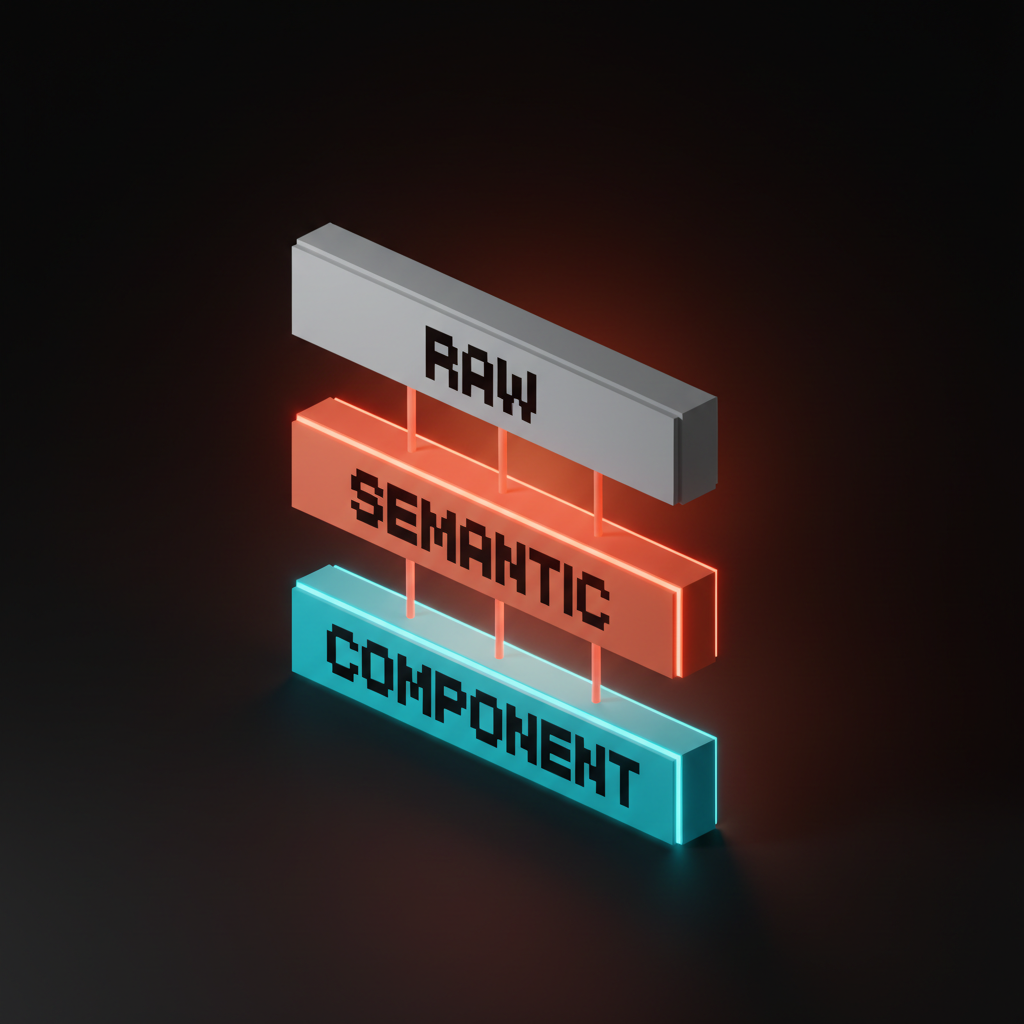
Design tokens are named values that represent design decisions. For a type scale, you want three layers:
-
Raw tokens. The actual size values.
font-size-100,font-size-200, etc., or named likefont-size-body,font-size-h1. These are the source of truth. -
Semantic tokens. Aliases that express intent.
text-heading-page,text-body-default,text-caption. Semantic tokens point at raw tokens. Components use semantic tokens, never raw ones directly. -
Component tokens. Bindings inside specific components.
card-title-sizepoints attext-heading-cardwhich points atfont-size-200. Component tokens give you per-component overrides without breaking the system.
A minimal JSON token file for a 16-base, 1.25-ratio scale:
{
  "font-size": {
    "raw": {
      "100": { "value": "0.625rem" },
      "200": { "value": "0.8125rem" },
      "300": { "value": "1rem" },
      "400": { "value": "1.25rem" },
      "500": { "value": "1.5625rem" },
      "600": { "value": "1.9375rem" },
      "700": { "value": "2.4375rem" },
      "800": { "value": "3.0625rem" },
      "900": { "value": "3.8125rem" }
    },
    "semantic": {
      "caption":  { "value": "{font-size.raw.100}" },
      "small":    { "value": "{font-size.raw.200}" },
      "body":     { "value": "{font-size.raw.300}" },
      "lead":     { "value": "{font-size.raw.400}" },
      "h4":       { "value": "{font-size.raw.500}" },
      "h3":       { "value": "{font-size.raw.600}" },
      "h2":       { "value": "{font-size.raw.700}" },
      "h1":       { "value": "{font-size.raw.800}" },
      "display":  { "value": "{font-size.raw.900}" }
    }
  }
}
That structure is portable. Style Dictionary, Tokens Studio, Specify, Supernova, all read this format and emit Figma variables, CSS variables, Tailwind config, iOS swift constants, Android XML, whatever the platforms need. The tokens are the source. Everything else is generated.
Ship the scale into Figma variables
Figma variables are where the scale lives for the design team, structured as a single typography collection with semantic aliases.
Create a Variables collection called Typography. Inside it, add a number variable for each raw size: size/100 through size/900, with the rem-equivalent pixel values (10, 13, 16, 20, 25, 31, 39, 49, 61). Then add a second tier of aliases: text/caption, text/small, text/body, text/lead, text/h4, text/h3, text/h2, text/h1, text/display. Each alias points at a raw size variable.
Then create text styles, one per role. Heading/H1 uses text/h1 for size, your heading typeface for family, your heading weight for weight, your heading line-height ratio for leading. Body/Default uses text/body, your body typeface, regular weight. Repeat for every role.
The discipline is that designers compose interfaces using text styles, not by typing font sizes into the inspector. Once a team adopts that discipline, the scale becomes self-enforcing. Anybody who sets a custom size has to break the pattern visibly, and that visibility is the governance.
Pair this with a Modes setup if you support multiple density modes. A "compact" mode can override the raw size variables to use a 1.125 ratio for a denser experience. A "comfortable" mode can use 1.25. The aliases stay the same. Components do not change. The scale just shifts under them. That is what the system buys you.
Wire the scale into Tailwind CSS
Tailwind config is where the scale lives for the engineering team, and it should mirror the Figma variable structure exactly.
Replace Tailwind's default fontSize with your scale, in tailwind.config.js:
module.exports = {
  theme: {
    fontSize: {
      'caption':  ['0.625rem',  { lineHeight: '1rem' }],
      'small':    ['0.8125rem', { lineHeight: '1.25rem' }],
      'body':     ['1rem',      { lineHeight: '1.5rem' }],
      'lead':     ['1.25rem',   { lineHeight: '1.75rem' }],
      'h4':       ['1.5625rem', { lineHeight: '2rem' }],
      'h3':       ['1.9375rem', { lineHeight: '2.375rem' }],
      'h2':       ['2.4375rem', { lineHeight: '2.875rem' }],
      'h1':       ['3.0625rem', { lineHeight: '3.5rem' }],
      'display':  ['3.8125rem', { lineHeight: '4.25rem' }],
    },
  },
}
Now text-h1 in markup means the same thing Heading/H1 means in Figma. The class name is the contract. Engineers do not pick sizes, they pick roles, and the role resolves to the right pixel value at build time.
The line-heights here are not arbitrary. The pattern is: tight body line-height for small sizes, looser leading for body and lead, tight leading again for headings. A common rule is body line-height 1.5, heading line-height 1.1 to 1.2, with a transition through 1.3 to 1.4 around the lead and h4 sizes. You can express this as another scale (a leading scale) or as per-step values, but the relationship between size and leading should be deliberate, not eyeballed.
If you want to keep Tailwind's default classes available alongside your scale (for legacy code or third-party components), use extend instead of replacing fontSize outright. But the long-term goal is one scale, not two. Two type scales in the same product is just one type scale and a bunch of accidents.
Pair the scale with a real font pairing guide for typeface choices and a design system framework that puts the scale in context. The scale is one part of the typography system, the typeface choice and the role mapping are the other parts. Need a working scale, real tokens, and Figma + Tailwind set up correctly from day one? Hire Brainy. We ship full type systems through BrandBrainy and UXBrainy with the tokens, the Figma variables, and the Tailwind config wired together as one delivery.
The governance rules that keep a scale alive
Every dead type scale died the same way, by exception.
Three rules will keep a scale alive longer than any tool will:
Rule one: every new component picks roles, not sizes. A designer building a card picks Body for body, H3 for the title, Caption for the timestamp. They do not type font-size: 18px into the inspector. If the role does not exist, they propose a new role through the system, not a one-off override.
Rule two: exceptions get a name and a date. If the marketing team needs a 72px headline for a hero on a campaign page and the display size is 61px, the exception gets named (hero-marketing-q3-launch) and dated. After the campaign ships, either the exception is rolled into the scale (if it is reusable) or it is deleted (if it was a one-off). No anonymous overrides.
Rule three: the scale gets reviewed quarterly, not annually. Quarterly is short enough that drift gets caught while it is still small. Annually is long enough that every team has built around the cracks and rolling them back is a project. Quarterly review is fifteen minutes. Annual review is a redesign.
The teams that lose their type scale always tell the same story afterwards. Somebody needed a 17px size for one button, somebody else needed a 21px size for one banner, six months later there are forty-seven font sizes in the codebase and nobody can tell you which ones are real. The scale is gone. What is left is a font-size graveyard.
You prevent that by treating the scale as a contract, not a spreadsheet. The contract is enforced by tools (Figma styles, Tailwind classes, lint rules) and by review. The contract gets renegotiated at the quarterly review. Anything outside the contract is a bug.
FAQ
What is a modular type scale?
A modular type scale is a system where every font size in a product is generated by applying a single ratio to a single base size. Pick a base, usually 16 pixels for the web, pick a ratio, usually between 1.125 and 1.618, and multiply or divide the base by the ratio repeatedly to generate the steps. The result is a scale where every size is mathematically related to every other size, which gives the typography a sense of internal consistency that arbitrary pixel choices cannot.
What ratio should I use for my type scale?
Pick the ratio for the density your product needs. Use 1.125 or 1.2 for dense data products like dashboards and admin tools where headings should not pull attention away from data. Use 1.25 or 1.333 for standard SaaS marketing pages, content sites, and product pages, which is where most B2B products live. Use 1.414 or 1.618 for editorial, magazine, or display-led products where headlines need to feel like headlines. The most common mistake is picking a ratio because it sounds impressive rather than because it fits the product.
How many sizes should a type scale have?
Most production-ready scales have seven to nine sizes. Caption, small, body, lead, h4, h3, h2, h1, and display covers almost every real product surface. Going below seven sizes leaves gaps that designers will fill with one-off overrides. Going above ten sizes thins out the scale to the point where some sizes are never used and the system gets harder to maintain. Seven to nine is the sweet spot, and the role names should describe what each size is for, not its pixel value.
Should I use rem or px for type scale values?
Use rem for the web. The browser root font size is 16 pixels by default but the user can change it through accessibility settings and browser preferences, and a rem-based scale respects those preferences automatically. Pixel-based scales ignore them. Tailwind, Material Design, and most modern design systems all use rem for this reason. For mobile platforms, follow the platform: iOS uses points and supports dynamic type, Android uses scale-independent pixels (sp). The principle is the same, use the platform's relative unit, not absolute units.
What is the difference between a modular type scale and design tokens?
A modular type scale is the math, design tokens are how the math gets shipped. The scale defines the values (10, 13, 16, 20, 25, 31, 39, 49, 61). Tokens are the named layer that lets the rest of the design system reference those values without hard-coding them. You can have a scale without tokens, but the scale will not survive a real codebase. You can have tokens without a scale, but the values will be arbitrary. The full system is the scale expressed as tokens, with raw, semantic, and component layers, and shipped to Figma and code through the same source.
The pattern most type scales miss
A type scale is not a list of font sizes, it is a contract about how text earns hierarchy in your product.
The teams that get this right do not pick a ratio and stop. They pick a ratio, build the scale, ship it as tokens, wire it into Figma and Tailwind, and then enforce it through a quarterly review and a no-exceptions rule that has teeth. The scale is not the deliverable, the discipline is. The deliverable is what makes the discipline possible.
The teams that get this wrong treat the scale as a moodboard. They pick beautiful ratios on a Pinterest mockup, ship a static spec doc, and discover six months later that the engineering team never adopted it because the spec doc was not executable code. Or they ship the scale into Figma and never into Tailwind, and the design files and the production app drift apart until they are two different products in different fonts. Or they ship into both and never govern, and the exceptions outnumber the rules within a year.
The shortcut is to treat the scale as a contract from day one. The math sets the steps. The tokens make the steps shippable. Figma variables and Tailwind config make the steps usable on both sides of the design-engineering line. The governance keeps the steps alive after launch. Every part of the system is doing one job, and the system fails if any of them are missing.
If you want a working modular type scale, real tokens, real Figma variables, real Tailwind config, and a governance plan that holds the scale together past launch, hire Brainy. We ship full design systems through BrandBrainy and UXBrainy, with type scales designed as tokens from day one, the typography system wired to the brand color palette, and the rules that keep the system alive once the team is shipping.
Need a type scale that holds up across Figma, Tailwind, and a six-product surface? Brainy ships full design systems through BrandBrainy and UXBrainy, with type scales designed as tokens from day one.
Get StartedNot ready to hire? Run the free Business Genome, an 11-dimension diagnostic for your venture.
Get your free GenomeGet new papers by email
New Brainy papers in your inbox. Confirm once, unsubscribe anytime.