Font Pairing: A Practical Guide for Designers Who Hate Guessing
A decision framework for pairing fonts that actually works, plus 12 tested combinations and the rules that make them survive a real design system.
Most font pairing advice is moodboard advice in a trench coat. "Pair contrast and complement." "Mix a serif with a sans." Cool. Now go open Figma and pick the actual two fonts that will hold up across a brand, a website, an app, and a pitch deck for the next three years. The mood is gone. The decision is still there.
This guide replaces vibes with a framework. Five rules that decide whether a pairing survives, twelve combinations that have already been tested in production, and the failure modes that kill most pairings before launch. Save the table at the end. Use it on the next project.
What font pairing actually is
Font pairing is the rule that decides which typeface does which job and why. It is not a beauty contest between two fonts on a moodboard.
A real pairing answers four questions before you ever look at a specimen. What is the heading font for. What is the body font for. What is the UI font for. Where do they overlap and where must they not. If you cannot answer those questions in one sentence each, you do not have a pairing yet, you have two fonts you happen to like.
Pairings live inside a system. The typography system design breakdown covers the full system. This piece is the slice that handles the typeface choice itself.
The five rules that decide every pairing
These rules compound. Hit four out of five and the pairing usually works. Hit three and it starts to feel off. Hit two and the design reads as amateur regardless of the rest of the work.
Rule 1: Contrast in structure, harmony in proportion
The pairing has to feel different and feel related at the same time. Different in structure means one is geometric and one is humanist, or one is serif and one is sans, or one is display and one is text. Related in proportion means they share x-height, cap-height, and stroke weight close enough that they sit on the same baseline without one looming over the other.
Contrast without harmony reads as a mistake. Harmony without contrast reads as flat. The pairing has to do both.
The fastest test: type the word "Hamburgefonstiv" in both typefaces at the same point size. If one is visibly taller, narrower, or heavier at the same size, the proportions do not match. The pairing will fight you forever.
Rule 2: One voice per role
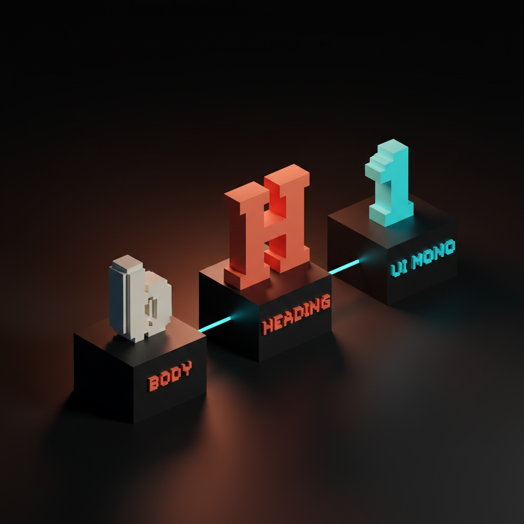
Every typeface gets one job. Heading, body, UI, or display. You do not let the heading font sneak into body copy. You do not let the body font cosplay as a headline.
Two fonts is almost always enough. Three is the maximum a sane system can hold. If you need four typefaces, you almost certainly need to use two typefaces better. Every additional font multiplies pairing decisions, weight decisions, license decisions, performance decisions, and brand-guideline decisions. The compounding cost is brutal.
The exception: a dedicated monospace for code blocks or data tables. That counts as a UI utility, not a third voice.
Rule 3: Test in context, not in a specimen
A pairing that looks gorgeous on a Behance type specimen can fall apart inside a card, a navbar, or a 12-line FAQ block. Specimens flatter typefaces. Real layouts expose them.
Test the pairing in three actual contexts before committing. A landing page hero with a headline and a subhead. A long-form article with H1, H2, body, and a pull quote. A product UI with buttons, inputs, and labels. If the pairing falls apart in any one of those, it is not a system pairing, it is a poster pairing.
The screen is not a print specimen. Browser rendering, hinting, OS-level font smoothing, and dark mode all distort what the type does. Test on the device the user will use, not the studio monitor where it will look good no matter what.
Rule 4: License and performance are part of the pairing
The most beautiful pairing in the world becomes a problem the moment it cannot be self-hosted, weighs 600KB above the fold, or cannot be embedded in a client deck without a separate license. Pairings live in real shipped products, and real shipped products have real constraints.
Check the license before falling in love. Web font, app font, and embedded font licenses are not the same thing. Many premium foundries charge separately for each. Subscription services like Adobe Fonts cover web but not always native app embedding. A pairing the client cannot use is a pairing you have to redo.
Performance matters just as much. Variable fonts collapse multiple weights into a single file, which is usually the right answer in 2026. Two variable fonts at 80KB each beat eight static font files at 40KB each, every time, on every device. The web design principles breakdown covers why performance is now an aesthetic decision.
Rule 5: Pair against the brand, not against the trend
A geometric sans paired with a wedge serif is the trend in 2026. That does not make it the right pairing for a 200-year-old law firm or a children's hospital. The brand decides the pairing. The trend gets a vote, not a veto, and not a coronation.
Run the pairing through the brand brief. What does the brand stand for. Who is the audience. What tone does the brand need to project. A geometric sans projects rationalism, modernity, and engineering. A humanist serif projects authority, history, and trust. Pair them in a startup brand and you get a credible mature challenger. Pair them in a children's hospital brand and you get cold and clinical.
For the deeper read on how brand strategy drives every typography decision, see the brand identity guidelines piece.
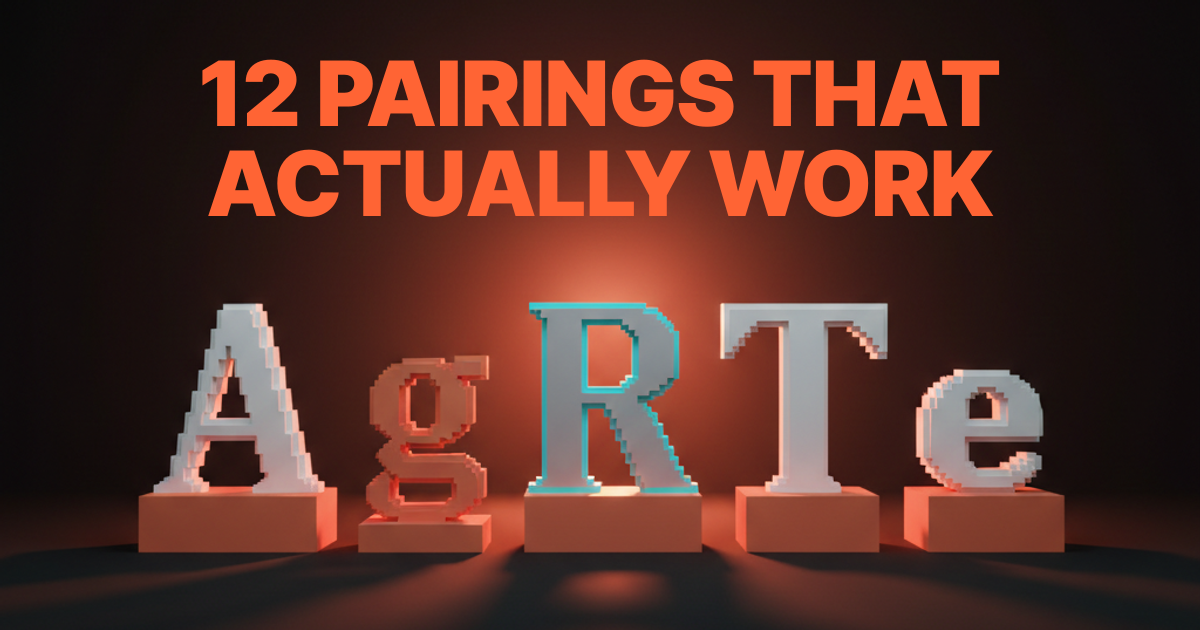
Twelve pairings that already work
Saving you weeks of testing. Each pairing here has shipped in real production work or holds up in identity systems for brands you have heard of. Each one obeys the five rules above. Use them as a starting point, not a final answer.
| # | Heading | Body | Best for | Vibe |
|---|---|---|---|---|
| 1 | Inter | Source Serif | SaaS, dev tools, technical brands | Engineered, calm |
| 2 | Satoshi | Source Serif | Modern startups, agencies | Crisp, editorial |
| 3 | DM Sans | Lora | Editorial, lifestyle, content brands | Warm, readable |
| 4 | General Sans | Newsreader | Magazine, longform publishers | Confident, literary |
| 5 | Manrope | Fraunces | Bold consumer brands, D2C | Expressive, playful |
| 6 | Space Grotesk | IBM Plex Serif | Engineering, dev infra, AI | Mechanical, sharp |
| 7 | Cabinet Grotesk | Crimson Pro | Premium brands, creative studios | Refined, classical |
| 8 | Switzer | Tiempos Text | Finance, fintech, professional services | Authoritative, modern |
| 9 | Söhne | Söhne Mono | Tech-native brands using one family | Tight system, low-overhead |
| 10 | Inter | Inter | Pure UI systems, dashboards, dev tools | Single-family discipline |
| 11 | Migra | Inter | Modern editorial with strong UI | Display-led, app-friendly |
| 12 | Tobias | General Sans | Luxury brands, fashion, hospitality | Elegant, restrained |
A few of these (9 and 10) are not technically pairings, they are single-family systems with multiple weights. That is intentional. A well-built single family with five weights and a mono cut is a more disciplined choice than a forced two-font pairing. Designers who panic at the idea of "only one font" are usually leaning on contrast to hide a weak hierarchy.
Where most pairings fail
Six failure patterns kill more pairings than anything else. If a pairing is not landing, it is almost always one of these.
Two display fonts. Two attention-grabbing typefaces in the same system fight for the same job. One always loses, and the loser ends up looking like a typo. Pair a display with a workhorse, never a display with another display.
Two near-identical sans. Inter paired with Manrope, or DM Sans paired with Satoshi. The structures are too close, the contrast disappears, and the pairing reads as someone who could not decide. If both fonts could do the same job, they are not pairing, they are competing.
Trendy vs. trend-resistant collision. A 2026 wedge serif paired with a 1990s humanist sans. The eras do not blend, they jar. Pair across centuries deliberately or not at all.
Body font pulling double duty as the headline. Body fonts are designed for sustained reading at small sizes, not for impact at 72px. Inter at 96px is fine in a dashboard, painful on a landing page. Use the right tool for the size.
No middle weight. A pairing that has a heavy heading and a regular body but nothing in between makes every UI element feel binary. A real system needs a medium weight to handle subheads, buttons, and emphasis without jumping straight to bold.
Pairing chosen before brand strategy. This is the cardinal sin. Falling in love with a pairing on a moodboard, then trying to retrofit a brand around it. Brand decides typography. Always. The order matters.
How to pick a pairing in 30 minutes
The decision should not take a week. Here is the actual workflow.
- Write the brand brief in one sentence. What does this brand project, to whom, and where will the type appear most.
- Pick the heading font first. It carries personality. Choose against the brief, not against your taste.
- Pick a body font that contrasts in structure but harmonizes in proportion. Use rule 1 as the test.
- Validate against rules 2 through 5. One voice per role. Test in three contexts. Check license and weight. Pair against the brand, not the trend.
- Build a one-page spec. Sample headline, three subheads, a paragraph of body, a button, and a label. If the spec holds together at desktop and mobile, the pairing is ready.
- Sleep on it. A pairing that still feels right 24 hours later usually is. A pairing that feels off in the morning is usually telling you the truth.
If you want a real team running this for a real brand instead of a moodboard exercise, hire Brainy. We ship brand and product UI with full typography systems.
Pairing for AI-assisted design
In 2026, more designers are using AI image generation, AI UI generation (v0, Lovable, Subframe), and Figma MCP-driven workflows to draft layouts. Font pairing matters more in that context, not less.
AI tools default to whatever font is in the prompt or whatever the design system feeds them. If the system has a clean two-font pairing already defined, the AI output looks like the brand. If the system is sloppy, the AI output is sloppy too, only faster and at scale. The prompt engineering for designers breakdown covers how to make these tools produce on-brand output, and the typography pairing is one of the load-bearing variables in that prompt.
The lesson: a strong pairing inside a strong system makes AI tools force-multiply the brand. A weak pairing makes AI tools force-multiply the inconsistency.
FAQ
What is the easiest font pairing for beginners?
Inter paired with Source Serif. Both are free, well-engineered, available in variable formats, and survive almost any context from SaaS UI to long-form editorial. They follow rule 1 cleanly, they ship at low file sizes, and they sit comfortably inside any design system.
How do you pair two Google Fonts that look professional?
Stick to fonts with full weight ranges and tested-in-production reputations. DM Sans with Lora, Inter with Source Serif, Manrope with Fraunces, and Space Grotesk with IBM Plex Serif are four pairings that look intentional out of the box. Avoid pairing Roboto with anything trendy, it makes the trendy font feel cheap by association.
Can you use two sans serif fonts together?
Yes, if they contrast in structure. A geometric sans (Inter, Satoshi) paired with a humanist sans (DM Sans, Söhne) can work, especially in editorial or content brands. The danger is picking two sans that are too similar. If both fonts could do the same job, the pairing fails.
How many fonts should a brand use?
Two is the right answer for almost every brand. Three is the maximum. One is acceptable and underrated, especially with a strong variable typeface. The instinct to add a fourth font is almost always a sign that the existing fonts are not being used well, not that the brand needs more typefaces.
What is the difference between font pairing and a type system?
Font pairing is choosing which typefaces play which roles. A type system is the full set of rules around those typefaces, including the type scale, weights, line heights, spacing, and responsive behavior. Pairing is one decision inside the system. The typography system design piece covers the rest.
How do I know if my pairing is working?
Run three tests. The squint test: the hierarchy should still read when you blur the screen. The role test: every typeface should have one obvious job. The brand test: a stranger should be able to feel the brand from the type alone, before reading the words. If all three pass, the pairing is working.
Pick the pairing, then ship the system
Font pairing is not the hardest decision in design. It is the most procrastinated. Designers spend weeks on Figma boards full of specimens because picking feels final. It is not. The pairing is reversible until launch and partially reversible after, and the cost of picking a good-enough pairing today is always lower than the cost of picking nothing for another month.
Use the five rules. Pull from the twelve pairings. Run the 30-minute workflow. Ship the system around the pairing within the same week.
A pairing that survives is a pairing that disappears. The reader never thinks about the fonts. They think about the brand, the product, the message, the offer. That is the goal. Type that calls attention to itself is type that is doing the wrong job. Type that vanishes into clarity is type that is doing the right one.
If you want a team that handles brand, type system, and product UI as one project instead of three, hire Brainy. We pair fonts the same way we pair the rest of the brand. Against the brief, not the moodboard.
Want a typography system you can actually ship instead of a Pinterest board of fonts? Brainy builds brand and product type systems end to end.
Get StartedNot ready to hire? Run the free Business Genome, an 11-dimension diagnostic for your venture.
Get your free GenomeGet new papers by email
New Brainy papers in your inbox. Confirm once, unsubscribe anytime.