Web Design Principles: The Complete Guide for 2026
The eight foundational principles still matter. The eight new 2026 principles matter more. A pillar guide with a conflict-resolution framework and a before and after case study.
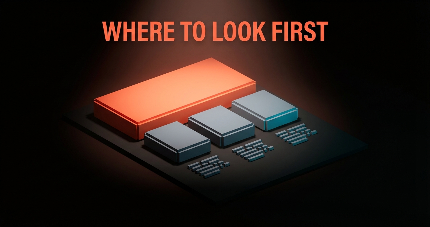
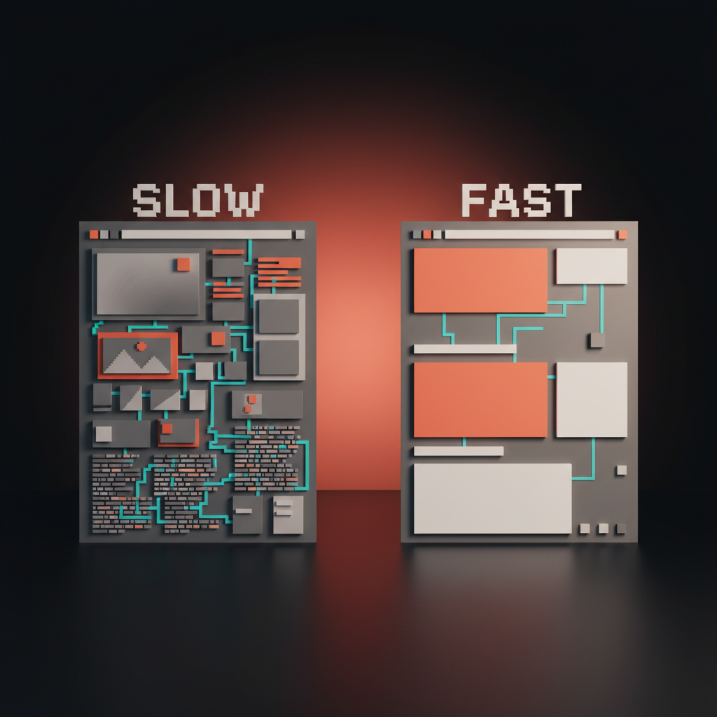
Most articles about web design principles list the same eight things and call it a guide. Hierarchy, contrast, white space, alignment, consistency, simplicity, balance, proximity. Design-school flashcards from 2014. They are still true. They are also no longer enough.
Web design in 2026 operates under a second layer of constraints that nobody is writing about clearly. Performance is aesthetics. Accessibility is a design constraint, not a QA pass. Motion carries information. Dark-mode is the native comp. AI reads your markup before a human does. Static page templates lost to content-first grids. This pillar covers both layers, then shows how to resolve the conflicts between them, because a principle that cannot resolve a conflict is not a principle, it is a preference.
This is the anchor guide for the Brainy web-design-ui cluster. Read it once, save the principles table, keep the conflict framework for the next design review.
Part 1: The foundational principles that never changed
The first eight principles are the grammar of web design. You cannot skip them, you do not need to relearn them, and no 2026 trend has replaced them. Part 1 exists to compress them into one read so Part 2 can do the real work.
Hierarchy decides what the reader sees first
Hierarchy is the sequence the page imposes on the eye. Size, weight, color, position, and space combine to say "look here first, then here, then here."
Without hierarchy every element competes for attention and the reader bounces. With hierarchy the page reads itself: one headline, one hero action, one supporting element, one proof point, in that order. For the full treatment on how hierarchy controls reading order, the visual hierarchy guide covers the mechanics.
The test: squint at any page until details blur. You should still be able to tell what the page wants you to do. If every element has the same visual weight at a squint, the page has no hierarchy, it has a checklist.

Contrast makes the page readable, period
Contrast is the difference between an element and its background, and between two adjacent elements. Low contrast feels premium in dribbble screenshots and breaks the moment it ships to real users in real light.
The rule is not subjective. WCAG 2.2 AA requires 4.5:1 for body text and 3:1 for large text, and these ratios exist because real humans read on real devices in real sunlight. The accessible color contrast guide covers how to hit those ratios without making every page look like a warning sticker.
Designers who hate contrast minimums usually hate them because they are optimizing for their own 27-inch studio monitor in a dim room. That is not where the page will be read.
Rhythm and alignment build the invisible grid
Rhythm is the repetition of spacing and scale that makes a page feel intentional instead of arbitrary. Alignment is what makes rhythm visible.
A four-pixel spacing scale (4, 8, 16, 24, 32, 48, 64) is the backbone. Every margin, every padding, every gap, every line-height lands on that scale. Typography gets its own scale (usually a 1.25 or 1.333 ratio). Together they form the invisible grid the page is snapping to, even when no grid lines are visible. The typography system design piece covers how to build the type scale.
Misalignment is usually the reason an otherwise finished design feels unfinished. One margin off by three pixels can make an entire section feel cheap. Alignment is not about perfectionism, it is about removing friction.
Proximity and consistency reduce cognitive load
Proximity is the rule that related things cluster and unrelated things separate. A label sits close to its input. A CTA sits close to the benefit it delivers. A testimonial sits close to the feature it validates. Break proximity and the reader stops parsing and starts guessing.
Consistency is the same rule applied across time. The same button style for the same action, everywhere. The same tone in error messages, everywhere. The same spacing rhythm on every page of the site. Consistency is what makes a site feel like a product instead of a deck.
The savings compound. Every consistent pattern is one less thing the reader learns from scratch on the next page.
Simplicity and feedback close the loop
Simplicity is the ruthless removal of anything the page does not need. Every element on the page either earns its place or steals attention from something else.
Feedback is the system telling the user something happened. A button changes state on hover and click. A form confirms on submit. A loading state appears before the wait feels like a bug. Feedback turns a static artifact into a conversation.
The classic eight principles, compressed: decide what matters most, make it readable, align the grid, cluster what belongs together, stay consistent across surfaces, cut what is not earning, and confirm every user action. They are still the grammar. Now we talk about the sentence.
Part 2: The 2026 principles that rewrote the game
The classic principles get a page to look designed. The 2026 principles get a page to actually work in 2026 conditions. These are the ones every real product team is shipping against, and the ones most listicles are still missing.
Performance is an aesthetic now
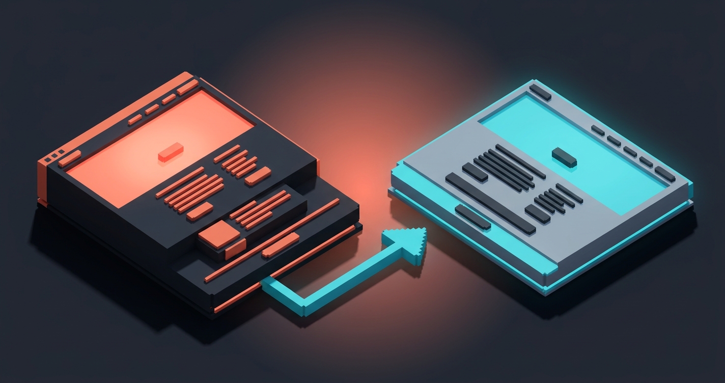
Performance is aesthetics now. A slow site looks worse than an ugly one. A site that takes three seconds to render the hero is a site the reader has already judged before they see it, and no amount of typography fixes it.
Core Web Vitals (LCP under 2.5s, CLS under 0.1, INP under 200ms) are not engineering metrics anymore, they are design metrics. Heavy fonts, hero videos that autoload, third-party scripts, unoptimized images, framework bloat, every one of these is a design decision dressed up as a technical one. The designer who ships 8MB of above-the-fold assets is not serving the brand, they are hurting it.
In 2026 the aesthetic bar is set by the fastest site in the category. If your competitor paints in 800ms and yours paints in 3 seconds, yours feels cheap. Speed reads as quality. Slowness reads as neglect.
Accessibility is a constraint, not an afterthought
Accessibility stopped being a compliance checkbox the year it started being a market-size lever. An inaccessible site excludes roughly 15% of visitors by default, plus everyone on a bad network, a cracked screen, a small phone, or a one-handed grip on a train.
Design accessible from the first artboard. Start with keyboard navigation, focus states, ARIA landmarks, and 4.5:1 contrast before a single decorative choice lands. Retrofitting accessibility at the end of a project costs three times more and always produces worse results. The web accessibility checklist covers every checkpoint in order.
Accessibility also happens to make the design better for everyone. Larger hit targets, clearer focus states, real keyboard flow, proper heading order. These things are not concessions to edge cases, they are the interface working as it should.
Motion is information, not decoration
Every motion on a modern site should communicate something specific. A hover confirms interactivity. A scroll reveal signals that content has loaded. A state change shows the system registered an input. A loading spinner buys time without silence.
Motion that does not communicate is friction. A parallax hero section that delays the first interaction, a splash animation that fires every visit, a micro-interaction that takes longer than the action it describes. All of these are decoration pretending to be craft.
The 2026 rule: if a user could not describe what an animation told them, the animation should not be there. Motion is a verb, not an adjective.

Design dark-mode first
Over 70% of active web users on OLED devices default to dark mode system-wide. Most design tools still default to white artboards. The mismatch is a design problem, not a preference one.
Designing dark-mode first forces better color decisions. Dark backgrounds are less forgiving of low-contrast text, noisy gradients, and over-saturated accents. A palette that works at dark-mode-first will almost always survive a light-mode inversion. The reverse is rarely true. The color theory guide covers how to build a palette that works in both directions.
Dark-mode-first does not mean dark-only. It means the dark comp is the primary comp, the light comp is the inversion, and both are approved together. Not "we will do dark mode later." Later never comes, and when it does, it looks retrofitted.
Structure for AI readers, not just humans
In 2026 a growing share of traffic is not a human scrolling, it is an AI agent retrieving. ChatGPT search, Perplexity, Google's AI overviews, Claude's research mode, site-level agents doing product comparisons. These readers do not look at your page, they parse it.
That changes the design brief. Semantic HTML is no longer an engineering preference, it is a design requirement. Heading hierarchy has to be linear, with one H1, logical H2s, and clean nesting. Structured data (schema.org markup) has to match the visible content. Alt text has to describe what is in the image, not what mood it evokes. The agent reads the DOM, not the visual.
Design that looks beautiful but renders as a dump of divs and images gets invisible to AI retrieval. In 2026 invisible to AI is a market share problem.
System-first, page-second
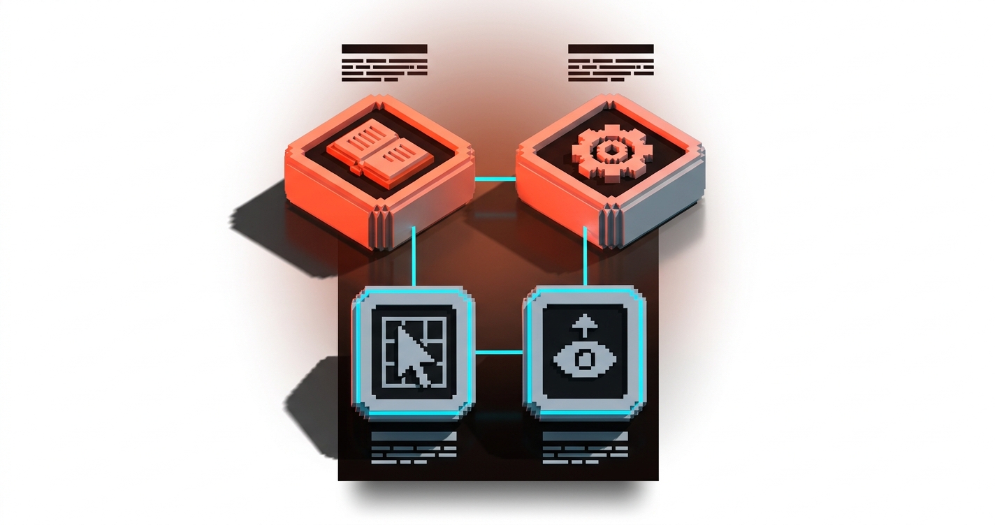
Every surface you ship is part of a design system whether you designed it as one or not. The 2026 principle: design the system first, then compose the pages from it.
Tokens (color, spacing, typography, radius, shadow). Primitives (buttons, inputs, cards, dialogs). Patterns (nav, hero, feature section, CTA block). Then pages. Shipping pages without a system is how companies end up with 14 button styles and 8 headline treatments across the same site. The design systems guide covers the full taxonomy if you want the deeper read.
A page without a system might ship faster. A site without a system always ships slower, because every new surface is built from scratch and every redesign rebuilds what a system would have held for free.
If you want a real team applying these principles against a real site and not a template, hire Brainy. End-to-end web, brand, and product UI.
Mobile and desktop must hit parity
The mobile version of your site is not a compressed desktop. It is a different composition of the same content, and the reader should get the same information, same offer, and same conversion path on both.
Parity means equivalent hierarchy, equivalent actions, equivalent proof, and equivalent speed, not pixel-identical layout. The mobile hero may be stacked, the mobile nav may collapse, the mobile copy may compress. What cannot happen is a feature that exists on desktop and disappears on mobile, a CTA that is one tap away on desktop and three taps away on mobile, or a hero that weighs 800kb on desktop and crashes on 3G.
Most parity failures are invisible on the designer's laptop and brutal on the user's phone. Test both. Ship both. Own both.
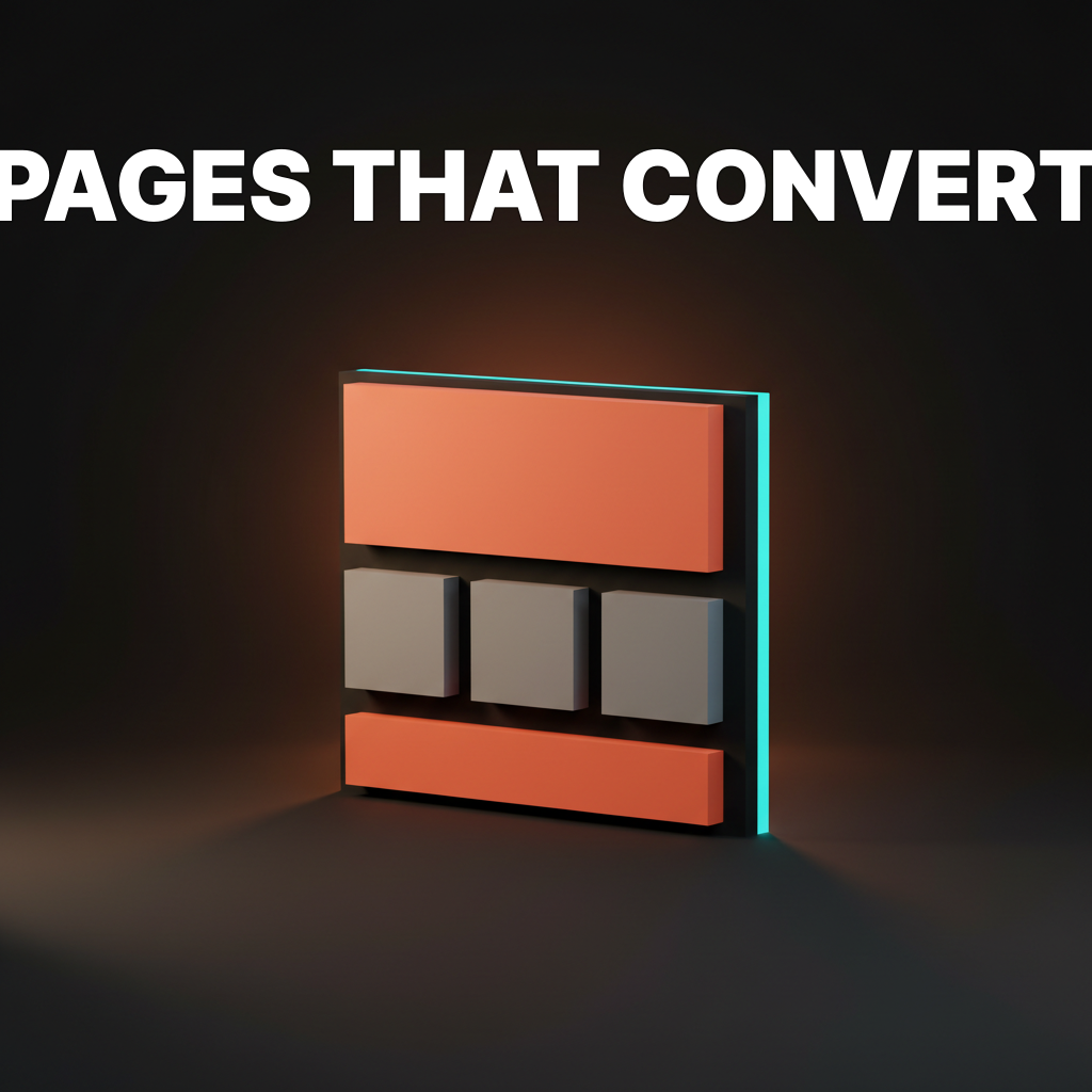
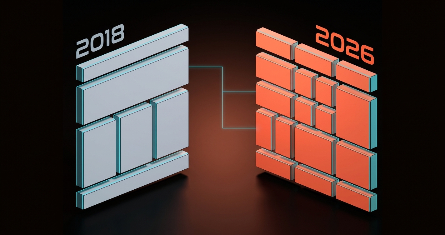
Content grids replaced page templates
The old page template was header, hero, three-column features, testimonial strip, CTA band, footer. Every page on every SaaS site followed the same rhythm for a decade.
The new model is a content grid. Unequal cells, varied content types, content weight determines layout. Bento grids are the most visible expression of this shift. See the bento grid design breakdown for the layout mechanics. The principle underneath bento is simpler: layout follows content, not content follows layout.
A page with two strong features and five minor ones does not need five equal columns. It needs a composition. A page with one dominant story and three supporting ones does not need a stack. It needs a hierarchy. Content grids give the designer back control over emphasis.
Part 3: How to apply them
Knowing sixteen principles is useful. Knowing which one wins in a fight is what separates a senior designer from a mid-level one. Part 3 is the application layer.
Principles at a glance
Save this table. Screenshot it. Pin it to the project doc. Every principle has one application rule.
| # | Principle | Layer | Application rule |
|---|---|---|---|
| 1 | Hierarchy | Classic | Squint test: the main action is still visible when details blur |
| 2 | Contrast | Classic | Text hits 4.5:1 minimum, large text hits 3:1, never below |
| 3 | Rhythm and alignment | Classic | Every spacing value lives on a 4px scale, every type size on a ratio scale |
| 4 | Proximity | Classic | Related elements group, unrelated elements separate |
| 5 | Consistency | Classic | One pattern per job, used everywhere that job appears |
| 6 | Simplicity | Classic | If an element does not earn its place, delete it |
| 7 | Feedback | Classic | Every user action gets a visible system response |
| 8 | Balance | Classic | Composition holds together when flipped horizontally |
| 9 | Performance as aesthetic | 2026 | LCP under 2.5s, or the design loses before it is read |
| 10 | Accessibility as constraint | 2026 | Designed into the artboard, not QA'd at the end |
| 11 | Motion as information | 2026 | If you cannot describe what it told you, cut it |
| 12 | Dark-mode first | 2026 | Dark is the primary comp, light is the inversion |
| 13 | AI-readable structure | 2026 | Semantic HTML, clean heading order, schema.org where relevant |
| 14 | System-first | 2026 | Tokens, primitives, patterns, pages, in that order |
| 15 | Mobile-desktop parity | 2026 | Same information, same actions, same speed, across breakpoints |
| 16 | Content grids over templates | 2026 | Layout follows content weight, not a fixed rhythm |
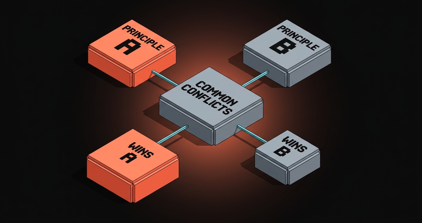
When principles collide, which one wins
Principles conflict constantly. The designer's job is not to know all sixteen, it is to know which one wins when two of them point in opposite directions. Here are the real fights.
Simplicity vs. Feedback. Simplicity says cut elements. Feedback says every action needs a visible response. Winner: Feedback. A simpler interface that silently swallows a click is worse than a busier interface that confirms one.
Performance vs. Motion. Motion wants expressive transitions. Performance wants fast paints. Winner: Performance. Every millisecond of motion is a millisecond the user is not yet in the app.
Accessibility vs. Aesthetic minimalism. A low-contrast, minimalist comp looks premium on dribbble. It fails 15% of users in real conditions. Winner: Accessibility. Minimalism that excludes users is not minimalism, it is exclusion.
Consistency vs. Hierarchy. Consistency says buttons look the same everywhere. Hierarchy says the primary action should dominate. Winner: Hierarchy, inside a consistent system. The primary CTA is visually stronger, but it is still a primary-CTA pattern, used the same way everywhere.
Dark-mode first vs. Brand color. A brand color that sings on white can look radioactive on dark. Winner: Dark-mode. Adapt the brand color tokens to the mode, not the other way around.
System-first vs. Page speed. A system adds weight (more tokens, more primitives, more variants). Shipping faster argues for a one-off page. Winner: System, every time, because a one-off page today is a redesign tomorrow.
Mobile parity vs. Desktop density. Desktop can hold a dense bento. Mobile cannot. Winner: Parity. Re-compose the mobile version around the same content, do not amputate it.
AI-readable vs. Design ambition. A weird, beautiful, JS-rendered hero that looks incredible for humans but dumps as a blank div to crawlers and AI agents. Winner: AI-readable structure. A server-rendered fallback of the same content wins, period.
A principle that cannot resolve a conflict is not a principle, it is a preference. Every row above is a principle doing its job.
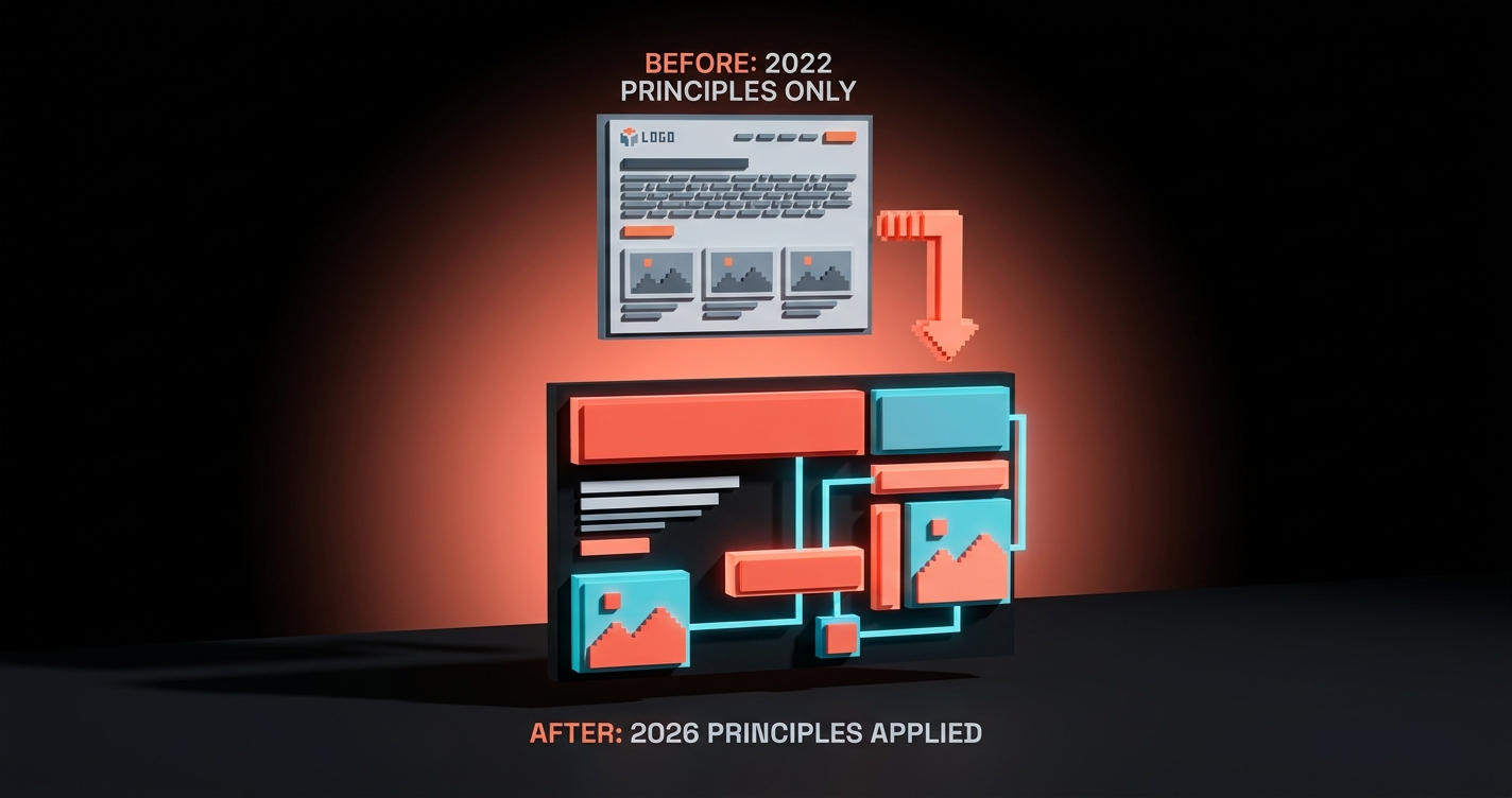
A landing page, before and after
Take a real example. A SaaS analytics product shipped a landing page in 2022 that followed the classic principles and nothing else. By 2026 it had stopped converting. Here is what changed.
Before (2022, classic principles only). A 3MB hero video autoplaying at 1080p (LCP 4.1s). Gray-on-gray body text at 3.2:1 contrast. A three-column feature row with three identical cells that read "Fast. Beautiful. Powerful." A parallax-heavy scroll experience with a 600ms fade-in on every section. Mobile was the desktop compressed to 375px. Dark mode did not exist. The hero was a JS-mounted component, invisible to crawlers. No design system, every new marketing page was a redesign.
The page looked fine. It loaded slowly, excluded users, failed AI retrieval, and its conversion rate dropped 40% over three years. Classic principles were intact. The 2026 layer was missing.
After (2026, both layers applied). Hero video replaced with a responsive SVG illustration (LCP 1.2s). Body text moved to 7:1 contrast. Feature row re-composed as a bento grid with one dominant cell (the hero capability) and four supporting cells with varied weight. Scroll animations stripped to three information-bearing micro-interactions. Mobile rebuilt as a parity comp, not a compression. Dark-mode ships as the primary comp. Hero rendered server-side with semantic markup and schema.org Product schema. A design system anchors the whole site so future pages ship in days, not weeks.
Same product. Same team. Same brand. A page that now loads in 1.2 seconds, excludes nobody, gets retrieved by AI, survives mode switches, and holds up as part of a system. Conversion rate recovered inside a quarter.
The landing page design breakdown covers the structural decisions behind a conversion-first page in more detail. The web design trends 2026 piece covers where each of these patterns is heading next.
FAQ
What are the principles of web design in 2026?
There are two layers. The eight classic principles (hierarchy, contrast, rhythm, alignment, proximity, consistency, simplicity, feedback) still apply. The eight 2026 principles (performance as aesthetic, accessibility as constraint, motion as information, dark-mode first, AI-readable structure, system-first, mobile-desktop parity, content grids) determine whether the site actually works in 2026 conditions. A modern guide covers both.
What are the most important web design principles?
For visual decisions, hierarchy and contrast. Without them no other principle lands. For shipping decisions in 2026, performance and accessibility. These two determine whether the site is usable at all before any aesthetic judgment happens.
What is the difference between classic and modern web design principles?
Classic principles describe how a page looks. Modern 2026 principles describe how a page works. A site can honor every classic principle and still be slow, inaccessible, AI-invisible, mobile-broken, and hard to evolve. The modern layer catches those failure modes.
How do you apply web design principles to a real project?
Build against them in order. Start with the system (tokens, primitives, patterns). Design the dark-mode comp first. Check accessibility and performance at the artboard stage, not at launch. Resolve conflicts using the principle conflict framework above. Ship the mobile version with parity. Measure against Core Web Vitals, contrast ratios, and AI crawl output.
Are the old web design principles still relevant?
Yes. They are the grammar. Without hierarchy and contrast no design reads, regardless of how well it performs. The 2026 layer does not replace the classic layer, it sits on top of it. Skip either layer and the design breaks in a different way.
Build for now, not for 2014
Most web design advice on the internet is a 2014 reissue wearing a 2026 font. The eight classic principles written by a design professor, copied across listicles, repackaged every year with a new hero image.
They are still true. They are also no longer sufficient. A beautiful, hierarchical, contrast-respecting site that takes three seconds to paint, excludes a seventh of its users, dumps as a blank div to crawlers, and breaks on a mid-range Android is not a good site. It is a good comp that shipped badly.
The 2026 principles are the layer that decides whether the comp becomes a product. Performance is aesthetics. Accessibility is a constraint. Motion is information. Dark-mode is the native. AI reads the DOM. The system eats the page. Mobile is a peer, not a portrait. Content decides layout, not a template.
Pick one page on your current site. Audit it against all sixteen principles. Find the three worst violations. Fix those first. Ship the fix. Do the next three. Repeat until the site holds up.
If you want a team that runs this process against every surface of your product, hire Brainy. We ship web, brand, and product UI with both layers applied, not just the flashcards.
Build for now, not for 2014.
Want a site built against 2026 principles and not 2014 design-school flashcards? Brainy ships web design and product UI end to end.
Get StartedNot ready to hire? Run the free Business Genome, an 11-dimension diagnostic for your venture.
Get your free GenomeGet new papers by email
New Brainy papers in your inbox. Confirm once, unsubscribe anytime.