Bento Grid Design: The 2026 UI Layout Playbook
What a bento grid actually is, when it works and when it does not, teardowns of Apple, Linear, and Vercel's implementations, and a CSS Grid starter.

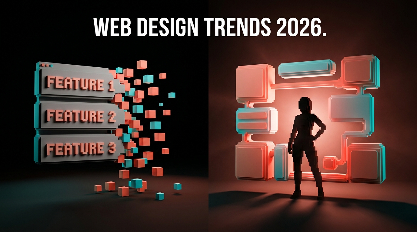
The three-column feature row is dead. It has been dead for two years and most designers still have not moved the body.
You know the one. Three equal columns, each with an icon, a heading, a paragraph, stacked on mobile. Every SaaS site built between 2018 and 2023 had one. It sold one lie: that your product was three features, each worth exactly 33% of attention. Attention has never been equal, and readers stopped reading those sections the same year TikTok taught them that density is the feature, not the bug.
The bento grid won because it admits what the feature row never did: some things are bigger than others, and the reader should know that at a glance. For the deeper pattern behind that, see visual hierarchy. Apple's Mac pages are the cleanest live example of what that looks like in production.
What a bento grid actually is
A bento grid is a layout pattern where a section is divided into unequal rectangular cells, each holding a distinct piece of content, arranged so the whole grid reads as a unified composition.
The name comes from the Japanese bento box. Compartments of different sizes, each holding something different, arranged to be visually balanced as a whole. Not a row of identical columns. Not a stack of narrative sections. A single composition with deliberate internal hierarchy.
The pattern has three essential characteristics. First, unequal cells, usually built on a 3 or 4 column grid with some cells spanning multiple columns or rows. Second, varied content per cell (a chart in one, an illustration in another, a metric in a third, a testimonial in a fourth). Third, visual coherence across the whole, usually through shared background treatment, consistent border radii, and restrained color use.
What it is not: a CSS Grid demo. A masonry layout. A Pinterest feed. A random arrangement of cards. Bento is compositional, not algorithmic.
A bento grid is compression. A feature row is narration. Most products need compression.
Why it replaced the feature row
Three reasons. Two of them obvious. One of them the reason the pattern stuck.
Reason one: dwell time. Apple's internal testing on marketing pages showed bento sections held visitors roughly 47% longer than equivalent feature rows. The reason is not mystery, it is just that a reader can graze a bento grid. There is no mandatory reading order. They land, pick the cell that interests them, and stay.
Reason two: density without walls of text. A well-designed bento grid communicates six to eight things in the space a traditional layout would use for three. Because cells hold different content types (visual, stat, copy, testimonial), the reader does not experience the density as heavy.
Reason three (the real one): it matches how modern products are actually sold. Most SaaS products in 2026 are not three features. They are a platform with one hero capability, three to five supporting capabilities, one integration story, one proof point, and maybe a specific feature worth calling out separately. That shape does not fit a three-column row. It fits a bento. The layout met the content where it was.
| Pattern | Fits this story | Fails this story |
|---|---|---|
| Three-column feature row | Three equal features, narrative product | Platforms with uneven feature weight |
| Feature stack (full-width rows) | Deep feature explanations | Need to show breadth at a glance |
| Bento grid | Platforms, suites, dashboards, proof pages | Linear tutorials, step-by-step flows |
The three best real implementations right now
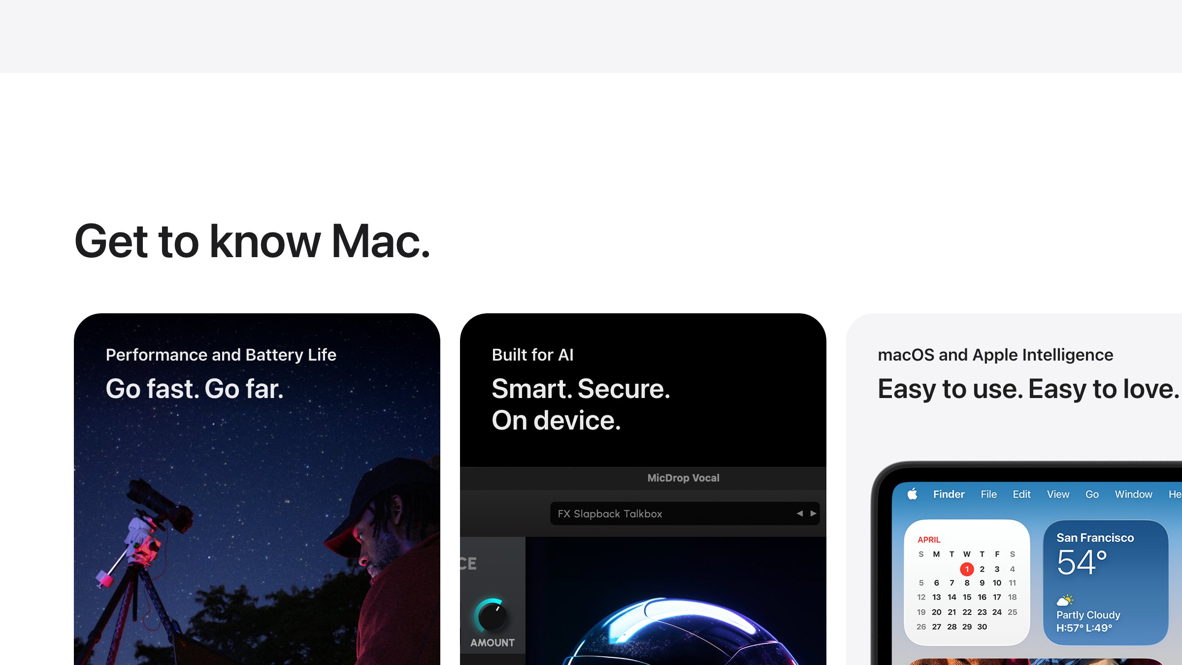
Apple (apple.com/mac). Already shown above. Every Mac product page from late 2022 onward uses bento. The M-series chip sections are the cleanest pattern: one dominant cell for the chip visual, smaller cells for benchmarks and use cases. Shared dark background, shared corner radius, consistent internal padding. The chip is always visually dominant. That is the editorial choice, not the grid.
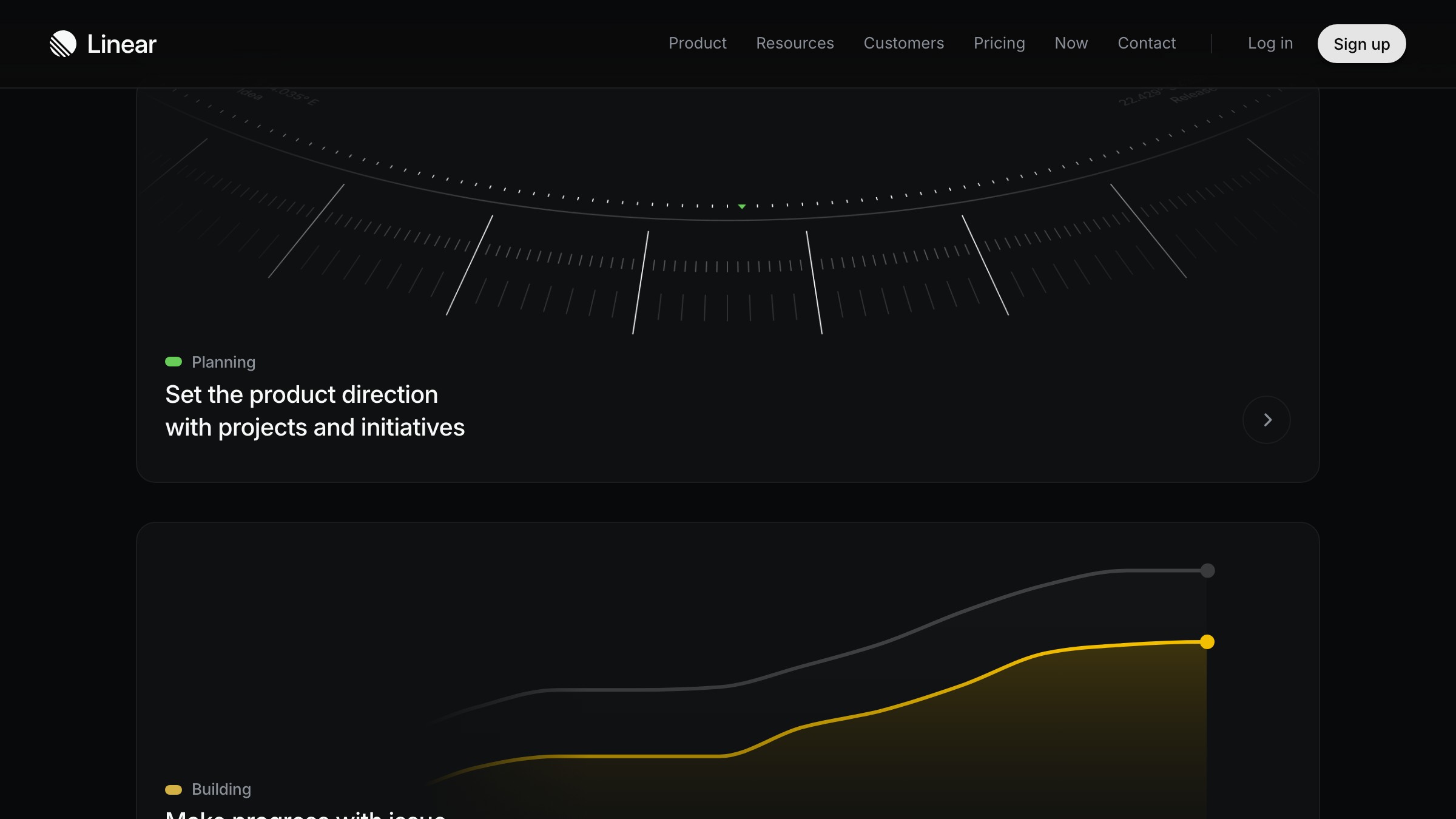
Linear (linear.app/features). Bento for developer tooling. The features page is a stack of 4-column bentos where the hero capability (issue tracking, planning, building) takes a 2x2 cell and smaller features get 1x1 or 1x2. Linear's version is famous because of restraint: product screenshots only, no stock illustration, monospace labels. It reads like a spec sheet, on purpose.
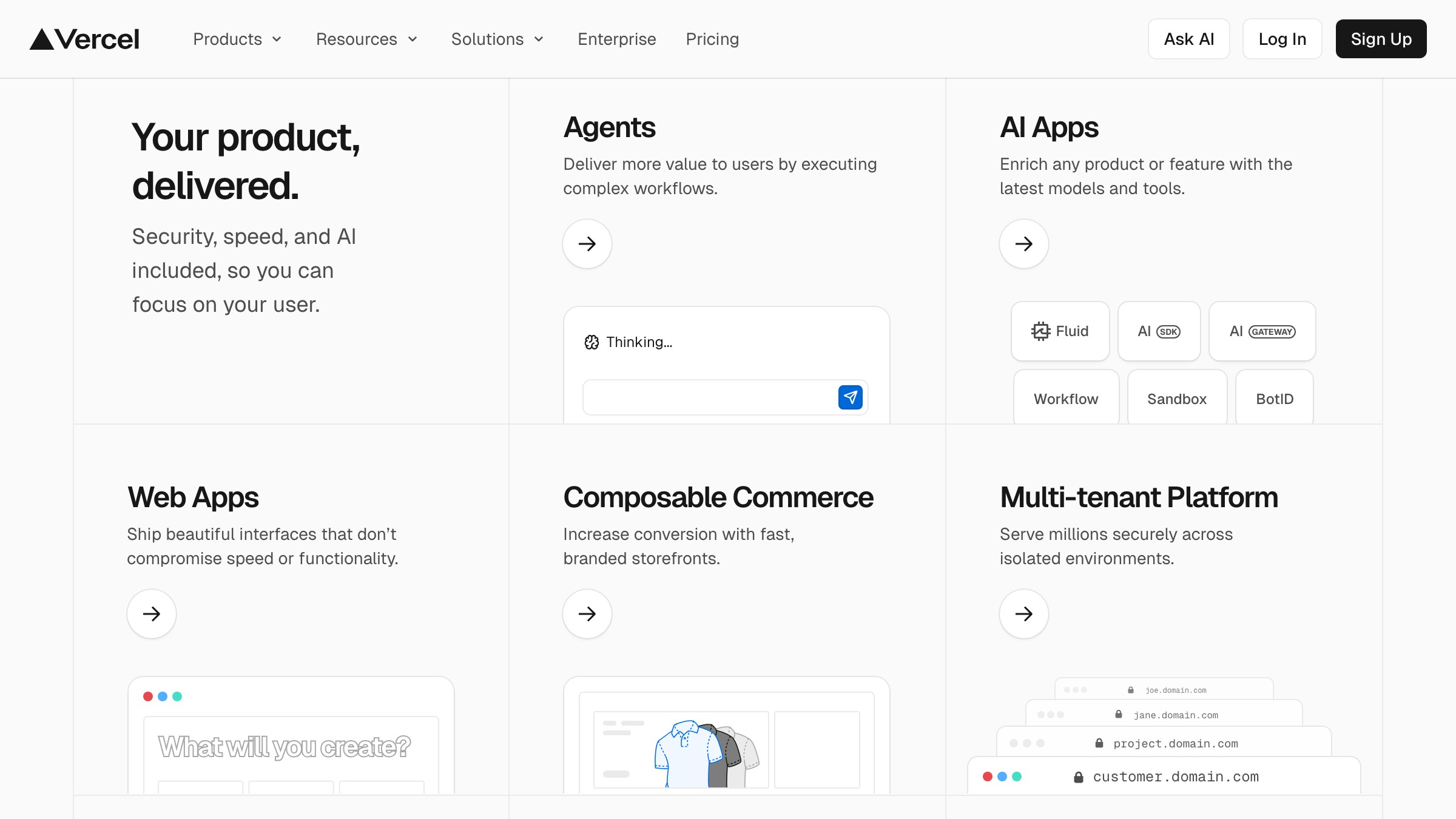
Vercel (vercel.com). Vercel's homepage bento is the hybrid version. Some cells are illustrations, some are product screenshots, some are pure text. They prove you can mix media inside a single bento without it feeling inconsistent, provided every cell shares the same visual language (same background, same radius, same inner spacing rhythm).
Three different industries, three different tones, same underlying pattern. The pattern is not fashion. It is a layout for a specific communication problem: "we do a lot of things, here they are at a glance, pick the one you care about."
The grid math (simpler than it looks)
Most bento grids use one of two base structures.
The 3-column bento. Good for tight sections, testimonials, feature highlights. Typical pattern:
- One 2x1 hero cell (spans 2 columns, 1 row)
- One 1x1 cell (1 column, 1 row)
- Two 1x1 cells in a second row
- One 1x2 cell for something that benefits from vertical weight
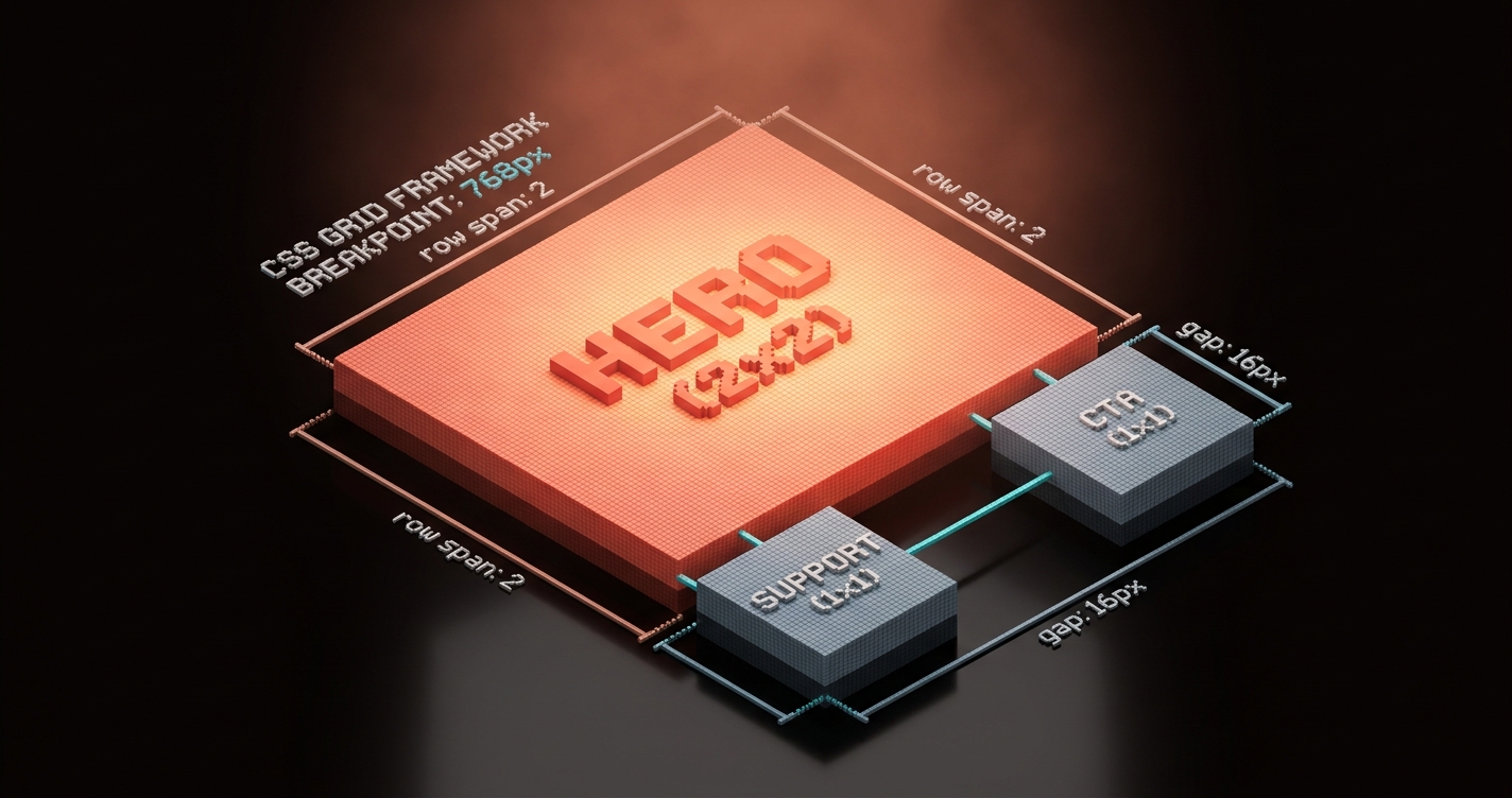
The 4-column bento. Better for full sections with more breadth. Typical pattern:
- One 2x2 hero cell
- Two 1x1 cells stacked beside it
- One 2x1 cell across the bottom
- One 1x1 cell to close the row
You can build a bento grid in CSS Grid in about twenty lines:
.bento {
  display: grid;
  grid-template-columns: repeat(4, 1fr);
  grid-auto-rows: 240px;
  gap: 16px;
}
.bento-cell-hero { grid-column: span 2; grid-row: span 2; }
.bento-cell-wide { grid-column: span 2; }
.bento-cell-tall { grid-row: span 2; }
.bento-cell-default { grid-column: span 1; grid-row: span 1; }
Apply the classes to children and the grid organizes itself. The math really is that simple. What makes bento hard is not the grid. It is the editorial decision about which cells deserve weight.
Responsive rules that do not fall apart
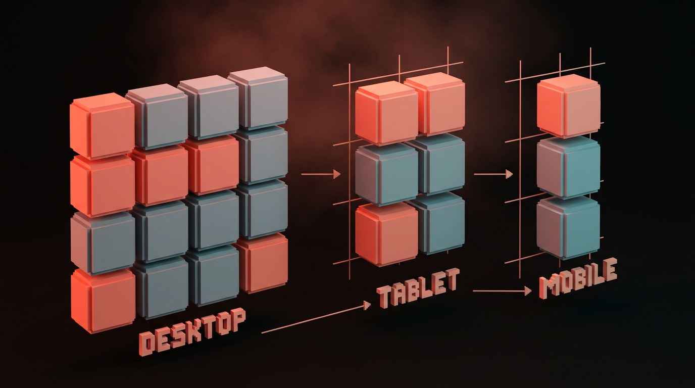
Desktop bento is easy. Mobile bento is where most implementations fail.
The mistake: keeping the grid shape and scaling everything down. At 390px wide, a 4-column bento becomes four 90px columns, which is useless. The cells cannot hold real content.
The rule: re-flow, do not shrink. On mobile, the bento grid collapses to a single column, but the cell order changes to preserve hierarchy.
- Hero cell moves to the top (largest visual impact first on mobile)
- 2x1 wide cells become full-width single-column cells
- 1x2 tall cells become standard-height cells, not stretched vertically
- Order is redecided by importance, not by visual position on desktop
CSS Grid makes this painless with grid-template-areas and media queries. Or, in Tailwind: use lg: prefixes to apply bento spans only on large screens, and let the default mobile stack handle itself.
| Breakpoint | Grid behavior |
|---|---|
| Desktop (1280px+) | Full bento, 4-column with varied spans |
| Tablet (768-1279px) | Simplified bento, 2-column with some spans |
| Mobile (under 768px) | Single column, reordered by content priority |
The test: at 390px, each cell must be tall enough that the content inside it is readable without zooming or horizontal scroll. If it is not, the cell is wrong, not the viewport.
If you want more layout breakdowns, browse the rest of Brainy Papers. If you need a landing page that stops losing visitors to a wall of feature rows, hire Brainy and we ship real layouts, real copy, real conversion.
When a bento grid is the wrong call
Bento is not a universal fix. Use it wrong and you will force content into cells that needed to breathe.
Bento fails when:
- Your content is sequential. A step-by-step tutorial, an onboarding flow, a narrative case study. These need linear order. Bento removes the reading order.
- Every piece is equal weight. If you genuinely have three equal features, a three-column row is still correct. Bento requires internal hierarchy. Flattening into bento cells makes equal things look randomly ranked.
- Each cell needs depth. If your feature needs 200 words to explain, it does not fit in a bento cell. Write it as a section, not a compartment.
- You do not have strong visual assets. Bento grids read best when cells contain visuals (charts, product shots, illustrations). All-text bentos look like cramped newspaper layouts.
Decision table:
| Your content is... | Use |
|---|---|
| A platform with uneven feature weight | Bento grid |
| Three equal, parallel features | Three-column row |
| A narrative explanation | Feature stack (full-width rows) |
| A step-by-step flow | Numbered sections |
| A dashboard-style proof page | Bento grid |
| A deep dive on one feature | Hero + supporting sections |
The designer's starter pattern
Use this as a baseline. Edit from here, do not build from scratch.
Section structure:
- Full-width heading above the grid (one line, punchy)
- 4-column grid, 3 to 5 rows total
- One hero cell (2x2), visually the strongest asset
- Four to six supporting cells, varied content types
- Optional full-width closing cell for CTA or proof
Cell content rules:
- One sentence per cell, max. If you need a paragraph, the cell is too small.
- One asset per cell (chart, illustration, screenshot, metric, testimonial, logo).
- Consistent inner padding (usually 24-32px).
- Consistent corner radius (usually 12-16px).
- Restrained color use. Most cells share a background. One or two can invert or use accent.
Mobile order: hero cell first, then the three most important supporting cells, then the rest.
Ship one bento section on your next landing page. You will feel the difference.
FAQ
Is the bento grid just a trend?
No. Trends last one to two years. Bento grids have been dominant on major product pages since 2022 and still hold. They are a layout pattern for a specific communication problem, and that problem is not going away.
Can I use a bento grid on a blog or content site?
Rarely. Bento is for product and marketing surfaces. Blog posts are sequential. An article hub or featured-content grid can use bento-style unequal cells, but full article body content should not.
What is the difference between bento grid and masonry?
Masonry is algorithmic. Cells are placed automatically based on content height. Bento is compositional. Cells are placed intentionally by the designer based on importance. Masonry works for Pinterest. Bento works for products.
Do bento grids work for dashboards?
Yes, when the dashboard has uneven widget weight. One primary metric, several secondary metrics, a chart, a log, a recent activity feed. This is exactly the bento shape. See: Linear's project view, Vercel's deployment dashboard.
How many cells should a bento grid have?
Between four and eight. Fewer than four and it stops reading as a grid. More than eight and it starts reading as a wall. Seven is a common sweet spot.
Stop building feature rows
Walk through any SaaS site built in the last three years. Count the three-column feature rows you see. Count the bento sections. The numbers flip every year.
There is a reason. The feature row was a layout for a story we stopped telling, the "three equal features" story. Modern products do not have three equal features. They have a platform, a hero capability, a cluster of supporting capabilities, a proof point, and a closing CTA. That shape fits a bento. It does not fit a row.
Pick a page on your current site that still has a feature row. Redesign that one section as a bento grid. Put the strongest capability in the hero cell. Put the proof in a supporting cell. Put the one-line differentiator in another. Ship it.
Watch dwell time go up. Watch bounce go down. Watch the page actually do work.
Stop building feature rows.
Need a landing page that actually converts, not another feature-row wall? Brainy ships landing pages.
Get StartedNot ready to hire? Run the free Business Genome, an 11-dimension diagnostic for your venture.
Get your free GenomeGet new papers by email
New Brainy papers in your inbox. Confirm once, unsubscribe anytime.