Web Design Trends 2026: What Actually Ships This Year
Year-in-preview for working designers. AI-native layouts, bento evolutions, variable type, micro-interactions, spatial UI, and what to stop shipping in 2026.
2026 is the year web design stops cosplaying as AI and starts being built by it. The shift is quiet, not cinematic, and most of it lands as pattern upgrades rather than new aesthetics.
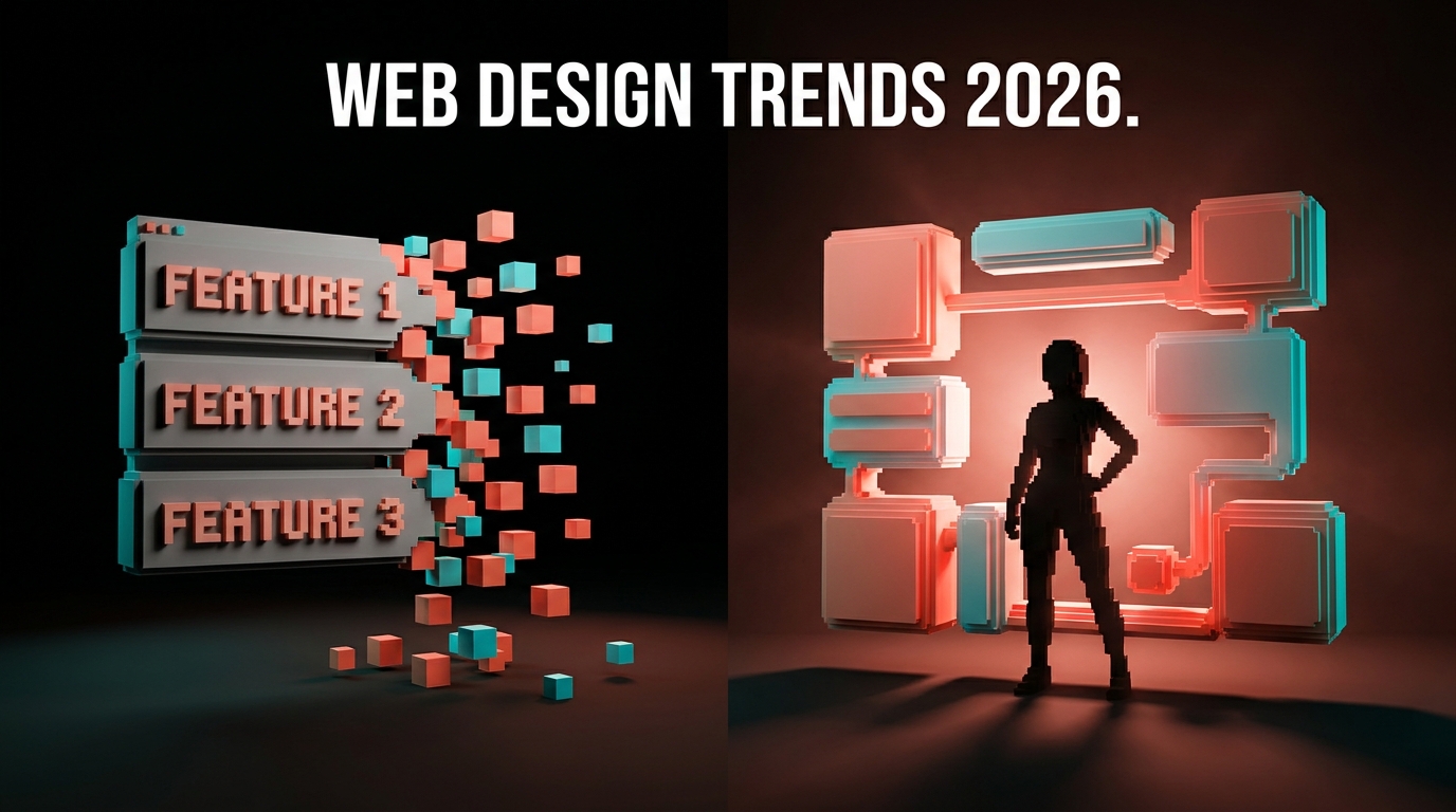
Forget the moodboard recaps. The real 2026 story is that the best product pages no longer render the same thing for every visitor, type systems are now behaving like brand identity, and the three-column feature row is finally in the ground. If you design websites for a living, a handful of patterns are about to define whether your work feels current or dated. Here they are, ranked by durability.
AI-native layouts quietly replace static pages
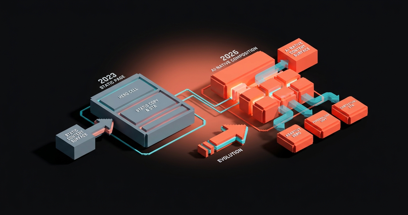
The biggest 2026 shift is not a new visual style. It is that a growing share of marketing and product pages are being composed at request time, not at build time.
An AI-native layout is a page whose cells, copy, and CTA are assembled per visitor based on referrer, intent, and prior behavior. Same surface, different composition. The designer defines the cell shapes, the hierarchy rules, and the tone. The model fills the slots.
Vercel, Linear, and Stripe have all shipped versions of this on marketing pages. Arc and Perplexity do it in-app. The pattern is not "one site, many themes," it is "one system, many compositions."
Use AI-native layouts when:
- Your audience has clearly distinct intents (ICPs, pricing tiers, industries)
- Your copy already lives in a structured CMS with clean fields
- Your analytics can feed real intent signals, not vibes
Skip AI-native layouts when:
- Your brand depends on a fixed editorial composition
- You cannot QA every permutation visually
- You have fewer than three meaningful audience segments
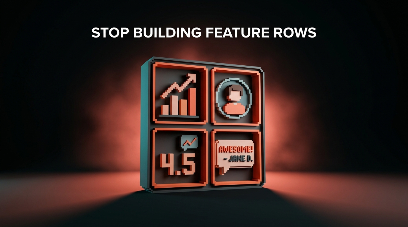
Bento grids grow up in 2026
The bento grids that took over in 2023 have stopped being a single layout and started being a system.
In 2024 and 2025, most bento implementations copied Apple: four columns, one 2x2 hero cell, shared radius, shared background. The 2026 evolution is nested and responsive. The hero cell is itself a mini bento, cells swap content by device, and some cells behave like live widgets instead of static tiles.
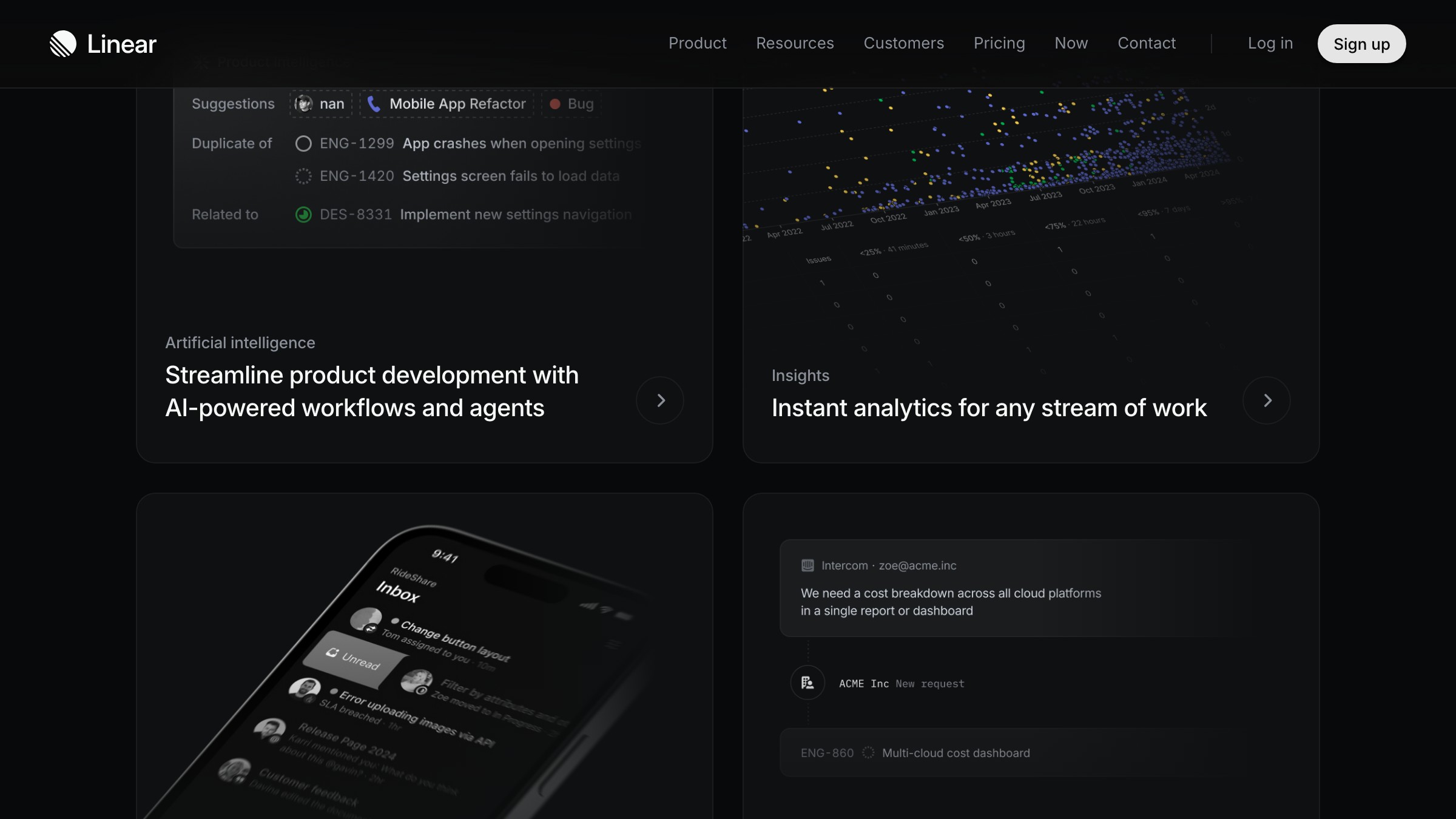
Linear's features page is the cleanest example. Each feature block is its own bento, some cells are product screenshots that reorder on hover, and the whole page reads like a spec sheet with depth, not a moodboard.
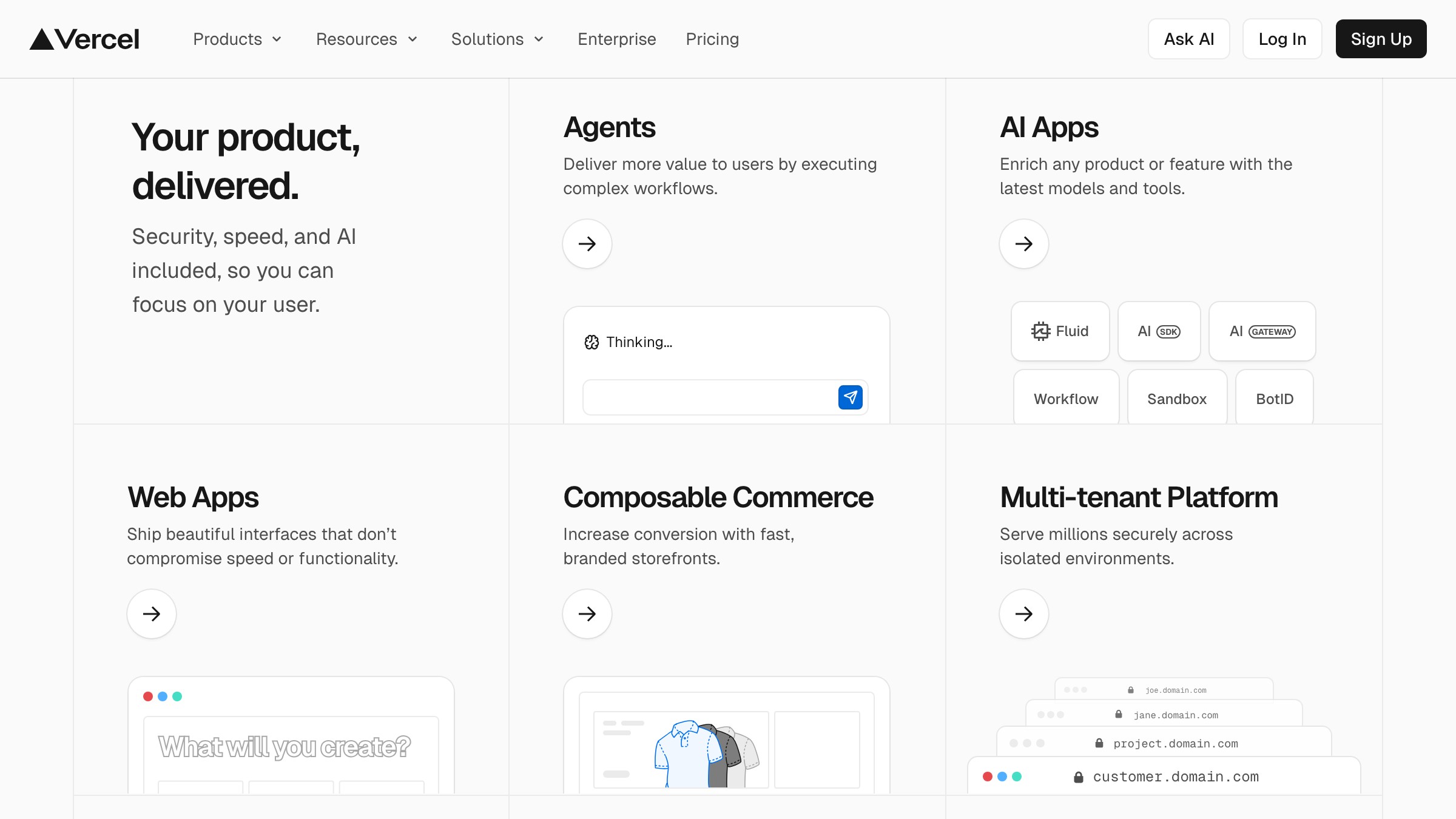
Vercel pushed the pattern further. Mixed media cells (illustrations, product shots, pure text) are unified by a shared background and radius rhythm rather than forced into one medium. That shared rhythm is doing more work than any single cell.
The takeaway: in 2026, bento stops being a layout you pick from a library and becomes a compositional discipline you practice. Hierarchy is the product. Cells are the vocabulary.
Micro-interactions stop being decoration
Micro-interactions in 2026 are no longer polish. They are attention control.
Hover states, scroll-linked animations, and cursor effects now carry real weight. They signal which cell a reader should land on, how close they are to the CTA, and whether an element is interactive. The good ones are almost invisible. The bad ones still make products feel like portfolios.
Three patterns worth stealing in 2026:
-
Magnetic cursors on primary CTAs. A subtle pull toward the button within 80 to 120 pixels, shipping on Framer and Arc, converts because it previews intent.
-
Scroll-linked metric reveals. Numbers that count up once they enter the viewport, used well on Stripe and Linear, used badly on every AI startup site.
-
Contextual hover previews. Hovering a feature name reveals a small live preview in the adjacent cell, the way Figma does in its navigation. A better tooltip.
The rule for 2026: if a micro-interaction does not help the reader decide, delete it. Motion that decorates without directing is noise.
Variable type becomes brand identity
For most of the last decade, typography on the web was "pick a font, pick a weight, done." In 2026, variable fonts have pushed type into the identity layer.
Variable fonts expose axes (weight, width, slant, optical size, plus custom axes) that can shift at runtime. Brands are using those axes to encode personality into type, not into a logo. The wordmark changes weight on scroll, the hero heading widens on load, the nav compresses on hover.
Arc, Vercel, and Linear all ship custom variable families with proprietary axes. Figma's 2026 rebrand added a "quirk" axis for micro-variations on headings. Type is no longer frozen. It behaves.

Three rules for using variable type well in 2026:
-
Pick one axis, not four. If everything moves, nothing means anything.
-
Tie the axis to a signal the reader can feel (scroll, hover, focus, load), not time alone.
-
Pair it with a brand color palette strong enough to hold its own without type doing the work.
If you are still shipping static headings in 2026, you are not wrong, you are just leaving identity bandwidth on the table.
Spatial and 3D UI finally earn their pixels
Every year since 2019, someone has predicted the year of 3D on the web. 2026 is not the year 3D takes over. It is the year 3D stops being a gimmick and becomes a product detail.
The shift is scope. In 2023, 3D meant a full hero scene that cost 6MB and 4 seconds of load time. In 2026, spatial UI shows up as small, targeted moments: a product that rotates subtly as you scroll past it, a chart that tilts on hover to reveal depth, a logo that has ambient parallax on focus.
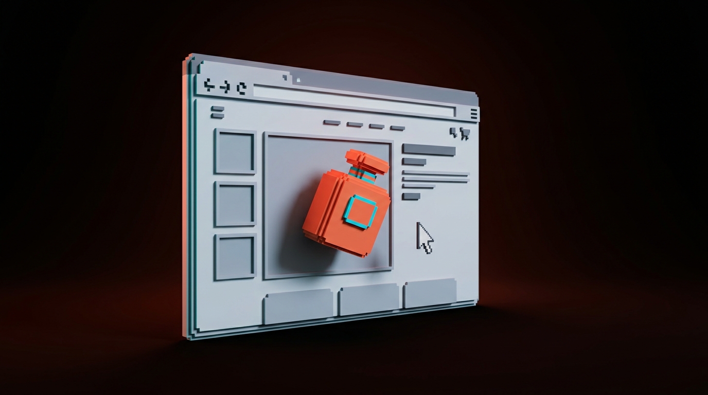
The tooling finally caught up. React Three Fiber, Spline, and native CSS transform-3d now make small spatial moments cheap. Apple's AirPods and iPhone product pages are the benchmark. 3D is used sparingly, just enough to let the reader turn the product over in their hands.
Use spatial UI when:
- The product benefits from being seen in the round (hardware, physical goods, devices)
- The interaction adds understanding, not just novelty
- The performance budget can absorb the weight
Skip spatial UI when:
- Your hero asset is a screenshot that can do its job flat
- Your audience is majority mobile on mid-tier devices
- You cannot ship a fallback that still looks intentional
Want this kind of work done right on a real project, not a showcase? Hire Brainy.
Performance becomes the new aesthetic
The fastest site is now the most premium-looking site. That is the 2026 reversal that most teams have not internalized.
For a decade, high-end design meant heavy: full-bleed video, loaded webfonts, bespoke cursor libraries, animated hero illustrations. In 2026, the highest-trust sites are lean. Linear loads in under 400ms. Vercel's marketing site is almost entirely static and streams the dynamic cells.
Readers now read load time as a quality signal. A 3-second hero animation used to say "premium brand." In 2026 it says "I was built on a theme." Speed is a design choice, not an engineering one.
| Old premium signal (2022-2024) | New premium signal (2026) |
|---|---|
| Full-bleed autoplay hero video | Instant static hero with a single subtle motion cue |
| Custom cursor and scroll libraries | Zero custom cursor, native scroll, deliberate hovers |
| Loaded webfont with three weights | One variable font, subset, self-hosted |
| Animated hero illustration | Static hero, micro-interaction on first scroll |
| Scrolljacked intro section | Instant content on paint, motion earned per cell |
Practical rule: if the page would still feel premium with motion off, the design is working. If it only feels premium because of motion, it is decoration.
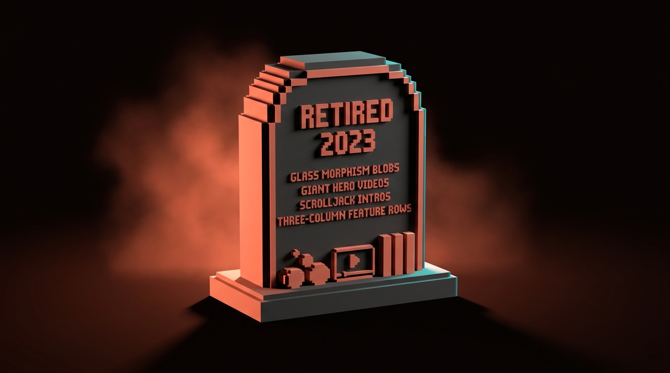
What you should stop building in 2026
Some 2023 patterns are now dead weight. Ship them and your site dates itself on arrival.
The 2026 kill list:
-
Glassmorphism blobs. The frosted-glass gradient card is now shorthand for "AI startup that shipped a template."
-
Full-bleed autoplay hero videos. Too heavy, too distracting, and they convert worse than a static hero for almost every product.
-
Scrolljacked intro sequences. Hijacking scroll to force a narrative was never great, and in 2026 it reads as hostile.
-
Three-column feature rows with equal weight. Replace with a bento grid or a prioritized feature stack.
-
Marquee logo strips with no hierarchy. A wall of client logos does not build trust, one named case study does more than ten logos.
-
Dark mode as a toggle instead of a system. If your dark mode is just inverted light mode, it is not dark mode.
-
Hero sections with five CTAs. One primary, maybe one secondary, everything else is navigation.
If your current site uses three or more of these, you are not following 2026 trends, you are defending 2023 choices.
FAQ
What is the biggest web design trend for 2026?
AI-native layouts. Pages that compose themselves per visitor based on intent, referrer, and behavior are the defining shift of 2026, and the only trend on this list that fundamentally changes how pages are built, not just how they look.
Is bento grid design still relevant in 2026?
Yes, and it is stronger than ever. Bento has evolved from a single layout pattern into a compositional discipline with nested cells, responsive rearrangements, and mixed media. If anything, 2026 is when bento stops being a trend and starts being a baseline.
Are scroll animations still a good idea in 2026?
Only if they direct attention. Scroll-linked reveals, metric counters, and cell entrances that help the reader land on the right content are good. Scrolljacking and purely decorative motion are out. The 2026 test is "does this help the reader decide?"
What web design trends are dying in 2026?
Glassmorphism blobs, full-bleed autoplay hero videos, scrolljacked intros, equal-weight three-column feature rows, marquee logo strips, hero sections with five CTAs, and dark mode implemented as a simple color toggle. All of these signal a site built on 2022 or 2023 templates.
Do I need to use AI to keep up with 2026 design trends?
No. You need to design systems that could be composed by AI, even if you are still composing them yourself. The patterns (modular cells, structured content, variable type, tight performance budgets) matter regardless of whether a model is assembling them. Also worth reading: Claude Code for designers.
The pattern behind every trend that sticks
Scroll back through the 2026 list. The trends that will last are not styles. They are system upgrades.
Every trend on this list maps to a system:
- AI-native layouts are composition systems
- Bento evolutions are hierarchy systems
- Micro-interactions are attention systems
- Variable type is an identity system
- Spatial UI is a depth system
- Performance is a restraint system
Every durable 2026 trend makes the underlying structure of a website more expressive. None of them bolt new decoration on top.
If you want a site built on those rules and not on someone's 2022 template, hire Brainy. We ship web design, product UI, and landing pages that work against 2026 patterns, not last year's.
Want a site built against 2026 patterns and not 2022 templates? Brainy ships web design and product UI.
Get StartedNot ready to hire? Run the free Business Genome, an 11-dimension diagnostic for your venture.
Get your free GenomeGet new papers by email
New Brainy papers in your inbox. Confirm once, unsubscribe anytime.