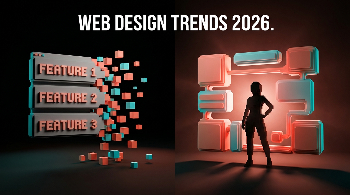
Bento Grid Design: A 2026 Guide to Layouts, Spacing, and When Not to Use Them
A definitive guide to bento grid design in 2026. Anatomy, sizing logic, spacing rules, responsive behavior, real teardowns of Apple, Linear, Vercel, Stripe, Arc, Apple Vision Pro, and Figma, and the cases where bento layouts hurt comprehension.

A bento grid is a section composed of cells of different sizes, each holding one self-contained piece of content, arranged so the cell sizes themselves rank what matters. The cell becomes the unit of meaning, and the eye reads importance from size before it reads a word.
Most bento grids on the web in 2026 are decorative. Cells are the same size, content was retrofitted to fit them, and the layout reads as a card wall. The good ones are the opposite. Cell sizes were earned by the content inside, gutters and padding hold the rhythm, and the responsive collapse stays legible down to mobile. This guide is anatomy, sizing logic, spacing, content-fit, responsive, seven teardowns (Apple, Linear, Vercel, Stripe, Arc, Apple Vision Pro, Figma), and the cases where bento hurts the page.
Bento grid design, the working definition
A bento grid is a deliberate composition where each cell holds one self-contained piece of content and the size of the cell is earned from what is inside it.
Three properties separate it from a card grid. Cells are sized in deliberate ratios. Cells hold different content types, not the same template repeated. The layout reads as a single composition. Strip any of the three and you have a card wall.
The pattern got popular because it solved a real problem. The feature row, three or four columns of identical icon-headline-paragraph cards, had become the lowest-rent layout on the web by 2023. Bento gave designers a way to present multiple features without the section itself screaming template.
The anatomy of a bento grid
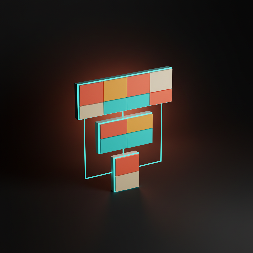
Every bento layout is built from four parts: the anchor cell, the supporting cells, the gutter, and the surrounding margin. Get any one wrong and the grid collapses.
The anchor cell is the largest, usually placed left or upper-left, carrying the strongest content. It lands first and frames the rest. A bento without a clear anchor reads as a flat card row. The supporting cells fill out the composition with secondary content and defer to the anchor on first read. The gutter is structural, telling the eye these are separate cells of one composition. The surrounding margin is the bounding box that lets the section read as a discrete unit.
The anchor sets the rank. The supporting cells fill in detail. The gutter rhythm separates units without breaking the composition. The surrounding margin frames the whole.
Cell sizing is content-driven, not decoration
The biggest mistake teams make is sizing cells to fill the canvas instead of sizing cells to fit what they hold.
A cell holding a single number with a one-line caption does not need to be the same size as one holding a screenshot and three sentences. Force them equal and one looks empty while the other looks cramped. The grid is decorating, not communicating.
Invert the order. Decide what content belongs in the section, pick the anchor, pick the secondary pieces, then size each cell so content fits with the right breathing room and no more. Each cell should hold roughly twenty to thirty percent inner whitespace. Less and it feels stuffed. More and it looks empty.

The cleanest grids use ratios. The anchor is roughly twice the area of the largest supporting cell. That ratio mirrors the visual hierarchy the rest of the page uses, compressed into the section.
The anchor cell carries the read
Every bento has one anchor, and most weak grids do not commit to one. The anchor wins on size by a clear margin, ideally twice the area of the next cell, and it wins on content density. The anchor is where the strongest copy, most important visual, or highest-stakes interaction lives. If the anchor is a generic illustration while a supporting cell holds the actual headline, the read path is broken.
Apple's Mac product page anchors with a tight product photograph and a bold headline. Linear does the inverse on the features page, a text-heavy anchor with a tight headline and a UI fragment, supporting cells sparser. Same principle, different content shape.
The bug: two anchors. Designers split into a left panel and a right panel of equal area and call it bento. That is a two-column hero. The moment the section has two equal claims for first read, the bento stops working.
Spacing rules that keep the grid from collapsing
Bento grids fail in spacing more often than in sizing, because the gutter and the inner padding are two different jobs and most teams treat them as one.
The gutter tells the eye where one cell ends and the next begins. Too tight, one block. Too generous, disconnected. Use a gutter of roughly half the inner padding. The inner padding tells the eye how much room content has to breathe. The surrounding margin is the third dimension, vertical breathing room of at least 1.5x the gutter so the section reads as a discrete unit.
A common bug. Teams use the same value for all three. The grid loses rhythm. Differentiating the three, even slightly, restores it.
Content-fit rules, what actually belongs in a cell
A bento cell is only as good as the unit of content it holds. Most cells fail because content was forced into the cell instead of the cell being shaped around the content.
A bento cell is a one-idea container. One claim, one feature, one number, one screenshot, one testimonial. Good content: a single feature with a one-line headline and a UI preview, a single metric with caption, a single testimonial with attribution. Bad content: a long-form paragraph, a cross-column comparison, a multi-step process, a pricing table with aligned rows.
The decision rule. If the content inside the cell could be lifted out and dropped into a paragraph anywhere else without losing meaning, the cell is doing its job. If it needs surrounding context, the bento is fragmenting it.
Responsive behavior, the real test
A bento that looks great at 1440 and breaks at 768 is a desktop poster, not a layout, and the responsive collapse is where most production grids quietly die.
The challenge is that cells are not uniform. A feature row collapses cleanly. A bento has to decide what to do with cells of different widths and heights. Get the rules wrong and mobile reads as a pile of mismatched boxes.
The playbook. Define desktop first. At tablet (768 to 1024), collapse into two columns with the anchor spanning both. At mobile (below 768), single column, every cell full-width and stacked, anchor first, supporting cells in priority order. Adjust inner padding and gutter at each breakpoint so cells feel proportional, not just shrunk.
The bug to avoid: cells with content that does not survive a width change. A horizontal infographic in a desktop cell becomes unreadable in a mobile column. Plan content for both shapes, not just one.
Seven real product pages, annotated
The framework only matters if it survives contact with shipped pages. Seven bento implementations in production right now. None are perfect. All are above the SaaS landing page baseline.
Apple, bento as product theater
Apple's product pages use bento as scroll-driven theater. Anchor cells are enormous, often a single product photograph at near-full viewport scale, ratios three or four times the supporting cells. Generous spacing. Every cell holds one feature, never two. The visitor leaves having read the page in the order Apple wanted. The miss: motion-heavy reveals can degrade on slow connections and flatten the rank.
Linear, bento as developer density
Linear ships one of the densest bento grids on the web and keeps it readable through ruthless typography and an anchor that always wins. Anchor on the left at twice the area of the largest supporting cell, two columns of three smaller cells on the right, tight gutters, wider inner padding. Every cell holds one feature with a tight headline and UI fragment. The type system carries the rank. Weaker typography would collapse the pattern.
Vercel, bento as motion choreography
Vercel uses bento as a stage for motion. Each cell rewards scroll with a small reveal, and the grid tells a build-and-ship story. A clear anchor at 1.5x with four to six supporting cells. Together they build a narrative about the developer workflow. The miss: motion can hit users with reduced-motion preferences harder than necessary.
Stripe, bento as restraint
Stripe's bento sections are the quietest on the list, which is exactly why they work for an audience that distrusts loud design. Anchor plus two or three supporting cells. Ratios clear but not dramatic. Editorial spacing. Each cell holds one claim with a tight code sample or a single illustration. The pattern reads as confidence without decoration.
Want a bento that compresses the page instead of decorating it? Hire Brainy. UXBrainy ships landing page design with bento layouts engineered cell by cell. AppBrainy ships product UI with the same discipline.
Arc, bento as personality
Arc uses bento as a vehicle for brand personality. Cells change shape, color, and motion to express the product's playfulness. Rounded corners, gradients, varied heights, loose ratios. Arc bends the rules and works because the brand has bought permission through positioning, the same instinct behind good brutalist web design, permission earned, not borrowed.
Apple Vision Pro, bento as spatial preview
Vision Pro is the most ambitious bento on the web because it has to suggest a three-dimensional product through two-dimensional cells. Anchor cells use video to imply spatial depth. Dramatic ratios, cinematic spacing. The video content does the spatial work and the cell sizing frames each moment. It is the strongest argument that the right content can elevate the layout beyond what the cell shape alone can do.
Figma, bento as feature density
Figma handles more parallel features than any peer and survives the density because the type system and the cell rhythm carry the load. Six or seven cells per section, a clear anchor, compressed ratios, tight gutters, generous inner padding. Every cell holds one feature with a UI fragment and a tight caption. Figma's typography system is strong enough to hold rank across many small cells. A weaker type system would lose the rank as the cell count climbs.
When not to use a bento grid
Bento is the wrong layout for any content that needs to be read in order, compared in detail, or scanned for a single decision. Most pages reach for it without checking.
Cases where bento sabotages the page:
- Long-form editorial. Bento fragments the read path.
- Comparison content. Pricing tables, feature comparisons, before-and-after lists. Cells are not aligned for cross-cell reading.
- Step-by-step processes. A how-to needs a clear order. Bento cells imply parallel ideas, not steps.
- Single-decision pages. If the page exists to push the visitor toward one CTA, bento splits focus across cells.
- Content-light pages. With only one or two ideas, a single hero panel is more honest than a bento with empty supporting cells.
Bento is for parallel ideas of similar register that the visitor can scan in any order. Skip it for sequence, comparison, decision, or single-claim pages.
A bento fit checklist before you ship
Run this before you commit a layout to bento:
- Anchor commit. One cell clearly the largest by at least 1.5x the next?
- Cell content-fit. Can every cell stand alone as a one-idea container?
- Sequential dependency. Does the visitor need to read cells in order? If yes, bento is wrong.
- Cross-cell comparison. Do cells need to be compared row-by-row? If yes, use a table.
- Inner padding ratio. Is inner padding roughly twice the gutter?
- Surrounding margin. At least 1.5x the gutter as breathing room above and below?
- Responsive plan. Does each cell have a planned shape at desktop, tablet, mobile?
- Anchor on mobile. Does the anchor stay anchor (first cell, full-width)?
- Content density. Roughly twenty to thirty percent inner whitespace per cell?
- Section count. More than three bento sections on the page? The page is becoming a bento gallery.
A page that passes those ten checks has a bento section that earns its layout.
FAQ
What is a bento grid in web design?
A bento grid is a section composed of cells of different sizes, each holding one self-contained piece of content, with cell sizes ranking what matters. The name comes from the Japanese bento box, which compartmentalizes different foods of different sizes into one tray. It is used most often for product feature sections, capability summaries, and testimonial walls.
When should you use a bento grid?
Use one when you have several parallel ideas of similar register that the visitor can scan in any order. It works for product features, capability summaries, and testimonial walls. Skip it for sequential reading, cross-cell comparison, step-by-step processes, and pages with only one or two ideas.
How do you size cells in a bento grid?
Size from the content inward. Pick the anchor, pick the secondary pieces, then size each cell so content fits with roughly twenty to thirty percent inner whitespace. The anchor should be at least twice the area of the largest supporting cell.
What is the right gutter spacing for a bento grid?
Use a gutter of roughly half the inner padding. If cells have 32 pixels of padding, use 16 pixels of gutter. The proportion matters more than the absolute value.
How does a bento grid behave on mobile?
It collapses to two columns at tablet and a single column at mobile, anchor first, supporting cells reordered in priority. Inner padding and gutter values scale at each breakpoint so cells feel proportional. Cells with content that cannot survive a width change should be redesigned for the mobile shape.
What is the difference between a bento grid and a card grid?
A card grid is uniform, every card the same size and content type. A bento is a deliberate composition where cells are sized in different ratios and hold different content types. Bento implies hierarchy through size, a card grid implies parallelism through uniformity.
The pattern behind bento grids that hold up
A bento grid that survives 2026 is not a grid full of clever cells. It is a grid where every cell is a deliberate compression of one idea.
The brands that hold up, Apple, Linear, Stripe, Figma, share one discipline. Cells are small only when content earns small. Cells are large only when content earns large. The gutter is consistent, the inner padding is consistent, the responsive collapse is planned. Nothing is accidental, because the bento pattern punishes accidents harder than any other layout on the web.
The brands that age badly treated the pattern as a visual style. They picked cell shapes first, then asked what content might fit. Cells end up holding content they were not built for and the responsive collapse fragments on mobile. Those grids get quietly redesigned section by section over the next year.
The discipline is to start from content. Decide what the section needs to communicate, pick the anchor, pick the parallels, then size cells around those decisions. Treat it as one of your core web design principles, the same way you treat hierarchy and type, and the bento sections you ship will still look right next year.
If you want a bento that compresses the page instead of decorating it, hire Brainy. UXBrainy ships marketing sites and landing pages with bento layouts engineered cell by cell. AppBrainy ships product UI with the same discipline.
Want a bento section that compresses the page instead of decorating it? Brainy ships landing pages, web design, and product UI through UXBrainy and AppBrainy, with bento layouts engineered cell by cell.
Get StartedNot ready to hire? Run the free Business Genome, an 11-dimension diagnostic for your venture.
Get your free GenomeGet new papers by email
New Brainy papers in your inbox. Confirm once, unsubscribe anytime.