Visual Hierarchy in Web Design: A Practical Framework With Examples
A working framework for visual hierarchy in web design. Five levers, six real landing pages from Linear, Vercel, Stripe, Figma, Arc, and Apple, and a Figma audit checklist you can run in twenty minutes.
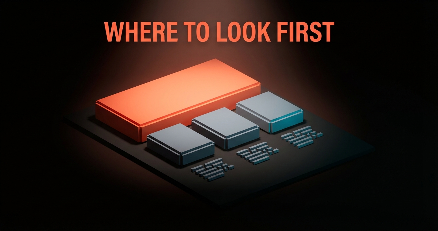
Visual hierarchy in web design is the deliberate sequencing of attention on a page. You decide what gets read first, what gets read second, what gets read only if the visitor stays. The page either leads the eye through that sequence on purpose, or it leaks attention to whichever element happens to be loudest, and the business loses the read it needed.
Five levers build hierarchy. Size, weight, space, contrast, and motion. Every other technique is a combination of those five. Most pages get two right and three wrong, which is why most pages feel busy without being read. The fix is not more design. The fix is ranking the levers against the read path the business actually needs, then pulling each lever in service of that read.
This piece is the operational version of that fix. The five levers, six real landing pages from Linear, Vercel, Stripe, Figma, Arc, and Apple with the hierarchy moves they are making right now, three before/after critiques showing common bugs and the actual fix, and a Figma audit checklist you can run on any working file in twenty minutes before you ship it to dev.
Visual hierarchy, the working definition
Visual hierarchy is the order in which a viewer reads a page. Not the order the elements appear in the DOM, not the order they live on the design grid, the order the eye actually picks them up.
Strong hierarchy means the eye lands on the primary message first, the secondary message second, and the supporting content last, in that exact order, every time. Weak hierarchy means the eye wanders, pinballs between competing elements, lands on a footer link before the headline, and the visitor leaves without the page having done its job.
The job changes by page. A homepage hero needs the eye to land on a value prop, then a CTA. A pricing page needs the eye to land on the recommended tier, then the cheaper tier, then the FAQ. A blog post needs the eye to land on the headline, then the dek, then the first paragraph. The hierarchy lever settings change with the job. The fact that there is a hierarchy does not.
This is also where most articles on the topic stop. They define hierarchy and walk away. The actual work is not defining it, the actual work is choosing which lever does what on a specific page.
The five levers that build hierarchy
Size, weight, space, contrast, and motion are the only tools you need. Everything else is a combination of these five.
Size is the relative scale of an element compared to everything around it. Weight is how heavy the element looks, controlled by font weight, stroke width, fill density, or visual mass. Space is how much room an element has around it, the negative shape that lets the element breathe and read as primary. Contrast is the difference in color, value, or saturation between an element and its background. Motion is whether and how the element animates into view or responds to interaction.
Every hierarchy decision is a setting on one or more of these five levers. The headline is bigger than the body copy, that is size. The CTA is in a heavy weight, that is weight. The hero has eighty percent whitespace, that is space. The CTA is bright orange against a dark background, that is contrast. The headline animates in slightly before the body copy, that is motion.

The mistake most pages make is pulling all five levers at once on every element. Everything is big, everything is bold, everything has space around it, everything has high contrast, everything moves. Hierarchy disappears the moment every element claims the same rank. The discipline is choosing which levers carry which element, and being willing to leave levers neutral.
A useful rule. Each element on a page should be ranking on at most two levers. The hero headline is large and high contrast. Done. The CTA is heavy weight and high contrast. Done. The supporting copy is neutral on every lever. Done. The page now has a sequence the eye can follow.
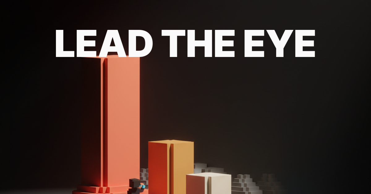
Size sets the first read
The largest element on the page is the first thing the eye finds, so the largest element must be the thing the business most wants read first.
Most teams know this in theory and ignore it in practice. They make the logo the largest element because the brand team asked for it. They make the navigation the largest element because the nav has the most links and needs to fit them. They make the hero image the largest element because the photographer charged a lot for it. None of those decisions reflect what the visitor needs to read first.
The fix is not subtle. The headline of the hero, or the value prop, or the primary CTA, depending on the page, is the largest element by a clear margin. Not slightly larger. Visibly larger. Large enough that no other element on the first viewport competes for first read.
Linear does this on the features page. The headline is enormous, the supporting copy is small, the navigation is small, the logo is small. There is one piece of content claiming the first read, and the eye lands on it before the page has finished loading. Compare that to a typical SaaS homepage where the headline, the navigation, and a hero illustration are all roughly the same size. The eye splits, the read path breaks.
Size is also relative. A 48-pixel headline on a page where the body copy is 16 pixels is dramatic. A 48-pixel headline on a page where the body copy is 28 pixels is not. The ratio is what creates rank, not the absolute number. Aim for a primary-to-body ratio of at least 2.5x, and ideally 3x or higher, on the hero element of any landing page.
Weight separates primary from secondary
Weight is the second filter, and it is where most pages quietly fall apart by treating bold as decoration instead of a ranking system.
Bold is a hierarchy tool. It tells the eye, this element ranks higher than the regular-weight elements next to it. The moment a page has bold copy in three different paragraphs, all of which are roughly equal in importance, the rank signal collapses. Bold becomes texture, not ranking. The eye stops trusting it.
Use weight as a strict ranking system. Heaviest weight on the most important element on the page. Slightly lighter weight on the secondary element. Regular weight on supporting copy. No bold inside body copy unless the bolded phrase is genuinely more important than the surrounding sentence, which is rare.
Stripe does this with discipline. Look at any Stripe landing page. The hero headline is heavy. The supporting copy is regular. There is almost no bold inside body paragraphs. The page reads in the order Stripe wants, and the weight lever does most of the work without ever feeling loud.
Weight extends beyond typography. The CTA button has a heavier visual weight than the surrounding elements, achieved through fill color, border thickness, or drop shadow. A featured pricing tier has a heavier visual weight than the surrounding tiers, achieved through a darker card background or a thicker border. The principle is the same. Heavier mass equals higher rank.
A common bug. Designers reach for bold inside paragraphs to "highlight" key phrases. Most of those highlights are not actually higher rank, they are nervous emphasis. Strip them out and the body copy reads cleaner, and the genuinely important bolded phrases regain their rank.
Space is the underused lever
Whitespace is not empty, it is the negative shape that gives every other element its rank.
Space ranks elements by isolation. The element with the most empty room around it reads as the most important, regardless of size or weight. A small headline in the center of a mostly empty viewport reads as primary. A large headline crammed next to a navigation, a logo, and a hero illustration reads as one of four competing elements.
Apple's product pages are the master class. The hero on an iPhone product page is often a single photograph with a short caption underneath, surrounded by a viewport of negative space. The element that gets the most space wins the read, and Apple wins it every time on every page. The product is the primary, everything else is supporting, and the space lever does most of the work.
Most pages refuse to leave space empty. There is always one more testimonial logo to fit, one more feature to mention, one more secondary CTA to place. Each addition costs hierarchy. The element that was claiming the read by isolation now competes with the new addition, and the rank signal weakens.
The discipline is the willingness to leave the viewport mostly empty. The hero of a landing page should have at least sixty percent empty space, ideally seventy percent or more, with the primary message claiming a clear visual island in the center or left of that emptiness. If the hero feels uncomfortable with that much space, the team has not yet trusted the lever.
Space also operates inside elements. The line height of body copy, the spacing between sections, the padding inside cards, the gap between a headline and its supporting copy. Each of these is a space lever, and each of them ranks the element relative to its surroundings. Tight line height with loose section padding tells the eye, this paragraph is one unit, the next section is a different unit. Loose line height with tight section padding tells the eye, everything is one continuous wall of text, good luck finding the rank.
Contrast forces the eye to commit
Contrast is what turns a page that the user can read into a page they cannot stop reading.
Contrast operates on three axes. Value contrast is the difference in lightness between an element and its background, the lever that drives accessible color contrast and the one that most directly controls legibility. Color contrast is the difference in hue between an element and its surroundings, the lever that makes a CTA pop against the rest of the page. Saturation contrast is the difference between vivid and muted colors, the lever that ranks a single accent against a desaturated palette.
Stripe's primary CTA is a single high-saturation color against a low-saturation page. The eye finds it instantly because it is the only saturated element in the entire viewport. Linear does the same with a single bright violet button against a near-monochrome page. Neither of those CTAs is the largest element. Neither is the heaviest. They win the eye because they are the highest-contrast element on the page, full stop.
A common bug. Pages with five or six saturated colors competing for attention. A green CTA, a red error state, a blue link color, an orange highlight, a pink accent on the hero illustration. Each color wants the eye, and the eye gives up trying to rank them. Pick one accent color, use it for one job (usually the primary CTA), and desaturate everything else.
Contrast also has a minimum threshold. Body copy that is gray on a slightly darker gray background fails the eye and fails accessibility. Aim for at least 7:1 contrast ratio on body copy and 4.5:1 on UI elements. Below those thresholds, the contrast lever stops creating rank and starts creating fatigue.

Motion finishes the sequence
Motion is the last lever, and the most often misused, because most teams treat it as decoration when it is actually a directional cue.
The eye is wired to follow movement. Anything that animates is briefly the highest-ranked element on the page, regardless of size, weight, space, or contrast. That is a lot of power for a lever, which is why motion is the easiest one to get wrong. A page where every element fades in, slides up, and pulses on hover is a page where motion is constant, which means motion has stopped ranking anything.
Use motion sparingly and on the highest-priority element only. The hero headline animates in. The CTA has a hover state. The supporting copy is static. The eye lands on the headline first because it is the element that moved, then on the CTA when the cursor approaches, and the read path is preserved.
Vercel's homepage uses motion as a primary hierarchy lever. The hero animates with a deliberate sequence, headline first, supporting copy second, CTA third, and the rest of the page is mostly static until the user scrolls. The motion is the sequence. By the time the visitor finishes the hero animation, they have read the page in the order Vercel wanted them to read it.
A useful constraint. Limit motion to one element per viewport, plus interaction states (hover, focus, active) on a single primary CTA. If more than one element is animating at the same time, the motion lever is not ranking, it is decorating, and the page will feel restless without leading the eye anywhere specific. Motion as ranking also pairs naturally with motion design principles thinking, where every animation answers a question rather than fills time.
Six real landing pages, annotated
The framework only matters if it survives contact with shipped pages, so here are six in production right now.
Each teardown is short and concrete. What the page is doing on each lever, where it wins, and where it leaves money on the table. None of these are perfect. All of them are above the SaaS landing page baseline, which is what makes them worth studying.
Linear, hierarchy as compression
Linear ships one of the cleanest hierarchies on the web because every lever is doing exactly one job.
Size: hero headline at roughly 4x body copy. Weight: a single heavy weight on the headline, regular everywhere else. Space: a hero with seventy percent negative space, no competing illustrations. Contrast: a single bright violet CTA against a near-monochrome page. Motion: a quiet fade-in on the hero, nothing animated below the fold.
The eye lands on the headline, sees the supporting copy, finds the CTA, and reads the rest of the page only if the visitor stays. Every lever is calibrated. Every choice is in service of one read path.
Where Linear leaves money. The features grid below the hero gets denser than the hero, and the rank signal weakens slightly when the eye drops past the fold. Tightening the size ratio in that grid would extend the hero's hierarchy further down the page.
Vercel, hierarchy as motion
Vercel uses motion as its primary hierarchy lever, and it works because the other four are deliberately quiet.
Size: hero headline is large but not enormous. Weight: regular weight, not heavy. Space: generous, not extreme. Contrast: low, mostly grayscale until the CTA. Motion: dominant. The hero animates in a deliberate sequence that builds the read order through movement, and the rest of the page rewards scroll with reveal animations on the bento grid below.
The bet works because the other levers are restrained enough to let motion do the work. If the hero were also large, heavy, and high-contrast, the motion would feel manic. Because the static state is calm, the motion reads as choreography, not chaos.
Where Vercel leaves money. The animation timings on first load can hit users with reduced-motion preferences harder than they need to. A more aggressive prefers-reduced-motion fallback would protect the hierarchy for that audience without losing the choreography for everyone else.
Stripe, hierarchy as restraint
Stripe's hierarchy is mostly invisible, which is the highest form of the craft.
Size: ratios are clear but not dramatic. Weight: a single heavy weight on the headline, regular everywhere else. Space: generous. Contrast: low across the page, with one high-saturation primary CTA color. Motion: almost none, beyond a quiet hover state on the CTA.
Stripe's discipline is the discipline of the restrained. They could pull more on every lever and they choose not to. The result is a page that reads in the order Stripe wants without ever feeling designed-at. The hierarchy is felt, not seen.
Where Stripe leaves money. Some product pages crowd the hero with simultaneous code samples, illustration, and supporting copy, which weakens the size lever's first read. Returning the hero to a single headline plus CTA and pushing the code sample to the second viewport would restore the rank.
Figma, hierarchy as density
Figma packs more into a hero than almost any peer and still keeps the read path clear.
Size: large headline against a smaller dek, with product UI elements scaled smaller still. Weight: heavy headline, regular dek, light UI overlays. Space: less than Linear or Stripe, more than most SaaS peers. Contrast: high on the headline against the dark background, lower on the surrounding elements. Motion: subtle on the product preview, nothing on the headline itself.
Figma's hero works because the size and weight ratios are aggressive enough to win the read even with more content competing for the viewport. A weaker pair of levers on those two would lose the headline. Because the ratios hold, the page tolerates more density than usual without breaking hierarchy.
Where Figma leaves money. The navigation gets visually busy with multiple primary nav items, secondary nav, a contact button, and a sign-in button. Compressing that to a single primary CTA in the nav would lower the competing rank against the hero.
Arc, hierarchy as rebellion
Arc deliberately breaks size and weight conventions, and the hierarchy still works because contrast and motion carry the load.
Size: not dramatic. Weight: not heavy. Space: variable, sometimes tight. Contrast: high across the page, with multiple saturated colors. Motion: heavy, with parallax, scroll-triggered reveals, and animated illustrations.
Arc's hero is a counterexample to the standard playbook. The headline is not the largest element, it is not the heaviest, and the eye does not necessarily land on it first. The page works because Arc is a known-unknown, the visitor arrives curious, and motion plus contrast pull the eye through a sequence that does not need traditional hierarchy to function.
This is the exception that proves the framework. Arc can break the rules because the brand has bought permission for it through positioning, audience expectation, and the willingness of visitors to scroll and explore. Most brands have not bought that permission and should not assume they have.
Where Arc leaves money. The motion-heavy hero can confuse first-time visitors who do not know what Arc is. A clearer first-read element above the motion would help newcomers without alienating the audience that already trusts the brand.
Apple, hierarchy as theater
Apple's product pages are the master class in scroll-driven hierarchy, where space and motion run the show.
Size: huge product images, almost-billboard-scale typography on key claims, small everywhere else. Weight: light, mostly. Space: enormous, often eighty percent or more of any viewport. Contrast: deliberate, often a hero photograph against a near-black background. Motion: scroll-triggered, with each section earning its reveal as the visitor moves down the page.
Apple treats the entire scroll as the hierarchy. Each section claims one read and only one read. The visitor moves through a sequence the page is choreographing in advance. By the time the page ends, Apple has told a single story in the order Apple wanted to tell it.
Where Apple leaves money. The product pages can be slow on lower-end devices, and the motion choreography degrades on slow connections, which can flatten the hierarchy for visitors who never see the reveals. A more aggressive low-bandwidth fallback would protect the read path for the long tail.
Want a site where every page has a deliberate read path and not a guess? Hire Brainy. UXBrainy ships hierarchy audits and full design system work, AppBrainy ships product UI for teams that want the same discipline applied to a working app.
Three before and after critiques
Knowing the levers is one thing, fixing a real page is another, so here are three common hierarchy bugs and the exact fix.
First. The hero with five competing elements. A common SaaS hero has a headline, a dek, a primary CTA, a secondary CTA, a customer logo strip, and a hero illustration, all on the first viewport. Every element claims the eye, none of them win. Fix: pick the one element that matters most (usually the headline plus primary CTA), claim the first viewport with just those two, push everything else below the fold. The hero now has a clear first read.
Second. The page that bolds everything. Bold copy in the headline, bold phrases in three paragraphs, bold subheadings, bold CTAs, bold testimonials. The weight lever has stopped ranking. Fix: strip every bold inside body paragraphs unless the bolded phrase is genuinely more important than the surrounding sentence. Restore bold to one heaviest element per section. The weight lever returns to a ranking system instead of a texture.
Third. The page with five accent colors. Green CTAs, red error states, blue links, orange highlights, pink hero illustrations. The contrast lever has stopped ranking and started fatiguing. Fix: pick one accent color for the primary CTA, desaturate everything else to grayscale or to muted versions of the brand color, accept that "looks colorful" is not the same as "ranks well". The page now ranks the CTA cleanly and the brand reads as more confident.
Each fix is not a redesign. Each fix is the removal of competing elements until the levers can do their job. Most hierarchy problems are subtraction problems disguised as design problems.
The twenty-minute Figma audit checklist
Run this checklist on any working file before handoff and you will catch the hierarchy bugs that ship to production.
- Squint test. Squint at the artboard until the details blur. Does one element clearly win the read? If not, the hero has a size or weight problem.
- First-read test. Cover the page, reveal it for one second, cover it again. What did you read? If it was not the primary message, fix the size and contrast on that element.
- Type-scale ratio. Measure the primary headline against the body copy. If the ratio is less than 2.5x, the size lever is underpulled.
- Weight inventory. Count the bolded elements on the page. If there are more than three per viewport, weight is decorating, not ranking.
- Saturation count. Count the saturated accent colors on the page. If there are more than two, contrast is fatiguing, not ranking.
- Whitespace ratio. Estimate the empty space in the hero viewport. If it is less than sixty percent, the space lever is underpulled.
- Motion inventory. Count the elements that animate on first load. If there are more than two, motion has stopped ranking.
- CTA contrast. Check the primary CTA's color against its background. If the contrast ratio is below 4.5:1, fix it before shipping.
- Body copy contrast. Check body copy against its background. If the ratio is below 7:1, the page is fighting legibility.
- Line-height. Check body copy line height. If it is less than 1.5x font size, the page reads as a wall.
- Section padding. Check the spacing between major sections. If sections are blurring together, the space lever is not separating units.
- Mobile shrink test. Open the file at mobile width. Does the hierarchy survive, or does the headline shrink to the same size as the body copy? If the latter, the type scale needs a mobile adjustment.
A page that passes those twelve checks has functional hierarchy. It will not be perfect, but it will not be embarrassing either, and the read path the business needs will be visible to the visitor in the first second.
FAQ
What is visual hierarchy in web design?
Visual hierarchy in web design is the deliberate sequencing of attention on a page so the visitor reads the primary message first, the secondary message second, and supporting content last, in that exact order. It is built from five levers: size, weight, space, contrast, and motion. Strong hierarchy means the eye lands on the primary element by default. Weak hierarchy means the eye wanders between competing elements and the page fails to deliver its core message.
How do you create visual hierarchy on a website?
Pick the one element on each page that the business most wants read first, then pull two of the five levers (size, weight, space, contrast, motion) hard on that element while keeping the other levers neutral. Repeat for the secondary element with a slightly weaker lever pull. Leave supporting content neutral on every lever. The result is a page where the read path is visible without effort, which is what good web design principles demand of every shipped landing page.
What are the most important visual hierarchy principles?
The five levers are size, weight, space, contrast, and motion. Size sets the first read by making the most important element the largest. Weight separates primary from secondary by reserving heavy weight for the highest-rank element. Space ranks by isolation, giving the most important element the most empty room. Contrast forces commit by being the highest-saturation or highest-value element on the page. Motion finishes the sequence by being the only animating element, used sparingly. All five must work in combination, not isolation.
Why does visual hierarchy matter on landing pages?
Landing pages have one job: deliver a single message and prompt a single action. Without hierarchy, the visitor's attention splits between competing elements, the message fragments, and the action does not happen. With hierarchy, the visitor reads the value prop, finds the CTA, and converts in the order the page intended. Every percent of conversion lift on a landing page is downstream of how clearly the page ranks its own elements, which is exactly what good landing page design principles are built to enforce.
What is the difference between visual hierarchy and information architecture?
Visual hierarchy is how the eye reads a single page or screen. Information architecture is how the content and navigation are organized across the whole site. Hierarchy is local to one viewport, IA is global to the experience. A site with good IA can still ship pages with bad hierarchy, and vice versa. Both matter, and both are separate disciplines that have to be designed deliberately.
The pattern most pages miss
A page with strong hierarchy is not a page with a lot of design choices, it is a page where every design choice serves one read path.
The mistake most teams make is treating hierarchy as a stylistic concern. They think strong hierarchy means more bold, more color, more animation, more visual interest. The opposite is closer to true. Strong hierarchy is usually subtractive. It is the willingness to leave the viewport mostly empty, to use weight on only one element per section, to restrict the accent palette to a single saturated color, to limit motion to one element per fold. The result is a page that reads in a deliberate order without ever feeling designed-at.
The brands that ship strong hierarchy (Linear, Stripe, Apple) have all internalized this. The brands that ship weaker hierarchy have usually fallen into the additive trap, where every quarterly review brings a new element into the hero, a new bolded phrase into the body, a new accent color into the CTA, and the cumulative effect drowns the original read path. The fix is rarely a redesign. The fix is an audit, a removal pass, and a return to the discipline of pulling each lever for one purpose at a time.
If your team is shipping pages where the read path is unclear, where every element is fighting for attention, where the conversion numbers do not move no matter what you A/B test, the underlying problem is almost always a hierarchy problem. The levers are mispulled. The levers are competing. The levers are doing too much at once. Strip the page back to size, weight, space, contrast, and motion as five independent dials, set each one for the read path the business needs, and the page will start working again.
If you want a site where every page has a deliberate read path and a hierarchy that does its job on every viewport, hire Brainy. UXBrainy ships hierarchy audits, design systems, and full web design projects with hierarchy baked into the spec. AppBrainy ships product UI with the same discipline applied to logged-in product surfaces. The framework on this page is what we run inside every project, on every page, before anything ships.
Want a site where every page has a deliberate read path and not a guess? Brainy ships web design and product UI through UXBrainy and AppBrainy, with hierarchy audits baked into every project.
Get StartedNot ready to hire? Run the free Business Genome, an 11-dimension diagnostic for your venture.
Get your free GenomeGet new papers by email
New Brainy papers in your inbox. Confirm once, unsubscribe anytime.