Motion Design Principles: How Interfaces Should Actually Move in 2026
A working designer's guide to UI motion. The seven principles that separate purposeful motion from decoration, the duration table, and how to ship animations that survive a real product.
Motion is the most abused tool in modern interface design. Every team ships an animation reel, almost nobody ships a motion system. The result is product work that bounces, jiggles, and parallaxes its way into a user's way. Motion that should have been cut.
This paper is the working designer's version. Seven principles that decide whether a piece of motion earns its place, a duration and easing reference that ends the argument, and a short list of patterns that hold up under real user testing. No Dribbble loops, no brand films, just product motion that respects the user's time.
What motion design actually is
Motion design is the behavior layer of a product. It is how elements enter, leave, respond, and relate over time. Done well, motion tells the user where they are, where they came from, and where they can go, without a single extra word of copy.
Done badly, motion tells the user the designer had access to Framer. Decorative animation, endless springs, and hero videos that autoplay with sound are the same mistake in different costumes. Motion costs attention, bandwidth, and accessibility. It has to earn the invoice.
The visual hierarchy design piece covers how the eye reads a static page. Motion is the next layer. It tells the eye not just where to look, but when.
Motion has two jobs and only two
Every animation in a shipped product is doing one of two jobs. If it is not doing either, it is decoration, and decoration is the first thing to cut in a performance review.
Job one: communicate state change. A button that was idle is now pressed. A modal that did not exist is now open. A row that was empty now holds data. Motion makes the change legible by showing the transition instead of snapping to the new state.
Job two: guide the eye. A new element slides in from the right because the user tapped a forward button. A card shrinks toward the bottom nav because it was saved. Motion teaches the user the product's spatial model without making them read documentation.
Motion that is not communicating state or guiding the eye is costing the user attention for free. Cut it.
The seven principles of product motion
These are the levers. Pull them in combination and the motion reads as intentional. Pull none and the product feels stiff. Pull too many and the product feels like a toy.
Principle 1: Purpose before polish
Every animation answers one question: what would a user lose if this motion did not exist? If the answer is "nothing," the motion is decoration. If the answer is "they would not understand what happened," the motion is structural and it stays.
Designers who start with "let us add a little animation here" ship products that feel noisy. Designers who start with "what is the user missing if this snaps instantly" ship products that feel alive.
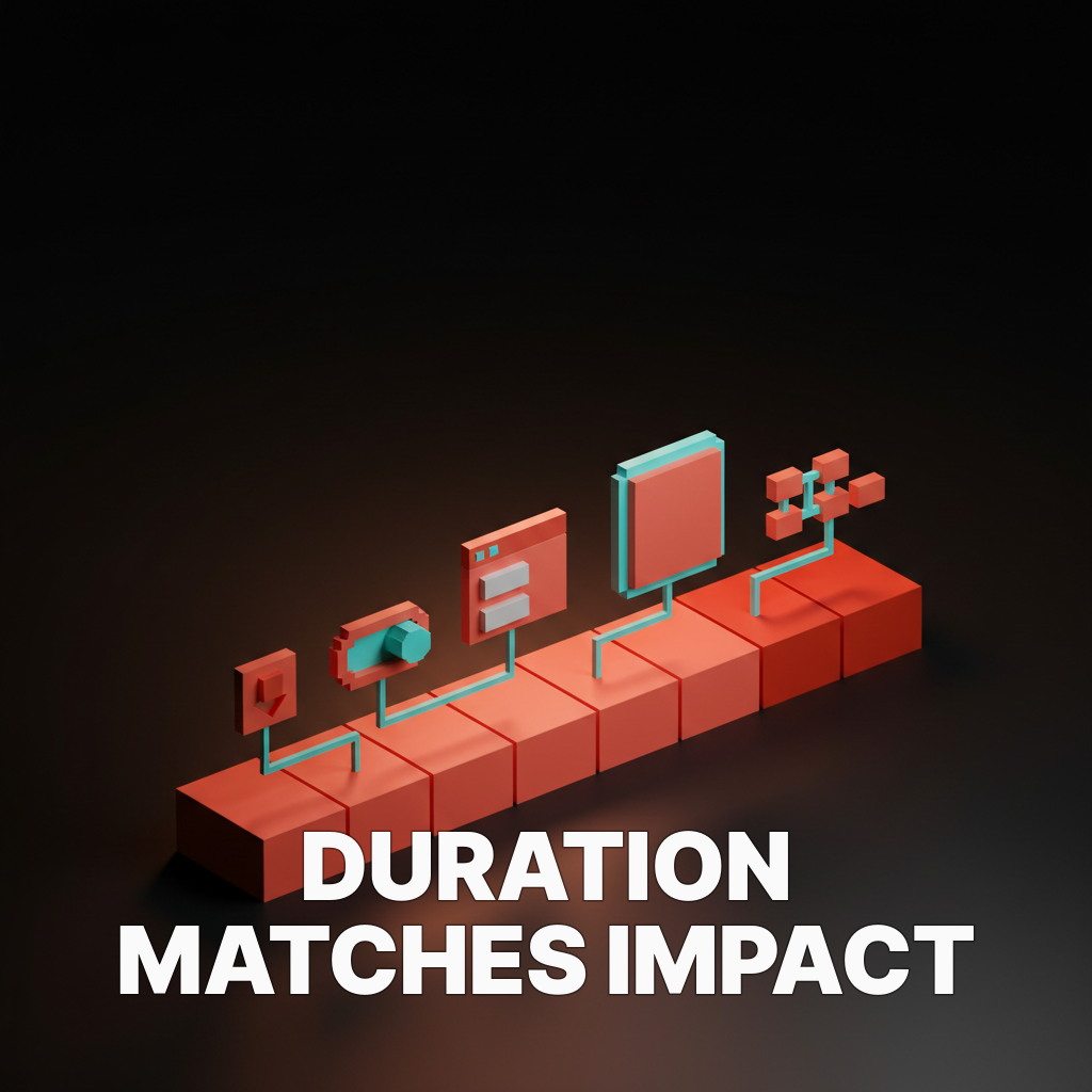
Principle 2: Duration matches impact
Short animations for small events. Longer animations for bigger ones.
A button press resolves in under 100 milliseconds. A page transition can take up to 400. A modal that takes over the entire viewport can afford 500. Anything past that feels slow on the tenth interaction, even if it feels cinematic on the first.
The duration table:
| Event | Duration | Why |
|---|---|---|
| Hover, focus, button press | 100 to 150 ms | Feedback has to feel immediate |
| Small state change (toggle, input) | 150 to 200 ms | Noticeable but not interrupting |
| Card, tooltip, dropdown open | 200 to 300 ms | Enough room for easing to feel natural |
| Page or modal transition | 300 to 400 ms | Sets spatial context without dragging |
| Large layout shift, onboarding reveal | 400 to 500 ms | Only when the moment actually matters |
Anything over 500 ms in a product (as opposed to a marketing page) is a tax on every repeat user. The first view is cinematic. The hundredth is torture.
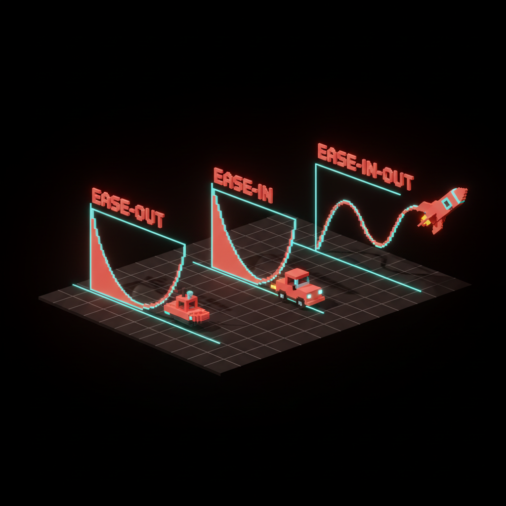
Principle 3: Easing carries the emotion
Linear motion is robotic. The physical world does not move linearly, and interfaces that do feel mechanical. Easing curves are what make motion feel human.
Three easings cover 90% of product work.
- Ease-out for elements entering the screen. Fast at the start, slow at the end. It matches how the user expects an object to settle into place.
- Ease-in for elements leaving the screen. Slow at the start, fast at the end. The user sees the element acknowledge the exit before it leaves.
- Ease-in-out for elements moving from one place to another. Smooth on both ends. It matches physical inertia.
Spring curves are the fourth option, used carefully. Springs feel playful and right for consumer apps with a friendly voice. They feel wrong for financial software, healthcare, or any product where overshoot reads as instability.
Principle 4: Motion respects motion preferences
Every product ships a prefers-reduced-motion path. Users with vestibular disorders, migraines, or attention sensitivities get harmed by motion other users enjoy. Ignoring the setting is not a style choice, it is an accessibility failure.
The rule is not to strip motion entirely when the setting is on. It is to replace distance-based motion with opacity-based motion.
A card that slides in 40 pixels becomes a card that fades in. The state change is still communicated, the vestibular trigger is removed. The web accessibility checklist breakdown covers where this fits in the full accessibility audit.
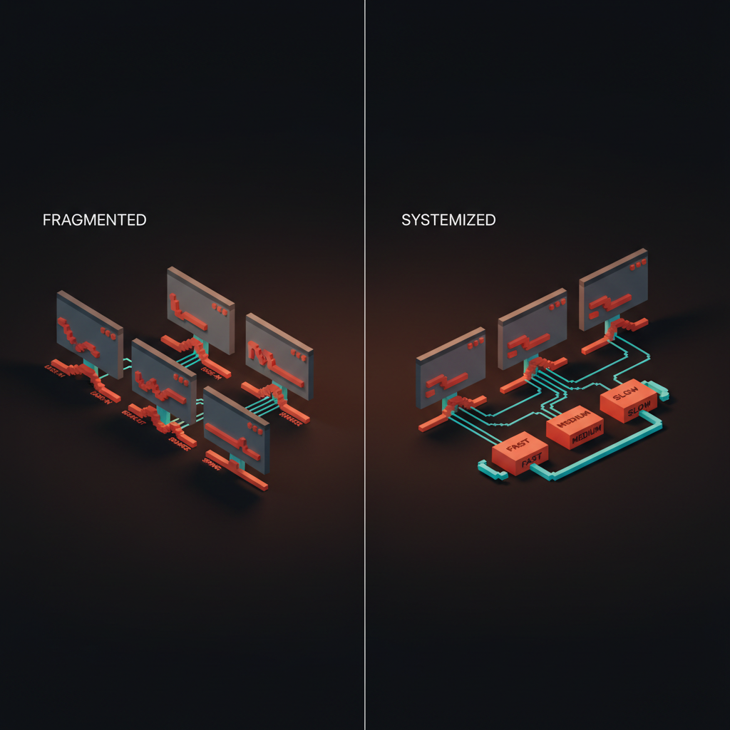
Principle 5: Consistency across the product
Motion has to feel like one product made one set of decisions. Two screens with two different easings and durations feel like two products stitched together. Users notice, even if they cannot articulate what feels off.
The fix is a motion system. Three to five durations. Three to five easings.
Named tokens like motion.short, motion.medium, motion.long, ease.enter, ease.exit, ease.standard. The design systems guide breakdown covers where these live alongside color and type tokens.
Motion tokens are not optional in 2026. They are the only way to keep motion from drifting as the team grows. A team of three shipping freehand animations produces a system of three opinions. The next hire adds a fourth. By the twentieth screen the product has no coherent behavior layer.
Principle 6: Motion follows the spatial model
Every product has an implicit map. New screens live to the right. Detail views zoom in from a card. Overlays descend from the top. Navigation drawers come from the edge of the screen they live on.
Motion reinforces the map. A detail screen that zooms in from the card the user tapped teaches spatial continuity. The same detail screen dropping in from the top confuses the user because it breaks the implied map.
When designers get this wrong, it is almost always because they picked the animation in isolation instead of in the context of the flow. The test: can you trace every transition back to a consistent spatial metaphor. If not, the motion is decorating, not teaching.
Principle 7: Motion has a budget
Every animation costs CPU, battery, and attention. Budget each.
CPU and battery budget means animating transform and opacity only, avoiding layout-triggering properties like width, height, top, left. Modern browsers handle transform and opacity on the GPU, which is cheap. Animating layout properties forces recalculations that tank performance on mid-range Android phones.
Attention budget means limiting concurrent animations. One thing moves at a time, almost always. Two moves is already a lot, three is a distraction.
A page where every element animates on scroll is not a designed page, it is a trap door for concentration. The core web vitals glossary covers the performance numbers that scroll-triggered animation usually ruins.
Patterns that earn their place
Out of the dozens of motion patterns floating around Dribbble, a short list actually improves product work. The rest are costume.
Micro-interactions on input
The button that compresses 2 pixels on press, the toggle that springs between states, the input that shakes gently on validation failure. These are the cheapest and most impactful motions in any product. They answer the user's question (did the system hear me) in under 150 milliseconds without any copy.
Every primary control should have a micro-interaction. Buttons, toggles, inputs, checkboxes, radios, sliders. If the control does not respond visibly to the user's touch, the product feels slow even when the backend is fast. The focus state glossary covers the accessibility rules that govern these interactions.
Staggered reveals for lists
A list of cards that fades in with a 50 ms stagger between items reads as intentional. The same list appearing all at once reads as abrupt. Staggering is almost always worth the extra few hundred milliseconds on first render.
The cap is four items. After four, continue the stagger below the fold and let the user's scroll trigger the rest. Staggering twenty items in sequence feels slow, and the user does not see most of them anyway.
Shared-element transitions
A card that the user taps becomes the header of the detail view. A thumbnail that expands into a full image. These transitions teach the spatial model loudly and cheaply, and they are the single most impressive-feeling motion pattern in modern product work. They also require engineering cost, which is why most teams cut them. When the moment matters (onboarding, key conversion flow, signature feature), pay the cost.
Progress indicators that respect time
Progress bars that move in real time on long operations. Skeleton screens on data that takes over 300 ms to load. Spinners only for operations under 1 second where a skeleton would flash. Progress motion is trust motion. It tells the user the system is working, which is the only thing they care about when they are waiting.
Meaningful loading states
A loading state is not the absence of design, it is a design in its own right. The progressive disclosure glossary covers how loading states can reveal content in stages rather than blocking on the slowest piece.
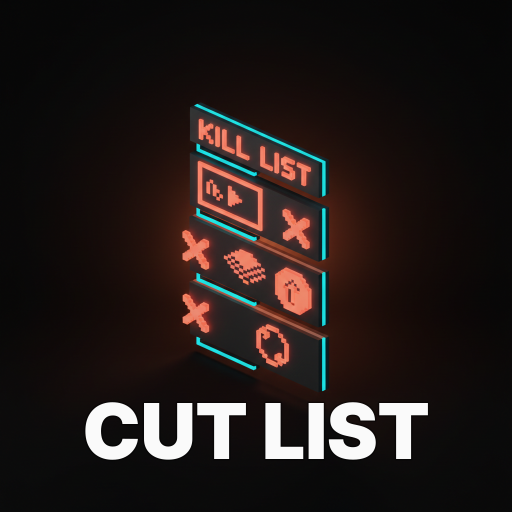
Motion failures to watch for
Every motion review catches the same failures. If the product ships with any of these, the motion system is undermining the rest of the design.
Autoplay video in the hero. Hijacks attention, tanks performance, and violates reduced-motion preferences. Replace with a still image or a user-triggered play.
Parallax that nobody asked for. Parallax is the motion equivalent of a brand color used on body text. It looks premium in a screenshot and reads as motion sickness on a real device.
Bounces on every state change. Spring motion is a spice, not an ingredient. A product where every button bounces, every card springs, and every modal overshoots is a product that cannot prioritize. Reserve springs for moments the user should feel.
Transitions that beat the server. A screen transition that takes 500 ms when the data arrives in 200 ms makes the product feel slower than it is. Motion should match or trail the actual operation, never pad it.
Looping background animation. A background that moves forever reads as a distraction forever. Every time the user glances back, they lose focus. Loop only when the motion is the point (a status, a visualization, a heartbeat indicator).
Motion in the system
Motion belongs inside the design system alongside color and type. Treating it as a late-stage polish layer is why most products ship inconsistent motion. The team that owns the system owns the motion tokens.
The minimum motion token set:
| Token | Value range | Used for |
|---|---|---|
| motion.duration.short | 100 to 150 ms | Feedback on input |
| motion.duration.medium | 200 to 300 ms | State change, dropdown, tooltip |
| motion.duration.long | 400 to 500 ms | Page, modal, large transition |
| motion.ease.enter | cubic-bezier(0, 0, 0.2, 1) | Elements entering the screen |
| motion.ease.exit | cubic-bezier(0.4, 0, 1, 1) | Elements leaving the screen |
| motion.ease.standard | cubic-bezier(0.4, 0, 0.2, 1) | Moves within the screen |
Name them, document them, ship them as variables in the design tokens layer. Every new animation in the product uses one of these tokens, or there is a written reason it does not. The discipline is what keeps motion coherent across a team of five designers and twenty engineers.
How to review a motion design
Run every animation through four questions before it ships.
Does it communicate state change or guide the eye. If neither, cut it.
Does it fit the duration table. If it runs long, shorten it until it feels aggressive, then back off one step.
Does it use a token. If it is hand-rolled, it will drift from the system. Refactor it into a token or reject it.
Does it pass prefers-reduced-motion. Toggle the setting. If the motion still triggers a vestibular response, rebuild it with opacity only.
Four questions. Five minutes per animation. Most products ship without asking any of them, which is why most products feel like they were decorated, not designed.
If you want a team that runs this review at ship time instead of apologizing for motion drift in a post-launch audit, hire Brainy. We build brand, web, and product UI with motion inside the system from the first screen.
Motion in 2026 conditions
Three shifts matter. Motion has to survive them all.
AI-driven interfaces move more than legacy UIs. Streaming responses, live reasoning traces, and dynamic tool invocations create constant subtle motion. The rule is to make the AI motion predictable and the product motion calm. If everything animates at once, nothing reads as important.
Scroll-driven animations are a browser feature now. CSS scroll-timeline lets designers animate based on scroll position without JavaScript. That is a new lever, and most teams are misusing it by animating too many elements on scroll. The rule is one scroll-driven animation per page, usually the hero, sometimes the CTA.
Accessibility regulations are tightening. The European Accessibility Act and similar laws mean reduced-motion is not a nice-to-have, it is enforceable. Shipping a product without a reduced-motion path is a compliance risk, not a design opinion. The wcag glossary covers the baselines that apply.
FAQ
What are the most important motion design principles?
Purpose before polish, duration matched to impact, easing that carries emotion, respect for motion preferences, consistency across the product, spatial model awareness, and a strict performance and attention budget. Seven principles in combination, not any one of them alone, produce motion that earns its place.
How long should a UI animation be?
Between 100 and 500 milliseconds for almost every product interaction. Feedback animations (hover, press) run 100 to 150 ms. Small state changes run 150 to 300 ms. Page and modal transitions run 300 to 500 ms. Anything longer becomes a tax on repeat users even if it feels cinematic on the first view.
What is the difference between motion design and animation?
Motion design is the behavior layer of a product, where animation is the visual technique used to produce it. Motion design asks what state change the animation communicates and why it is needed. Animation asks how the movement looks. Motion design is strategy, animation is craft. Good product work needs both.
Should every interaction have animation?
No. Every primary control (button, toggle, input) benefits from a micro-interaction because the user expects feedback on touch. Secondary elements do not. The test: cut the animation and see if the user loses information. If not, keep it cut.
What is prefers-reduced-motion and how do you handle it?
It is an operating system setting that signals a user wants less motion, usually for vestibular or attention reasons. The correct handling is not to remove motion entirely but to swap distance-based animation for opacity-based animation. The state change still gets communicated, the vestibular trigger is removed.
How do you build a motion system?
Start with three durations and three easings as named tokens. Document where each is used. Enforce the tokens in code review. Add more tokens only when the existing set produces a motion that is genuinely wrong, never to accommodate a one-off designer preference. Three to five tokens per axis is usually all a product needs.
Motion is a craft, not a feature
Products with great motion feel alive. Products without it feel stiff. Products with too much motion feel like a demo reel. The distance between those three is small, and the only path to the first one is a system with hard rules and honest reviews.
Pull the seven principles in combination. Sit inside the duration table. Pick the easings with intent. Ship a motion token layer next to the color and type tokens.
Run every animation against four questions before it ships. The product that results will not look like it tried, it will look like it thought.
If you want a team that runs this discipline across brand, web, and product UI as one project, hire Brainy. Motion as a first-class system decision, every time.
Related reading
- Visual Hierarchy Design
- Design Systems Guide
- Web Accessibility Checklist
- Design Handoff Figma to Dev
Want a product that moves with purpose instead of showing off? Brainy ships brand, web, and UI with motion built into the system, not sprinkled on top.
Get StartedNot ready to hire? Run the free Business Genome, an 11-dimension diagnostic for your venture.
Get your free GenomeGet new papers by email
New Brainy papers in your inbox. Confirm once, unsubscribe anytime.