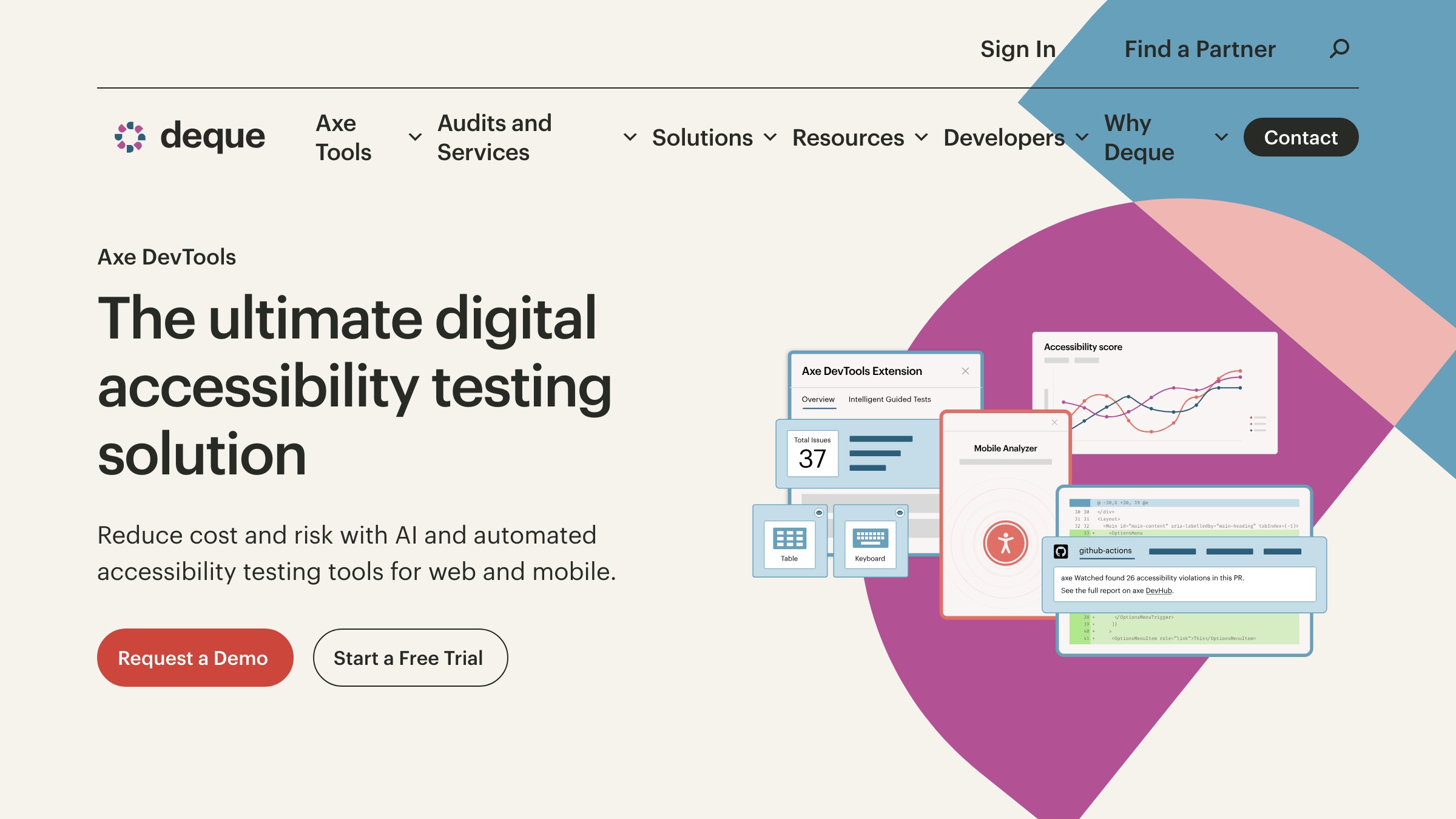
Web Accessibility Checklist: WCAG 2.2 for Working Designers
A WCAG 2.2 accessibility checklist organized by where the work happens: Figma, browser, post-ship. Plus a designer-mistake-to-criterion map.
Most web accessibility checklists are useless to designers. They are organized by WCAG success criterion number, which is how a lawyer reads the spec and how nobody builds software.
Designers do not open Figma thinking about criterion 1.4.3. They open Figma and pick a text color. The useful checklist meets the designer where the decision happens, which means three separate lists: one for the design file, one for the browser, one for after launch. Organize it any other way and it gets skipped.
What WCAG 2.2 actually requires
WCAG 2.2 is the current global standard as of 2026, and it adds nine new success criteria on top of WCAG 2.1, mostly focused on mobile, touch targets, cognitive load, and authentication.
The nine new criteria that matter to designers are a short list. Focus appearance gets stricter (2.4.11, 2.4.13). Dragging gestures now need a non-drag alternative (2.5.7). Touch targets have a minimum size of 24 by 24 CSS pixels unless the target has enough spacing around it (2.5.8). Consistent help placement across pages is required (3.2.6). Forms cannot ask for the same information twice unnecessarily (3.3.7). Authentication cannot rely on a cognitive test like remembering a password without an alternative (3.3.8, 3.3.9).
AA is the level required by most accessibility laws globally, including the EU's European Accessibility Act, Section 508 in the US, and the UK's Public Sector Bodies Accessibility Regulations. AAA is stricter and mostly reserved for government, healthcare, and education.
A checklist organized by WCAG section numbers is a spec. A checklist organized by where the work happens is a tool.
The only checklist format that works
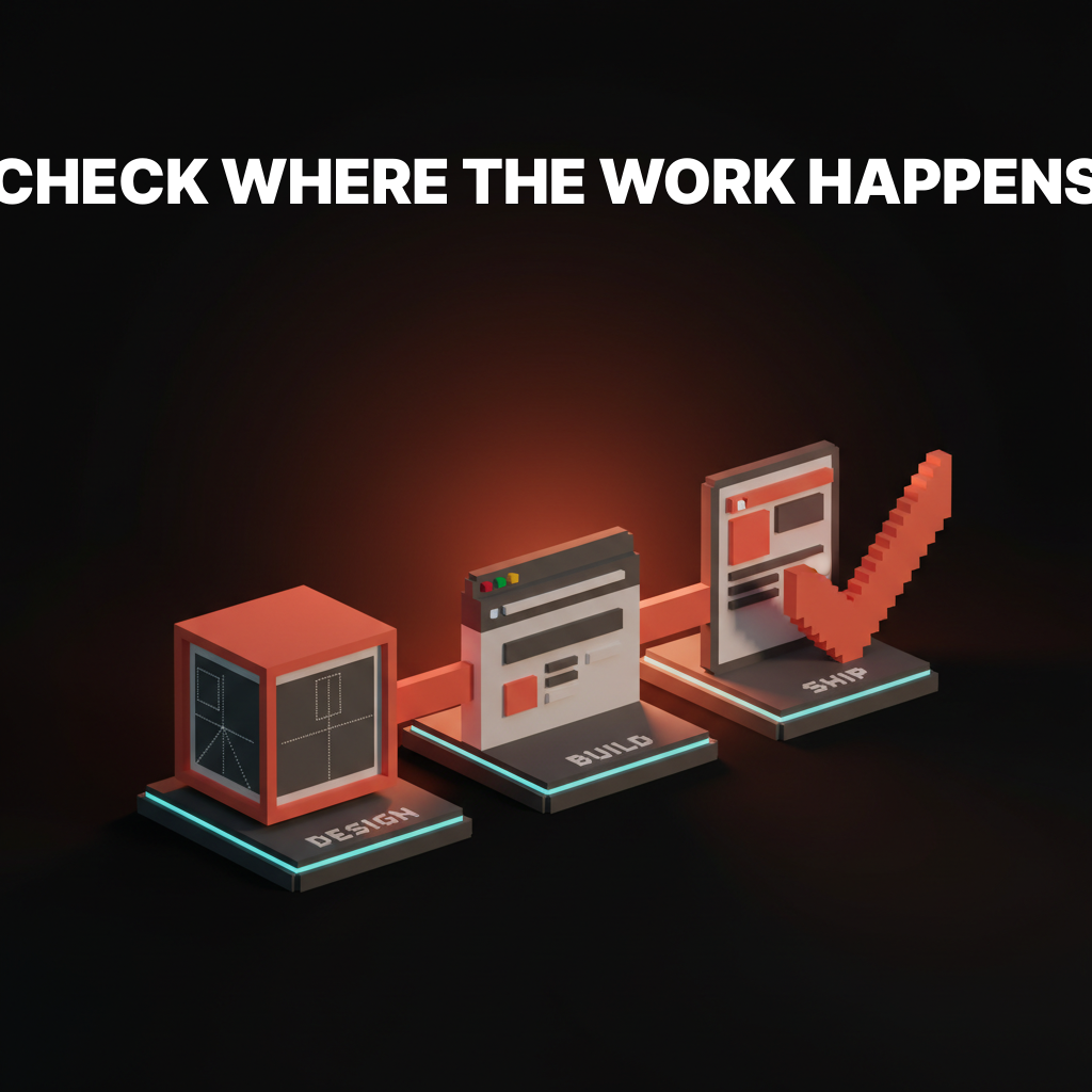
There are three places accessibility gets decided. The design file. The built interface in a browser. The production site after launch.
Roughly 70% of accessibility failures are decisions made in Figma, 20% are made in implementation, and 10% leak in after launch through content changes, third-party embeds, or user-generated material. Any checklist that does not map to those three phases is forcing the designer to translate from spec language to workflow language, and the translation is where items get skipped.
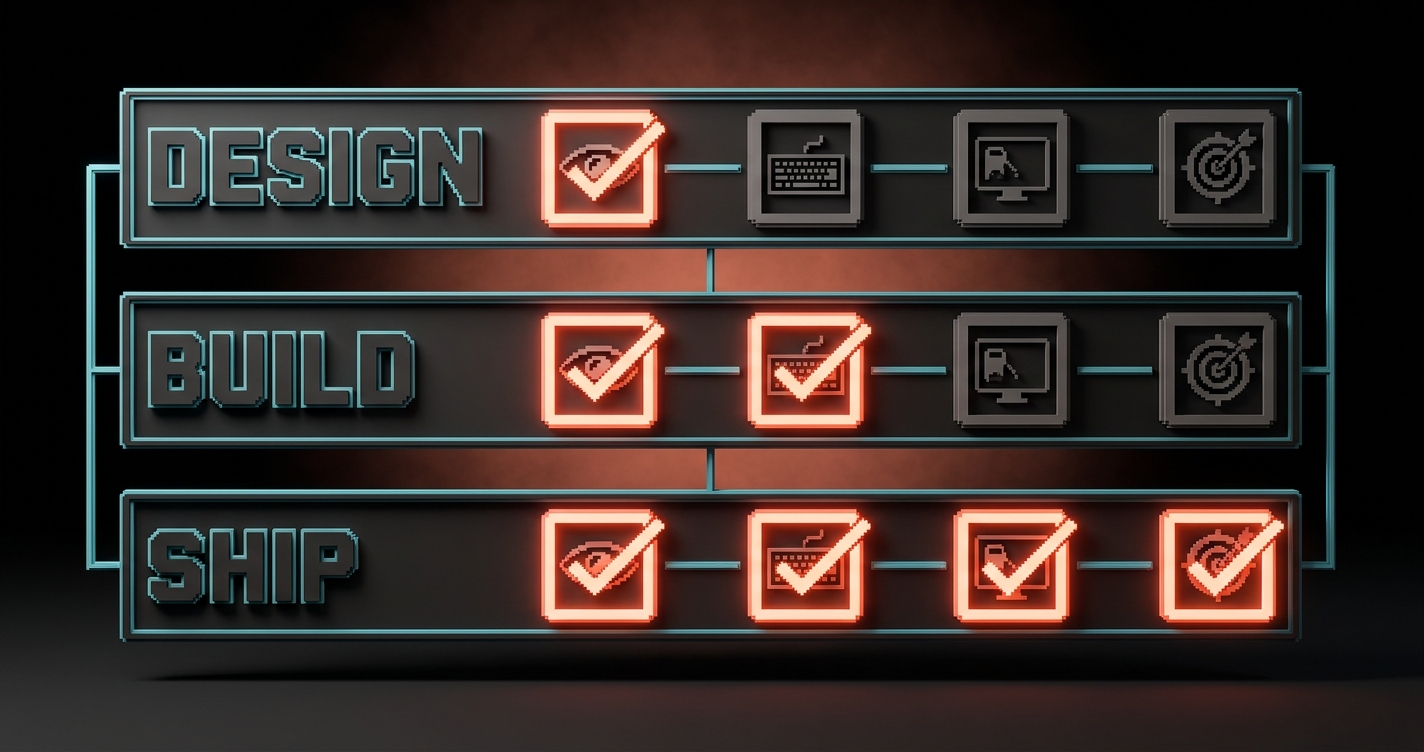
The rest of this article is the three lists, in order. Run them in order. Anything that fails the design-phase check should never reach the build phase. Anything that fails the build phase should never ship.
Design-phase checklist (what you check in Figma)
Roughly 70% of accessibility failures are decisions made in the design file, which means they are also cheapest to fix there.
| Check | WCAG 2.2 criterion | How to verify in Figma |
|---|---|---|
| Body text hits 4.5:1 contrast against its background | 1.4.3 Contrast (Minimum) | Stark, Able, or Figma's built-in contrast checker |
| Large text (18pt+ or 14pt+ bold) hits 3:1 | 1.4.3 | Same tools |
| Non-text UI (buttons, borders, icons, focus rings) hits 3:1 | 1.4.11 Non-text Contrast | Manually sample color pairs on the canvas |
| Touch targets are at least 24 by 24 CSS px (48 by 48 recommended) | 2.5.8 Target Size (Minimum) | Measure frame dimensions directly |
| Information is not conveyed by color alone | 1.4.1 Use of Color | Grayscale the frame (Figma plugin or screenshot filter) |
| Every image frame has alt text in the layer metadata | 1.1.1 Non-text Content | Figma's accessibility panel or dev mode |
| Headings are used in a logical order (H1, H2, H3, not H1, H3, H2) | 1.3.1 Info and Relationships | Read the heading tree top to bottom |
| Focus state is designed for every interactive element | 2.4.7 Focus Visible, 2.4.11 Focus Not Obscured | Every interactive component has a focus variant |
| Link text makes sense out of context | 2.4.4 Link Purpose | No "click here" or "learn more" labels |
| Form labels are visible, not placeholder-only | 3.3.2 Labels or Instructions | Every field has a persistent label outside the input |
The design file is also where you catch the new WCAG 2.2 mobile criteria. Tap targets that fail 2.5.8 almost always fail because the designer was thinking in desktop pixels and the target is a 16-pixel icon with no padding.
For the deeper dive on contrast specifically, see contrast rules and APCA. The design-phase color work is where most sites lose the audit before a line of code is written.
Build-phase checklist (what you check in the browser)
The browser is where accessibility decisions get proven or exposed, because it is the first place real assistive tech touches your work.
| Check | WCAG 2.2 criterion | How to verify in the browser |
|---|---|---|
| Every page works with keyboard only (tab, shift-tab, enter, space, arrow keys) | 2.1.1 Keyboard | Unplug the mouse and navigate the page |
| Focus order follows visual order (left-to-right, top-to-bottom in LTR) | 2.4.3 Focus Order | Tab through and watch the focus ring |
| Focus is never hidden by sticky headers, cookie banners, or modals | 2.4.11 Focus Not Obscured (Minimum) | Scroll while tabbing to confirm visibility |
| Drag interactions have a click or tap alternative | 2.5.7 Dragging Movements | Check sliders, sortable lists, carousels |
| Skip-to-content link appears on first tab | 2.4.1 Bypass Blocks | Tab once on page load |
| HTML landmarks are used (header, nav, main, footer, aside) | 1.3.1, 4.1.2 | Inspect the DOM outline |
| Form errors are announced, not just color-coded | 3.3.1, 3.3.3, 4.1.3 | Submit a broken form with a screen reader |
| Screen reader announces headings, lists, and buttons correctly | 4.1.2 Name, Role, Value | NVDA on Windows, VoiceOver on Mac, TalkBack on Android |
| Autocomplete attributes are set on personal data fields | 1.3.5 Identify Input Purpose | Inspect autocomplete on name, email, address fields |
| Media has captions, transcripts, or audio descriptions | 1.2.1 to 1.2.5 | Play every video, check for tracks |
Automated tools catch about 30% of these. The rest need a human pressing tab and listening to a screen reader. Both matter, and neither replaces the other.
The best browser-stage tool stack in 2026 is small: axe DevTools for automated scanning, Lighthouse for page-level audits, and a real screen reader for the manual pass. Three tools, ten minutes per page, catches almost everything a real audit would flag.
Post-ship checklist (what you check in production)
Accessibility does not end at launch, because content, third-party embeds, and user-generated material all ship after the designer has signed off.
| Check | WCAG 2.2 criterion | How to verify in production |
|---|---|---|
| CMS-authored images have alt text enforced at the editor level | 1.1.1 | Test the CMS: can an author publish without alt? |
| Embedded third-party widgets (chat, maps, forms) are accessible | Varies | Run axe on pages with embeds |
| PDF downloads and documents are tagged and readable | 1.1.1, 1.3.1, 2.4.6 | Open in Acrobat's accessibility checker |
| Help, support, and contact links are in the same place on every page | 3.2.6 Consistent Help (WCAG 2.2 new) | Visual audit across templates |
| Forms do not ask for redundant information in a flow | 3.3.7 Redundant Entry (WCAG 2.2 new) | Walk through multi-step forms |
| Authentication has an accessible alternative (passkeys, email links, SSO) | 3.3.8, 3.3.9 Accessible Authentication (WCAG 2.2 new) | Try signup and login with a password manager blocked |
| Dynamic content (modals, toasts, live regions) is announced | 4.1.3 Status Messages | Trigger each one with a screen reader open |
| Page continues to meet contrast and target-size rules after user scaling to 200% zoom | 1.4.4 Resize Text, 1.4.10 Reflow | Zoom the browser to 200% and check |
| No auto-playing media, or media has a pause control | 1.4.2 Audio Control, 2.2.2 Pause, Stop, Hide | Load the page cold |
| Cookie banner does not trap keyboard focus | 2.1.2 No Keyboard Trap | Tab into the banner, tab back out |
The post-ship list is where most teams fail. The design shipped accessibly. The CMS authors fill it with untagged PDFs, autoplay videos, and a chat widget with a 2:1 contrast ratio on its launcher. Accessibility is a system property, not a launch milestone.
Common designer mistakes mapped to WCAG criteria
Every accessibility audit finding traces back to a specific WCAG success criterion, and most designers are making the same five mistakes against the same five criteria.
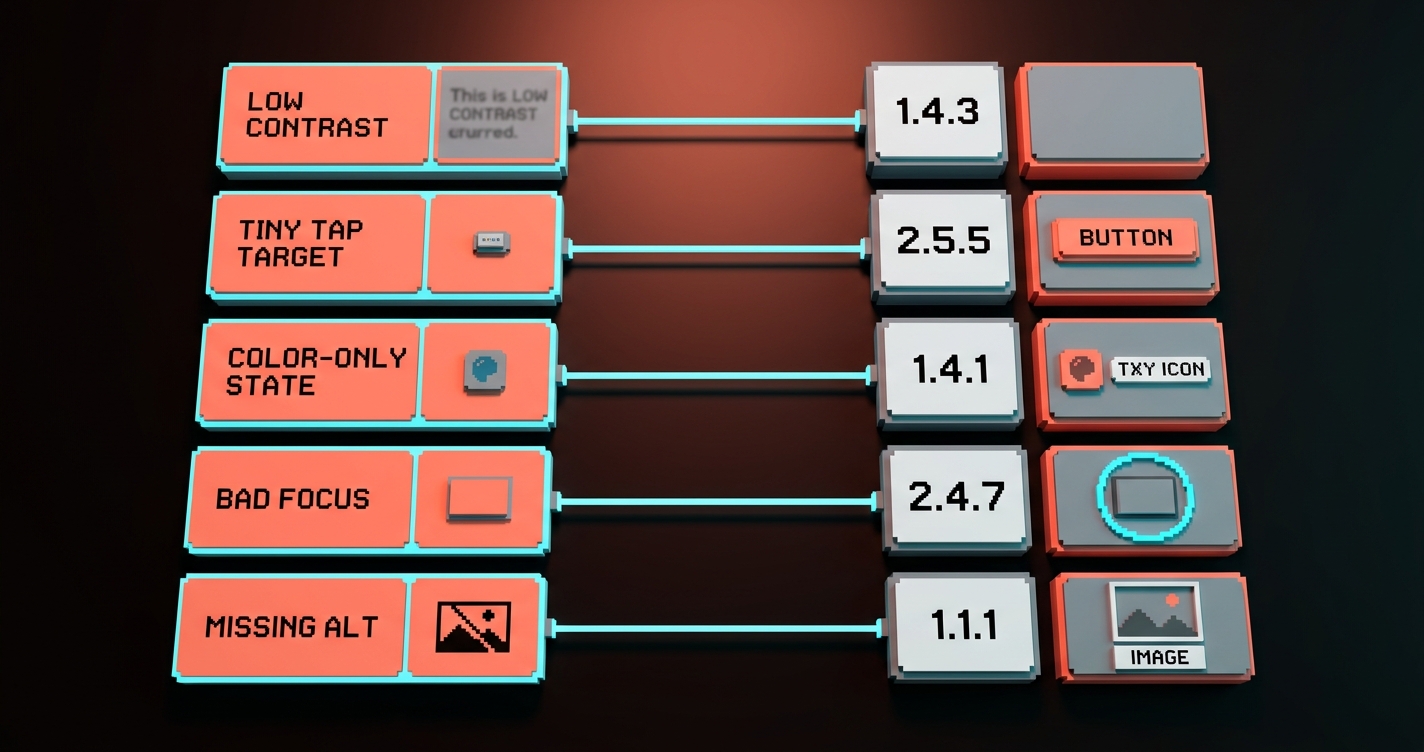
| Designer mistake | What it actually is | WCAG 2.2 criterion it violates |
|---|---|---|
| Placeholder text as the only label | Users lose the label the moment they start typing | 3.3.2 Labels or Instructions |
| Icon-only buttons without aria-label or tooltip | Screen readers announce "button" with no purpose | 4.1.2 Name, Role, Value |
| Error messages shown only with red border or red text | Users with color blindness see no error | 1.4.1 Use of Color, 3.3.1 Error Identification |
| Focus ring removed for aesthetics | Keyboard users cannot see where they are | 2.4.7 Focus Visible |
| Tap targets under 24 by 24 px with no spacing | Mobile users mis-tap constantly | 2.5.8 Target Size (Minimum) |
| Low contrast on "subtle" UI (placeholder text, disabled states, helper copy) | Readers in sunlight or with vision loss cannot read it | 1.4.3 Contrast (Minimum), 1.4.11 Non-text Contrast |
| Modal that traps focus but has no close on ESC | Keyboard users are stuck in the modal | 2.1.2 No Keyboard Trap |
| Carousels with drag-only navigation | Motor-impaired users cannot advance | 2.5.7 Dragging Movements |
| Sticky header that hides the focused element on tab | Users see the page scroll but lose track of their position | 2.4.11 Focus Not Obscured |
| Sign-in with password only, no SSO or email link | Cognitive load failure | 3.3.8 Accessible Authentication |
The same ten mistakes make up the majority of every audit report. Fix these and you are 80% of the way to WCAG 2.2 AA before any consultant opens a spreadsheet.
The accessibility basics also connect to the rest of a good visual hierarchy. Contrast, target size, and focus states are hierarchy decisions. A design that nails hierarchy nails most of the accessibility checklist by default, which is why the overlap between good color theory and accessible design is almost total.
How to run the checklist without burning a week
The checklist is only useful if running it takes minutes, not days, which means tooling has to do most of the work.
The working cadence is three passes, one per phase, each done at the moment the work reaches that phase. Not all three at the end. Not one of them at the end. Three separate passes, each cheap, each enforced by tooling where possible.
- Design pass: 10 minutes per screen. Stark or Figma's contrast checker on every text pair, grayscale the frame to test color-only information, measure every tap target. Do it before handoff, not during review.
- Build pass: 10 minutes per template. axe DevTools scan, keyboard-only navigation test, one screen-reader pass on the most-visited pages. Integrate axe-core into CI so new code cannot merge with regressions.
- Ship pass: monthly, not per release. Full-site axe or pa11y crawl on production, PDF audit on any document library, manual walkthrough of forms and authentication flows.
That is half a day of work per month per product and maybe 15 minutes per design handoff. Anything more than that and the team will stop running it. Anything less and the audits come back unfixed.
FAQ
Is WCAG 2.2 legally required?
Yes, in most of the major markets. The European Accessibility Act took effect in June 2025 and references WCAG 2.1 minimum, with 2.2 as the current working standard. Section 508 in the US references WCAG 2.0 but procurement contracts increasingly require 2.2. Canada, the UK, Australia, and Japan all have similar requirements tied to WCAG 2.1 or 2.2. If you ship to any of those markets, 2.2 AA is the safe target.
What are the new WCAG 2.2 criteria I actually need to know?
Four matter most for designers. 2.5.7 Dragging Movements requires a non-drag alternative for drag interactions. 2.5.8 Target Size (Minimum) requires tap targets of at least 24 by 24 CSS pixels with enough spacing. 2.4.11 Focus Not Obscured requires the focused element to remain visible through scrolling and sticky overlays. 3.3.8 Accessible Authentication prohibits cognitive tests like remembering a password without an alternative (SSO, passkey, or email link).
Do I need a separate checklist for mobile?
No. WCAG 2.2 is explicitly written to cover mobile and touch, which is why so many of its new criteria (target size, dragging, focus) are mobile-aware. The same three-phase checklist works for mobile web and responsive design. Native apps have additional platform-specific guidelines (Apple's HIG and Android Accessibility) but the WCAG rules still apply.
What is the minimum touch target size in WCAG 2.2?
24 by 24 CSS pixels is the minimum under 2.5.8 Target Size (Minimum), but this has exceptions if targets have enough spacing around them or are inline with text. The practical target most designers should aim for is 48 by 48 CSS pixels, which matches Apple's and Google's platform recommendations and avoids the edge cases in the WCAG spec.
Ship the checklist, not the guesswork
Accessibility is not a compliance task. It is a design property, built at three moments, enforced by tooling, checked by humans.
The teams that ship accessible sites without pain are not the ones with the best auditors. They are the ones who moved the checks into the design phase, the build phase, and the ship phase, and who refused to let work advance past any of them with known failures.
Run the three lists. Catch the ten common mistakes before they compound. Automate the browser-stage scans into CI. Audit the post-ship drift monthly. WCAG 2.2 AA stops being a finish line and starts being a property of how the team works.
Pick one product surface on your site today. Run the design-phase checklist against its Figma file. Count the fixes. That count is the cost of not running this earlier.
Ship the checklist, not the guesswork.
Need a site that passes WCAG 2.2 without a three-month remediation cycle? Brainy ships accessible design from the first Figma frame.
Get StartedNot ready to hire? Run the free Business Genome, an 11-dimension diagnostic for your venture.
Get your free GenomeGet new papers by email
New Brainy papers in your inbox. Confirm once, unsubscribe anytime.