Color Theory for Designers: The System Behind Every Good Palette
Color theory for working designers. The wheel, harmonies, perception, psychology, accessibility, and how modern design systems turn all of it into shipped product.
Color theory is taught like an art history survey and practiced like construction engineering. Wheels, harmonies, complements. Warm and cool.
"Red means passion." These are the artifacts most designers get handed in school, and almost none of it survives contact with a real product interface.
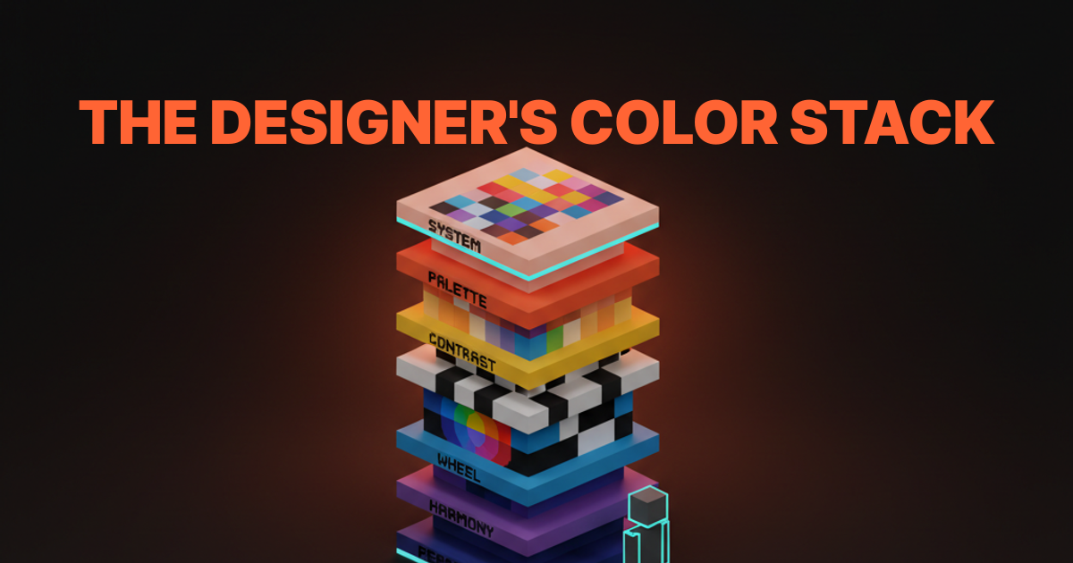
What working designers actually need is a stack. A layered system that runs from how the eye perceives color, through the wheel and its harmonies, into contrast and hierarchy, across psychology and culture, up through palette construction, and finally into the tokens and design systems that ship the work. Skip a layer and the palette looks fine in Figma and falls apart in production.
This paper is the whole stack. Each layer has its own Brainy paper for going deeper. Here we connect them.
What Color Theory Is Actually Asking You to Solve
Color theory is not a set of aesthetic rules, it is a stack of vision, perception, and systematic thinking that has to all work together before a palette ships.
The short version: human vision is weird, color is physical, and designers have to produce outputs that work for millions of people across hundreds of devices in dozens of contexts. Theory is the vocabulary we use to reason about that problem. It is not a set of commandments. It is the set of shared concepts that let you go from "this feels off" to "the accent is competing with the background and the contrast fails at 14pt."
The stack is layered on purpose. Each layer answers a different question.
| Layer | The question it answers |
|---|---|
| Perception | How does the eye actually see this color in context? |
| Wheel | What is the hue relationship between these colors? |
| Harmony | Do these colors feel related or clashing? |
| Contrast | Can this be read, seen, clicked? |
| Palette | What colors does this brand or product own? |
| System | How are those colors applied consistently at scale? |
| Accessibility | Does every pairing in the system work for every user? |
Every layer is load-bearing. A palette designed without perception thinking fails in context. A system built without accessibility fails in audit.
A harmony picked without palette logic fails in scale. The layers compound, which is also why getting color right pays off compounding dividends.
The Wheel, the Harmonies, and What They Are Actually For
The color wheel is a model of hue relationships, and the harmonies are shortcuts for picking pairs and groups that the eye reads as related.
Most designers learn the wheel as primary-secondary-tertiary triangles and never use it again. That is a waste. The wheel is the fastest way to reason about which colors belong together and which ones fight, which matters every time you add a new color to a palette, a chart, or a mark.

Four harmonies earn their keep in product and brand work.
Complementary
Opposite colors on the wheel. Blue and orange, red and green, purple and yellow. Complementaries create the highest possible visual tension between two hues.
That is great for single-moment impact (a poster, a hero image, a sports uniform) and terrible for extended interface use, which is why you almost never see pure complementary product palettes. In UI, complementaries get softened: one hue dominates, the other shows up as a restrained accent.
Analogous
Adjacent colors on the wheel. Sky blue, blue, blue-violet. Analogous palettes feel coherent and calm.
They are the foundation of most modern brand systems. The danger is that they can read monotonous if there is not enough value contrast between the hues. Analogous works when you treat the color palette as a family, not a set of rivals.
Triadic and Split-Complementary: The Underused Pair
Complementary and analogous get most of the attention in design school. The next two harmonies are less talked about and, for working designers, often more useful.
Triadic
Three hues evenly spaced around the wheel. Red-yellow-blue. Orange-green-purple. Triadic palettes feel playful and high-energy, which is why they show up in children's brands, sports, and entertainment.
In product design, pure triadic is rare because it is hard to balance. Triadic-inspired palettes (one dominant hue, two others muted) are everywhere.
Split-Complementary
One hue plus the two hues adjacent to its complement. Blue plus yellow-orange and red-orange. Split-complementary keeps most of the contrast of complementary with less tension. It is the underrated harmony that shows up in a lot of well-executed brand systems when you go looking.
The harmonies are tools, not answers. You do not pick a brand palette by saying "let's do triadic." You use the harmonies to reason about proposed combinations and spot the ones that already work.
Perception Beats Theory Every Time
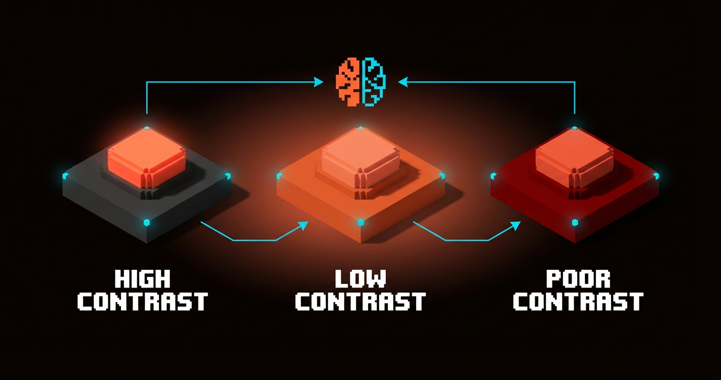
The same red on the same button reads as urgent on a neutral page, noisy on an orange page, and invisible on a dark red page, and none of that is explained by the wheel.
Context is the force multiplier in color. A color does not have a fixed meaning, a fixed brightness, or a fixed readability. It has a relationship with whatever is next to it, whatever was on screen a second ago, whatever display the user is looking at, and whatever light is hitting that display. Theory without perception is theory in a vacuum.
Three perception effects are worth knowing by name.
Simultaneous contrast. The same gray looks lighter next to black and darker next to white. The implication: a brand color you pick against a white studio background will feel completely different dropped onto a dark hero. You have to test colors in their production context, not in isolation.
Chromatic adaptation. The eye adjusts to ambient color in 500ms or less. A page that spent five seconds on a warm orange hero before scrolling into a neutral content area will feel subtly cooler than that content area actually is. The user's perception has shifted without them noticing.
Value clustering. The eye groups items of similar brightness as related and similar darkness as separate. This is how hierarchy works. A strong design leverages value contrast more than hue contrast because value is what the visual system processes first.
Color Psychology: Evidence vs Superstition
Color psychology is real but most of what gets called color psychology is recycled myth, which is why designers need to separate evidence from folklore.
There is real research on the Loyola brand recognition study (color drives up to 80% of brand recognition), on saturation effects on perceived urgency, on dark mode preferences, and on cultural color associations. That is useful. There is also a flood of blog posts claiming "red increases conversion 21%" that fall apart under the slightest scrutiny. That is not useful.
The quick test: any color psychology claim that does not include context, culture, or audience is superstition. Color meaning is contextual, always. Green reads as money in US fintech and as nature in wellness, and both are correct in their context.
For the full breakdown on what is real, what is recycled, and how to actually apply color psychology in brand and product work, the color psychology in design paper has the evidence-based frame.
Why Proportion Rules Broke at Product Scale
The 60-30-10 rule and its cousins solved a single-surface problem, and product design is not a single surface.
Interior design invented 60-30-10 to answer "how much of each color goes on the walls, the furniture, and the accents." That maps cleanly to a room. It does not map to a digital product that has hundreds of surfaces, dozens of states, light mode and dark mode, and users on a spectrum of devices.

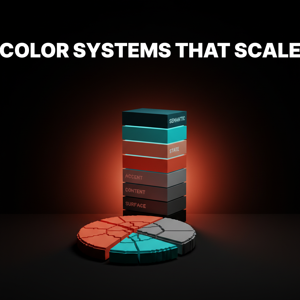
Modern product color abandoned proportion for roles. Surface, content, accent, state, semantic. Each role gets a design token that resolves to a different raw value per theme. That is the replacement for 60-30-10, and it is the only thing that scales.
Full treatment of why proportion broke and what role-based token systems look like in practice is in the 60-30-10 rule is broken paper.
Accessibility Is Part of Color Theory Now
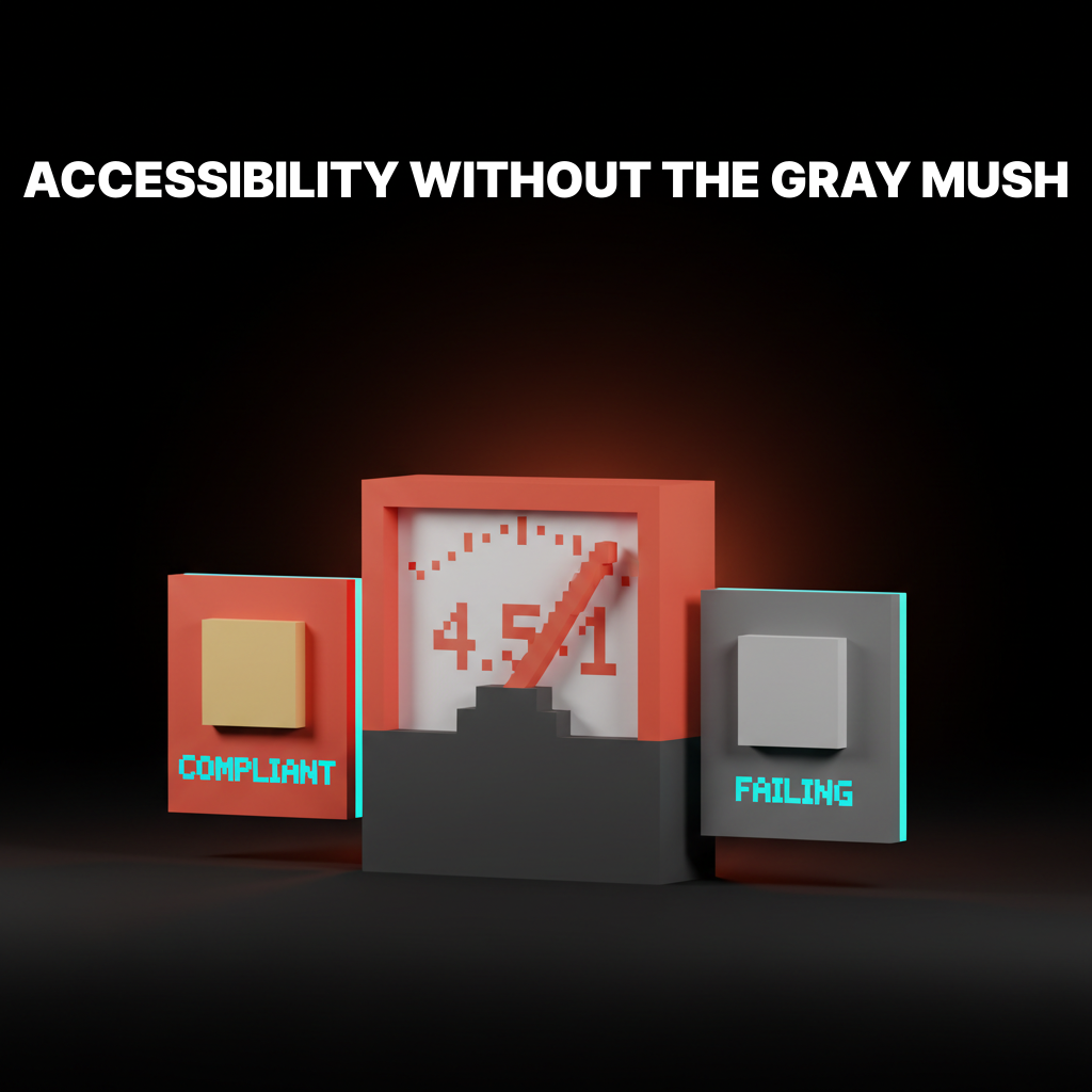
WCAG and APCA moved accessibility from "something QA reviews at the end" to a property of the color system itself.
For a long time, accessibility was a separate conversation. Designers picked a palette for aesthetics, QA checked ratios at the end, something got tweaked, everyone moved on. That workflow does not scale. Every shipped design system now encodes accessibility at the token layer, which means the palette itself has to be designed against contrast ratio and perceptual thresholds from the start.
The short version: WCAG 2.2 AA is the compliance floor (4.5:1 body, 3:1 large text and non-text UI). APCA is the perceptual algorithm that correlates better with actual readability and is proposed for WCAG 3. Real products target both.
For the full working designer's take on WCAG ratios, APCA, and how design systems tokenize contrast, the accessible color contrast paper covers it end to end.
Building a Palette: The Working Designer's Stack
A palette that ships and scales is built layer by layer, not picked in one sitting.
The process that works runs in a deliberate order. Each layer constrains the next, which is how you keep the palette coherent instead of drifting into a collection of one-off color picks.
-
Start with a neutral scale. Build 8 to 12 steps of gray (or near-gray, often slightly hue-shifted toward the brand's temperature). Most of a real interface is neutrals. This is the foundation every other layer sits on.
-
Pick the brand accent. One anchor color, the one thing a reader would associate with the brand if they saw it by itself. Restraint here is the whole game. Reserve the accent tier for brand moments, primary actions, and high-signal elements.
-
Add semantic colors. Success, warning, critical, info. These are functional, not decorative, and they need to work across light and dark mode without carrying brand personality. Treat them as utility, not flavor.
-
Expand to a state tier. Hover, focus, pressed, disabled, selected. These usually derive from the other tiers (a darker accent for hover, a muted neutral for disabled) but they are their own tokens.
-
Tokenize everything. Every pairing that ships needs a role name.
text-on-accent,bg-subtle,border-default. If a designer can reach for a raw color without a token, the palette is already leaking. -
Test against perception, not just math. WCAG ratios first, APCA scores second, then real-world tests: grayscale mode, squint test, low-light preview, five-second reactions from people who do not work on the brand.
-
Ship dark mode as a parallel token set. Not a filter. Not an inversion. A proper parallel palette that resolves the same tokens to different values.
Build in Order, Not in One Sitting
The order matters because neutrals do the heavy lifting on any page, and designers who start with the accent color end up building the rest of the palette around one decision that may not hold up. Start with the quiet layer. Add the loud layer last.
Design Systems as Applied Color Theory
The best reference material for color theory today is not a textbook, it is the public design system docs of brands shipping at scale.
These systems bake every layer of the stack into the defaults. They are also free, open, and maintained by people who ship product color every day.
Material Design 3
Material 3 is the most explicit about color theory as applied system. Every role has a paired on- counterpart (text/icons that sit on top of that role), the scales are derived from hue-chroma-tone rather than HSL, and the whole system is built to theme dynamically from a single source color.
What to take from it: the on- pattern. When a designer picks primary for a button, the system already knows what color the text on that button should be. Accessibility and contrast theory are baked into the naming.
Radix Colors
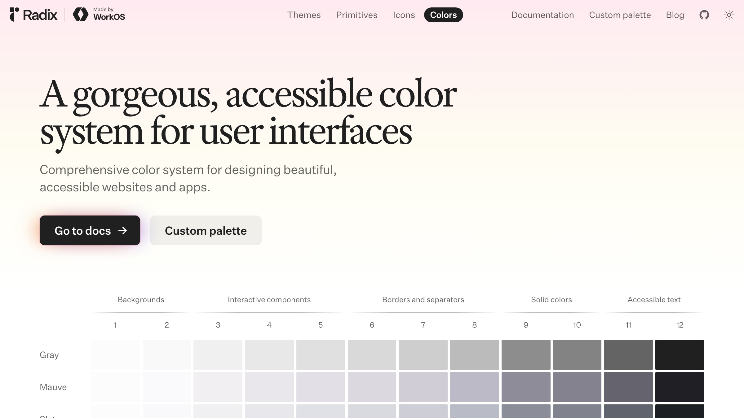
Radix ships 12-step scales per hue with each step mapped to a specific role (app background, subtle background, UI element, hover, focus, active, solid, text, high-contrast text). It is effectively a color harmony reference stapled to a contrast ladder. Designers reach for step 11 when they need high-contrast text and know it will pass AA against the lower steps.
What to take from it: the numbered ladder. Giving every step of a scale a role removes the "which gray do I use" debate from every design review.
Adobe Spectrum: Perceptual Uniformity at Scale
Material and Radix solve color at the role layer. Adobe goes deeper, building the scales themselves on perceptual models so contrast relationships hold when hues rotate.
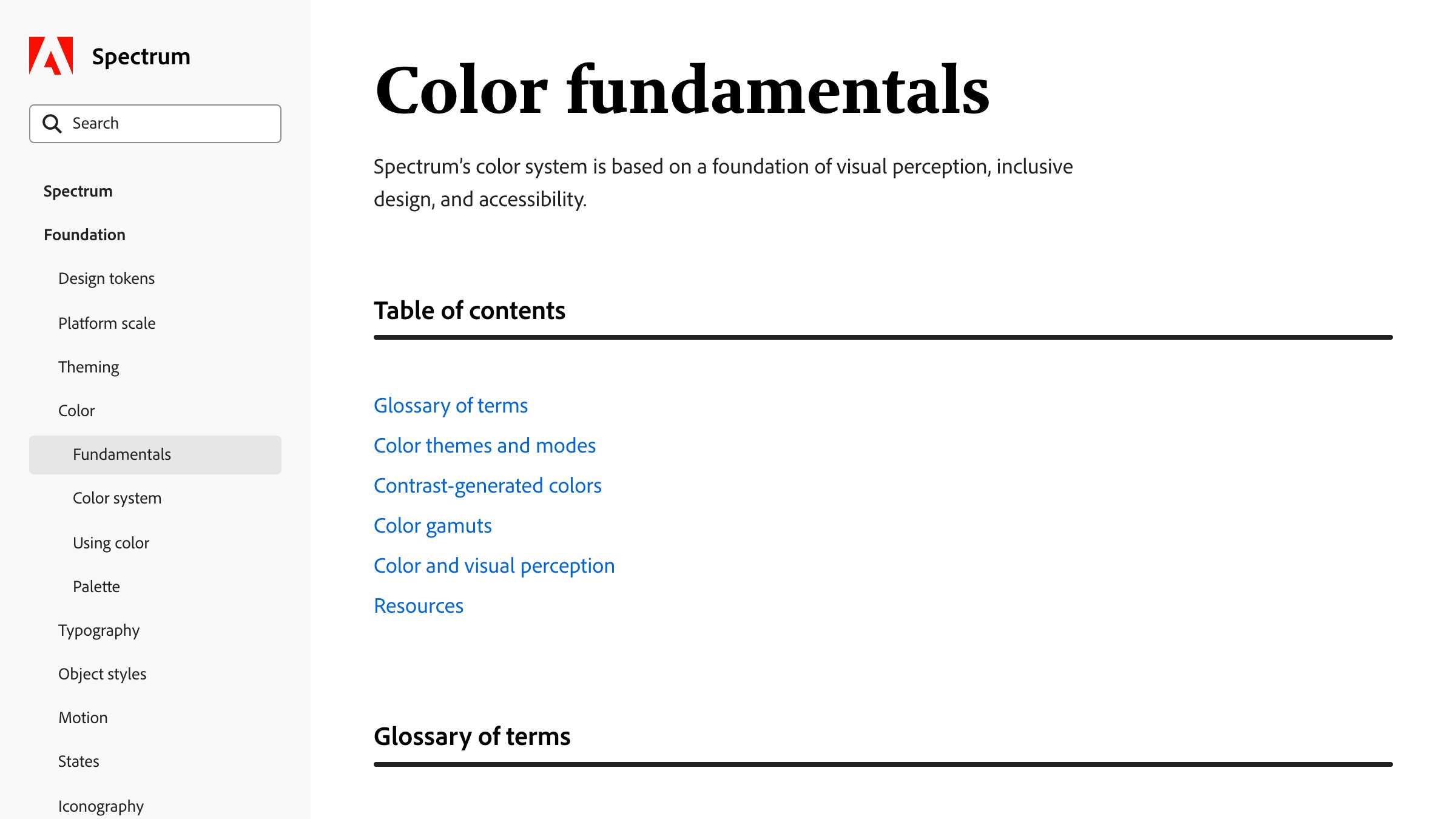
See it live on spectrum.adobe.com
Spectrum uses perceptually uniform scales so that two tokens with the same step number have the same visual weight across every hue. That means a theme can rotate from blue to orange without breaking contrast, because the perceptual relationships are locked at the scale level.
What to take from it: perceptual uniformity. If your scale is built on perceptual models like OKLCH or HSLuv, accessibility becomes portable across brand themes instead of something to re-verify on every new color.
FAQ
How do I actually learn color theory as a designer?
Read the stack top to bottom (perception, wheel, harmony, contrast, palette, system), then apply it in order on a real project. Theory without application fades in a week. Theory applied on a shipped palette sticks because the feedback is immediate. Start with reading Josef Albers' Interaction of Color for perception, spend an afternoon on the Radix Colors docs for applied contrast ladders, and build a real palette using the stack above.
Do I need to know the science or can I just use the tools?
You can ship without knowing the physics of light or the biology of cone cells. You cannot ship without knowing perception, contrast, and role-based system thinking.
The tools handle math. The designer handles judgment. A designer who leans entirely on tools is a designer who cannot tell when the tools are wrong (which is often, especially for WCAG 2 math).
What is the biggest mistake new designers make with color?
Picking the accent first. The accent is the loudest color in the palette, and building the rest of the palette around one loud decision almost always produces a loud palette.
Start with neutrals. Let the accent be the last thing you lock in. You can always swap the accent later if the rest of the stack is sound.
Color Theory Is Not Optional, It Is Ambient
Color theory is the part of design nobody argues about and everybody applies, whether they know it or not.
A designer who picks "that coral, it feels right" is applying color theory. A product manager who asks "can we make the button pop more" is asking a color theory question. A user who says "this page feels cluttered" is reporting a value-contrast failure.
The theory is already in the room. The question is whether you are operating on it consciously or reacting to it after the fact.
Working the stack makes the invisible visible. You stop picking colors and start designing palettes. You stop choosing hues and start designing systems. You stop guessing at accessibility and start shipping it.
The payoff compounds. A palette designed through the stack rebrands cleanly, goes dark cleanly, scales cleanly, and passes audits cleanly. A palette picked on vibes does none of those things and costs the team time every time one of them matters.
Learn the stack. Work the stack. Ship the stack.
Want a color system that actually works end to end? Brainy builds palettes from perception to tokens with accessibility baked in.
Get StartedNot ready to hire? Run the free Business Genome, an 11-dimension diagnostic for your venture.
Get your free GenomeGet new papers by email
New Brainy papers in your inbox. Confirm once, unsubscribe anytime.