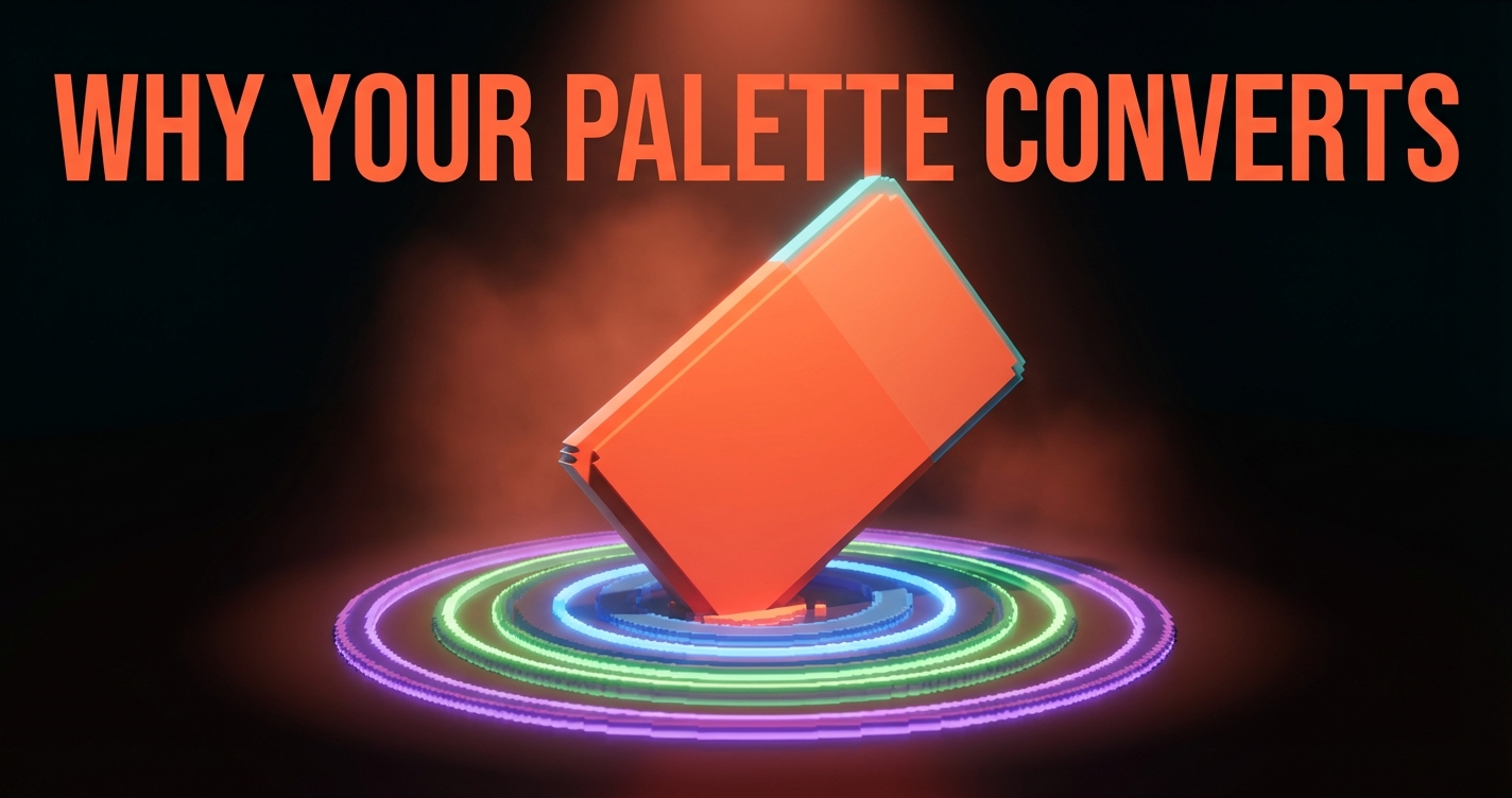
Color Psychology in Design: Why Your Palette Converts (Or Does Not)
What every color actually communicates in design, why context beats theory, and three rules for building palettes that convert.
Every color is a decision. Red on a button is not decoration, it is a conversion bet. Blue in a healthcare app is not aesthetic preference, it is a trust signal. The brands that understand this ship palettes that work. The ones that do not ship palettes that look nice and convert nothing.
This is what color psychology actually looks like when it meets real design decisions.
Colors Are Not Decorative
Color is the first thing the brain processes when it encounters a visual. Before the eye reads a headline or recognizes a logo, it has already responded to the color. That response is emotional, instant, and mostly unconscious.
This is not mysticism. It is neuroscience. Color triggers associations built from culture, experience, and context. Red does not universally mean "danger." It means urgency, energy, passion, appetite, or warning depending entirely on where it appears and what surrounds it.

The mistake most designers make is treating color psychology as a lookup table. Red equals excitement, blue equals trust, green equals nature. That framing is too simple to be useful. Color psychology is contextual, not universal.
What Each Color Actually Communicates
Here is the honest breakdown. Not the oversimplified version, but what each color does when it shows up in a real product, a real brand, or a real interface.
Red grabs attention faster than any other color. Coca-Cola, YouTube, and Netflix use it because red triggers urgency and appetite. In a UI, red is your "act now" color: sale badges, error states, primary CTAs on neutral pages. Use it sparingly or it stops meaning anything.
Blue is the internet's favorite color for a reason. It signals trust, stability, and competence. PayPal, LinkedIn, and Calm all lean on blue to say "you are safe here." The risk is blandness. If every competitor in your space uses blue, your blue identity disappears into the crowd.
Green does double duty. In wellness and eco brands (Whole Foods, Beyond Meat), it reads as natural and healthy. In fintech (Robinhood, Mint), it reads as money and growth. Spotify broke the mold by using green for music, proving that strong branding can override default associations.
Yellow is pure optimism and warmth, but it is the hardest color to use well. Too much yellow overwhelms. Too little disappears. Snapchat, IKEA, and National Geographic use it as a dominant signal, not a background wash. It works best in small, high-contrast doses.
Purple signals premium and unconventional. Figma, Twitch, and Cadbury use it to stand apart from the blue-and-green majority. In fintech, purple says "we are not your father's bank." It reads as creative without being childish.
Orange is the friendly middle ground between red's urgency and yellow's warmth. Headspace, HubSpot, and Fanta use it to feel energetic but accessible. It is one of the strongest CTA colors because it pops against both light and dark backgrounds without the alarm of red.
Black communicates authority and luxury. Apple, Chanel, and The New York Times use it to say "we do not need color to be interesting." In editorial design, black is confidence. In fashion, it is premium. In tech, it is sophistication without trying.
Context Beats Theory
Spotify is green. So is Whole Foods. One sells music streaming. The other sells organic groceries. Same color, completely different associations. The green is not doing the same job in both contexts.

This is where most color psychology advice falls apart. It treats colors as fixed meanings when they are actually flexible signals that shift based on three factors.
Saturation and value. A muted dusty rose communicates something completely different from a neon hot pink. Same hue, different planet. Desaturated colors read as sophisticated and calm. Saturated colors read as bold and energetic.
Neighboring colors. A red button on a white page reads as a confident CTA. The same red button on an orange page reads as noise. Colors do not exist alone. They exist in relationship to whatever is beside them.
Cultural context. White means purity in Western design. It means mourning in parts of East Asia. Any framework that ignores geography is incomplete.
Three Rules for Palettes That Convert
If you take nothing else from this article, take these three.
Rule 1: Contrast drives action. The most important color decision in any interface is not which color you pick for the CTA. It is how much contrast you create between the action and everything else on the screen. A button can be any color, as long as it is the most visually distinct element in its context.
Rule 2: Consistency builds recognition. Pick fewer colors and use them the same way everywhere. Stripe uses purple consistently. Mailchimp uses yellow consistently. The color palette itself matters less than the consistency of its application across every brand touchpoint.
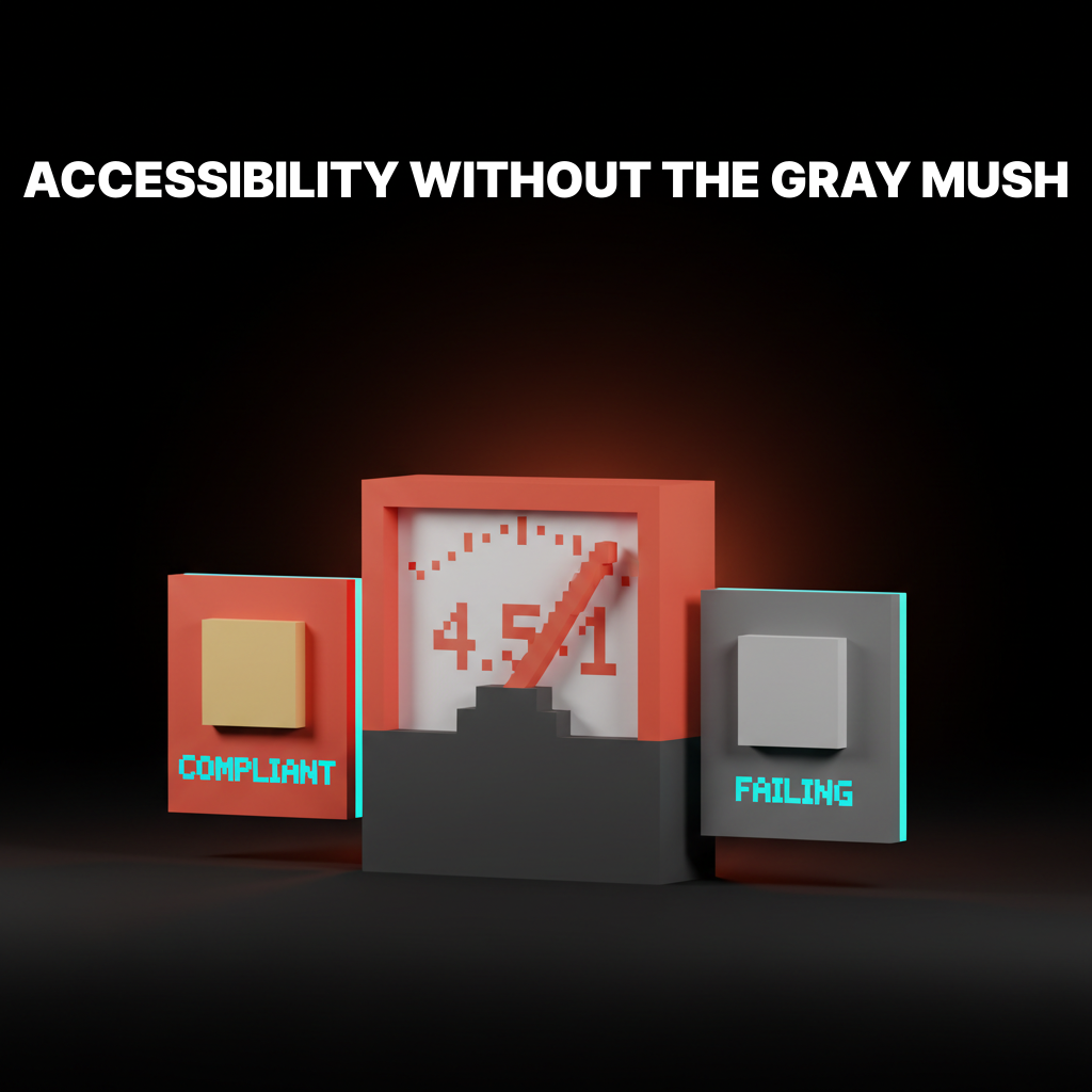
Rule 3: Accessibility is not optional. 8% of men and 0.5% of women have some form of color vision deficiency. If your design relies on color alone to communicate meaning, you are excluding millions of users. Always pair color with text, icons, or patterns.

How to Test Your Palette
Four tests. Five minutes. Do not ship without running all four.
- Squint test. Squint at your design until everything blurs. Can you still tell where the primary action is? If the CTA disappears, your contrast is failing.
- Grayscale test. Convert your design to grayscale. Does the hierarchy still hold? If everything flattens to the same gray, your visual identity depends too much on hue and not enough on value.
- Context test. Show your palette to five people without any design context. Ask them what kind of company it belongs to. If their answers diverge wildly from your intent, the palette is not communicating.
- Accessibility audit. Run your color combinations through a WCAG contrast checker. Body text needs a minimum 4.5:1 ratio. Large text needs 3:1.
FAQ
Does color psychology really affect conversions?
Yes, but not in the way most articles claim. Changing a button from green to red will not increase conversions by 21%. What matters is contrast and context. A button that stands out converts better regardless of its specific color.
What is the best color for a CTA button?
Whatever color has the highest contrast against the rest of your page. There is no universal answer. If your page is mostly blue, orange will pop. If your page is neutral, almost any saturated color works. The only wrong choice is a CTA that blends in.
How many colors should a brand palette have?
Three to five. One primary, one secondary, one accent, and one or two neutrals. More creates noise. Fewer limits flexibility. The constraint is the feature.
Need a palette that actually converts? Brainy builds color systems for brands across every industry.
Get StartedNot ready to hire? Run the free Business Genome, an 11-dimension diagnostic for your venture.
Get your free GenomeGet new papers by email
New Brainy papers in your inbox. Confirm once, unsubscribe anytime.