The 60-30-10 Rule Is Broken: Modern Color Systems That Actually Work
The 60-30-10 rule is an interior design shortcut designers keep forcing onto product work. Here is what modern color systems do instead.
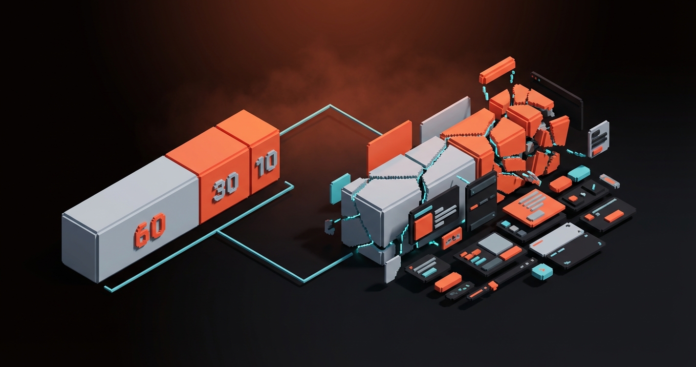
The 60-30-10 rule is the first thing most designers get taught about color, and it is the first thing most serious product teams quietly abandon the moment they ship a real interface. Sixty percent dominant, thirty percent secondary, ten percent accent.
Clean. Quotable. Completely unworkable once a brand has buttons, disabled states, notifications, charts, dark mode, and a documentation site.
The rule is not wrong. It is just built for a different problem. What the best-shipped design systems use instead is not a proportion, it is a role-based token system. This paper walks through why 60-30-10 breaks, what replaced it, and five real design systems doing the replacement at scale.
Where the 60-30-10 Rule Came From
The 60-30-10 rule is an interior decorating shortcut from the mid-twentieth century, retrofitted onto digital design by people who needed a rule to cite.
Its origin is residential design. A room has a dominant color (walls), a secondary color (upholstery, drapes), and an accent (cushions, art). Sixty, thirty, ten. It works for rooms because rooms are single static surfaces viewed by a single human at a time, and they stay the same color until someone repaints.
None of those assumptions survive contact with product design. A digital product is not a static surface. It is hundreds of surfaces, each with its own states, themes, and contexts. The rule was never designed for that world and it shows.
Why It Falls Apart in Product Design
The 60-30-10 rule assumes a single static surface and a single viewer, which is exactly nothing about how product design works.
Real interfaces have disabled buttons, hover states, focus rings, error banners, success toasts, chart data series, empty states, loading skeletons, and semantic colors for destructive actions. None of these map cleanly to "60, 30, or 10 percent of the canvas." They are not canvas. They are behavior.
The rule also collapses the moment you add dark mode. Your 60 percent light neutral now has to become a 60 percent dark neutral, your 30 percent secondary has to shift in tone to maintain hierarchy, and your 10 percent accent usually has to brighten or shift hue entirely to stay accessible. That is not a proportion problem. That is a system problem.
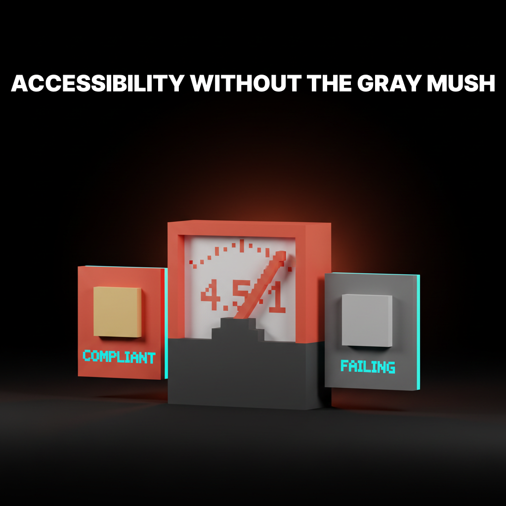
Accessibility is the final nail. WCAG contrast ratios do not care what percentage of your page is blue. They care whether the specific blue on the specific button has enough contrast against the specific background behind it. You cannot solve that problem with ratios of real estate.
What Modern Color Systems Use Instead
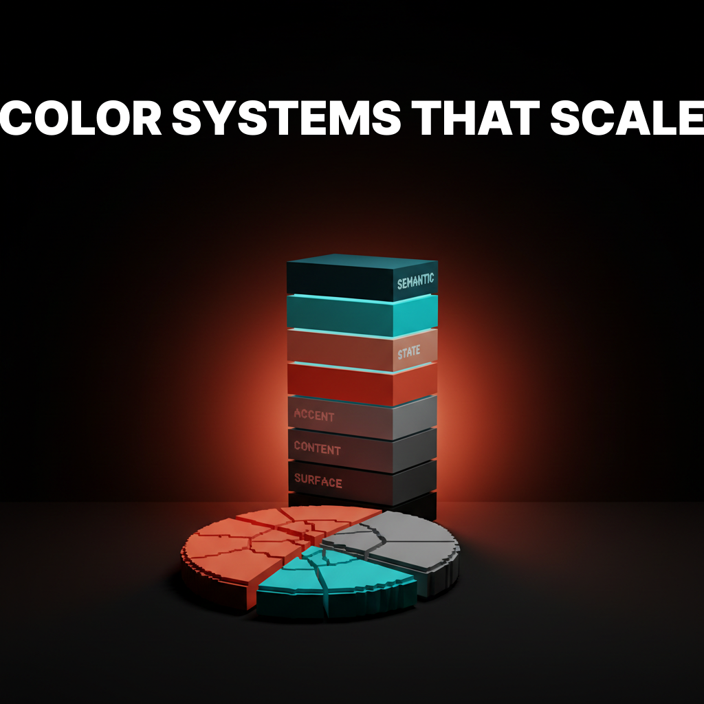
The systems powering the best-shipped interfaces replace proportion rules with role-based token tiers that describe what a color does, not how much of it exists.
| Tier | What it does | Examples of tokens |
|---|---|---|
| Surface | Background layers and elevations | bg-default, bg-subtle, bg-raised, bg-overlay |
| Content | Text and icons on surfaces | text-default, text-muted, text-on-accent |
| Accent | Brand and primary action colors | accent-primary, accent-primary-hover, accent-secondary |
| State | Interactive and feedback states | state-hover, state-focus, state-disabled |
| Semantic | Meaning-loaded signals | success, warning, critical, info |
Each token describes a role. "This color is the surface behind a card." "This color is the text on top of the accent."
The designer never chooses between "secondary or accent at 30 percent." They choose between roles the system already defines.

The benefit compounds. Adding dark mode becomes a matter of mapping the same tokens to different raw values, not repainting the interface. Adding a new brand theme becomes a single token swap at the accent tier. Accessibility gets enforced at the token level, not checked page by page.
Five Design Systems Doing It Right
These are shipping at scale with role-based palettes that hold up across light mode, dark mode, and every surface a user touches.
Material Design 3
Material 3 is the most explicit about the shift. The system defines color roles like "primary," "on-primary," "surface," "on-surface," "inverse-primary," with each role pre-paired for contrast. Designers do not pick colors. They pick roles, and the tokens resolve to the right values for the active theme.
What to steal: the "on-" naming convention. on-primary for text/icons sitting on top of a primary surface encodes accessibility directly into the token name.
Radix Colors
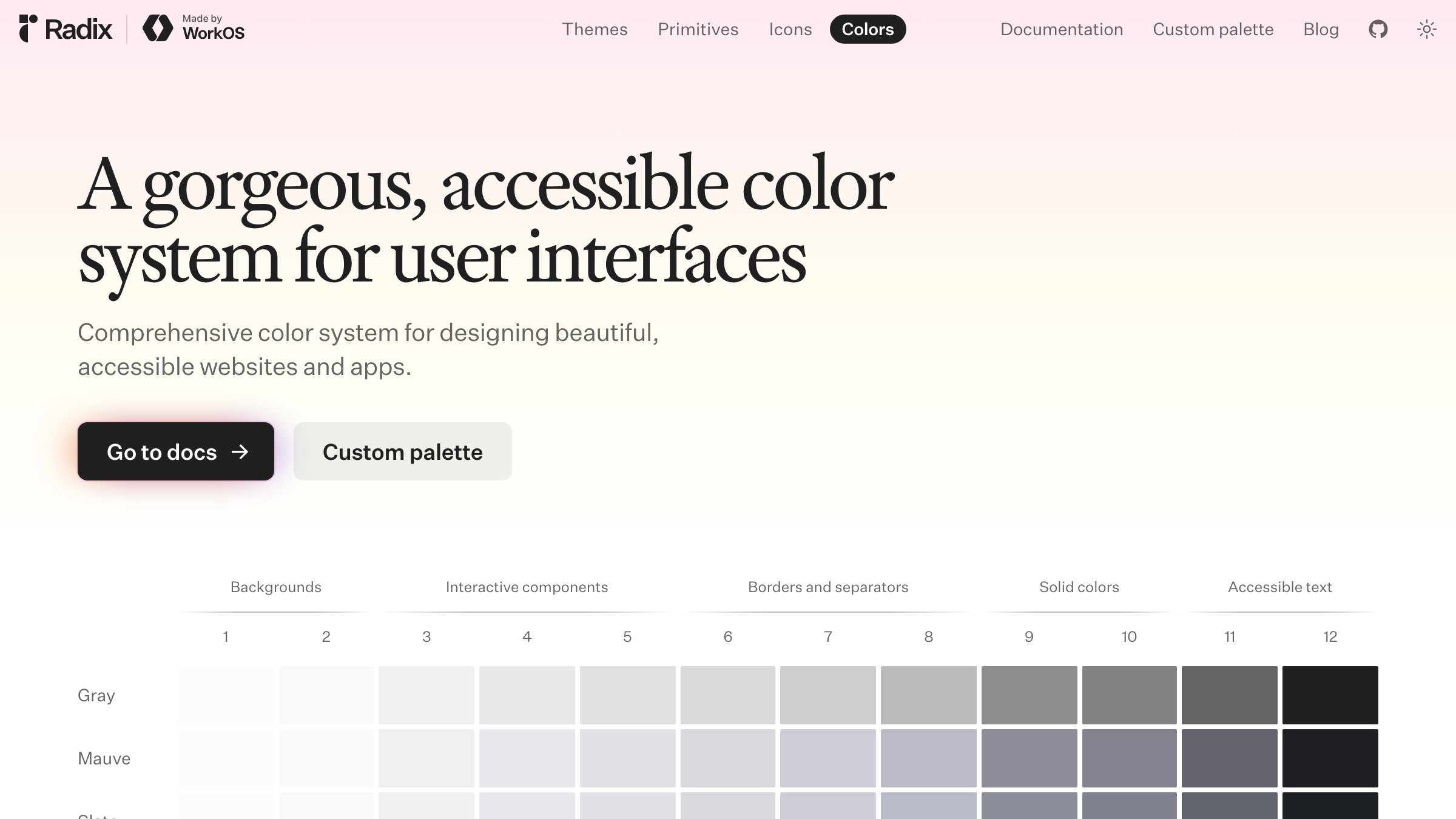
Radix Colors ships 12-step scales per hue, with each step pre-assigned to a role (app background, subtle background, UI element, hover, focus, active, solid, text, high-contrast text). No proportion logic. Every step is a role.
What to steal: the numbered scale with role annotations. It gives designers a shared vocabulary that removes 90 percent of the "which gray do I use" debate.
Shopify Polaris
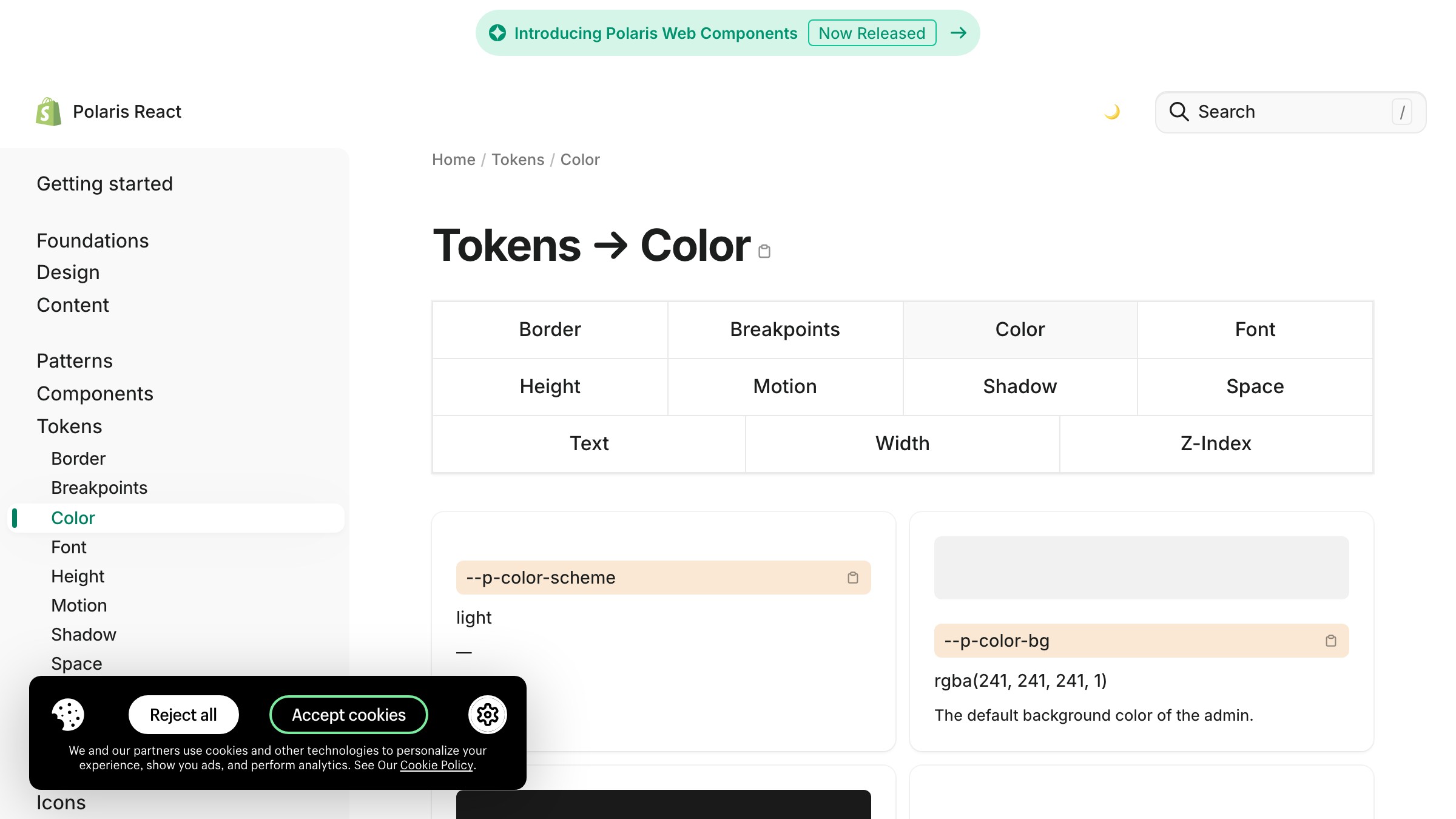
See it live on polaris.shopify.com
Polaris organizes color by component role: bg (surface), text (content), icon, border, and interactive. Each has sub-roles for hover, pressed, disabled, selected. The system makes it structurally hard for a designer to reach outside the defined tokens.
What to steal: the role grouping. Separating "border" tokens from "surface" tokens forces intentional color use at the component level.
Two Brands Shipping It in Production
The design-system docs above are the reference. These two brands are the proof. Stripe and Linear run role-based color at the product layer every day, and both prove the pattern holds under real usage.
Stripe

Stripe ships a shipped brand, not just a design system doc. The public site demonstrates what role-based color looks like in production.
Nearly everything is neutral surfaces and neutral content. Purple is the accent tier and it appears exactly where actions, links, and brand signals live. No proportion logic. Role logic.
What to steal: the discipline of keeping the accent tier thin. Stripe's accent color is used sparingly because its role is reserved. If you use accent colors for decoration, you lose the ability to use them for action.
Linear

Linear leans harder on neutrals than almost anyone shipping at scale. The entire product is layers of dark surface tokens with a single accent hue (purple) doing all the action work. No proportion rule could produce this. It is a pure role-based system where the "accent" tier is one color used with restraint, and the "surface" tier is a full elevation stack.
What to steal: the confidence to let the accent tier be one color. Many new design systems over-allocate accent colors. Linear proves that one well-chosen accent, used consistently, builds stronger recognition than three accents in proportion.
How to Build a Role-Based Palette
Building a palette this way takes longer than picking three colors and assigning percentages, and it pays for itself the first time a designer adds dark mode.
The process runs backwards from how most designers learned. Instead of picking colors first and finding roles for them, you pick roles first and find colors for them.
- Define the role tiers. Start with surface, content, accent, state, semantic. Most products need exactly these five. Some need a sixth for data visualization.
- Write the tokens before picking the hex values. Every token should describe a role (
surface-subtle,content-muted,accent-primary-hover). If a token name describes a color ("light-blue"), rename it. - Fill in the neutral scale first. Most of a real interface is neutrals. Build a full scale (Radix uses 12 steps for a reason) before you touch brand color.
- Add the accent tier last. The accent color is usually the only spot where brand identity actively lives. Restraint here is the whole game.
- Map dark mode by re-resolving tokens, not by redesigning. If your system is role-based, dark mode is a token value swap, not a color overhaul.
- Enforce accessibility at the token layer. Every
on-surfacetoken should pass 4.5:1 against its paired surface. Bake the check in.
The tempting shortcut is to define three roles (primary, secondary, accent), declare victory, and ship. That is the 60-30-10 rule wearing a tokens costume. It falls apart at the exact same point: the first real component.
For the broader frame on how color decisions read to users before any of this token work matters, color psychology in design covers the meaning layer. For how color systems sit inside the larger system context, the design systems guide has the full picture.
FAQ
Is the 60-30-10 rule ever useful?
Yes. Single-surface design still benefits from it. Posters, social posts, marketing hero sections, packaging, editorial spreads. Anywhere the deliverable is one canvas seen once, the rule gives a fast proportion shortcut. Product design is not that world.
How many colors should a design system have?
Fewer raw hex values than you think, organized into more tokens than you think. Most shipping systems have 8 to 12 neutral steps, 8 to 12 accent steps, and 3 to 5 semantic families, all resolved into role-based tokens. The raw color count is small. The role count is large.
What is the difference between a color palette and a color system?
A color palette is a set of colors. A color system is a set of roles, a set of rules about how those roles interact, and a mapping from roles to colors that can change per theme. A palette answers "what colors are in the brand." A system answers "what color is this element in this state in this theme."
Stop Measuring Color in Percentages
The 60-30-10 rule is not evil. It is just out of scope.
Product design is not a room. It is a system of surfaces, states, and roles that changes as the user moves through it.
Measuring color in percentages makes as much sense as measuring typography by percentage of the page. You do not say "30 percent of the text is headings." You say "headings are a role with a defined style." Color has to work the same way.
The brands shipping the best-scaling visual identity work, Material, Radix, Polaris, Stripe, Linear, figured this out and built around it. Copying their percentages misses the point. Copying their role structure is the whole point.
If your current palette is three colors and a vague allocation rule, you do not have a color system. You have a color preference. Build the tiers, name the roles, and let the hex values be the last thing you argue about.
Need a color system built to scale, not just to swatch? Brainy builds palettes with token tiers, dark mode, and accessibility baked in.
Get StartedNot ready to hire? Run the free Business Genome, an 11-dimension diagnostic for your venture.
Get your free GenomeGet new papers by email
New Brainy papers in your inbox. Confirm once, unsubscribe anytime.