Accessible Color Contrast: WCAG Without the Gray Mush
How to design for WCAG 2.2 contrast without flattening your brand into gray. Ratios, APCA, real design-system examples, and a tokenized testing workflow.
Accessibility and design personality are not in conflict. That is the myth most brand teams tell themselves when they avoid the contrast conversation, and it is also why so many "accessible" rebrands end up looking like airport signage.
Accessible color contrast is a measurement problem. Modern design systems have already solved it at the token layer, which means you do not have to choose between hitting WCAG and keeping the brand interesting. You just have to know the rules, know where the rules are wrong, and know where the work actually happens.
Why Contrast Is the One Rule You Cannot Skip
About 300 million people see color differently than your base palette assumes, and even more use interfaces in low light, on bad screens, or through partial vision loss that nobody has filed a ticket about.
Low contrast is the single most common accessibility failure on the web. It is also the easiest to fix. Blind spots, color deficiencies, glare, aging eyes, cheap monitors, direct sunlight on a phone screen. All of these collapse into the same solution: enough contrast between text and background that the message survives the hardest case, not just the designer's Retina display.
The cost of getting this wrong is not just exclusion. It is compliance exposure. The EU's European Accessibility Act, Section 508 in the US, AODA in Ontario, and a growing list of national laws all use WCAG as their legal reference. Contrast is one of the first things an audit checks because it is one of the first things that ships broken.
WCAG 2.2 Contrast Rules in Plain Language
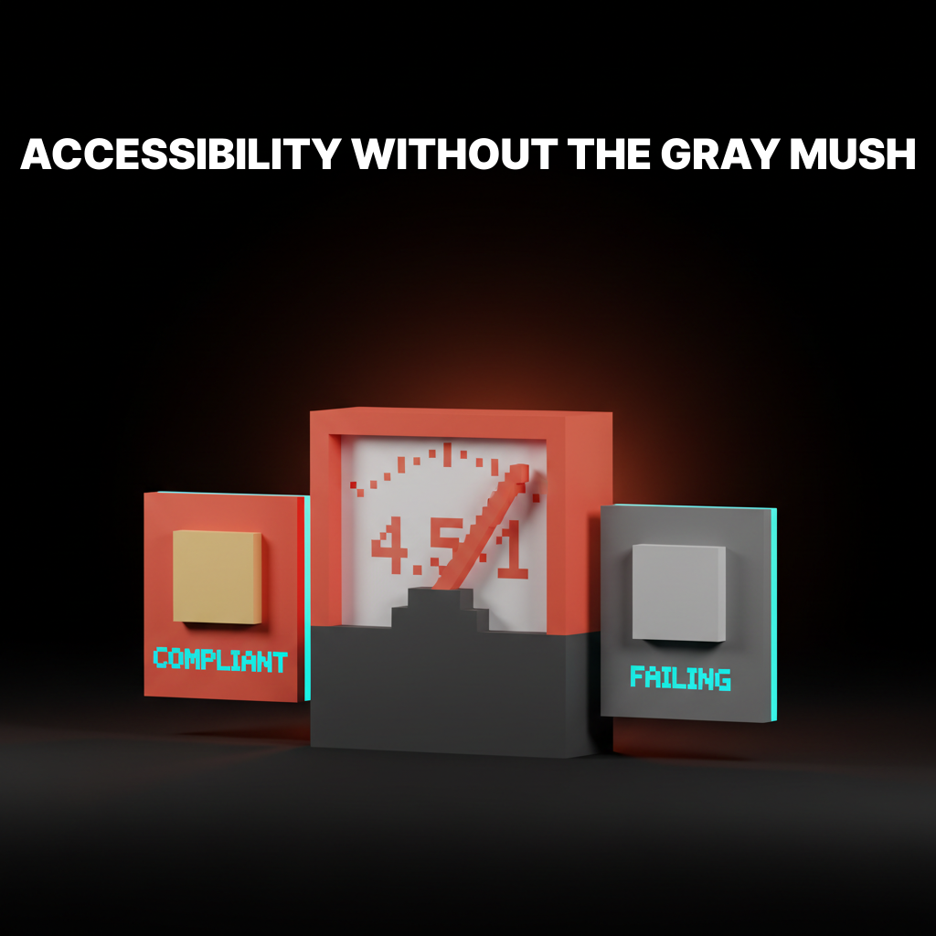
WCAG gives you three numbers: 4.5:1, 3:1, and 3:1, and each one applies to a specific type of UI element.
| Element | AA minimum | AAA minimum | Notes |
|---|---|---|---|
| Body text | 4.5:1 | 7:1 | Any text smaller than 18pt regular or 14pt bold |
| Large text | 3:1 | 4.5:1 | 18pt+ regular or 14pt+ bold |
| UI components and graphics | 3:1 | Not specified | Buttons, icons, form borders, focus rings |
| Text in logos or decorative images | Exempt | Exempt | Brand elements and incidental text do not count |
AA is the level most commercial products aim for and most accessibility laws require. AAA is a stricter target, mostly used by government, healthcare, and education work. Unless someone hands you a compliance doc saying AAA, AA is the floor.
The trap most designers fall into is forgetting the 3:1 non-text rule. A form field border at 2:1 against the page background fails even if the label inside it passes.
A focus ring with insufficient contrast fails. An icon whose meaning depends on color at 2.5:1 fails. Non-text contrast is not optional.
Why WCAG Math Is Often Wrong
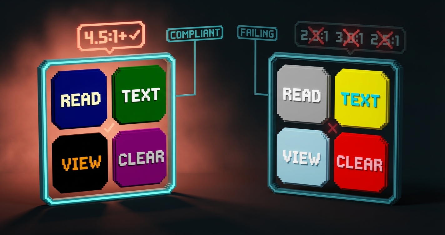
WCAG contrast ratios are a 30-year-old formula that ignores perceptual vision, which is why they sometimes pass colors that look terrible and fail colors that look fine.
The WCAG 2 formula is based on luminance only. It treats text-on-background as a linear relationship between two colors' relative brightness. That is not how the human visual system actually reads contrast.
Real perceptual contrast depends on font weight, font size, color temperature, and what the eye has been looking at a second earlier. WCAG 2 handles exactly none of this. The result is a ratio that treats light gray text on white the same as black text on light gray, even though one is readable and the other is painful.
How APCA Fixes the Perceptual Problem
APCA, the Accessible Perceptual Contrast Algorithm, measures contrast the way human vision actually works, which is why the WCAG 3 draft proposes it as the replacement.
APCA scores range from 0 (no contrast) to roughly 108 (extreme contrast). Unlike WCAG 2, it accounts for text weight, text size, and polarity (light-on-dark versus dark-on-light behave differently to the eye).
Rough APCA thresholds for common text:
- Body copy (16px regular): 75+ (required), 90+ (ideal)
- Small body (14px regular): 90+ (required)
- Large text (24px+): 60+ (required)
- Non-text UI: 45+ minimum
APCA is not yet legally required anywhere. But shipping products are already using it as an internal standard because it correlates better with what actually reads well. The smart move is to meet WCAG 2 AA for compliance and meet APCA for actual quality. Both targets at once is not hard if your color tokens are designed for it.
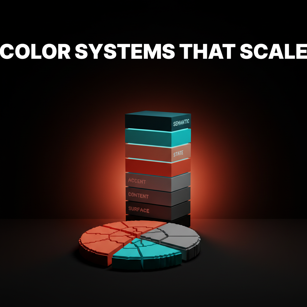
Four Design Systems Tokenizing Contrast
These systems already encode accessibility into the token layer, so designers pick a role instead of computing a ratio.
Radix Colors
Radix Colors ships 12-step scales with each step pre-assigned to a role. Steps 11 and 12 are the high-contrast text steps, guaranteed to pass WCAG AA against the lower steps. The role tokens (text, textContrast, solid, solidHover) mean designers never compute a ratio. They pick a role.
What to steal: the numbered contrast-by-role model. Any designer reaching for step 11 knows it passes against the lighter steps of the same scale. The ratio is encoded in the step number itself.
Material Design 3
Material 3 pairs every color role with an on- counterpart (on-primary, on-surface, on-error) that is guaranteed to meet 4.5:1 against its parent. The paired tokens are the accessibility layer, built directly into the system.
What to steal: the on- pattern. When a designer reaches for on-primary for text, accessibility is automatic. There is no decision to get wrong.
Two More: Ratios and Perceptual Systems
Radix and Material solve contrast through role pairing. The next two solve it through documented ratios and perceptually uniform scales. Both approaches work. Both are worth stealing from.
GitHub Primer
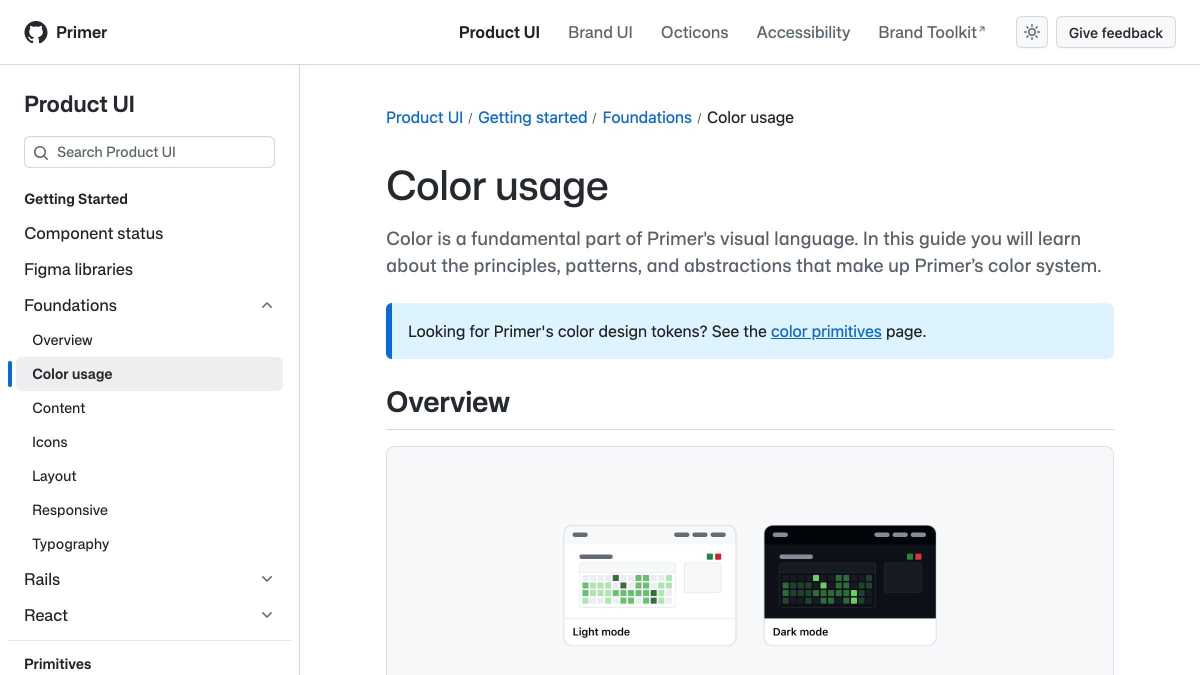
Primer separates foreground, background, and border tokens into explicit tiers with documented contrast ratios. Their fg.default and bg.default are published with exact ratios, and every role-based semantic token has the same treatment.
What to steal: publishing the ratios next to the tokens. When every token's contrast against every relevant background is documented, designers and developers can skip the checker entirely.
Adobe Spectrum
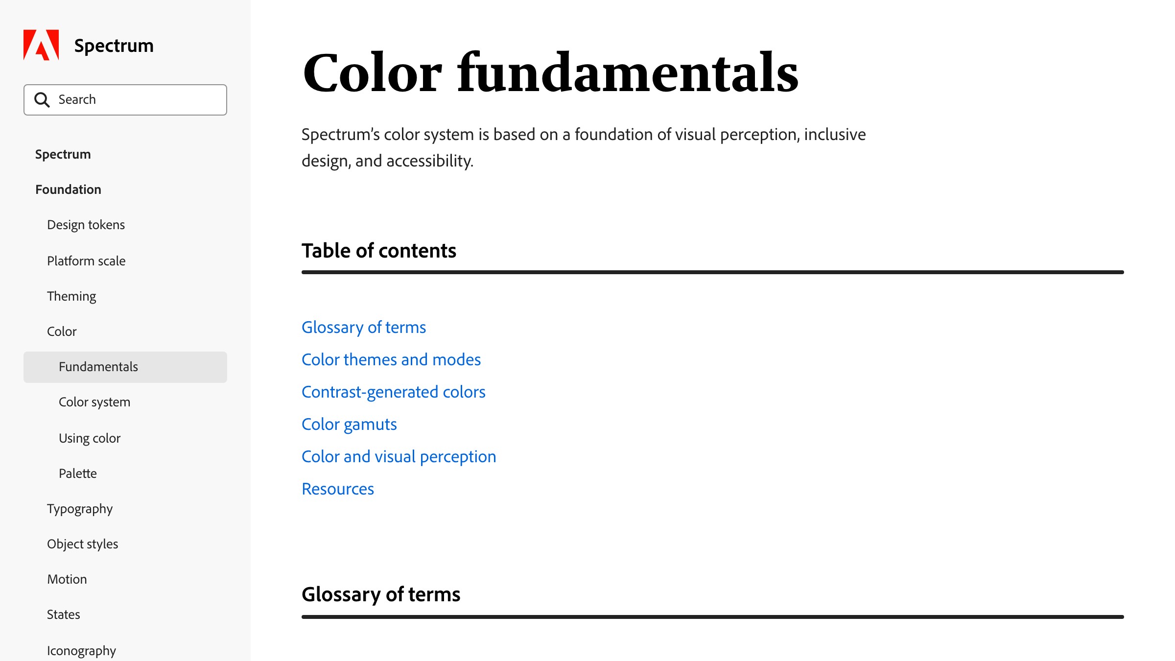
See it live on spectrum.adobe.com
Spectrum uses perceptually uniform color scales so that two tokens with the same step number have the same visual weight across hues. That means swapping hues within a theme preserves the contrast relationships. No more "it passed in blue but fails in orange."
What to steal: perceptual uniformity. Scales built on perceptual models (like HSLuv, OKLCH, or Spectrum's custom approach) make accessibility portable across brand themes.
How to Stay Accessible Without Losing Personality
Accessibility does not mean black text on white and a muted brand, and the teams shipping the most inclusive products are the ones who figured that out.
The trick is where in the stack accessibility lives. If it lives at the token layer, the brand gets to be vivid and designers still get accessible outputs. If it lives as a final review, every brand color is a liability waiting to fail an audit.
Three techniques keep personality and accessibility in the same room:
- Split the accent tier into a brand color and an accessible action color. Linear uses a specific purple for brand moments and a slightly different purple for interactive elements. Both are recognizably the brand. Only one is guaranteed against every surface.
- Use perceptually uniform scales. OKLCH and HSLuv map color values to perceived brightness, so you can rotate through hues without breaking contrast. Radix, Spectrum, and Material 3 all do variations of this.
- Ship dark mode as a parallel token set, not an afterthought. A token that fails in dark mode is not dark-mode-ready. If your system resolves
text-defaultto one color in light and a different color in dark, both values must pass against their paired surface.
The worst outcome is the compromise nobody asked for: a muted brand that is still not accessible. That happens when teams react to contrast feedback by desaturating every color instead of fixing the pairings. Desaturation is not the same as accessibility. Relationships are.
The Accessibility Testing Workflow
Testing contrast is cheap, automated, and completely pointless if you leave it until the design review.
The workflow that works runs contrast checks at four points, not one.

- At token definition. When a token is created, its allowed surfaces are defined too.
text-defaultis only allowed onbg-default,bg-subtle, andbg-raised. The token's contrast against each is checked once and locked. - At component commit. Storybook plus an axe-core or pa11y integration runs accessibility checks on every component variant as part of CI. Any new variant that fails is blocked before merge.
- At design file handoff. Figma plugins like Stark or the built-in WCAG checker flag issues inside the design tool. Catch it at design time, not review time.
- At page level. Lighthouse, axe DevTools, or pa11y runs on live pages in staging or production. This catches real-world failures (third-party embeds, user-generated content, dynamic themes) that component tests miss.
The point is not to run more tools. The point is to move the check earlier. A contrast failure found by a CI pipeline is a five-minute fix. The same failure caught in a pre-launch audit costs the team a week.
For the structural reason this layered approach works, the design systems guide covers why token-layer thinking wins. And the 60-30-10 rule is broken piece explains why role-based color (which accessibility depends on) replaced proportion-based thinking.
FAQ
Is WCAG AA enough or do I need AAA?
AA is the standard for most commercial products and most accessibility laws. AAA is only legally required in specific contexts (government, healthcare, education) and is expensive to hit without flattening the palette. Aim for AA as the floor, APCA-ideal as the ceiling.
Does every non-text element need to meet contrast ratios?
Non-text UI components that convey meaning need 3:1 minimum under WCAG 2.2. That covers buttons, form borders, focus rings, icons with meaning, and graphical elements. Pure decoration (background patterns, ambient gradients) is exempt. Incidental text (a logotype, a photo caption overlay) is also exempt.
What is the difference between WCAG and APCA?
WCAG 2 is the current legal standard, based on a 30-year-old luminance formula. APCA is the proposed replacement in the WCAG 3 draft, based on how human perception actually works. APCA scores correlate better with real readability but are not yet legally required. Shipping products use both: WCAG 2 for compliance, APCA for quality.
Bake Accessibility Into the Tokens
Accessible color contrast is not a style choice. It is a system property.
The teams shipping the most inclusive, brand-forward products are the ones who stopped treating accessibility as an afterthought and started treating it as a property of the color palette itself.
Tokens encode the ratios. Scales encode the pairings. Testing happens at four points in the workflow. Nobody is holding a contrast checker up to a screen before a launch.
If your current process involves a designer eyeballing a palette for "looks readable," you are going to fail an audit. If your process involves a checker tool plus manual reviews, you are going to fail at scale. If your process involves role-based tokens that encode accessibility at the definition layer, you are going to ship.
Build the tokens. Publish the ratios. Automate the checks. The brand stays vivid, the interface stays readable, and the audit becomes a formality instead of a rebuild.
Need a color system that hits WCAG without flattening the brand? Brainy builds token-layer accessibility into every palette.
Get StartedNot ready to hire? Run the free Business Genome, an 11-dimension diagnostic for your venture.
Get your free GenomeGet new papers by email
New Brainy papers in your inbox. Confirm once, unsubscribe anytime.