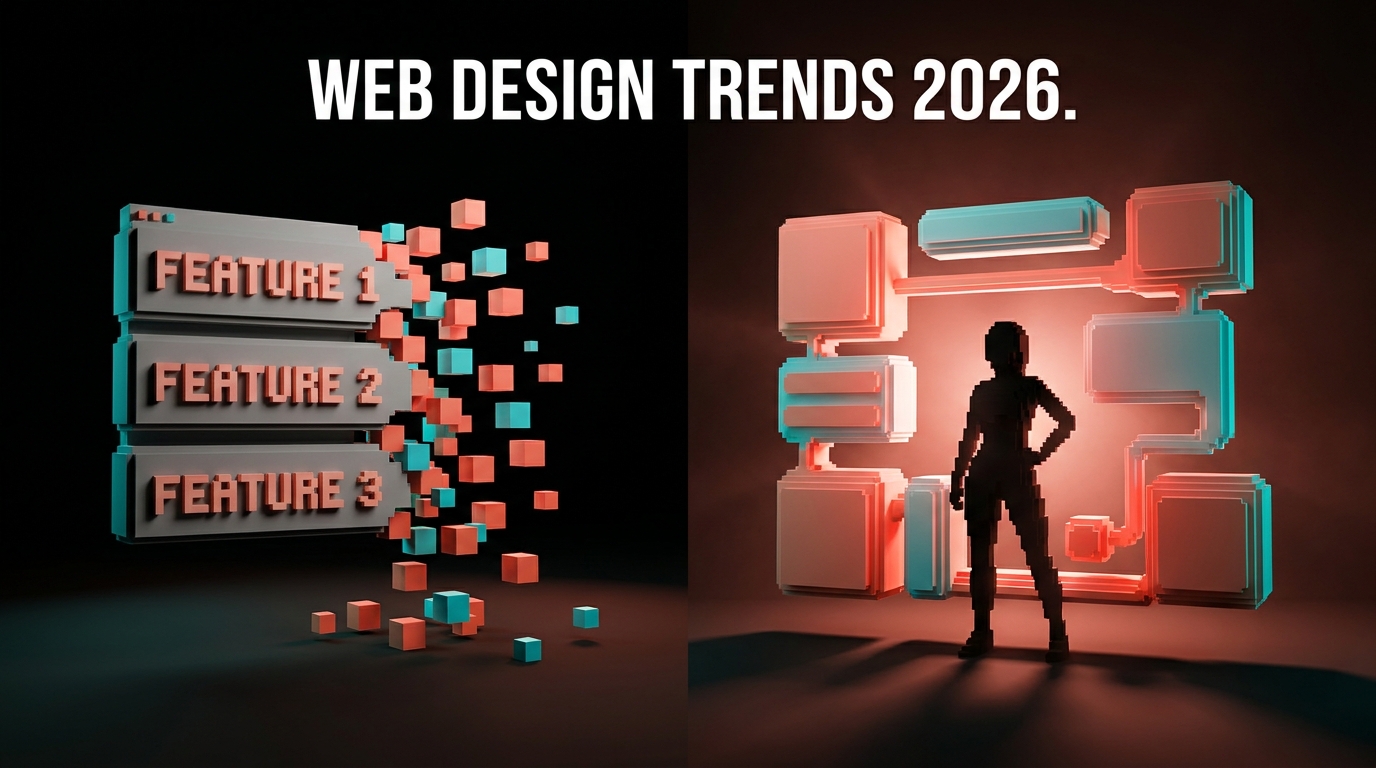
Brutalist Web Design in 2026: When the Trend Works and When It Backfires
A teardown of brutalist web design in 2026. Real examples, conversion data, type-driven heroes, and a checklist for when raw layouts help versus when they sabotage clarity.
Brutalism on the web is not ugly design, it is honest design. That distinction is the whole reason it came back in 2026, and the reason most brands using it are getting it wrong.
The 2026 brutalist resurgence is real. Bloomberg, Balenciaga, Gucci Vault, Are.na, and a long tail of indie SaaS sites are all leaning on raw type, monolithic blocks, and stripped-back interaction. The aesthetic works when the brand has earned the attention. It tanks when it has not. This piece is a teardown of when brutalism fits, when it backfires, and what separates the sites that pull it off from the ones that look like a developer threw out the design system and called it a style.
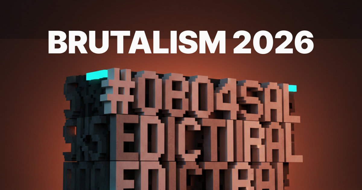
What brutalist web design actually is in 2026
Brutalism on the web inherited the name from architecture, where the term meant exposed concrete and unhidden structure. On a website that translates to exposed structure too. Raw HTML rhythms. Big system fonts. Borders you can see. Buttons that look like buttons. Grids that show their math.
Brutalism in 2026 is not the 2018 Craigslist revival. It is not Times New Roman on a white background as a joke. It is a deliberate aesthetic that strips away the polish layer to make the message the loudest thing on the page. Think Bloomberg Businessweek's editorial sections, Balenciaga's post-2022 site direction, Are.na's monospace navigation, Berghain's site, MSCHF's product drops.
The defining moves in 2026:
- Type at hero scale, often filling the viewport
- Asymmetry that feels intentional, not broken
- Monospace or industrial sans paired with one display face
- Borders, dividers, and rules that read as structure
- One accent color, used sparingly, often acid green or hazard yellow
What it is not: minimalism, plain HTML, or a blank slate. Brutalism is a deliberate choice with strong opinions. Minimalism removes. Brutalism shouts.
Why brutalism came back this hard
Every aesthetic moment is a reaction. 2026 brutalism is a reaction to template fatigue.
Look at the average SaaS landing page in 2024 and 2025. Soft gradient backgrounds, friendly illustrations, three-column feature rows, a glass card or two, the same purple-to-pink wash. The web started feeling like one giant design system that everyone shared. Brutalism is what happens when a generation of designers gets bored of the same theme and wants to be sure their site does not look like the next twenty-five sites.
It also rides a real cultural shift. Audiences in 2026 trust honesty more than polish. A site that looks deliberately raw signals that the brand is confident enough not to hide behind production value. That signal is rare and it is valuable, which is why fashion houses, editorial publications, and confidence-driven SaaS brands are using it.
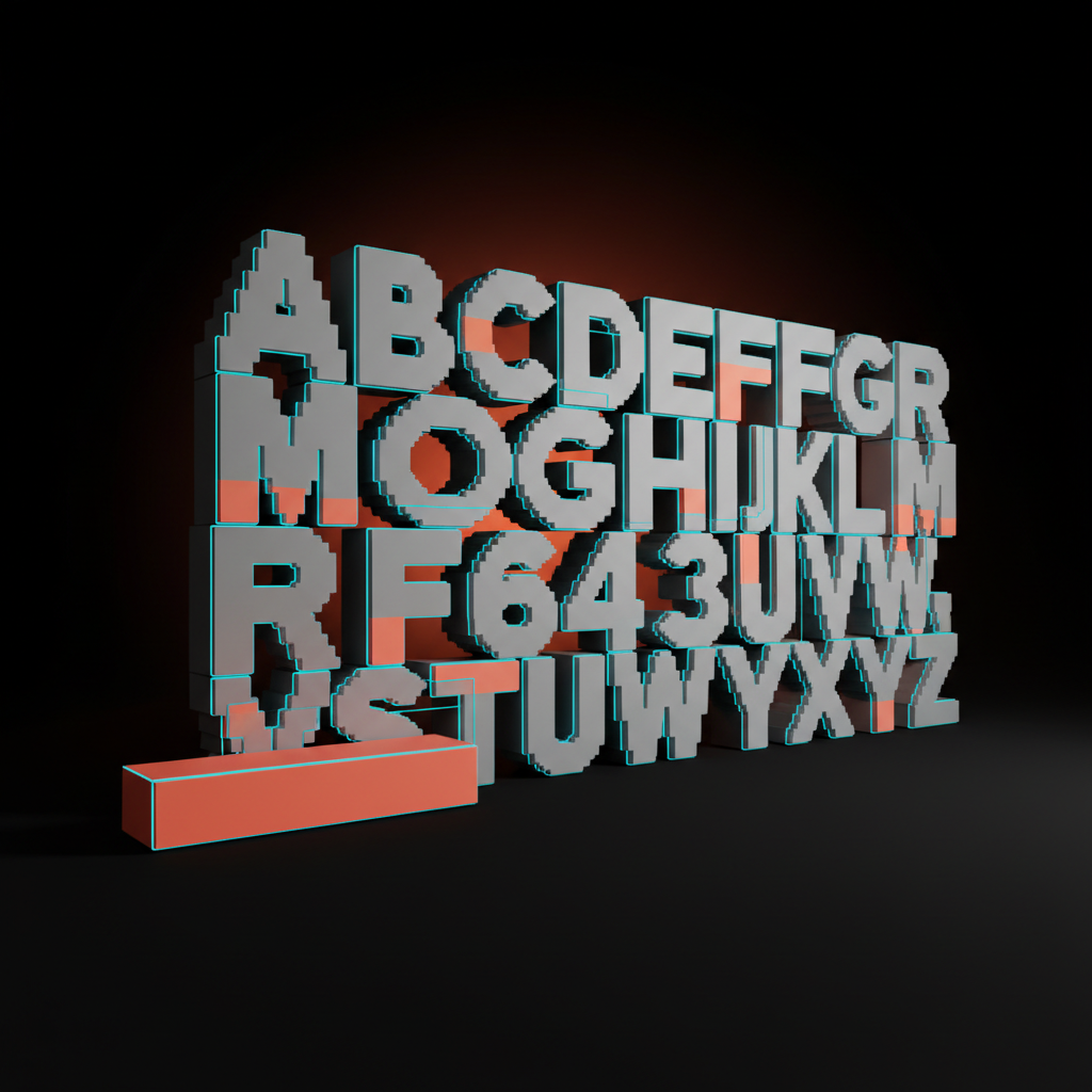
Type-driven heroes are the new brutalist signature
The cleanest brutalist sites in 2026 lead with a wall of type, not a hero illustration.
Walk through the canon. Bloomberg's editorial verticals open with massive headlines set tight against the viewport edge. Balenciaga's collection pages use the brand wordmark at hero scale with no supporting imagery. Are.na's homepage is a tight monospace block. Berghain.berlin is functionally one giant typographic statement. The pattern: the headline carries the entire hero, and everything else gets out of the way.
This works because type is the densest brand signal a site can ship. A photograph could belong to anyone. A wordmark at hero scale could only belong to one brand. When the hero section is doing identity work, you do not need an illustration on top.
Three rules for type-driven brutalist heroes that actually work:
-
Pick one face and commit. Two faces in a brutalist hero is one face too many.
-
Set the type to bleed. The viewport edge is part of the composition. Margin equals timidity.
-
Pair scale with restraint. If the headline is huge, the supporting copy stays small and quiet. Two loud things cancel.
The brands that get this wrong fill the rest of the hero with extra UI to compensate. A massive headline plus three CTAs plus a logo cloud is not brutalist. It is a polished site wearing a brutalist mask.
The conversion data behind raw layouts
Brutalism converts when the brand has earned attention. It tanks when it has not.
This is the part most teams skip. Brutalist sites measured against polished controls show a clear directional split based on traffic source. On warm traffic, returning users, branded search, organic referrals, raw layouts hold or lift conversion. The audience has already decided the brand is worth their time, and the aesthetic confirms it. On cold acquisition, paid traffic from someone scrolling Instagram, raw layouts lose against polished controls almost every time. The cold visitor has not invested attention yet, and brutalism asks them to figure out the page.
The same pattern shows up in usability research. Brutalist sites score higher on "memorable" and "feels like the brand" metrics. They score lower on "I knew what to do next" for first-time visitors. Both of those are real, and they matter at different funnel stages.
The takeaway is not "brutalism does not convert." It is "brutalism converts on the right audience." If your site is mostly serving warm traffic, brutalism is a positioning win. If your site is the first impression for cold paid traffic, brutalism is asking the audience to do work they have not yet committed to.
If your site needs to do both jobs, the answer is not a half-brutalist compromise. The answer is two different surfaces. A brutalist brand site for warm traffic, a clearer conversion-focused landing page for cold campaigns. Want to ship that split correctly? Hire Brainy.
Brutalism that signals confidence vs brutalism that signals laziness
Same aesthetic, two opposite reads, and the difference is intent visible in the details.
Confident brutalism is dense. The grid is tight. The type is set with care. The asymmetry is deliberate and rebalanced with weight. The accent color appears in three places that form a triangle across the layout. Hover states are deliberate, not absent. The site looks raw because the designer made it raw, and you can feel the choices.
Lazy brutalism is empty. There is too much whitespace where decisions should be. The headline is huge but the rest is just default. There is no rhythm, no accent, no pairing. The site looks raw because nobody decided what should fill the space, and you can feel the absence.
| Confident brutalism | Lazy brutalism |
|---|---|
| Tight, deliberate grid with clear rhythm | Empty page with one big headline |
| One accent color used in three intentional places | No accent, or accent used randomly |
| Custom or carefully chosen monospace and display pairing | System default fonts, no pairing |
| Hover and focus states designed with intent | No hover states or default browser styling |
| Asymmetry that resolves into balance | Asymmetry that just feels broken |
| Edge-to-edge composition with margin used as a tool | Viewport-centered content with random padding |
| Restraint in motion and color | Absence of motion and color |
The test: if you stripped out one element, would the page feel worse? On confident brutalism, yes. On lazy brutalism, no. That is the whole difference.
When brutalism fits your brand and when it sabotages clarity
Brutalism is a positioning lever, not a default. Use it where the message can carry the load.
Brutalism fits when:
- Your brand already has cultural weight or wants to declare it (fashion, editorial, music, art, established SaaS)
- Your audience is design-aware and rewards rigor
- Your value proposition is bold and easy to state in one line
- Your traffic is mostly warm or branded
- Your team can commit to the aesthetic across product, marketing, and content surfaces
Brutalism backfires when:
- Your audience needs hand-holding to understand the offer
- Your product has feature density that benefits from polished hierarchy
- You sell into compliance-heavy or trust-sensitive industries (health, finance, B2G)
- Your traffic is dominated by cold paid acquisition
- Your brand voice is warm, friendly, or service-led
The mistake most brands make is treating brutalism as a visual treatment. It is not. It is a brand stance. If the company is positioned as approachable and the site is positioned as brutalist, the site lies about the brand and visitors feel the friction without naming it.
A practical rule: brutalism is for brands that want to be respected before they are liked. If your brand strategy says "we want to be liked first," skip it.
A fit checklist before you ship a brutalist redesign
If your project does not score five of seven on this list, do not go brutalist.
- Your brand has earned attention or is willing to commit to a long campaign to earn it
- Your traffic is at least sixty percent warm or branded
- Your value proposition fits in one short, declarative sentence
- Your team has a strong typography system or is willing to build one
- Your design lead has a point of view, not just taste references
- Your audience trusts honesty over polish
- Your competitive landscape rewards differentiation more than familiarity
Score four or fewer and brutalism becomes a costume. The site will look bold for a quarter, then get rolled back when the conversion numbers come in. Score five or more and brutalism becomes a moat, because almost no competitor will commit hard enough to copy it.
FAQ
What is brutalist web design in 2026?
Brutalist web design in 2026 is a deliberate aesthetic that strips away polish to make the message the loudest thing on the page. It uses raw type at hero scale, asymmetric grids, exposed structure, and a restrained accent palette. It is not the 2018 anti-design revival. It is a confident, intentional style used by brands like Bloomberg, Balenciaga, Are.na, and Berghain to signal cultural weight.
Does brutalist web design convert?
Brutalism converts on warm and branded traffic, where the audience has already invested attention in the brand. It generally underperforms polished controls on cold paid acquisition, where first-time visitors need clearer hierarchy and explicit conversion paths. The data is directional but consistent across studies, so the right answer is to match the aesthetic to the traffic source rather than apply it everywhere.
What is the difference between brutalism and minimalism?
Minimalism removes elements until only the essential remains. Brutalism strips polish but keeps strong opinions. A minimalist page is quiet. A brutalist page shouts. Minimalism feels neutral. Brutalism feels declarative. They share a love of whitespace and restraint, but the intent is opposite.
Is brutalist web design accessible?
Brutalism can be fully accessible if the designer treats accessibility as part of the aesthetic, not an afterthought. Strong type contrast, clear focus states, real semantic HTML, and respectable color contrast ratios are all compatible with raw layouts. The brutalist sites that fail accessibility usually fail because the team confused brutalism with carelessness, not because the style is incompatible with WCAG.
What kinds of brands should use brutalist web design?
Brands that already have or want to signal cultural confidence: fashion, editorial, music, art, design-aware SaaS, and established direct-to-consumer brands. Brutalism is a poor fit for service brands that need to feel warm, for compliance-heavy industries that need to feel safe, or for early-stage products selling primarily to cold paid traffic that has not yet decided to trust the brand.
The pattern behind brutalism that actually lasts
The brutalist sites that survive 2026 share one thing, and it is not raw HTML.
It is rigor. Every brutalist site that holds up over time, Bloomberg, Are.na, Balenciaga, has the most rigorous underlying visual hierarchy on the web. The reason the rawness reads as confident is because the system underneath it is unusually disciplined. The grid is tighter than a polished site. The type pairing is more deliberate. The accent usage is more controlled. The brutalist surface is the loud part. The system underneath is the quiet, careful part.
That is the whole insight. Brutalism is not the absence of design. It is design with the polish layer removed. If the system underneath is sloppy, removing the polish exposes that sloppiness. If the system underneath is rigorous, removing the polish lets the rigor speak.
The 2026 brands getting brutalism right are not winning because they got bolder. They are winning because they got more disciplined and then dropped the makeup.
If you want a brutalist site built on that kind of rigor and not on a Tumblr aesthetic from 2018, hire Brainy. We ship web design, product UI, and landing pages for brands ready to commit to a position, not just a vibe.
Want a brutalist site that converts and not just provokes? Brainy ships web design and product UI for brands ready to commit to the aesthetic.
Get StartedNot ready to hire? Run the free Business Genome, an 11-dimension diagnostic for your venture.
Get your free GenomeGet new papers by email
New Brainy papers in your inbox. Confirm once, unsubscribe anytime.