How to Build a Brand Color Palette That Actually Works
A working designer's guide to building a brand color palette that survives dark mode, disabled states, and every surface past the logo. Five real brands inside.
Most brand color palettes are built for a logo pitch, and they stay pretty right up until the first real button needs a disabled state.
A working brand color palette is not five colors. It is a layered system: one anchor, a real neutral scale, semantic colors, state colors, and a dark mode plan that existed before anyone opened Figma. This paper walks the layers, shows five brands getting it right, and ends with the build order.
Why Most Brand Color Palettes Fail
Most brand color palettes fail not because the colors are wrong, but because they were built for a logo pitch instead of a shipping system.
The typical process runs like this. A designer moodboards, picks five colors that feel on-brief, labels them primary, secondary, accent, light, dark, and hands the palette to the teams shipping product, site, docs, and campaigns. None of those teams were in the room when the five swatches were picked.
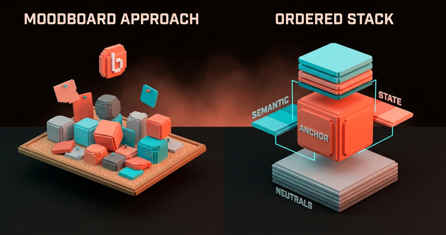
The "secondary" has no usable middle range. The "primary" is too saturated for body text. Nobody picked a neutral gray, so the designer invents one.
The dark mode team gives up and reverses everything through a CSS filter. The palette did its job for the pitch. It failed at the work.
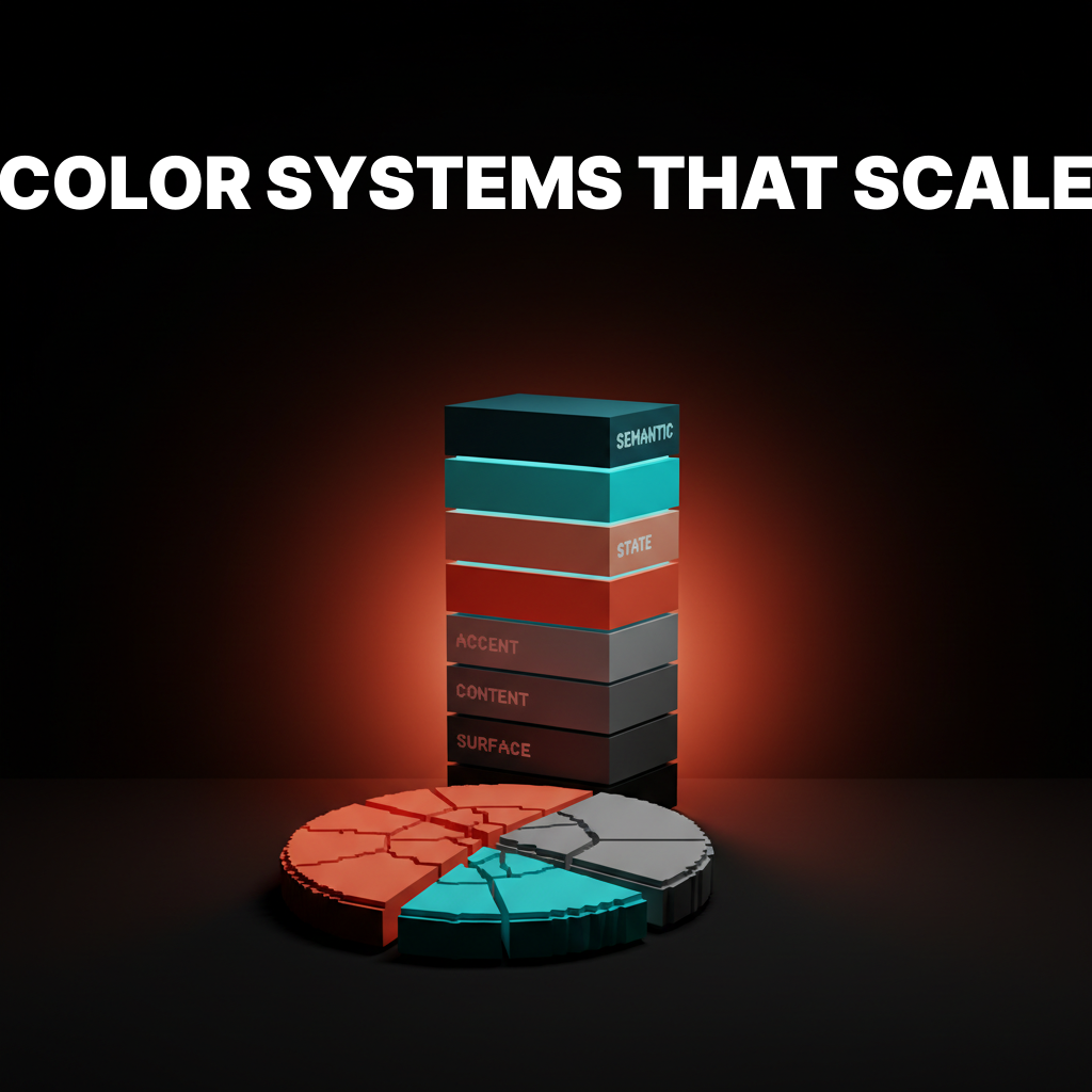
The Five Layers of a Working Palette
A palette that survives real brand work has five layers, not five colors. Designers shipping brand systems at scale argue about which layer a color belongs in, not about which shade of green is "more us."
| Layer | What it does | Typical count |
|---|---|---|
| Anchor | Carries brand recognition | 1 (maybe 1 support) |
| Neutrals | Surfaces, text, borders, backgrounds | 9-12 steps |
| Semantic | Success, warning, critical, info | 3-5 families |
| State | Hover, focus, pressed, disabled | Paired to every interactive color |
| Dark | Dark-mode resolution of every layer | Full parallel set |
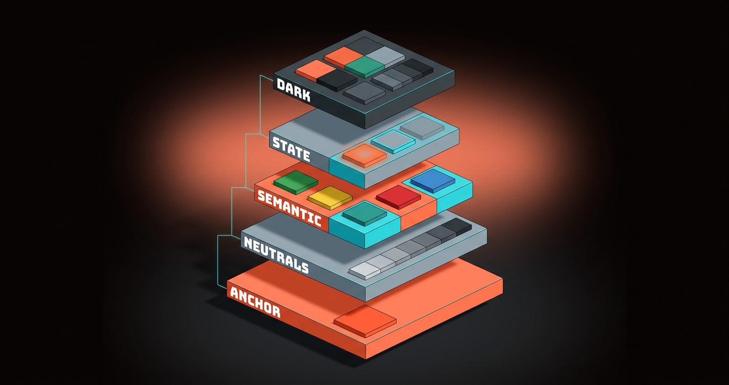
Notice what is not on that list. No "secondary brand color," no "tertiary," no "accent 2." Most brands that think they need a second brand color actually need a fuller neutral scale or a bolder anchor.
Flattening is the bug. The layers are the feature.
Pick the Anchor Color First and Last
The anchor is the one color that carries brand recognition across every surface, and it gets chosen twice: once at the start, once after you know what it has to live next to.
The first pick is directional. The anchor should be the one hue that, if stripped of the wordmark, would still signal the brand. The hue choice is also an emotional claim, which is where color psychology decides half the work before the hex is ever committed. Think Stripe purple, Linear purple, Figma blue, Notion black, Slack magenta. One color does the identity work.
The second pick is technical. After the neutral scale is built, the anchor almost always needs a minor shift. It needs to pass contrast against the neutral it sits on, needs a tuned dark-mode sibling, and needs hover and pressed states that do not muddy. Real brand systems ship 5-9 anchor steps, not one committed hex.
The Neutrals Are the Palette
Most of a shipped interface is neutrals, and a brand without a true neutral scale has no palette, it has a mood board.
A true neutral scale is 9 to 12 steps from near-white to near-black, tuned for the anchor color it lives next to. Pure grays often look dead next to a warm anchor and too cool next to a blue anchor.
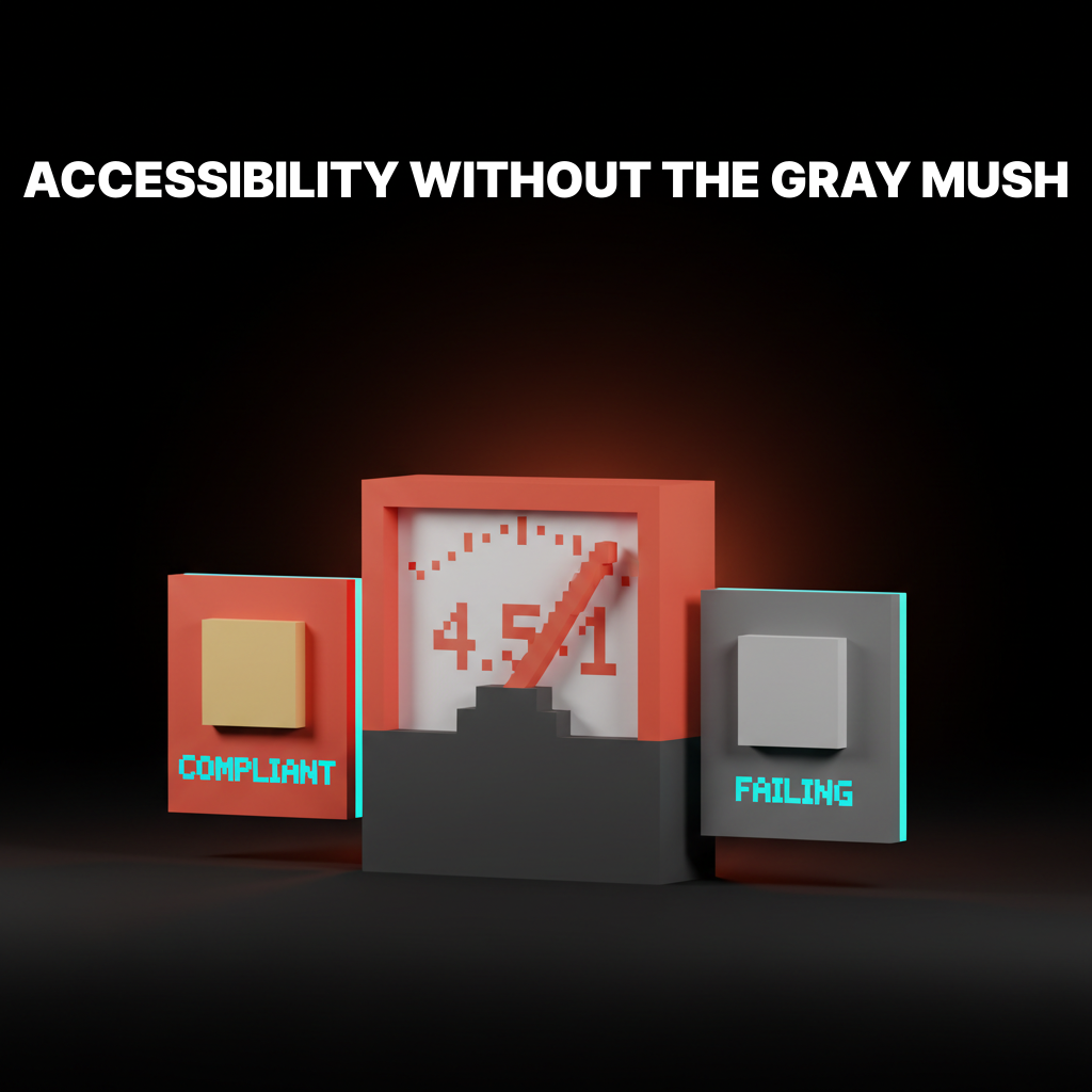
The neutral scale is where accessible color contrast gets designed in or designed out. Every surface step has a text step and a border step that passes contrast. Every step has a role: background, subtle background, surface, raised surface, overlay, divider, border, muted text, default text, strong text.
The brands with the strongest neutral work treat neutral as the hero of the palette, not the filler. The anchor is the flag. The neutrals are the whole country.
Three Brands That Nail Anchor Discipline
These three run one restrained anchor against a deep neutral scale, and the anchor stays recognizable because it never sprawls.
Notion
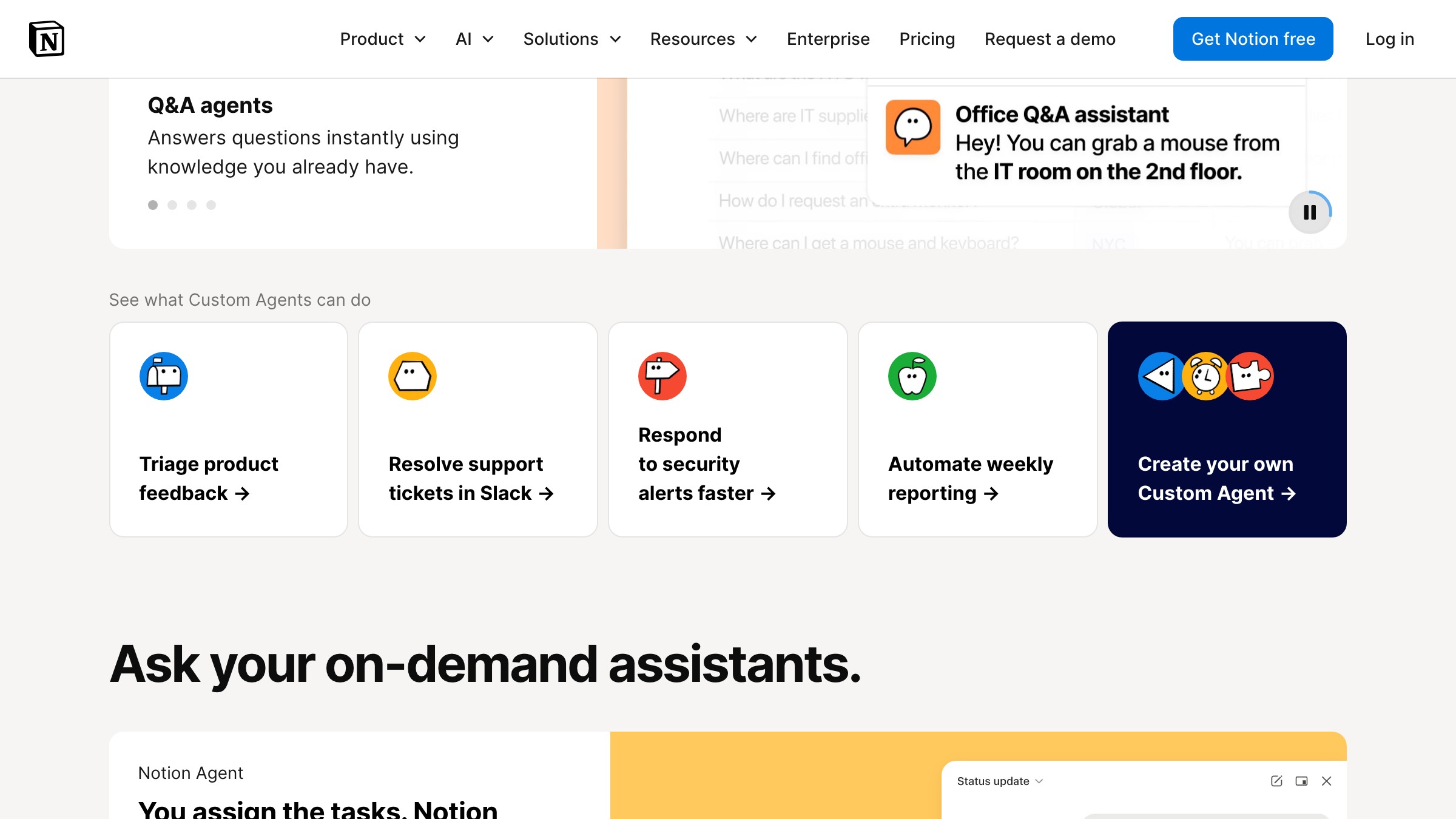
See it live on notion.com/product
Notion ships the minimalist extreme. Almost all of the working surface is a tuned off-white with black text. A single deep navy carries the marketing band, and the semantic tier does the visible color work: red, orange, blue, green for task states.
What to steal: pick one anchor, then ask whether the brand needs a second. The honest answer is usually no.
Linear

Linear runs the most opinionated dark-first palette in the category. The anchor is a single purple. The neutrals are a full dark-mode scale (surface, subtle surface, raised surface, overlay) all doing different jobs.
What to steal: if the product ships dark mode, build the dark palette with the same care as the light palette, not as a filter pass.
Stripe
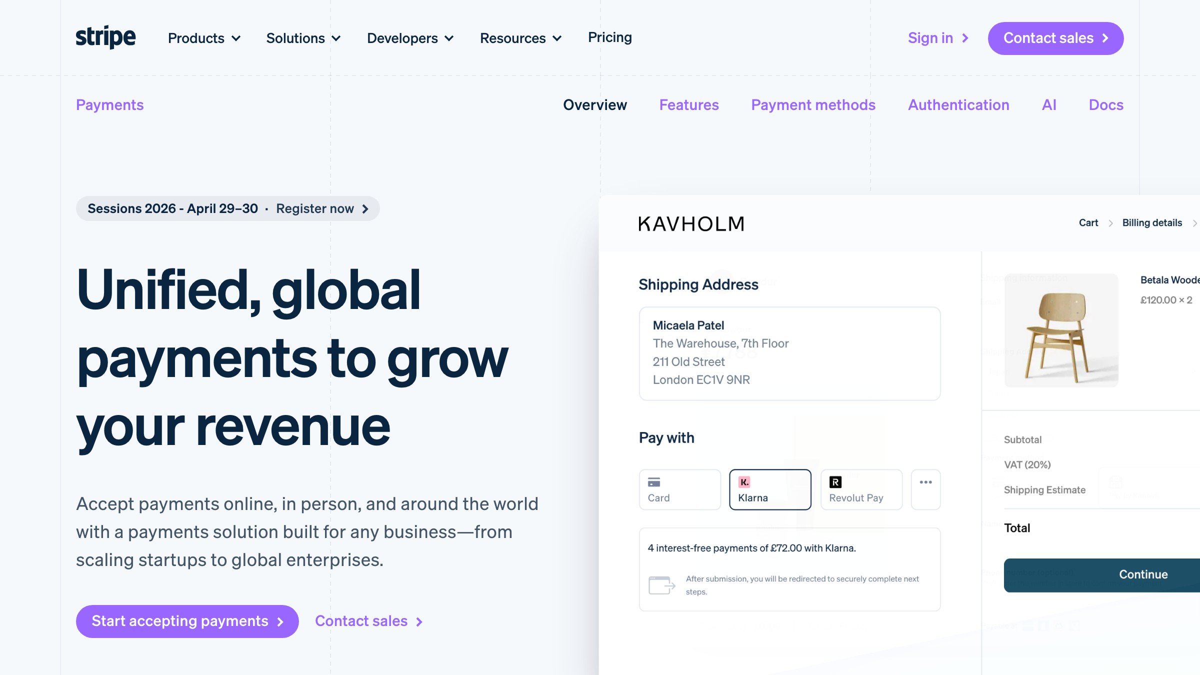
See it live on stripe.com/payments
Stripe runs the cleanest anchor-tier discipline in SaaS. The violet-leaning purple shows up on CTAs, inline links, illustrations, and brand moments, and almost nowhere else. When the purple appears, the eye reads it as action, not decoration.
What to steal: the more restrained the anchor, the more recognizable the brand. Loose anchors read as noise.
Two Brands Where Neutrals Are the Whole Story
These two brands show what happens when the neutral scale itself carries the brand and the anchor is either monochrome or tokenized into roles.
Supabase
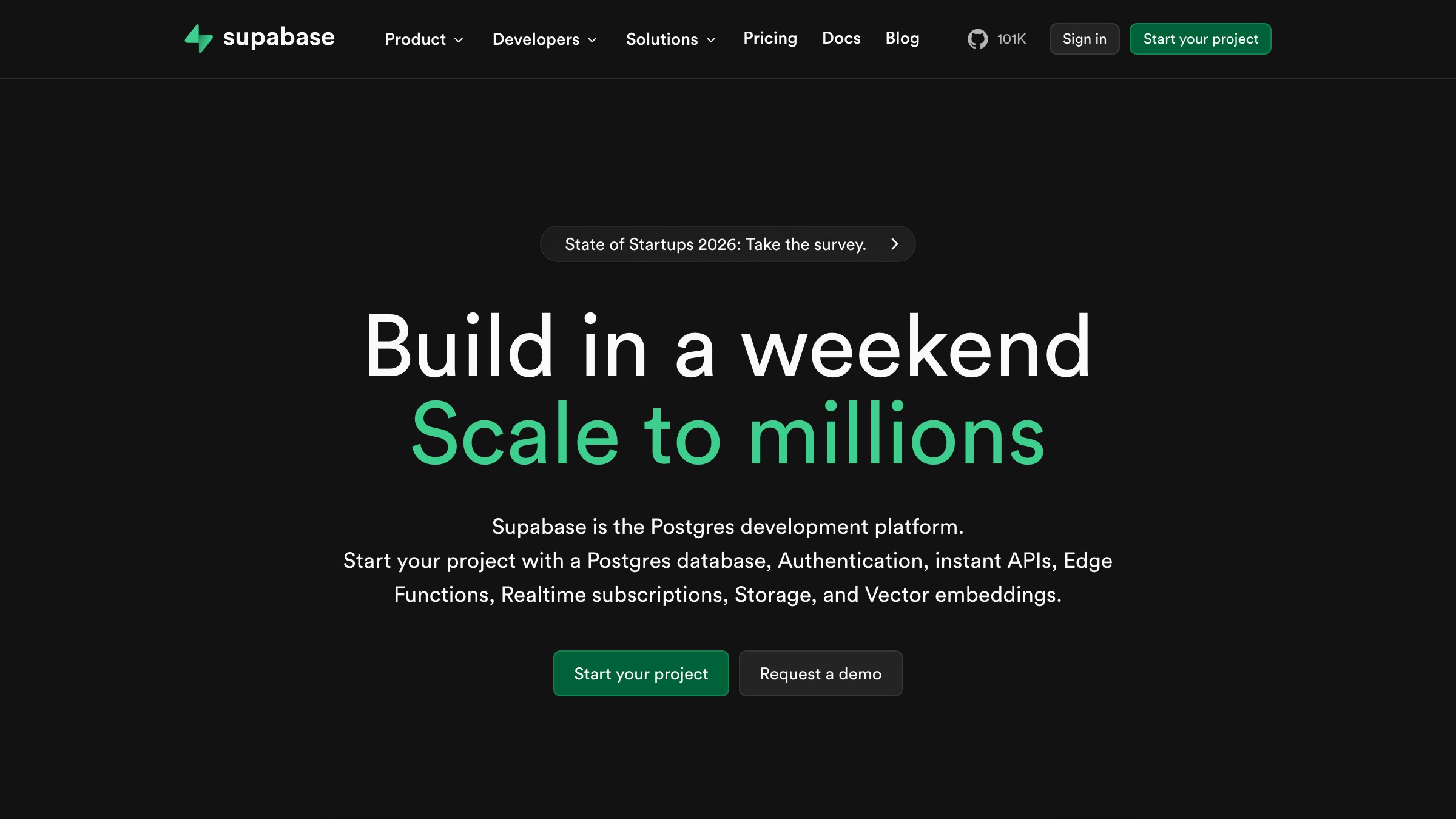
Supabase runs the most disciplined one-accent palette in dev tools. The surface is near-monochrome dark neutrals. The anchor is a single emerald green, and it appears only on brand elements, CTAs, and status success states. No second brand color is ever invited to the party. The neutral scale is the brand. The green is the verb.
What to steal: a brand can skip the loud anchor entirely if the neutral system is disciplined enough. Some brands need a signature grayscale, not a signature color.
Shopify
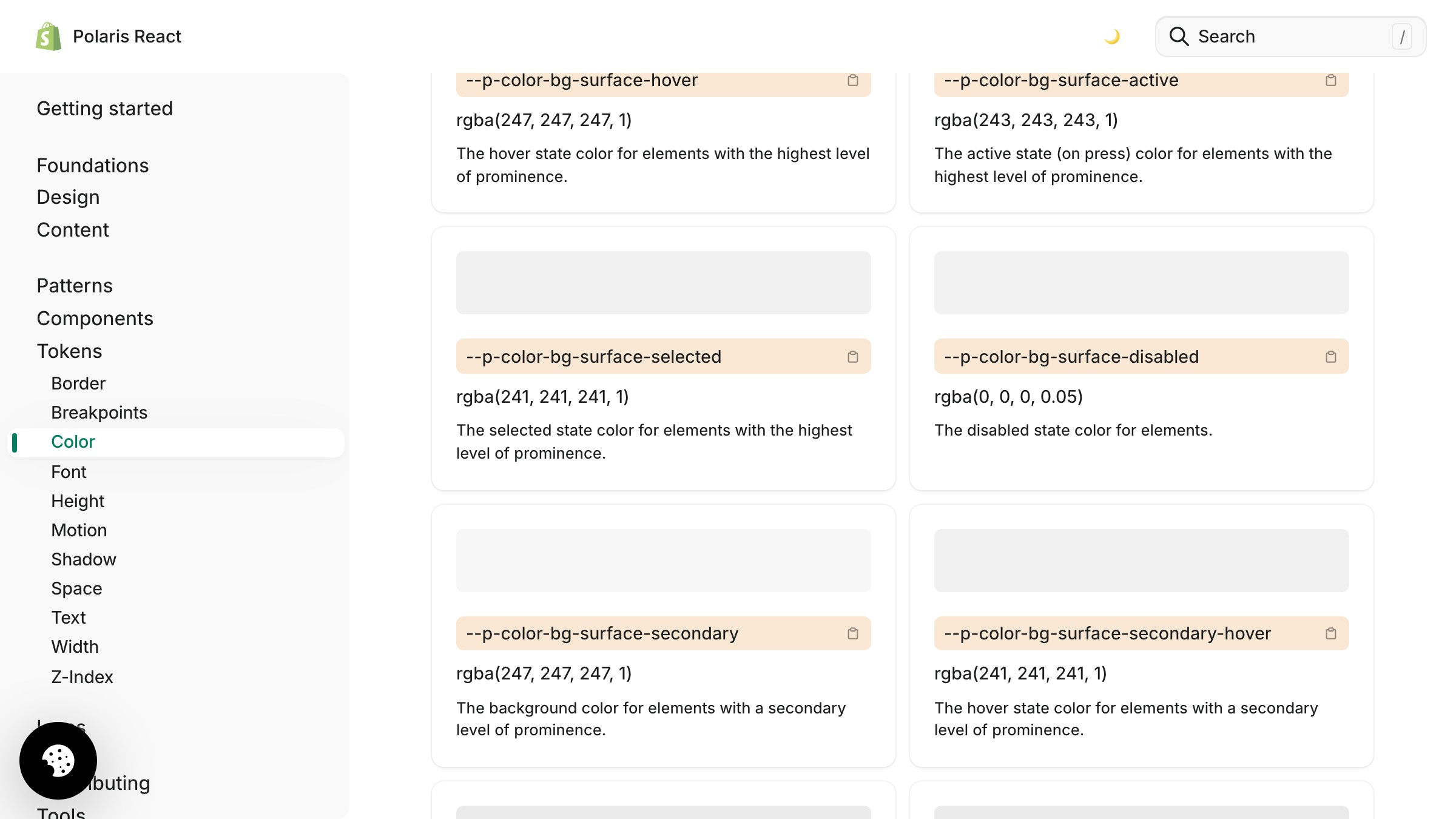
See it live on polaris.shopify.com
Shopify's Polaris system shows what a brand palette looks like fully tokenized. The palette is presented as a role-token tree: surface, text, icon, border, interactive, critical, caution, success, info, each role carrying light and dark values. Polaris leaves no space for a designer to reach past the defined tokens. The palette is not a vibe, it is a contract.
What to steal: write tokens as roles first and resolve to hex only at the last step. If a token name describes a color instead of a role, the palette will drift.
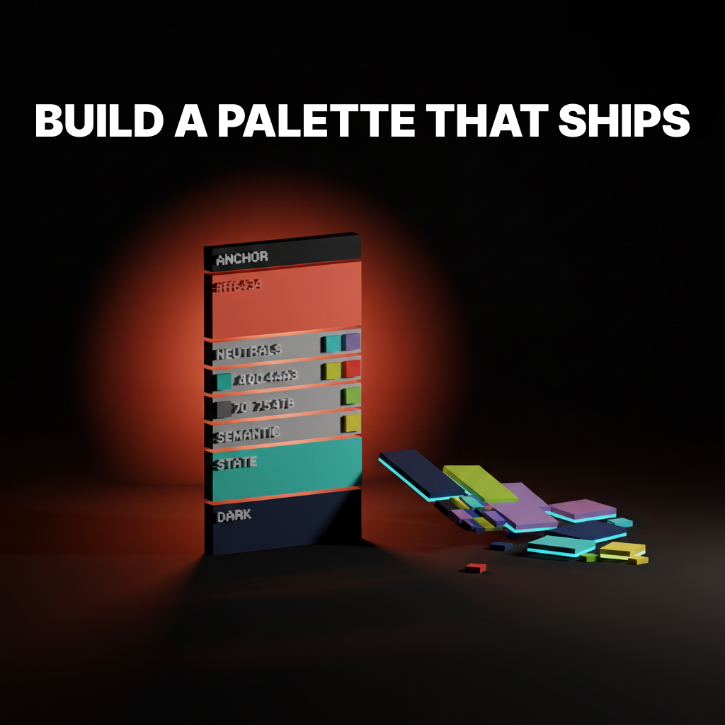
The 6-Step Build Order
Build the palette in this order and most of the common mistakes cannot physically happen.
- Write the role list before the color list. Anchor, neutral surfaces, neutral text, neutral borders, semantic success, semantic warning, semantic critical, semantic info, state hover, state focus, state disabled. Do this on paper first.
- Pick the anchor direction, not the final hex. One hue, rough lightness target, rough saturation target. Keep it editable.
- Build the neutral scale next, tuned to that anchor. 9 to 12 steps. Test each step against the others. Cold neutrals for cool anchors, warm neutrals for warm anchors.
- Add semantic colors as a set, not as individuals. Success, warning, critical, info. They have to feel like siblings. A lone green added later almost always looks wrong against a palette it was not built with.
- Define state colors by pairing, not by inventing new ones. Hover is usually a one- or two-step shift on the scale. Focus is usually an outlined ring in the anchor hue. Disabled is usually a specific neutral step.
- Commit the anchor's final hex last. Run contrast checks against the neutral it sits on. Tune the dark-mode sibling. Add hover and pressed steps. Only now does the anchor become a committed value.
Why the Order Matters
Every layer constrains the next, and running the steps backwards is how palettes end up with colors that fight each other.
Pick the anchor last and you pick it with full knowledge of the neutral scale it has to live on. Pick it first and every neutral choice becomes a compromise around a color decided before the interface existed.
For the theory behind this layering, the color theory for designers pillar covers the full stack. For the contrast rules behind neutral-plus-anchor pairings, accessible color contrast handles the specifics. For palettes inside design systems, the design systems guide has the wider picture.
The Three Mistakes That Kill Most Palettes
The same three mistakes show up on almost every failing brand color palette, and all three come from picking hex before picking roles.
The logo-swatch mistake. Five palette colors because the logo has five colors. Nothing downstream needed five. No neutrals, no semantic tier, no dark mode plan. The most common failure mode.
The saturation trap. Every color at the same saturation, usually high. Looks vibrant in a moodboard, feels exhausting in a real interface. Good palettes vary saturation aggressively, and proportion rules like the 60-30-10 rule keep the loudest hues from dominating the frame.
The missing middle. One light neutral, one dark neutral, nothing between. Real interfaces live in the middle of the scale. A palette with only two neutrals ships flat no matter how good the anchor is.
Fix the process and the mistakes stop showing up.
FAQ
How many colors should a brand color palette have?
Fewer anchors than you think, more neutrals than you think. Most shipping brands have 1 anchor, 9-12 neutral steps, 3-5 semantic families, paired state colors, and a parallel dark-mode set. The hue count is small. The step count is large.
Do I need a separate palette for dark mode?
Not a separate palette. A parallel resolution of the same palette. Roles stay identical, only the raw hex values change per theme. If a designer is manually redrawing dark mode from scratch, the palette was not built as a system.
Can I use a palette generator to build a brand palette?
A generator can seed the anchor and a rough neutral direction. It cannot build the system. Every shipping palette in this article has been tuned by hand: neutrals warmed or cooled to fit the anchor, semantic families adjusted, dark-mode values custom-tuned, state colors paired step by step.
Build the System, Not the Swatches
A brand color palette is not five colors on a moodboard. It is a layered system with roles, a neutral scale, semantic signals, state colors, and a dark-mode plan, built in a specific order.
Notion, Linear, Stripe, Supabase, and Shopify did not win on swatches. They won by treating the palette as infrastructure: one anchor, a full neutral scale, a semantic tier that means something, a paired state layer, dark mode designed on day one.
Build the layers, run the 6-step order, and stop picking brand colors like you are decorating a room.
Want a brand color palette built for everything past the logo? Brainy builds palettes with a real neutral scale, dark mode, and semantic tokens baked in.
Get StartedNot ready to hire? Run the free Business Genome, an 11-dimension diagnostic for your venture.
Get your free GenomeGet new papers by email
New Brainy papers in your inbox. Confirm once, unsubscribe anytime.