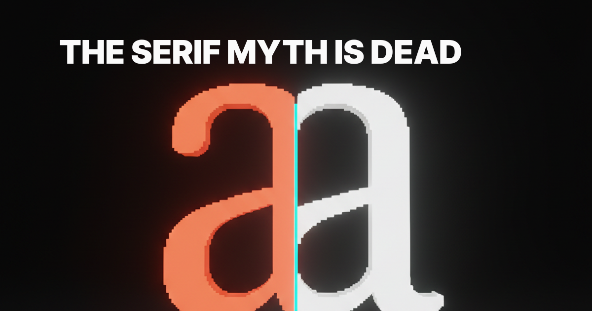
Serif vs. Sans Serif: When to Use Each (And When It Doesn't Matter)
The honest take on serif vs sans serif. Where the distinction actually matters, where the readability myth falls apart, and a decision framework that ignores trends.
"Serifs are for print, sans serifs are for screens." That sentence shows up in every beginner typography article on the internet, and it has been wrong for at least fifteen years. Modern displays render hairlines fine. Body copy on Medium, The Atlantic, The New York Times, and Stripe Press is set in serif and reads beautifully on a phone. The myth survives because it is easy to teach, not because it is true.
The honest version is messier. Serif and sans serif do different work, and the difference shows up in tone, brand, and context, not in raw legibility on a 2026 screen. This piece sorts out where the choice genuinely changes the design and where designers are arguing about a coin flip.
What actually separates the two
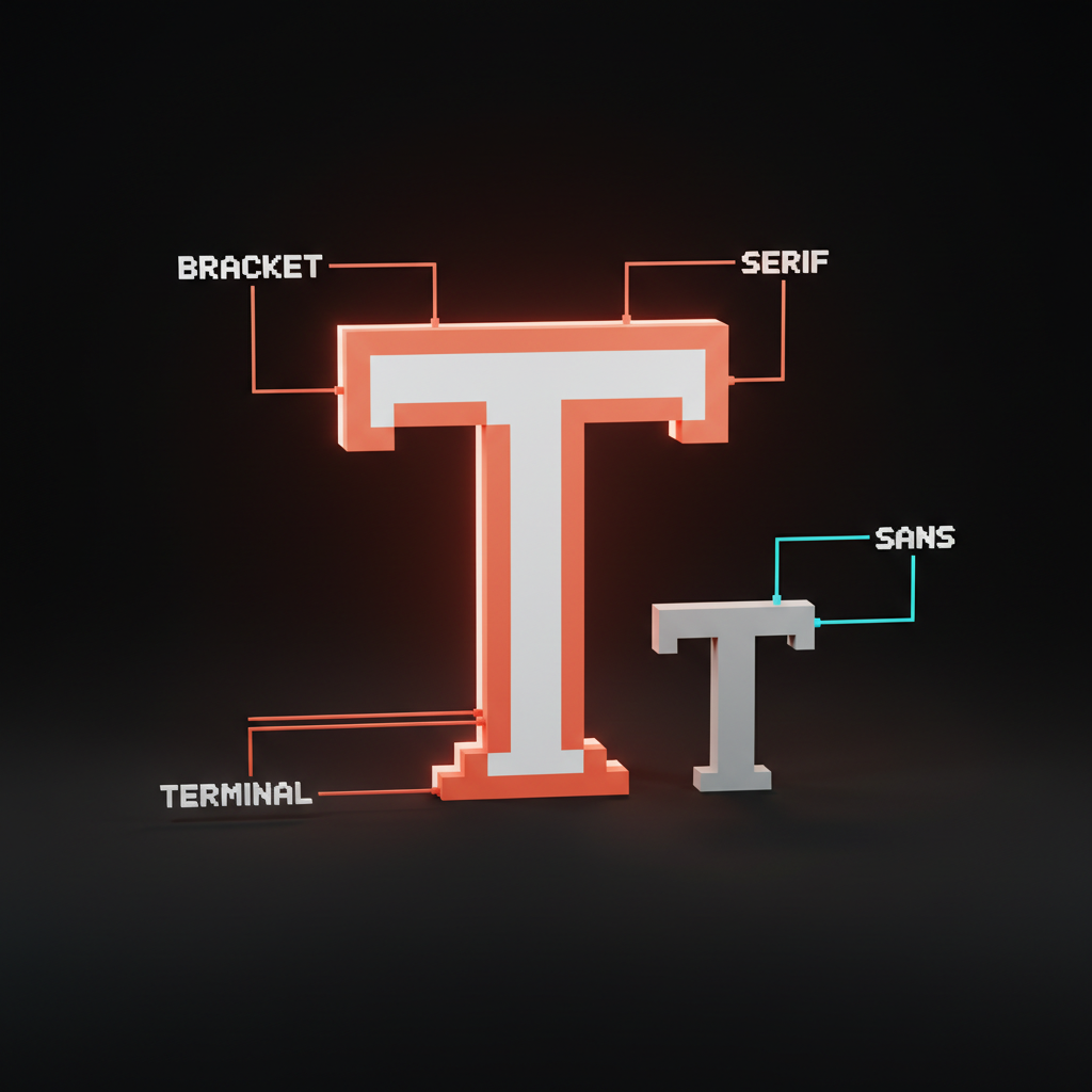
A serif is the small finishing stroke at the end of a letter's main strokes. A sans serif has none. That is the entire structural difference. Everything else, the warmth, the authority, the modernity, is cultural baggage stacked on top of those tiny feet over four hundred years.
Serif families split into useful subgroups. Old-style faces like Garamond and Sabon have soft, calligraphic strokes inherited from quill writing. Transitional faces like Baskerville and Georgia sit between calligraphy and geometry. Modern or Didone faces like Bodoni and Playfair swing for high contrast and razor-thin hairlines. Slab serifs like Rockwell and Roboto Slab use heavy, blocky feet that read closer to a sans in tone.
Sans serif families divide the same way. Geometric sans (Futura, Avenir, Circular) are built on circles and clean angles. Humanist sans (Gill Sans, Source Sans, Inter) borrow proportions from Roman inscriptions and read warmer. Grotesque and neo-grotesque sans (Helvetica, Söhne, Inter again, IBM Plex Sans) sit in the middle, which is why they dominate UI work.
For the underlying anatomy and how those small strokes interact with hierarchy, the typography system design breakdown covers it cleanly.
The readability myth, in one paragraph
There is no honest research that proves serif is more readable than sans serif at body sizes. The original "serifs guide the eye" claim came from print-era studies, most of which compared a single serif to a single sans, on paper, under one set of conditions. Modern controlled studies, including Nielsen Norman Group's reviews, land on the same answer almost every time. At reasonable body sizes on modern screens, well-designed serifs and well-designed sans serifs read at roughly equal speed and comprehension. The differences inside each category, the quality of the typeface itself, the spacing, the line length, dwarf the differences between the two categories.
Translation: pick the typeface that fits the brand and the context. Stop arguing about which group is "more readable." It is a tie at body sizes, and at display sizes, tone matters far more than measurable speed.
When the choice genuinely matters
The choice matters when it changes how the audience feels about the brand or the content. That happens in five specific situations.
The brand needs heritage or authority. Law firms, private banks, universities, literary publishers, luxury fashion houses. These categories have a hundred years of visual conventions, and serifs are part of the contract. Setting Sotheby's in Inter would feel wrong before anyone could explain why. The serif does not "look more readable," it carries inherited weight.
The brand needs modernity or engineering. SaaS, fintech, dev tools, AI infrastructure. Stripe, Linear, Vercel, OpenAI, and Anthropic all run sans serif identities, and that is not an accident. Sans serifs read as rational, current, and built for systems. Wrapping a 2026 dev tool in Garamond would project archive, not platform.
The product is dense UI. Dashboards, data tables, configuration panels, code editors. Sans serifs almost always win here, not because of "screen readability" but because their even stroke weight survives at 12 to 14 pixels in tight grids. Serifs at small UI sizes tend to vibrate against the pixel grid in ways that look noisy.
The product is sustained long-form reading. Editorial sites, book platforms, longform journalism. Serif and serif-leaning typefaces (Source Serif, Newsreader, Lora, Tiempos Text, IBM Plex Serif) often win, not because the user reads faster, but because the texture feels less industrial over a long session. Substack, Medium, and most major newspapers picked serif body for a reason.
The headline needs personality the body cannot carry. A neutral sans serif body paired with a high-contrast serif display (Migra, Fraunces, Tobias) gives the brand a voice in the headline without sacrificing UI cleanliness in the body. One of the most common patterns in modern editorial design, worth stealing.
When the choice barely matters
Most of the rest of the time, the serif vs sans serif debate is performance art. If the typeface is well-designed, the spacing is right, and the hierarchy is clear, both categories will work. A few cases where designers waste energy on the wrong axis.
Generic SaaS landing pages. Inter, Söhne, Geist, and Aeonik all do the job. So would a well-set Source Serif. The tone of the brand decides, not the category.
Marketing copy on a homepage. Body copy at 18 to 22 pixels reads cleanly in either category. Pick by tone and stop benchmarking.
Logos and wordmarks. Wordmarks live or die on letter shapes, kerning, and proportion, not on whether the typeface has feet. Plenty of iconic identities work in serif (Vogue, Tiffany, The New York Times) and plenty work in sans (Google, Spotify, Airbnb). The category is downstream of the brand. The brand identity guidelines piece breaks down how that decision actually gets made.
Real pairings, real categories
Concrete examples beat vibes. Here are typeface choices working in production right now and what they signal.
| Brand or product | Type direction | What it signals |
|---|---|---|
| Stripe | Söhne sans | Engineered, calm, rational |
| Linear | Inter Display sans | Modern, fast, dev-native |
| The New York Times | Cheltenham and Imperial serif | Authority, archive, trust |
| Substack | Spectral serif body | Editorial, long-form, considered |
| Apple | SF Pro sans | Clean, premium, system-first |
| Stripe Press | Tiempos serif body | Literary, intentional |
| Vogue | Didot serif | Luxury, fashion, heritage |
| Medium | Charter serif body | Reading-first, comfortable |
The pattern is clear. Serif shows up where heritage, editorial, or sustained reading is the job. Sans shows up where systems, density, or engineering is the job. The decision tracks the brand and the context, not the medium.

A framework for picking in five minutes
The full debate fits in a five-question check. Run a candidate typeface through it and the answer surfaces.
- What does the brand need to project? Heritage, authority, editorial, or fashion lean serif. Modernity, systems, engineering, or mass-market lean sans.
- Where does the type live most of the time? Long-form reading favors serif or serif-leaning. Dense UI favors sans.
- What is the audience already used to in this category? Banks, law, publishing, and luxury have serif conventions. SaaS, fintech, and dev tools have sans conventions. Break the convention only with a reason.
- What does the typeface do at small sizes on the actual device? Test at 14 pixels on a real phone, not in a Figma specimen. Some serifs hold, some smear.
- Does it pair with a counterpart that handles the other job? A serif headline almost always wants a sans body partner, and the reverse is also common. The full logic is in the font pairing guide.
If the answers cluster on one side, the choice is obvious. If they split, the brand brief breaks the tie. The brand always breaks the tie.
What to ignore in 2026
A few habits worth retiring this year. The "serif for print, sans for screen" rule is dead. Every modern display renders both categories cleanly at body sizes.
The assumption that sans serif is "more modern" is also dated. Serif revivals like Migra, Fraunces, and Tobias, plus modern editorial brands using serif body (Stripe Press, Substack), make the modernity claim look thin. The idea that one category is automatically more "readable" is the same myth in different clothing. Quality of the typeface matters far more than the category it belongs to.
The instinct to pick the typeface before the brand brief is backwards. The brief picks the category, the category narrows the candidates, and the candidates compete on craft, license, and performance.
Frequently asked questions
Are serifs really harder to read on screens?
Not at modern body sizes on modern displays. Hairline serifs at very small UI sizes can vibrate against the pixel grid, but well-designed text serifs (Source Serif, Newsreader, Lora, IBM Plex Serif) read cleanly at 16 to 22 pixels on phones and laptops. The "serifs are for print" claim is a print-era artifact, not a 2026 measurement.
When should I use a serif font for a website?
Use a serif when the brand needs heritage, editorial weight, or a sustained reading experience. Long-form journalism, book platforms, literary brands, luxury fashion, and law or finance often justify serif bodies. Pair the body serif with a clean sans for UI elements like buttons, labels, and forms so the system holds up across landing pages and product screens.
Should headings and body use the same category?
Not necessarily. A common, durable pattern is a high-contrast serif headline with a humanist sans body, which gives the brand personality at the top of the page and clean rendering through the rest of the layout. The reverse, a confident sans headline with a quiet serif body, reads beautifully in editorial contexts. The categories are tools, not teams.
Pick the typeface, then forget the debate
Serif vs sans serif is not the most important typography decision a designer makes. It is the most argued one, which is different. The actual decisions that move the needle are the brand brief, the type system, the hierarchy, the spacing, and the pairing. The serif or sans question is downstream of all of them.
Run the five-question framework. Pick the side that fits the brand and the context. Then spend the rest of the design budget on the parts that actually change how the work feels: the scale, the rhythm, the contrast, and how the type sits inside the rest of the system. The web design principles breakdown covers how typography sits inside the bigger picture.
If you want a team that picks the typeface, builds the system, and ships the brand and product UI together, hire Brainy. We treat serif vs sans serif as a five-minute decision, then spend the rest of the project on the work that actually shows up in the product.
Want a typography system built around your brand instead of a tired serif vs sans serif debate? Brainy designs the type, the system, and the product UI as one project.
Get Started