Dark Mode Color Systems: How to Build a Palette That Works at 2 a.m.
A working guide to dark mode color systems. The surface elevation model, the desaturation rule, accent calibration, and the seven brands shipping the cleanest dark mode palettes in 2026.
Dark Mode Color Systems: How to Build a Palette That Works at 2 a.m.
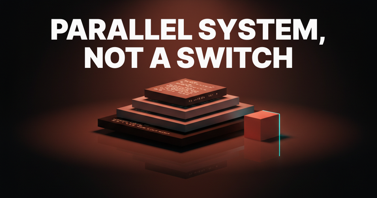
A dark mode is a parallel system, and the products that flip a switch on light are the ones that look broken when the lights go out.
That is the whole article in one sentence. The reason most dark modes fail is more specific: designers reach for "invert the light palette" and end up with grey-on-grey flatlands or electric coral that sears retinas. The fix is architectural, not cosmetic. Build a parallel system with its own elevation model, its own desaturation ruleset, and its own accent calibration, and the result looks intentional because it is.
A dark mode is a parallel system, not an inversion
Your light palette has background, surface, border, text, and accent tokens. Your dark palette needs all the same tokens, and the values are not the inverse of the light values. Chroma behaves differently at low lightness. Hue shifts happen at the perceptual boundary. What reads as a clean coral at L 0.62 in light mode blooms into a vibrating neon at L 0.72 in dark mode against a near-black surface.
The teams that ship clean dark modes do not touch a toggle. They design a second palette, map it to the same semantic token layer, and connect the two through a mode switch at the theme root. It is more work. It is the only approach that does not embarrass you.
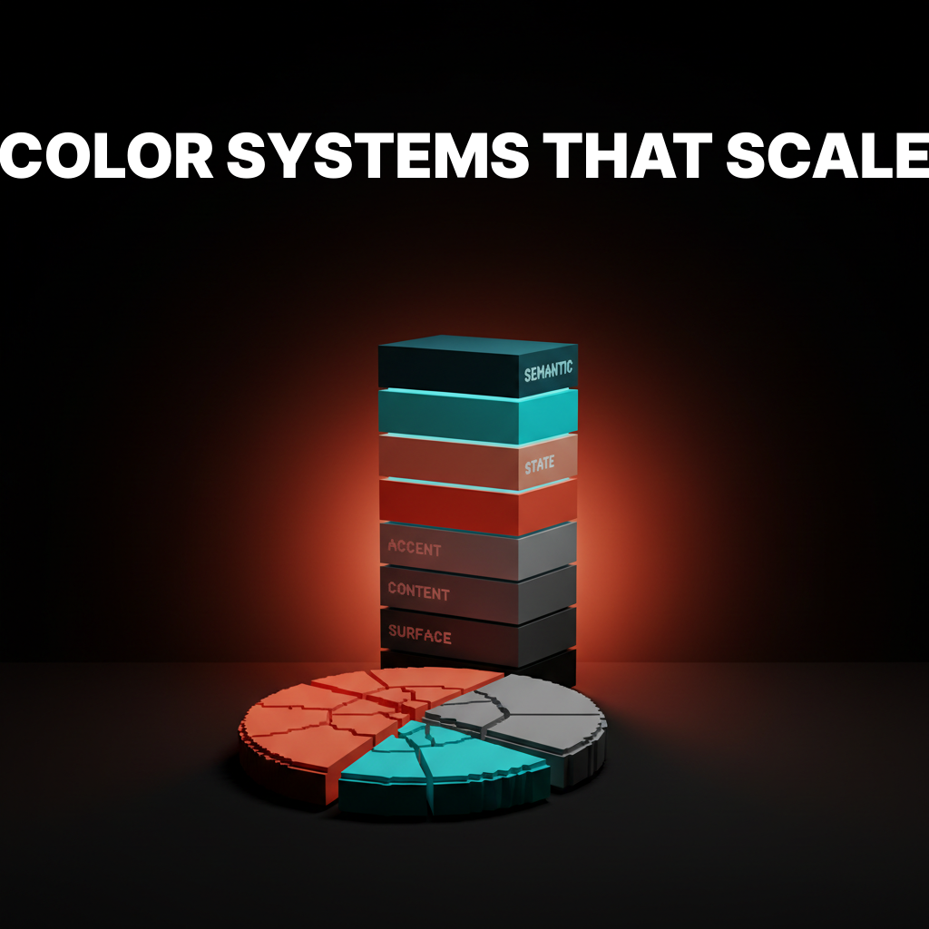
The surface elevation model
Background. Surface. Surface-elevated. Surface-overlay. Every working dark mode design UI has these four tiers, and skipping the third tier is the most common reason dark UIs feel flat.
In light mode, elevation is obvious: white cards sit on grey backgrounds, shadows are cheap, and depth is free. In dark mode, shadows disappear against dark surfaces. Elevation has to live in the lightness of the surface itself. Each tier is a small, deliberate step up in lightness, not a jump.
The four tiers are not aesthetic choices. They are load-bearing structure. Every component in your system sits on one of these tiers, and the legibility of every text-over-surface pair depends on where in the stack you place it.
Background sets the floor
The background is the deepest tier. The rule: never use pure black (oklch(0 0 0)) at full saturation. Use a slightly tinted near-black around 8 to 10 percent lightness. The tint is almost always warm, because cool blacks read as cheaper and colder than the product deserves.
A value like oklch(0.10 0.012 30) gives you a dark warm charcoal that reads as "black" on any display but avoids the dead-vacuum feeling of pure black. The 0.012 chroma and 30-degree hue angle (a slight warm lean) is enough. More and it looks muddy. Less and it looks lifeless.
Surface holds the content
Surface is the tier where most content sits, slightly elevated from background. The lightness step from background to surface is typically 3 to 5 points in OKLCH. That gap is the first signal the eye reads: this is where the content lives, the background is behind it.
oklch(0.14 0.010 30) against oklch(0.10 0.012 30) is enough visual separation without a border or shadow. The chroma drops slightly because as lightness increases in dark surfaces, chroma needs to pull back to avoid muddy bleed into the background. This is subtle at render time and completely wrong when you skip it.
Surface-elevated and surface-overlay
Elevated surfaces hold cards and panels. Overlay surfaces hold modals and sheets. The lightness progression continues: surface-elevated at roughly oklch(0.18 0.008 30), surface-overlay at oklch(0.22 0.007 30). Chroma drops with each step because higher in the stack means closer to the viewer, and those surfaces need to feel clean.
The reason most dark UIs collapse into flat grey porridge is that designers use two tiers: background and surface. Cards live on background, text lives on surface, and everything reads at the same depth. Add the third and fourth tier and the UI immediately gains legibility without a single drop shadow.
The desaturation rule
Saturated colors that work in light burn at night. The rule: desaturate accents by 15 to 25 percent and drop chroma on text and borders even more. This is not about dimming the brand. It is about how the eye processes chroma at low ambient light.
At high ambient light (the office at noon), vivid chroma reads as vibrant. At low ambient light (the desk at midnight), that same chroma reads as aggressive, haloing, and physically uncomfortable. The solution is not to fear color. It is to calibrate it. The brand stays recognizable. The product stops hurting.
Why pure white text is wrong
Pure white on near-black is not high contrast, it is too much contrast. The haloing effect, where bright text appears to bleed into dark surrounds, is a documented optical phenomenon that makes dark UIs harder to read, not easier.
The right value for primary text in dark mode is around 90 to 95 percent lightness with a touch of warm tint. oklch(0.93 0.005 60) reads as "white" but does not halo. Secondary text drops to oklch(0.70 0.010 60), still readable at body size, visually recessive against primary text. The off-white is the value designers most often get wrong, because it feels like a compromise and it is actually the correct value.
Accent calibration keeps the brand recognizable
Brand accents have to read in dark mode without losing identity. The calibration is a lightness lift plus a chroma drop, not a hue shift. If the light-mode accent is oklch(0.62 0.22 25), the dark-mode accent is oklch(0.72 0.17 25). Same hue. Higher lightness so it pops against dark surfaces. Lower chroma so it does not halo.
The mistake is treating dark mode as a place where accents get dimmed. Dimming kills brand recognition. Lifting lightness and dropping chroma preserves the feel of the brand color palette while preventing visual burn. The user does not notice the adjustment. They notice that the product looks good.
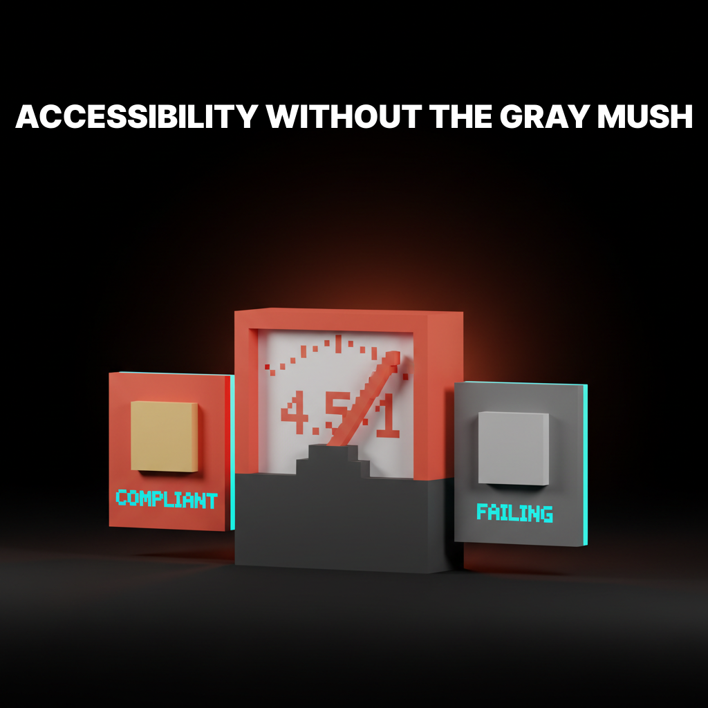
The contrast pass that WCAG misses
WCAG 2.1 contrast ratios pass a lot of ugly dark UI. A 4.5:1 ratio between a dark surface and muted grey text can WCAG-pass while being genuinely hard to read in ambient conditions. The second pass is APCA, which models lightness perception more accurately, especially in the light-on-dark distinction.
After APCA, run the eyeball test. Shimmer is the vibration you see when two colors at similar lightness but different chroma sit together. Halo is the bleed from bright elements into dark surrounds. Bloom is the perceived glow on saturated accents. Any of these present means the pair fails regardless of the ratio. Fix the values, not the ratio. For a deeper pass on accessible color contrast mechanics, the full methodology covers edge cases that light-mode auditing does not surface.
Seven brands shipping clean dark palettes
Linear, Notion, Vercel, Stripe, GitHub, Arc, and Raycast each solve dark mode differently. The patterns they share are the ones worth stealing.
| Brand | Surface model | Accent strategy | What they get right |
|---|---|---|---|
| Linear | True four-tier, tight steps | Purple lifted, chroma ~0.15 | Steps so tight the depth reads as seamless |
| Notion | Three-tier with overlay | Minimal accent use in dark | Almost no chroma, all depth |
| Vercel | Binary (background + elevated) | White only | Brutally simple; works because it commits |
| Stripe | Four-tier, warm tint | Blue calibrated, not reduced | Dense data reads cleanly at every tier |
| GitHub | Three named themes (dark, dimmed, high-contrast) | Blue-green, desaturated | "Dimmed" is the correct default |
| Arc | Custom per-space tinting | Fully user-defined hue | Elevation from hue shift, not lightness |
| Raycast | Two-tier with heavy blur | Orange accent, aggressively lifted | Blur creates implied elevation |
Linear is the reference implementation. The surface steps are narrow enough that the UI reads as a single dark field with real depth. The purple accent is identifiable as Linear's purple without ever burning. The typographic hierarchy relies on lightness steps in text tokens, not size alone.
Vercel proves the binary model can work if you commit fully. No third surface. No grey states. Everything is either deep background or slightly elevated surface, and the monochrome commitment makes it feel like a design decision rather than a limitation. Most teams cannot pull this off because they have status colors, illustrations, and brand moments that need elevation.
GitHub's "Dimmed" option is the correct insight applied to the wrong scope. They built it as a theme variant, but the real lesson is that a warm-tinted dark surface is more comfortable for extended reading than the cooler default. Every dark mode should run warm by default.
Want a dark mode that looks intentional at 2 a.m. instead of inverted at noon? Brainy designs parallel dark color systems with the elevation model, accent calibration, and the OKLCH token map ready to drop into Figma and CSS. Hire Brainy.
The working dark mode token map
The token map below ships a real dark mode in OKLCH color coordinates. Primitives are the raw values. Semantics are the roles. Drop primitives into a Figma variable collection as raw values. Map semantics to primitives as aliases. That two-layer architecture is the whole token system.
| Token | Role | OKLCH Value | Hex Approx |
|---|---|---|---|
--color-bg | Background floor | oklch(0.10 0.012 30) | #191512 |
--color-surface | Default content surface | oklch(0.14 0.010 30) | #221e1a |
--color-surface-elevated | Cards, panels | oklch(0.18 0.008 30) | #2c2723 |
--color-surface-overlay | Modals, menus, sheets | oklch(0.22 0.007 30) | #35302c |
--color-text-primary | Body copy, headings | oklch(0.93 0.005 60) | #edeae5 |
--color-text-secondary | Captions, labels, meta | oklch(0.70 0.010 60) | #b0a89e |
--color-text-disabled | Disabled states | oklch(0.45 0.005 60) | #6e6860 |
--color-border-subtle | Dividers, hairlines | oklch(0.22 0.008 30) | #36302b |
--color-border-default | Input borders, card borders | oklch(0.28 0.010 30) | #433d37 |
--color-accent | Primary CTA, active states | oklch(0.72 0.17 25) | #e0816a |
--color-accent-muted | Hover, secondary accent | oklch(0.65 0.12 25) | #c27060 |
--color-accent-subtle | Tinted bg behind accent elements | oklch(0.16 0.04 25) | #2a1e1a |
The hue runs 25 to 30 degrees throughout (warm coral territory). The system coheres because temperature is consistent from floor to ceiling. Swapping hue to 250 degrees gives you a Linear-like palette. Swapping to 200 degrees gives you a Vercel-adjacent palette. The structure does not change. Only the hue does.
For implementation, the entire table maps to CSS custom properties on :root[data-theme="dark"]. In Figma, each row is a variable in a "Dark" mode collection. That two-collection architecture is what makes a design system scalable across surfaces.
Mode switching, the implementation that does not flicker
Switching modes without a flash of the wrong theme is solved by setting the color scheme on the html element before any JavaScript runs. Any other approach is wrong in at least one edge case.
The pattern: read localStorage for a saved preference in a blocking inline <script> tag in <head>. Apply data-theme="dark" or data-theme="light" to the html element synchronously, before the CSS that references custom properties renders. No React. No useEffect. No flash.
<script>
  const saved = localStorage.getItem('theme');
  const prefersDark = window.matchMedia('(prefers-color-scheme: dark)').matches;
  document.documentElement.dataset.theme = saved ?? (prefersDark ? 'dark' : 'light');
</script>
That script is blocking by design. It runs before the render. The flash of unstyled content is caused by applying theme in JavaScript after the first paint, and this single blocking script eliminates it entirely.
System preference, default, and override
The default should follow OS preference. The user override should persist to localStorage. The toggle should expose three states: system, light, and dark.
A two-state toggle is a design mistake. The user who sets their OS to dark and wants the app to follow does not want to manage a second switch. The toggle needs a "system" state that clears the stored override and lets OS preference lead. Most apps build two states and then get a support ticket every time someone changes their OS theme and wonders why the app did not follow.
FAQ
Does using accent colors in dark mode hurt OLED battery life?
Accent colors cover a small surface area in a typical UI. The battery savings from dark mode on OLED come almost entirely from dark surface areas. A coral CTA button on a dark background does not meaningfully change battery draw. Pure black backgrounds matter. Saturated full-screen illustrations matter. A button does not.
Can I use my light-mode brand color directly as the dark-mode accent?
Not without calibration. If your light-mode brand color is at L 0.55 to 0.65 in OKLCH, using it directly on a dark surface will either underperform (too dim to pop) or halo (too vivid against dark ambient). Lift lightness by 8 to 12 points. Drop chroma by 20 to 30 percent. Keep the hue. That is the calibrated dark-mode accent.
What is the minimum viable dark mode for a system that does not have one yet?
Background, surface, surface-elevated, primary text, secondary text, accent. Six tokens. It is not complete, but it is a system. Every component can map to one of these six values, the elevation model is in place for expansion, and you can ship it without embarrassment. Start there, not with a hundred tokens and no structure.
Is auto-generated dark mode ever acceptable?
For prototypes, internal tools, and products with one active designer, an automated inversion with saturation adjustments is acceptable as a starting point. As a shipped dark mode for a product with brand standards and real users, no. Automated dark modes fail on accent colors, fail on illustration, and fail on component states. They are a starting sketch, not a finished system.
Does OKLCH make dark mode easier to build?
Dramatically. OKLCH's perceptually uniform lightness axis means lightness steps between elevation tiers behave as expected across hues. In HSL, a 5-point step at orange looks different from a 5-point step at blue. In OKLCH, it does not. Building the elevation model in OKLCH means the steps feel consistent regardless of accent hue. The full case for OKLCH color covers the math in depth.
Should semantic tokens differ between light and dark, or only primitives?
Primitives differ. Semantics stay the same. --color-surface means "the default content surface" in both modes. The primitive it points to is different in dark mode. This is the point of the two-layer architecture. Components reference semantics. Semantics reference primitives. The mode switch reassigns primitives. Components update automatically and correctly.
The shift dark mode systems actually unlock
A real dark mode is a parallel design surface. Not an afterthought. Not a settings toggle. A second surface with its own structure, its own constraints, and its own craft decisions. The teams that treat it that way ship products that look intentional at 2 a.m. The teams that flip a switch ship products that look like someone forgot to finish.
The elevation model is the foundation. The desaturation rule and accent calibration are the craft layer. The OKLCH token map is the implementation. The three-state toggle with non-flickering mode switching is the shipping condition. Every piece connects. None of it is optional if you want the result to be good.
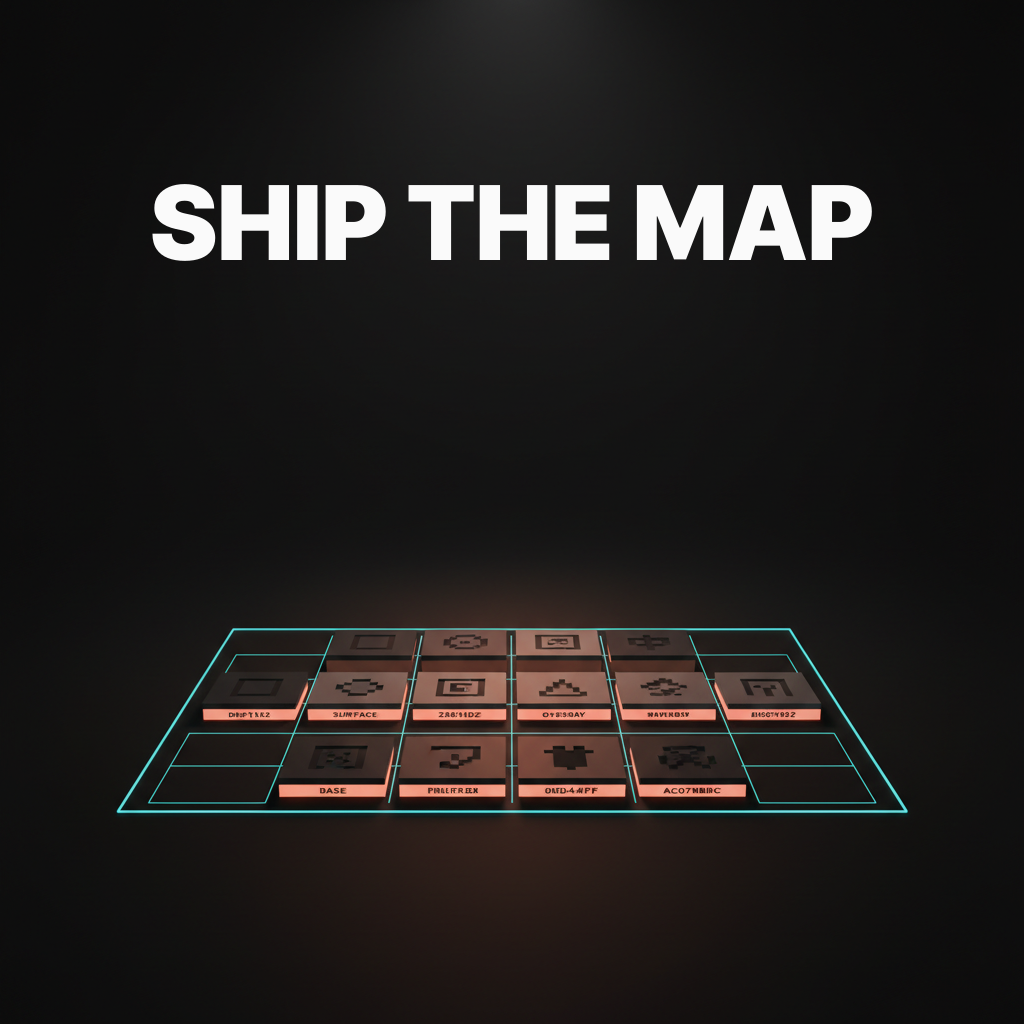
Build the parallel system. Ship the map. The difference shows.
Want a dark mode that looks intentional at 2 a.m. instead of inverted at noon? Brainy designs parallel dark color systems with the elevation model, accent calibration, and the OKLCH token map ready to drop into Figma and CSS. Hire Brainy.
Now saving to drafts/dark-mode-color-systems.md.
Want a dark mode that looks intentional at 2 a.m. instead of inverted at noon? Brainy designs parallel dark color systems with the elevation model, accent calibration, and the OKLCH token map ready to drop into Figma and CSS.
Get Started