Dark Mode Design: How to Ship a Second Theme Without Breaking the First
A working designer's guide to dark mode. The color math that actually works, the component traps to avoid, and how to ship a dark theme that looks designed instead of inverted.
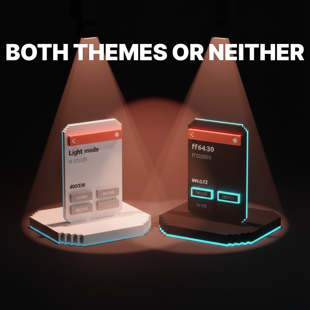
Most dark modes are not designed, they are inverted. A designer flips the background to near-black, tints the text near-white, and calls it done. The result is a theme that looks harsh, reads worse than the light version, and makes the brand feel like a different product in the wrong lighting.
This paper is the working version. The color math that makes a dark theme feel intentional, the component traps that break in the dark, and the token structure that keeps both themes in sync as the product grows. No Dribbble gradients, just a dark theme that earns its own place in the design system.
What dark mode actually is
Dark mode is a full second theme, not a color inversion. It has its own surface logic, its own contrast rules, and its own typography weight adjustments. A real dark mode is designed from scratch against the same component set and then reconciled back to the light theme through shared tokens.
The inversion shortcut fails for a specific reason. Light mode relies on white surfaces reflecting depth upward. Dark mode cannot invert that, because pure black surfaces absorb depth instead of creating it. The entire elevation system has to be rebuilt. The design systems guide breakdown covers why this has to happen inside tokens, not inside individual components.
Why dark mode matters in 2026
Three reasons. None of them are aesthetic.
Battery life on OLED displays. Every pixel that is black on an OLED panel draws zero power. A dark interface on a phone can reduce display power draw by 30 to 60 percent on high-brightness settings. For users on mobile, a dark theme is a battery feature before it is a visual one.
Accessibility for light sensitivity. Users with migraines, astigmatism, or photophobia cannot comfortably use a light interface for extended periods. Shipping dark mode is an accessibility commitment, not a preference. The web accessibility checklist covers where theming fits inside a full audit.
User expectation. Operating systems ship a dark mode toggle that applies to the whole OS. A product that ignores the system setting feels old. Users filter the app store and extension directories by dark mode support. A missing dark theme is a marketing problem, not just a UI gap.
The first rule: never use pure black
Pure black (#000000) is the most common mistake in a new dark mode. It feels correct because it seems like the darkest possible surface. It reads as wrong because the human eye cannot judge depth against perfect black.
The fix: use a dark gray with a subtle brand hue as the base surface. Something in the range of #0B0B10 to #121218 for most products, sometimes as high as #1A1A1F. The exact value depends on the brand's color temperature. A warm brand goes slightly warm dark. A cool brand goes slightly cool dark. Pure neutral reads as lifeless.
The same rule applies to the highest-contrast text. Pure white (#FFFFFF) on a dark surface creates halation, a bright-edge blur effect that makes small text fatiguing to read. Drop the text to around #E8E8EA or apply an 85 to 92 percent opacity white. The drop is invisible to the eye but huge for legibility.
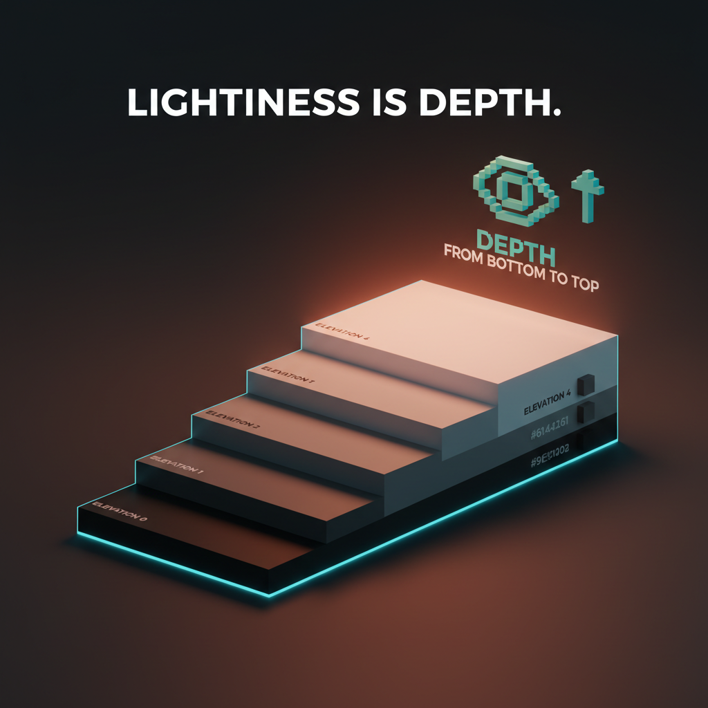
Surface elevation in dark mode
Light mode uses shadows to show that a card is above the background. Dark mode cannot, because shadows get swallowed by dark surfaces. The workaround is elevation through lightness.
Each elevation step lightens the surface, not darkens it. A card sitting above the base surface is slightly lighter than the base. A modal sitting above a card is lighter still. Depth in a dark interface reads as a gradient of surfaces stepping up toward the user, not shadows falling away beneath them.
Material Design formalized this with a five-step elevation scale, and the general idea holds across any design system. A working scale for most products:
| Elevation | Example | Surface value |
|---|---|---|
| 0 | Base background | #0E0E12 |
| 1 | Card, input field | #17171C |
| 2 | Raised card, menu | #1F1F25 |
| 3 | Modal, dialog | #28282F |
| 4 | Popover, tooltip | #31313A |
The specific numbers vary by brand, but the logic does not. Every raised surface is lighter than the one beneath it, every drop of shadow is subtle, and the hierarchy reads as surfaces stacked in space rather than boxes drawn on a page.
Contrast math for dark themes
The contrast ratio glossary covers the WCAG baseline of 4.5 to 1 for normal text and 3 to 1 for large text. Dark mode does not relax those rules, but it changes how they are met.
In light mode, body text at around #222 on a white background hits roughly 16 to 1. Designers are used to having enormous headroom above the minimum. Dark mode is tighter. Body text at #E0E0E0 on #0E0E12 hits around 13 to 1, which is still strong, but the margin for error is smaller. Dropping the text to #B0B0B0 to soften the look can quietly push a section under 4.5 to 1.
The discipline: every dark mode color decision gets run through a contrast checker. Not once per theme, once per token pairing. Text on base surface, text on card, text on modal, placeholder text, disabled text, link text. Each pairing is a separate check.
A common trap is the muted text token. In light mode, muted text at #666 on white reads clearly at 5.7 to 1. Inverted to #999 on #0E0E12, the ratio drops to about 4.2 to 1, which fails WCAG AA. The inversion shortcut breaks accessibility compliance quietly, and most teams do not notice until an audit finds it.
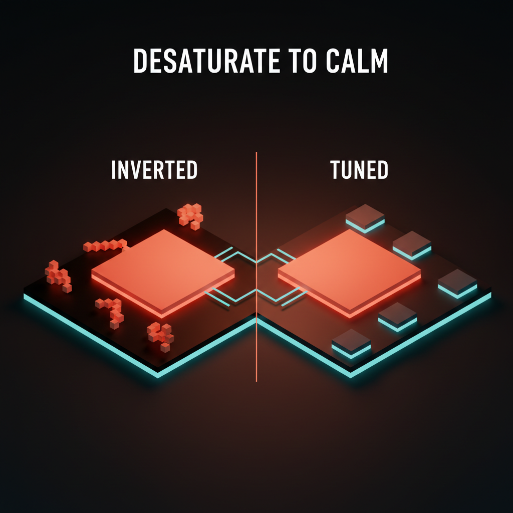
Color in dark mode: saturation, not just value
Brand colors that sing on a white background often feel muddy or electric on a dark one. The reason is that dark surfaces amplify perceived saturation. A 100 percent saturated accent on a light surface reads as confident. The same accent on a dark surface reads as radioactive.
The rule is to desaturate accent colors for the dark theme, usually by 10 to 20 percent, and lighten them slightly. A primary button that is #3455FF on white might become #5C78FF on dark. Same hue family, adjusted for the new contrast environment. The brand still reads as the brand. It just stops hurting.
The color palette glossary covers the base structure this adjustment lives inside. A good dark mode does not invent new colors, it ships a parallel set of the same brand colors tuned for the new surface context.
Component traps that break in the dark
Most components need at least one adjustment for dark mode. A few break entirely without it. Here are the usual offenders.
Borders become the primary separator
In light mode, a subtle shadow or a barely-visible border separates components. In dark mode, shadows disappear and most borders vanish. The border becomes the primary tool for defining component edges, and it often needs to be raised from something like #EEE in light mode to something around #2A2A30 in dark mode to stay visible.
The test is to view the UI at 80 percent brightness on a laptop. If component edges start disappearing, the border token needs a brighter value in the dark theme.
Shadows invert their purpose
Shadows in light mode push surfaces down and away. Shadows in dark mode have to imply surfaces coming up and forward. This is usually achieved through a combination of a very subtle lighter surface (elevation) plus a near-invisible dark shadow underneath that adds weight without visibility.
A working shadow pair for dark mode:
- Outer:
0 4px 12px rgba(0, 0, 0, 0.5)to ground the element - Inner top highlight:
inset 0 1px 0 rgba(255, 255, 255, 0.05)to imply a lifted edge
Used together, the component reads as raised instead of cut out. Used alone, neither effect reads at all.
Disabled states disappear
A disabled button in light mode is usually a desaturated gray on white. The same treatment in dark mode blends the button into the surface entirely. The fix is to increase the disabled state's opacity, not decrease it. Something like 40 percent opacity on top of the raised surface color, rather than dropping to a washed-out gray. The disabled state should still read as a button, just inactive.
Images and illustrations need their own treatment
A product photo shot on a white background looks broken on a dark surface. A brand illustration drawn with a white stroke vanishes entirely. Images need their own dark-mode pass, either through a separate asset, a background swap, or a carefully tuned filter. This is the single most expensive part of dark mode to ship correctly, and it is the part most teams cut.
The pragmatic fix for teams that cannot ship parallel image assets: add a soft background to every image container in dark mode, something around #F5F5F7 with rounded corners. Images that were shot on white now sit on a light container, and the rest of the UI stays dark.
Input focus states need more contrast
A blue focus ring that works on a white background loses impact against dark surfaces. The focus state glossary covers the WCAG-required focus-visible indicator. In dark mode, the focus ring often needs to be 10 to 20 percent brighter or thicker than its light-mode twin. The accessibility requirement is unchanged, but the visual treatment has to adjust to still hit it.
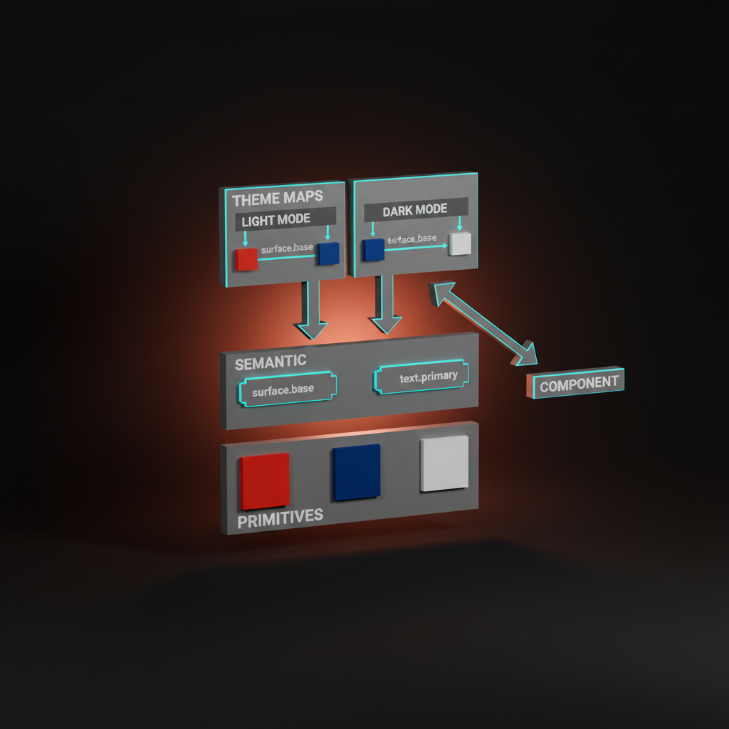
Token structure for dual themes
A dark mode that lives in CSS overrides is a dark mode that will drift. Every new component will handle theming differently, and within six months the product will have three theming patterns arguing with each other.
The correct structure is semantic tokens. The design token glossary covers the base concept. Dark mode is the use case that proves tokens are non-optional.
Three layers of tokens:
Layer one: primitives. Raw color values. color.neutral.900, color.brand.500. No opinion, no context.
Layer two: semantic. Role-based names. color.surface.base, color.surface.raised, color.text.primary, color.text.muted, color.border.default. Each semantic token points to a primitive.
Layer three: theme. Two complete maps, one per theme, deciding which primitive each semantic token resolves to. The light theme maps color.surface.base to color.neutral.50. The dark theme maps color.surface.base to color.neutral.900.
Components only ever consume semantic tokens. They never reference a primitive directly, and they never hardcode a theme. The theme switcher changes the map, the components redraw, and nothing breaks. This is the only pattern that scales past a team of two designers.
Respecting system preferences
The browser exposes prefers-color-scheme through CSS media queries. The product has to respect it. The default experience for a user with dark mode enabled at the OS level is the dark theme, period. A toggle inside the app is a refinement, not a replacement.
Three rules for a correct implementation:
Default to the system preference on first load. Never override the user's OS choice with a light theme just because the designer prefers the light mockups.
Persist the user's in-app choice. If the user toggles to dark inside the app, that choice survives refreshes and beats the system preference until they reset it.
Provide a "match system" option. Users who want the OS setting to drive need a way back to that behavior. The three-state toggle (light, dark, system) is the expected pattern and should be shipped by default.
Testing dark mode
Dark mode bugs hide. A component looks fine in the design file, passes code review in the light theme, and ships with a contrast failure that only surfaces when a user opens it at night. The testing discipline is aggressive.
The brightness test. Open the product on a laptop at 30 percent brightness in a dark room. Anything that disappears, anything that smears, anything that glows uncomfortably gets logged as a bug. This catches borders that are too subtle, text that is too bright, and accent colors that are still too saturated.
The contrast audit. Every theme change triggers a full contrast check across all semantic pairings. Tools like axe, WAVE, or Figma's built-in contrast checker catch the regressions a visual review misses.
The screenshot diff. Light and dark mode screenshots get captured for every key screen at every release. Visual diffs expose unintentional theme drift before a user does.
The real-device test. OLED phones render dark surfaces differently than LCD laptops. A dark mode that looks perfect on a MacBook often reveals banding or harsh transitions on an iPhone. Test on actual phones, not just the browser's device emulator.
Common dark mode failures
Three patterns cause most dark mode ship quality issues. All three are avoidable with the token structure above.
The half-inverted UI. Main surfaces flipped to dark, but buried components (modals, tooltips, marketing pages, legacy admin screens) still shipping in light mode. The user toggles dark and half the product jumps back to white on click. The fix is an audit of every surface in the product, with a checklist that tracks theme coverage per screen.
The broken brand moment. Marketing landing pages staying light while the product goes dark, or the other way around. The brand identity fragments across the user's journey, and the product feels like two companies. The fix is agreeing up front whether the marketing site ships dark mode. Both choices are valid, but the two surfaces have to match.
The accessibility regression. Light mode ships WCAG AA compliant, dark mode misses it in three places, nobody checks until a compliance audit. The fix is the semantic token layer plus automated contrast checking in CI. Every PR runs a contrast check. Failures block the merge.
If you want a team that ships dark mode as a first-class system decision, from tokens to testing, hire Brainy. Dark mode is rarely the hard problem. The hard problem is shipping the pair without drift.
FAQ
Is pure black the best background for dark mode?
No. Pure black (#000000) creates harsh contrast with white text and removes the visual depth cues the eye needs to read elevation. Use a dark gray with a subtle brand tint, usually in the range of #0B0B10 to #121218. Depth in a dark interface reads as surfaces stepping up toward the user, which requires a starting surface that is not pure black.
How do you do elevation in dark mode without shadows?
Elevation in dark mode comes from lightness, not shadows. Each raised surface is slightly lighter than the one beneath it, creating a gradient of surfaces that stack toward the user. A subtle dark shadow and a very faint top highlight can reinforce the effect, but the primary cue is the surface color itself.
Should dark mode just invert the light theme colors?
No. Inverting saturates accent colors to uncomfortable levels, drops muted text below WCAG contrast thresholds, and breaks the elevation model that depends on shadows. Dark mode is a second theme designed from scratch against the same component set, then reconciled through shared semantic tokens.
How do I handle images and photos in dark mode?
Images shot on white backgrounds break the theme's continuity. Options: ship parallel assets for dark mode, add a subtle light container around every image when dark mode is active, or apply filters carefully. Illustrations often need a separate dark-mode variant. This is the most expensive part of dark mode and the most commonly skipped.
How do I structure tokens for dual-theme support?
Three layers. Primitives (raw color values), semantic tokens (role-based names like color.surface.base), and theme maps (one per theme, resolving each semantic token to a primitive). Components consume only semantic tokens, so the theme switcher changes the map and nothing breaks. This pattern is what makes dark mode scale past a small team.
Does dark mode improve accessibility?
For users with light sensitivity, migraines, or photophobia, yes. For users who need high-contrast text or specific color perceptions, not necessarily. Dark mode is an accessibility option, not an automatic accessibility win. A correctly implemented dark theme meets WCAG contrast rules with the same rigor as the light theme, and a poorly implemented one fails them.
Dark mode is a system decision, not a toggle
A product with one theme and a broken second theme is worse than a product with one clean theme. Dark mode either ships as a fully designed, fully tested, fully tokenized parallel to the light theme, or it does not ship.
Build the token layer first. Run the contrast math second. Design the dark theme against every elevation, every component, every image container. Test at low brightness on real devices. Ship both themes together or neither.
If you want brand, web, and UI work that treats dark mode as a system-level commitment instead of a preference toggle, hire Brainy. Two themes, one product, one coherent design decision.
Related reading
- Design Systems Guide
- Accessible Color Contrast
- Web Accessibility Checklist
- Color Theory for Designers
- Visual Hierarchy Design
Want a product that ships dark mode as a system decision instead of a last-minute toggle? Brainy builds brand, web, and UI with both themes wired into the tokens from day one.
Get StartedNot ready to hire? Run the free Business Genome, an 11-dimension diagnostic for your venture.
Get your free GenomeGet new papers by email
New Brainy papers in your inbox. Confirm once, unsubscribe anytime.