Negative Space Logo Design: The Hidden Layer That Makes Logos Unforgettable
The best logos hide something in plain sight. How negative space creates meaning, memorability, and the "aha" moment that makes people remember your brand.
The best logos say two things at once. One meaning is obvious. The other is hiding in the space between forms, built from emptiness that was never empty at all. That second layer is what turns a competent mark into one people mention at dinner.
Negative space design is not a gimmick. It is a structural approach to communicating more with less, and the brands that have used it well are some of the most recognized marks ever made. Understanding why it works is also understanding what separates a brand identity that gets remembered from one that gets ignored.
What Negative Space Actually Does in a Logo
Negative space is the area around and between the main forms in a design, and in logo work, it becomes a second canvas.
Most designers treat it as background. The best designers treat it as material. When you design with negative space intentionally, the empty areas carry meaning rather than just breathing room. The result is a logo that rewards the viewer for paying attention.
This exploits a principle called the figure-ground relationship. Your eye toggles between what it reads as the figure (the dominant form) and the ground (what surrounds it). A well-designed negative space logo controls that toggle deliberately, making the ground reveal a second figure once you find it.
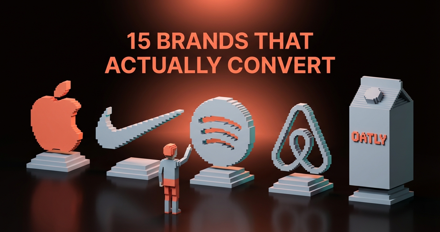
8 Logos That Use Negative Space Perfectly
These are not obscure design exercises. These are some of the most recognized brands on the planet, and each one uses negative space to communicate something the wordmark alone could not.
| Logo | Primary Form | Hidden Element | What It Communicates |
|---|---|---|---|
| FedEx | Wordmark | Arrow between E and x | Speed, forward direction |
| WWF | Panda illustration | Negative space defines the panda body | Softness, nature, life |
| NBC | Colored peacock feathers | White center forms the bird's body | Unity beneath the color |
| Carrefour | Two directional arrows | White gap forms the letter C | Brand initial, hidden in plain sight |
| Toblerone | Matterhorn silhouette | Bear standing in the mountain face | Bern, the city of bears |
| Pittsburgh Zoo | Tree | Gorilla on one side, fish on the other | Land and water animals, all from one form |
| Guild of Food Writers | Fork | Tines become a fountain pen nib | Food and writing, fused |
| Amazon | Wordmark with arrow | A-to-Z smile | Everything, delivered with a smile |
FedEx
The FedEx logo has been analyzed in every design school since Lindon Leader created it in 1994, and it still surprises people who look at it for the first time. Between the capital E and the lowercase x in the FedEx wordmark, the negative space creates a clean, forward-pointing arrow. The message is unambiguous: speed, direction, momentum, without adding a single graphic element to the mark. The arrow was already there, built from the letterforms themselves.
WWF
The World Wildlife Fund panda works because of what is not drawn, not what is. The black areas are minimal. The white negative space fills in the rest of the bear's form, and your brain completes the image through Gestalt closure. The result is a mark that feels alive and organic even though it is made from a handful of flat black patches. The restraint is the technique.
NBC
The NBC peacock's feathers fan outward from a central point, and the white negative space at the center creates the bird's beak and body. This is easy to miss because the color grabs attention immediately. Remove the color and the structure becomes obvious: the feathers only work because of the white core that anchors them. The white space is not background. It is the peacock's chest.
Carrefour
Carrefour's logo reads as two colored arrows pointing in opposite directions, and most people stop there. Look at the white negative space between the two shapes and you find a bold letter C, the brand's initial, never drawn directly. It exists purely as the gap between the arrows. It is one of the cleanest examples of a brand hiding its own name inside its mark.
Toblerone
The Toblerone logo is a mountain silhouette, the Matterhorn in Switzerland where the brand originates. Look at the mountain's face and you find a bear standing upright, built from the negative space within the peak. Bern, the Swiss city connected to Toblerone's founding, is called the City of Bears. The bear is not decoration. It is geographic and cultural identity compressed into a mountain outline.
Pittsburgh Zoo
The Pittsburgh Zoo logo may be the most technically complex negative space logo in common use. The primary reading is a tree. But the trunk and branches simultaneously form a gorilla on one side and a fish on the other. Three distinct readings from one shape: zoo, land animal, aquatic animal. Every element earns its place, and none of them exist as separate forms.
Guild of Food Writers
The Guild of Food Writers logo solves a specific brief: represent both food and writing in one mark. The answer is a fork where the tines become the nib of a fountain pen. The negative space between the tines creates the pen's split tip. It reads as cutlery first, writing instrument second, and once you see both you cannot unsee either. That is a successful fusion.
Amazon
Amazon's arrow curves beneath the wordmark from A to Z. The primary read is a smile. The secondary read is a geographic argument: Amazon sells everything from A to Z. Both meanings load simultaneously, and both map directly onto the brand's actual positioning. Happy customers, comprehensive inventory. It is rare for a negative space application to carry a complete business argument inside its geometry.
Why Hidden Meaning Makes Logos Stick
A logo with a hidden element creates a discovery moment, and discovery triggers emotional memory. This is not speculative. Research on the "aha" experience shows that moments of sudden insight produce a neurochemical response that reinforces memory formation. You do not just see the FedEx arrow. You find it. Finding something feels different from being shown it.
That emotional charge is why people share these logos. "Did you know there's a bear in the Toblerone mountain?" has been said at a thousand dinner tables. That organic conversation is brand exposure that no paid media budget can manufacture, and it compounds every time someone new finds the hidden element for the first time.
There is a second mechanism at work: perceived craft. A logo with a hidden element signals that someone thought hard about it. Intentionality reads as quality, and for brand identity work, that signal matters far more than most clients realize at the brief stage.
How to Design with Negative Space
Negative space design is not about hiding Easter eggs. It is about making one form do two jobs.
The practical starting point is always the primary form. Define what the logo needs to communicate on its own terms, then ask what secondary meaning could live in the negative space that would reinforce or extend the primary reading. The secondary form should complete the first, not compete with it. For more on the discipline of reduction that makes this possible, see the minimalist logo design breakdown.
| Principle | What It Means in Practice |
|---|---|
| Functional first | The primary form must work as a standalone logo. The hidden element adds meaning; it does not carry meaning the main form cannot. |
| Shaped gaps | Negative space must be designed, not leftover. Every gap, notch, and counter should be deliberate. |
| Single revelation | One hidden element. Two hidden elements become a puzzle. |
| Contrast discipline | Figure and ground need enough contrast to toggle clearly. A muddy secondary form at small sizes means it fails. |
| Scalability test | The hidden element must survive at favicon scale. If it disappears at 32px, it is a print trick, not a logo feature. |
Build in black and white first. Color masks the structural relationship between figure and ground. Confirm both readings are clear in grayscale, at multiple sizes, before introducing color. This order is not optional.
When Negative Space Fails
The technique has limits, and crossing them produces logos that feel like puzzles instead of brands.
The most common failure is complexity overload. The designer gets excited about the concept and layers too much into the negative space. The result is a logo that takes 30 seconds to decode. Logos do not get 30 seconds. If the hidden element does not emerge in under three seconds, it does not function as a logo feature.
The second failure is irrelevance. A hidden shape that has no real relationship to the brand's positioning is a visual trick with no payoff. When someone finds it, they feel nothing, because the discovery does not tell them anything new about the brand. The Toblerone bear works because Bern is historically the city of bears. A random bear in a random logo is decoration wearing a concept's clothes.
The third failure is poor construction. The secondary form is ambiguous, poorly proportioned, or only visible at specific sizes and against specific backgrounds. This is a craft problem, not a concept problem. It is solved by iteration and honest feedback at every scale where the logo will actually appear.
FAQ
What is negative space in logo design?
Negative space in logo design is the area around and between the main visible forms, used intentionally to create a second image or meaning. Instead of treating the background as empty, the designer shapes it so it communicates alongside the primary mark. The FedEx arrow, the Carrefour C, and the Amazon smile are all built from negative space, not from separate graphic elements added to the mark.
How do you create a negative space logo?
Start with your primary form and make it work as a standalone mark. Then identify the gaps, counters, and surrounding areas that could be shaped into a secondary meaning relevant to the brand. The secondary form should reinforce the primary message, not compete with it. Build in black and white first, confirm both readings are legible at multiple sizes, then apply color. One hidden element is almost always the right number.
What are the best examples of negative space logos?
The most recognized examples are FedEx (the arrow between E and x), WWF (the panda defined by its negative space), Amazon (the A-to-Z smile arrow), Carrefour (the hidden C between the arrows), and Toblerone (the bear in the Matterhorn). The Pittsburgh Zoo logo is one of the most technically complex, forming a tree, a gorilla, and a fish from a single mark. The Guild of Food Writers logo fuses a fork and a fountain pen nib into one form.
The Best Logos Are Conversations
A negative space logo says something to the viewer and lets the viewer say something back. That exchange is what makes the craft investment worth it.
Most logos communicate in one direction: here is our name, here is our mark, here is our color. A negative space logo asks the viewer to participate. The discovery moment only happens because the viewer was paying attention. That participation creates ownership, and ownership builds loyalty in a way that passive recognition never does.
The technique is not for every brand or every brief. It requires that the secondary meaning be genuinely relevant, that the primary form be strong enough to stand alone, and that the designer have the patience to build the relationship between figure and ground correctly. When those conditions exist, negative space is not a clever trick. It is a second voice in the conversation between brand and audience.
The brands that got it right? People are still talking about them decades later. That is the actual metric.
Need a logo with more than one thing to say? Brainy builds brand identities with intention behind every element.
Get StartedNot ready to hire? Run the free Business Genome, an 11-dimension diagnostic for your venture.
Get your free GenomeGet new papers by email
New Brainy papers in your inbox. Confirm once, unsubscribe anytime.