
Digital Product Design 2026: The Year the Tools Started Designing Back
The real progress in digital product design 2026: AI as interface, design engineering, generative UI, and craft as table stakes, with named proof.
Digital Product Design 2026: The Year the Tools Started Designing Back
2026 was not the year AI replaced product designers. It was the year the work moved up a level, from drawing screens to deciding what the system should do, because the tools finally handle the screens.
That's not hype. It's the logical endpoint of a shift that started when Figma made visual design fast and Tailwind made front-end fast. Each wave of tooling automation pushed the designer's actual judgment closer to the surface.
Now that wave has crested. The screen stopped being the deliverable. The decision became the deliverable.
Here are the six concrete shifts that actually changed digital product design this year, each with a real product proving it.
What actually changed in 2026 (the short version)
The job changed more in 2026 than in the previous five years combined. Here is what a product designer's day looked like two years ago versus what it looks like now.
| Task | 2024 | 2026 |
|---|---|---|
| Initial UI exploration | Design 8-12 screens in Figma | Prompt 6 variants in v0, pick the best direction, refine |
| Responsive layout | Hand-spec breakpoints, annotate for dev | Generated in the same pass; you approve or reject |
| Component production | Build from scratch or pull from a system | Assembled from prompt; you enforce consistency |
| Motion and micro-interaction | Optional polish at end of cycle | Expected from the first review |
| Handoff documentation | Figma specs + Zeplin annotations | Increasingly: deployed code is the handoff |
| Core job | Make it look like the product | Decide what the product should be and how it behaves |
The tools are faster. That raises the bar on the thinking behind them.
AI stopped being a feature and became the interface
AI stopped being a feature you bolt on and became the interface itself. For years it meant a small sparkle icon in a sidebar, a summarize button, a dropdown suggestion. AI as garnish.
That model is largely dead. The leading products of 2026 don't have AI as a feature. The AI is the surface, the interface you interact with every session.
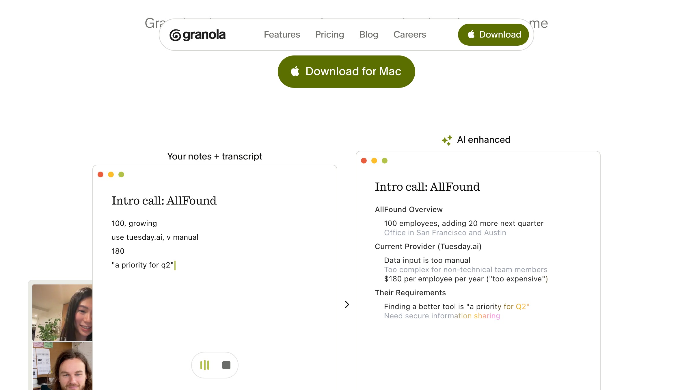
Granola is the clearest proof. It's a meeting notepad where the AI doesn't transcribe in a corner panel while you take notes separately. The AI and your notes are the same thing.
You write what matters, the AI fills what you missed, and the output is genuinely useful rather than a wall of transcript. The product UI is built around AI output as the primary content, not as an afterthought bolted onto a traditional notes view.
This design decision changes everything downstream:
- Information architecture
- Interaction model
- Error states
- Trust signals
When AI output is your primary canvas, you cannot design it the way you would design a document editor or a settings panel.
The patterns don't exist yet. Designers building AI-native products are writing the playbook from zero.
The implication for product designers is direct. If your mental model for AI product design is still about where the AI button goes, you are solving the wrong problem. The real question is how much the AI can own before the user loses trust.
The gap between design and code basically closed
The gap between design and code basically closed in 2026. Design engineering has been a job title for a few years, and now the reason is unavoidable. The handoff ritual that used to separate the two disciplines is nearly gone.
Zed is the sharpest example in the tools space itself. The code editor rebuilt for AI-native development is also one of the most carefully designed software products of the year. Typographic care, native performance, an interface where the AI is woven into the canvas rather than layered on top.
The team building it is, demonstrably, not splitting design from engineering. The product reads like a single coherent mind made it.
That convergence is happening in product teams too. Designers who can read and write production code, or developers who have internalized visual and interaction craft, are doing work in a single pass that used to require two people and a week of back-and-forth. The role distinction still exists, but the workflow distinction is collapsing.
For product leaders, this changes hiring calculus. You don't necessarily need a designer and a front-end engineer for every surface. You need people who can hold both, and they ship faster with less coordination loss.
For designers, the uncomfortable truth is this. If you cannot engage with the implementation layer at all, you're leaving half the craft on the table. Understanding what's easy to build versus expensive is now part of making good design decisions.
Building a product and want the design to match 2026, not 2021? Brainy designs and ships product interfaces.
Generative UI went from demo to daily driver
Generative UI graduated from party trick to daily production tool in 2026. A year ago, v0 and Lovable spat out generic Tailwind-plus-shadcn layouts, fine for prototyping but not for shipping.
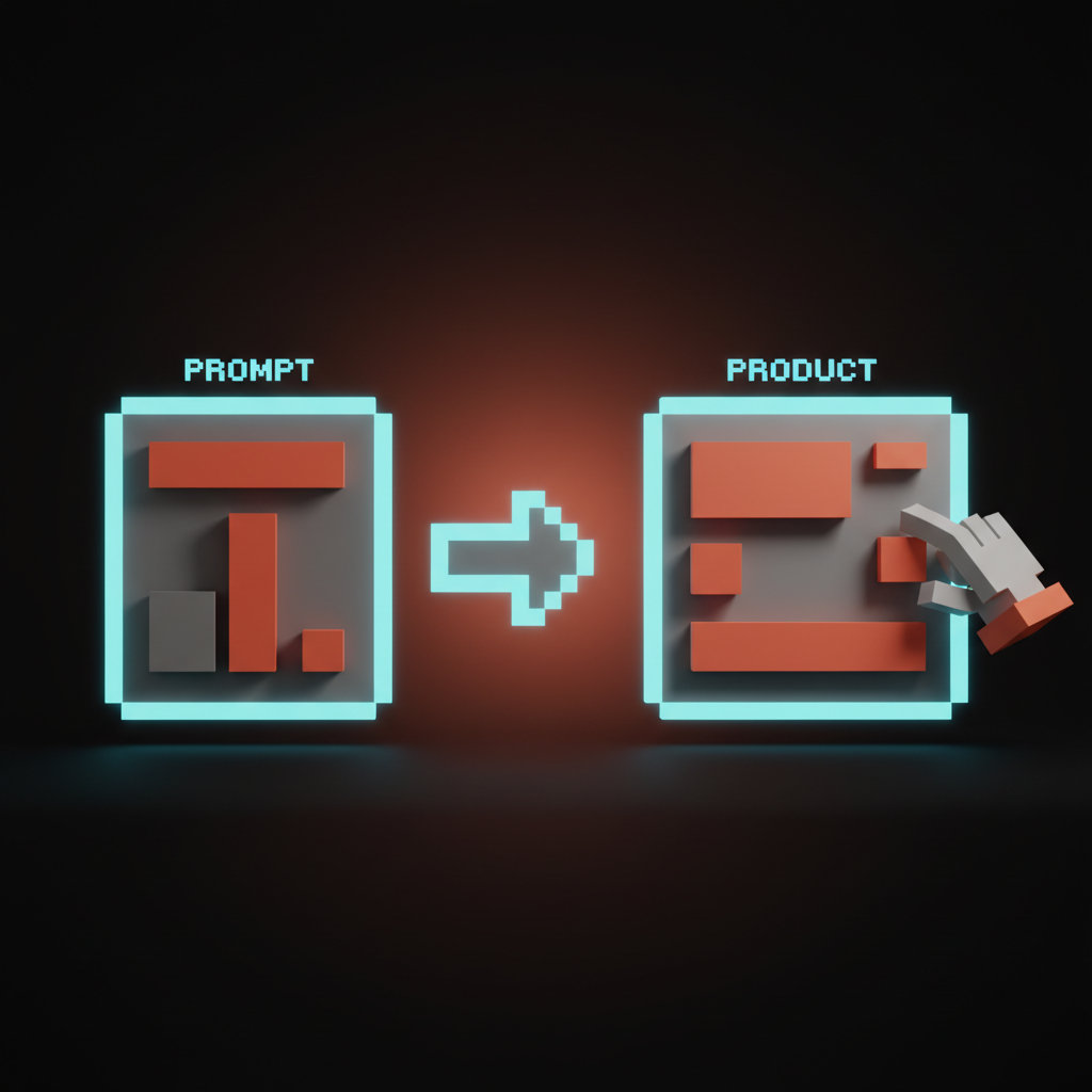
That changed. The outputs are now differentiated enough to be a genuine starting point for production work. The workflow matured too, and designers figured out how to use generative UI as a first draft rather than a one-shot answer.
The meaningful shift is not AI writing your UI for you. It's that design exploration no longer requires hours of Figma work to validate a direction. You can test whether a layout concept works in a browser, with real data, in minutes.
That speed changes how many options you can honestly evaluate. More options considered means better final decisions.
The flip side is that generative UI defaults to patterns it was trained on. If you don't have a strong opinion about what makes your product's UI distinct, the generator hands you something that looks like everything else. The creative pressure shifted earlier in the process, to the brief and the taste call, not to the execution.
For more on where web design is heading, the pattern repeats: tools got faster, the judgment premium got higher.
Motion and craft became the price of entry
Motion became the price of entry in 2026, not a finishing touch. Motion design used to be a nice-to-have that went in after the real work, if there was time and budget. A team with motion polish was doing something special.
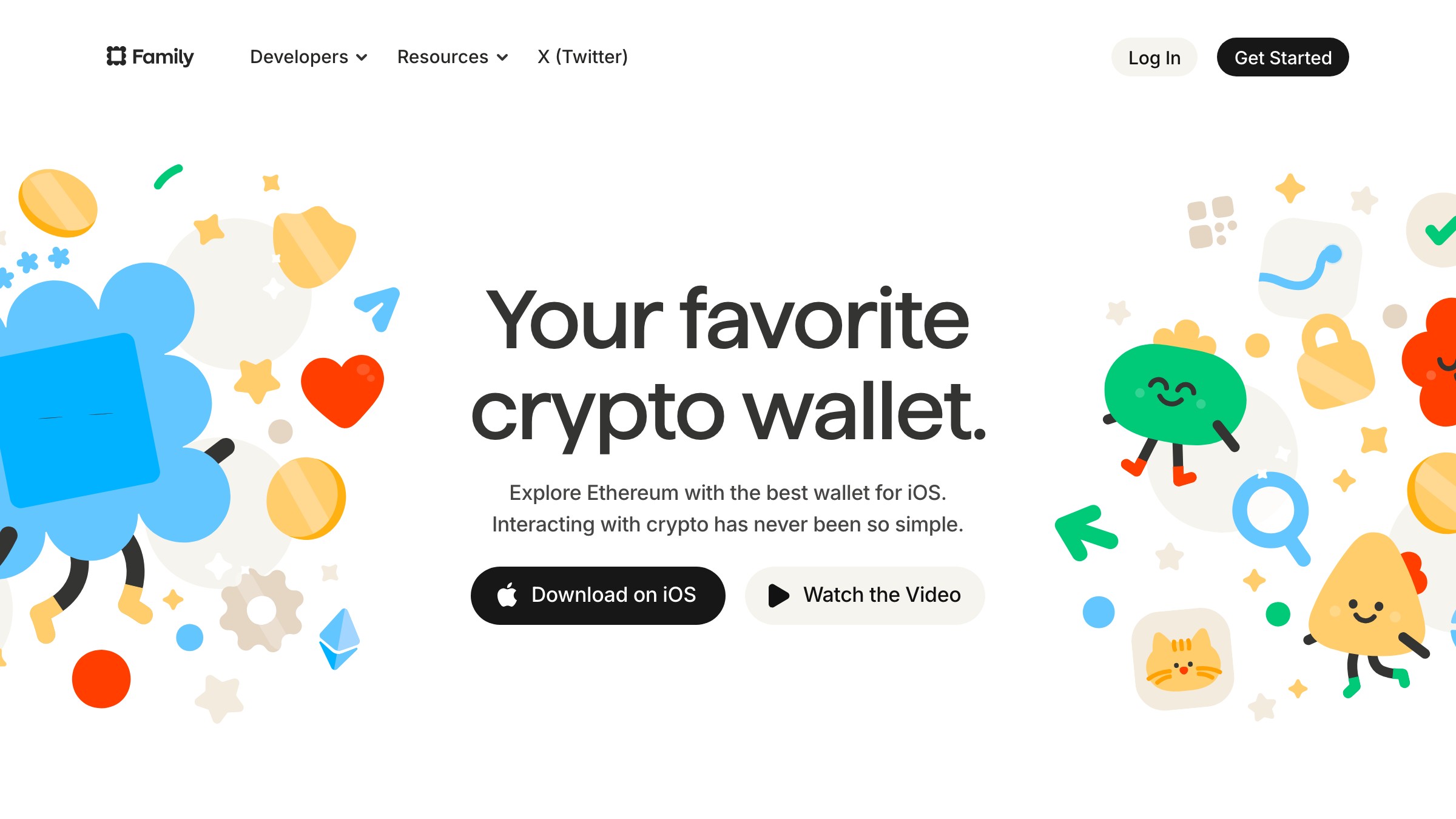
Now it's expected, not as a bonus but as a baseline. Users who interact with products that move well have recalibrated what finished feels like. If it doesn't move well, it reads as incomplete.
Family is the reference. The wallet app has been building a reputation for motion that actually communicates meaning rather than just decorating transitions. The animations are not window dressing.
Good motion tells the user three things:
- What just happened
- What is about to happen
- How the system is responding
That is motion design as information design, and it takes serious craft to do well.
The lesson is not to add more animation. Motion is now a dimension of quality that reviewers, investors, and sophisticated users notice immediately. Teams that treat it as optional decoration are shipping work that reads as incomplete to the audience that matters most.
For product designers, this means motion thinking needs to happen during the interaction design phase, not in post-production. If you're not thinking about what happens when the user completes an action, during the design of that action, you're missing a layer of the work.
Dense data interfaces stopped being ugly
Dense data and visual craft stopped being a trade-off in 2026. The old assumption was binary. Cram in the data and sacrifice craft, or make it beautiful and cut half the information users need. Most enterprise software chose density, most consumer software chose craft.
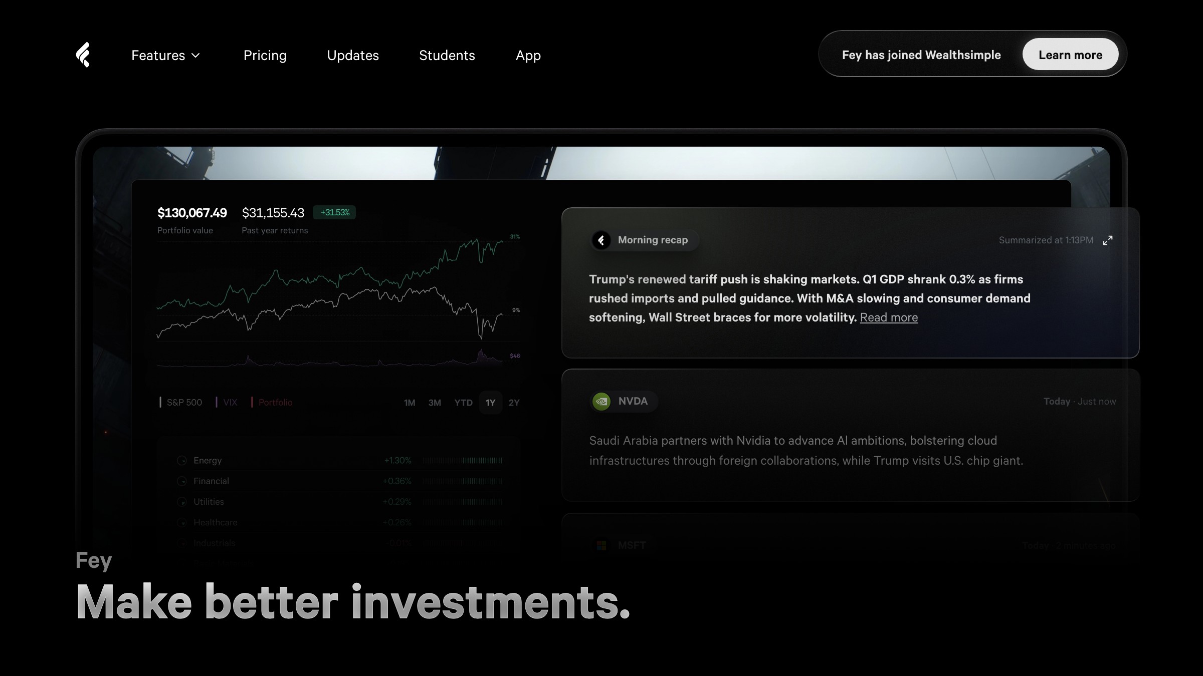
That compromise is no longer necessary, and Fey proved it. The financial portfolio tracker shows a genuinely beautiful interface packed with data. Charts, portfolio weights, performance breakdowns, and watchlist data all share the same screen.
It does not look like a Bloomberg terminal from 2009 or a stripped-down consumer app that hides complexity. It looks like someone cared about both things equally and refused to sacrifice one for the other.
Three decisions make this work:
- Tight typographic hierarchy
- Restrained color, used only where it signals something
- Spatial organization that groups related data without boxing it in
No decorative borders, no gradient fills on cards, no noise that competes with the content.
Dense data design has always been solvable. What changed is that more designers are bringing that problem-solving rigor to it, and the results are shifting user expectations. If your product deals in data and it looks like it was designed by engineers alone, the comparison to products like Fey is becoming visible.
Software started adapting to the user, not the reverse
Software started taking the shape of the user's work instead of forcing the reverse. Every CRM of the last decade shipped a fixed data model, contacts, deals, stages, and made you map your business onto it. That was the deal.
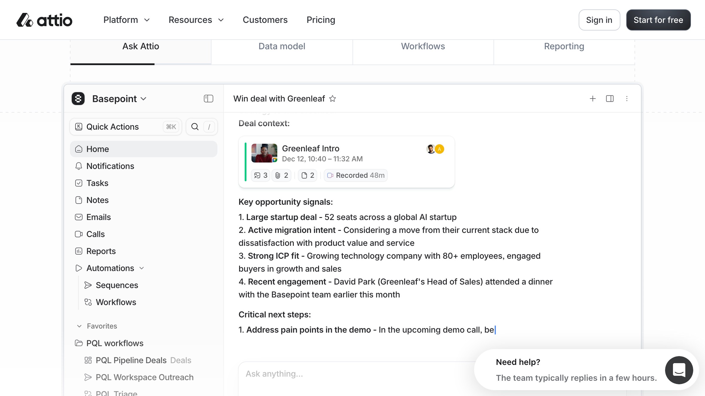
Attio broke that deal. The CRM lets users define their own objects and relationships, so the software takes the shape of the business. You're not stuffing your sales motion into a predetermined schema if that's not how your pipeline actually works.
This is a hard design problem. Adapting to user-defined structure is much harder than designing for a fixed schema, because three things have to hold at once:
- The UI handles infinite configurations without breaking
- The information architecture works whether the user has three objects or thirty
- The interaction model stays learnable even when content varies completely between users
What Attio got right was designing the configuration layer with the same craft attention as the daily-use UI. Most flexible software buries the power-user controls in an ugly settings panel that feels like a different product. Attio made the structure-building experience feel native.
This pattern will spread. Users who have experienced software that fits their actual workflow will not go back to forcing themselves into someone else's schema. Product designers building the next generation of workflow tools need to design for configurability as a first-class concern, not a premium feature.
What this means for designers (the uncomfortable part)
The value of design work split in two this year: execution depreciated, judgment appreciated. That is the part most 2026 roundups skip.
Junior work is shrinking fastest. Screen-pushing, component production, responsive layout specification, and basic icon creation are the first casualties of generative UI and AI-assisted design. Not gone, but worth less per hour than they used to be.
What's appreciating: judgment, taste, product thinking, systems design, and the ability to hold both the design problem and the implementation constraint in your head simultaneously. The work that requires a trained human perspective on what good looks like and why it matters.
| Skill | Trajectory | Why |
|---|---|---|
| Figma component production | Declining value per hour | Generative tools catch up fast |
| Prompt-to-UI iteration speed | Rising expectation | Becomes baseline table stakes |
| Motion and interaction design | Appreciating | Craft premium, hard to generate convincingly |
| Design systems thinking | Appreciating | AI output needs governance |
| Product strategy and prioritization | Appreciating | Tools execute faster, judgment matters more |
| AI-native interface patterns | High demand, undersupplied | New category, no established playbook |
| Design engineering fluency | Appreciating | Handoff friction is a competitive disadvantage |
This is not a take about AI replacing your job. It's about the job changing, and the parts changing are the boring parts. The designers most stressed right now are the ones whose value was built on execution speed, because the tools are now competitive on execution speed.
The designers who are energized are the ones who always found the thinking more interesting than the drawing.
For more on designing with AI tools in practice, the same pattern holds: the tool handles the rote, the human handles the judgment call.
FAQ
Is digital product design actually changing that fast, or is this hype?
Fast is relative. The six shifts took 18-24 months to move from interesting experiments to competitive baseline. That's genuinely fast by industry standards, and if you've shipped something recently, the velocity change is not subtle.
Do I need to learn to code to stay relevant as a product designer?
No, but you need to understand the medium well enough to make better decisions. Knowing what's hard to build versus easy to build, what's performant versus expensive, has always made designers better. It matters more now because the tools execute your decisions faster.
What is generative UI actually good for in production?
First-draft exploration, rapid component prototyping, and variance testing. Not good for final production output without significant curation and a strong design system. Treat it like a very fast junior who needs direction, not an autonomous collaborator.
How do I evaluate if my product's design is keeping up?
Audit against the six shifts. Ask yourself:
- Is AI part of the core interface or bolted on the side?
- Does the design-to-code handoff still waste a week?
- Does the product move well, and does dense data still look cared-for?
- Does the software fit the user's actual workflow?
Honest answers to those questions tell you where the gaps are.
What's the best way to learn AI-native interface design patterns?
Use the products. Granola, Linear, Notion AI, Cursor, and Perplexity are all making live design decisions about AI as interface surface. Use them as a designer, which means noticing what works, what breaks trust, and what feels off.
Is motion design worth investing in for B2B products?
Yes, if your users spend significant daily time in the product. The real distinction is high-use daily driver versus occasional utility, not B2B versus B2C. Motion quality matters when users are in your product for hours.
The work moved up a level
The six shifts are concrete. But they all point to the same underlying change.
Product design used to be, in practice, a craft of making interfaces that communicated and functioned well. That work still exists, but the tools have taken on enough execution burden that the ceiling on what a small team can ship has risen dramatically. When execution gets faster, the constraint becomes something else.
It becomes: do you know what you're trying to build and why? Can you make a confident call on what the product should be and how it should behave, before touching a tool? Do you have strong enough taste to know when the AI's first draft is good enough versus when it's quietly wrong?
Those questions were always important. Now they're determinative. The teams that can answer them quickly are shipping products that look and feel like they have 3x the design investment, while the teams that can't are producing generative slop at high velocity.
The tools started designing back. The designers who are winning in 2026 are the ones who were ready to hand over the execution and focus on the call.
For more design breakdowns covering brand, type, and system design, the same principle shows up across every discipline.
Building a product and want the design to match 2026, not 2021? Brainy designs and ships product interfaces.
Building a product and want the design to match 2026, not 2021? Brainy designs and ships product interfaces.
Get StartedGet new papers by email
New Brainy papers in your inbox. Confirm once, unsubscribe anytime.