Typographic Hierarchy: How to Build One That Actually Reads
How to build a typographic hierarchy from scratch using real scale ratios, weight contrast, leading, and tracking. Plus the failures that kill most hierarchies before launch.

Most articles about typographic hierarchy describe it instead of building it. They say headings should feel important and body text should feel calm. Useless when the ask is "pick five sizes, three weights, and the leading that holds up across a homepage, an article, and a settings panel." Description is not a system. The system is what ships.
This piece is the build. Real ratios, real numbers, the order of decisions, and the failure patterns that kill most hierarchies before launch.
What typographic hierarchy actually is
Typographic hierarchy is the structural ranking of every text element so the eye knows what to read first, second, and third before it reads anything at all. It is the type-specific layer of visual hierarchy and the spine of any working typography system.
A real hierarchy answers four questions in writing. How many levels. What size each level is. What weight each level is. What spacing sits between and within levels. If those answers do not exist on a single page of documentation, the system is improvised, not designed.
The five levels almost every system needs
Most working systems land on five levels: H1, H2, H3, body, and small. More creates noise. Fewer flattens the page.
The trap is treating buttons, captions, and form labels as separate levels. They are body or small with a different role. Button is body at medium weight. Caption is small at regular weight. Label is small at medium weight. Same sizes, different jobs.
Pick a scale ratio and commit to it
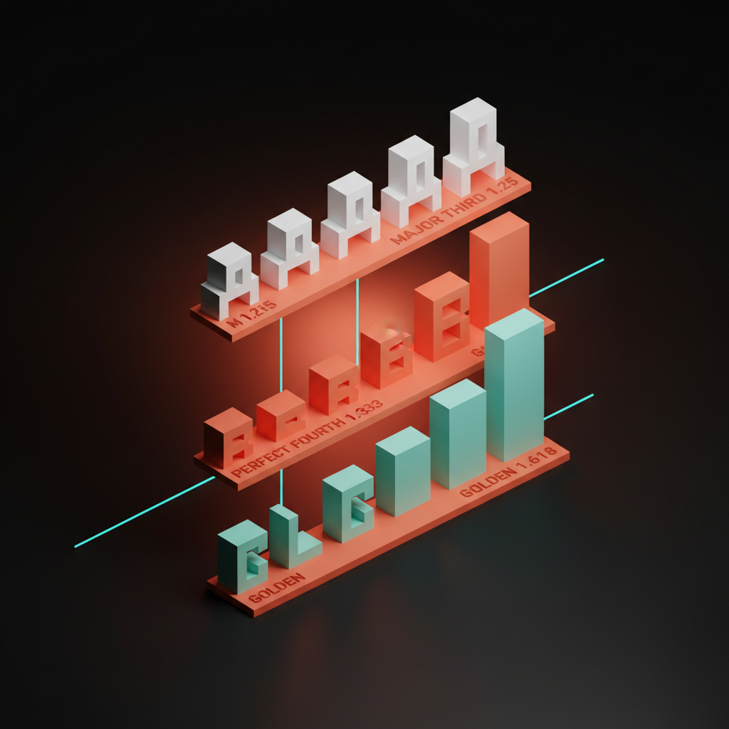
The size of every level comes from a single ratio applied to a base. Pick the ratio first, then derive every size from it. The base is almost always 16px, the browser default and the size body reads cleanest at on screen. Three ratios cover almost every project.
Major third (1.25). Tight and dense. Best for data-heavy UI and admin tools. From a 16px base: 16, 20, 25, 31, 39, 49, 61. Visible but never dramatic.
Perfect fourth (1.333). The workhorse. Strong enough for editorial, restrained enough for product. From a 16px base: 16, 21, 28, 37, 50, 67. The default for most marketing sites.
Golden ratio (1.618). Editorial, expressive, almost theatrical. Best for landing pages and magazine layouts. From a 16px base: 16, 26, 42, 68, 110. The H1 towers over the body, which is the point.
Tools like type-scale.com generate the table for any base and ratio in a second. Pick one, write the numbers down, ship. Switching mid-project is a refactor that touches every page.
Weight is the second axis, not the first
Designers reach for size as the only lever and wonder why the page reads flat. Weight carries half the work, especially on mobile where size range is constrained.
A working system needs three weights. Regular for body, medium for emphasis and labels, bold or semibold for headings. A fourth weight is a brand decision, not a system requirement.
The rule that fixes most flat pages: never use the same weight for two adjacent levels. If H2 is bold, H3 should be semibold or medium. Same-weight adjacency collapses the hierarchy regardless of size. The reverse trap is everything-is-bold, which removes weight as a lever entirely.
Leading is the silent hierarchy lever
Leading is the vertical space between lines, baseline to baseline. CSS calls it line-height. The most undervalued lever in typographic hierarchy.
Tight leading on a headline reads confident and dense. Loose leading on body reads calm and readable. Backwards inverts the hierarchy. Body at 1.2 reads as a wall. A 64px headline at 1.6 reads as decoration.
Working defaults. Headlines (H1, H2): 1.1 to 1.2. Subheads (H3): 1.2 to 1.3. Body: 1.5 to 1.7. Captions: 1.4 to 1.5. Bigger text needs less leading, smaller text needs more. Long-form needs more body leading than UI. A dashboard at 1.4 reads dense, which is correct.
Tracking is for display type, not body
Kerning is the space between specific letter pairs, adjusted at logo or headline scale. Tracking is the space across all letters in a run, set uniformly. They are not the same lever.
Tracking is a hierarchy tool only at the extremes. Tight tracking on a large headline (-0.02em to -0.04em) makes it feel set and decisive. Loose tracking on small uppercase labels (+0.05em to +0.1em) makes the label feel intentional. Both signal the role of the type.
The danger zone is body. Tracking body text damages readability without buying any hierarchy benefit. Leave body at zero. The fastest tell of a designer who does not understand tracking is a hero headline set at +0.1em because it "feels editorial." It does not. It feels like decoration.
Spacing between levels is part of the hierarchy
Vertical space around each level ranks it as much as size and weight do. An H2 with 80px above and 24px below reads as the start of a new section. The same H2 with 24px above and below reads as a paragraph break.
The rule: space above should be roughly twice the space below. The element belongs to the content underneath. Starting spec: above H2: 64 to 96px, below H2: 16 to 24px. Above H3: 32 to 48px, below H3: 8 to 16px. The whitespace discipline matters as much as the type itself. A perfect scale with sloppy spacing reads flat.

The decision order for building a hierarchy from scratch
Skip steps and the hierarchy looks fine in isolation but falls apart inside a real product.
- Pick the base size. 16px for screen. 18px for editorial-heavy sites. Never below 16px for body.
- Pick the scale ratio. Major third for dense UI, perfect fourth for general use, golden ratio for editorial.
- Generate the size table. Derive every level from the ratio. Round to whole pixels. Write it down.
- Pick three weights. Regular, medium, bold or semibold. No more.
- Set leading per level. Tight for headlines, loose for body.
- Set spacing per level. 2-to-1 above-below ratio on every heading.
- Set tracking only for extremes. Tight on display, loose on small uppercase. Zero on body.
- Validate on three real screens. A homepage hero, a long-form article, a dense UI panel. If it holds in all three, ship it.
The fastest way to ship a broken hierarchy is to derive sizes from intuition instead of a ratio, then patch leading and spacing per page.
Where most hierarchies fail
Six failure patterns kill more hierarchies than anything else.
Everything is bold. Weight stops being a lever and the page leans on size alone. Drop H3 and any tertiary heading to medium or semibold.
Only two levels exist. H1 and body with nothing in between reads as a flat document with a title on top. Add an H2 every 150 to 300 words.
The floating subhead. Equal space above and below leaves the subhead belonging to neither section. Collapse the space below so it attaches to the body that follows.
The runaway H1. A desktop hero H1 used inline on every content page breaks the rhythm. Set a desktop H1 token and a content-page H1 token. Same name, two values.
Body copy at 14px. Below 16px breaks readability and squeezes the smaller levels into a 2px range. 16px minimum. Use 13 to 14px only for captions and labels.
Hierarchy designed only on desktop. Mobile compresses every level and collapses the hierarchy into a smear. Design mobile first, scale up.
Hierarchy in 2026 conditions
Variable fonts are now the right default. A single 80KB file delivers regular, medium, semibold, and bold from one axis. Two variable fonts cover the whole system. The font pairing guide covers how to pick them.
AI overviews read the semantic markup, not the visual one. A page with an H1, then a div styled to look like an H2, then an H3, gets parsed wrong. Visual hierarchy and semantic HTML have to match. One H1 per page, no skipped levels. The web design principles breakdown covers the semantic side.
The hierarchy audit checklist
Save this. Run it before launch. Any no gets fixed before shipping.
| # | Check | Pass |
|---|---|---|
| 1 | Base size and scale ratio documented | One ratio for the system, written down |
| 2 | Every level derives from the ratio | No arbitrary sizes |
| 3 | At least three text levels on every content page | H1, H2, body minimum |
| 4 | No two adjacent levels share a weight | Weight contrasts at every step |
| 5 | Body text 16px or larger | 16px floor for screen body |
| 6 | Leading tighter for headlines, looser for body | Headlines 1.1 to 1.2, body 1.5 to 1.7 |
| 7 | Space above each heading roughly 2x space below | 2-to-1 ratio on H2 and H3 |
| 8 | Tracking zero on body, adjusted only on extremes | Body left alone |
| 9 | Hierarchy holds at 375px viewport | Validated on mobile |
| 10 | Semantic HTML matches visual hierarchy | One H1, no skipped levels |
Ten of ten reads itself on every device. Seven of ten reads as designed. Below seven reads flat regardless of typeface.
FAQ
What is the difference between visual hierarchy and typographic hierarchy?
Visual hierarchy is the broader system that ranks every element using size, weight, color, position, space, alignment, and imagery. Typographic hierarchy is the type-specific layer that uses size, weight, leading, tracking, and spacing to rank text. Typographic hierarchy is one input into visual hierarchy.
What is the best ratio for a type scale?
Perfect fourth (1.333) is the safest default. It produces clear contrast without becoming theatrical. Use major third (1.25) for dense UI and admin tools. Use golden ratio (1.618) for editorial and landing pages where the hero must dominate.
How do I fix a hierarchy that looks flat?
Three moves in order. Increase size contrast first. H1 at least 2x H2, H2 at least 1.5x body. Add weight contrast second. No two adjacent levels share the same weight. Tighten the spacing rhythm third with a 2-to-1 above-below ratio on every heading. If the page still reads flat, the layout is doing too much and needs scope cuts before more typography work.
Build the hierarchy, then trust it
A working hierarchy is the cheapest path to a page that reads itself. The reader does not see the levels, the ratios, or the leading values. They see a page that makes sense. The math disappears into clarity.
The trap is treating hierarchy as a final-mile polish step. It is the spine. Build it first, validate on real screens, document as tokens, and let every other decision compose against it. If you want a team that builds the type system, the hierarchy, and the product UI as one project instead of three, hire Brainy. We pick the ratio, write the tokens, and ship the system on a real product.
Want a type system with a hierarchy that survives a real product instead of a Figma file? Brainy ships brand and product typography end to end.
Get Started