AI-Native Product Design: How to Build Products That Are AI-First, Not AI-Bolted
What AI-native product design actually means. Six principles, five teardowns from Linear, Cursor, Granola, Perplexity, and Arc Search, two cautionary tales of AI-bolted-on misfires, and a checklist for shipping AI-first.
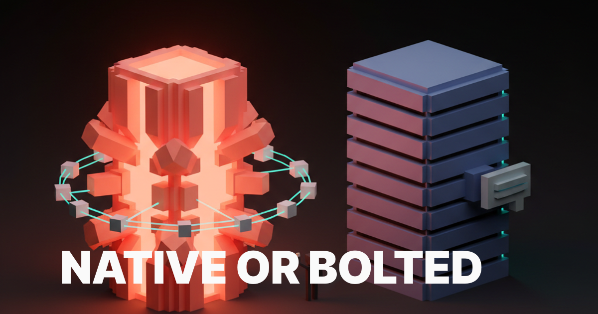
An AI-native product is one where removing the model leaves nothing usable. Most products calling themselves AI-native today would still work fine without the AI, which means they are not AI-native. They are AI-bolted-on, and the difference is not branding, it is architecture.
The cleanest test is the deletion test. Open the product, mentally delete every model call, every chat panel, every sparkle button, every "AI summary" line. What is left? If the answer is a fully functional product that has lost a few flourishes, the product is AI-bolted-on. If the answer is a hollow shell that has lost its primary surface, the product is AI-native. Linear passes the deletion test only on its newer surfaces. Cursor fails the deletion test instantly because there is nothing left without the model. Most enterprise SaaS that shipped a chat sidebar in 2024 passes the deletion test by losing nothing important, which is the indictment.
This piece is the operational version of that test. The six principles that separate AI-native from AI-bolted-on, five real product teardowns from Linear, Cursor, Granola, Perplexity, and Arc Search showing how each principle ships, two cautionary tales of products that bolted AI onto a side panel and got nothing for it, and a pre-ship checklist any team can run on a working build before shipping.
AI-native means the model is the product, not a feature
The phrase "AI-native" gets thrown at every product with an OpenAI key and a glow effect, which has emptied the term. The working definition is sharper. An AI-native product is one where the model is the primary surface and the rest of the UI exists to make the model usable, accountable, and fast. The chat panel, the form fields, the dashboards, the side rails, all of those are scaffolding. The model is the load-bearing wall.
This sounds obvious until you look at how products actually ship. The standard 2024 enterprise pattern was to keep the existing dashboard intact and bolt a chat panel onto the right edge. The model is in the product, but the product is not built around it. The user can ignore the chat panel and complete every task they came for using the original UI. That is the definition of AI-bolted-on, no matter how prominent the sparkle icon is.
The AI-native version of the same product would have rebuilt the primary workflow around the model. The dashboard becomes a prompt. The form becomes a conversation. The export becomes a generation. The model is no longer something you can ignore, it is the surface itself. That is a much harder product to ship, which is why most teams settle for the bolt-on.
The six principles of AI-native product design
Model as core surface, prompt-as-input, agency by default, transparency surfaces, deliberate model reveal, and latency as a design constraint. Every AI-native product worth studying ships some combination of these six.
The principles are not a checklist in the sense that hitting four out of six makes a product AI-native. They are a posture. A team that treats the model as the surface from day one will naturally arrive at most of these. A team that treats the model as a feature added in sprint twelve will fail all of them and ship a chat sidebar.

The principles below are framed as decisions, not features. Each one has a default posture for an AI-native product and a default posture for an AI-bolted-on product. The gap between those two postures is what separates Cursor from any text editor with a Copilot plugin.
Model as core surface, not side panel
The first principle is the simplest and the most violated, because every enterprise SaaS shipping a chat sidebar is failing this one on day one.
Core surface means the model is what the user reaches for first when they open the product. Side panel means the model is parked next to the existing UI, available on demand, ignored by default. Perplexity is core surface. Notion AI's slash command is mostly core surface inside the writing context. Cluely is core surface as an overlay on the entire screen. The chat sparkle icon docked to the right of any standard SaaS dashboard is the platonic ideal of side panel.
The test is where the user lands when they open the product cold. If the first thing they see is a prompt field, an answer surface, or a model-driven primary view, the product is core surface. If the first thing they see is the original dashboard with a chat icon in the corner, the product is side panel and the AI will be ignored by anyone past the first session.
The fix for an existing product is not subtle. The chat panel cannot stay docked to the right. The model has to either replace the primary surface or be promoted into the central workflow as a first-class action. That is a redesign, not a feature, which is why most teams refuse to do it and ship the sidebar instead.
Prompt-as-input replaces form-as-input
The second principle is the input model itself, where natural language replaces the dropdown, the multi-step wizard, and the empty-state form.
Prompt-as-input means the user types what they want in their own words and the model figures out the structure. Form-as-input means the user fills in the structured fields the product has predefined and the model has nothing to do. Cursor's Cmd-K is prompt-as-input. Linear's command palette plus AI is prompt-as-input. Perplexity is the entire product as a prompt. Krea's image input field is prompt-as-input augmented with reference images. Lovable is prompt-as-input that builds the entire app from a sentence.
Form-as-input is not always wrong. Some structured data genuinely belongs in a form, and forcing every interaction through a prompt is its own design crime. The discipline is asking which inputs the model can do better than a form, then replacing those forms first. Configuration screens, search filters, report builders, query interfaces, those are all prime candidates. The user's name, email, and credit card are not.
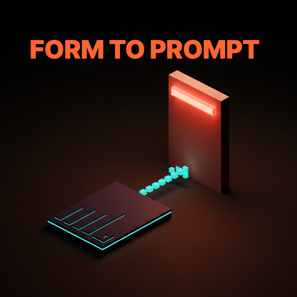
The bug most products ship is keeping every form intact and adding a prompt as an alternative entry point. The user now has to learn two ways to do the same thing, which is worse than either alone. The prompt should replace the form, not coexist with it, and the team should be willing to deprecate the form when the prompt outperforms it.
Agency by default means the product acts, not asks
The third principle is autonomy posture, where AI-native products do the work without waiting for permission and AI-bolted-on products ask for confirmation on every keystroke.
Agency by default means the product takes the action when the user expresses the intent, then shows what it did and lets the user undo. Permission by default means the product offers to take the action, the user clicks confirm, the product asks again, and the user gives up. Cursor's agent edits files without asking. Granola transcribes and augments notes without asking. Arc Search browses, summarizes, and presents an answer without asking. The product is acting, not negotiating.
The trade-off is real. Agency by default needs an undo affordance, an audit trail, and a clear surface for what the model did. Without those, agency becomes hostile, the product takes actions the user did not want, and trust evaporates. The discipline is shipping agency together with the recovery surface, not shipping agency alone and hoping nothing breaks. The same trade-off applies to the broader agent UI design patterns discussion, where the autonomy slider is a first-class control.
The cautionary version is the product that asks "would you like me to..." on every action. Each confirmation costs a click, breaks flow, and signals that the model is not actually trusted by the team that built it. If the team does not trust the model, the user will not either, and the agency posture should be raised until the friction stops feeling protective and starts feeling cowardly.
Transparency surfaces make the model accountable
The fourth principle is the trust loop, where the product shows what the model saw, what it decided, and why, in a surface the user can actually read.
Transparency is not the same as exposing the system prompt. Transparency means the user can answer three questions on demand. What context did the model have access to? What action did the model take? What did the model produce, and where did it source it? Perplexity ships this with citations on every claim. Cursor ships this with a diff on every edit. Granola ships this with the raw transcript next to the augmented notes. The user is never wondering whether the model invented something, because the source is one click away.
The opposite is the magic-box pattern, where the model produces an output and the user has no way to verify it. Notion AI's older summary feature shipped this way for a while, where the summary appeared and the user had to trust it. The fix was adding citations and a way to see what content was summarized. The lesson is that transparency surfaces are not optional in an AI-native product, they are the trust mechanism that keeps the product from being a hallucination machine.
The discipline is to ship the transparency surface from day one, not retrofit it after the trust has eroded. A product that shipped without citations and is now adding them is doing damage control. A product that shipped with citations from the first version is doing its job.
Hide model details by default, reveal them on intent
The fifth principle is the discipline of when to expose temperature, model name, and system prompts, and the answer is almost never on the main surface.
The user does not care which model variant is running. They care whether the answer is good, fast, and verifiable. Exposing the model name on the primary surface is a leak from the product team's mental model into the user's, and it signals that the team has not yet decided what the product actually is. ChatGPT used to ship the model picker prominently, then quietly demoted it because most users did not know what GPT-4-Turbo meant relative to GPT-4o, and the choice was creating decision paralysis instead of value.
The exception is the power user surface. Cursor exposes model selection because its users are developers who want the choice. Claude Code exposes model selection for the same reason. Krea exposes generation parameters because its users want to tune them. The pattern is to hide model details by default on the consumer surface, then reveal them in a settings panel or an advanced mode for users who explicitly want the control.
The bug is shipping the model picker on the home screen of a product whose audience does not know what the models are. Every product launch deck still has the model picker on the hero screenshot. Most of those products would do better hiding it and letting the team route to the right model invisibly.
Latency is a first-class design constraint
The sixth principle is that an AI-native product feels slow if the model takes more than two seconds to start streaming, and the design has to fix that perception before the engineering does.
Latency is not just a performance number, it is the rhythm of the product. A two-second pause before the first token is dead space, and the user fills that space with doubt. The fix is a combination of streaming the response token by token (so the user sees motion immediately), showing a skeleton or shimmer state that promises a response is coming, and surfacing partial results as soon as they are available. Perplexity does all three. Cursor does all three. Most enterprise SaaS chat sidebars do none of them and feel broken on every interaction.
The design constraint that flows from this is that the product cannot be designed without testing the actual latency of the model. A prototype that runs against a fast mock model will not surface the latency problems, and the team will ship a product that worked in the design review and feels slow in production. The discipline is to design with the real latency from the first prototype, then either fix the perception or change the architecture until the rhythm feels right.
Five AI-native products, annotated
The principles only matter if they survive contact with shipped products, so here are five doing it right today.
Each teardown is short and concrete. What the product is doing on each principle, where it wins, and where it leaves money on the table. None of these are perfect. All of them are operating well above the AI-bolted-on baseline, which is what makes them worth studying.
Linear, AI-native as quiet command surface
Linear's AI is invisible until you summon it, then it is the single fastest path to any action in the product.
Surface: the AI lives inside the existing command bar, which is already where Linear power users do most of their work, so the model is core surface for the audience that matters. Prompt: pure prompt-as-input via natural language commands. Agency: high, the AI creates issues, edits descriptions, and triages without negotiation. Transparency: the action is visible in the timeline as a normal Linear event. Reveal: model details hidden, even the trigger feels like a Linear feature rather than an AI feature. Latency: streaming responses, instant trigger.
Where Linear leaves money. The AI is gated behind the command bar invocation, which means new users discover it late. A more explicit AI-first onboarding would lift adoption for the long tail without breaking the quiet posture for power users.
Cursor, AI-native as the editor itself
Cursor is what happens when you stop bolting AI onto VS Code and rebuild the editor around the model, and the result is the cleanest AI-native developer tool shipped to date.
Surface: the model is everywhere, Cmd-K, agent mode, autocomplete, chat, all woven into the editor surface. Prompt: prompt-as-input is the primary action, the editor still has menus but the prompt does most of the work. Agency: very high in agent mode, the product edits files, runs commands, and ships diffs. Transparency: every change is a diff the user reviews, every action is logged. Reveal: model details exposed because the audience is developers who want them. Latency: streaming, parallel calls, optimistic UI.
Where Cursor leaves money. The agent mode UI still feels like a chat panel attached to the editor on some flows, where it should feel more woven into the inline experience. Tightening that integration would push Cursor further into core-surface territory.
Granola, AI-native as silent transcription with a brain
Granola treats the model as an ambient layer that runs while the user takes manual notes, then quietly augments those notes after the meeting.
Surface: the model is the entire augmentation step, which is the primary value of the product. The note-taking surface itself is conventional, but it is the membrane over the model. Prompt: less prompt-as-input than most, more prompt-as-postprocess, where the user's manual notes become the prompt for augmentation. Agency: high, the augmentation happens without asking. Transparency: the raw transcript and the augmented notes sit side by side, the user can verify any claim. Reveal: model details hidden, the user does not know which model ran. Latency: post-meeting, so latency is not a real-time concern.
Where Granola leaves money. The product could lean further into prompt-as-input by letting the user steer the augmentation with a quick prompt after the meeting, rather than relying entirely on the silent default. Adding that surface would extend the AI-native posture into the user's editorial control without breaking the ambient default.
Perplexity, AI-native as the search engine itself
Perplexity rebuilt search around a model and an answer, and the input is the model, the surface is the model, and the result is the model.
Surface: maximum core surface, the entire product is the model. Prompt: prompt-as-input is the only interaction model. Agency: medium, the model answers the question without asking, but the user still drives every interaction explicitly. Transparency: citations on every claim, sources displayed inline, follow-up questions surfaced. Reveal: model details mostly hidden on the consumer surface, exposed in pro settings. Latency: streaming, fast first token, partial results during deeper queries.
Where Perplexity leaves money. The agentic deep research mode still feels grafted onto the main surface, where it could be better integrated into the answer flow as a depth slider rather than a separate mode. That integration would make the agency principle more legible to first-time users.
Arc Search, AI-native as the browser tab
Arc Search collapses the entire browse-and-summarize loop into one tap, and the AI is the tab itself rather than a panel attached to one.
Surface: the model replaces the page, "Browse for me" returns an answer, not a list of links. Prompt: prompt-as-input via the address bar, which is the most natural prompt surface on a browser. Agency: very high, the product visits multiple pages, summarizes them, and presents one synthesized result without asking. Transparency: source links sit at the bottom of the synthesized result. Reveal: model details fully hidden, the AI is invisible as infrastructure. Latency: surprisingly fast for a multi-page agent action, the perception is helped by a tight loading state.
Where Arc Search leaves money. The synthesized answer can be wrong in subtle ways, and the transparency surface (linked sources) is functional but easy to miss. Promoting source citations more aggressively in the answer body would lift the trust loop without breaking the AI-native posture.
Want a product where the AI is the surface, not a sparkle icon parked in the corner? Hire Brainy. UXBrainy ships AI-first product strategy and design audits. AppBrainy ships full AI-native product UI for teams building Cursor-grade tools. ClaudeBrainy ships a Skill pack and prompt library for teams who want AI features built like the products on this list, not like a 2024 chat sidebar.
Two cautionary tales of AI bolted onto a side panel
For every AI-native product winning trust, there is an enterprise SaaS that shipped a chat sidebar in 2024, watched usage flatline, and is now wondering why nobody clicks the sparkle icon.
These two patterns are everywhere in enterprise software right now, and both are diagnosable in the first ten seconds of using the product. They are the canonical AI-bolted-on shapes, and any team about to ship one of them should rethink before the launch deck goes out.
The chat sidebar that nobody opens
The first cautionary pattern is the AI panel docked to the right of the existing UI, which adds nothing to the workflow and competes with it for screen real estate.
The shape is familiar. A CRM, a project tool, a help desk, an analytics dashboard, all add a chat panel to the right side, with a sparkle icon promising AI-powered assistance. The user opens it once, asks a question, gets a generic answer that does not understand the surrounding context, closes it, and never opens it again. The chat panel survives in the product because the team launched it on the keynote, not because users wanted it.

The fix is not making the chat panel better. The fix is killing the chat panel and rebuilding the primary workflow around the model. Replace the form with a prompt. Replace the report builder with a generation. Replace the search bar with an answer surface. The model has to be in the path, not next to it. Teams that refuse this redesign will keep shipping chat sidebars and keep wondering why their AI engagement is one percent.
The sparkle button that summarizes things nobody asked to summarize
The second cautionary pattern is the magic wand bolted onto every text field, where the AI offers to rewrite, summarize, or expand any input, and the user keeps typing.
The shape: every form field, every text input, every comment box gets a small sparkle button that offers AI assistance. The team shipped it because it was easy. The user ignores it because the AI does not know enough about the surrounding context to be useful, and clicking the button costs more attention than just writing the sentence themselves. The button accumulates across the product surface like barnacles, and the metric the team tracks (button visibility) is up while the metric that matters (user satisfaction) is flat.
The fix is the same shape as the chat sidebar fix, with a smaller scope. Pick the two or three text fields where the AI genuinely helps (long-form content, structured data extraction, large-document summarization) and ship a deep AI-native experience there. Remove the sparkle button from every other field. The product is now AI-native in the surfaces that matter, and the noise has been deleted.
The pre-ship checklist for AI-native products
Run this checklist on any product claiming to be AI-native and you will catch the bolted-on patterns before they reach a real user.
- Deletion test. Mentally remove every model call from the product. What is left? If a complete, functional product remains, the product is AI-bolted-on. If a hollow shell remains, the product is AI-native.
- Cold-open test. Open the product cold. What is the first surface the user lands on? If it is a prompt field, an answer surface, or a model-driven primary view, the surface principle holds. If it is the original UI with a chat icon in the corner, the surface principle is failing.
- Form-to-prompt audit. List every form field in the product. For each field, ask whether a prompt would do this better. Replace the ones that fail the test.
- Agency posture. Count the confirmation modals between the user's expression of intent and the model's action. If there are more than one, the agency principle is too cautious. Push more actions to act-then-undo.
- Transparency inventory. For every model output, ask: can the user see what context the model had, what action it took, and where the answer came from? If any of those three is missing, the transparency surface is incomplete.
- Reveal discipline. Look at the primary surface. Is the model name, temperature, or system prompt visible? If yes and the audience is not technical, hide it. If yes and the audience is technical, keep it.
- Latency rhythm. Measure the time from the user's intent to the first token of model response. If it is more than two seconds without any feedback, the latency perception is broken. Add streaming, skeleton states, or partial results until the rhythm feels alive.
- Sparkle-button audit. Count the sparkle icons across the product surface. If there are more than three, most of them are noise. Ship deep AI-native experiences on the two or three surfaces that matter and remove the rest.
- Onboarding test. Watch a first-time user complete the primary task. Did the model carry the experience, or did the user complete the task using the original UI? If the latter, the AI is bolted on, no matter what the marketing says.
- Trust failure recovery. Force the model to produce a wrong answer. What does the product do? If there is no clean recovery surface, the trust loop is incomplete and the product will lose users to its first hallucination.
A product that passes those ten checks is genuinely AI-native. It will not be perfect, but the architecture is right, and most other problems are tractable from there. A product that fails most of them is AI-bolted-on, no matter how prominent the AI features look in the launch post.
FAQ
What does AI-native product design mean?
AI-native product design means the model is the primary surface and the rest of the UI exists to make the model usable, accountable, and fast. The cleanest test is the deletion test: if you remove every model call from the product and a fully functional product remains, the product is AI-bolted-on. If only a hollow shell remains, the product is AI-native. Linear, Cursor, Granola, Perplexity, and Arc Search pass this test on their core surfaces. Most enterprise SaaS that shipped a chat sidebar in 2024 fail it.
How is AI-native different from AI-bolted-on?
AI-native products rebuild the primary workflow around the model. AI-bolted-on products keep the existing workflow intact and add an AI panel to the side. The difference shows up in where the user lands on cold open, whether the input is a prompt or a form, whether the product acts or asks, and whether the model can be ignored without losing primary functionality. AI-bolted-on products can be ignored. AI-native products cannot.
What are the principles of AI-first product design?
Six principles separate AI-native from AI-bolted-on. Model as core surface, not side panel. Prompt-as-input, not form-as-input. Agency by default, not permission by default. Transparency surfaces that make the model accountable. Hide model details by default, reveal them on intent. Latency as a first-class design constraint with streaming, skeleton states, and partial results. Every AI-native product worth studying ships some combination of these six.
What is the best example of an AI-native product?
Cursor is the cleanest example of AI-native product design shipped to date for developer tools. Perplexity is the cleanest example for consumer search. Linear is the cleanest example of an embedded AI-native experience inside an existing productivity surface. Granola is the cleanest example of an ambient AI-native product where the model runs in the background. Arc Search is the cleanest example of an AI-native browser interaction. Each one rebuilt its primary workflow around the model rather than bolting AI onto an existing UI.
How do you design AI UX for an AI-native product?
Start with the deletion test on every screen. Replace forms with prompts where the model can do the structuring better than the user. Set the default agency posture to act-then-undo, not ask-then-act, and ship the undo surface together with the action. Add a transparency surface for every model output. Hide model details from the consumer surface. Design every interaction with real model latency, not mock latency, and use streaming or skeleton states whenever the first token takes more than a beat to arrive. The same posture applies to the broader web design trends 2026 shift toward layouts that adapt to the model rather than wrap around it.
The shift AI-native products actually unlock
An AI-native product is not a SaaS app with a chat window glued to the corner, it is a new shape of product where the model is the primary medium and the UI is the membrane.
The brands that ship AI-native (Linear on its newer surfaces, Cursor everywhere, Granola in its augmentation layer, Perplexity end-to-end, Arc Search as an entire interaction model) have all internalized this. They did not add AI to a product, they built a product around AI. The architectural decision is upstream of every design choice, and it shows up in everything from the input model to the latency rhythm to the recovery surface. The products that try to retrofit AI onto an existing surface end up with a chat sidebar nobody opens and a sparkle button nobody clicks, no matter how much the marketing site insists they are AI-first.
The opportunity for design teams in 2026 is to take the deletion test seriously on every product they ship. If the product survives the test, the team is shipping a feature, not a product. If the product fails the test (in the right way, by becoming a hollow shell without the model), the team has a chance to build something genuinely AI-native, and the principles above are the working scaffolding for getting it right. The same scaffolding sits underneath the broader visual hierarchy discipline, where the model now claims the largest visual rank on the page rather than orbiting the original UI.
The deeper shift is that the user's mental model of software is changing. They no longer expect to learn a tool, they expect to express an intent and have the tool respond. Products built for the old mental model (forms, dashboards, multi-step wizards) are going to feel slow, ceremonial, and antique within two years. Products built for the new mental model (prompt, answer, action, undo) are going to feel like the present. The teams that move first will define what AI-native means in their category, and the teams that bolt a chat sidebar onto an existing surface will spend the rest of the decade explaining why their AI engagement metric is so low.
If your team is building an AI feature, building an AI product, or trying to figure out which one you are actually shipping, the principles on this page are the operating manual. If you want help applying them to your specific product, hire Brainy. UXBrainy ships AI-first product strategy and full design audits against this framework. AppBrainy ships AI-native product UI for teams building tools they want their users to actually use. ClaudeBrainy ships Claude Skills and a prompt library for teams that want AI features built like Cursor and not like a 2024 chat sidebar. The framework on this page is what we run inside every project, on every screen, before anything ships.
Want a product where the AI is the surface, not a sparkle icon parked in the corner? Brainy ships UXBrainy for AI-first product strategy, AppBrainy for full AI-native product UI, and ClaudeBrainy as a Skill pack for teams who want AI features built like Cursor and not like a 2024 chat sidebar.
Get Started