Generative UI Design: The Practical Handbook for 2026
Generative UI design explained: the four architectures, the pattern language, the failure modes, and the practical handbook for designers shipping in 2026.

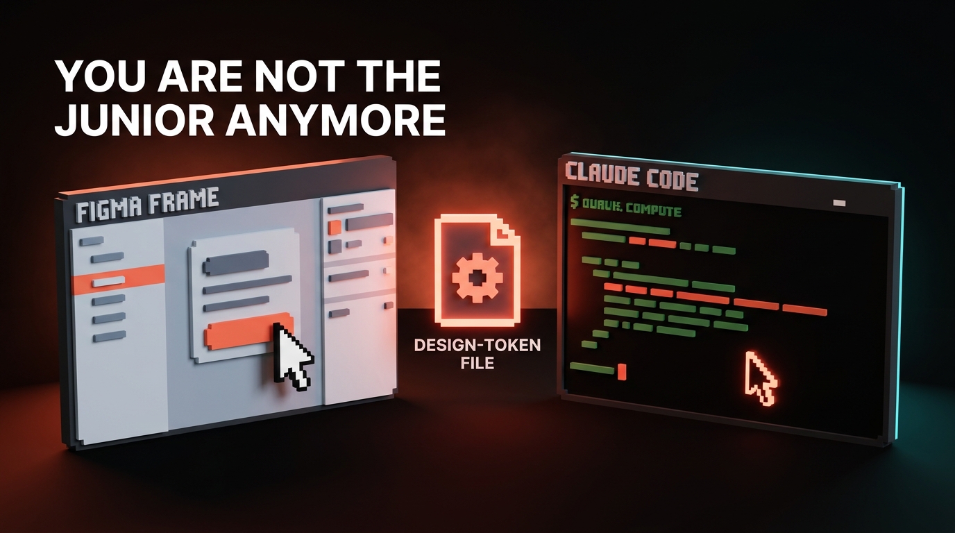
The screen you ship in 2026 might not exist until the user asks for it. That is the bet behind generative UI, and it changes what design actually is.
This paper is a working handbook for generative UI. It defines the term, names the four architectures shipping in production, gives you a pattern vocabulary, calls out the failure modes by name, and lays out the new job description for designers who want to stay relevant. It is opinionated on purpose.
The hype cycle has produced enough vendor pages. What designers need now is principles that survive the next model release.
What generative UI actually is
Generative UI is interface that assembles itself at runtime in response to user intent. The system holds a vocabulary of primitives, a model that knows how to compose them, and a contract that says which compositions are allowed. The user types, speaks, or clicks. The interface forms.
The opposite of generative UI is the design we have been doing for two decades, where every screen is a static artifact drawn ahead of time and shipped as a fixed flow. Generative UI does not replace static screens. It absorbs the long tail. The boring middle of most products, where users want one specific answer and a tiny amount of interactivity around it, becomes a generated surface instead of a route in your sitemap.
A useful test: if the same question from two users could reasonably warrant two different layouts, that surface is a candidate for generative UI. If the answer is always a list of orders sorted by date, it is not.
Why this is happening in 2026 and not 2022
Three things had to land at once. Models had to become good enough at structured output that they could call tools and emit valid component trees instead of paragraphs. Frameworks had to expose a way to stream those trees into a running app. Component libraries had to mature into vocabularies a model could actually reason about.
By early 2026 all three are real. v0 ships components into your codebase that already match shadcn and your tokens. Vercel AI SDK lets you stream React components from a server route as the model produces them. Claude Artifacts renders a self-contained interactive program inside a chat turn.
ChatGPT Canvas treats the document and the UI around it as one editable surface. Bolt and Same.new produce running applications from a prompt. Tools by Anthropic and Cursor's composer let agents reach into structured systems and emit interfaces against them.
None of these are the same product. They are evidence that the substrate finally exists, and that the design conversation can move past whether generative UI works and into how to build it well.
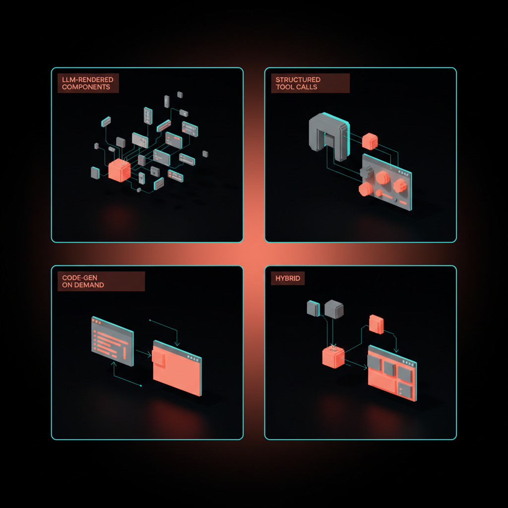
The four architectures shipping in production
Most generative UI in production is one of four shapes. Choose deliberately, because the choice constrains your design system, your evals, and your latency budget.
-
LLM-rendered components. The model picks from a fixed vocabulary of components in your codebase and emits a typed tree. The Vercel AI SDK pattern. Predictable, brand-consistent, easy to evaluate, capped by how rich your library is.
-
Structured tool calls. The model calls a tool that returns structured data, and a static layout renders it. Most chat product features work this way, with a fixed interface and dynamic content. Cheap, safe, and limited in flexibility.
-
Code generation on demand. The model writes code that produces the interface, in patterns like Claude Artifacts, v0, Bolt, Same.new, and ChatGPT Canvas in code mode. Maximum range, maximum risk, the hardest to keep on-brand and accessible.
-
Hybrids. The most interesting category and where most serious products end up. A trusted shell of static UI, a vocabulary of LLM-rendered components for the dynamic middle, and a code-gen escape hatch for the rare custom case.
If you do not know which architecture you are using, you are using the wrong one.
How to choose between them
Three questions decide the architecture.
| Question | LLM-rendered | Tool calls | Code-gen | Hybrid |
|---|---|---|---|---|
| Is brand consistency load-bearing? | Strong | Strongest | Weak | Strong |
| Does the surface need novel layouts? | Some | Almost never | Yes | Yes |
| Can you tolerate seconds of generation latency? | No | No | Often yes | Mixed |
| What breaks first if it goes wrong? | Composition errors | Wrong content | Broken code | Boundary errors |
LLM-rendered components are the right default for most teams. Code-gen earns its keep when the surface is genuinely one-shot, like a custom analysis or a thrown-together prototype, and where the user understands they are looking at a draft. Tool calls handle the cases where the layout is solved and only the data is dynamic. Hybrids are where you end up after twelve months of production traffic.
The pattern language: what designers actually design
Generative UI does not eliminate design work. It moves it. The artifact you ship is a vocabulary, not a screen.

A working vocabulary has five layers.
-
Primitives. The atomic components the model is allowed to use. Card, table, chart, form, list, image, callout, code block. Each one needs typed props the model can satisfy.
-
Intent slots. Named regions the model fills based on user intent. "Summary," "evidence," "action," "follow-up." Slots constrain composition without freezing it.
-
Fallback states. Every primitive needs a graceful empty, loading, partial, and refused state. The model will produce all four constantly. Design them as first-class artifacts.
-
Recoverability affordances. Edit-in-place, regenerate, "show me a different version," undo. Generative interfaces are conversations, and conversations need a back button.
-
Citation and source UI. Where the data came from, when it was fetched, and how confident the system is. Without this, generative UI looks like a confident liar. With it, the same output reads as honest.
If a designer cannot explain what each layer of the vocabulary contains in their product, the vocabulary does not exist yet, and the model is just guessing in public.
Intent slots, in practice
Intent slots are the part most teams skip and then regret. Treat them as the new wireframes.
A slot is a named, typed region with rules about what can land there. "Primary answer" might accept a callout, a table, or a chart, but never a form. "Suggested next step" might accept a button or a card with one CTA, never a long paragraph.
The model is briefed on the slots in its system prompt, the same way you would brief a junior designer. The frontend renders slots in a stable layout grid so the surface feels like one product even when its contents change every time.
The result reads as a designed interface that happens to vary, instead of a generated mess that happens to render. That difference is the entire battle.
Failure modes you will hit and how to design against them
Generative UI fails in specific, repeatable ways. Name them now or rediscover them in production.

-
Hallucinated UI. The model invents a button that does nothing, a tab that has no content, or a chart of numbers it made up. Counter it with strict component contracts, server-side validation of every emitted tree, and disabled states on any control whose handler is not wired.
-
Latency dread. The user stares at a spinner while the model thinks. Stream partial results, reserve layout space ahead of content, and show the model's intent ("composing a comparison table") before the data lands.
-
Infinite-canvas trap. Code-gen surfaces feel limitless and end up unusable. Constrain the canvas. Show the user what kinds of outputs are possible up front. A grid of starter prompts beats a blank textarea every time.
-
Single-model lock-in. A vocabulary tuned to one provider's quirks breaks the day you swap models. Write component contracts that any reasonable model can satisfy, and run your evals against at least two providers before you ship.
-
Conversation amnesia. The interface forgets what it just generated. Persist generated artifacts as first-class objects users can name, save, share, and return to. ChatGPT Canvas got this right. Most chat-only products get it wrong.
The teams that ship sustainable generative UI are the ones that treat these as architecture problems on day one, not bugs to fix in QA.
How to evaluate a generative UI surface
You cannot review a generative UI feature the way you review a static page. The output is not a single artifact, it is a distribution.
A working evaluation has three layers. The first is a deterministic rubric that runs as code on every emitted tree: did the model use only allowed components, did it satisfy the intent slots, did it include a citation when the schema requires one, did any control land without a wired handler.
These checks are pass or fail. They run on every change to the prompt, the components, or the model. If they fail, the surface refuses to render and falls back to a safe state. Treat these the way a backend team treats integration tests, with the same blocking power on deploy.
The second layer is sampled human review. A small panel, ideally including a brand designer and a domain expert, scores ten to twenty generated outputs per week against a five-point rubric on tone, brand fit, and usefulness.
Track the score over time. The day it drops, you have a regression. The day it climbs, something you changed worked, and you need to know what.
The third layer is in-product feedback. Every generated surface ships with a thumbs-up, thumbs-down, and a free-text comment. Wire that signal back to the team that owns the vocabulary, not to a generic feedback inbox where it dies. Generative UI products that improve are the ones whose owners read every comment for the first three months.
How to scope a generative UI project
Most generative UI projects fail at the scoping stage, not the execution stage. Teams pick a surface that is too important, too regulated, or too complex, and then six weeks later the rollback is a story about how AI is not ready.
The right first surface is one with three traits. The user clearly benefits from a tailored answer, the static fallback is acceptable if generation fails, and a wrong answer is recoverable rather than catastrophic.
Internal dashboards meet all three. Help center answers meet all three. Personalized analytics summaries meet all three. Account creation, payment authorization, and medical advice meet none of them.
Scope the work as a vocabulary release, not a feature release. The deliverable is not "the generated dashboard ships in Q3," it is "the v1 vocabulary plus the v1 eval suite plus the v1 generated surface ship together in Q3, and any v2 generated surface in any product after that consumes the same vocabulary." Treat the vocabulary as platform investment. That is the only framing that justifies the design system effort the work actually requires.
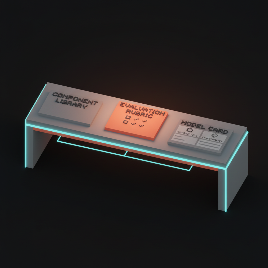
The designer's new job: vocabularies, evals, and intent
Generative UI rewrites the designer's job description more than any change since responsive design.
The unit of work shifts from screens to systems. Designers stop drawing every state and start curating the primitives, slots, and fallbacks the model composes from. The Figma file becomes a reference for the vocabulary, not the destination for the work.
Specs become evaluations. A generative surface cannot be acceptance-tested against a single mockup, because the same prompt produces many valid outputs.
Designers write rubrics instead: "the result must include a citation, must use the brand chart palette, must surface a follow-up action, and must never recommend a competitor's product." Those rubrics run as automated evals on every model release. Design quality becomes measurable.
Documentation becomes prompting. The system prompt that describes how the model should compose your vocabulary is now a design artifact. It is versioned, reviewed, and in many products the most important piece of "design copy" the team writes.
What good looks like, in shipping products
A few examples to anchor the principles, not as endorsements.
The Vercel AI SDK generative UI primitive treats components as a typed vocabulary the model streams into a server-rendered route. The win is brand consistency and predictability. The cost is being capped by the library you wrote.
Claude Artifacts demonstrates code-gen-on-demand inside a chat turn, with persistence and edit-in-place. Strong on recoverability and the artifact-as-object pattern. Honest about being a draft surface, not a polished product.
ChatGPT Canvas is a hybrid. The conversation provides intent, the canvas provides a stable, editable artifact, and the model can generate either text or code into it. The lesson is that pinning generated content to a persistent canvas dramatically lowers the cognitive cost of working with a model.
v0 and Bolt are code-gen optimized for production handoff. They prove that the failure modes are tractable when the output gets handed to a developer who can review it, and unworkable when the output is shown directly to an end user.
Same.new shows what happens when you treat the entire app as the generated artifact. Useful for prototyping, dangerous for anything load-bearing. Tools by Anthropic and Cursor's composer hint at the next stage, where agents wire generated UI into structured backends.
The pattern across all of them is the same. The more generative the core surface, the more the surrounding affordances have to do, and the more the design system around the model carries the weight of brand, accessibility, and trust. Generative UI is never just the model. It is the model plus the rails the team built for it.
How to start, this quarter
Concrete moves, in order, that any product team can run with right now.
-
Pick one surface. A single feature where users today get a static page that should probably be dynamic. Reports, dashboards, recommendations, summaries are good candidates. Skip checkout, skip auth, skip anything regulated.
-
Inventory the vocabulary. List every primitive component in your design system that has typed props and a tested empty/loading/error state. If the list has fewer than ten items, fix that before you generate anything.
-
Define three intent slots. The simplest viable layout is "answer, evidence, next step." Use that until you have a reason not to.
-
Write a system prompt that names the vocabulary. Not vibes. Component names, prop types, slot rules, and explicit constraints on what the model is forbidden to produce.
-
Build evals before you build the feature. Five to ten test prompts with a rubric for each. Run them on every change to the prompt, the components, or the model.
-
Ship behind a flag, to ten percent of traffic, with a feedback affordance on every generated surface. Read the feedback every morning for the first month.
-
Decide your second model. Pick a backup provider and run the same evals against it before you depend on the primary. The day a model release breaks your vocabulary, you want a one-line config swap, not a re-architecture.
This is not theoretical. A team of three can run this loop in six weeks and learn more about generative UI than a year of reading.
What this means for the next three years
Designers who treat this as a tools cycle will be wrong. Designers who treat it as a category change will be early.
The static screen is not dying. The web app login form, the settings page, the checkout flow, those stay drawn for the same reason highways stay paved. What changes is the long tail in the middle of every product, the surfaces where the user wants a specific answer presented well. That tail gets generated, and the tail is most of the surface area.
Design systems that survive will be the ones written for two readers, humans and models. Tokens with explicit names, components with typed props, documentation that doubles as prompts, evals that test composition the way unit tests check logic. The teams that already work this way are pulling further ahead every quarter. The teams still shipping pixel-perfect Figma files for surfaces a model could compose are about to find out what the last mile of irrelevance feels like.
The deeper bet is simpler. Interfaces stop being the destination of design and become the output of design. The designer's craft moves up a level, into the systems and rubrics and vocabularies that produce interfaces. The work gets harder, the impact gets bigger, and the designers who learn it now will be running the field by 2029.
That is the assignment. Pick one surface this week, ship a vocabulary, write the evals, and start.
hero:
  key: hero
  prompt: "Voxel illustration, isometric, soft pastel palette aligned with Brainy ink/paper aesthetic. Composition: a building made of components assembling itself in mid-air, with floating UI fragments (cards, charts, forms) snapping into a layout grid below. Editorial, calm, precise. The composition does not include any human figures."
  alt: "Voxel building made of UI components assembling itself mid-air"
  width: 1600
  height: 900
inline-1:
  key: gen-ui-architectures
  prompt: "Voxel illustration showing four distinct architectures as four floating panels arranged in a 2x2 grid: LLM-rendered components, structured tool calls, code-gen-on-demand, and a hybrid panel showing parts of all three. Soft pastel palette. The composition does not include any human figures."
  alt: "Four floating voxel panels showing the four generative UI architectures"
  width: 1400
  height: 900
inline-2:
  key: pattern-vocabulary
  prompt: "Voxel grid of UI primitives like card, table, chart, form, list, arranged neatly with subtle arrows showing how an LLM picks among them. Soft pastel palette, editorial. The composition does not include any human figures."
  alt: "Voxel grid of UI primitives with arrows showing model selection"
  width: 1400
  height: 900
inline-3:
  key: failure-modes
  prompt: "Voxel illustration of broken or glitching UI: hallucinated buttons floating with no labels, a loading spinner stretched into infinity, an infinite scroll collapsing into a tangle. Soft pastel palette with a hint of chaos. The composition does not include any human figures."
  alt: "Voxel scene of broken generative UI with hallucinated and stuck states"
  width: 1400
  height: 900
inline-4:
  key: how-to-start
  prompt: "Voxel illustration of a designer's desk: a small library of labeled components on a shelf, an eval rubric printed on a tablet, and a model card pinned to a board. Soft pastel palette, calm and methodical. The composition does not include any human figures."
  alt: "Voxel desk with component library, eval rubric, and model card"
  width: 1400
  height: 900
Want to ship generative UI without the hype? Brainy designs interfaces that compose themselves and still feel intentional.
Get StartedNot ready to hire? Run the free Business Genome, an 11-dimension diagnostic for your venture.
Get your free GenomeGet new papers by email
New Brainy papers in your inbox. Confirm once, unsubscribe anytime.