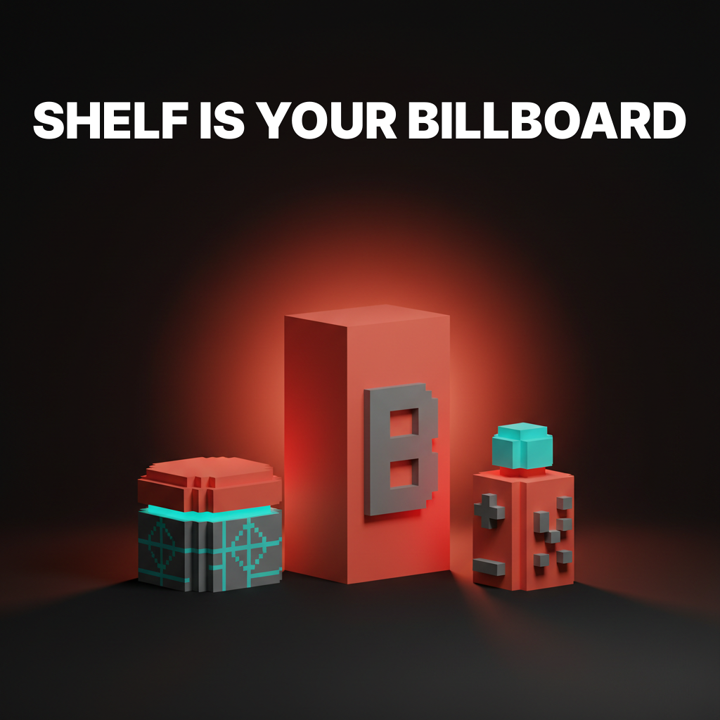
Packaging Design Identity: When the Shelf Is Your Only Billboard
How to design packaging that sells without a sales pitch. The structural, material, and visual decisions that make people pick your product off the shelf instead of the one next to it.
Your packaging has about three seconds. That is the window between a customer scanning the shelf and reaching for a product. In that window, your packaging needs to communicate what the product is, who it is for, and why it deserves attention over everything next to it.
No headline. No sales pitch. No 30-second elevator speech. Just shape, color, material, and type working together fast enough to win a decision the customer does not even realize they are making.
This is packaging design identity. And it is one of the hardest disciplines in design because the constraints are brutal and the margin for error is zero.
Packaging Identity Is Not Label Design
The most common mistake in packaging is treating the package as a surface to decorate. Slap a logo on a box, add some product photography, pick a nice color, done.
That is label design. Packaging identity is the complete system of structural, material, and visual decisions that make a product recognizable across every format it appears in: shelf, e-commerce thumbnail, unboxing video, social media post, and the customer's kitchen counter.
A real packaging identity defines:
- Structural form. The physical shape and dimensions of the package itself.
- Material palette. Kraft paper, matte board, glass, aluminum, compostable film. Each material sends a signal before the customer reads a word.
- Color system. How brand colors map to product variants, SKUs, and seasonal editions.
- Typography hierarchy. What text appears at what size, and what gets read first from three feet away.
- Image strategy. Photography, illustration, pattern, or nothing. Each choice positions the brand differently.
- Tactile experience. Embossing, foil, spot UV, soft-touch lamination. What the package feels like in hand.
Skip any of these and you have a decorated container, not a packaging identity.
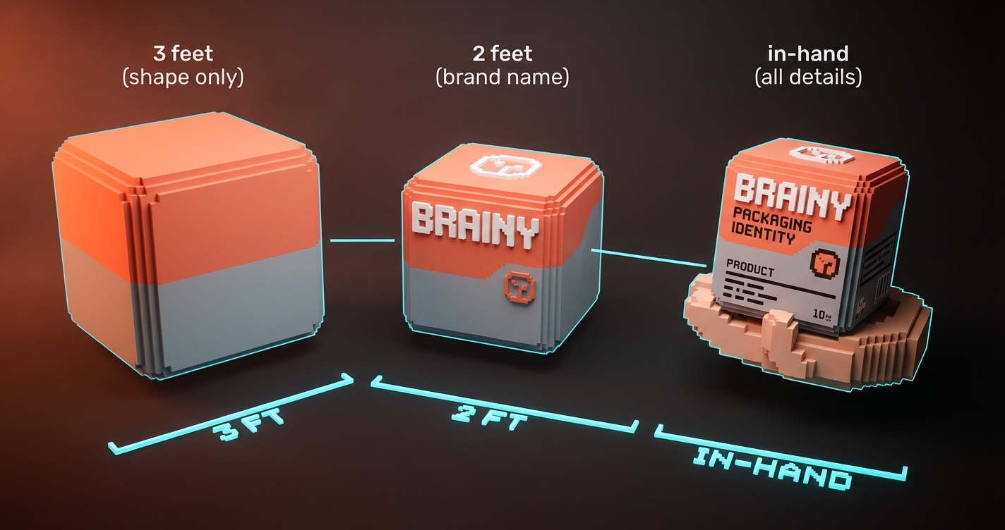
The Three-Foot Rule
If your packaging does not communicate from three feet away, it fails at shelf. This is not metaphorical. Grocery store aisles are designed so customers stand roughly three feet from the shelf. At that distance, your customer sees color blocks, shapes, and maybe one or two words. Nothing else.
What works at three feet:
- High-contrast color. A dark shelf full of white boxes makes the single black box with a coral accent impossible to miss.
- Distinctive silhouette. Method soap bottles sell partly because their shape is recognizably different from every other soap on the shelf. You do not need to read the label.
- One dominant text element. The brand name or the product name. Not both at the same scale. Pick one to dominate.
- Color blocking by SKU. When your line has multiple variants, each variant needs a color that reads differently at distance. Oatly does this perfectly. You can tell oat milk from barista edition from chocolate from across the store.
What fails at three feet:
- Detailed illustrations that turn into noise at distance
- Multiple competing text hierarchies
- Muted, low-contrast palettes that blend into the shelf
- Clever design that requires close inspection to understand
Material Tells the Story First
Before color, before typography, before any graphic element, the material of the package sets expectations. A customer picks up a kraft paper box and expects artisan, natural, honest. A customer picks up a glossy rigid box and expects premium, luxury, gift-worthy.
| Material | Signal | Best for |
|---|---|---|
| Kraft paper | Natural, artisan, sustainable | Organic food, handmade goods, eco brands |
| Matte board | Modern, premium, restrained | Beauty, tech accessories, specialty food |
| Glossy board | Mass market, vibrant, confident | Beverages, snacks, consumer electronics |
| Glass | Premium, preserving, ritual | Spirits, skincare, candles |
| Aluminum | Industrial, modern, portable | Beverages, supplements, personal care |
| Soft-touch laminate | Luxury, tactile, intimate | High-end cosmetics, jewelry, spirits |
The brands that win at packaging pick a material that aligns with their positioning and commit to it. Aesop's amber glass is as much of their identity as their typography. Apple's white rigid board with magnetic closure is packaging as brand experience.
Color System for Product Lines
Single-product brands have it easy. Pick your brand color, apply it to the package, done. Multi-SKU brands face a harder problem: how to make every product look like it belongs to the same family while being immediately distinguishable.
The system that works:
Fix one element across all SKUs (usually the brand mark placement, typography layout, and structural format). Vary one element per SKU (usually a color band, background color, or accent stripe). Keep everything else identical.
Oatly fixes the layout, illustration style, and brand mark position. The background color changes per variant. You know it is Oatly instantly, and you know which variant it is instantly. Two jobs done with one system.
What breaks the system:
- Changing the layout structure between SKUs
- Using completely different illustration or photography styles per variant
- Letting the variant color overwhelm the brand color
- Redesigning the hero SKU without updating the rest of the line
Typography at Shelf Scale
Packaging typography follows different rules than digital typography. On screen, you control viewing distance. On shelf, you do not.
The hierarchy:
- Brand name. Largest or most distinctive element. Readable from three feet minimum.
- Product name or variant. Second in hierarchy. Readable from two feet.
- Key benefit or descriptor. Third. Readable in hand.
- Regulatory and detail text. Smallest. Only readable up close.
Rules for packaging type:
- Sans-serif reads faster at distance. Use it for the three-foot elements.
- Serif adds personality and premium feel. Use it for in-hand elements.
- All-caps works for short brand names at shelf distance. It fails for anything longer than two words.
- Tracking (letter spacing) needs to be looser on packaging than on screen. Print substrates and viewing angles eat into legibility.
- If you cannot read it at arm's length, it does not exist to the shelf shopper.
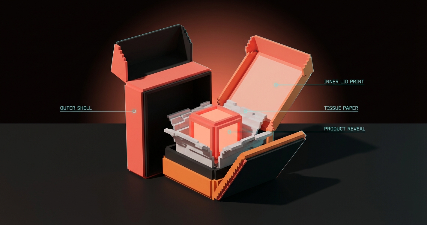
The Unboxing Layer
E-commerce changed packaging identity. The shelf is no longer the only stage. The unboxing experience is content. Millions of people film themselves opening products, and the interior of your package is now a brand touchpoint that reaches audiences you never planned for.
What the unboxing layer needs:
- A reveal moment. Tissue paper, a printed inner lid, a pull tab that exposes the product. Something that creates a beat between opening and seeing.
- Brand reinforcement. The inside of the box should feel like the outside of the box. Same color system, same typography, same level of care.
- A shareable detail. A printed message, a pattern, a hidden illustration. Something worth photographing. Glossier's pink bubble wrap pouch became more iconic than most of their actual packaging.
You are not designing for the customer alone anymore. You are designing for the customer's camera.
Sustainability Is Not Optional
Consumers are reading packaging materials. "100% recyclable" is not a marketing line anymore. It is a purchase filter. Brands that use excessive plastic, non-recyclable coatings, or oversized packaging for small products face real backlash.
The practical moves:
- Use mono-material construction where possible. A box that is all paperboard is recyclable. A box that mixes paperboard with plastic window, foil laminate, and plastic tray is not.
- Right-size the package. Shipping air is waste. Amazon's frustration-free packaging program exists because customers complained about oversized boxes.
- Make sustainability visible. If your packaging is compostable, say it on the package. If the ink is soy-based, mention it. Sustainability that the customer cannot see does not influence the purchase decision.
FAQ
How much does packaging design cost?
Custom packaging design for a single SKU typically ranges from $2,000 to $15,000 depending on structural complexity and the scope of the identity system. Multi-SKU systems with structural engineering, prototyping, and production management run $10,000 to $50,000 or more.
What is the difference between packaging design and label design?
Label design creates the graphics applied to an existing package format. Packaging design encompasses the complete system: structural form, material selection, graphics, typography, and production specifications. Label design is one layer of packaging design.
How do I make my packaging stand out on shelf?
Focus on the three-foot rule: high-contrast color, distinctive shape, and one dominant text element. Test by photographing your packaging from three feet away alongside competitors. If you cannot instantly identify your product, the design needs more contrast.
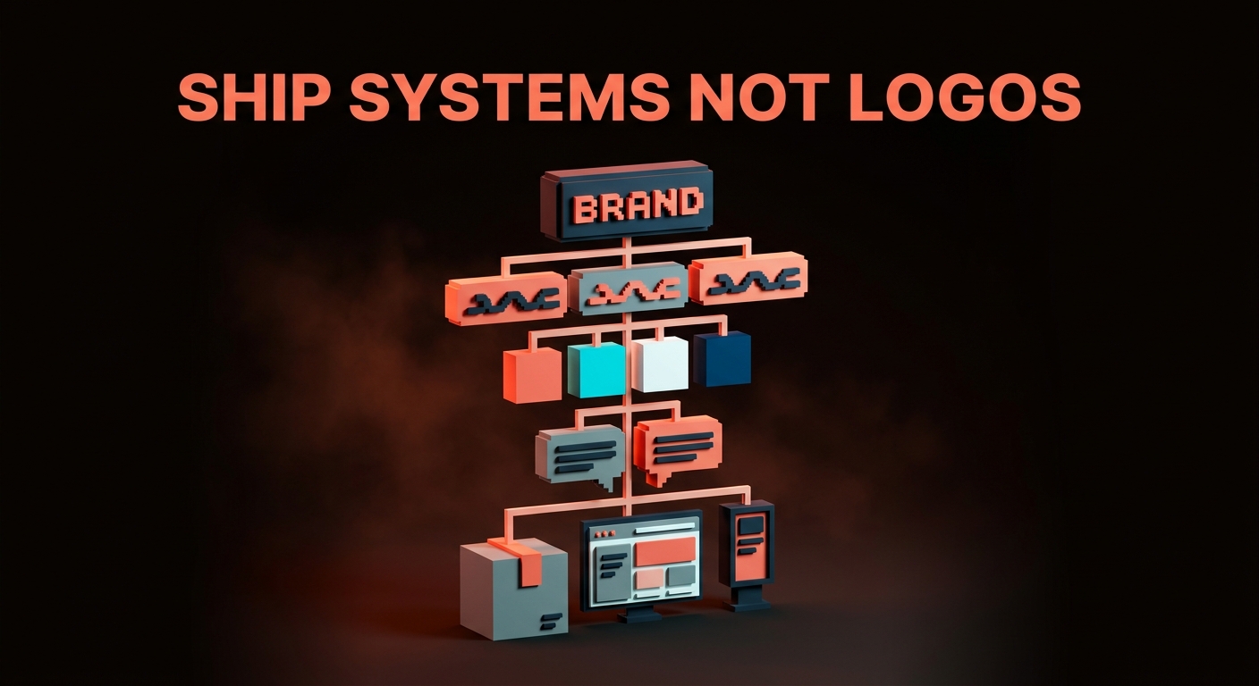
Ship the System, Not Just the Box
One package is a project. A packaging identity system is an asset that scales across every SKU, every seasonal edition, every market you enter. Build the system first, the box second. Your future self, your production team, and your customers will thank you.
Ready to build packaging that moves product? Let's design it.
Get StartedNot ready to hire? Run the free Business Genome, an 11-dimension diagnostic for your venture.
Get your free GenomeGet new papers by email
New Brainy papers in your inbox. Confirm once, unsubscribe anytime.