How to Create a Brand Identity: The Complete Framework for Designers
The seven phases of brand identity creation, from discovery brief to rollout, with the work a designer actually does at each step.
The client asks for a logo. You say yes because the invoice needs paying. Three months later the logo exists, the client is still unhappy, and nobody can figure out why.
Because they did not need a logo. They needed a brand identity. The logo was one piece. The piece that gets remembered, sure, but not the piece that actually made the brand work. The brand worked because of seven phases of decisions, most of which happened before the logo ever entered the conversation. Skipping those phases is why most brand projects fail.
A brand identity is not a logo. It is the answer to the question: how should this business show up, everywhere?
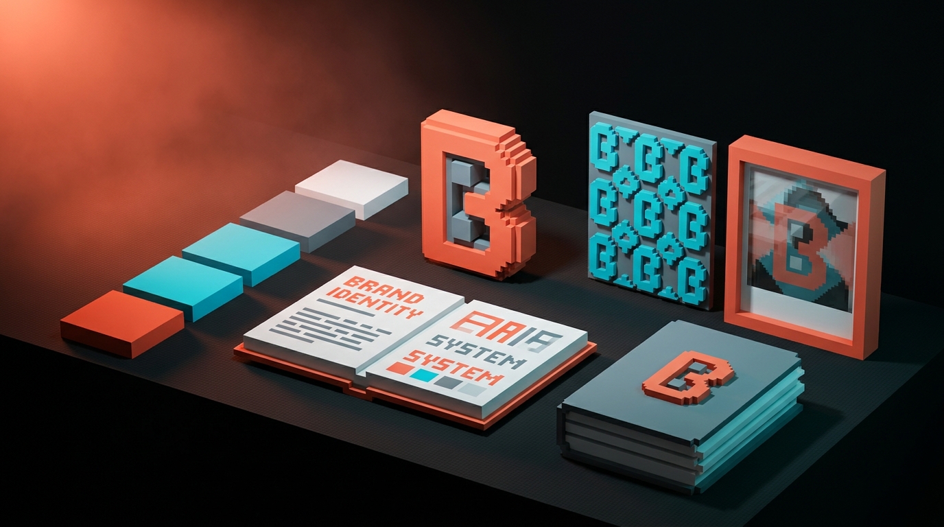
Brand identity is a system, not a logo
Here is the test. Show a stranger your client's logo. Ask them what the business does, who it is for, and why they should care. If they cannot answer, you did not deliver a brand identity. You delivered a mark.
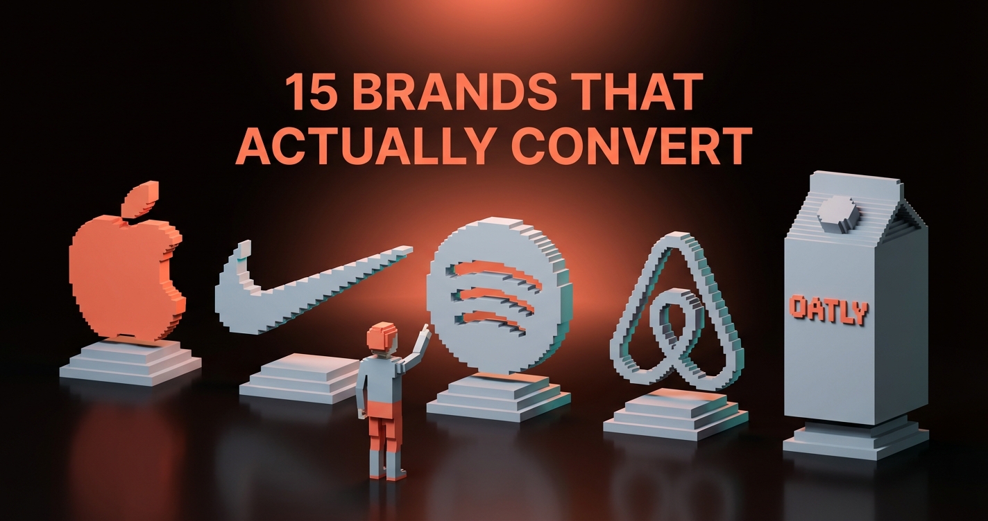
A brand identity is a system that makes those answers obvious across every surface the business shows up on. The logo is the compressed visual shorthand. The system is the expanded version that works on a business card, a billboard, a landing page, a Twitter reply, a shipping box, a support email, and a founder's keynote slide. For worked cases of this across real companies, see brand identity examples. Same business. Same feeling. Every time.
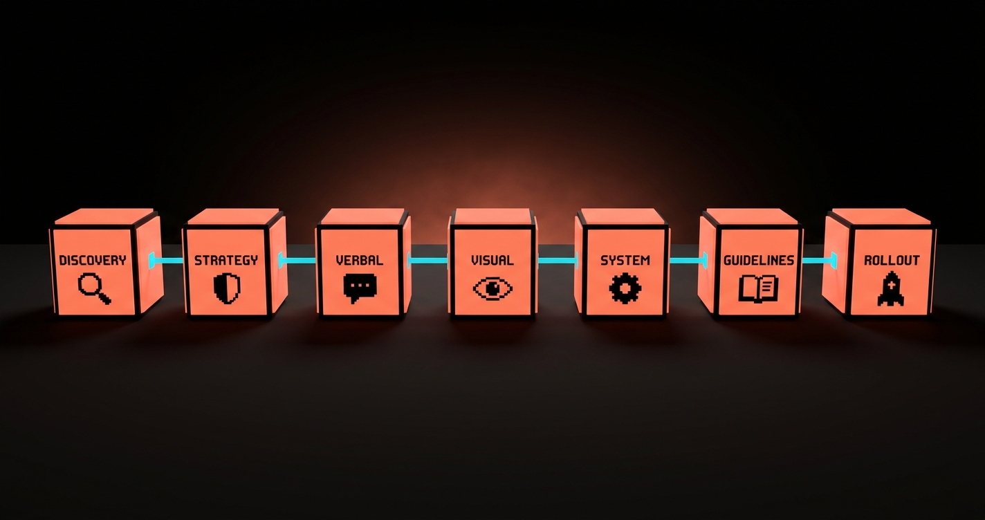
The seven phases in this framework produce the full system. Each phase has a specific deliverable, a specific sign-off point, and a specific failure mode if you skip it. Follow them in order. They compound. You cannot do visual identity before strategy. You cannot do strategy before discovery. Every shortcut is a revision round you will pay for later.
Phase 1: Discovery that earns the right to design
Discovery is where most projects silently lose. Designers treat it as the boring preamble before the real work. Clients treat it as a form to fill out. Both are wrong. Discovery is where you learn enough about the business to have an opinion worth paying for.
The designer's job in discovery is to extract three kinds of truth from the client. What the business actually does (not what the founder wishes it did). Who the business is actually for (not who the founder wishes bought it). What the business is actually fighting against (not the polished competitive slide).
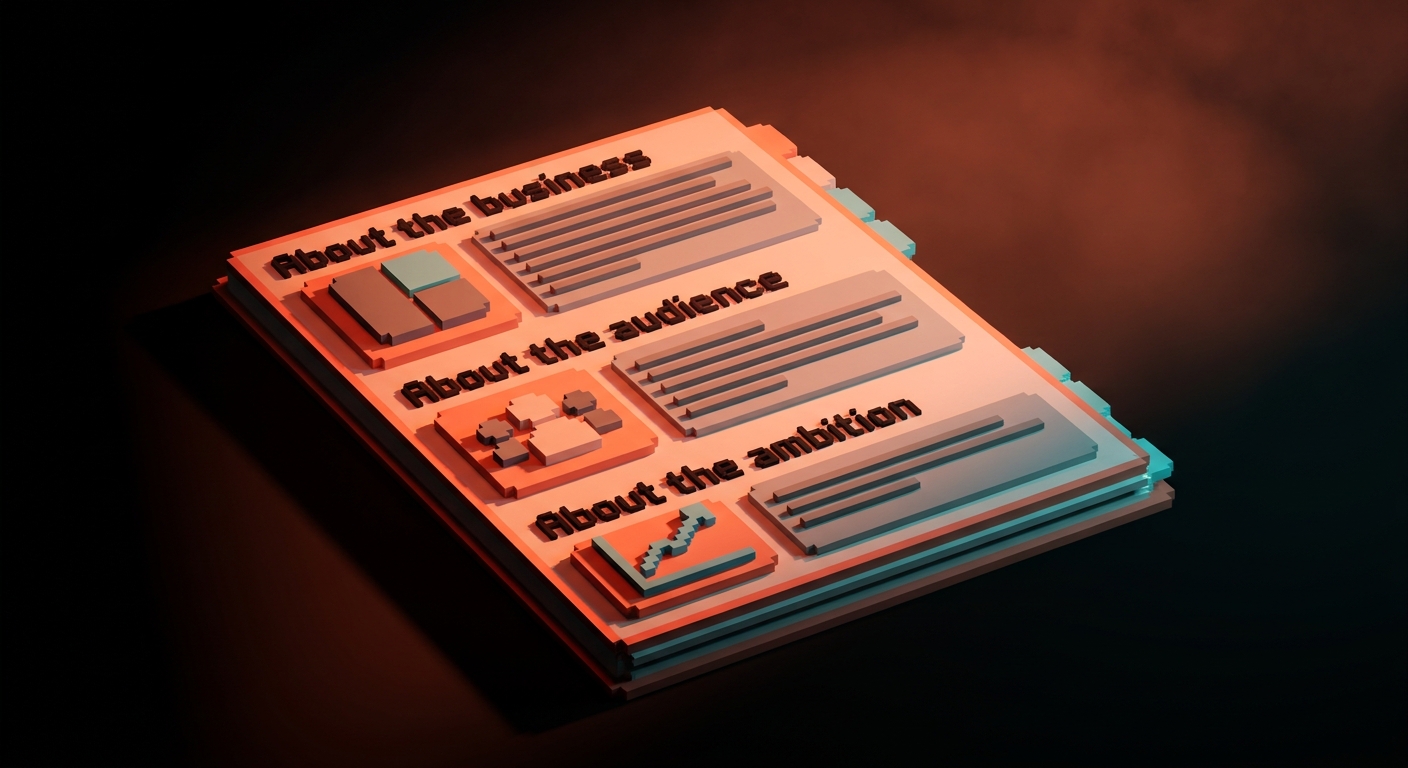
Run a structured session. Not a casual call. A working session, 90 minutes, with these prompts on a shared screen.
About the business
- Describe the business in one sentence. Not a mission statement. A sentence.
- What does the business do that is irreplaceable?
- What does the business do that is replaceable but you do anyway?
- Who are the three closest competitors? Why is the business better or different?
About the audience
- Describe the single best customer you have had. What made them a fit?
- Describe a customer you had to fire. What made them wrong?
- What does the customer Google the night they decide to buy?
About the ambition
- Where does the business need to be in two years?
- What does the brand need to enable that is currently held back?
- What do you want the brand to stop attracting?
Write down everything. Voice-memo the session if the client agrees. Transcripts are gold. The client will say something offhand that becomes the entire positioning.
Deliverable at end of phase 1: A discovery document. 4 to 8 pages. Summarizes what you heard, what you see as the core of the brand, and the three or four tensions you think the identity needs to resolve. This document gets signed off before you open Figma.
Failure if you skip it: Every revision round will be "I'll know it when I see it." You will redesign the logo seven times and never get approval because there is no agreed-upon target.
Phase 2: Strategy foundation
Once discovery is done, you distill it into a strategy foundation. Not a 40-page deck. A one-page document the whole team (yours and the client's) can memorize.
The strategy foundation has five pieces.
- Positioning statement. One sentence. "For [audience], [business] is the [category] that [differentiator], because [proof]." Example: "For founders of series-A SaaS, Brainy is the design studio that ships brand, web, and content as one system, because our community of 2M+ designers sharpens every brief."
- Audience description. Two or three sentences describing the primary and secondary audience. Real humans, not personas with fake names.
- The three brand pillars. The three ideas the brand must communicate across every surface. Not twelve. Not five. Three.
- Tone spectrum. Where the brand sits on three to five tone axes (serious/playful, expert/accessible, bold/restrained, classic/contemporary, warm/cool). Mark each axis.
- What the brand is not. Three sentences about what the brand should never be mistaken for. This is the cleanest way to anchor taste.
Brand strategy is where you pitch the client on what the brand is, before you ever pitch them on what the brand looks like. If the strategy is rejected, you rework it now, cheap. If the strategy is approved and visual design gets rejected later, you can trace the problem back to a specific strategy line and fix it, instead of starting over.
Deliverable at end of phase 2: A one-page strategy foundation. Signed off by the client. Posted in your design doc, your Figma cover page, and the top of the brand guidelines.
Failure if you skip it: You design based on your own assumptions. The client rejects everything and cannot tell you why. You both get frustrated. The project stalls.
Phase 3: Verbal identity (before visual, always)
This is the phase most designers skip or treat as "write a tagline." Verbal identity is bigger than that. It is the brand's voice, vocabulary, and rules for how it writes.
Do verbal before visual. Two reasons. First, the words you land on shape how the visual feels. A brand that writes short, blunt sentences needs different typography than a brand that writes long, lyrical ones. Second, clients approve words faster than they approve visuals, so you get faster validation of the strategy in a lower-stakes medium.
Verbal identity deliverables:
Voice description. Three adjectives, plus a description of what each adjective looks like in practice. For example: "Direct. We say what we mean. We do not hedge. We avoid generic business cliches." Then three adjectives the brand is not, with examples.
Vocabulary list. 10 to 15 words and phrases the brand uses. 10 to 15 the brand avoids.
Tone examples. Three sample pieces of copy: a social post, a landing page hero line, and an error message. The same core idea, written in the brand voice. These are the reference for every future copywriter.
Naming conventions (if relevant). How product features get named. How the company talks about itself (the brand name vs "we" vs "the team"). Whether customers are called "users," "members," "clients," or something else.
Present verbal identity in a short deck. Get sign-off. Now you can design.
Deliverable at end of phase 3: A voice and vocabulary document, 3 to 5 pages.
Failure if you skip it: You design a visual system that looks beautiful but does not match how the brand sounds. The mismatch shows up six months later when every marketing asset feels slightly off and nobody can figure out why.
Phase 4: Visual identity
Now you draw. Four components, in this order: logo, typography, color, and motif.
Logo. Start with the wordmark. Most modern brand identities are wordmark-led, with an optional mark or monogram for small surfaces (favicon, avatar, app icon). Explore three directions. Narrow to one. Refine. The logo has to survive being scaled down to 16px and being printed at billboard size. Test both. See our minimalist logo and negative space guides for the craft-level work on mark design.
Typography. Pick a primary typeface for headlines, a secondary for body, and a monospace if the brand has any developer or technical surface. Usually one or two families total. More than two and the system feels scattered. The typography carries more of the brand's personality than the logo does, across 95% of touchpoints. Do not rush it. Check out our typography system piece for detail.
Color. A primary (or "brand") color, two to three secondaries, a neutral range (3 to 5 grays), and semantic colors (success, warning, error, info). All defined as tokens, not hex codes scattered in Figma. Our brand color palette guide covers the full approach.
Motif. The recurring visual element that is not the logo. This could be a pattern, an illustration style, a photography treatment, a grid motif, or a specific shape language. Motif is what makes the brand recognizable when the logo is not present. It is often what separates a memorable identity from a generic one.
Present visual identity as a deck, with mockups. Not just the logo on a white page. Show the logo in context: on a website, a business card, a social post, a product UI. Visual identity is only approved when the client sees it working across touchpoints.
Deliverable at end of phase 4: Approved logo, typography system, color palette, and motif.
Failure if you skip any component: The brand feels incomplete. Most commonly, teams ship with a logo and color but no defined motif or typography rules, and end up rebuilding these ad hoc in marketing collateral two months later.
If you want more brand identity breakdowns, browse the rest of Brainy Papers. If you want this process run end-to-end on your business by a team that ships brand systems weekly, hire Brainy.
Phase 5: System rules that hold it together
Visual identity produces the pieces. System rules make those pieces survive real-world use.
System rules cover:
Spacing and layout. The grid system the brand uses across touchpoints. The spacing scale (4px, 8px, 16px, 24px, 32px, 48px, 64px). The rules for composition: how much whitespace is required around the logo, how layouts breathe, what breaks a composition.
Hierarchy rules. How headline, subhead, body, and caption relate across media. What size the logo appears at on a business card vs a billboard vs a website header.
Usage rules. How the logo sits on dark vs light backgrounds. What color combinations are allowed and which are forbidden. Minimum sizes. Forbidden distortions.
Accessibility rules. Minimum contrast ratios (4.5:1 for body text, 3:1 for large text, WCAG 2.2 AA minimum). Focus states for any interactive brand element. Scale rules for users who increase default type size.
Voice rules. Connecting back to verbal identity. What the brand never says. What word substitutions are allowed. How punctuation works (does the brand use Oxford commas? Em dashes? Ellipses?).
System rules are the contract between the brand identity and every future piece of work anyone in the company ships. They protect the brand from entropy.
Deliverable at end of phase 5: A rules document, often embedded inside the guidelines document.
Phase 6: The guidelines document
The guidelines document is the artifact the client keeps. It is how the brand identity lives inside the company after you hand it over. It should be usable by a marketing hire who joins the company six months later and has never met you.
Modern guidelines documents are usually one of two formats:
PDF guidelines. 20 to 60 pages. Brand strategy, verbal identity, visual identity, system rules, usage examples, do's and don'ts, asset downloads. Good for formal clients (enterprise, institutional, regulated industries). Works offline.
Web-based guidelines. A dedicated site (often on a subdomain like brand.company.com) that hosts the same content plus downloadable assets. Better for fast-moving teams. Easier to update. Serves as a single source of truth for everyone on the team plus outside partners.
Either way, the guidelines document must contain:
- Strategy foundation (from phase 2)
- Voice and vocabulary (from phase 3)
- Full visual identity specs (from phase 4)
- System rules (from phase 5)
- Downloadable logo files (SVG, PNG, EPS if needed, both color variants)
- Typography files (or a clear link to foundry licenses)
- Color tokens (hex, RGB, CMYK, Pantone if print relevant)
- Real usage examples (website mockup, social post templates, business card, email signature, presentation template)
- Contact for brand questions (either you for the first 6 months, or the client's internal brand owner)
Deliverable at end of phase 6: Either a PDF or a web-based brand site, delivered with all source assets.
Phase 7: Rollout
The last phase is the one most freelancers skip. Rollout is the supervised launch of the brand identity across the business's surfaces.
Rollout has three parts.
Internal launch. The client's team sees the brand first. You present the identity to their leadership, then to their broader team. This creates buy-in and starts teaching the voice and visual rules internally.
Prioritized rollout. Not everything gets updated the same week. Agree on the order. Usually: website, social avatars, email signatures, sales deck, product UI, physical assets (business cards, signage), third-party integrations. This can span weeks to months depending on the business size.
Monitoring and iteration. Spend 30 to 60 days after launch watching how the brand shows up in the wild. What rules are being broken? What was unclear in the guidelines? What did you not anticipate? Iterate the guidelines document based on real use, not theoretical use.
Deliverable at end of phase 7: Updated guidelines document, rollout timeline completed, internal brand owner identified.
What this looks like as a project plan
Here is a typical project timeline for a mid-sized brand identity engagement.
| Phase | Weeks | Designer hours (solo) | Client sign-off |
|---|---|---|---|
| 1. Discovery | 1-2 | 15-25 | Discovery document |
| 2. Strategy foundation | 1 | 10-15 | One-page strategy |
| 3. Verbal identity | 1-2 | 15-20 | Voice doc |
| 4. Visual identity | 3-5 | 60-100 | Logo + type + color + motif |
| 5. System rules | 1-2 | 15-25 | Rules doc |
| 6. Guidelines document | 1-2 | 20-40 | Final guidelines + assets |
| 7. Rollout | 2-8 | 20-40 | Launched brand |
| Total | 10-22 | 155-265 |
A solo designer charging 100-200 dollars per hour is looking at a 25,000 to 50,000 dollar project. A small studio charges 50,000 to 150,000 for the same scope with more senior craft. Enterprise brand work from name-brand studios runs 250,000 to millions. All of these do the same seven phases, at different levels of depth and with different team sizes.
Rushing the timeline is the most common cause of failure. The phases need time to compound. Compressing them produces a brand that looks fine but does not hold up under real-world use.
The three things that kill brand projects
After a hundred brand engagements, three patterns kill the work more than anything else.
One: Starting with the logo. Every designer is tempted. The client is tempted. The logo is where the emotional energy is. Resist. Start with discovery. Always. The logo is a compressed output of everything else. If you compress nothing, the logo compresses nothing.
Two: Skipping verbal identity. Because visual is what designers are trained to produce, verbal gets treated as writing, not design. It is design. How a brand sounds is a design decision. Skipping verbal is how you end up with a beautiful brand that nobody can talk about coherently.
Three: Treating guidelines as optional. Freelancers especially are tempted to hand over a logo file and some color hex codes. That is not a brand identity. That is a set of assets. Without guidelines, the brand starts drifting the week after launch and looks nothing like itself within a year.
FAQ
How long does it take to create a brand identity?
Solo designer doing it right: 10 to 22 weeks. Small studio with a team: 8 to 14 weeks. Enterprise engagement: 6 to 12 months. Anyone promising a brand identity in two weeks is skipping phases, and the brand will fail quietly.
What does a brand identity cost?
Freelance: 5,000 to 25,000 dollars for small businesses, 25,000 to 80,000 for mid-sized. Studio: 50,000 to 250,000. Name-brand agency: 250,000 to several million for enterprise. Below 5,000 dollars, you are probably getting a logo, not a brand identity, and that is fine if that is what you need.
Do I need to do all seven phases for a small business?
Yes. The phases scale in depth, not in existence. A small business brand might finish discovery in two hours, not two weeks. Strategy might be a single page. Visual identity might cover fewer touchpoints. But every phase should happen, or the brand will have structural gaps.
What is the difference between brand identity and brand strategy?
Brand strategy is phase 2 of this framework, the single page that defines positioning, audience, pillars, and tone. Brand identity is the whole seven-phase output: strategy, verbal, visual, and system, delivered as a coherent brand. Strategy is a part of identity. Many agencies blur the two.
Can AI tools speed this up?
Yes, in specific places. AI is great for speeding up discovery (transcription, thematic analysis), strategy exploration (positioning alternatives), and verbal identity (tone samples, vocabulary testing). AI is bad at final visual identity, which still depends on human taste. Use AI for the research-heavy phases, not for the craft phases. See our prompt engineering piece for how to use AI well in brand work.
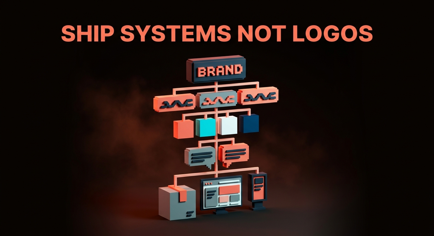
Ship systems, not logos
The next time a client asks you for a logo, say yes. Then walk them through what a logo means without the rest of the brand system around it. If they want just the mark, charge for the mark and be clear about what they are getting and what they are not.
If they want the business to actually show up as a brand, run the seven phases. Discovery, strategy, verbal, visual, system rules, guidelines, rollout. In that order. No shortcuts.
You will finish with a brand identity that holds together on a business card and a billboard and an Instagram reply, that a new marketing hire can understand in an afternoon, that survives the first pivot, that the client can operate for years without calling you back panicking.
A logo is an icon. A brand identity is the answer to a question.
Ship systems, not logos.
Want a brand identity built by a team with 2M+ followers in design? Brainy ships brand identities end-to-end.
Get StartedNot ready to hire? Run the free Business Genome, an 11-dimension diagnostic for your venture.
Get your free GenomeGet new papers by email
New Brainy papers in your inbox. Confirm once, unsubscribe anytime.