

Empty States Are the Product
Empty states are not polish. They are the activation surface, the first impression, and the screen that decides whether your retention curve breaks before users see real data.
The most important screen in your product is the one with nothing in it. Not the dashboard. Not the settings page. The screen the user lands on before any data exists. That screen is the entire product compressed into one frame, and most teams treat it like an afterthought.
Empty states get assigned to whoever has time. They get a stock illustration of a person with a magnifying glass and a sentence that says "Nothing here yet." Then the team ships and wonders why activation is flat. The empty state was not polish. It was the product. You just built the wrong one.
The empty state is the activation surface
Activation does not happen in the dashboard. It happens in the empty state. That is where the user decides whether the product is worth a second session.
A new user does not see your roadmap or your case studies. They see a blank screen with your logo on it and a small voice asking "okay, what now." Whatever the screen says next becomes the product. The empty state is the only product they have ever used.
Linear understands this. The empty inbox is not "No issues." It is a tightly composed canvas with one keyboard shortcut, one clear next action, and a feeling that you are inside a tool built by people who care. The empty state is the activation. The dashboard is the reward.
What every empty state is saying
An empty state is the system speaking when it has nothing else to say. Whatever it says becomes the brand and the user's first impression of how this product treats them.
A bad empty state apologizes for not having data. A good one assumes the user is here on purpose and gives them the next move. The difference is posture. One says "sorry there's nothing here." The other says "here's how this gets going."
Notion's blank doc is the cleanest example in the industry. A soft prompt, a slash menu hint, immediate keyboard focus. No illustration, no welcome screen. The act of typing is the activation, and the empty state is the product.
The five archetypes designers keep getting wrong
Most teams treat "empty state" as one design problem. It is five. Each one shows up at a different moment, plays a different role in retention, and fails for a different reason.
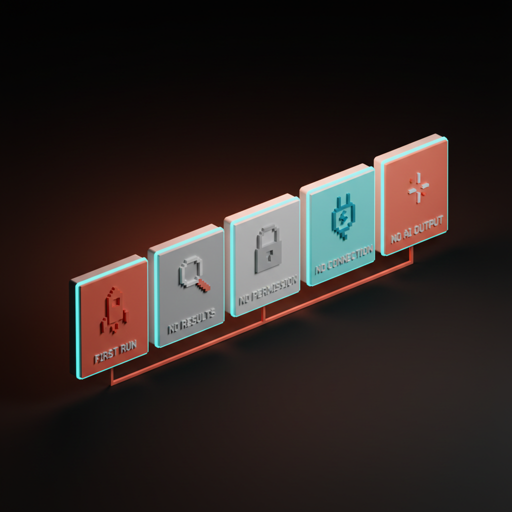
1. Zero data, first run
The screen the user sees the first time they open the product. No projects, no documents, no history. The highest-stakes empty state in the app, and usually the most neglected.
Cursor's first-open state is a lesson. A single editor window, a soft prompt, a sample command primed for the keyboard. No tour, no tooltip parade, no "Welcome to Cursor" modal. The user is already inside the work.
Figma's new file canvas does the same thing in a different register. A clean infinite canvas, a toolbar within reach, a cursor where you left it. Compare that to products that open with a five-step checklist and a "Connect your workspace" wall. One feels like a tool. The other feels like homework.
2. Zero results from a filter
The user just asked for something specific and your product has nothing to show. This is a moment of trust. The empty state has to acknowledge the search, validate that it ran, and offer a next step.
Linear shows the active filter, a one-line explanation, and a clear "Clear filters" action. Stripe's payments dashboard does the same when a date range returns no results. The page does not vanish. It explains, then offers.
The failure mode is the dead-end: "No results found." Period. No context, no escape. The user is stuck in a state the product created, and the product refuses to help them out of it.
3. Zero permission
The empty state nobody designs and everyone ships. The user lands on a screen they do not have access to, and the product punishes them for being curious. A 403, a "You do not have permission" line, a dead end.
The good version respects the user. It explains who can grant access, gives them a one-click "Request access" button, and tells them what happens next. Slack does this when you click into a private channel as a non-member. The empty state turns a wall into a doorway.
4. Zero connection
The user opened your product and it has not connected to anything yet. Stripe before any payments. Vercel before any deployment. A new Slack workspace before any channels are real. Highest abandonment risk in the app, because the user is staring at a blank product and has not yet committed to filling it.
Stripe Atlas's "no payments yet" state is a masterclass. No empty chart with a sad face. It shows the kind of activity the dashboard will display, prompts you toward your first integration, and links directly to the API key you need next.
Vercel's empty project list is the opposite of a void. A deploy button, an import option, a sample template on the same screen. The first deploy is the activation event, and the empty state is the runway.
5. Zero AI output
New, and most products are failing at it. The user sent a prompt and the system has nothing to return. The model timed out, the input was insufficient, or an output rail blocked it.
The bad version says "Sorry, something went wrong." The good version is specific. Why nothing came back, what the user can change, whether there is a retry path. Loom's first-recording flow handles a similar problem well: when the recording fails to upload, the empty state explains the failure and offers an immediate retry without losing the file. The AI product onboarding design breakdown covers how the broader onboarding shape changes when AI is the core surface.
What every empty state needs
The strong ones share five elements. Skip any and the screen drops back into apology mode.
- Context. Name what the user is looking at and why it is empty. "No issues yet" is not enough. "No issues in this cycle. Add the first one with C." is a screen doing its job.
- Action. One primary action, one keystroke, one button. If you write three sentences telling them what to do, the design is wrong.
- Voice. The system's voice when it has nothing else to say has to match the rest of the brand. A sterile error tone inside a friendly product breaks the spell.
- Hierarchy. Title, one-line explanation, primary action, optional secondary link. Four elements with real visual hierarchy doing the work. Anything more is clutter.
- Motion. A soft cue that the screen is alive. A blinking cursor, a subtle CTA pulse, a small animated arrow. A signal that the product is waiting for the user.
Failure modes that kill empty states
Six patterns kill more empty states than anything else.
Hand-wavy illustrations. A cartoon holding a clipboard. A telescope. A floating astronaut. These replace the work the screen was supposed to do, and signal that the product is not serious enough to write real copy.
Dead-end states. "Nothing here yet" with no next step. A 404 with no escape. A 403 with no path to access. Every empty state without a next action is a leak in retention.
Empty states that lecture. A long paragraph explaining what this section does. The user came to use the product, not read a tutorial. If the empty state needs three paragraphs, the product needs less explanation, not the screen needs more.
The inbox-zero trap. Designing the "all done" celebration before the "first action" flow. Superhuman earns inbox zero with months of real work. Most products copy the celebration without earning it, and users feel patronized on day one.
The "nothing here yet" cop-out. Three words, no context, no action, no voice. The empty-state equivalent of a designer giving up. If this string ships in your product, your retention is already broken.
Generic across all archetypes. One reused component across first run, no results, no permission, no connection. Each archetype has different stakes. A single component cannot serve them all without flattening every one.
The empty state audit
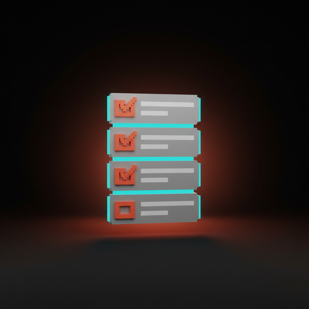
Run every empty state through these seven questions. If you cannot answer all of them with a clear yes, the screen is not done.
- Does the screen tell the user where they are and why it is empty? A label, a one-line explanation, a reason. If they have to guess, the screen failed before it loaded.
- Is there exactly one primary action? Not two competing buttons. One action, made obvious by hierarchy and contrast, like the hero section of the screen it actually is.
- Does the voice match the rest of the product? Read it out loud next to a populated screen. If the tone shifts, the empty state is wearing a different brand.
- Is the next step achievable in one keystroke or click? Not "go to settings, then connect, then come back." One move. Anything longer is work the empty state should have absorbed.
- Does the screen feel alive, not abandoned? A cursor, a pulse, a placeholder, a hint. A static blank feels broken even when functioning correctly.
- Is the screen specific to the archetype? Each archetype has different stakes and different copy. A reused generic component is a smell, not a system.
- If the user only sees this screen, does it sell the product? If the answer is no, the empty state is not pulling its weight, and that is the screen most new users will judge the product on.
A product where every empty state passes those seven activates without trying. Everything else compounds on top of screens that already did the convincing.
Pick the principle, then ship the screen
Empty states are not the polish layer, they are the load-bearing layer. The product that wins in 2026 is the one whose first screen, zero-results page, and disconnected dashboard already feel like the product the user signed up for. The landing page design principles breakdown is the marketing-page version, and the web design principles piece covers how the rest of the product follows.
Stop designing the dashboard first. Start with the screen that has nothing on it. The dashboard is the reward. The empty state is the deal.
Frequently asked questions
What is the difference between an empty state and a zero state?
They mean the same thing in most teams. "Zero state" tends to refer to first-run, no-data scenarios specifically. "Empty state" is broader and covers any screen where expected content is absent, including filtered results, permission walls, and AI failures. The principles are identical.
Should every empty state have an illustration?
No. Most should not. An illustration is justified when it carries information, sets a tone the brand needs, or visually anchors a complex first-run explanation. A friendly cartoon holding a clipboard is decoration, not design. If the screen works without the illustration, ship it without.
How do you write copy for an empty state?
Two sentences, maximum. The first names what the user is looking at and why it is empty. The second tells them the next move, in active voice, with a verb. Cut every adjective and every apology. Read it out loud. If it sounds like a stock template, rewrite it.
Design the empty screen first
The screen with nothing on it is the screen that decides everything. The dashboard and the integrations sit on top of a first impression you may not have designed on purpose. The cost of getting that screen right is one extra week. The cost of getting it wrong is the retention curve nobody can explain.
If you want a team that designs empty states as part of the product instead of as cleanup at the end, hire Brainy. We ship products where the first screen the user sees is the screen they remember.
Want a product where the empty states do the selling instead of the apologizing? Brainy designs first-run flows and zero states as part of the product, not as cleanup.
Get Started


