Onboarding AI Products: How to Design the First-Run Experience for AI Tools
A working playbook for AI product onboarding. Real teardowns of Cursor, Claude.ai, Linear AI, Granola, Perplexity, ChatGPT, and v0. The patterns that build a mental model in 60 seconds, the patterns that kill activation, and a pre-ship checklist for any AI first-run experience.
Most AI products fail at onboarding because they ship the same form-fill flow they would for any SaaS. AI is a different problem. The user has to build a working mental model of a non-deterministic tool in the first sixty seconds, and no carousel of feature screenshots will do that work.
This is the working playbook. The four jobs the first sixty seconds has to do, six teardowns of flows that work, the three patterns that kill activation, the new model for AI first-run, and a pre-ship checklist.
AI onboarding is a mental model problem, not a feature tour
AI products fail at onboarding because they treat it like a feature tour. The user does not need a list of features. They need a working mental model of what the product can and cannot do, how to talk to it, and what success looks like. None of that shows up on a carousel slide.
A mental model is the user's running theory of how the system behaves. With deterministic SaaS, it builds passively as the user clicks around. With AI, the surface is the same prompt bar for every task and the model has to be built deliberately, before the user gives up. The teams shipping the best AI onboarding treat the first sixty seconds as a single design problem with four jobs to do.
The four jobs the first 60 seconds has to do
Every AI first-run has to ship four answers in the first sixty seconds. What can it do, how do I talk to it, what does success look like, what is my first prompt. Get all four right and the user activates. Miss any of them and activation craters.
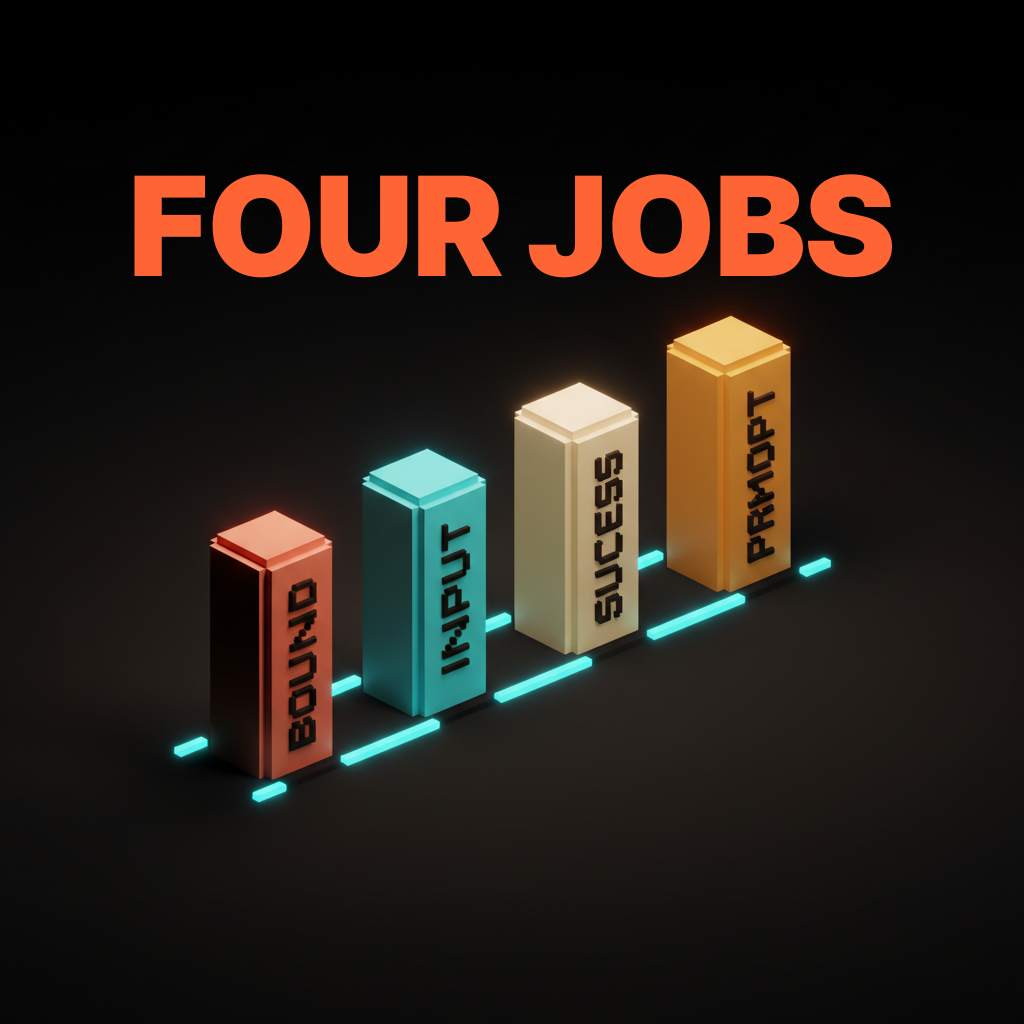
The four are not negotiable. The order is. Some products lead with capability bound, some lead with first prompt and let capability bound emerge from the output. What does not work is asking for the user's role and team size before answering any of them.
Capability bound, what the AI can and cannot do
The first job is bounding the capability surface. Users walk in with either too much skepticism or too much expectation, and both wreck the first run. Skeptics expect a chatbot that hallucinates. Optimists expect a magic answer machine. Neither matches the actual product.
The fix is showing the surface, not describing it. ChatGPT's original landing did this with a three-column layout, examples on the left, capabilities in the middle, limitations on the right. That single screen taught the shape of the tool faster than any tour. Hiding limitations to look more impressive is the wrong move. Users discover the limits in session two anyway, except now they feel misled.
Interaction model, how the user is supposed to talk to it
The second job is teaching the input pattern. Chat is not the only AI interface. The user has to know whether to type a sentence, hit a hotkey, or drop a file. Assuming the user already knows is the most common bug in AI onboarding.
Cursor teaches the interaction model in three seconds. The user opens a folder and a small command palette hint offers to apply an edit. Notion AI ships the same lesson with the slash menu. Show the invocation in context, not in a tutorial overlay. Tutorial overlays teach the user how to dismiss tutorial overlays.
Success state, what done looks like
The third job is showing what success looks like before the user has produced any. AI outputs are unfamiliar enough that users cannot recognize a good one without a reference. A blank prompt bar is not a successful state, it is a question the user does not know how to answer.
Perplexity solves this by rendering a real result on the home screen. Click any trending question and a full answer page appears, with citations, follow-ups, and the visual register of a finished output. Compare that to a tool that drops the user into a blank chat with a greeting. The user has to imagine the success state, and most users will not.
First prompt, the moment value lands
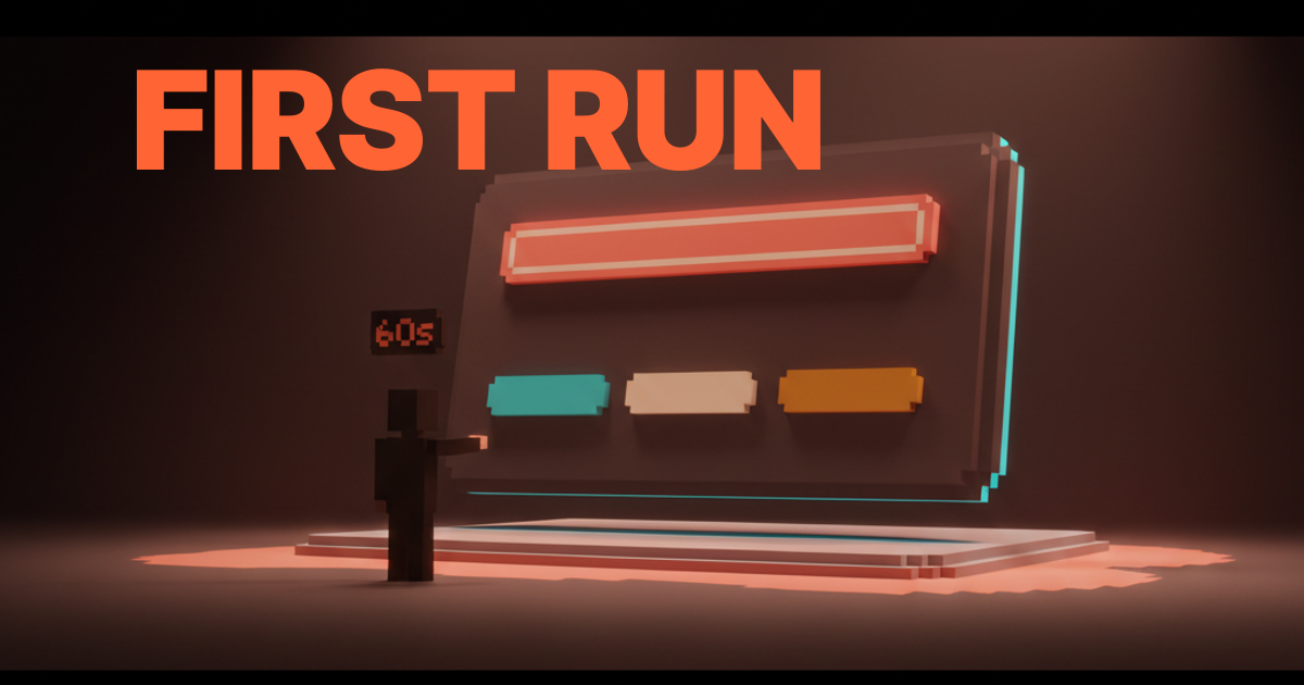
The fourth job is getting the user into a real prompt within thirty seconds. Every second past that is a second the mental model decays. Thirty seconds is the actual budget, not a soft target.
Granola buys the budget by event-triggering the first run. Onboarding is one screen, connect your calendar. The product activates the next time the user joins a call. Cursor buys it by asking the user to open a real codebase. The AI gets invoked the first time it would have been useful.
Six AI onboarding flows that work
The patterns only matter if they survive contact with shipped products. Six AI first-runs that get the four jobs right.
Cursor, open a real codebase as the cold start
Cursor's first run does not show you Cursor. It asks you to open a real folder and the editor takes over. The mental model lands in under a minute because the user is already looking at familiar code, the AI is invoked from familiar shortcuts, and the first useful edit happens on the user's actual work.
The right cold start for an AI tool is the user's real environment. A scaffolded sandbox feels safer to ship but it teaches nothing about how the tool will behave on the work that actually matters.
Claude.ai, example prompts as the demo
Claude.ai ships a homepage of example prompts on first load. Clicking one drops the user into a working conversation with no setup, no tour, and no carousel. The user gets a real output within five seconds.
Example prompts are a better demo than a feature list. Each example carries capability bound, interaction model, and success state at once. The user reads it, clicks it, and the mental model lands in a single move.
Linear AI, progressive disclosure inside the existing flow
Linear AI does not ship a separate onboarding for its AI features. The AI shows up inside the actions the user was already taking. Drafting an issue, the AI offers a refined description. Triaging a backlog, it suggests a sort order. Each surface is one click and one acceptance.
Embedded AI inside an existing product needs zero standalone onboarding. The right pattern is progressive disclosure inside flows the user already knows. A separate AI onboarding inside a product the user already uses is a tax.
Granola, join your next call as the trigger
Granola's onboarding is one sentence, connect your calendar. The product activates the next time the user joins a call. The user does not have to remember to use the product. The product remembers for them.
Event-triggered first runs beat session-triggered first runs for any AI product attached to a recurring user behavior. The first prompt is the user's next real meeting, the next real commit, the next real document opened. Value lands without the user opening the app a second time.
Perplexity, prompt suggestions as the runway
Perplexity's home screen is a prompt input with five suggested questions underneath. The suggestions are good enough that the first query lands within twenty seconds. The user does not have to invent a question, they pick one and the answer page teaches the rest.
Prompt suggestions are the cheapest runway in AI onboarding. They cost almost nothing to ship and collapse time-to-first-output by an order of magnitude. Every AI product with a blank prompt bar should ship suggestions until the user has produced their own.
ChatGPT, what can you do as the landing
ChatGPT's first-run, in its original form, showed examples, capabilities, and limitations on a single screen. That three-column landing is still the cleanest capability-bound onboarding shipped at scale. Each column did one of the four jobs in plain prose.
An honest capability-bound landing beats a tutorial wall every time. Limitations belong on the same screen as capabilities. Hiding limits to look more impressive is the move that erodes trust on day two.
Want an AI product that lands its mental model in the first sixty seconds? Hire Brainy. UXBrainy ships first-run audits and onboarding redesigns, AppBrainy ships full AI product delivery, and ClaudeBrainy ships the prompt and Skill layer that makes capability demonstration cheap. Pair it with the AI agent UI design patterns work so the agent layer ships at the same craft level.
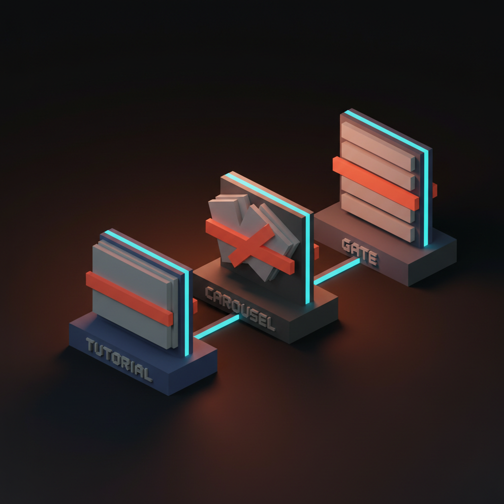
Three AI onboarding patterns that fail
Most AI products that struggle with activation ship some combination of three failing patterns. Tutorial walls. Modal carousels. Form gates. Each delays the first real output, and each teaches less than the first prompt would have taught for free.
Tutorial walls block the first prompt
A multi-step tutorial that runs before the user can type anything is the most expensive mistake in AI onboarding. Three steps is too many. Five is hostile. The user clicks through without reading and arrives at the prompt bar with nothing learned.
Delete the tutorial. Replace it with a populated home screen, a real example, or an event trigger. The tour was always a substitute for confidence.
Modal carousels explain features the user cannot use yet
A modal carousel listing the AI's features before the user has produced any output is feature explanation without capability demonstration. The user reads, dismisses, and forgets every screen. Feature lists do not build mental models. Real outputs do.
This is the most common failure mode in enterprise SaaS bolting AI onto an existing product. The team ships a What's New modal with screenshots of the AI features and calls it onboarding. Activation does not move because the user cannot recognize a successful output and has no reason to come back.
Form gates ask for context before delivering value
Asking the user to fill out team profile, role, and use case before a single AI output is a form gate. Form gates are activation killers in AI products specifically. The user signed up to see what the AI could do, and the form is a wall between them and the answer.
Ship value first and collect context later. The first prompt does not need the user's team size. Move the form to a settings screen the user fills in after deciding the product is worth keeping.
The new model for AI onboarding
The new model is three rules. Capability demonstration over feature explanation. First prompt within thirty seconds. Success state visible inside two minutes. Every AI product winning at activation right now lives inside those constraints.
The three rules compose. A product that ships capability demonstration but takes three minutes to first prompt is still failing the activation budget. A product that lands the first prompt fast but never shows a finished output is still failing the success state. All three or none.
The AI onboarding pre-ship checklist
Run this on any AI first-run before it ships. Twelve checks, all measurable.
- Time from arrival to first prompt is under thirty seconds in user testing.
- Time from arrival to first finished output is under two minutes.
- The capability surface is shown on the first screen, not buried in a help center.
- Limitations are visible on the same screen as capabilities.
- The interaction model is taught in context, not in a tutorial overlay.
- The home screen shows a populated example, suggestion, or event trigger.
- There is no tutorial wall before the prompt bar.
- There is no modal carousel listing features before the first output.
- There is no form gate before the first AI output.
- The success state is visible to the user before they have produced one.
- Embedded AI features ship inside existing flows, not in a separate tour.
- The first prompt is invoked from a familiar shortcut, menu, or event.
The list lives in the design review template and gets faster every time you run it.
FAQ
What is the most important moment in AI product onboarding?
The first prompt. Every other moment is in service of getting the user to a real output as fast as possible. Thirty seconds is the budget.
Should AI onboarding include a tour?
No. A tour is a substitute for confidence in the product. A populated home screen, an example prompt, or an event trigger does the same teaching work without delay.
How is AI onboarding different from SaaS onboarding?
AI onboarding has to build a mental model of a non-deterministic tool in sixty seconds. SaaS can rely on the user clicking around to discover deterministic features. Borrowing SaaS patterns is the most common mistake in the category.
What is the right way to teach an AI product's limits?
Show them on the same screen as the capabilities. Hiding limits erodes trust on day two. Honesty in the first run is what earns the second session.
Do AI products need user accounts before the first prompt?
Almost never. The first prompt should run without an account whenever cost allows. Every account-gate is an activation tax.
The shift AI onboarding actually unlocks
An AI product with a great first run is not a product with a tour. It is a product that lands the mental model and the value at the same time, under sixty seconds, with no friction in between. The products winning right now treat that as a single design problem, not a sequence of screens.
Most AI products still ship onboarding from the SaaS playbook. Form gate, feature carousel, success modal, blinking cursor. That flow was already mediocre for SaaS and it is broken for AI. The teams pulling ahead delete the form gate, replace the carousel with a real example, and put the prompt bar on the first screen with suggestions underneath.
If the first prompt lands in thirty seconds and the first output lands in two minutes, the user activates. If either number slips, the user churns. Pair the work with AI-native product design, reach for Claude Skills to make example prompts cheap, and lean on visual hierarchy to keep the first screen scannable.
If you want an AI product that lands its mental model in sixty seconds, hire Brainy. UXBrainy ships first-run audits and onboarding redesigns, AppBrainy ships full AI product delivery, and ClaudeBrainy ships the prompt and Skill layer that makes capability demonstration cheap.
Want an AI product that lands its mental model in the first sixty seconds, not the tenth session? Brainy ships UXBrainy as first-run audits and onboarding redesigns, AppBrainy as full AI product delivery, and ClaudeBrainy as the prompt and Skill layer that makes capability demonstration cheap to build.
Get Started