

The Anti-Dashboard
Most dashboards are data graveyards built by teams afraid to choose. The anti-dashboard is opinionated, action-first, and answers one question. Here is what that looks like.
Most dashboards are data graveyards. Twelve widgets, eight palettes, four time horizons, and zero opinion about what the user should look at first. The team called it data-driven and shipped it. The user opens it once, scans like a stranger, and never opens it again.
The anti-dashboard takes the opposite bet. One question, one priority list, one action. Everything that does not feed the next decision gets cut, hidden, or pushed below the fold. This is the case for that bet, the brands winning with it, and five rules that hold the line.
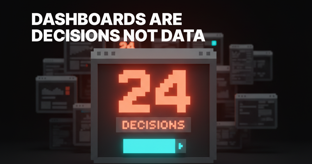
Dashboards are decisions, not data
A dashboard is not a place to store numbers. It is a place to make decisions. If the screen does not answer "what should I do next," it is decoration with a chart library on top.
Most product teams skip this question because answering it requires an opinion. A wall of widgets has the safety of being a buffet. Nobody gets blamed for shipping every metric, only for choosing one. So the team chooses none, and the user pays the cost in attention.
Linear's inbox does not ship every issue at once. It sorts by priority, then by SLA, and the screen is short enough to actually clear. Vercel's project view does not show 20 things above the fold. It shows the deploy timeline and the URL, and that is the entire question a developer is asking. Both teams picked a side.

The five failure modes
Every dashboard that fails the "what do I do next" test fails in one of five recognizable ways. Each one ships in production right now.
The Salesforce graveyard. Twelve widgets nobody opens, in a 4x3 grid because that is what fit on the wireframe. They exist because someone asked once and nobody had the authority to delete one. Attention given to anything is attention stolen from everything.
The metric carousel. Six KPIs in a horizontal strip, each a number, a percentage, a tiny sparkline. No context, no comparison, no recommended action. The user feels vaguely informed and acts on nothing.
The eye-of-Sauron view. Every event, every log line, every webhook, in real time, scrolling. Nothing is highlighted, everything blurs. Real-time data without prioritization is noise on a clock.
The assembly-required dashboard. Drag a widget. Configure a query. Save the layout. Regret it the next morning. Asking the user to design their own dashboard is asking them to do the product team's job.
The executive-vanity dashboard. Numbers go up, every chart is green, every quarter is on track. No decisions follow because none are required. The dashboard exists to be screenshotted into a board deck.

A great dashboard answers one question
The anti-dashboard starts with the question, not the widgets. What does the user open this screen to find out. Write it in one sentence. Everything on the screen either answers it or earns a place beneath it.
Stripe Dashboard's home answers "how is the business doing today." Revenue today, comparison to yesterday, and the three things that need a human: a failed payment, a dispute, a verification request. The rest of Stripe is a click away.
Cursor's project pane answers "where was I and what was I doing." File tree on one side, last prompt at the top, editor in the center. No telemetry, no usage charts. The screen is the work.
Cron and Notion Calendar answer "what is next." The next event sits at the top of the day, the week sits below it. No infinite scroll, no monthly heat map fighting for attention. The opinion is that the next event matters more than the shape of the month.
The Raycast move: a dashboard does not have to look like a dashboard
Raycast is the cleanest version. The search bar IS the dashboard. No widgets, just a single input. Type a few characters and the right thing surfaces.
The lesson is not "build a search bar." The lesson is that a dashboard does not have to be a layout of cards. GitHub's home is pull requests assigned to you, full stop. Notion's home is your last three documents and nothing else. Superhuman opens to a triage-first inbox where zero is achievable, because the product was designed around the idea that an inbox should end. None of these are dashboards in the traditional sense. All of them are dashboards in the only sense that matters.
Progressive disclosure is the principle underneath. Show the one thing that matters now. Reveal the long tail only when the user signals they want it.
The five rules of the anti-dashboard
These rules compound. Hit four of five and the dashboard usually works. Hit two and you have shipped a graveyard.
Rule 1: One question per screen
Every dashboard view answers exactly one question. Write it down. If a widget cannot be defended as part of the answer, it does not ship on this view. Other questions get other views, not the same one with a tab on top.
Stripe's home answers "how is the business today." Vercel's project view answers "what is the state of this deploy." Linear's inbox answers "what needs my attention right now." Different surfaces for different questions. None of them try to be all three.
Rule 2: One priority list, sorted by the product
The screen has one list, and the product sorts it. Not the user. Not a customizable column header. The product picks the order based on the answer to "what should the user do next." The order is the opinion.
Linear sorts by priority then SLA. Stripe Atlas sorts the four action cards by what unblocks the next business step. Superhuman sorts by VIP and intent signal, not strict reverse chronology. The product is doing the work the user does not want to do.
Rule 3: Sensible time horizon, picked once
The dashboard picks one default time horizon and earns the right to change it. Today, this week, this month, all time. Pick the one that matches the question and stop offering five toggles.
A revenue dashboard for a transactional business defaults to today. A retention dashboard defaults to this week. A finance dashboard defaults to this month. A dashboard that opens with no default and a date picker waiting for input has already lost the user.
Rule 4: Every number is tied to an action
A number without an action attached is decoration. The anti-dashboard treats every primary number as a hook for the next move. Revenue today links to failed payments. Open issues link to the triage queue. Deploy time links to the build log.
Stripe Atlas's four-card layout is the cleanest example. Each card is a number plus a button. "$0 in revenue, set up your payment integration." "0 employees, hire your first." The user is never stranded on a stat with no path forward.
Rule 5: Hide the long tail
The anti-dashboard accepts that 80% of metrics matter to 5% of users 5% of the time. Those metrics live behind a tab, a "more" link, or a separate analytics view. The home screen is the question, not the index.
Hiding metrics feels risky because someone will ask for the one you removed. The fix is to make it findable, not visible. Search and a dedicated analytics surface handle the long tail.
Anti-patterns to delete on sight
These show up in nearly every audit. Each one is a tell that the team is hiding behind features instead of shipping an opinion.
Every metric on every screen. Revenue, retention, churn, MAU, NPS, and CSAT in one frame is not a question, it is a hedge. Split into role-based or task-based views.
"Customizable widgets" as a substitute for product opinion. Translate "users can configure their own dashboard" as "the team could not agree on what mattered." Customization is a real feature when defaults are strong, and an excuse when they are not.
The live activity feed nobody reads. A scrolling list of every event in the system. Useful for debug logs, useless on a dashboard. The data visualization for designers breakdown covers why real-time without hierarchy is just expensive noise.
The empty state that asks the user to design their own dashboard. "Drag widgets from the sidebar to get started." The product is admitting on the first screen that it has no opinion. The empty states are the product breakdown covers why the first screen is the activation surface, not homework.
Tabs that hide the actual answer. Six tabs across the top, the most important data on tab three. Either promote tab three, or accept that tabs one and two are not as important as the team thought.
Before and after, in one frame
The shift from graveyard to anti-dashboard is usually a layout decision, not a feature decision. Same data, ranked around the question.
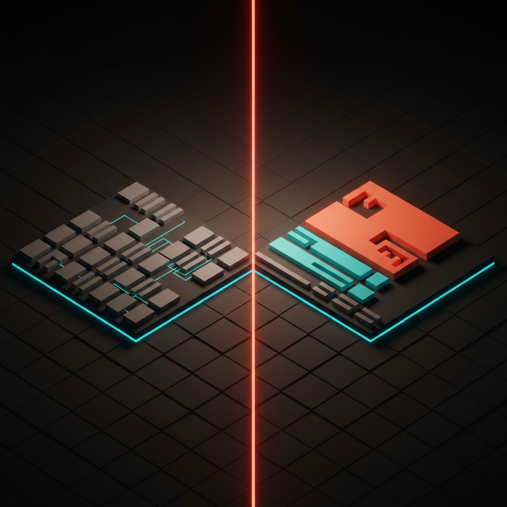
The "before" is a 4x3 grid where every cell competes for attention. The "after" uses visual hierarchy to break the screen into three zones: a hero stat tied to the question, a short action list tied to the next move, and a muted footer for the curious user. Nothing is deleted, the team has just chosen which features get the privileged seat.
The dashboard audit
Run any product dashboard through these seven questions. If you cannot answer each with a clear yes, the dashboard is not done.
- What is the one question this view answers? Write it as a sentence. If the team cannot agree on the sentence, the team has not designed the dashboard yet, they have arranged widgets.
- Is there one primary number tied to an action? Not three competing stats. One hero number, one obvious next move, every other element ranked beneath it like the hero section of a landing page.
- Is the priority list sorted by the product, not the user? If the answer is "the user can sort it however they want," the product has not picked a side. Defaults are the opinion.
- What time horizon does this view default to, and why? The default has to match the question. A toggle without a thoughtful default is a tell that the team punted.
- What did you decide to hide? If the answer is "nothing," the team has not done the work. Hidden metrics are the proof of an opinion.
- Does the empty state advance the product, or stall it? If it asks the user to configure widgets, you have shipped homework as a product. Replace it with a single primed action.
- If a new user opens this screen and never sees another, do they understand the product? The home view is a sales pitch as much as a tool.
A dashboard that passes those seven is one the user opens more than once. One that fails any of them gets scanned, screenshotted, and abandoned. The landing page design principles breakdown covers the marketing-page version of the same discipline, and the web design principles piece covers how the rest of the product follows.
Friction in the right place
The anti-dashboard is not minimalism for its own sake. It is friction in the right place. The home view is easy, the long tail is one click harder. That gradient is the design. The designing friction on purpose breakdown covers why some friction is a feature.
Frequently asked questions
What is the difference between a dashboard and an anti-dashboard?
A traditional dashboard tries to show every metric a user might want. An anti-dashboard answers one question and ties every visible number to an action. The traditional version is a buffet. The anti-dashboard is a decision surface.
Should every product dashboard have customization?
Almost no product dashboard needs deep customization. Most teams ship customization to avoid picking defaults. Strong defaults beat configurable widgets in nearly every retention measure. Reserve customization for power-user surfaces, not the home view.
How many KPIs should a dashboard show on the home screen?
One hero stat tied to the answer, plus three to five secondary actions. Past five, the eye loses the priority order and the dashboard reverts to a metric carousel. Hide the long tail behind a deeper analytics surface.
Pick the side, then ship the screen
Dashboard design is not the hardest problem in product. It is the most procrastinated. Teams spend months arranging widgets because picking one over another feels like risk. The anti-dashboard treats that risk as the actual job. Pick the question. Pick the priority. Pick the time horizon. Pick what to hide.
The dashboards that win in 2026 are not the ones with the most data. They are the ones with the most opinion. Linear, Vercel, Stripe, Cursor, Cron, Raycast, GitHub, Notion, and Superhuman all share one thing. They picked a side, and the screen carries the side.
If you want a team that designs product dashboards as decision surfaces instead of widget grids, hire Brainy. We ship the opinion in the default layout.
Want a dashboard that ships an opinion instead of a wall of widgets? Brainy designs product dashboards that pick a side and earn the screen.
Get Started


