Data Visualization for Designers: How to Make Charts That Actually Communicate
A working designer's guide to data visualization. Chart selection, color, hierarchy, accessibility, and the principles that turn data into a chart a real user can read in three seconds.

Most product dashboards are noise. Twelve charts, six color palettes, no clear hierarchy, and a user who has to study each one to figure out what it is even measuring. The team called it data-driven and shipped it. The user calls it confusing and ignores it.
This paper is the working version. The chart types that actually communicate, the color rules that hold up at small sizes, the hierarchy decisions that let a user understand the data in three seconds, and the accessibility baselines that keep the work usable. No D3 tutorials, no chart galleries, just the design discipline of dataviz inside a real product.
What dataviz actually is
Data visualization is the visual encoding of numbers into shapes that the eye can compare faster than the brain can read text. A bar chart turns a column of numbers into rectangles whose heights the eye compares instantly. A line chart turns a time series into a slope the eye reads as a story. The encoding is the entire job.
A bad chart is a chart where the encoding fights the data. A pie chart with eleven slices encodes nothing the eye can compare. A 3D bar chart encodes the data and then warps the encoding for visual flair. A dual-axis line chart encodes two stories as if they were one. Each is a failure of design, not a failure of math.
The visual hierarchy design breakdown covers how the eye reads a static page. Dataviz is hierarchy applied to numbers.
Why dataviz design matters in product
Most product surfaces have one or two pieces of information per screen. A dashboard has dozens. Without design discipline, a dashboard becomes a wall of competing signals where the user cannot find what matters.
Dataviz also fails differently than other design. A button that is the wrong color is ugly. A chart that is the wrong type is misleading. The user makes a decision based on what they think the chart says and the chart said something else. The cost of a misleading chart is a wrong decision, not just a bad aesthetic.
In 2026, every product surface is data-heavier than it was five years ago. AI features expose model confidence, usage metrics, cost breakdowns. Analytics surfaces are tables and charts everywhere. Designers who can build dataviz systems are now critical for any product more complex than a single-purpose app.
Pick the chart that fits the question
Chart selection is 80% of dataviz work. Pick the wrong chart and no amount of polish saves it. Pick the right chart and the design almost completes itself.
The five chart families that cover most product work
Most product dataviz lives inside five chart families. Master these and over 90% of dashboard work becomes routine.
| Question the user is asking | Chart type |
|---|---|
| How does this number compare to others in a category? | Bar chart |
| How does this number change over time? | Line chart |
| What is the breakdown of a whole? | Stacked bar or treemap (almost never a pie) |
| How are two variables related? | Scatter plot |
| What is the distribution of values? | Histogram or box plot |
If the chart on the screen does not match one of these, the user probably does not know what question it is answering. Either change the chart to match the question or change the question being asked.
When to use a single number
The most underused chart in product design is no chart at all. A single big number with a label and a comparison ("Revenue: $124,500, up 12% from last month") communicates more than most dashboards do with twelve charts.
Use a single number when:
- The user only cares about the latest value, not the trend
- The trend is implied by the comparison context
- Screen real estate is limited (mobile, sidebar, status bar)
The visual weight of a single number with bold typography and a clear label is enormous. Most dashboards would be better if half the charts were replaced with single numbers.
When to use small multiples
Small multiples are a grid of the same chart type repeated for different categories. Use them when the user needs to compare patterns across many items, not the absolute values.
A grid of 12 sparklines showing revenue per region is faster to scan than a single chart with 12 lines crossing each other. The eye reads each region in isolation, then compares the shapes across the grid. The technique is from Edward Tufte and it remains underused in product dashboards.
The cap is around 16 to 20 small multiples per view. Past that, the eye cannot compare them all and the grid becomes wallpaper.
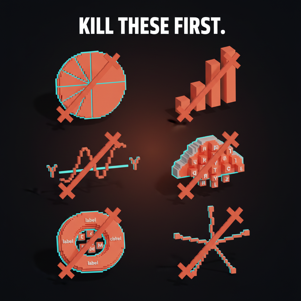
Charts that almost never work in product
Some chart types persist because they look impressive in a screenshot. They almost never communicate well in a real product. Cut them when you see them.
Pie charts with more than three slices. The eye cannot compare angles accurately past three or four wedges. Use a stacked bar or a treemap instead. Pie charts work for two-slice ratios (yes/no, on/off), almost nothing else.
3D bar charts. The third dimension distorts the encoding. The bar in front looks bigger than it is, the bar in back looks smaller. Always use 2D.
Dual-axis line charts. Two y-axes on one chart suggests the two lines should be compared, but the comparison is meaningless because each axis is on a different scale. The user reads correlation that does not exist. Either split into two charts or use indexed values on one axis.
Donut charts with a label inside. Donut charts are pie charts plus extra effort. The label inside often duplicates information already on the screen. Use a single number plus a small bar chart instead.
Word clouds. They look like data and communicate nothing. Word size correlates loosely with frequency, the eye cannot compare sizes accurately, and longer words look bigger because they have more pixels. Cut on sight.
Radar charts. Useful for very specific comparisons (multi-dimensional ratings on the same scale), almost always misused for general comparisons. The eye cannot compare areas of irregular polygons. If the chart is not for a specific known use case, use a bar chart.
Color in dataviz
Color in dataviz is not decoration. It is part of the encoding. The wrong color choice can flip the meaning of a chart from clear to misleading.
The three color uses
Every color in a chart is doing one of three jobs:
Categorical color distinguishes discrete categories that have no order. Each region, each product, each customer segment gets a different hue. Use a palette of 6 to 8 distinct hues. Past 8, the eye starts confusing similar colors and the encoding fails.
Sequential color shows ordered values along a single dimension. Light to dark, low saturation to high. Use one hue ramp, not multiple. Sequential palettes communicate magnitude through value, not hue.
Diverging color shows values that range from negative to positive around a meaningful midpoint. Red to white to blue is the classic example. The midpoint must be a real zero or threshold, not a visual convenience.
Mixing the three kills the chart. A categorical palette used to encode magnitude is unreadable. A sequential palette used to encode categories is confusing. Pick the right one for the data.
The color theory for designers breakdown covers the broader color principles. The color palette glossary covers how palettes are structured.
Color rules that survive small sizes
Most chart color fails at the small sizes where charts actually live in product UIs. A 60 pixel sparkline does not have the visual real estate to render eight categorical colors clearly.
Five rules that hold up:
- Use no more than 6 categorical colors per chart. Past six, the eye gives up.
- Reserve one accent color for the highlight. The line or bar the user should look at first gets the brand color or a high-contrast hue. Everything else is muted.
- Mute the secondary data. Backgrounds, gridlines, axis labels at 40 to 60% opacity. Foreground data at full saturation. The contrast is the hierarchy.
- Test in monochrome. Convert the chart to grayscale and check that the hierarchy still reads. If the chart only works in color, color is doing too much work.
- Test in dark mode. Most product charts need to work on both light and dark backgrounds. The same hue often reads as too saturated on dark and too washed on light. Build a paired palette per mode.
The dark mode design breakdown covers the broader dark mode discipline. Charts are one of the hardest pieces of dark mode to get right.
Color blindness is not a niche
About 8% of men and 0.5% of women have some form of color vision deficiency. Most categorical palettes that look fine to a designer become unreadable for these users.
The fix is to never encode information by color alone. Pair color with shape, position, label, or pattern. A line chart with three colored lines should also have direct labels on each line. A bar chart should have value labels for the bars the user needs to compare.
Test palettes against color blindness simulators. The most common failure is red and green being indistinguishable for users with deuteranopia. Use blue and orange as a categorical pair instead, both of which work across the most common color vision deficiencies.
The accessible color contrast breakdown covers the contrast baselines. The contrast ratio glossary covers how contrast gets measured.
Hierarchy in a chart
Every chart has a hierarchy. The user's eye needs to land on the data first, the labels second, the gridlines and axis third. Most product charts invert this and the user has to work to find the data.
What to emphasize, what to mute
The data is the hero. Bars, lines, dots get the strongest visual weight. Full opacity, full saturation, brand or accent color where appropriate.
Labels and titles are the supporting cast. Strong enough to read, not strong enough to compete with the data. Usually 50 to 70% of the visual weight of the data.
Gridlines, axis lines, and tick marks are the stage. Visible only when the user looks for them. Usually 20 to 40% of the visual weight of the labels.
Most product charts ship with gridlines at full strength because that is the default in every chart library. The fix is one CSS override that mutes the gridlines and the chart immediately reads as designed instead of templated.
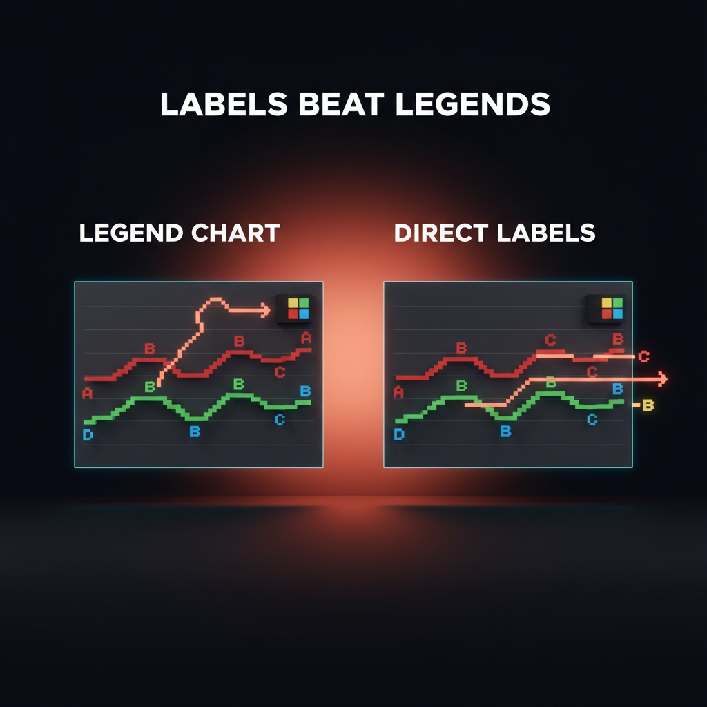
Direct labeling beats legends
A legend on the side of a chart forces the user's eye to ping-pong between the legend and the data. Direct labels on each line, bar, or segment let the user read the chart in one pass.
Direct labeling is harder to implement and the chart libraries do not support it well. Build it anyway. A line chart with three lines labeled at the right end is dramatically more readable than the same chart with a legend in the corner.
The exception is when there are too many series for direct labels to fit. In that case, use a legend that is interactive. Hovering or tapping a legend item highlights that series in the chart and mutes the rest.
The three-second rule
Every chart in a product should answer its question in three seconds. If the user has to study the chart, the design failed.
How to test the three-second rule
Show the chart to someone who has not seen the dashboard before. Ask "what does this chart tell you?" Time the answer.
If the answer comes in under three seconds, the chart works. If it takes longer, find what is slowing them down. Usually it is one of:
- The chart type does not match the question
- The hierarchy is inverted (gridlines louder than data)
- The legend is forcing eye ping-pong
- Color encoding is unclear
- The chart has too many series
Fix the failure, retest. A dashboard where every chart passes the three-second test is a dashboard a user can actually use.
When the three-second rule does not apply
Exploratory analytics tools (BI tools, data science notebooks) are different. The user is not glancing, they are investigating. They want every variable, every dimension, every filter. Three seconds becomes three minutes and that is fine.
The mistake is to build a product dashboard with the discipline of a BI tool. The product user is not investigating. They are checking. Three seconds is the budget.
Interaction in dataviz
Charts in product UIs are interactive. Hover for tooltips, click to filter, brush to zoom. The interactions need design as deliberate as the static encoding.
Tooltip design
Tooltips on charts answer the question "what is the exact value of this point?" Most chart libraries default to a tooltip that shows every series at once, which becomes a wall of text on hover.
Better defaults:
- One tooltip per series, not all series. Hover the line you care about, see the value of that line. Hovering the chart background shows nothing.
- Tooltips include the unit. "$1,240" not "1240."
- Tooltips show comparison context where useful. "$1,240 (+8% vs last week)" turns the tooltip into a story.
- Tooltips never block the data. Position above or below the cursor based on chart edge proximity.
Filtering and brushing
Charts that support direct manipulation feel responsive in a way charts that need a separate filter panel do not. Brushing a date range on the x-axis to zoom, clicking a category in the legend to isolate it, dragging a threshold line to filter rows. Each requires engineering work that pays off in user trust.
The risk is over-engineering. A chart that needs five interactions to be useful is a chart that should be split into multiple simpler charts. Each interaction is a cognitive cost.
The progressive disclosure glossary covers the broader principle. Charts can use it well by hiding advanced controls until the user demonstrates intent.
Dataviz failures to watch for
Every dashboard audit catches the same failures. If the product ships with any of these, the dataviz layer is undermining the rest of the product.
Truncated y-axes that exaggerate change. A bar chart with a y-axis starting at 95 instead of zero turns a 2% change into a visual cliff. Use full-range axes unless there is a clear reason not to, and label any truncation explicitly.
Charts with no zero baseline on bar charts. Bar length is the encoding. If the bar does not start at zero, the encoding lies. This is non-negotiable for bar charts. Line charts can use truncated axes when the chart is showing a small range over time.
Mismatched chart types in one dashboard. Two bar charts using different orientations, two line charts using different axis ranges, a pie chart next to a stacked bar showing the same data. Pick the chart type that fits each question, but make the visual treatment consistent across the dashboard.
Charts that take longer to load than the rest of the page. A dashboard that paints the layout in 200 ms and the charts in 2 seconds feels broken. Build skeleton states for every chart. Lazy-load charts below the fold. Stream data instead of waiting for the full payload.
Charts that ignore the brand. A dashboard that uses default chart library colors looks like a template. The chart palette should be derived from the brand color system, with adjustments for accessibility and small-size legibility. Never ship a dashboard with the default Chart.js or Recharts color palette in production.
The brand color palette breakdown covers the broader brand color discipline. Dataviz palettes are derived, not invented.
Dataviz in 2026 conditions
Three shifts changed how dataviz gets designed. The work has to adapt.
AI generates charts in seconds. Tools like ChatGPT and Claude can generate a chart from raw data in one prompt. The risk is that designers stop thinking about chart selection because the AI picks one. The AI almost always picks a generic chart type that does not match the actual question. Use AI for first drafts, then refactor based on the question the user is asking.
Real-time data is the default. Dashboards now stream live data instead of refreshing every 60 seconds. The design implication is that motion needs design too. Live charts that flicker on every update are unusable. Smooth interpolation between data points and a clear "live" indicator are the baseline.
Mobile dashboards are common. A dashboard designed only for a desktop is a dashboard that loses most of its weekend and travel usage. Charts on mobile need different decisions, often simpler chart types, fewer series, taller layouts that scroll instead of grid layouts that compress.
The responsive design breakdown covers the broader responsive discipline. Dataviz is one of the hardest layers to make truly responsive.
FAQ
What chart type should I use?
Match the chart to the question the user is asking. Comparing values across categories: bar chart. Showing change over time: line chart. Showing parts of a whole: stacked bar or treemap (almost never a pie). Showing two-variable relationships: scatter plot. Showing distribution: histogram or box plot. If the chart on the screen does not fit one of these, the user does not know what question it is answering.
When should I avoid pie charts?
Almost always. Pie charts work for two or three slices where the ratio is the entire story (yes/no, on/off, simple binary splits). Past three slices, the eye cannot compare angles accurately, and the chart becomes decoration. Use a horizontal stacked bar or a treemap instead.
How many colors should a chart use?
Six categorical colors maximum, plus one accent for the highlighted series. Past six, the eye starts confusing similar hues and the encoding fails. For sequential data (low to high), use one hue ramp from light to dark. For diverging data (negative to positive), use a two-hue ramp around a meaningful midpoint.
How do I make charts accessible?
Never encode information by color alone. Pair color with shape, position, label, or pattern. Test palettes against color blindness simulators (deuteranopia is the most common). Hit WCAG contrast minimums between chart elements and the background. Provide direct labels instead of legend-only references where possible. Add accessible names to chart components for screen readers.
What is the three-second rule for charts?
Every chart in a product dashboard should answer its question in three seconds or less when shown to a fresh user. If the user has to study the chart, the design failed. Test by showing the chart to someone who has not seen the dashboard and timing how long it takes them to summarize what the chart says. Anything over three seconds means the chart needs simplification.
Should I use a chart library or build custom?
Use a chart library for first drafts and prototypes. Most production charts in product UIs benefit from custom layers on top of the library to fix defaults: muted gridlines, direct labels, branded color palettes, custom tooltips. Pure custom dataviz with D3 or canvas is justified only when the chart type is unusual enough that no library supports it.
Dataviz is design, not decoration
A dashboard with disciplined dataviz feels like a product that respects the user's time. A dashboard without it feels like a wall of decoration that happens to contain numbers. The distance between those two is small, and the only path to the first is design discipline applied to chart selection, color, hierarchy, and interaction.
Pick the chart that matches the question. Mute the gridlines, highlight the data. Use color as encoding, not decoration. Test against the three-second rule. Test against color blindness. Test on mobile and dark mode.
The product that ships disciplined dataviz reads as serious. The product that ships default chart library output reads as a template. Users notice the difference even when they cannot articulate why.
If you want a team that builds dataviz systems alongside the rest of the product UI, hire Brainy. Charts as a first-class part of the design system, on every project.
Related reading
Want a dashboard or product UI where the data actually communicates? Brainy ships data-heavy interfaces with chart systems built in, not bolted on after the fact.
Get StartedNot ready to hire? Run the free Business Genome, an 11-dimension diagnostic for your venture.
Get your free GenomeGet new papers by email
New Brainy papers in your inbox. Confirm once, unsubscribe anytime.