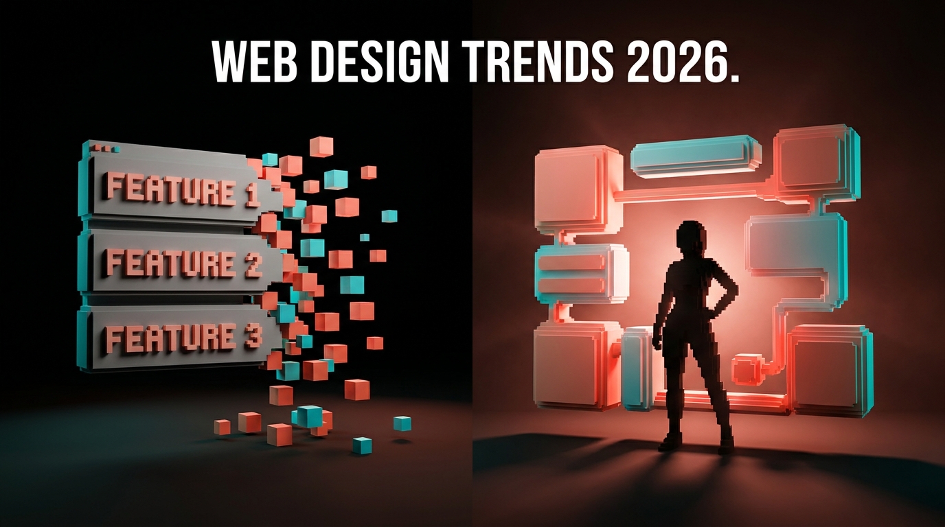
Designing Friction on Purpose
Frictionless is dead. The best products in 2026 added friction back, deliberately, in specific places, for specific reasons. The map of where friction earns its keep, the shapes friction can take, and the audit framework to run any flow through.
Frictionless is dead. The decade-long sprint to remove every tap, every confirmation, every pause turned products into tap-and-pray slot machines, and the best teams in 2026 are quietly putting the friction back. Not by accident. On purpose. In specific places, for specific reasons.
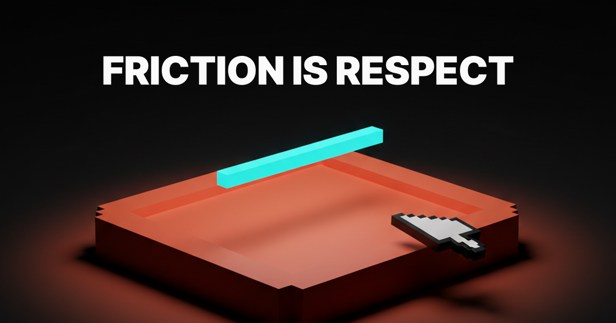
Friction is not the enemy of UX. Friction is how UX signals respect. A product that lets a user delete an account in one tap does not respect them. A product that asks them to type the account name first does. The pause is the message.
Accidental friction is not the same thing
Most "friction is bad" arguments are about accidental friction. Lag. Confusing UI. Dark patterns. Forms that ask for a fax number in 2026. Onboarding flows that demand an email confirmation, an SMS code, and a setup wizard before the product does anything useful. That kind of friction is bad. Nobody is defending it.
Designed friction is a different thing. It is the deliberate pause at a high-stakes moment so the user can make a real decision instead of an accidental one. The second tap on Apple Pay. The type-the-repo-name-to-delete on GitHub. The diff Cursor shows before it touches your code.
Accidental friction is a bug. Designed friction is a feature. Conflating the two is how the industry ended up with one-tap account deletion buttons sitting next to "are you sure you want to leave this page" modals on contact forms.
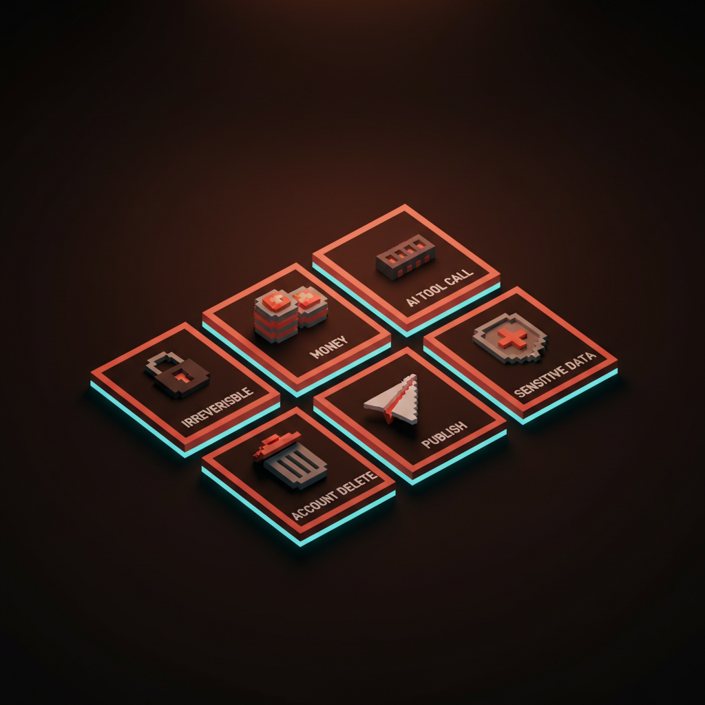
The six places where friction earns its keep
Friction earns its keep in specific contexts. Six of them, ranked by how badly the absence punishes the user.
Irreversible actions
Anything the user cannot undo deserves friction. Delete account. Drop database. Force-push. Empty the trash. Wipe the device. The cost of an accidental tap is unrecoverable, so the product owes the user a moment to confirm intent.
GitHub's repo deletion is the textbook version. The user types the full repo name, exactly, before the delete button activates. The friction is not theater, it is a forcing function that converts muscle memory into deliberate choice. Stripe uses it on API key revocation. AWS uses it on resource deletion. The "type DELETE" pattern exists because muscle memory beats intention, and irreversible actions cannot afford to lose to muscle memory.
Money flows
Every product that moves money owes the user a confirmation step. Stripe Checkout is intentionally a two-step flow. Card details on one screen, summary and confirm on the next. The "extra" step is the entire pitch. The user sees what they are paying, who they are paying, and what they are getting, before the charge lands.
Apple Pay's double-press is the same idea compressed into hardware. The user commits twice, with a one-second beat in between, before money moves. That second press is the difference between a payment and an accident.
Frictionless payments exist. They are called subscriptions, and they are also the most-complained-about category in app stores for a reason. Removing the confirmation step does not make the user happier, it makes them feel like the product is taking advantage of them.
AI tool calls
Every time an AI is about to take a real action, write to the file system, run a command, send an email, hit an API, the user deserves an approval beat.
Cursor's accept-or-reject diff is the gold standard. The model proposes a change, the diff appears, the user accepts, rejects, or edits before the change lands. Claude's artifact approval follows the same shape. Code agent proposes a file edit, the user reviews, then commits. The friction is the trust layer. Without it, the agent is just a faster way to corrupt a codebase.
The AI products that skipped this step in 2024 and 2025 burned a lot of trust. The ones that built in the approval beat are the ones users actually leave running.
Account deletion and destructive settings
Linear's destructive-action confirmations are the underrated example. Archive a project, the system asks once. Delete a project, the system asks twice and shows what is about to vanish. Delete a workspace, the system requires the workspace name typed in plain text. The friction scales with the size of the loss.
Notion runs the same gradient. Archive at one tap because archive is reversible. Delete behind a typed confirmation because delete is not. The user never has to ask which is which because the friction itself signals the stakes.
A product that treats archive and delete as the same one-tap gesture does not respect the difference. The user finds out the hard way, usually at 11pm on a Tuesday, that the button they tapped was not the button they thought.
Sharing and publishing moments
The publish button deserves a beat. Posting a tweet, sending a Slack to channel, publishing a blog draft, sharing a Figma file with a client. The act is reversible in theory and humiliating in practice. A pause before the send prevents the 2am DM intended for one person and broadcast to a department.
Twitter's "are you sure you want to send this" prompt on incendiary replies is a working example. Slack's "you are about to message 4,200 people" warning is another. The friction is the product remembering what the user will wish they had been asked.
The same logic applies to publishing. WordPress, Ghost, Webflow, and every CMS worth using shows a confirmation summary before the post goes live. The friction is the difference between "publish" and "publish and immediately have to unpublish."
Sensitive data and account access
Logging in is not where friction belongs. The new device confirmation is. The 2FA prompt the first time a sensitive action is taken is. The "we noticed a login from a new location" pause is.
Put the friction at the threat surface, not the front door. Apple's Are You Sure prompts on a new sign-in are the right shape. Google's session re-auth before changing the recovery email is the right shape. Banks asking for a second factor on a wire transfer over a threshold is the right shape. Banks asking for a second factor every time the user checks their balance is the wrong shape, and it trains the user to ignore the prompts that matter.
Where friction kills the product
Friction in the wrong place is just bad product. Three patterns to avoid, every one a real failure mode in shipped products.
Friction at the front door. Extra steps to log in. Captchas on every session. Email confirmation flows that take three days. The user has not committed yet, so every step of friction is a chance to leave. Save the friction for after the user decides to stay.
Dark-pattern unsubscribe. Friction designed to prevent the user from leaving. Cancel buttons buried four screens deep. "Are you sure you want to lose all your benefits" guilt modals. Type-your-password-to-cancel patterns on accounts that did not require a password to sign up. Hostile friction converts short-term retention into long-term reputation damage. The brands that pull it pay for it.
Onboarding gates. Setup wizards that demand every preference before the product does anything. "Complete your profile to continue" walls on a product the user just signed up to try. Friction during the trust-building phase is friction the user has not bought into yet. The right pattern is progressive disclosure, where the user gives the product more as the product earns more.
The rule of thumb: friction at the action, not at the entrance. Friction proportional to the cost of the mistake. Friction the user reads as care, not obstruction.
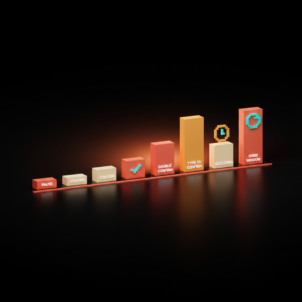
Friction is a design material
The mistake most teams make is treating friction as binary. Confirm or no confirm. The teams shipping the best 2026 products treat friction as a material with a tunable shape. Six common shapes, each with a different weight.
Pause. A 200ms beat between tap and execution. The lightest possible friction. Used on hover-to-confirm patterns and slow buttons.
Confirmation. A modal asking once. Default friction for medium-stakes actions like archiving a project or sending an invoice.
Double confirm. Two prompts in a row, the second different from the first. Used when the first prompt is a thing users dismiss out of habit.
Type to confirm. The user types the resource name, the word DELETE, or the account email. Forces deliberate attention. Used for the most irreversible actions.
Cooldown. A delay window before the action can be repeated or reversed. Used on bulk operations and moderation actions where panic is likely.
Undo window. The action happens, but the user has a fixed period to reverse it. Gmail's send-undo. Slack's edit window. The right shape when the action is reversible-with-effort but not catastrophic.
The right shape depends on the stakes, the reversibility, and how often the action runs. Designers picking a single shape for every flow are designing the same way someone picks a single font weight for every layout. The constraint is the bug, not the feature.
For how speed and friction interact, see speed is the brand and landing page design principles.
The friction audit framework
Run every flow through these four questions before it ships. If the answers are wrong, the friction is wrong.
- Is the action reversible? If yes, friction can be light or absent. If no, friction is mandatory and should scale with the cost of the mistake.
- What does the user lose if they tap by accident? Time, money, data, reputation, all four. The friction shape should match the loss size.
- Where is the friction landing in the flow? Front door friction is bad. Action-moment friction is good. Friction between the user and the value is in the wrong place.
- Does the friction read as care or as obstruction? A user who hits the friction should feel respected, not blocked. If it reads as the product slowing them down, the friction is hostile.
Four questions, run in order, against every flow with stakes. Most teams skip this because the engineering cost of adding a confirmation modal is trivial and the design conversation about whether it should be there is not.
For the deeper read on flow-level decisions, see web design principles, death of the mockup, and AI product onboarding design.
FAQ
When should you add friction to a UX flow?
Add friction at high-stakes moments. Irreversible actions, money flows, AI tool calls, account deletion, publishing, and sensitive data changes. The friction should scale with the cost of an accidental tap, and it should land at the action, not at the entrance.
Is frictionless design dead?
Frictionless as a universal goal is dead. Frictionless at the right moments is still right. Effortless and frictionless are not the same thing, and designed friction at high-stakes moments signals a product that respects the user.
What is the difference between good friction and dark patterns?
Good friction protects the user from a mistake they would regret. Dark-pattern friction protects the company from a decision the user already made. Good friction lives at the action. Dark-pattern friction lives between the user and the exit. The shape can look similar. The intent is the opposite.
Build the layer that earns the trust
Friction is not the opposite of good UX. It is the part of UX that signals the product knows what it is for. The teams shipping products people trust in 2026 mapped their flows, named the high-stakes moments, picked the right shape of friction for each, and defended the choice when leadership asked why the flow has a confirmation modal.
If your product is leaking trust because every action feels the same, hire Brainy. We ship UX audits, flow redesigns, and the friction layer that turns a tap-and-pray product into a product people stay with. Friction is a material. Use it on purpose, in the right places, in the right shape, and the product reads as care every time the user touches it.
If your product is leaking trust because every action feels the same, Brainy ships UX audits, flow redesigns, and the friction layer that turns a slot machine into a product people respect.
Get Started