

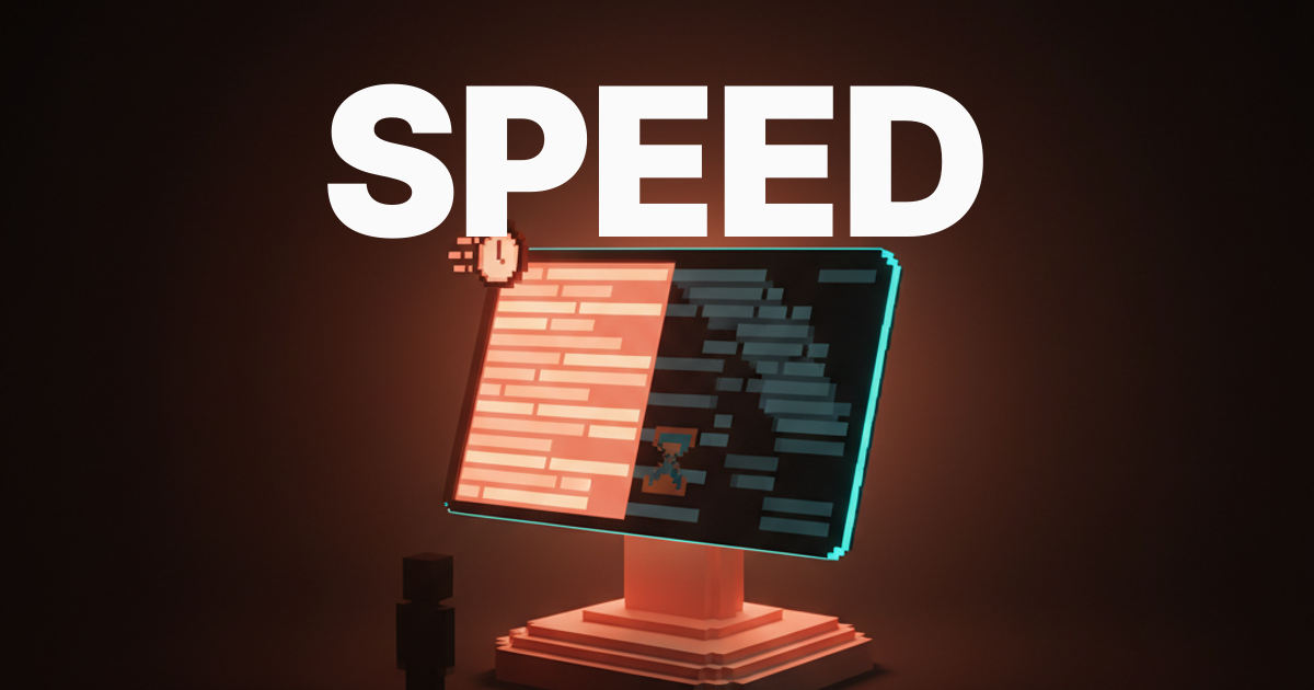
Speed Is the Brand: Why Performance Became the Most Visible Design Decision in 2026
A slow site looks worse than an ugly one. In 2026, web performance is the most visible brand signal a site carries. Core Web Vitals as design metrics, the brands that won by treating speed as identity, and the perf budget designers should bring to every brief.
A slow site looks worse than an ugly one. In 2026, the first brand signal a visitor experiences is not the typography, not the color, not the headline. It is how long they wait for the page to feel like a page.
Performance moved from engineering concern to brand decision. The winners treat speed as identity. The losers ship six-second LCPs behind a hero video and a chat widget, then wonder why bounce sits at 70 percent.
This piece names Core Web Vitals as design metrics, the brands setting the bar, the design choices that ARE performance choices, and the perf budget every designer should bring to every brief.
Speed reads as quality, slowness reads as neglect
A premium brand cannot ship a five-second paint. The visitor will not call it slow. They will call it cheap, close the tab, and never come back, and the brand will spend the next quarter wondering why paid traffic is not converting.
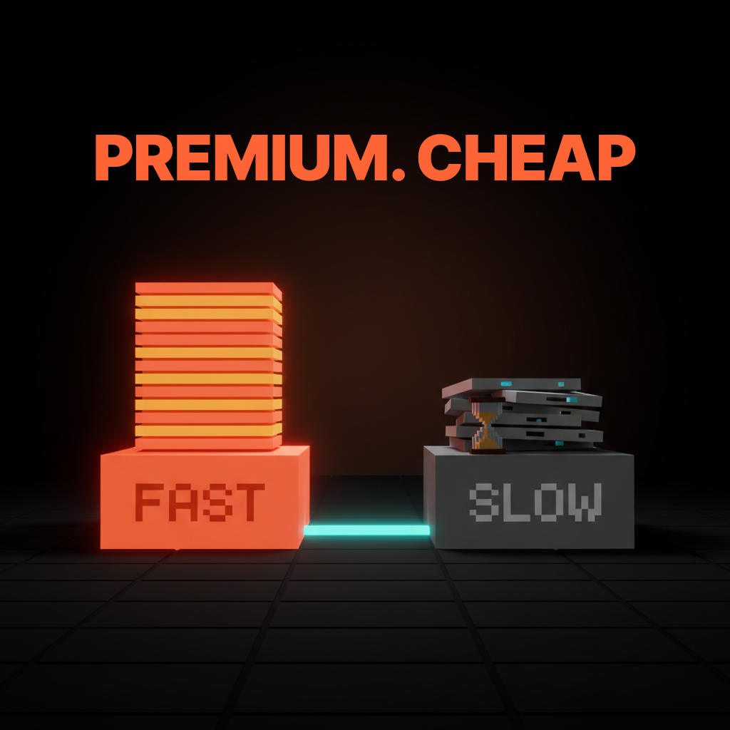
A fast site reads as engineered. As cared for. As the kind of company that finishes the work. A slow site reads as the opposite, and no amount of typography or color or copy can override that first signal once it lands.
The teams shipping the web design trends 2026 that actually stick figured this out. Performance is not the layer below the brand. Performance is the brand.
Core Web Vitals are design metrics now
LCP under 2.5 seconds. INP under 200 milliseconds. CLS under 0.1. Three numbers, three brand thresholds, every one of them decided by a design choice the team made before the engineers ever saw the build.
Treating Core Web Vitals as engineering metrics is the mistake. Engineering can shave TTFB, lazy-load below the fold, and ship a tighter bundle. None of that fixes a hero video the design team specified, three font weights the brand team requested, or a chat widget marketing dropped on the page two days before launch. The numbers are owned upstream. Designers who do not own them ship slow brands and blame engineering.
LCP is the first impression
Largest Contentful Paint is the moment the page reads as the page. The hero image lands, or the hero headline lands, or the main visual lands. Under 2.5 seconds is the brand-safe threshold. Over four seconds is brand damage.
The design choices that move LCP are blunt. A hero video instead of a hero image. A custom font that blocks render until it loads. A 4MB illustration shipped at default Figma export. Each one is a design call. Each one decides whether the brand reads fast or slow before the visitor reads a word.
Linear's marketing site lands LCP under 800ms on a warm session. Vercel sits in the same band. Apple holds product pages under 2.5s under heavy choreographed media. None of those teams got there by accident.
INP is the responsiveness the body feels
Interaction to Next Paint is the metric the visitor feels in the body. Tap the menu, click the CTA, scroll the carousel. Under 200 milliseconds and the product feels alive. Over 500 milliseconds and the product feels broken.
INP is decided by what the page is doing when the tap lands. An autoplay hero video, a chat widget warming up, three analytics scripts firing, and a marketing pixel loading all fight for the main thread. The visitor feels the lag and reads it as cheap.
The fix is design discipline, not a faster framework. Cut the autoplay. Defer the chat. Drop two of the three analytics scripts. The interaction snaps back to the 100ms band and the brand feels premium.
CLS is the trust metric you cannot fake
Cumulative Layout Shift under 0.1 is the difference between a brand that feels engineered and a brand that feels held together with tape. CLS is the visitor watching the page rearrange itself after they started reading, the button moving the moment they go to tap it, the image popping in and shoving the headline down.
CLS is almost entirely a design and spec problem. Set image dimensions. Reserve space for embeds. Load fonts so they do not reflow. Stop injecting late banners that push everything down. Every one is a design choice.

Hold CLS under 0.05 if you can. The visitor will not name it, but they will trust the brand more, and trust is the long compounding signal that paid acquisition cannot buy.
Every design choice is a performance choice
Heavy fonts. Hero videos. Framework bloat. Third-party scripts. Unoptimized images. Autoplay everything. Six design choices, six performance choices, every one of them made before the build engineer opens a code editor.
Three custom font weights at 200KB each is a 600KB font budget the brand team chose. An 8MB hero video is a video the design team specified. A chat widget, a CRM pixel, a heatmap, an A/B runner, and a consent banner is a 1.2MB stack marketing shipped. None of it is engineering. All of it is design.
The teams winning are the ones where design, brand, and marketing all signed the same perf budget. The losers let each lead defend a pet feature, then blame engineering for the resulting six-second paint.
The brands winning by treating speed as identity
Linear, Vercel, Stripe, Apple, Anthropic, Notion, Figma. None of them got fast by accident. Their design teams treated speed as part of the brand and defended it through every brief.
Linear, near-zero load as the entire pitch
Linear's marketing site paints under 800ms on a warm session. The interaction snap is instant. No hero video, no autoplay, no chat widget on the front page. The product is positioned as fast, and the marketing site reads as the product.
The design move is consistency. Linear sells a product that opens fast and feels instant, and the marketing site holds the same standard. A four-second wait would change the read on the product itself.
Vercel, edge-everything as design choice
Vercel pushes everything to the edge. TTFB sits in the low double-digit milliseconds globally. The site feels frictionless, and the friction the visitor does not feel is the entire pitch.
A platform that ships fast sites should be a fast site. The marketing layer is a working demo of the deployment layer, which is exactly why the brand reads as credible.
Stripe, instant handoff as premium signal
Stripe's marketing site, dashboard, and checkout all feel instant on first paint and on every interaction. The handoff between surfaces never breaks the rhythm. That consistency is doing brand work no headline could buy.
A premium financial brand cannot afford a slow checkout, and a fast checkout cannot live behind a slow marketing site without breaking the read. Stripe holds the line everywhere.
Apple, product pages as performance theater
Apple's product pages run heavy media, scroll choreography, and animation budgets that should kill performance. Every LCP still lands under 2.5s. The site is fast and theatrical at the same time, which is the hardest performance trick in the industry.
The design move is fighting for every byte. Images get hand-optimized. Fonts get subset. Animations get budgeted. Scroll choreography gets profiled. Apple treats performance as craft constraint, and the brand reads as the product, dense, refined, fast, premium.
If your site reads as cheap because it paints slow, hire Brainy. UXBrainy ships performance audits and design-led perf rebuilds, AppBrainy ships full marketing-site delivery on a hard perf budget, and BrandBrainy ships the brand and craft layer that makes speed legible as identity. Pair it with designing for AI latency so the AI surfaces hold the same standard.
The B2B SaaS site hitting 6-second LCP
The cautionary pattern is the B2B SaaS marketing site shipping 5 to 8 second LCP, 600ms INP, and 70 percent bounce. Same template, same widgets, same outcome, repeated across hundreds of post-Series-A brands.
The build is consistent. A 6MB hero video autoplaying behind a headline. Three font weights. A chat widget warming up on load. A CRM pixel, a heatmap, a feature-flag service, an A/B runner, a consent banner, and four analytics scripts. Page weight north of 5MB. Bundle north of 800KB of JavaScript before first interaction.
The brand spent 200K on the rebrand and the visitor closes the tab in three seconds. Pipeline blames demand-gen. Demand-gen blames product marketing. Nobody blames the design lead who signed off on the hero video, because performance was never on the design team's scoreboard.
The fix is always the same. Cut the autoplay. Drop two font weights. Defer the chat. Compress the hero. Strip the stack to one analytics tag and a consent banner. The site lands under 2.5s, bounce drops twenty points, and nothing about the brand looks worse, only faster.
The perf budget designers should bring to every brief
A perf budget is a one-page contract. It names the targets the design will hold, and it gets signed before the first wireframe lands.
The numbers, in 2026:
- LCP under 2.5 seconds on a 4G connection.
- INP under 200 milliseconds on the median interaction.
- CLS under 0.1, ideally under 0.05.
- Total page weight under 1.5MB on the marketing home.
- JavaScript bundle under 200KB before interaction.
- Font budget two weights maximum, subset to the characters the page uses.
- Image budget hero under 200KB, body images under 100KB each, all in modern formats.
- Third-party script budget two scripts maximum on the marketing home, deferred or lazy-loaded.
Eight numbers, one page, signed by design, brand, and marketing. The budget lives at the top of the brief and it gets defended every time a stakeholder asks for an exception.
How to defend the perf budget in the room
The budget gets attacked the moment the brand wants a hero video, an extra font weight, a chat widget, or a marketing pixel. The designer has to be ready to defend it in brand language, not engineering language.
The wrong defense is the engineering pitch. TTFB, render-blocking resources, and bundle splits lose every time, because the room does not own those metrics.
The right defense is the brand pitch. A slow site reads as cheap. A fast site reads as premium. Linear paints in 800ms and the brand feels engineered. Our competitor lands at three seconds and we feel sluggish next to them. The hero video adds 1.5 seconds to LCP, which moves us from premium to mid-market in the visitor's gut, and we pay for that gap in conversion every quarter for two years.
Speed reads as quality. Slowness reads as neglect. Frame the budget as a brand decision and the design team owns it, every time.
FAQ
Is web performance really a design problem now?
Yes. 2026 is the year SERPs, AI answer layers, and user expectations all caught up at once. The brands ranking, converting, and reading premium are the fast ones. Performance is decided upstream by design choices, so the design team owns it.
What are the Core Web Vitals targets I should hold?
LCP under 2.5 seconds, INP under 200 milliseconds, CLS under 0.1. Those are Google's good thresholds. Premium brands push tighter, LCP under 1.5 seconds, INP under 100 milliseconds, CLS under 0.05. Pick the band that matches the brand position you want.
Can a heavy hero video ever be worth it?
Sometimes, never on the marketing home. On a product page where the visitor is already qualified, a video can carry weight. On the home, where the decision happens in three seconds, the video almost always costs more in bounce than it earns in engagement.
How do I get the engineering team to hold the budget?
Sign the budget before the brief lands. Engineering is not the bottleneck, the design and brand decisions in the brief are. Make perf a brief-level contract owned by design, brand, and marketing, and engineering will hold the line because the upstream choices already made it possible.
What if leadership wants the chat widget, the heatmap, and the marketing pixel anyway?
Defer everything. The chat widget loads on scroll. The heatmap fires after first interaction. The pixel runs through a tag manager that defers everything by default. The design team can hold the budget without losing the tools, if the load order is owned.
The new line every designer should hold
If your competitor paints in 800ms and yours paints in three seconds, yours feels cheap. Speed reads as quality. Slowness reads as neglect. Every brief that does not name a perf budget is a brief that ships the wrong brand by accident.
The teams winning hold the line. They cut the hero video, subset the fonts, defer the third-party stack, and ship LCP under 2.5s, INP under 200ms, CLS under 0.1. The brand reads premium because the site reads engineered. Pair the work with web design principles, visual hierarchy, and designing for AI latency so every surface holds the same speed standard.
If your site reads cheap because it paints slow, hire Brainy. UXBrainy ships performance audits and design-led perf rebuilds. AppBrainy ships full marketing-site delivery on a hard perf budget. BrandBrainy ships the brand and craft layer that makes speed legible as identity. The fast brand is the credible brand in 2026, and the design team that owns the perf budget owns the brand.
If your site reads as cheap because it paints slow, Brainy ships UXBrainy as performance audits and design-led perf rebuilds, AppBrainy as full marketing-site delivery on a hard perf budget, and BrandBrainy as the brand and craft layer that makes speed legible as identity.
Get Started


