Designing for Latency: When AI Speed Becomes UX
A working playbook for designing around AI latency. Streaming text, optimistic UI, progressive disclosure, reasoning surfaces, and background agents, with real teardowns of Claude.ai, Cursor, Linear AI, Granola, and Perplexity. Plus the math of perceived speed.

AI latency is the most important UX problem in AI products and almost nobody is treating it as design work. The teams shipping the best AI experiences stopped waiting on faster models and started designing around the wait.
This is the playbook. The math of perceived speed, the five patterns that work, the four that fail, five teardowns, and a pre-ship checklist.
AI latency is a design problem, not an engineering one
Most AI products feel slow because they treat latency as engineering's problem. Engineering ships a faster model and the product still feels slow, because the bottleneck was never the milliseconds. It was the design choice that left the user staring at a spinner with nothing to read.
The user does not measure milliseconds. The user measures whether something is happening. Four seconds of streaming prose reads as fast. 1.5 seconds behind a modal reads as broken.
The math of perceived speed
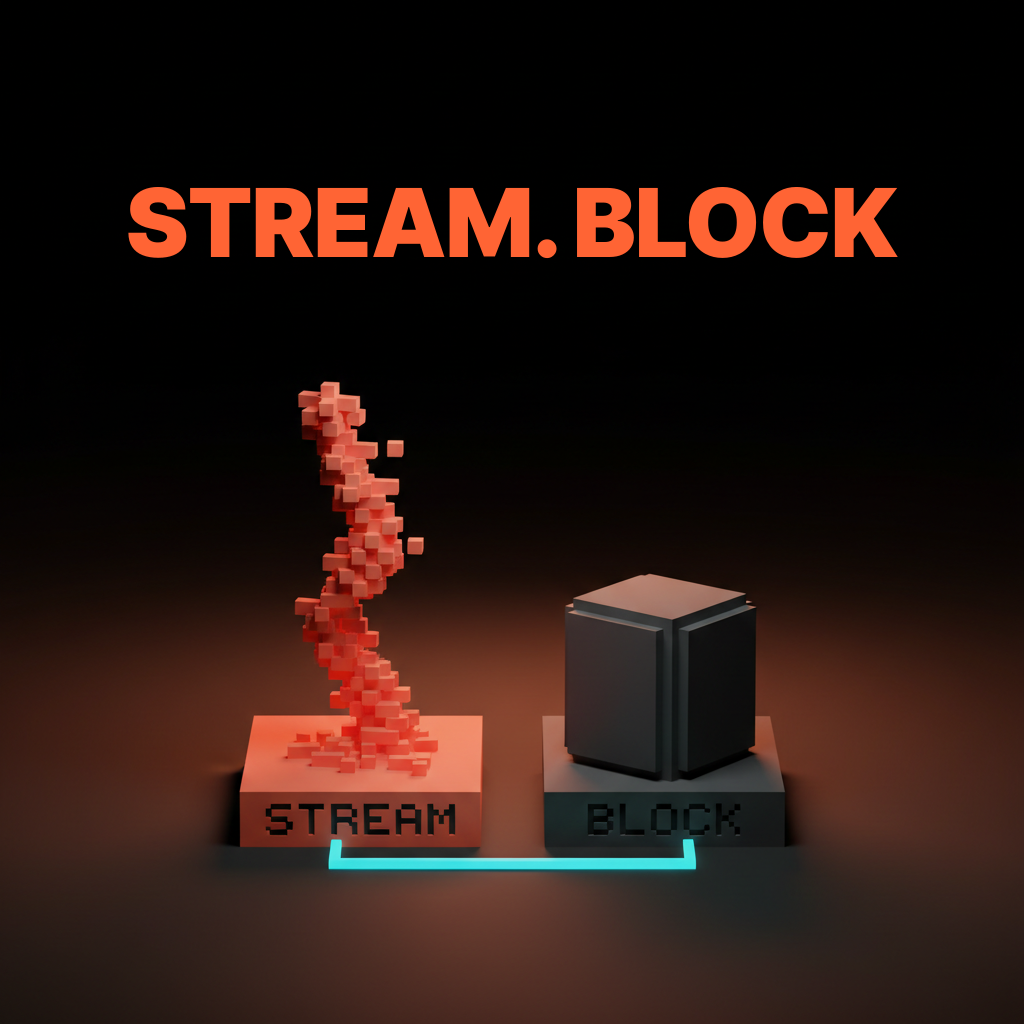
A four-second response that streams reads as fast. A 1.5-second response that blocks reads as slow. Perceived speed is about feedback density, not elapsed time. That single fact rearranges every latency decision in an AI product.
The numbers that matter are time-to-first-token and tokens per second, not total response time. Under 500 milliseconds to first token feels instant. Thirty to eighty tokens per second reads at human speed. A five-second total budget is tolerable when it streams from token one and broken when it blocks. Design around those numbers and a slower model can feel faster than the competition.
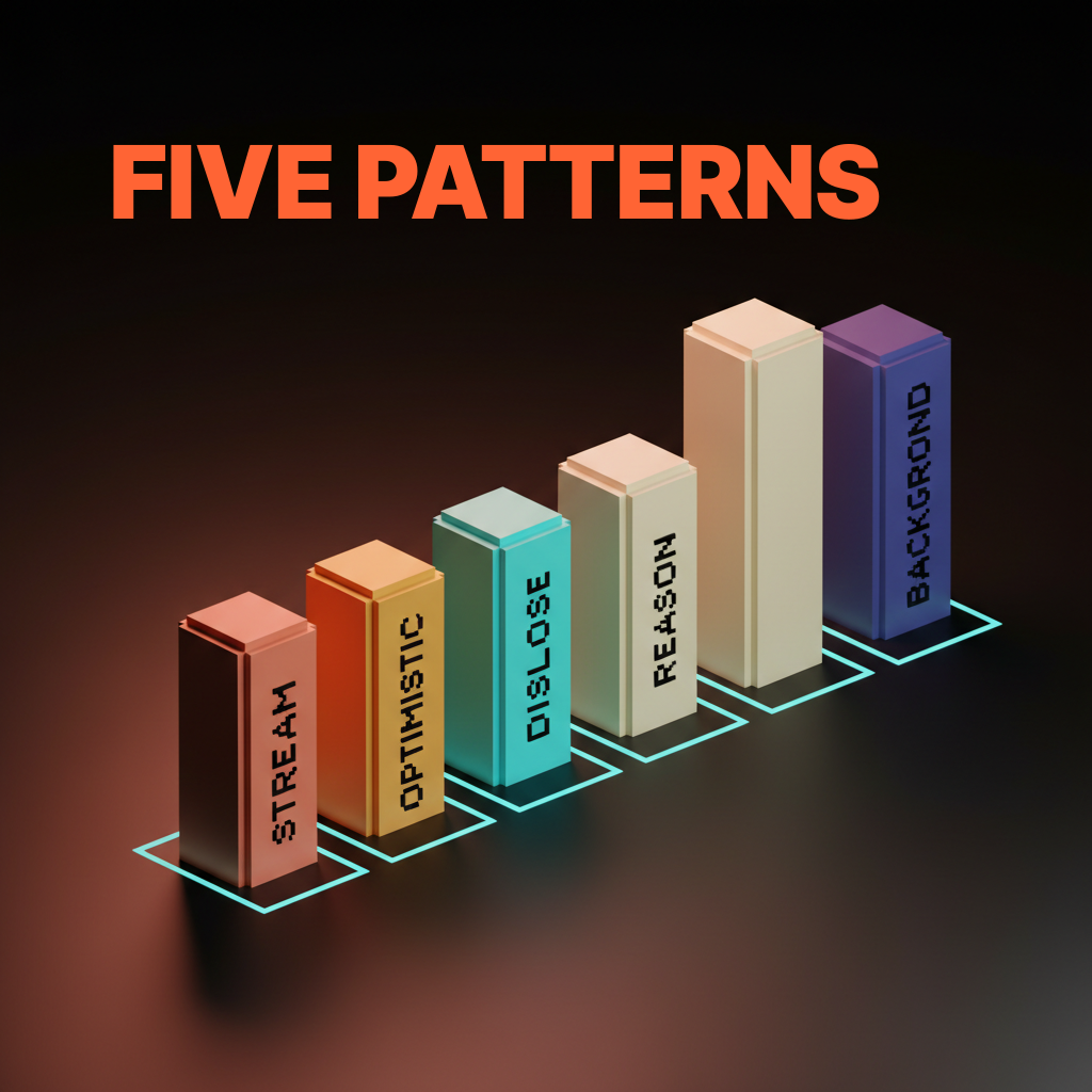
The five patterns that work
Streaming text. Optimistic UI. Progressive disclosure. Reasoning surfaces. Background agents. Every shipped AI product winning on perceived speed leans on at least three of them, and the great ones lean on all five.
The five compose. Streaming gives the user something to read. Optimistic UI gives them something to see. Progressive disclosure gives them something to scan. Reasoning surfaces give them something to trust. Background agents give them something else to do. Combined, the model takes ten seconds and the product still feels alive.
Streaming text turns the wait into the answer
The first pattern is token-by-token rendering. The user reads as the model writes and the wait disappears into the output. Time-to-first-token becomes the only number that matters. Once the first token lands the user is reading, not waiting.
Claude.ai's streaming is the cleanest example shipped. The first token arrives in under a second and the rest cascades at reading speed. The user is mid-sentence on paragraph one before the model finishes paragraph two. Same model, delivered as a finished block after four seconds, would feel like a different product.
Optimistic UI commits the action before the model returns
The second pattern is showing the result before the model finishes, then reconciling when the response lands. The user does not need the answer correct yet. They need it committed.
Linear AI does this when accepting a suggestion. The result lands in the issue immediately with a subtle pending state, and reconciliation happens behind the scenes. If the model lands a different result, the UI updates without a flash. If it fails, the UI rolls back and surfaces the error. The user keeps moving either way.
Progressive disclosure ships skeleton, draft, and final
The third pattern is skeleton first, partial draft second, final output last. Structure lands before content, which collapses the perceived wait by giving the eye something to track.
v0 ships this on its prompt-to-app surface. A layout skeleton appears almost immediately, components fill in as the model generates them, and the final styled preview lands last. Lovable runs the same play. Each stage is a checkpoint the user can read while the next one loads.
Reasoning surfaces convert wait time into trust
The fourth pattern is showing the model's plan or thought process while it works. Watching an agent reason beats watching a spinner. It also builds trust, because the user sees what the model is trying to do before it does it.
Cursor's agent mode ships this with a plan surface. The user sees the intended steps before the first command runs. ChatGPT shows reasoning traces for thinking models, with collapsible thought summaries that read as structured prose. Fifteen seconds of visible reasoning beats three seconds of black box.
Background agents let users keep working while the model runs
The fifth pattern is moving the agent out of the foreground and into a side panel. The user is never blocked by a single AI request. The agent runs in the corner while the user keeps writing, coding, or designing in the main canvas.
Cursor's background agents are the cleanest version shipped. The user kicks off a long task and keeps editing in the foreground while the agent works in a side panel. GitHub Copilot's coding agent does the same with pull-request-shaped tasks. The pattern only works if the user has something else to do, and in any real workflow, they always do.
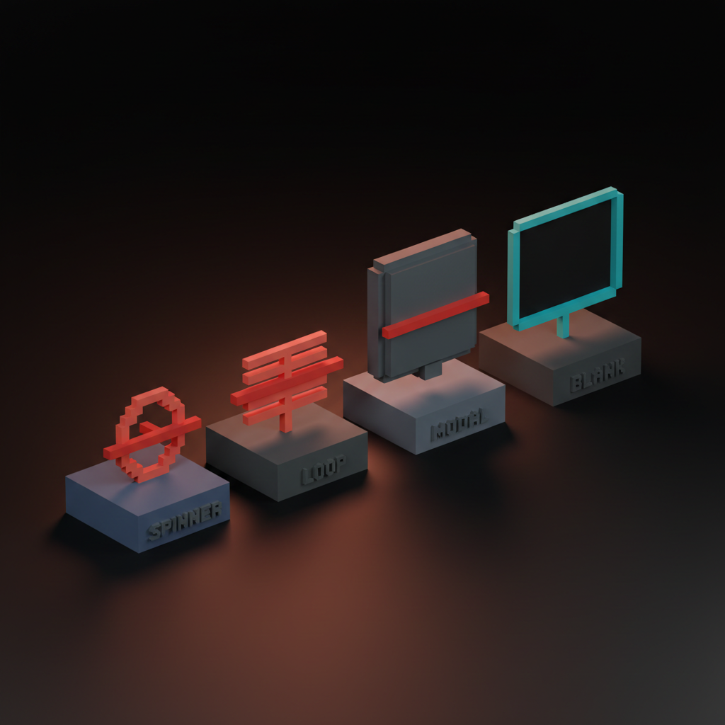
The four patterns that fail
Most AI products that feel slow ship some combination of four failing patterns. Pure spinners. Thinking text loops. Modal blocking dialogs. No progress signal at all. Each one collapses perceived speed even when the response is fast.
Pure spinners hide everything the user needs
A spinner with no progress signal is a black box. The user has nothing to attach attention to and the wait reads slower than the same wait with a token stream. A spinner tells the user to look away, which is the opposite of what an AI surface should do.
Delete the spinner. Ship a token stream, a skeleton, or a reasoning trace. If the response is too short to stream, ship an optimistic state. If the model is doing invisible work, ship a status line that names it.
Thinking text loops are noise without information
A rotating Thinking text loop is worse than a spinner. It implies progress that is not there. Users learn within two sessions to ignore it, which kills the channel for any real status the surface ships next.
Replace the loop with a real status. Searching three sources. Reading file. Drafting response. The status line is information. The loop is noise pretending to be information.
Modal blocking dialogs turn waits into walls
A modal that blocks the rest of the UI while the model runs is the most expensive latency mistake. It converts a wait into a hostage situation. The user cannot scroll, cannot copy a previous answer, cannot do anything else.
Delete the modal. Ship the response inline, in a side panel, or in a non-blocking toast. The user should never lose access to the rest of the product because one AI request is in flight.
No progress signal teaches the user to bounce
An AI surface with no progress signal teaches the user to assume the request is broken. They hit the back button before the response lands. Worst case they refresh and lose the request.
Every AI surface that takes more than 500 milliseconds needs a progress signal. Streaming text is the best. A skeleton is next. A reasoning trace works for longer waits. A status line works for everything else. The signal has to exist.
Five real product teardowns
Five AI surfaces that turn latency into UX.
Claude.ai, streaming as the entire interaction
Claude.ai's streaming is the cleanest example of latency as feature. Time-to-first-token sits well under a second on a warm session, the prose lands at reading speed, and the wait disappears into the output.
The design move is committing fully to the stream. No spinner, no thinking text, no skeleton, just the response landing one token at a time. The product feels fast through twenty seconds of generation because the user has been reading for nineteen of them.
Cursor, the plan-and-run loop
Cursor turns latency into trust by showing the agent's plan first, running each step with visible progress, and committing diffs as they land. A multi-minute task feels purposeful because the user can read the plan, watch each step, and review each diff as it commits.
The design move is ranking the wait. Plan first. Each step as a checkpoint. Diffs as final output. Every layer carries information, so the user never stares at a black box even though the job runs for minutes.
Linear AI, inline progressive disclosure
Linear AI ships progressive disclosure inside existing surfaces. The AI never owns the foreground. A draft suggestion appears inline in the issue. A summary appears inline in the project. The wait never blocks the user's actual work because the user is already doing the work the AI is augmenting.
Embedded AI inside a product the user already knows should never be a modal or a takeover. Inline disclosure is the right pattern, and the latency cost hides inside actions the user is already taking.
Want an AI product that feels fast even when the model is slow? Hire Brainy. UXBrainy ships latency audits and streaming UI redesigns, AppBrainy ships full AI product delivery, and ClaudeBrainy ships the prompt and Skill layer that makes streaming cheap. Pair it with AI agent UI design patterns so the agent layer ships at the same craft level.
Granola, the recording-to-summary cascade
Granola hides minutes of model work behind a four-stage cascade. Recording lands first as raw waveform. Transcript lands second as scrollable text. Draft notes land third as bullet structure. Final summary lands last as polished prose. Each stage is useful before the next is ready.
Three minutes of model work feels like thirty seconds because the first useful artifact lands inside ten. The transcript is valuable on its own. The notes are valuable on their own. The summary completes the experience without gating the value.
Perplexity, live source streaming
Perplexity streams its sources before the answer. The citation list lands first, populated as the model retrieves and ranks each source. The answer streams underneath while the user is already reading the sources. The wait reads as research, not loading.
The design move is showing the work before the result. A user reading a source list is not waiting. Same total response time, sources hidden until the answer is ready, would feel two to three times slower. The information density of the wait is the entire perceived-speed story.
The pre-ship latency checklist
Run this on any AI surface before it ships. Twelve checks, all measurable.
- Time-to-first-token under 500 milliseconds on a warm session.
- Streaming sustains 30 to 80 tokens per second on the target model.
- Every wait longer than 500 milliseconds has a progress signal.
- No pure spinner anywhere in the AI surface.
- No rotating Thinking text loop anywhere in the AI surface.
- No modal blocking dialog while the model runs.
- Optimistic UI commits the visible action within 100 milliseconds of intent.
- Skeletons render before content for any response longer than two seconds.
- Reasoning traces exposed for any task longer than ten seconds.
- Long-running agents run in a side panel, not the foreground.
- The user can scroll, copy, and read previous output while a request is in flight.
- Every multi-stage response surfaces intermediate stages the user can consume.
The list lives in the design review template and gets faster every time you run it.
FAQ
What is the most important latency number in an AI product?
Time-to-first-token. Total response time matters less than how long the user waits before they have something to read. Under 500 milliseconds reads as instant.
Is streaming always better than blocking?
For text, yes. Under 500 milliseconds, blocking is fine because the wait is invisible. For anything longer, streaming beats blocking on every perceived-speed metric.
When should I use optimistic UI versus streaming?
Streaming when the output is the answer, like prose, code, or structured generation. Optimistic UI when the model is making a decision the user already expects, like a refined draft or accepted suggestion. The two compose.
How do I show progress for an agent that takes minutes?
Reasoning surfaces and side-panel progress streams. Show the plan first, the active step second, the running output third. The user reads the plan, watches the steps tick, and never feels locked out.
What is the worst latency mistake in AI products today?
The blocking modal with a spinner. It combines all four failing patterns into one screen, and it teaches the user that AI is something to wait through, not something to use.
The shift designing for AI latency actually unlocks
Designing for AI latency is not a workaround for slow models. It is the design move that lets a slower, better model beat a faster, worse one on every metric the user actually cares about.
The teams winning right now stopped optimizing for raw speed and started designing for perceived speed. They committed to streaming, added optimistic UI, built 200ms skeletons, and moved agents into side panels. Every wait carries information.
If your AI surface still ships a spinner, a Thinking loop, or a blocking modal, the model is not the bottleneck. The design is. Pair the work with AI agent UI design patterns, the AI product onboarding playbook, AI-native product design, and visual hierarchy to keep every stage scannable.
If you want an AI product that feels fast even when the model is slow, hire Brainy. UXBrainy ships latency audits and streaming UI redesigns, AppBrainy ships full AI product delivery, and ClaudeBrainy ships the prompt and Skill layer that makes streaming cheap.
Want an AI product that feels fast even when the model is slow? Brainy ships UXBrainy as latency audits and streaming UI redesigns, AppBrainy as full AI product delivery, and ClaudeBrainy as the prompt and Skill layer that makes streaming and reasoning surfaces cheap to build.
Get Started