Onboarding Without Onboarding
The 5-step welcome modal is dead. The five patterns AI-native products use to put new users inside real work in under thirty seconds, and the cases where onboarding still earns its keep.
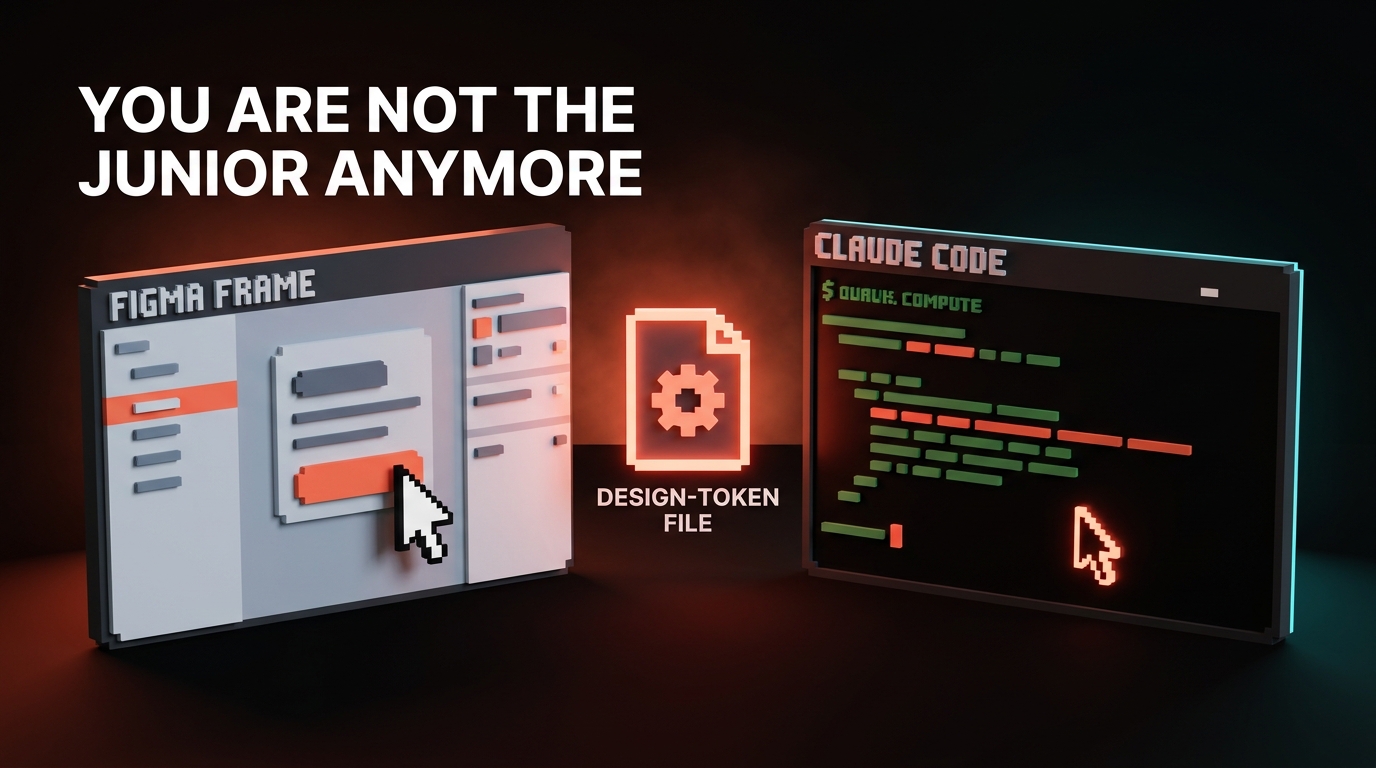
The five-step welcome modal is dead. The product tour is dead. The checklist gating real work is dead. Modern AI products opened the door, threw the user inside, and killed the lights on the tutorial. The user is already typing before they realize they were never onboarded.
Explanation is a tax on activation. The best 2026 products do not explain. They put the user inside real work in under thirty seconds and let the product itself do the teaching.
Why onboarding existed, and why AI killed it
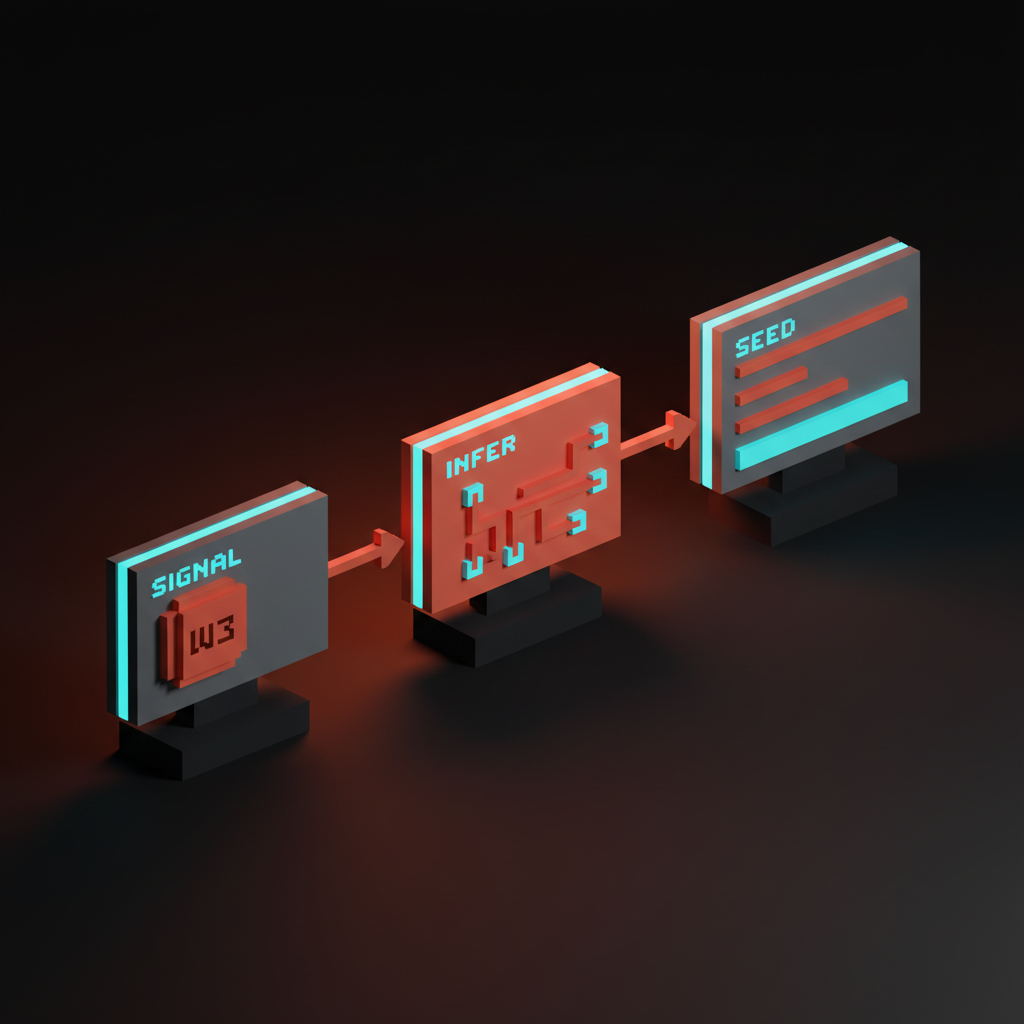
Onboarding survived for two decades because activation was hard and products needed explaining. AI-native UI killed both reasons at once.
Activation used to require setup before the first useful action. Connect a database. Invite a team. Configure a workspace. The 5-step tour and the welcome modal were duct tape over a broken first run, not a design pattern worth keeping. Products needed explaining because deterministic SaaS exposed a thousand controls and the user had to learn the map.
AI collapsed both. Lovable takes a one-line brief and builds the app. v0 takes a screenshot and generates the UI. Cursor opens to a real folder and the agent figures out the codebase. Stripe Atlas pre-fills 90 percent of incorporation from the company name and country. The user is not configuring. The product is. And the prompt surface is universal: the same input box handles every task in Claude, ChatGPT, and Cursor, so there is no map left to learn.
The five patterns of no-onboarding done right
Five patterns separate the products that skip onboarding cleanly from the ones that just delete the modal and ship a confused empty product. Each one absorbs a job the old tutorial used to do.
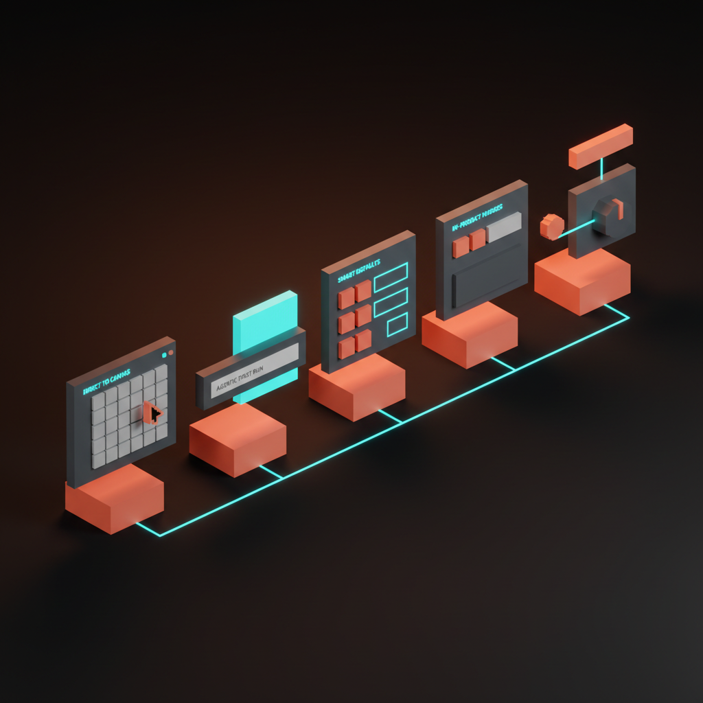
The patterns compose. A great no-onboarding flow ships three or more inside the first session.
Pattern 1: Direct to canvas
The product opens to the work, not to an explanation. Cursor opens to a folder. v0 opens to a prompt bar. Claude opens to a textarea. Linear opens to your inbox, not to a checklist. Figma opens to a blank canvas with the toolbar already in your hand.
There is no welcome modal and no "let us walk you through Cursor." The first thing the user sees is the surface they will use forever, and the cursor is already where it needs to be. Direct-to-canvas works because the canvas itself is legible. A textarea with a send button is a complete affordance. The user has used one in twenty other products, so the new product borrows the literacy and skips the lesson.
Pattern 2: Agentic first run
The user types one line and the product produces a working artifact in under sixty seconds. Lovable turns "build me a SaaS landing page for a Pilates studio" into a deployable site. v0 turns a screenshot and a sentence into a React component. The Vercel AI Playground turns a prompt into a working API call. Cursor turns "fix the lint errors" into a real diff.
Agentic first run is the most expensive pattern to ship and the highest-leverage one to land. The user does no setup, sees a finished output, and walks away with a working mental model. Capability bound, interaction model, and success state all land in one move. The empty state is the product when the empty state is one input that produces something real. The trap is the canned demo where the prompt looks live but the output is a pre-recorded gif. Trust burns in two prompts.
Pattern 3: Smart defaults
The product pre-fills 90 percent of the work from a single signal. Stripe Atlas asks for the company name and the country and seeds the rest of the incorporation form. Linear infers the workspace from the email domain and seeds projects from the company name. Notion auto-creates a starter set of pages. Vercel detects the framework on import and configures the build.
Smart defaults work because most users want the median answer. The discipline is making the override visible without making the configuration mandatory. Stripe Atlas shows pre-filled fields with an edit icon next to each one. Linear lets you rename the workspace inline after seeding it. The default is loud, the override is quiet, and both are reachable in one click.
Pattern 4: In-product nudges
The product surfaces hints inside real work, not before it. Linear shows inline help when you hover an unfamiliar command. Raycast surfaces command suggestions as you type. Cursor's first-prompt hint pops up after the user opens a file but before they have prompted. Cron shows a single keyboard hint the first time you create an event, then disappears forever.
In-product nudges replace the tour with a micro-lesson scoped to the action the user is already attempting. The hint is two words. The dismiss is a single keystroke. The failure mode is the nudge parade: five hints stacked on the same screen, each blocking the click. A nudge is a quiet line of text near the action. A parade is a tour with a different name.
Pattern 5: Just-in-time tutorials
The tooltip explains the unfamiliar control when the user hovers it, not when they arrive. Superhuman explains the keyboard shortcut the first time you reach for the mouse. Loom explains the recording controls when you start your first recording. Figma explains the constraint pin the first time you select an auto-layout frame.
Just-in-time tutorials are the safest place for explanation because the user has already chosen to engage with the control. Curiosity is loaded, attention is focused, and the explanation answers a question the user was already asking. The hard rule: if the user has not hovered, clicked, or summoned, the tutorial does not run. Progressive disclosure is the principle. The product reveals depth in the order the user reaches for it.
Failure modes that ship anyway
Bad onboarding patterns refuse to die. Five of them are still landing in production this year, and each one is a tax on activation the product cannot afford.
The welcome modal that asks for a goal you do not know yet. "What brings you to Notion today?" "What is your team size?" The user signed up to find out what the product does, and the modal is asking them to commit to a use case before they have used it. Move the survey to session three.
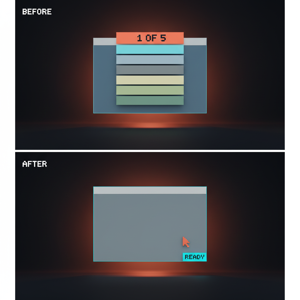
The empty workspace that demands a name and color. The products that make you stop, name a workspace, pick a color, and choose an icon are punishing the user for arriving. Default it. Let them rename it later.
The seven-step checklist that gates real work. The checklist is the new tour with a progress bar. Real activation does not happen on step seven. The user churned on step three.
The tour that walks you past buttons you cannot see yet. A coach mark pointing at a feature that is not relevant to the first action. The tour is teaching the product the team wanted to ship, not the product the user is using.
The form gate before the first AI output. Asking the user to fill out team size, role, and use case before a single output. Every form-gate before the first prompt is an activation tax. Ship value first, collect context later.
Four questions before you design onboarding
Run the spec through these four before writing a single tutorial step. If the answers point at a pattern from the five above, the design is done.
- What does activation actually require? Name the smallest action that delivers value. If activation is "type one line and see an output," the onboarding is an empty input with a suggestion underneath.
- What can the product do instead of asking? Every question the product asks is a question the product chose not to answer. Domain on the email. Framework on the import. Default project from the company name.
- What is the minimum the user must learn to start? Almost always less than the team thinks. A textarea needs zero explanation. A keyboard shortcut needs none until the user reaches for the mouse.
- What can wait until they need it? Advanced features, team invites, billing, integrations. None of them block the first prompt. Ship them just-in-time inside the flows that need them.
These four replace the onboarding spec for most AI products. The output is rarely a tour. It is a smarter empty state, a better default, and a hint that fires once.
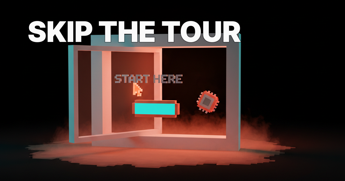
When onboarding still earns its keep
Some flows still need the explicit walk-through, and skipping them is malpractice.
Compliance and KYC. Stripe Atlas pre-fills 90 percent of incorporation, but the KYC flow is explicit, sequential, and gated by design. You cannot skip identity verification with a smart default. Same goes for any banking, lending, or regulated first run.
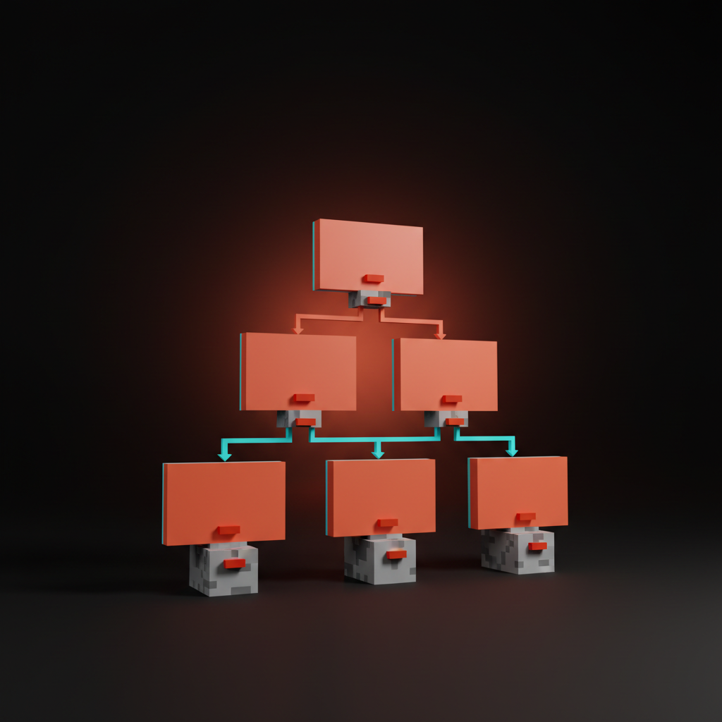
Multi-tenant setup. Workspaces, organizations, and team scopes have real consequences. A new admin spinning up a Vercel team or a Linear workspace needs an explicit setup because the choices propagate.
Enterprise SSO and identity provisioning. SAML, SCIM, custom domains, IdP integration. The user is an admin doing a configuration task, not a new user looking for value. A wizard is the right answer here.
Irreversible actions. Deleting a workspace, transferring billing, signing a contract. Every irreversible action deserves a confirmation flow that walks the user through the consequence. The designing friction on purpose breakdown covers why slowing down is the right move when the action cannot be undone.
The pattern: high-stakes, regulated, or destructive gets the explicit flow. Exploratory, reversible, or low-stakes skips it. Most product onboarding is the second category, and most teams design it like the first.
The no-onboarding audit
Run any first-run flow through these five questions. Fail two or more and the onboarding is doing work the product itself should be doing.
- Is the user inside the product within thirty seconds of arrival? If no, the welcome modal is the bottleneck.
- Does the first screen show a real surface, or a tour? A real surface is a textarea, a canvas, an inbox, an editor. A tour is a coach mark over an interface the user cannot use yet.
- Has the product pre-filled everything it could have pre-filled? Workspace name, project starter, framework, currency, locale. If the user is typing data the product could have inferred, the defaults are wrong.
- Are explanations scoped to the action, or front-loaded as a tour? Front-loaded is a tax. Scoped is a service. Same words, different timing, different result.
- Does the user produce a real output before the first session ends? A deployed site, a saved file, an answered question, a sent message. If they close the tab without producing one, the first run failed.
A flow that passes all five activates without the user ever feeling onboarded. They just feel like they used the product, and that feeling is the entire point. The prompt surfaces breakdown covers how the input itself carries this load when the AI is the core surface, and the AI product onboarding design piece covers cases where some onboarding still earns its keep.
FAQ
What is the difference between no-onboarding and a bad empty state?
A no-onboarding flow ships a deliberate first surface that activates the user without a tour. A bad empty state is a blank screen with no defaults, no suggestions, and no path forward. One is design, the other is neglect. The cleanest no-onboarding flows ship the strongest empty states, because the empty state is the onboarding.
Does no-onboarding work for B2B SaaS, or only consumer AI products?
Both. Consumer AI products like Claude, v0, and Lovable can ship pure direct-to-canvas. B2B often needs smart defaults plus in-product nudges, because the surface has more controls. Linear, Vercel, and Stripe Atlas are the proof. None of them ship a tour, and all of them are B2B.
When should I add a tour or checklist?
When the product has compliance, multi-tenant setup, SSO, or irreversible actions in the first session. Outside those four cases, a tour is almost always a UI patch over weak product design. The AI-native product design breakdown covers how to redesign the product so the tour is unnecessary.
Skip the tour, ship the surface
Onboarding without onboarding is not lazy product design. It is the highest-leverage product design left in 2026. Every minute spent on the tour is a minute not spent on the empty state, the smart defaults, the agentic first run, and the just-in-time hints that actually move activation.
The teams winning right now have already deleted the welcome modal, the checklist, and the tour. They replaced all three with a working surface, a sane default, and a single hint that fires when the user reaches for it. The user does not feel onboarded. They feel like they showed up and the product was already running. The landing page design principles breakdown is the marketing-page version of the same idea.
If you want a team that ships first-run flows without a tour, hire Brainy. We design AI-native product UI end to end, from the empty state to the first prompt to the moment the user produces something real, with no welcome modal in sight.
Want a first-run flow that activates in thirty seconds instead of explaining itself for five minutes? Brainy ships AI-native product UI, first-run audits, and onboarding redesigns that put the user inside the work, not in front of a modal.
Get Started