
Hero Section Design: 8 Patterns That Convert in 2026
Eight production hero section patterns teardown with Apple, Webflow, Hex, Mux, Klim, Loops, Liveblocks, Are.na, plus a stage-fit framework.
Hero Section Design: 8 Patterns That Convert in 2026
Your hero section is not a place to be original. It is a decision matrix with eight working patterns, and most teams pick the wrong one because they pick by mood board instead of by funnel stage.
The hero section is the most overdesigned part of the page
Most hero sections fail before the designer opens Figma. They fail because nobody asked the right question first: what does this visitor already believe when they land here?
Three visitor temperatures each demand a different hero:
- Cold visitor: needs proof before they will believe a claim
- Warm visitor: needs clarity to act on what they already half-believe
- Hot visitor: needs no friction, especially not a six-second animation they have seen before
The hero is not a brand expression opportunity. It is the first conversion gate. Every second of friction it generates is a visitor lost before they reach pricing, the demo request, or the signup form.
The single metric your hero controls is whether someone scrolls. That is the whole job.
The eight patterns below are not design trends. They are structures used by production brands that drive real revenue in 2026.
Each one works under specific conditions and breaks under others. Your job is not to copy the pattern that looks good on Dribbble. Match the pattern to the signal your visitor is carrying.
The eight patterns at a glance
| # | Pattern | Best for | Primary mechanism | Load risk |
|---|---|---|---|---|
| 1 | Product-shot centered | Consumer hardware, established brands | Visual confidence | Low |
| 2 | Split-screen | B2B SaaS with visible UI | Visual proof + claim | Low |
| 3 | Interactive demo | Product-led growth tools | Hands-on conviction | Medium |
| 4 | Video-first | Motion-native products | Category-fit medium | High |
| 5 | Big typographic statement | Type-led or cultural brands | Brand conviction | Low |
| 6 | Animated headline | SaaS with a crisp value prop | Attention + restraint | Low |
| 7 | Live collaborative demo | Real-time collaboration tools | Social proof via product | Medium |
| 8 | Brutalist minimal | Developer tools, design communities | Anti-marketing trust | Low |
Read left to right: each pattern maps to a product type, uses a specific psychological mechanism to earn belief, and carries a load risk that affects mobile performance. The wrong pattern loaded fast is still the wrong pattern. The right pattern loaded slow is a conversion killer.
Pattern 1: Product-shot centered, the Apple template
The product is the argument. Use this pattern only when the product is visible, beautiful, and capable of carrying the page alone.
When it fits. Apple's iPhone page in 2026 still runs the product-shot hero because nothing converts hardware like the object itself, lit perfectly, at viewport scale. The product has to be beautiful enough to carry the page alone. If your product is invisible, meaning SaaS, API, or infrastructure, this pattern is a lie.
How it works. A centered hero image with a short, declarative headline and one CTA. The visual hierarchy runs in three beats:
- Product carries the frame
- Claim sits under the product in plain language
- Action is a single CTA, no alternatives
White space is structural, not decorative. Nothing competes with the product for attention. Apple's current iPhone page runs under 15 words above the fold, and every word is load-bearing.
Where it breaks. When teams borrow this pattern for products that don't look like anything. A screenshot of a SaaS dashboard is not an iPhone. A generic lifestyle photo filling the centered slot is not a product shot. If you are reaching for a metaphor image to fill the hero, you are using the wrong pattern.
Pattern 2: Split-screen, when the product is the proof
The product is the evidence and the headline is only the frame. This is the cleanest B2B pattern when your UI shows what the product does better than copy can.
When it fits. Split-screen belongs to B2B SaaS products with a UI that explains itself. Hex ran a split-screen hero in 2026 with the product notebook filling the right half and the value claim on the left.
How it works. Left half carries the narrative. Right half carries proof. The layout divides cognitive load cleanly.
Visitors who read first go left. Visitors who scan visually go right. Both paths lead to the same conviction. The best split-screen heroes let the product screenshot do more persuasion work than the copywriter.
Where it breaks. Split-screen fails when the product screenshot needs explanation. If a visitor looks at your right half and doesn't understand what they're seeing in under two seconds, you've replaced your hero with a support ticket. The screenshot must be self-evident at a glance. If it needs a caption, it's doing the wrong job.
Pattern 3: Interactive demo, when seeing is selling
Touching the product is faster persuasion than reading about it. Ship this when the visitor's first objection is "I do not know if I can do this."
When it fits. Webflow's homepage in 2026 lets you drag, drop, and interact with the canvas before you have read a headline. That is the right move for a product whose value proposition is tactile.
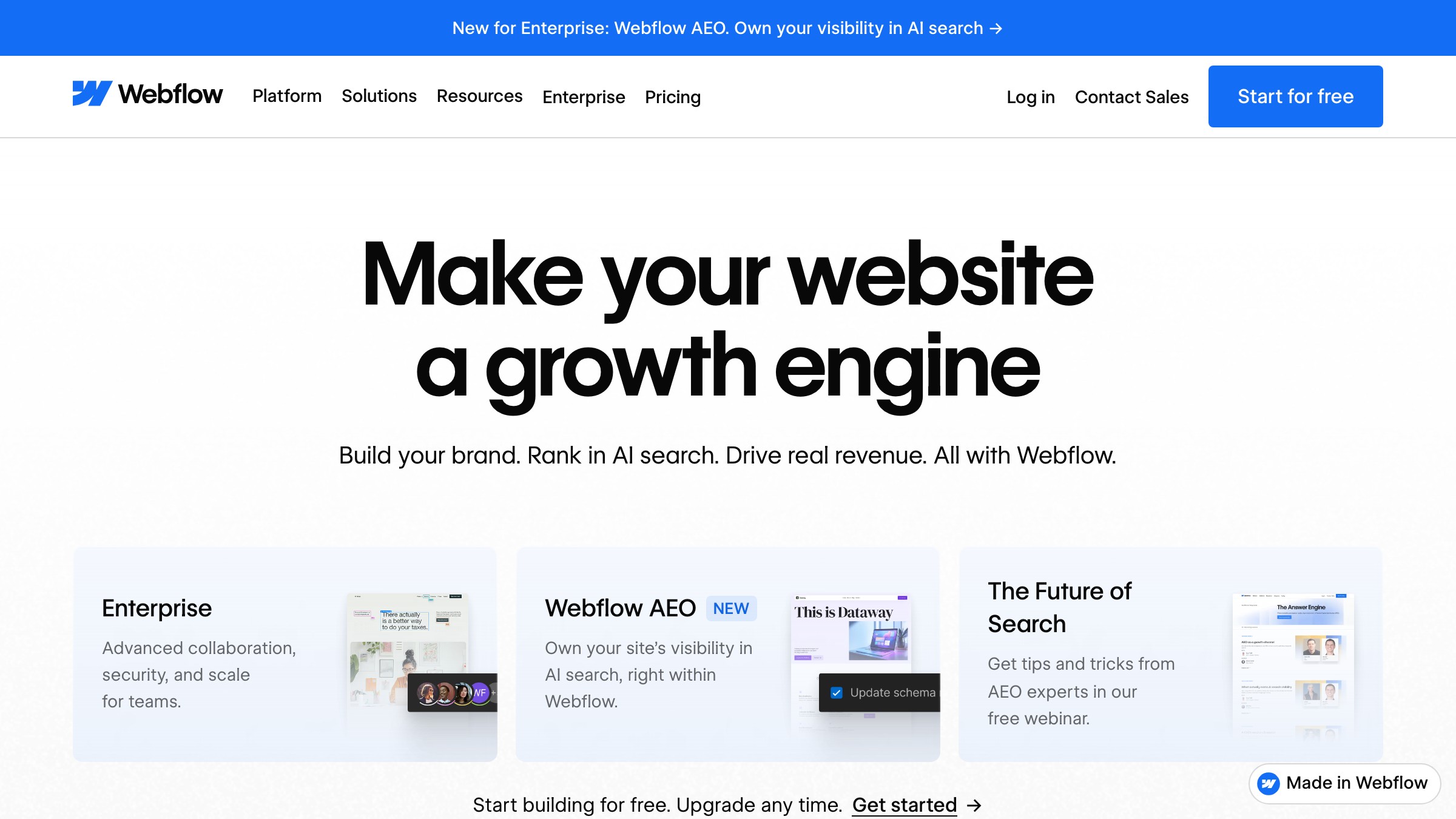
How it works. The hero loads an embedded, interactive product environment that is simplified, constrained, and real enough to trigger a "wait, I can do that" moment.
The CTA lives below the interaction zone, not above it. Webflow's structure says, touch the product first, then we will talk about signing up. Conviction comes before the call to action.
Where it breaks. Performance. An interactive hero is a JavaScript bundle, and JavaScript bundles kill mobile Lighthouse scores. If the majority of your traffic comes from mobile, this pattern requires serious engineering investment.
It also breaks when the demo is too simplified to feel real, or too complex to figure out without a tutorial. Confusion in the hero is worse than no demo at all.
Pattern 4: Video-first, when motion is the message
Video in the hero is justified only when the product category and the medium are the same thing. For most other products it is a production budget trying to cover for a weak value proposition.
When it fits. Mux builds video infrastructure. Their hero in 2026 uses video because showing the product means showing video itself.
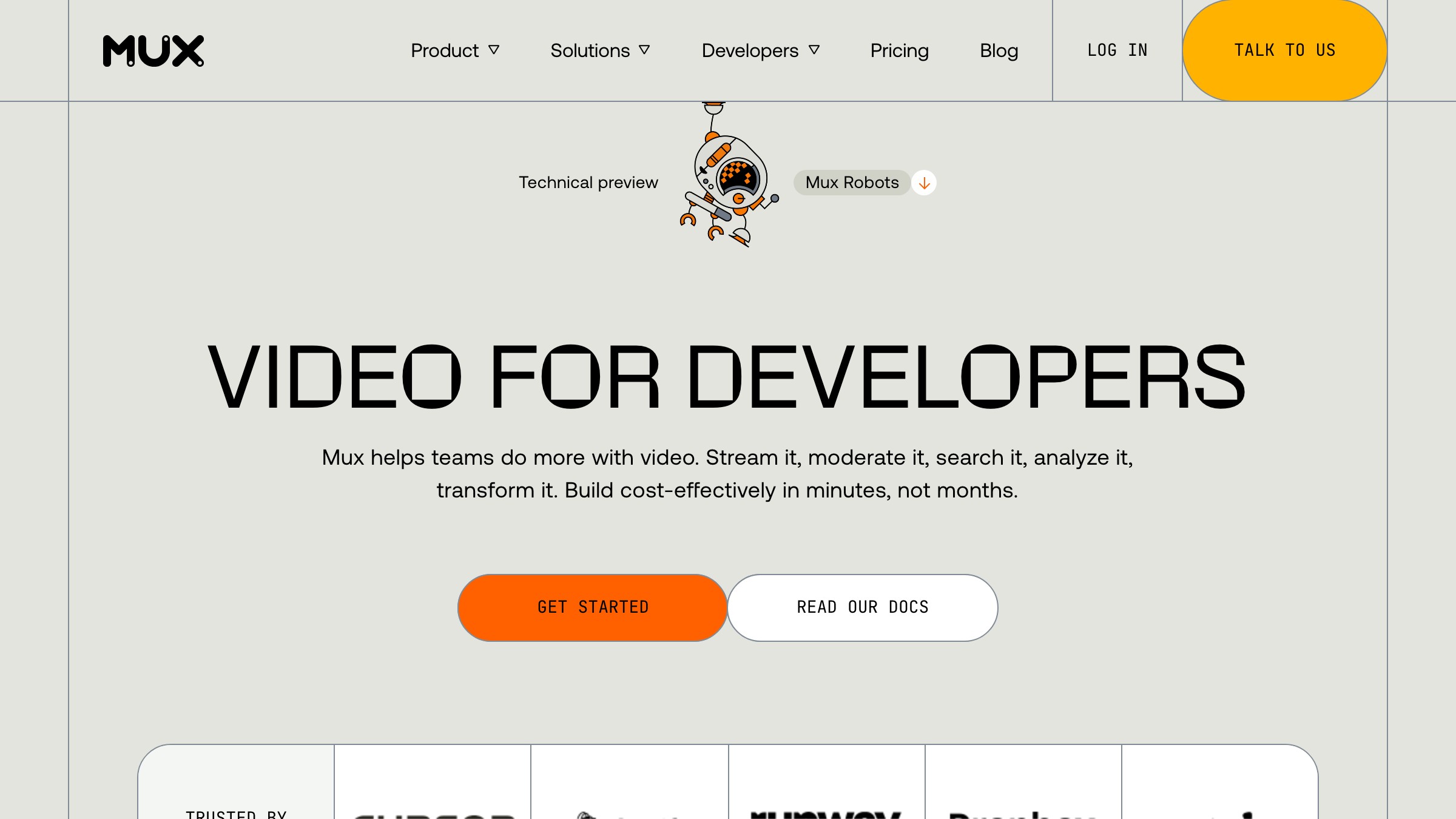
How it works. Mux autoplays a muted looping video demonstrating the quality and smoothness of their encoding pipeline. No controls, no pause button, no scrubber. It loops behind the headline and CTA.
The video is not decoration, it is the product demo. One second of watching communicates what the headline would take 40 words to explain. Medium and message are the same thing.
Where it breaks. Bandwidth and load time. A hero video that does not load in under two seconds on a mobile connection converts worse than a static image with a play button.
Video heroes require aggressive optimization:
- Compressed WebM or AV1, not MP4
- Poster frame served immediately while the video loads
- Lazy-load on mobile to skip the cost on smaller screens
They also break when the video is generic B-roll of happy people in open offices. That video says nothing and costs you seconds of load time to say nothing.
Need a hero that converts your specific audience, not a generic landing page? Brainy ships landing pages.
Pattern 5: Big typographic statement, when the brand carries the claim
The type IS the product, or the brand has enough authority that one confident line carries the page. Big type signals conviction; reach for it only when you can back the claim.
When it fits. Klim Type Foundry's homepage in 2026 uses the type itself as the hero. The headline is set in one of their own typefaces, at display scale, with nothing else competing for attention.
The pattern extends to any brand with enough cultural authority that the statement lands without needing visual support.
How it works. Full-width display-scale typography. One headline, an optional sub. No product screenshot, no illustration, no lifestyle photo.
The type carries everything. The line has to be both memorable and specific. Klim doesn't say "beautiful fonts for modern brands." They say something with weight.
The confidence of the typesetting signals the quality of the product before a visitor reads a single word.
Where it breaks. When the brand isn't established enough to make the bet. A startup with three months of runway running a pure-type hero reads as "they couldn't afford an illustrator." Big typographic statements require earned brand authority or genuinely exceptional copy. Without one of those two things, this pattern reads as empty no matter how well the type is set.
Pattern 6: Animated headline, when restraint is the differentiator
One word moves while everything else stays still. That contrast is the entire attention mechanism, and the moment more elements move, the contrast dies.
When it fits. Loops uses an animated cycling headline to capture attention and communicate that their product serves multiple use cases. The animation is minimal: a word or phrase swapping at a measured pace, not a particle explosion.
This pattern works when the product has several strong value propositions and one static headline cannot carry all of them without turning into a run-on sentence.
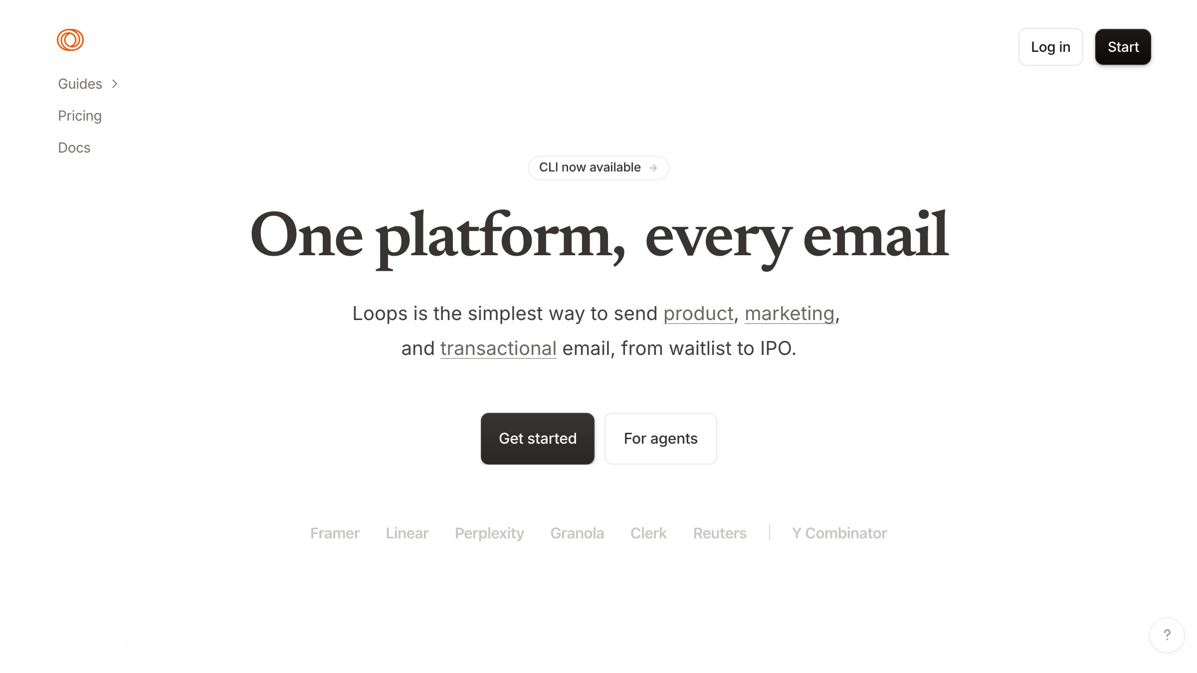
How it works. A short headline with one variable word or phrase that animates through a short list. The cycle is slow enough to read, fast enough to not feel like a progress indicator.
Everything else on the page is still. That stillness is what makes the animation land. Loops pairs the animated line with minimal supporting copy and a single clear CTA.
Where it breaks. Animated headlines fail in three predictable ways:
- The cycle words are vague ("transform," "elevate," "reimagine") and the motion becomes noise
- The motion substitutes for a real value proposition instead of supporting one
- More than one element starts moving, and the page begins to feel like a push notification
Each failure mode dilutes the contrast that makes the pattern work in the first place.
Pattern 7: Live collaborative demo, when the social proof is the product
The realization "this is actually working right now" is a more powerful pitch than any headline. Ship this when the collaborative feature is visible, real-time, and inherently compelling to watch.
When it fits. Liveblocks builds real-time collaboration infrastructure. Their hero in 2026 shows live cursors from multiple users moving across a shared canvas, with presence indicators showing who is in the document.
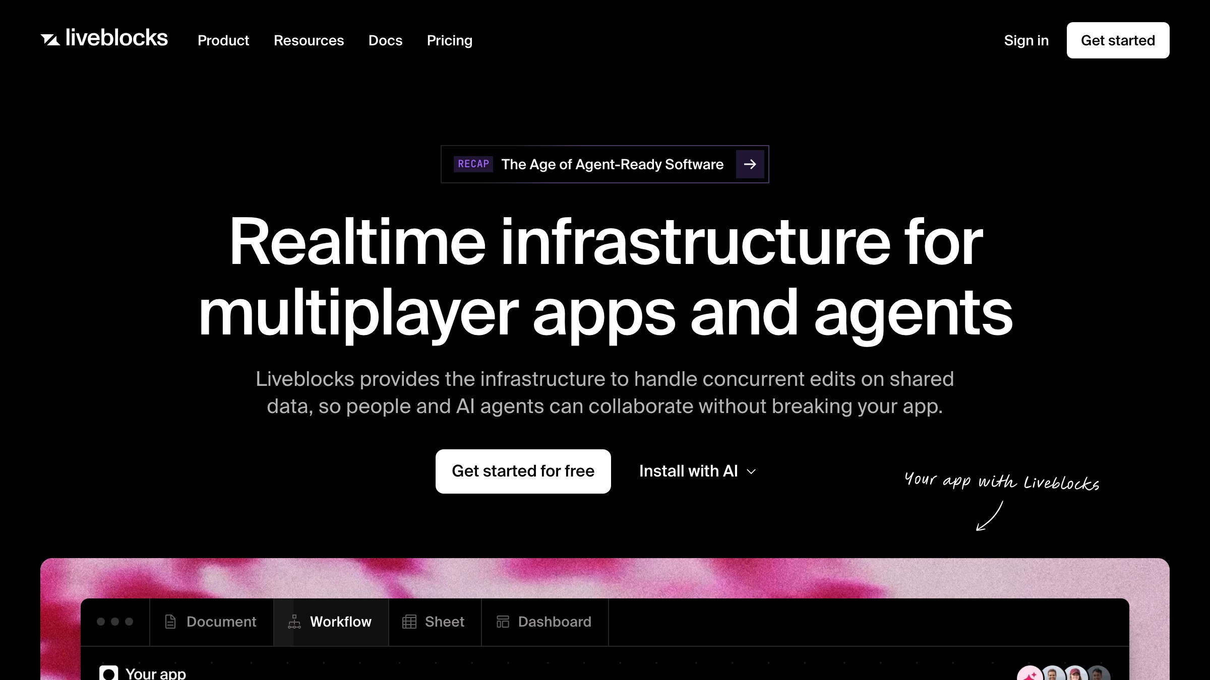
The product is collaborative presence. The hero demonstrates collaborative presence. The alignment is exact. This pattern works when the core product feature is visible, real-time, and inherently compelling to watch.
How it works. The hero loads a product instance or a high-fidelity simulation showing multiple users active simultaneously. Liveblocks uses real WebSocket connections in their demo, so the cursors and presence indicators are genuine.
Visitors become aware they're not watching a recorded video. That realization is the conversion moment. "This is actually working right now" is a more powerful pitch than any headline a copywriter can write.
Where it breaks. Engineering complexity and demo fidelity. A live demo hero that glitches, lags, or shows zero other users because no one else is currently on the page breaks trust faster than any weak headline could. It also fails for products where collaboration is secondary to the core workflow. Don't build a live multi-user demo hero if most of your users work alone.
Pattern 8: Brutalist minimal, when the audience is allergic to marketing
The anti-pattern IS the positioning. Brutalist minimal repels the wrong visitor on purpose and earns trust from the right one through restraint.
When it fits. Are.na's homepage in 2026 is a block of text. No hero image, no animation, no gradient CTA button. It describes what the platform is in plain language and provides a sign-in field.
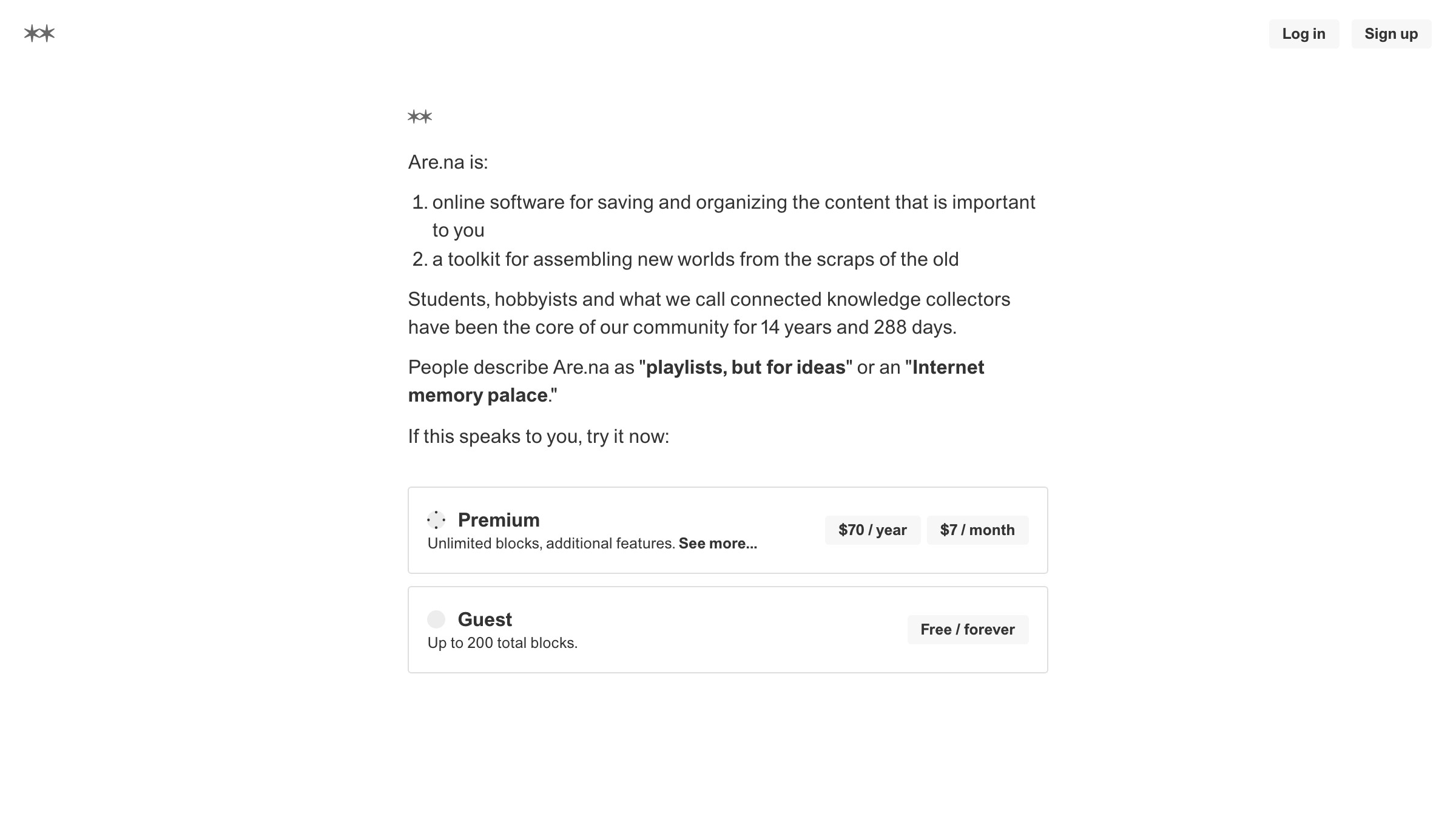
The audience Are.na serves (artists, researchers, designers who distrust curation algorithms) would be repelled by a polished marketing hero. The anti-pattern IS the product positioning.
How it works. No image. No motion. Minimal or zero visual hierarchy beyond typographic weight. Copy reads like a description, not a pitch.
Any interactivity is functional (a search field, a login form), never decorative. The brutalist minimal hero signals: we are not here to sell you. We are here to work.
That signal self-selects for exactly the audience these products want, and repels everyone else. The repulsion is a feature.
Where it breaks. When the brand uses this pattern to seem sophisticated without having earned the community trust that makes it work. Are.na can run a text-only hero because their community knows the project and trusts the people building it. A new B2B SaaS with no brand history running a brutalist minimal hero reads as a broken page, not a design choice.
How to pick the right pattern for your funnel stage
The eight patterns above are tools. The framework for picking the right tool has two axes: how aware is your visitor when they arrive, and how complex is your product to communicate?
| Awareness level | Product complexity | Recommended patterns |
|---|---|---|
| Cold | One-line claim | Big type, animated headline |
| Cold | Needs a demo | Interactive demo, split-screen |
| Cold | Multi-feature | Split-screen, interactive demo |
| Warm | One-line claim | Product-shot, animated headline |
| Warm | Needs a demo | Interactive demo, live collaborative |
| Warm | Multi-feature | Split-screen, video-first |
| Hot (repeat/direct) | Any | Product-shot, brutalist minimal |
| Community-native | Anti-marketing | Brutalist minimal |
Cold traffic comes from paid ads, social, or top-of-funnel SEO. These visitors don't know your brand and arrive carrying skepticism.
Big type fails cold visitors unless the line is genuinely surprising. Product-shot fails cold visitors unless the product is immediately beautiful and legible. Interactive demo and split-screen earn cold traffic because they show instead of claim, and showing does not require brand trust.
Warm traffic arrives via email, referral, retargeting, or branded search. These visitors already believe you might be relevant. The hero's job shifts from "earn attention" to "earn the click." Product-shot and animated headline work well here because the visitor is willing to spend a moment before deciding.
Hot traffic, meaning direct or repeat visitors, already knows the brand. Brutalist minimal and product-shot both work here because the visitor is past persuasion mode and into action mode. Don't slow them down with an interactive demo they've already seen.
For a deeper breakdown of how the hero fits into the rest of the page, read the full SaaS landing page anatomy and landing page design principles.
The four-question checklist before you ship
Before pushing a hero to production, run these four questions. Each maps to a specific failure mode that ships in real products every week.
-
Does this pattern match my traffic temperature? Cold traffic plus a big typographic statement plus a weak line equals a hero that earns no scrolls. Check your UTM data and analytics before assuming your traffic is warm. Most teams overestimate how warm their traffic is.
-
Is there visible proof above the fold? A claim without a product screenshot, a real customer name, or a concrete number is an assertion. Assertions require trust you haven't earned yet. Proof earns trust in one frame.
-
Is there exactly one CTA? Two CTAs split focus. Three CTAs create decision paralysis. The hero is not a place to offer options. One action, one button, one result.
-
Does this hero load under 2.5 seconds on a 4G connection? Video heroes and interactive demos are performance risks that need to be measured, not assumed. A hero that drops your Lighthouse performance score below 70 is costing you conversion on every mobile visit, quietly, every day.
If you pass all four, ship it. If you fail one, fix that one thing before touching anything else. The checklist is sequential: question 1 is more foundational than question 4.
FAQ
What makes a hero section "convert"?
A converting hero does one thing: makes enough visitors scroll, click, or sign up to justify the traffic cost. Conversion is not one specific button click. Define your conversion event before designing, then measure whether the hero serves it.
How long should hero copy be?
As short as the product allows. Apple's iPhone hero runs under 15 words above the fold. Target one headline, one optional sub, one CTA. Every word above that count needs to earn a specific belief the shorter version cannot.
Should the hero CTA say "Get started"?
Usually no. "Get started" is generic enough to fit any product, which means it communicates nothing specific about yours. The best CTAs are concrete: "Try the demo," "Ship your first video," "Start for free, no card required."
How do I know if my hero is working?
Scroll depth, CTA click rate, and bounce rate from paid traffic. Organic traffic carries selection bias and will inflate your numbers. If more than 60-70% of paid visitors bounce without scrolling, the hero is failing.
What is the fastest way to improve an existing hero?
Remove something. Most heroes fail from complexity, not scarcity. Remove the secondary CTA, remove the ambient animation, remove the sub-headline. Constraints force the remaining elements to work harder.
Stop letting your hero be a decision by default
Most heroes ship because someone in a Figma file said "let's go with something like Linear" and nobody pushed back hard enough. That hero is not designed. It is borrowed without understanding why it works for Linear's specific traffic, product complexity, and audience awareness level.
There are eight patterns. Each one has a use case, a mechanism, and a failure mode. The brands in this article (Apple, Hex, Webflow, Mux, Klim, Loops, Liveblocks, Are.na) are not using these patterns by accident. Every one of those heroes is the result of a deliberate decision about who lands on the page and what that visitor needs to believe before they take the next step.
Match the pattern to the visitor. Execute it with discipline. Measure whether it worked before you redesign it.
For more UI teardowns at this depth, read the landing page design playbook and browse more UI breakdowns. If you want Brainy to build it instead: have Brainy ship your landing page.
Need a hero that converts your specific audience, not a generic landing page? Brainy ships landing pages.
Get StartedGet new papers by email
New Brainy papers in your inbox. Confirm once, unsubscribe anytime.