

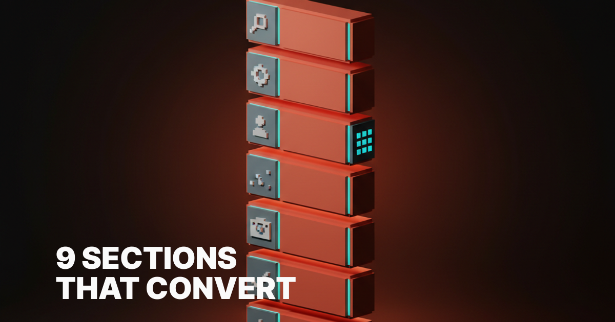
SaaS Landing Page Design: 9 Sections That Convert in 2026
The 2026 SaaS landing page design anatomy. Nine sections, why each earns its place, with live teardowns of Stripe, Arc, Resend, Clerk, and Railway.
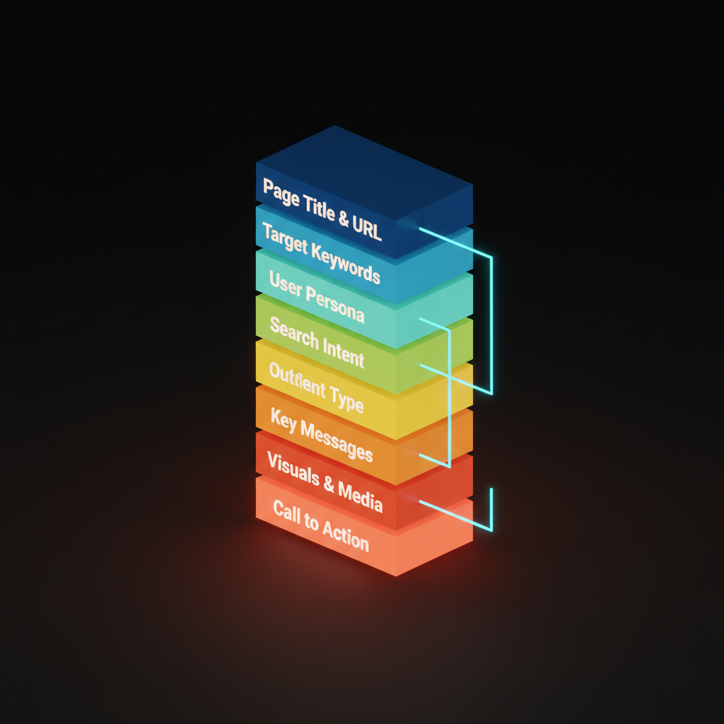
SaaS landing page design has nine sections, in this order, and almost no acceptable substitutes. Every well-converting page on the modern web, from Stripe to Linear to Resend, runs through this same anatomy.
Most pages fail because they are structured like brochures: here is what we built, here are some screenshots, here is a button at the bottom. The nine sections below answer real buyer objections in the order a skeptical buyer asks them.
Why anatomy beats inspiration
Inspiration-driven design produces pages that look great in screenshots and die in practice. A founder copies a beautiful hero, ignores the logic, and ends up with a page that has no forward momentum. Visitors scan it, feel vaguely impressed, and close the tab.
Anatomy is different: a sequence of jobs where each section answers a specific objection before the visitor raises it. Get the order right and the page reads like a good argument; get it wrong and visitors feel confused, then gone.
The nine sections below are not a rigid template. They are a decision framework. Skip one only if your product genuinely does not need it, and you can say exactly why.
Section 1: the one-second hero
The hero has one job: stop the bounce. Three things make it work:
- A headline naming the benefit, not the feature
- A sub-headline adding "for who" and "so that"
- A primary CTA
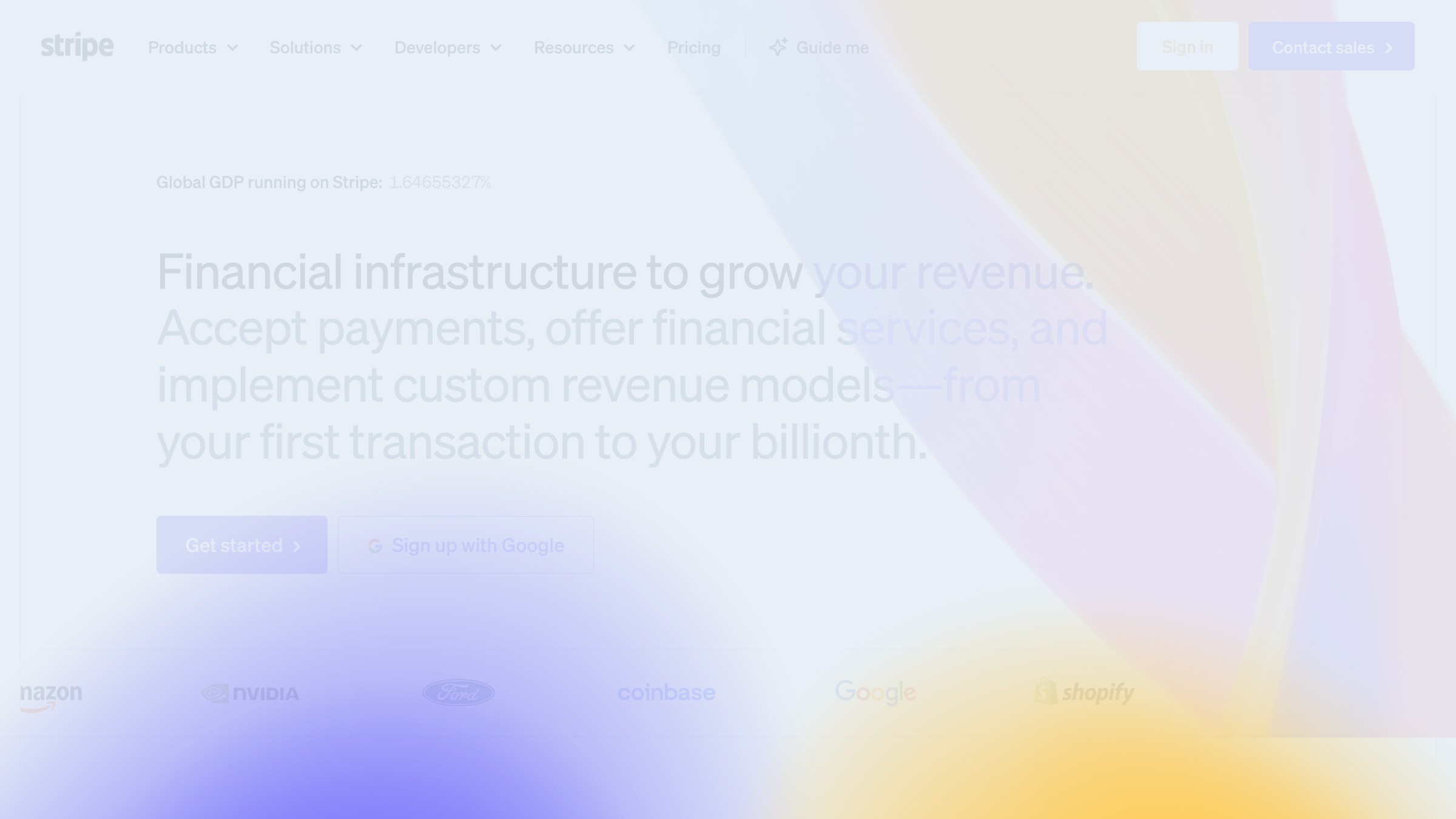
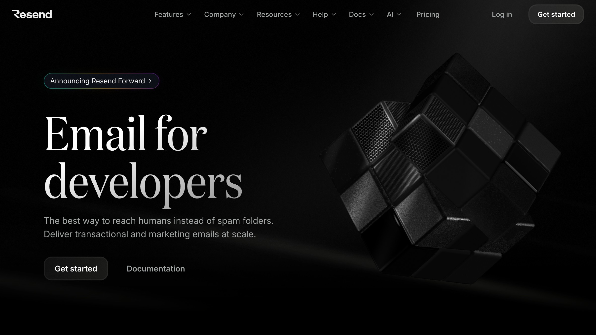
Stripe's homepage is the canonical example. "Financial infrastructure for the internet" is precise, not clever. The product is large, the headline is small, the CTA says "Start now."
Two hard rules: no auto-playing background videos. No carousels. Both break the one-second test before the visitor reads a word.
Section 2: the proof strip
Immediately below the hero, before the visitor has scrolled more than a hundred pixels, you need social proof that does not require reading. Logo strip or stats bar, positioned here.
Logo strips work when the logos are recognizable. Stats work when numbers are defensible ("10,000 developers" beats "trusted by teams worldwide"). Placing this section after the feature breakdown is the common mistake; by then, the skeptic is gone.
One rule: only logos you have explicit permission to display, only numbers you can actually back up.
Section 3: the problem reframe
Skipping the problem reframe is the most expensive mistake on most SaaS pages. After proof, this is where the visitor decides they belong.
The problem reframe is two to four sentences, sometimes a short list, that names the friction the visitor already lives with. Its job is the recognition "yes, that is my problem, and this page is for me," which also filters out visitors who do not have that problem.
This section does not need a headline that reads "The Problem." Frame it as context, a frustrated question, or a cost. Just name it.
Section 4: the product demo block
This is the most important section on the page and the one most teams execute worst. A screenshot of a dashboard is not a demo. A GIF of a loading spinner is not a demo.
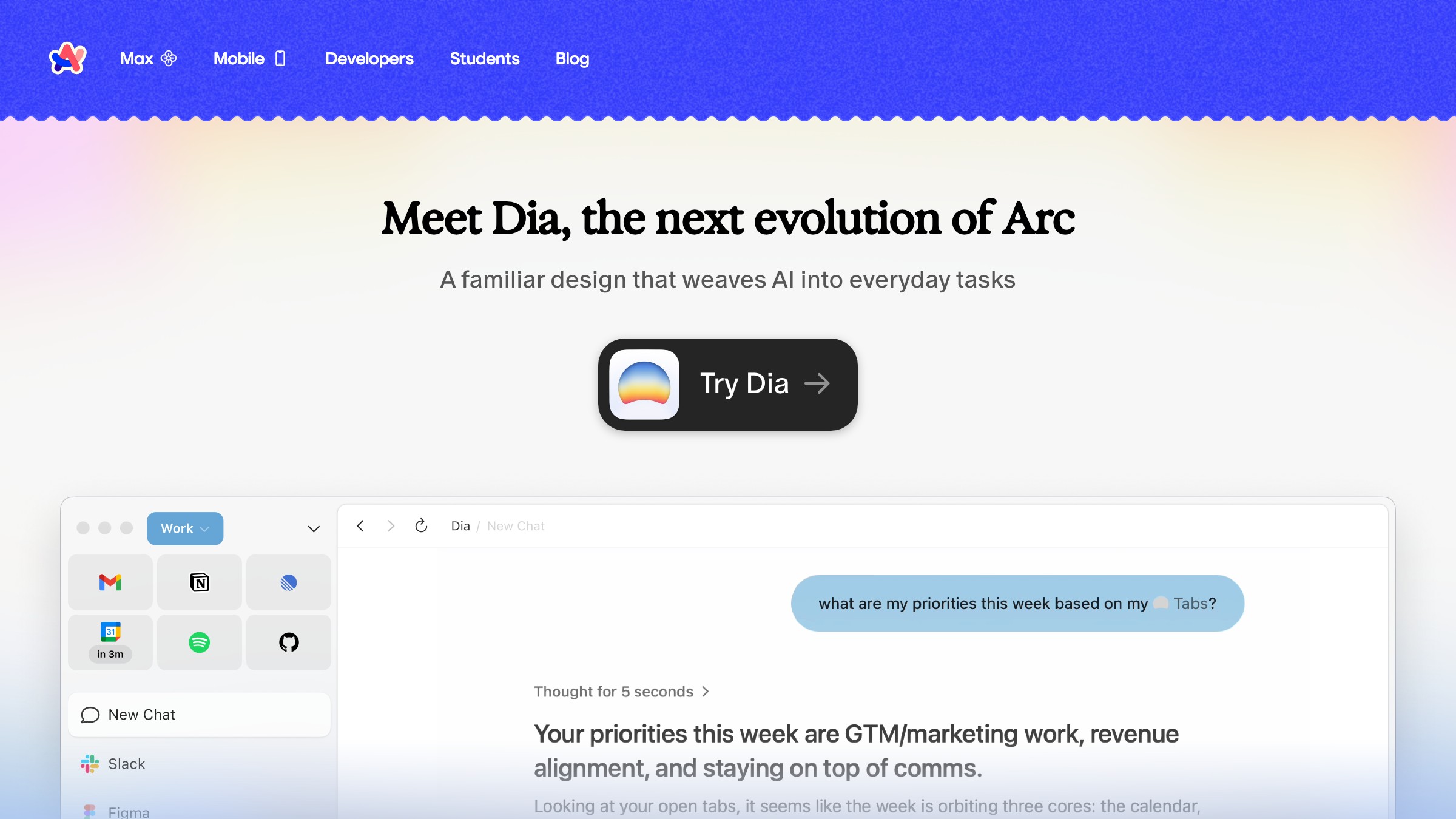
A real demo block shows the product doing its core job in the context of a real workflow. Arc Browser's homepage earns this: instead of describing what Arc does, it shows the interface under genuine use conditions.
The visitor does not have to imagine the product working. They see it working.
Format options in descending order of trust:
- Interactive embed of the real product.
- Screen recording with narration.
- Annotated screenshot sequence.
- Single annotated screenshot.
Never a marketing render that does not look like the actual product.
Section 5: the feature breakdown
Feature breakdowns fail when product teams write them without visitor-facing edits. The result: twelve bullets with icons and headers like "Powerful Collaboration" and "Seamless Integration."
The version that works: three to six features, each built as:
- Benefit-first headline
- Two-sentence explanation
- Micro-visual or code snippet where available
Resend's homepage does this exactly. Their feature copy reads like documentation, not marketing fluff. For a developer audience, that is the right call.
Consider bento grids as a feature block if your features have different visual weights. They let you size features by importance instead of filing them into identical cards.
Section 6: the use-case grid
A feature breakdown tells people what the product does. The use-case grid tells people whether the product is for them. These are different things, and most SaaS pages only do one.
Clerk handles this well. Instead of describing the auth API in abstract terms, they frame the product as a felt experience for different audiences: the startup that needs auth fast, the enterprise that needs it locked down tight.
Two use cases, two tones, same product. Conversion improves when the visitor can place themselves in the scenario.
Use-case section formats that work:
- Tabbed interface, one tab per audience.
- Toggle-reveal cards that swap copy and screenshots.
- Two-column grid with named personas.
What use-case sections cannot be is a third feature list in a different layout.
Section 7: the price honesty
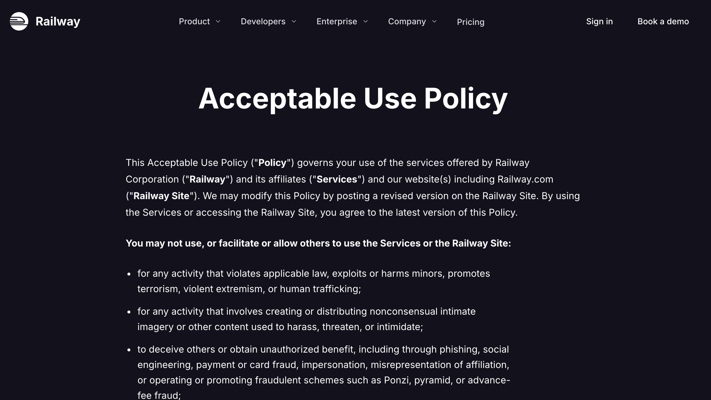
Hiding pricing does not prevent price anxiety. It amplifies it. If you have a self-serve product with visible tiers, show them. Railway's homepage is the benchmark: tiers are named clearly, the free tier is visible without fine print, the self-serve motion is legible before a visitor commits to a call.
| Pricing format | What it signals | Risk |
|---|---|---|
| Visible tiers with prices | Confidence, transparency | None if pricing is competitive |
| Visible tiers, prices hidden | Expensive or complicated | Bounce before the form gets filled |
| "Contact us" only | Enterprise-first, no self-serve | Filters out the prosumer segment entirely |
| Free tier not shown | You don't really have one | Visitor assumes it is a trap |
If you are pure enterprise with negotiated contracts, a "Talk to sales" tier is fine. But if you have a $20/month pro plan, show it.
Section 8: the integration shelf
Integration shelves earn their place only if your product connects to other tools. Skip the section entirely if it does not.
The integration shelf is a trust signal for the person already locked into a stack who needs to know your product will not break what they have.
Three valid formats:
- Logo grid of the most common integrations.
- Search bar if you have fifty-plus integrations.
- Curated short list of the five your target audience uses daily.
Do not list every integration alphabetically. That is an engineering exercise, not a sales argument.
Section 9: the final CTA
The final CTA tips a visitor who has decided the product is plausible into action. That is a different emotional job than the hero CTA, and it deserves different copy.
Making them identical is the mistake. If the hero says "Start for free," the final CTA can say "Your first project is free. You can be set up in five minutes." Specificity at the bottom of the page converts better than brevity.
Empty states deserve the same care as this section. Both live at the moment the user decides whether to commit, and both are almost always underwritten.
Six teardowns from 2026
| Brand | Section done right | What makes it work |
|---|---|---|
| Stripe | Hero | Utility-first headline. No wordplay. CTA is "Start now," not "Get started today." |
| Arc | Demo block | Shows the interface in use, not a marketing render. Proof through product, not pitch. |
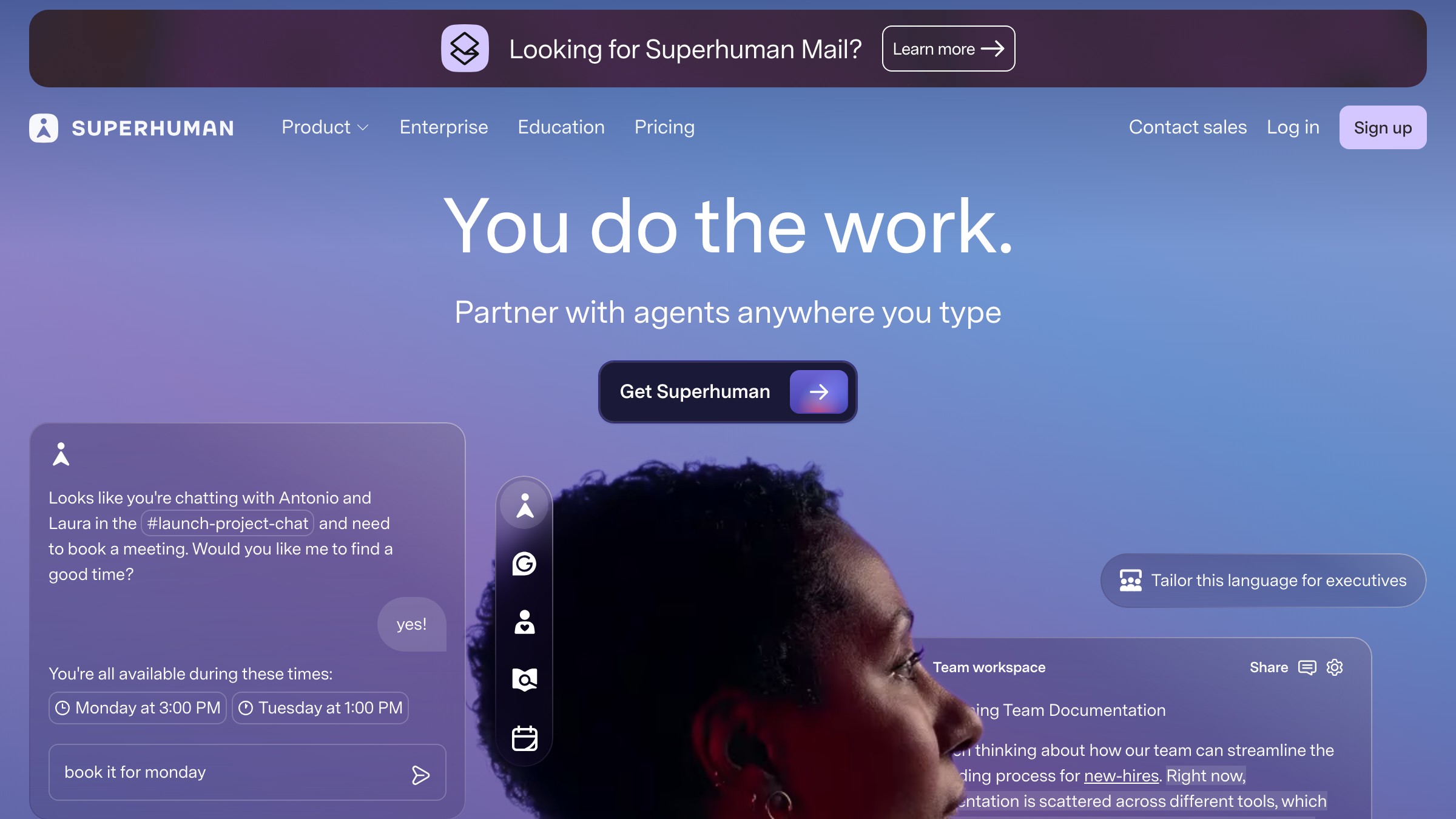
| Superhuman | Hero | Price is loud, audience is narrow. The page filters who converts before they scroll. |
| Resend | Feature breakdown | Documentation-style copy for a dev audience. Trust through precision, not enthusiasm. |
| Clerk | Use-case grid | Auth sold as a feeling, not an API spec. Different emotional frames for different buyers. |
| Railway | Price honesty | Tiers visible, free tier visible, no "contact for pricing" on self-serve plans. |
Need a landing page that actually converts, not another feature-row wall? Brainy ships landing pages.
What to cut when in doubt
| Section | Cut if... | Keep if... |
|---|---|---|
| Problem reframe | Audience arrives already sold | Cold traffic with mixed intent |
| Integration shelf | Fewer than three notable integrations | Stack-compatibility is a real purchase driver |
| Use-case grid | Single clear buyer type | Multiple segments with different needs |
| Pricing | Pure enterprise, no self-serve | Any self-serve or hybrid motion |
| Proof logos | No recognizable logos | At least two logos the audience will recognize |
| Final CTA | Never cut this | Always |
Every section you add makes every other section compete harder for whatever patience the visitor has left. When in doubt, cut. A shorter page with clear momentum outperforms a complete page with diluted attention.
FAQ
How long should a SaaS landing page be?
Long enough to answer every objection a qualified visitor would raise, no longer. For most self-serve SaaS products, that is the nine sections above. Enterprise products with longer buying cycles can run longer with case studies and security sections added. The ceiling is your visitor's patience, not your feature count.
Should the hero have a video?
Not in the hero position. A background video loop adds noise before the visitor has read a word. If you want video, put it in the demo block where context already exists and the visitor has elected to engage.
What order should testimonials appear in?
Logo strips and stats go directly below the hero. Quote-based testimonials belong adjacent to the section they reinforce: a quote about speed near the demo block, a quote about support near pricing. Stacking all testimonials at the bottom treats them as decoration instead of objection-handlers.
How many CTAs should appear on the page?
One primary CTA, repeated at natural decision points: after the hero, after the demo block, and in the final section. A secondary CTA alongside the primary is fine if you genuinely offer two conversion paths. More than two CTA types at any single point creates choice paralysis.
Do I need a navigation bar on a landing page?
It depends on your traffic source. Paid traffic converts better with no navigation, fewer exits. Organic traffic benefits from minimal navigation so visitors can explore related content if they are not ready to convert. A sticky header with the logo and one CTA is a reasonable default for mixed traffic.
Stop treating landing pages like brochures
A brochure lists what exists. A landing page answers what the visitor is already thinking. The nine sections above are not there to fill space. They are there because a visitor without clear answers to "is this for me," "does this work," and "what does it cost" will leave without a second thought.
The SaaS pages that convert in 2026 look simple because they made a hundred deliberate cuts. Every section that could not justify its slot is gone. What remains is a clear argument in nine steps, in the right order, leading to one action.
For more on the visual side of conversion design, more web design teardowns are in the Brainy archive. And if you want someone to build the whole thing correctly from the start, have Brainy redesign your landing page.
Need a landing page that actually converts, not another feature-row wall? Brainy ships landing pages.
Get StartedNot ready to hire? Run the free Business Genome, an 11-dimension diagnostic for your venture.
Get your free GenomeGet new papers by email
New Brainy papers in your inbox. Confirm once, unsubscribe anytime.


