

The Empty State Is Your Product, Not An Afterthought
The empty state is the most important screen in your product, and most teams ship it last. A canonical guide to designing every variant, with examples.
The most important screen in your product is the one with nothing in it. That is the screen most teams ship last, design least, and then forget exists.
Open any new app for the first time. Inbox is empty, projects list is empty, search returns nothing, you just cleared a board. Five different moments, five different empty screens, and almost every product treats them like the same problem.
They are not the same problem. They are five completely different design surfaces, and together they decide whether someone keeps using your product or quietly closes the tab.
Why the empty state is your real first impression
People do not judge your product by your homepage. They judge it by the second screen, the one after they sign up, the one where they expected magic and got a sad illustration that says "Nothing here yet."
That moment is the entire pitch, compressed. It tells the user what is possible, what to do next, and how much you actually thought about them. Get it right and they lean in. Get it wrong and they bounce, and no amount of email re-engagement gets them back.
A great empty state does three jobs at once. It teaches what the feature is for, it sets the emotional tone of the product, and it gives the user a specific next action that is easier than closing the tab.
Most empty states do none of those things. They show a friendly cartoon, apologize for being empty, and hope the user figures it out. That is not design, that is a shrug.
The five types of empty (and why they need different treatments)
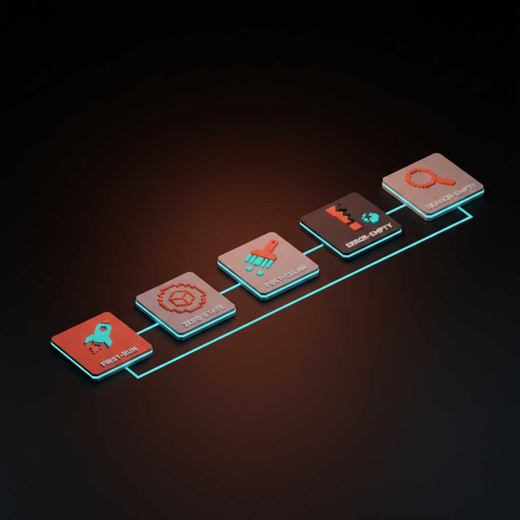
Treating all empty screens the same is the original sin of empty-state design. Here are the five distinct moments, in order of how often teams botch them.
-
First-run empty. The user just signed up, they have never seen this product before, and the screen has nothing because they have done nothing. This is the highest-stakes empty state in your product.
-
Zero-state empty. The user has been in the product before, but a specific area is naturally empty, like a fresh project, a new workspace, or a freshly created list. They know the product, they do not know this corner of it.
-
Post-clear empty. The user just emptied something on purpose. They cleared their inbox, finished all their tasks, archived everything. This is a moment of accomplishment, not absence.
-
Error-empty. The screen is empty because something failed. The fetch broke, the connection dropped, the integration is misconfigured. The user thinks the product is broken even when it is not.
-
Search-empty. The user typed a query and got zero results. They have intent, they have effort invested, and you returned nothing. This is the most rescuable empty state if you do it right.
Each type wants a different blend of explanation, action, and tone. A first-run state needs to teach, a post-clear state needs to celebrate, a search-empty state needs to suggest. Use the same generic "Nothing here" template for all five and you have wasted four of them.
Side by side: what each empty state should and should not do
The differences become obvious when you put them next to each other. Here is the cheat sheet.
| Empty type | When it appears | What it should do | What to avoid |
|---|---|---|---|
| First-run | User just signed up, has done nothing yet | Teach the core action with sample data or a guided first task | Sad face plus "Get started" with no destination |
| Zero-state | A specific area is fresh, but the user knows the product | Suggest 2 or 3 concrete actions, hint at templates | Repeating the entire onboarding tour |
| Post-clear | User just finished, archived, or emptied a list | Celebrate, then surface the next reasonable thing to do | Acting like the user did something wrong |
| Error-empty | The data failed to load or sync | Say what failed in plain English, give a retry, link a status page | Showing a generic empty state and pretending nothing is wrong |
| Search-empty | User typed a query, got zero matches | Show what they searched, suggest related queries, offer to create | "No results found" with a dead end |
Notice that the failure modes are nearly identical across the table. Most products default to the same generic message for every empty surface, which is why every empty state in most apps feels the same kind of mediocre.
The four design moves that make empty states work
There are exactly four moves you can pull. Most great empty states use two or three of them in combination, never all four at once, because that gets noisy.
-
Sample data. Pre-populate the screen with realistic example content the user can play with, edit, or clear. Stripe's dashboard with a "View test data" toggle is the textbook version.
-
Suggested actions. Surface two or three specific next steps as buttons or cards, not a vague "Get started" button. Notion's template suggestions on a fresh page are the move.
-
Teaching illustration. Use the visual to show what the populated state will look like, not a sad cartoon. A tiny preview of what an inbox or a board feels like once it is full.
-
Tone-setting copy. Three to twelve words that establish the product's personality and tell the user what this space is for. Linear's empty inbox copy has more brand voice in one line than most landing pages.
The trick is choosing the right combination per state. First-run wants sample data plus suggested actions, post-clear wants tone-setting copy and maybe a small celebration, search-empty wants suggestions and an offer to create. Match the move to the moment.

Real products that get this right (and what to steal)
The fastest way to internalize this is to study products that respect the empty state as a design problem. A short tour through some of the best.
Linear's empty inbox. Linear treats the empty inbox as a tiny vacation moment. The copy is dry, slightly funny, on-brand, and the visual is calm rather than apologetic. There is no "Get started" button because you do not need one.
Notion's template suggestions. A new Notion page is technically empty, but it never feels empty. The cursor sits ready, slash commands are hinted, and template suggestions appear contextually. You are never staring at a blank wall, you are staring at a menu of choices.
Figma's Drafts wall. A new Figma account does not show you a blank file list. It shows you the Drafts space with example files, hints about creating a team, and a clear path to the first canvas. You learn the product by looking at it.
Cron, now Notion Calendar's onboarded calendar. When you finish onboarding, the calendar shows your real connected events, but it also shows the keyboard shortcuts overlay and a few sample events that demonstrate the product's personality. You feel oriented within ten seconds.
Things 3's first launch. Things ships with an onboarding project that uses the product to teach the product. Each task is a lesson. By the time you check the last item, you have used every feature you need and the empty state is your real life.
More products worth stealing from (Granola, Superhuman, Stripe, Replit, ChatGPT)
A few more, biased toward newer products and AI tools, because the patterns are still settling there.
Granola's first transcript prompt. Granola knows that the most awkward moment is the first meeting where you have nothing to transcribe. So it offers to record a short test, or to import a sample transcript so you can see what the AI does. It removes the chicken-and-egg problem the product would otherwise have.
Superhuman's onboarding. Superhuman runs a real human onboarding call before you ever see an empty inbox, but the in-app first-run still teaches with sample emails and a keyboard-shortcut walkthrough. By the time you are alone with the app, the empty state feels like a feature.
Stripe's empty dashboard. Stripe shows a fully populated dashboard with sample data the moment you sign up. There is a clear "Viewing test data" indicator, and one click flips to your real, empty account. You see the destination before you see the path to it.
Replit's empty workspace. A fresh Replit workspace is not blank. It is a code editor with a starter file, a console with a friendly hello, and a run button that already works. You write code in the first ten seconds.
ChatGPT's blank prompt page. ChatGPT's empty state is famously a single text box, and it kind of works because the product has cultural pull. It still adds suggested prompts at the bottom for new users, which is the bare minimum. If you do not have ChatGPT's brand, do not copy ChatGPT's empty state.
The failure modes, named and shamed
Bad empty states fall into a small number of recognizable patterns. Once you can name them, you stop shipping them.
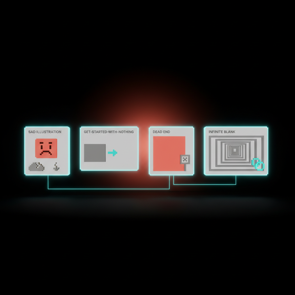
The sad illustration. A friendly mascot with droopy eyes next to "Nothing here yet." It feels cute in Figma, it feels insulting in the product. The user is not sad, the user just signed up.
The "Get started" button to nowhere. A big call-to-action that opens a generic create form with no context, no template, no example. The user clicks, sees a blank form, and now the empty state is two screens deep.
The dead-end state. Search returns nothing, end of story. No suggestions, no related results, no offer to create what they searched for. The user typed something, you said no, the conversation is over.
The infinite blank. Common in AI products. The whole interface is one empty input box waiting for a prompt. No examples, no defaults, no rails. The user types "hi" and bounces.
The activation math: why the first 60 seconds matter most
Every product has an activation moment, the first time the user does the thing that makes the product valuable. Sending the first message, creating the first project, importing the first contact, generating the first output.
The empty state is the screen between signup and activation. Every second the user spends staring at "Nothing here yet" is a second they could have spent activating, and the drop-off is brutal. The first 60 seconds of a session correlate more strongly with retention than the next 60 minutes combined.
This is why sample data and suggested actions outperform clean blank screens almost every time. They cut the activation distance from "decide what to do, then figure out how, then do it" down to "click this thing, see what happens, learn the product." Three steps to one.
If your activation rate is bad, your empty states are usually the cheapest fix in the entire product. Cheaper than redesigning onboarding, cheaper than tutorials, cheaper than email sequences. Just put something useful on the screen.
The AI angle: designing for the infinite empty
AI products have a unique empty-state problem. The interface is often a single input box that can theoretically do anything, which means it can practically do nothing until the user knows what to ask for. This is the infinite empty.
ChatGPT, Claude, image generators, Cursor, every AI tool faces this. The naive solution is a giant blank text field with "Ask me anything." The user, faced with infinite possibility, types something low-stakes, gets a generic response, and concludes the product is mid.
The fix is the same as in regular products, just sharper. Suggested prompts that show the range of what the AI is good at, sample conversations or generations that demonstrate quality, a few starter templates that get the user past the cold start. Granola's "record a test meeting" move applied to whatever your AI does.
Treat the input box as a sentence the user is finishing, not a sentence they are starting. Give them the first half. The infinite empty becomes a guided first move, and your activation jumps.

Tone and post-clear: the empty states with feelings
Most teams stop at first-run. The post-clear state is where the product gets to feel like a coworker who noticed.
Tone runs the whole show. Empty states are read in moments of low confidence. The user is new, or lost, or just finished something, or got an error. A snarky empty state in a finance app feels disrespectful, a formal one in a creative tool feels stiff, a cheerful one in an error case feels obtuse. Write empty-state copy from a single voice, with intentional variation by context.
Post-clear deserves a small celebration. The user just finished a list, archived everything, hit inbox zero. Things 3 puts up a tiny achievement message when you complete every task. Linear quietly celebrates an empty triage queue. The dopamine is real, and it is one of the few moments where the product is genuinely happy with the user.
Do not overdo it. A confetti animation every time someone clears five tasks gets old by Tuesday, while a clean, calm acknowledgment plus a thoughtful "what's next" suggestion lands every time. After inbox zero, suggest planning the day. After clearing a project, suggest reviewing the next one.
Error and search: the empty states that win or lose trust
These are the two empty states the user cares about most, because both happen mid-task with intent on the line.
Error-empty must design for trust. When data fails to load, most products show a generic empty state or a stack trace dressed as an error. Both destroy trust differently. The generic version is worse because the user does not even know the product is broken, they assume the empty inbox is real and never come back.
The right move is plain-English failure communication. Tell the user what failed in their words, not yours. Give them a retry, link a status page, point at the misconfigured setting. Bonus points if the error-empty state inherits the visual structure of the populated state, so the user understands what they are missing.
Search-empty is the most rescuable. The user typed something, you know exactly what they want, and "No results found" with a sad face is malpractice. The minimum viable version echoes the query and suggests related searches. The good version offers to create what they searched for. The great version uses the query to suggest a template, an action, or a help article.
GitHub's search-empty often suggests creating an issue with the query as the title. Notion suggests creating a page. Linear suggests filing a bug. Search-empty is the one place where "Get started" can earn its keep, because the destination is now obvious.
How to audit your own product's empty states
You cannot fix what you have not catalogued. Most teams are surprised by how many empty states they have once they actually count them. Run this audit, in this order.
Open every page of your product in a fresh, incognito session signed in as a brand-new user. Screenshot every screen that has any kind of empty surface. List them in a spreadsheet, one row per screen, with columns for type, current copy, current visual, and current action.
Then label each with one of the five types. First-run, zero-state, post-clear, error-empty, search-empty. You will find that most products have ten to thirty empty states, and only one or two have been intentionally designed.
For each, ask three questions, does it teach what this surface is for, does it give a specific next action, does it sound like the rest of the product. If yes to all, leave it alone, if any answer is no, fix that one move and move on.
If you want to make this a team activity, block 90 minutes and invite design, PM, and one engineer who hates writing copy. The agenda is dead simple, and you can ship results the same week.
First 30 minutes, do the audit as a team, sharing one screen, walking through every empty surface. Argue about which type each one is. Disagreement is fine, the conversation is the point.
Next 30 minutes, pick the three highest-traffic empty states and rewrite them on the spot. One sentence of tone-setting copy, two suggested actions, and a decision about whether to add sample data. Resist the urge to perfect the visuals, copy first.
Final 30 minutes, assign owners and a one-week ship target. Do not turn this into a quarterly initiative. Empty states are small, contained, and ship fast. Get three live this week, three more next week, and within a month your activation graph will move.
The empty state is the product's body language
You can fake the marketing site. You can fake the homepage. You cannot fake the empty state, because it is the moment the product stops promising and starts delivering.
When the user lands on a screen with nothing in it, every choice you made is on display. Did you think about them, or did you ship the default. Did you teach them the product, or apologize for being empty. Did you write copy that sounds like a person, or a wizard from 2008.
Treat the empty state like the front door, not the footnote. Design it first, not last. Audit it monthly. Hire someone to own it.
The most overlooked screen in your product is also the one your users see the most often. Make it count.
Want your product's empty states designed by people who treat them like the front door, not a footnote? Hire Brainy.
Get StartedNot ready to hire? Run the free Business Genome, an 11-dimension diagnostic for your venture.
Get your free GenomeGet new papers by email
New Brainy papers in your inbox. Confirm once, unsubscribe anytime.


