Gestalt Principles for Designers
The perception canon for modern UI. Eight Gestalt principles, one rule each, with real examples from Linear, Stripe, Vercel, Figma, Notion, Apple, Cursor, and Anthropic, plus an audit you can run on any screen.
Every interface you trust runs on Gestalt. Linear, Stripe, Vercel, Figma, Notion, Apple. None of them invented new perception rules. They obeyed the ones the human visual system has been running since before screens existed. That obedience is the difference between a screen that reads itself and a screen the user has to decode.
Gestalt principles are how the brain assembles raw pixels into meaning before the conscious mind shows up. Designers who know them ship interfaces that feel calm. Designers who do not ship interfaces that feel busy, even when the visual density is identical. The pixels are the same. The grouping is what changes.
This piece is the canon. Eight principles, one rule each, real product examples for every one, and an audit you can run on any screen before it ships. Bookmark it.
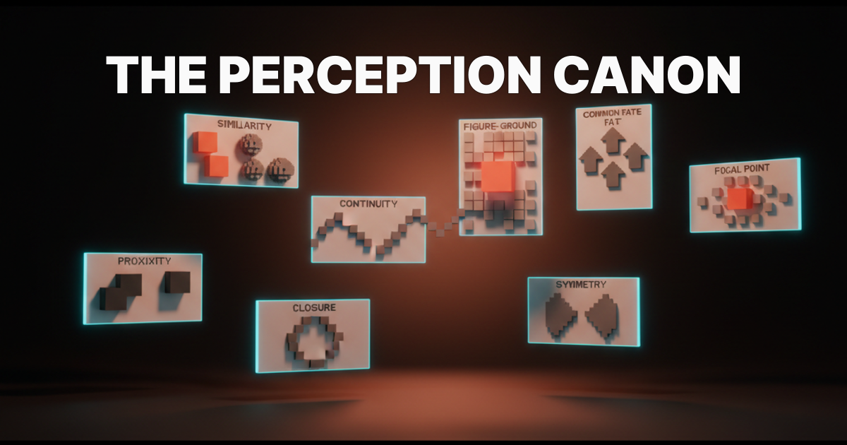
The eight principles, one law each
Gestalt is short for "the whole is greater than the sum of its parts." A pile of dots becomes a face. A row of cards becomes a list. The brain does grouping before it does content. If your design ignores that, the user has to do the brain's job manually, and they will not.
The eight principles every working designer needs. Memorize the rule, the rest is application.
-
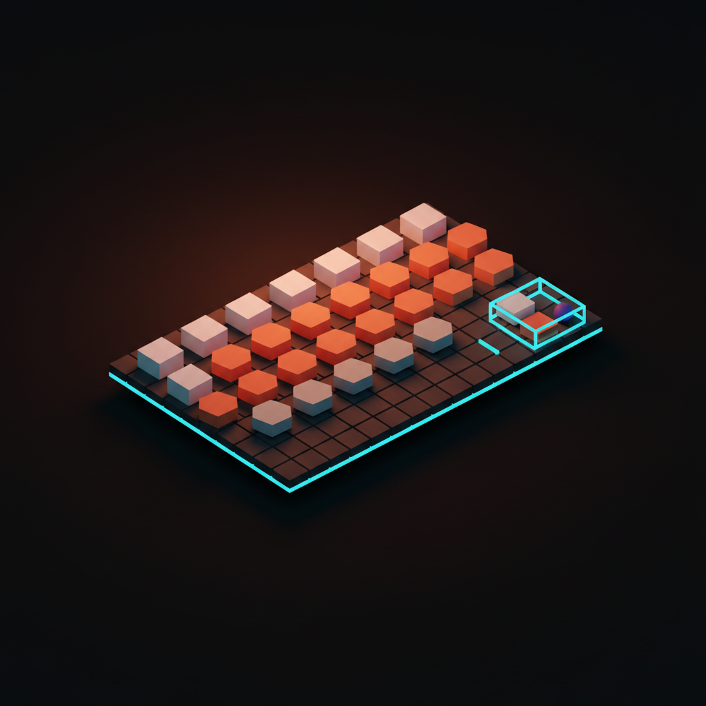
Proximity. Things close together read as a group.
-
Similarity. Things that look alike read as a group.
-
Continuity. The eye follows the smoothest path through a layout.
-
Closure. The brain completes incomplete shapes into whole ones.
-
Figure and ground. The eye separates a layout into foreground and background.
-
Common fate. Things moving together read as a group.
-
Symmetry and order. Symmetric, regular layouts feel resolved before content arrives.
-
Focal point. A single break in pattern earns the entire screen's attention.
Every screen on every product you respect uses several of these at once. Most use all eight. The principles compose, they do not compete.
Proximity: spacing is the grouping
Spacing carries more meaning than borders, dividers, or labels. If two items sit close, the eye reads them as related. If a third item sits twice as far, the eye reads a break. No label needed. The whitespace did the work.
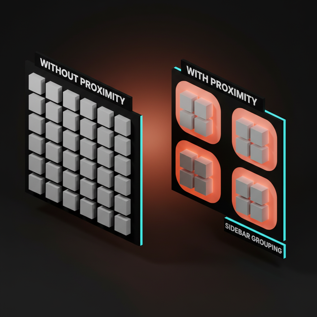
Linear's sidebar is the cleanest proximity demo shipped. Inbox, My Issues, and Active sit in one tight group. Projects, Views, and Teams sit in another. Settings sits alone at the bottom. There are no dividers between the groups, only spacing, and the categories read instantly.
Stripe Dashboard does the same with the metrics row. Revenue, payments, and customers cluster as one tile, balances and payouts as another. Same canvas, different rhythm, three obvious sections.
The anti-pattern is uniform spacing across an entire screen. Every item sits the same distance from every other item, and the user has to read every label to find structure. The fix is never adding more borders.
The fix is opening up the gutters between groups and tightening the gaps inside them. Whitespace is not the absence of design, it is the design. The deeper version of this lives in the whitespace glossary entry.
Application rule: within a group, spacing tight. Between groups, spacing wide. Never the same value twice next to each other unless you mean both items as one.
Similarity: matching shapes are matching meanings
Repeated visual treatment signals repeated function. If two elements look alike, the user assumes they do alike. If they do not, the design is lying.
Notion is built on similarity. Every block of the same type renders identically. Headings look like headings, callouts look like callouts, code blocks look like code blocks. The user learns the visual vocabulary in five minutes and can scan a thousand-block doc afterward without reading.
Figma's left panel runs on the same logic. Frames look like frames, components look like components, instances inherit the look of their main but with the purple wrap that says "this is a copy." The shape teaches the user the rules.
Apple's iOS home grid is the consumer-scale version. Every app icon is the same size, the same corner radius, the same grid spacing. The eye reads "apps" as a single category and only switches to picking when intent kicks in. Break the similarity and you break the read. A single off-grid icon would crash the whole grid as a unit.
Cursor's diff view runs the same logic at a smaller scale. Added lines are the same green, removed lines are the same red, unchanged lines are the same neutral. Three categories, three treatments, no labels needed.
The anti-pattern is "let's make this one button look different to draw attention." That breaks the similarity contract everywhere else. The user has to re-read every button to figure out which rules still apply. If you want to highlight a single action, use the focal point principle below, not a violation of similarity.
Continuity: the eye follows the line
The eye prefers smooth paths over interrupted ones. Once it starts moving along an alignment, a curve, or an axis, it wants to keep going. Designers who respect that ship layouts that scan in one breath. Designers who do not ship layouts that snag.
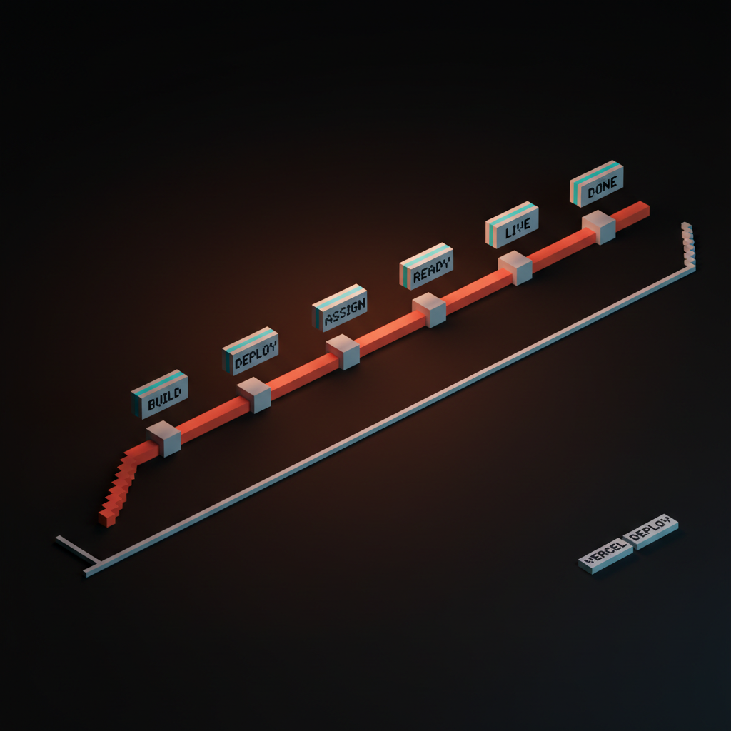
Vercel's deploy view is continuity in production. The pipeline runs as a vertical line of stages, each stage tucked onto the same axis with the same indent. The eye reads from the build commit at the top to the deploy at the bottom in a single sweep, even on long logs. The piece on the loading state is the product covers why this surface gets so much watch time. Cursor's diff gutter does the same on a smaller axis, with the change marker hugging a clean vertical rule that the eye tracks line by line.
The anti-pattern is breaking the alignment for visual variety. Stagger the indents, vary the line heights, throw in a centered element halfway down, and the eye loses the path. The user is not reading a layout, they are decoding a puzzle.
The fix is to pick an axis and let the content sit on it, even when individual elements differ. Stripe's invoice list, Linear's issue list, Anthropic's docs nav. All flat, all aligned, all readable in a single eye-pass.
Application rule: when in doubt, line things up. Forced alignment is faster to read than artistic asymmetry.
Closure: the brain finishes the shape
Incomplete shapes get completed automatically. A circle missing 40 degrees still reads as a circle. A logo with a deliberate notch still reads as the brand. The brain fills the gap because it would rather see a whole than an interruption.
Anthropic's logomark is the textbook example. The two angled forms never close, but the eye stitches them into a unified mark. Loops uses closure on its loop logo, where the bend implies a full circuit even though the shape is open.
Figma uses closure on selection. The blue handles at four corners imply a full bounding rectangle even when only the corners are drawn. The user sees a frame, not four floating dots.
Closure is also why hero sections work without borders. A hero section defined only by spacing and a headline still reads as a contained unit because the eye closes the implied rectangle. The same logic governs minimalist cards, pull quotes, and ghosted CTA buttons. The boundary does not need to be drawn if the content implies it. Pulling that off depends on respecting contrast ratio so the implied boundary still reads.
The anti-pattern is over-drawing every container. Heavy borders, thick dividers, full-stroke outlines on every panel. The screen ends up cluttered, every shape competing for closure attention. Trim the strokes. Trust the eye.
Figure and ground: depth without borders
The eye separates every scene into a foreground and a background. That separation is how attention works. Whatever you push back becomes context, whatever you lift forward becomes the subject.
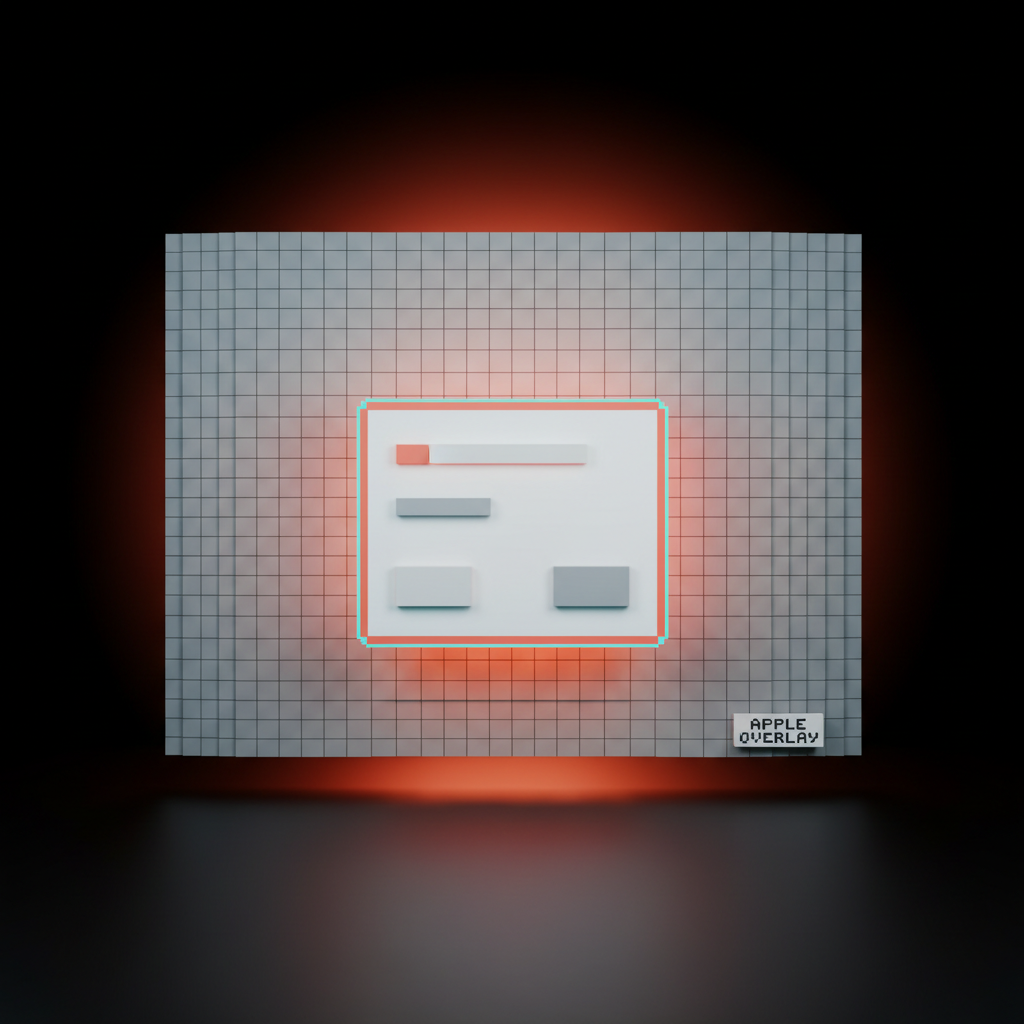
Apple's modal pattern is the canonical demo. The background blurs and dims, the modal lifts forward with a soft shadow, and the user's attention moves before the copy is even read. Stripe's overlays follow the same pattern, slightly less dramatic but identical in logic. The pay button shimmer rides on top of a subtly receded card. Resend's confirmation dialogs use a near-identical figure-and-ground move, with the whole app dropping a step and the dialog stepping forward.
The anti-pattern is the flat overlay with no depth shift. The modal sits on the canvas at the same elevation as the rest of the UI, and the user does not feel the focus change. The fix is layering the actual perception cues that signal foreground.
Shadow, blur, dim, scale. Pick at least two. The piece on the anti-dashboard covers how dashboards leak figure-and-ground when every panel sits at the same elevation.
Application rule: if every element is on the same plane, nothing is foreground. Pick what matters and lift it.
Common fate: motion is grouping
Things that move together read as one thing. Drag three items, watch them shift in unison, and the eye reads them as a single unit even when their shapes differ. Stop the motion and the unity breaks.
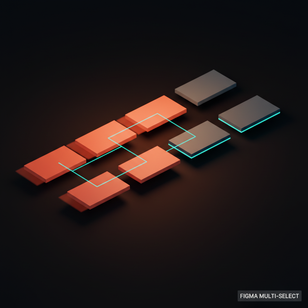
Figma's multi-select is common fate at work. Grab three layers, move them, and they travel as a coordinated unit. The user is editing a single grouped object, even though Figma never asked for a group.
Linear's drag-to-reorder uses the same trick on issue lists. Pick up an issue, the surrounding rows shift in coordinated motion, and the new position reads as obvious. Notion's block drag is identical, with the surrounding blocks animating apart in unison to make room.
The other end of common fate is removal. Animate three items off the screen at the same speed and direction, and the user reads them as deleted-as-a-group. Animate them at different speeds and the user wonders if some failed. Onboarding flows borrow this: the slides advance with a single motion vector, and the user reads the journey as one path. The deeper take on motion as structure sits in onboarding without onboarding.
The anti-pattern is asynchronous motion on logically grouped items. Three cards that all belong to the same selection but animate on different timings, with different easing, on slightly different vectors. The user reads them as separate even though the data says they are one. Lock the motion. Group reads where group acts.
Symmetry and order: balance feels resolved
Symmetric layouts feel finished before they finish loading. The brain reads regularity as competence. Asymmetric layouts can be powerful, but they cost the user a perception tax that has to be earned by other means.
Stripe's pricing page is the textbook example. Three columns, identical card structure, perfectly aligned vertical rhythm, the middle plan slightly elevated to mark the recommendation. The user reads "this is a real product team" before they read the prices.
Apple's product grids do the same on the marketing site. Vercel's dashboard panels run on a strict grid that holds even as the panels reflow. The composition signals stability. The deeper take on this kind of pricing structure sits in the pricing page problem and the broader marketing site stack 2026 breakdown.
The anti-pattern is "let's make it look creative." Cards at irregular widths, columns that do not align, rows that vary in height for no functional reason. The user reads chaos.
There is a place for asymmetric design, but it is a deliberate compositional choice that requires a strong focal point and a clear hierarchy. It is not the default for a SaaS dashboard. Every dashboard that breaks the grid pays for it in scan time.
Application rule: start symmetric, break it on purpose. Never break it because the screen looked boring.
Focal point: one break wins the screen
The eye gives full attention to the single element that breaks pattern. This is why a coral primary button on a screen of muted gray secondary actions wins. It is also why a screen with five "primary" actions has zero primaries.
Linear's command palette is a focal-point clinic. The rest of the UI dims and recedes, the palette lifts forward as a single high-contrast surface, and there is exactly one default action highlighted. The user knows where to look without thinking.
Stripe's pay button is the e-commerce version. The button breaks pattern with brand color, gentle motion, and slightly larger scale. Anthropic's landing pages anchor on a single coral CTA against an otherwise neutral page, and the eye lands on it before the headline finishes. Cursor's "Apply" button on AI suggestions runs on the same logic.
The anti-pattern is the screen with three "primary" buttons and a sea of equally weighted nav items. Every focal point cancels every other one. The user's eye stalls because nothing breaks pattern hard enough to win.
The fix is brutal demotion. Pick one primary, demote everything else to secondary or tertiary treatment. The screen feels louder even though you removed weight, because the one thing that survives now actually pulls the eye. The deeper take on this lives in visual hierarchy in design and the way why every SaaS looks the same in 2026 breaks down focal-point inflation across the industry.
Gestalt principle vs UI pattern
The fastest reference. One row per principle, one rule, one modern example, one product. Save this row for life.
| Principle | Rule | Modern UI Pattern | Real Product |
|---|---|---|---|
| Proximity | Tight inside, wide between | Sidebar group spacing | Linear sidebar |
| Similarity | Same look means same job | Block-typed documents | Notion editor |
| Continuity | Eye follows the line | Vertical pipeline log | Vercel deploy |
| Closure | Brain finishes the shape | Open-form logomarks | Anthropic mark |
| Figure and ground | Push back, lift forward | Modal blur and shadow | Apple sheet |
| Common fate | Same motion, same group | Multi-select drag | Figma layers |
| Symmetry and order | Regular grid feels resolved | Three-column pricing | Stripe pricing |
| Focal point | One break wins the screen | Coral primary CTA | Anthropic landing |
If you internalize one save asset, internalize this. Every working designer should be able to recite the row from memory before the first design review.
How to audit a screen for Gestalt
Run a screen through these eight questions before it ships. If any answer is "no," the screen is leaking perception, even if it looks fine on the surface.
-
Proximity. Are related items closer to each other than to unrelated items? If spacing is uniform across the screen, no proximity grouping is happening.
-
Similarity. Do items with the same function share visual treatment? If two buttons do the same thing but look different, similarity is broken.
-
Continuity. Does the eye have a clear path from top to bottom or left to right? If the layout zigzags without reason, continuity is broken.
-
Closure. Are containers drawn with the lightest treatment that still reads? If every panel has a heavy border, closure is being over-drawn.
-
Figure and ground. Does the screen have a clear foreground? If every element sits at the same elevation, attention has nowhere to land.
-
Common fate. Do animations on grouped items move in unison? If multi-select pieces drift on different timings, the group reads as broken.
-
Symmetry and order. Does the layout feel resolved at first glance? If the eye has to do work to find the structure, the grid is fighting the user.
-
Focal point. Is there exactly one primary action? If there are two or more, the focal point is canceled.
Run this on any screen, in any product, in any state. The screens that pass feel calm. The screens that fail feel busy, even when the visual density is identical. Pair this audit with the discipline in the settings page problem and you will spot the worst offenders fast. The doctrine on doing more with less, including the case in you don't need a design system, pairs with this audit naturally.
The principles compose, never compete
A great screen runs all eight at once. Proximity organizes, similarity confirms, continuity guides, closure cleans, figure and ground prioritize, common fate animates, symmetry stabilizes, focal point decides. None of them work alone. None of them fight each other if you respect the order.
Linear's app is a working masterclass. The sidebar groups by proximity, the issues repeat by similarity, the list scrolls by continuity, the cards close by light borders, the modal lifts by figure and ground, the drag uses common fate, the grid holds by symmetry, the cmd-K palette wins by focal point. The whole product is Gestalt obedience compressed into one tab.
Stripe is the same lesson at a different scale. Vercel, Figma, Notion, Apple, Anthropic, Cursor, Loops, Resend. None of them invented a new perception law. They obeyed the existing ones harder than their competitors.
That is the entire moat in design quality. There is no secret. There is only fluency in the perception canon and the patience to apply it on every screen, every flow, every state. The deeper context for progressive disclosure plays the same role inside specific flows.
FAQ
What are the eight Gestalt principles for designers?
Proximity, similarity, continuity, closure, figure and ground, common fate, symmetry and order, and focal point. Each one is a perception law the human visual system runs automatically. Designers who respect them ship interfaces that read themselves. Designers who do not ship interfaces that feel busy.
Which Gestalt principle matters most in UI design?
Proximity, by a wide margin. Spacing carries more grouping signal than any other treatment, including borders, color, and labels. If you only had time to get one principle right on a screen, fix the spacing.
How is Gestalt different from visual hierarchy?
Visual hierarchy is the strategy. Gestalt is the perception physics underneath it. Hierarchy says "the user should look here first." Gestalt explains why their eye actually goes there. You cannot build hierarchy without obeying Gestalt, and obeying Gestalt without a hierarchy plan produces calm but directionless screens.
Are Gestalt principles relevant for AI-native interfaces?
More relevant, not less. AI-native interfaces ship more dynamic content, more streaming output, and more uncertain layouts than traditional apps. Gestalt is the ruleset that keeps those dynamic surfaces readable. Common fate, similarity, and focal point carry most of the weight when the content is changing in real time.
How do I teach Gestalt to a design team?
Audit one screen together. Pick a real surface, run all eight questions on it, and watch the team see the failures they could not name before. Gestalt is not learned in the abstract. It is learned by spotting violations in real products until the eye starts catching them automatically.
CTA
Want a product where every screen reads itself before the user reads the copy? Brainy designs interfaces with perception baked into the bones, not painted on at the end. We obey the canon on every flow, every state, every detail. Hire Brainy and ship the kind of clarity Linear, Stripe, and Anthropic ship by default.
Want a product where every screen reads itself before the user reads the copy? Brainy designs interfaces with perception baked into the bones, not painted on at the end.
Get StartedNot ready to hire? Run the free Business Genome, an 11-dimension diagnostic for your venture.
Get your free GenomeGet new papers by email
New Brainy papers in your inbox. Confirm once, unsubscribe anytime.