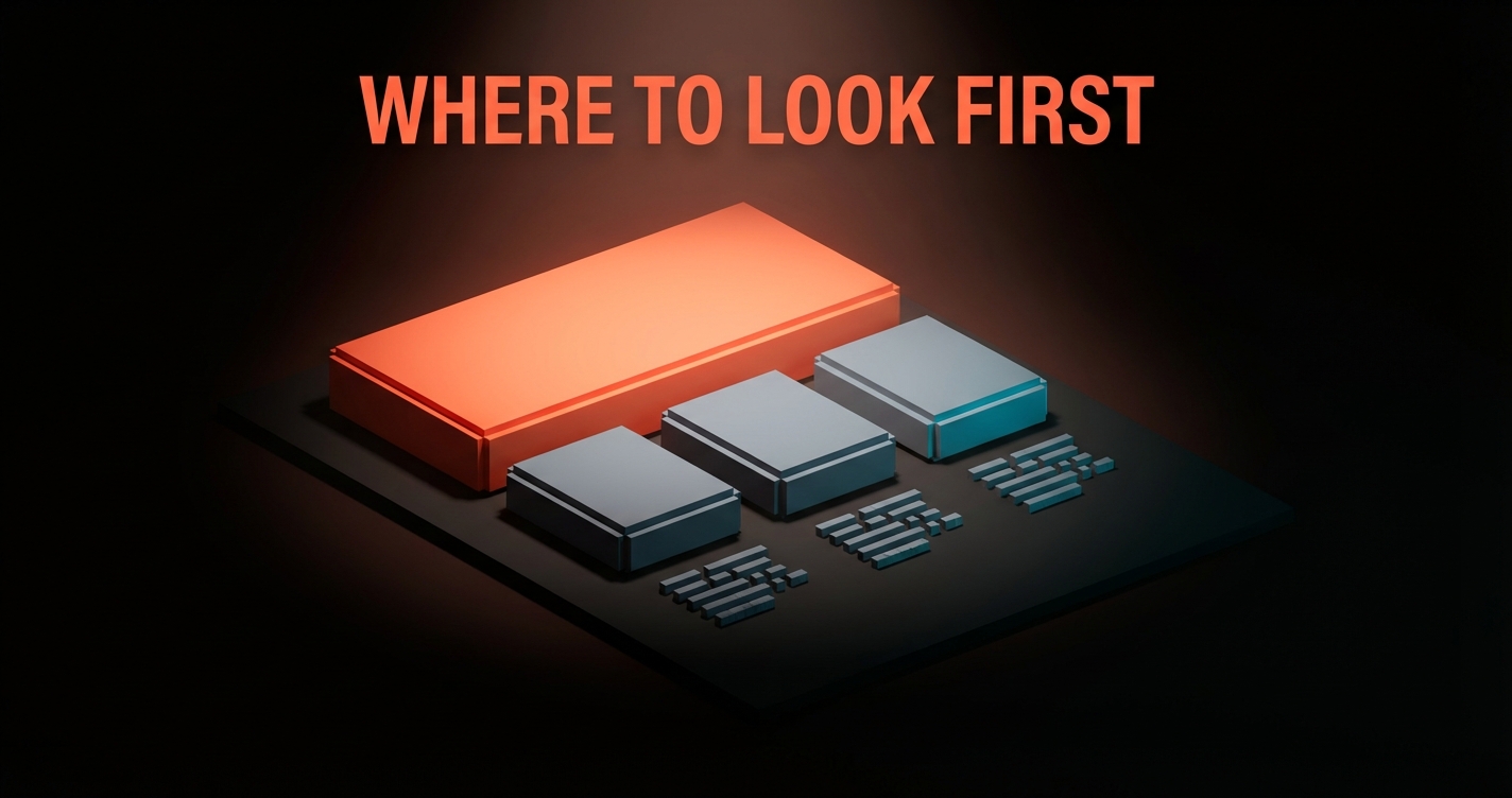
The Settings Page Problem
Settings pages are where product integrity goes to die. Five archetypes, six rules, real examples from Linear, Notion, Vercel, and an audit you can ship from.
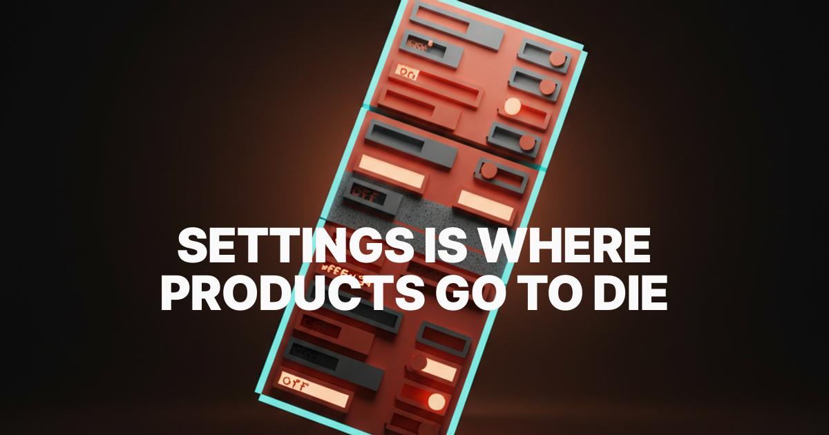
The settings page is the most honest screen in your product. It shows, in one scroll, exactly which decisions the team refused to make. Every toggle is a fossilized argument. Every nested tab is a "we'll figure it out later" nobody figured out.
Most settings pages are landfills. Three years of toggles dumped by engineers who could not say no, marketers who needed an opt-out, and PMs who treated "make it configurable" as a substitute for "decide." The result is a screen the team is embarrassed to demo and a user is afraid to touch.
This is the case for treating settings as a first-class product surface. Five archetypes, six rules, real examples from products you already use, and an audit to run before you ship.
Settings is the screen that exposes the team
Settings sprawl is a leading indicator of organizational dysfunction. When a team cannot align on a default, the toggle ships. When a customer complains and nobody wants to push back, the toggle ships. When the PM cannot decide between two flows, both ship behind a setting.
Six months later, nobody remembers why half the toggles exist. Removing a setting requires the same decision the team avoided the first time, so they accrete. Look at any product shipping for more than three years and you can count the unmade decisions in the settings tree.
The five archetypes of bad settings pages
Bad settings pages are not random. They fall into five patterns, each the endpoint of a specific kind of organizational laziness.
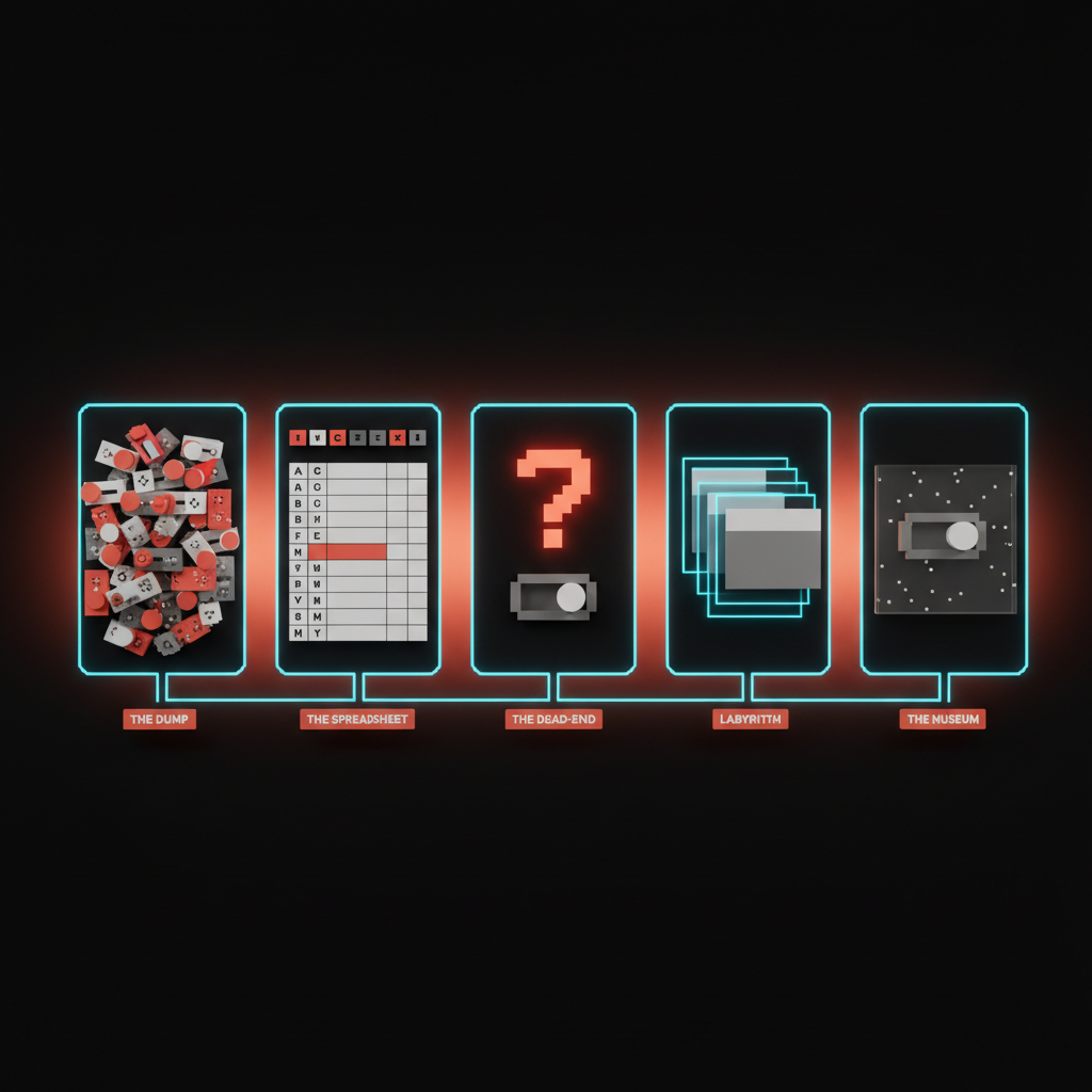
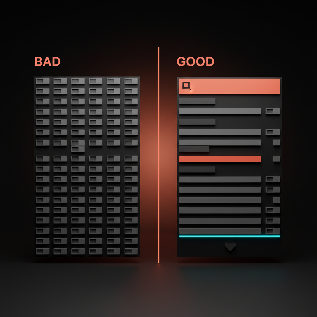
1. The Dump
Chronological accretion. Settings appear in the order they were added, never grouped. The newest feature flag sits next to a 2019 notification preference next to a beta toggle that was supposed to graduate two years ago. Cursor is sliding into this. Every release adds three toggles to the General tab, and the General tab is now a 40-row scroll of unrelated decisions. The Dump is the default state of any settings page nobody is actively designing.
2. The Spreadsheet
Alphabetical preferences. The team gave up on hierarchy and let the OS do the sorting. Every toggle is equal weight, every row identical. Slack's notification preferences live here. Sound, badge, mobile, channel, keyword, do-not-disturb, schedule, custom, all flattened into a wall with no story about which ones matter.
3. The Dead-End
Settings that change nothing visible. The user flips "Compact mode" and the screen looks identical. They flip "Enable advanced features" and nothing appears. Apple's System Settings redesign on macOS shipped a generation of these: settings silently overridden by other settings, settings that need a restart the screen never mentions. The Dead-End teaches users that settings do not work, and they stop trusting the rest of the product.
4. The Labyrinth
Ten levels of nested tabs. Settings buried under a category, a sub-category, an "Advanced" disclosure, a modal. The user knows the toggle exists, has flipped it before, and still cannot find it. Older Jira built a career on this: project, board, workflow, scheme, permission scheme, notification scheme, all separate trees.
5. The Museum
Settings nobody has touched in three years. They exist because removing them feels risky. They reference features sunset in 2023. Every legacy SaaS product has a Museum wing, and the cost is the team's promise to maintain code paths that should have been killed two refactors ago.
Settings is a product surface, not a closet
Most teams treat settings as where the rest of the product gets cleaned up. That framing is the bug. Settings is one of the highest-leverage surfaces in the product, and the strongest teams design it that way.
Settings express the product's worldview about the user. They communicate four things at once. How much the team trusts the user. How much control the team is willing to share. What the team thinks the right defaults are. Whether the team respects the user's time enough to design for the 5% who change defaults without punishing the 95% who do not.
Linear designed settings as a single search surface, command-K driven, almost no nested tabs. The implicit message: the user is competent, search is fast, the team did the hierarchy work so the user does not have to. Notion went the opposite direction and won the same way. Settings live next to the thing they affect. Page settings on the page. Database settings on the database. Contextual settings disappear into the work.
Vercel uses scoped hierarchy: project, team, and account, each clearly labeled, each scoped to the resource it governs. Stripe Dashboard goes action-oriented, where every screen is "do this thing," not "configure this preference." GitHub's repo settings nail the scoping with clean separation between repo, org, and account ownership.
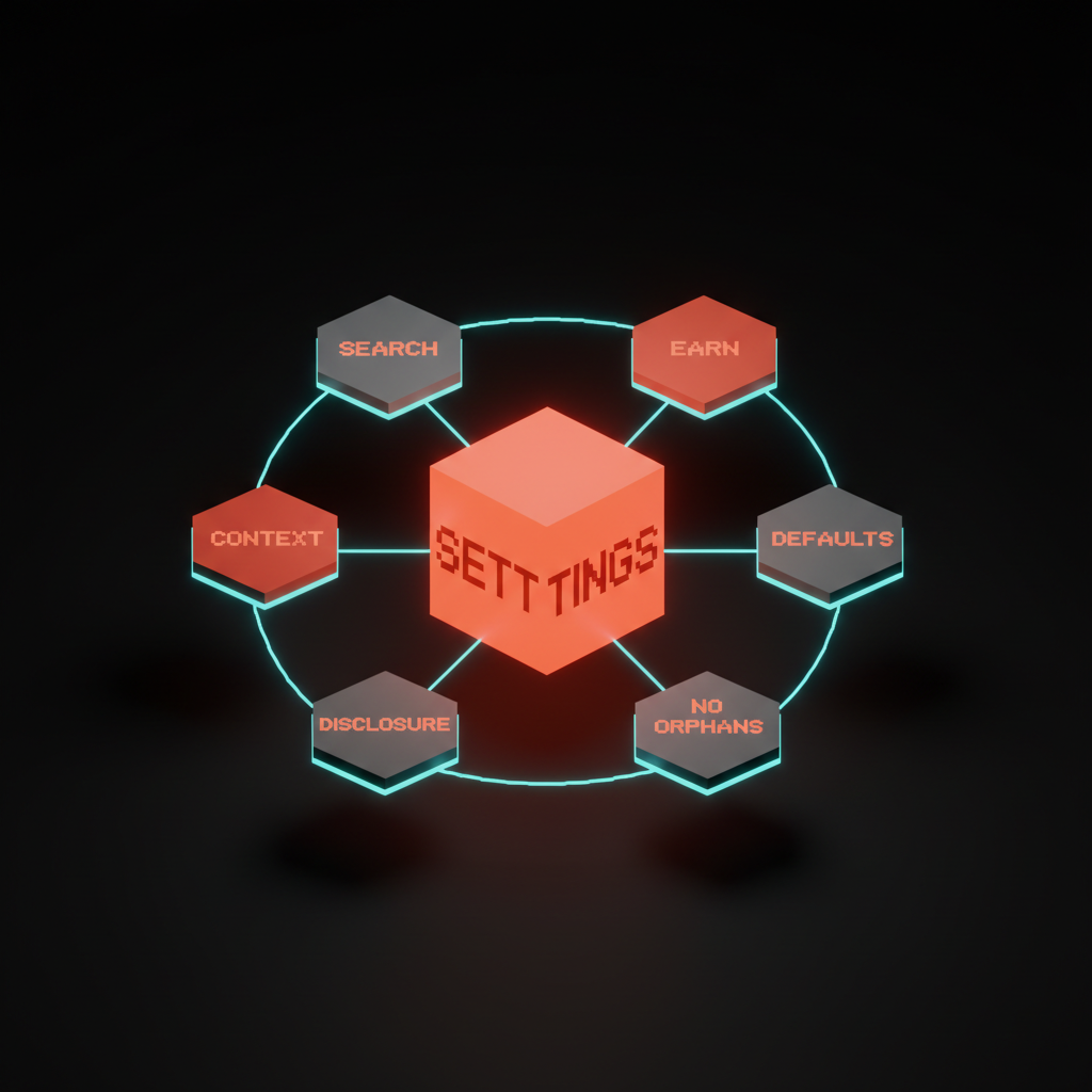
The six rules that decide every settings page
These rules compound. Hit five out of six and the page reads as a product surface. Hit three and it slides into one of the archetypes within a year.
Rule 1: Search-first
Hierarchy is a fallback, not a primary. The user knows the name of the setting before they know which tab it lives under. Linear's command-K covers settings as a first-class result type. Figma added settings search and time-to-toggle dropped immediately. If your settings page has no search bar, you are betting users will memorize your information architecture. They will not.
Rule 2: Contextual placement over central registry
Settings live next to the thing they affect. Notification settings in the notifications panel. Page settings on the page. A central settings page is fine for account-level concerns like profile, billing, and sessions, and almost nothing else. Notion is the gold standard. Figma's right-rail does the same job for layer, frame, and component properties.
Rule 3: Sensible defaults that earn trust
Every default is a product decision. It expresses what the team believes the right answer is for 80% of users. If the default is wrong, the toggle is a bandage. Slack's notification defaults assume you want to be reachable, not silent. The bet is correct for the median user. Most teams design the toggle first and let the default fall out. That order is wrong.
Rule 4: Progressive disclosure over flat sprawl
The user should see the five settings that 90% of users care about. The other 50 belong one click deeper, behind a clear "Advanced" affordance. Vercel's project settings nail this. The first screen surfaces domain, environment variables, and deployment protection. Build overrides, function configs, and rewrites live in Advanced.
Rule 5: No orphans
Every setting belongs to a group. Every group has a name. The orphan test: read any label out loud with no other context. If a designer on your team cannot tell you what the toggle does, it is an orphan. Orphans are the seedlings of the Museum.
Rule 6: Every setting earns its keep
A setting is a contract. The team commits to maintaining it, documenting it, testing it, and reasoning about its interactions with every other setting forever. Most settings cannot pay that rent. The default disposition for any new setting should be "no." Good teams kill more settings than they ship.
Anti-patterns that signal something deeper is wrong
Three patterns kill more settings pages than the rest combined. Each is a symptom that the problem is not the screen, it is the team behind it.
Settings as a substitute for product decisions. The team could not agree on opt-in or opt-out, so it shipped as a toggle. The user inherits the unresolved argument. If you hear "let's make it configurable" in standup, you are watching this anti-pattern form. The deeper read is in designing friction on purpose.
Settings that compensate for bad design. A "compact mode" toggle because the default density is too loose. A "high contrast" toggle because brand colors fail accessibility. A "classic view" toggle because the redesign got rejected. Each is a real fix dressed as an option. The fix is to design density, contrast, and views correctly the first time.
Settings nobody can explain in one sentence. If a designer cannot describe what the setting does, what changes when it flips, and who it is for, the setting should not ship. Run that test before any new toggle hits the codebase.
The settings page audit

Run every settings page through these seven questions. Anything less than a confident yes on six and the page is not done.
- Can the user find any setting in under five seconds? If not, the page is missing search or the hierarchy is broken.
- Does every setting have a one-sentence description a non-engineer understands? If the label needs an engineer to explain it, it does not belong in the product surface.
- Does flipping the toggle produce a visible, immediate effect? Hidden state changes are trust killers.
- Are settings grouped by user task, not by feature team? A page organized by which team owns the feature is an internal artifact leaking into the product. Group by user goal.
- Are defaults defended in writing somewhere? The team should be able to point at a doc, a visual hierarchy decision, or a brand principle. If the default is "whatever the engineer set during the sprint," the page is not done.
- Could you remove half the settings without a user noticing? If yes, do it. The Museum is heavier than the team thinks.
- Does the page look and feel like the rest of the product? Read it next to your landing page design principles. If the brand falls apart, the settings page is off-brand.
A team that runs this audit twice a year ships a settings surface users do not flinch at. The team that runs it never ships the kind of settings page that becomes a recruiting tool for the competition.
Pick the principle, then prune the page
Settings are the team's worldview, frozen in toggles. Good teams treat the page as a first-class flow, with the same craft they bring to onboarding, the dashboard, and the marketing site.
The fastest way to fix a settings page is not to redesign it. It is to delete half of it. Remove every setting that fails the orphan test, the one-sentence test, and the earns-its-keep test. What remains is the spine of a real settings surface.
The connection to empty states is not accidental. Both screens reveal what the team believes when nothing else is on screen to distract from it. The same discipline shows up in web design principles.
Frequently asked questions
How many settings should a product have?
As few as possible. Every setting is a contract the team maintains forever. The default disposition for any new setting should be "no." If the team cannot defend the setting in one sentence, name the user it serves, and describe what changes visibly when it flips, the setting should not ship.
Where should settings live in the product?
Next to the thing they affect, not in a central settings wing. Page settings on the page. Workspace settings on the workspace. Notification settings in the notification panel. A central settings page is fine for account-level concerns like billing, profile, and sessions, and almost nothing else.
How do I clean up a settings page with years of accumulated toggles?
Run the audit, then delete. Group every setting by user task. Identify orphans, dead-ends, and museum pieces. Remove the bottom 30% in the first pass and watch the support tickets. If nothing complains, remove another 20%.
Design the settings page like the homepage
The settings page is not a basement. It is a room your power users live in, and your new users judge you by. Treat it like the homepage, the onboarding, the dashboard. Apply the same craft. Ship it with the same conviction.
If you want a team that designs the settings page like the rest of the product instead of inheriting it from the backlog, hire Brainy. We design settings as a first-class flow, with the discipline that keeps the page small and the toggles earning their rent.
Want a settings surface that reads like the product instead of the bug tracker? Brainy designs settings as a first-class flow, not a graveyard.
Get Started