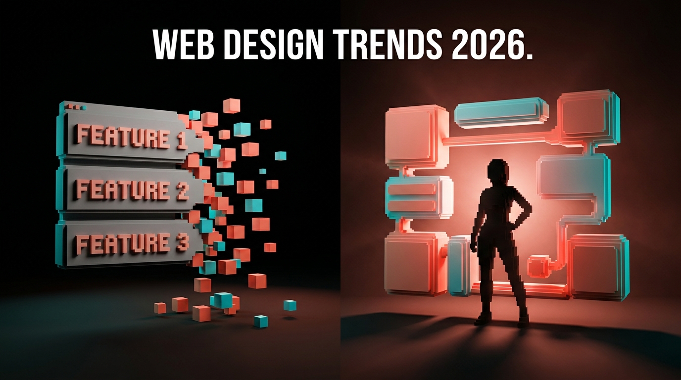
Why Every SaaS Looks the Same in 2026
The Linear aesthetic ate the industry. Five visual tells, the AI feedback loop accelerating it, and a four-question identity audit that turns visual identity back into a moat.
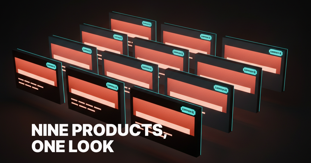
Open ten SaaS homepages from the last twelve months. Linear, Vercel, Resend, Loops, Cal.com, Posthog, Cursor, Raycast, the new YC batch, the next one. They all look like cousins who share a stylist. Dark surface.
Coral or violet gradient mesh. Sans headline. Tiny monospace accent. Command-K pill in the corner. A "trusted by" row of logos in a 60% opacity wash.
The Linear aesthetic ate the industry. AI tools are pouring kerosene on the fire because they were trained on the same fifty homepages. The result is a 2026 where feature parity is cheap, design parity is automatic, and visual identity is suddenly the most underpriced moat in the category.
The Linear aesthetic ate the industry
One company set the template, and forty-nine others copied it. Linear shipped a product so visually confident that it became the default reference for "what a serious B2B tool looks like" somewhere around 2022. By 2024 the aesthetic had a name. By 2026 it has a stranglehold.
Vercel ships it. Resend ships it. Loops ships it. Cal.com ships it.
Posthog redesigned into it. Even tools that sit miles from Linear's category, the AI labs, the email infra plays, the dev tools, all converged on the same grammar. It works, so it spreads. It spreads, so it becomes invisible. It becomes invisible, so nobody questions whether it still works for them.
The trap is that the aesthetic was a Linear answer to a Linear problem. Hyper-focused tool, opinionated workflow, dev-shaped audience. When a community-led design tool or a vertical SaaS for accountants ships the same template, the brand is not signaling craft. It is signaling that the founders were on the same Twitter feed last year.
Five tells of the SaaS monoculture
Most teams cannot describe the template they are inside. They think they made choices. They picked five defaults in a row and called the result a brand.
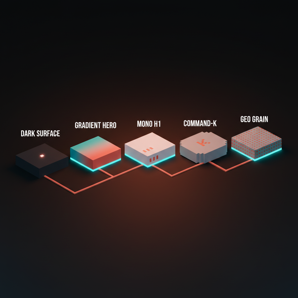
The five tells:
-
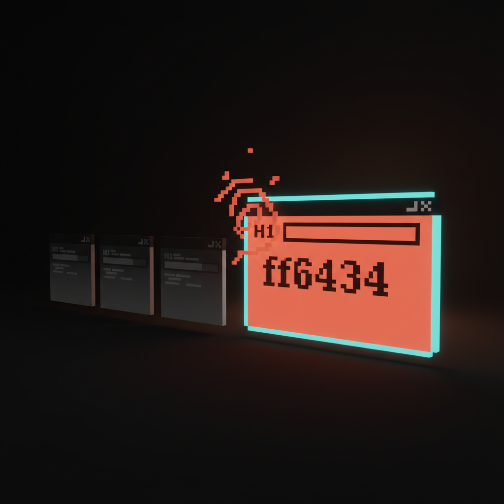
Dark surface as default. Slate or near-black background, white type, faint cyan or violet accent. Reads as serious, dev-coded, premium. Ships on roughly 70% of new B2B SaaS launches in the last 18 months.
-
Gradient mesh hero. A blurred radial gradient from coral to violet to cyan in the top third of the homepage. Stripe ships it. Linear ships it.
The next ten YC batches ship it. The mesh has stopped meaning "premium" and started meaning "we used the same Figma plugin."
-
Monospace H1 accent. A serif or sans headline with a single monospace word slipped in like a code variable. JetBrains Mono, IBM Plex Mono, Berkeley Mono, Geist Mono.
Signals "for builders." Now signals "by builders, like everyone else."
-
Command-K palette. The keyboard pill in the top right, the Cmd-K hint, the global search modal. Real utility for power users, real virtue signal for everyone else. The anti-dashboard breakdown covers when this pattern earns its keep and when it is cargo cult.
-
Geometric grain. The faint dot pattern, hairline grid, or noise texture on the dark surface. Adds depth without color. Adopted from Vercel's marketing, copied into every dev-tool homepage in 2025.
Hit four of five and you are in the template. Hit all five and the only thing differentiating the brand is the wordmark in the top left. The marketing site stack breakdown shows how the toolchain itself nudges teams toward this exact look.
AI training data is making it worse
The feedback loop tightened the second AI tools entered the stack. v0, Lovable, Bolt, Cursor, the Figma AI features, the design plugins. They were all trained on the same web. The web they were trained on is the web that already homogenized.
Ask any of these tools to "design a SaaS landing page" and they will return some shade of the Linear template. Not because the model lacks taste. Because the data lacks variance. The training corpus is a recursive snapshot of designers copying each other, with the originals already converged on the same five tells.
The output reinforces the input. A founder uses an AI tool to ship the first design. The first design is the template. The shipped product becomes part of the next training crawl. The next AI tool ships the same template, faster.
The loop closes. The variance keeps shrinking.
The homogenization loop
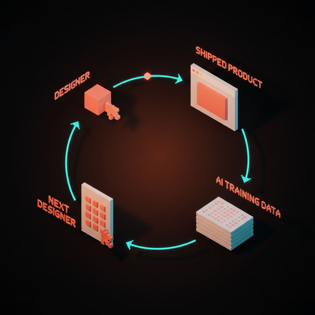
Four nodes. One coral arrow connecting each to the next. The whole thing runs faster every cycle.
| Node | What happens | Effect on variance |
|---|---|---|
| Designer | Looks at what shipped this year. Picks the safe references. | Down |
| Shipped product | Inherits the template. Ships into the wild. | Down |
| AI training data | Crawls the shipped product. Bakes the template into the next model. | Down hard |
| Next designer | Prompts the AI. Gets the template back. | Down again |
Every cycle removes a little more variance. This is not an industry-wide conspiracy. It is what feedback loops do when nobody breaks the cycle on purpose. The same pattern is happening to pricing pages and settings pages, which have collapsed into two or three reference layouts each.
Why founders keep choosing the same look
Founders are not lazy. They are pattern-matching against a small dataset under high uncertainty.
When a YC partner says "ship something that looks like Linear," the founder ships something that looks like Linear. When the design Twitter consensus is that gradient mesh reads premium, the founder ships gradient mesh. The cost of looking different is real, and the cost of looking the same is invisible. Until competitors catch up. Then the cost of looking the same is total.
The other reason is that the component library ecosystem made the template close to free. Shadcn shipped, Tailwind UI shipped, every AI design tool shipped opinionated defaults. A founder can ship the entire Linear template in an afternoon. So they do.
Visual identity is the cheapest moat left
Feature parity arrives in weeks. Design parity arrives in days. Visual identity is the asset that takes years to build and seconds to recognize.
Stripe is the canonical proof. The product is rails, the differentiator is taste. The illustrations, the typography, the documentation surfaces, the receipt, the dashboard. Every touch reads as Stripe before the logo enters the frame. Stripe spent a decade making the brand feel like Stripe, and now competitors have to build both the product and the visual moat to catch up.
Notion did the same with the doodled illustrations and the cream surface. Figma did it with the playful spectrum and the multiplayer cursors. Anthropic ships a brand that reads as careful, warm, slightly literary, in a category where the default is sterile.
Cal.com ships a brand that reads as community, in a category where the default is enterprise. Each of them refused the template and got rewarded for it.
The math works in favor of the contrarians. If forty-nine competitors look identical and one looks like itself, the one that looks like itself owns the category in memory. That is the moat.
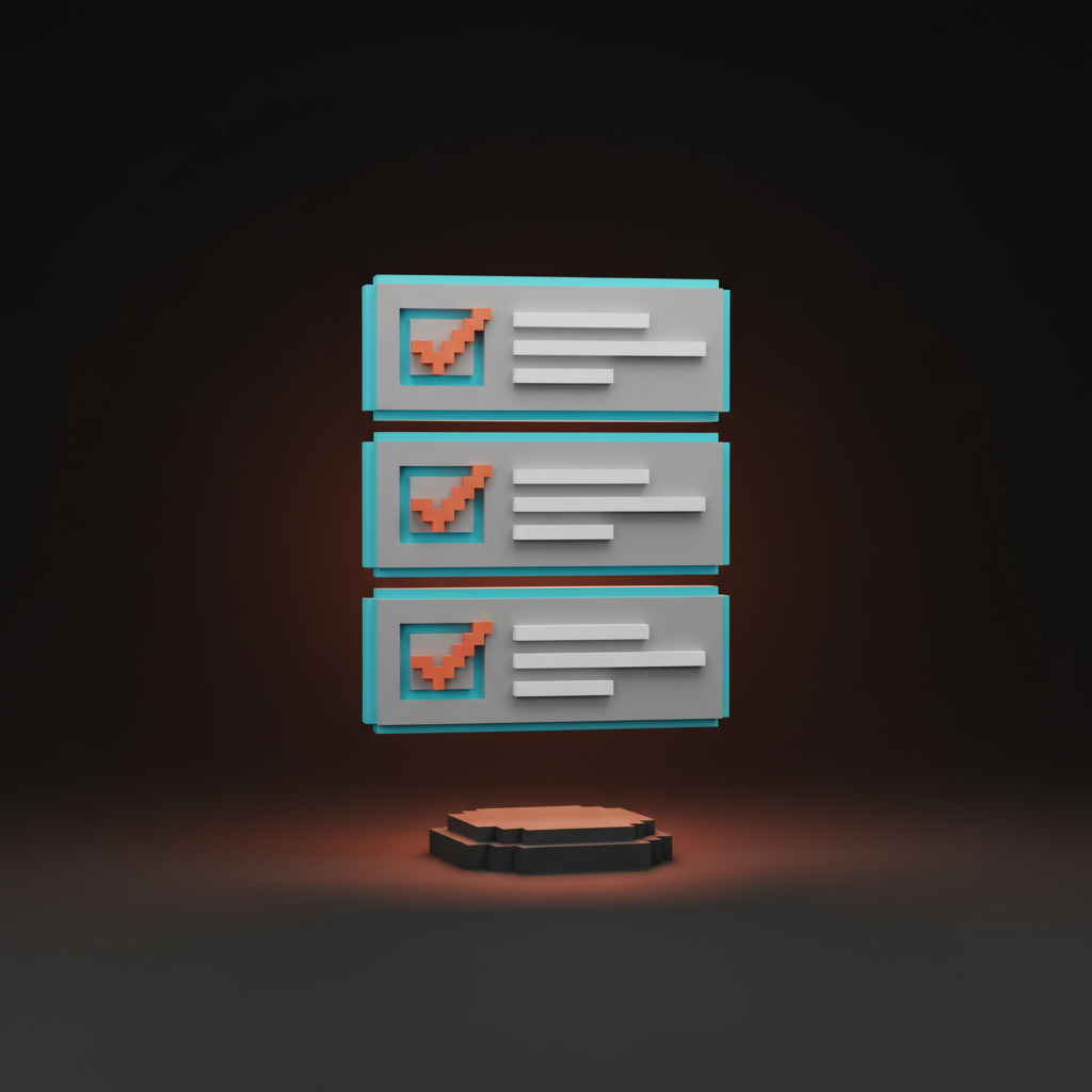
The identity audit
Four questions. Run the homepage, the product, the docs, and the loading screens through them.
-
If a stranger swapped our wordmark with a competitor's, would they notice? If not, the visual identity is the category template, not the brand.
-
What single visual choice would we never copy from a competitor? The answer should be specific. A color, a typeface, an illustration style, a layout move. If there is no answer, there is no identity.
-
Does the product surface match the marketing surface? If the homepage is bold and the dashboard is generic, the brand only lives in the marketing. The user lives in the product. The loading states and onboarding flows are where most teams reveal that the brand was paint, not paint plus structure.
-
Could we describe the brand without naming a competitor? If every sentence in the brand brief starts with "like Linear, but" or "Stripe-style," the brand has no center. It is a vector pointing at someone else's center.
A product that passes those four feels like itself before it feels like the category. That is the bar. Anything less is rent.
Pick a fight with the template
The way out is not subtle. Subtlety inside the template still reads as the template. The way out is a deliberate fight with one or two of the five tells.
Linear's whole-cloth opposite would be a high-saturation light surface, a serif or display H1, an illustrative hero instead of a gradient, a non-Cmd-K affordance, and a cream or warm-grain background. Notion did three of those. Figma did two. Anthropic did three. Each one is now memorable in a category that mostly is not.
Pick the fight that fits the brand. A vertical SaaS for healthcare should not look like a Vercel deploy log. A community-led design tool should not look like a fintech infra play. A creative collaboration product should not look like a Series-A dev tool.
The design system is the lever. Use it to lock in the parts that are correct and break the parts that are inherited.
The template is rent. Identity is the moat.
Every founder shipping the Linear aesthetic in 2026 is paying rent on someone else's brand. The template was earned by the team that made it. Borrowing it costs nothing on day one and costs the entire visual moat by year three.
The teams that will own the next decade are the ones who pick a fight with at least two of the five tells, build the identity into the product not just the marketing, and treat visual differentiation as a compounding asset, not a launch checklist. The rest will keep shipping forty-nine versions of the same homepage and wonder why retention reads as a feature problem when it was a recognition problem.
FAQ
Is the Linear aesthetic actually a problem if it works?
It works for Linear. It works for products in Linear-shaped categories. It stops working the moment the category has fifteen products that all wear it, because the visual signal collapses to "another B2B SaaS" and the brand has nothing left to anchor on. The aesthetic is a default, not a strategy.
How is AI making SaaS design more homogenous?
AI design tools are trained on the public web of shipped product. The public web already converged on the Linear template. Models return the template by default. Founders ship it by default.
The shipped output goes back into the next training crawl. Each cycle removes variance. The fix is to design against the model's defaults, not with them.
How do I differentiate a SaaS product visually without looking unprofessional?
Pick a fight with one or two of the five tells, not all five. Keep the parts of the template that are genuinely useful, like clear typography and strong information hierarchy. Replace the parts that are inherited, like gradient mesh or Cmd-K-as-virtue-signal, with choices that fit the brand's actual audience. Reference the identity audit. Run the four questions on every surface.
Hire a team that breaks the template
A SaaS that looks like the other forty-nine is renting a brand that was earned by somebody else. The cost is invisible at launch and total by year three.
If you want a product that looks like itself in a category where everyone else looks alike, hire Brainy. We design visual identity systems that earn the moat instead of borrowing one.
CTA
Brainy designs visual identity systems for SaaS products that refuse the template. Branding, marketing site, product surface, and the dashboard all built to read as one brand, not as the category default. Hire Brainy if you want a product that strangers would not confuse with anyone else in your space.
Want a SaaS that does not look like the other forty-nine in your category? Brainy designs visual identity systems built to break the template, not extend it.
Get StartedNot ready to hire? Run the free Business Genome, an 11-dimension diagnostic for your venture.
Get your free GenomeGet new papers by email
New Brainy papers in your inbox. Confirm once, unsubscribe anytime.