

The End of the Dashboard: What Replaces the 2015 SaaS UI
The classic SaaS dashboard is dead. Here are the five patterns replacing it, the real products already shipping them, and the failure modes you must avoid.
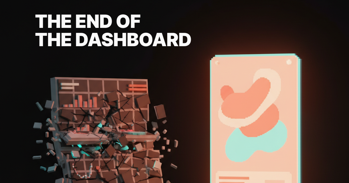
Every product is still shipping the same dashboard you saw in 2015. The dashboard is dead. Here is what replaces it.
Open any B2B SaaS tool today and you will see the same shape. A top nav, a left sidebar, four KPI cards in a row, a line chart underneath, a donut for category split, and a sortable table that nobody scrolls. It is the muscle memory of a generation of product designers, and it has stopped paying rent on the screen real estate it occupies.
This is not a paper about prettier charts. This is about the model itself, the assumption that the right way to show a person their data is to lay out every metric you have and let them figure out what matters. That assumption is broken. The replacement is already shipping in products you use every day, you just have not named the pattern yet.
Why the dashboard earned its place
The classic dashboard was a real upgrade once. Before it, you had spreadsheets, weekly emailed PDFs, and a BI analyst who you had to bribe with snacks to pull a query. The dashboard collapsed that into a self-serve surface where a non-technical operator could check the pulse of the business without filing a ticket.
It also fit the technology of its decade. Charting libraries got good around 2012, responsive grids got cheap, and SaaS pricing models rewarded "single pane of glass" pitches that executives could justify on a procurement form. The dashboard was not designed for the user, it was designed for the renewal conversation.
For a stretch of time, it worked. People learned the grammar, designers got to flex on data viz, and product teams got a clean canvas to demo. The problem is the grammar never evolved. The dashboard you ship in 2026 is the dashboard you shipped in 2015, just with rounder corners and a dark mode toggle.
Why dashboards stopped earning their keep
Five forces broke the dashboard at the same time, and any one of them on its own would have been enough.
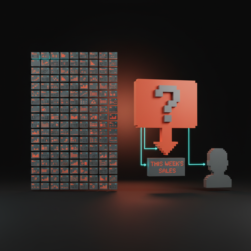
First, information overload, the average B2B product now exposes hundreds of metrics, and a 12-card grid cannot prioritize for you. Second, no action, a chart tells you a number went down but not what to do about it, and most users are not analysts. Third, no narrative, a dashboard is a noun, a wall of facts, when what people actually want is a verb, a story about what changed and why.
Fourth, no priority, every card on a classic dashboard has the same visual weight, which means nothing on it has weight. Fifth, AI changed the cost curve of a different shape entirely, a shape that can summarize, prioritize, and answer questions in plain language without a chart at all. Once the cost of a written paragraph fell to roughly zero, the chart-grid lost its monopoly on conveying state.
The result is a product surface that feels busy and useless at the same time. Users open the page, scan, get nothing actionable, and leave. The metric that should scare every product team is the one nobody puts on a dashboard, time to insight, and on most dashboards it rounds to forever.
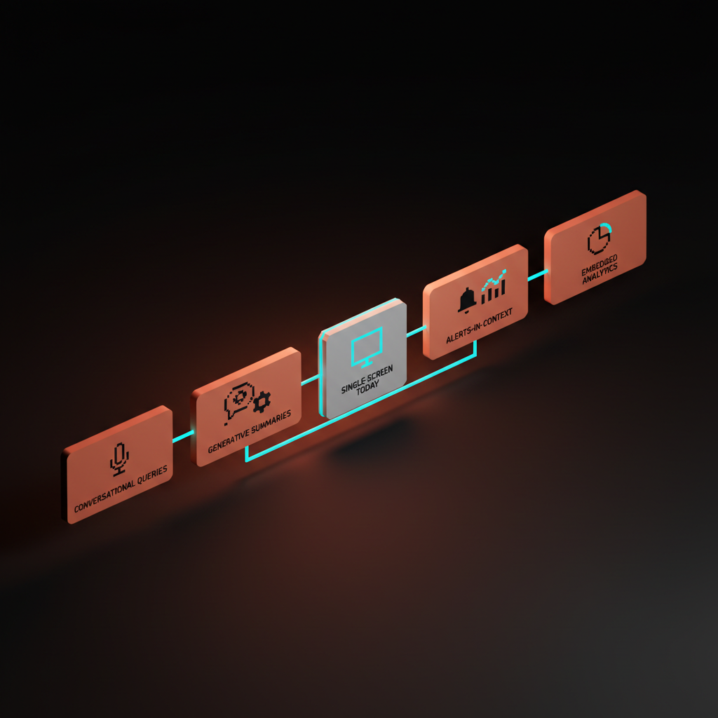
The first replacing pattern: conversational queries
The fastest way to kill a dashboard is to let people ask a question. Pulse does this for revenue, Stripe Sigma lets analysts write SQL against their own ledger, and the latest wave of analytics tools, from Hex to Mode to even Notion AI, treat the prompt as the primary input.
This works because most dashboards are answering a question the designer guessed at, not the question the user has today. A conversational surface inverts the contract, the user states the question, the system returns the smallest possible answer. The win is not the chat box, the win is the focus.
The failure mode here is when a team replaces the dashboard with a chat box that just returns the same charts inside a speech bubble. That is not progress, that is a costume. The right version of conversational queries returns a sentence first, a number second, and a chart only when the chart actually clarifies something the sentence cannot.
The second replacing pattern: generative summaries
A summary is a dashboard that already did its homework. Granola treats every meeting as a one-page generative summary instead of a transcript wall, and the surface is the summary. Linear's project updates roll up sub-issues into a paragraph that reads like a teammate wrote it. Notion AI charts can describe their own shape in plain English at the top of the page.
The pattern is simple, do the synthesis on the server, ship the synthesis as the UI. The chart, if it appears at all, is supporting evidence under a sentence. You do not need a designer to choose which KPI goes top-left, the model writes the lede.
Two things make this work in practice. The summary has to be specific, "revenue is up" is useless, "revenue is up 14 percent week over week, driven entirely by the enterprise tier" earns the slot. And the summary has to be wrong sometimes in safe, recoverable ways. The user has to be able to click into the underlying numbers in one motion when the paragraph smells off.
The third replacing pattern: the single-screen today view
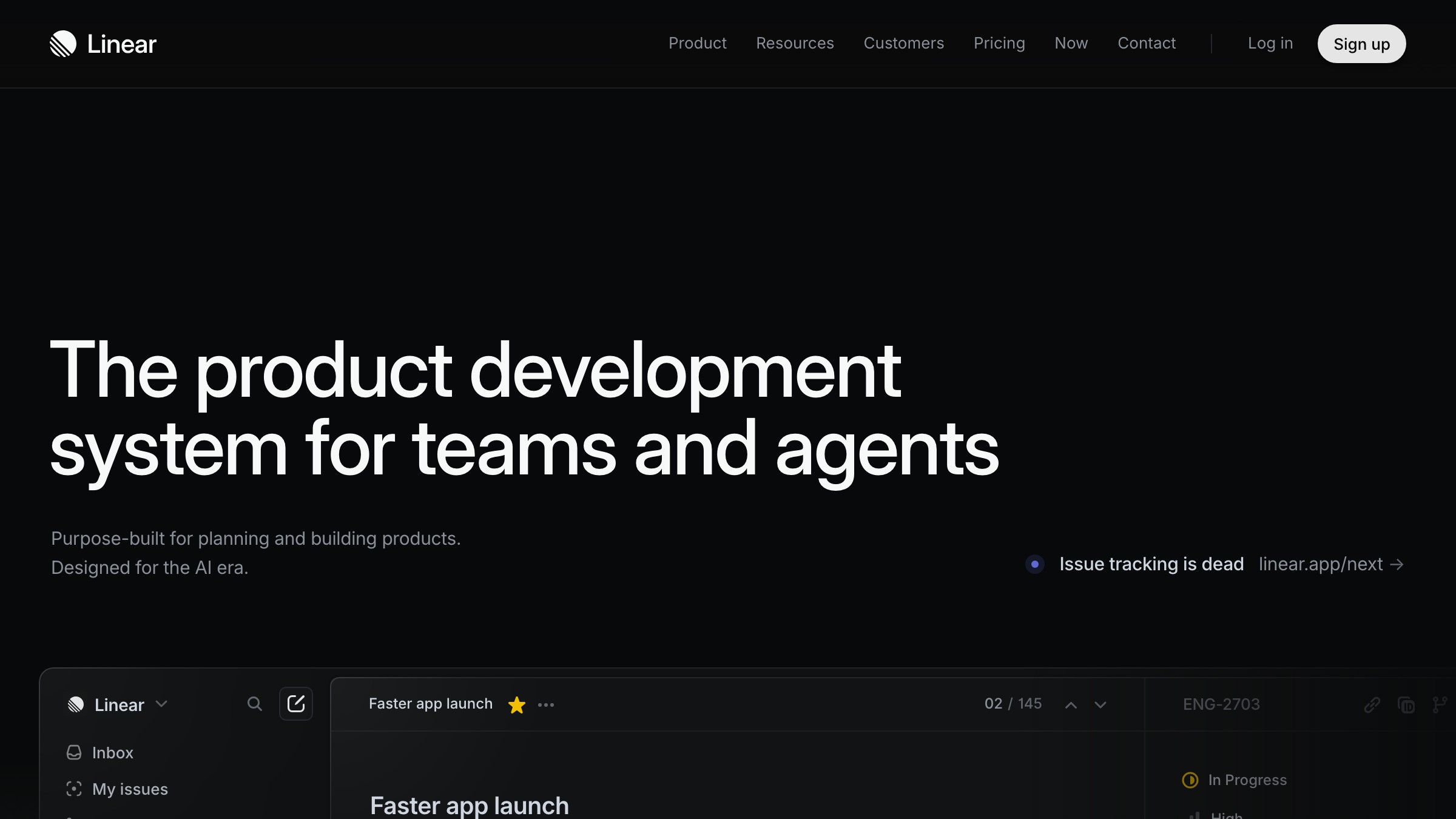
The most underrated post-dashboard pattern is the home view that fits in one screen and answers one question, what should I look at right now. Linear's home is the canonical example, your assigned work, your active project, the next thing that matters, no chart grid anywhere. Cron and Notion Calendar collapse a normally chart-heavy planner into one focused day.
The single-screen today view is the opposite of the dashboard's "show me everything" instinct. It picks. It commits. It is willing to be wrong about what matters, and it earns the right to be wrong by being right most of the time. The design discipline is brutal because every pixel on that screen has to justify itself against the question "is this what the user needs in the next 30 seconds."
The product math behind this pattern is what makes it stick. A user who opens your product and immediately sees the next action they should take is a user who keeps opening your product. A user who opens your product and sees a chart they have to interpret first is a user who installs a competitor.
The fourth replacing pattern: alerts in context
The dashboard assumes the user will come to it. The post-dashboard pattern assumes the product will come to the user, and the product will speak the user's native channel, which is Slack, push, email, or the surface where the work actually happens.
PagerDuty proved this years ago for incidents. Linear, Height, and most modern collaboration tools now send the diff, not the link to the dashboard, so you can reply or resolve without clicking through. Stripe's notifications increasingly carry the number directly in the email subject line, not a "log in to view" tease.
The rule is straightforward, the alert is the dashboard. If your product still sends a "your weekly report is ready" email that requires a click to find out what changed, you are still building for 2015. The post-dashboard version writes the headline in the notification, ships the number in the push, and only links back to a deeper view when the user needs to act.
The fifth replacing pattern: embedded analytics
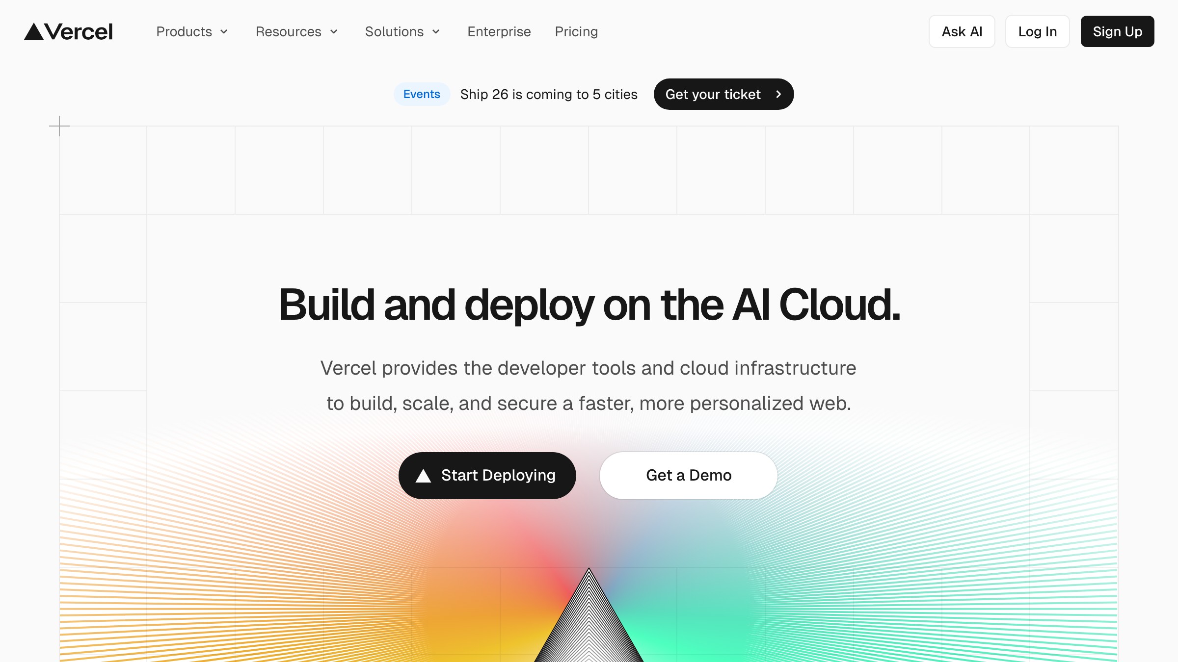
The last replacing pattern is the most invisible one, and instead of a separate analytics page, the data lives inside the working surface itself. Vercel's deployment view shows you build performance next to the deploy, not in a separate observability tab. Figma's file inspector shows you usage and version history without a "stats" page, and GitHub's PR view embeds CI status, coverage, and review state directly in the surface where you decide to merge.
This works because data is most valuable at the exact moment of a decision, and the dashboard pattern divorces the data from the decision. By the time you click over to "Analytics," you have already context-switched and lost the thread. Embedded analytics make the number a property of the object you are already looking at, not a destination you have to visit.
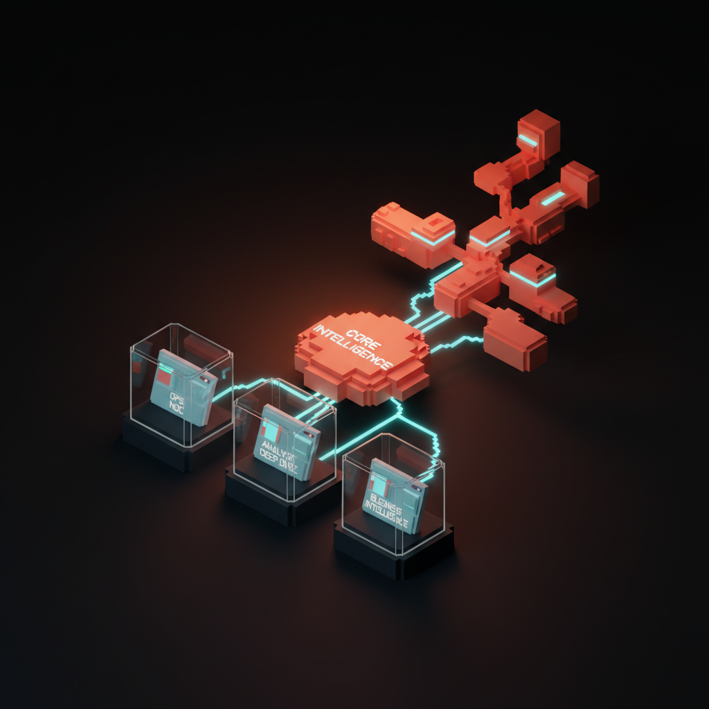
The design implication is that the analytics team and the product team are the same team. There is no "dashboard PM" anymore in the products that have figured this out, there is a working-surface PM who owns whatever data appears in their flow.
Classic dashboard versus the five replacing patterns
Here is the comparison the rest of this paper has been circling. The classic dashboard is one row of this table, the five replacing patterns share the other rows, and the differences are what your product roadmap should look like for the next 18 months.
| Pattern | Primary input | Primary output | Best for | Failure mode |
|---|---|---|---|---|
| Classic dashboard | None, you arrive | Chart grid | Demos, procurement | No action, no priority |
| Conversational queries | A question | A sentence plus chart | Ad hoc analysis | Chat box returning charts |
| Generative summaries | A time window | A paragraph | Weekly reviews, standups | Generic, ungrounded summaries |
| Single-screen today view | Identity, time of day | One focused answer | Daily operators | Hidden depth, lost analysts |
| Alerts in context | A threshold change | A line in your channel | Incidents, anomalies | Alert fatigue, noise |
| Embedded analytics | The object you are viewing | Data on that object | Decisions at the edit point | Hidden cross-object views |
Notice the input column. Every replacing pattern starts from something the user already gave you, a question, a time window, an identity, a threshold, an object. The classic dashboard starts from nothing and demands the user manufacture context. That is the whole game.
Who already moved, and who is still stuck in 2015
The post-dashboard era is not a thesis, it is a list. Linear shipped the single-screen home view as the default entry point, Granola turned the meeting transcript into a generative summary that is the product itself, and Pulse for revenue replaced the SaaS finance dashboard with a daily Slack message and a conversational follow-up.
Vercel observability embeds analytics in the deployment surface instead of a separate page, Stripe Sigma exposes the underlying ledger as a queryable thing rather than a fixed chart set, Notion AI now writes summaries above database views so the page reads like a brief, and Cron and Notion Calendar collapse calendar analytics into a single planner screen.
Each of these products made the same trade, they sacrificed surface area for direction. They picked an answer and shipped it. They stopped trying to be everything for everyone at once, and started being one thing for one person at one moment.
The cautionary list is just as instructive. Google Analytics is the museum piece, a product whose every redesign just shuffles the same chart grid into new tabs. Mixpanel and Amplitude still open to a wall of cards that requires a workshop to interpret. Most B2B billing tools, most HRIS platforms, most CRM home screens, they all default to the same chart grid as if the last decade did not happen.
This is not because the teams are lazy, it is because the dashboard was always easier to sell than to use. A demo of a chart grid looks impressive to a buyer who is not yet a user, and procurement is the boss level of B2B.
The market rewards the dashboard at the deal, then punishes it every day after, and the punishment is invisible churn. If you can ship a post-dashboard surface that demos as well as a chart grid and uses ten times better, you eat your category, and the companies above are giving you a head start.
The failure modes when you try to replace the dashboard
Replacing a dashboard is harder than killing it, and most attempts fail in predictable ways. Here are the four to avoid.
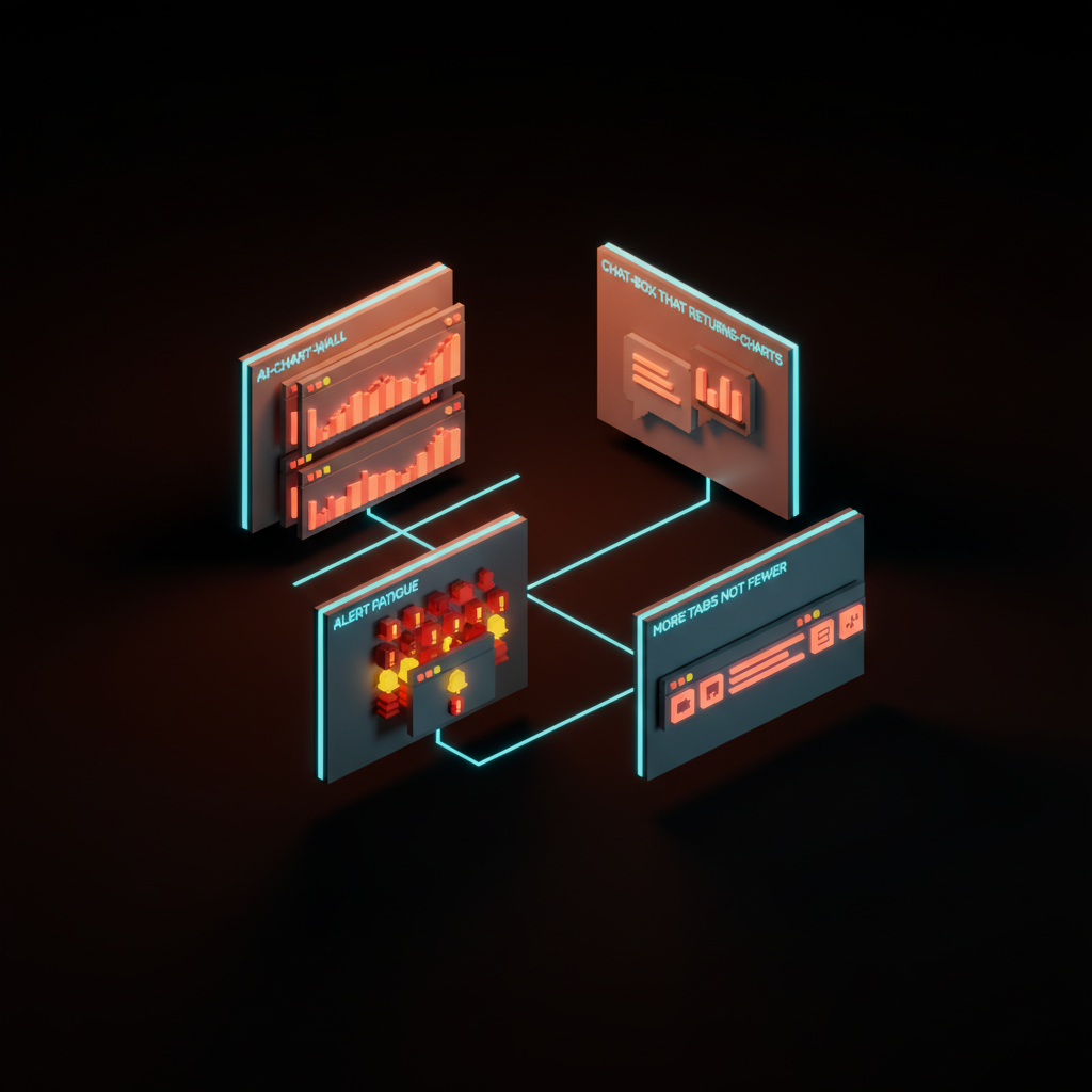
- The AI chart wall. You wrap the same chart grid in a "generate insights" button that produces three more charts. Now the user has to read both the original grid and the generated one. You have doubled the work, not halved it.
- The chat box that returns charts. You add a prompt input, the prompt returns the same dashboard layout. The interface moved, the answer did not. The user is still hunting through cards.
- Alert fatigue. You replace the dashboard with notifications, then ship every event as an alert. Within a week the user mutes the channel, and you have lost the only post-dashboard surface that was working.
- More tabs, not fewer. You keep the dashboard, add a today view, add a conversational page, add a summary section, and ship them all as siblings. Now the product has four entry points and the user has none.
The common thread in every failure is additive thinking. The post-dashboard pattern is subtractive. You delete the chart grid, you delete the tabs, you delete the cards that nobody clicks. The replacing surface earns its place by being smaller than what it replaced, not by sitting next to it.
When the dashboard still earns its keep
Dashboards do not disappear, they retreat to the specific jobs where the chart grid is genuinely the right shape. There are three of them, and if your product is one of these, you can keep your grid.
- The operational status view, the data center NOC, the airline ops console, the trading floor, the live event monitor. When the user's job is to scan dozens of signals for anomalies in real time, a chart grid is correct, that is literally the job.
- The deep analytics workbench for analysts. Hex, Mode, Tableau, Power BI, this is where a quant or analyst lives all day, and a chart grid plus query editor is the right professional surface. Do not try to make a quant use a chat box.
- Executive business intelligence at the board level. A monthly or quarterly summary deck where the chart grid is the meeting artifact, not the daily working surface. This is dashboard as document, not dashboard as app.
Notice that all three are professional, infrequent, or both. The classic SaaS mistake is taking a surface designed for a full-time analyst on a trading floor and shipping it to a marketing manager who opens the product twice a week. That is the mismatch that killed the dashboard.
How to design what replaces a dashboard
If you are sitting in front of a Figma file with a chart grid in it right now, here is the playbook.
Start with the question. Write down, in one sentence, what the user is trying to figure out when they open this page. If you cannot write that sentence, you are not ready to design anything, you are still in research. If the sentence is "see all my data," your user does not want a dashboard, your buyer wants one, and you are designing for the wrong person.
Pick one of the five replacing patterns based on the question. Recurring decisions go to single-screen today views, ad hoc questions go to conversational queries, periodic reviews go to generative summaries, time-sensitive changes go to alerts in context, and decisions at the edit point go to embedded analytics. If your question fits two patterns, you have two pages, not one.
Ship the smallest version. Resist the urge to add a "classic view" toggle or a "see all metrics" link. Every escape hatch you add to the old dashboard pattern is permission for users and for your own team to keep living in 2015. The point of the replacing surface is that it commits.
What this means, and where to start
The next two years of B2B product design will be defined by which teams kill their dashboards first. The category leaders are already moving. The laggards will spend 2026 and 2027 in expensive redesign cycles, and most of those redesigns will fail, because they will redesign the chart grid instead of replacing the model.
The teams that win will look strange to procurement at first. They will demo a single sentence instead of a chart wall, they will pitch a Slack alert instead of a "single pane of glass," and they will sell a today view that fits on one screen. They will lose a few deals to the chart-grid incumbent and then keep every user they win, because the surface they shipped is the surface the user actually wanted.
Open your product tomorrow. Look at the screen the user sees first. Ask whether that screen answers a real question or just lays out your data model, and if it lays out your data model, you have a dashboard, and the dashboard is dead. Then pick the one question your highest-value user has when they open the product, and ship a single-screen answer to that question in place of the grid.
You do not have to redesign your entire product to start, you have to redesign the first screen, and the rest will follow. Once your home view is not a dashboard, the rest of the product stops looking like one too. The chart grid had a good run, it just stopped being the answer, so build the surface your users actually need and let the dashboard go.
If your product still opens to a wall of charts in 2026, we will redesign the surface your users actually need. Start at /hire.
Get StartedNot ready to hire? Run the free Business Genome, an 11-dimension diagnostic for your venture.
Get your free GenomeGet new papers by email
New Brainy papers in your inbox. Confirm once, unsubscribe anytime.


