

Form Design Best Practices: 10 Rules for Web and Mobile
The 10 rules for designing forms that convert. Real teardowns of Notion, Tally, and Mercury sign-up flows, plus mobile-first patterns that actually work.

Form Design Best Practices: 10 Rules for Web and Mobile
The cost of a bad form
A bad form is a strategy tax on every dollar you spent getting someone to the page. Completion rates for sign-up, checkout, and onboarding forms average around 12% when friction is present. Remove the friction and that number climbs past 50%.
The gap is almost never copy or branding. It's the ten rules, applied consistently.
Salesforce-style 30-field lead forms exist because someone mapped a database schema onto a page and called it a form. The user didn't sign up for that. They showed up for the product, and your qualification logic cost you the lead.
Rule 1: One column, one task per screen
One column, always. Multi-column layouts feel efficient in a Figma grid and kill completion rates on a screen.
The eye reads left to right and expects continuity. When fields split into two columns, the user has to decide which path to follow, and that micro-decision adds friction before they've typed a single character.
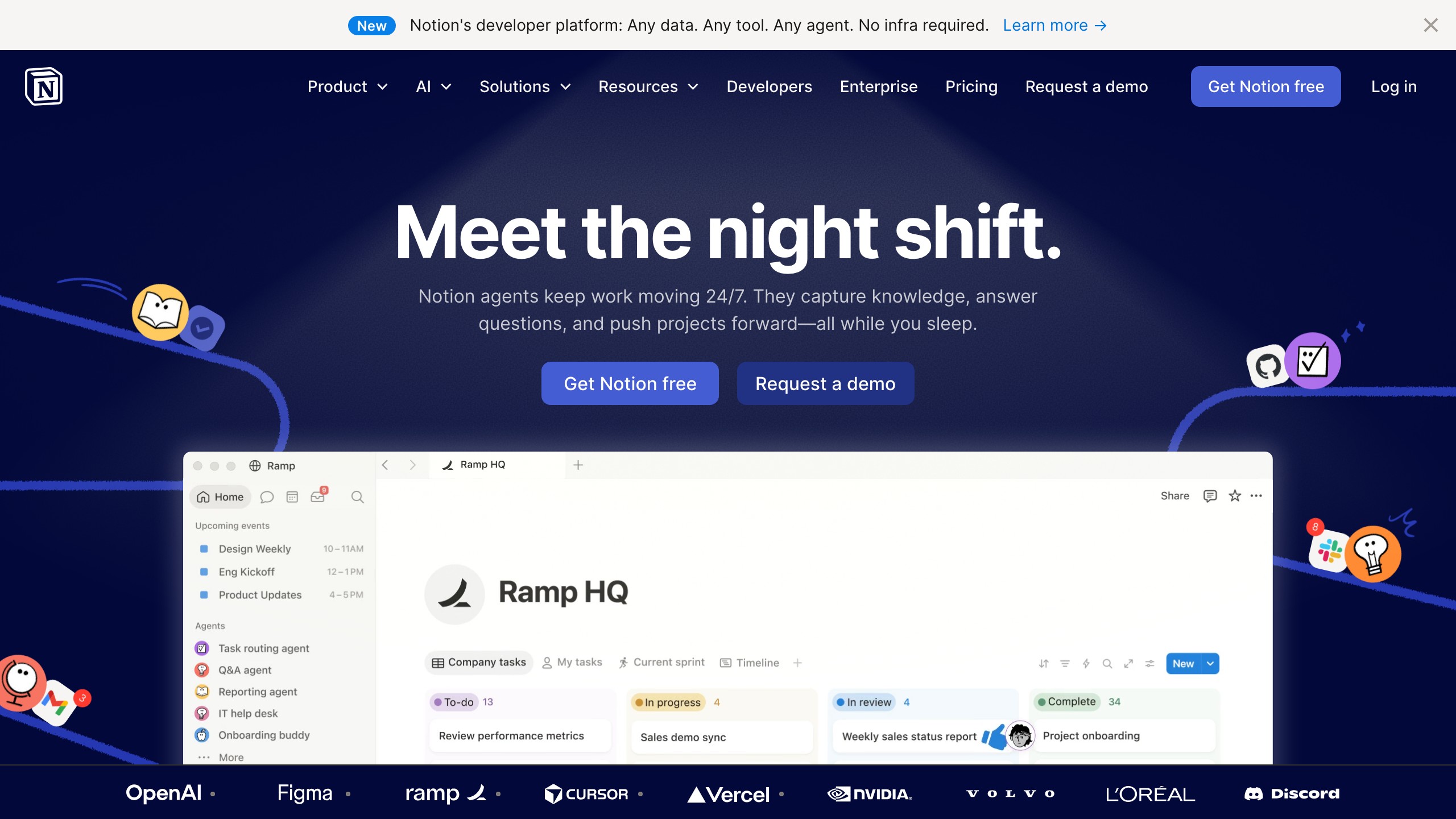
Notion's sign-up flow is a single centered column with one field promoted at a time on mobile. The form feels fast because it asks for one thing. That's the rule.
Rule 2: Label position matters more than label style
Labels go above the field. Not inside it, not to the side. Above, always visible.
Placeholder text used as a label disappears the moment the user starts typing. At that point they have to clear the field to remember what they're filling in. Mercury's onboarding flow uses persistent above-field labels on every input so context is never lost mid-fill.

Floating labels, which animate up from placeholder position on focus, are an acceptable middle ground, but they require tight contrast and careful timing to be accessible. When in doubt, put the label above and leave it there.
The UX research behind label placement is covered in depth in our guide to UX research methods.
Rule 3: Field order follows user reality, not database schema
The sequence of your fields should match how a person thinks about the task, not how engineers structured the data model.
A checkout form that asks for shipping address before confirming the cart puts the burden of context on the user. Stripe Checkout, the canonical reference for hosted-checkout form UX, sequences the form in three steps:
- Email (who are you)
- Payment (how will you pay)
- Address (where does it go)
That's the sequence a reasonable human would use in person. When the database drives the field order, you get forms that ask for a zip code before a country, or a job title before a company name.
Rule 4: Validate inline, never on submit
Validate the field the moment the user leaves it, not when they hit submit.
Submit-time validation means the user fills out a ten-field form, hits the button, and gets a wall of red errors. Every error is a correction task, and every correction task risks losing them entirely. Inline validation, triggered on blur, surfaces the error before the user moves on.
Apple ID sign-in validates email format on blur and confirms account availability before the submit button is ever active. That sequencing prevents two categories of error at once. The interaction patterns behind this are covered in our microinteraction design guide.
Rule 5: Mobile-first means mobile keyboards
Every field type should summon the correct keyboard. That's 80% of mobile form design.
If a field asks for a phone number and the default text keyboard appears, the form is broken before the user types anything. Use inputmode="numeric" on numeric fields, type="email" to surface the @ key, and inputmode="decimal" for prices. iOS and Android both support the full range of input modes.
The keyboard is the primary input device on mobile. Specifying the wrong one turns a correctly designed visual form into a frustrating one.
| Field Type | Correct HTML Attribute |
|---|---|
type="email" | |
| Phone | type="tel" |
| Whole number | inputmode="numeric" |
| Decimal / price | inputmode="decimal" |
| URL | type="url" |
| Search | inputmode="search" |
For the broader mobile-first foundation these patterns sit inside, see responsive web design fundamentals.
Rule 6: Progress, microcopy, and the long-form problem
If the form requires more than five fields, show the user where they are in the flow.
Airbnb's multi-step booking flow shows a progress indicator with named steps throughout. Users who can see they are 60% complete are measurably more likely to finish than users who have no reference point.
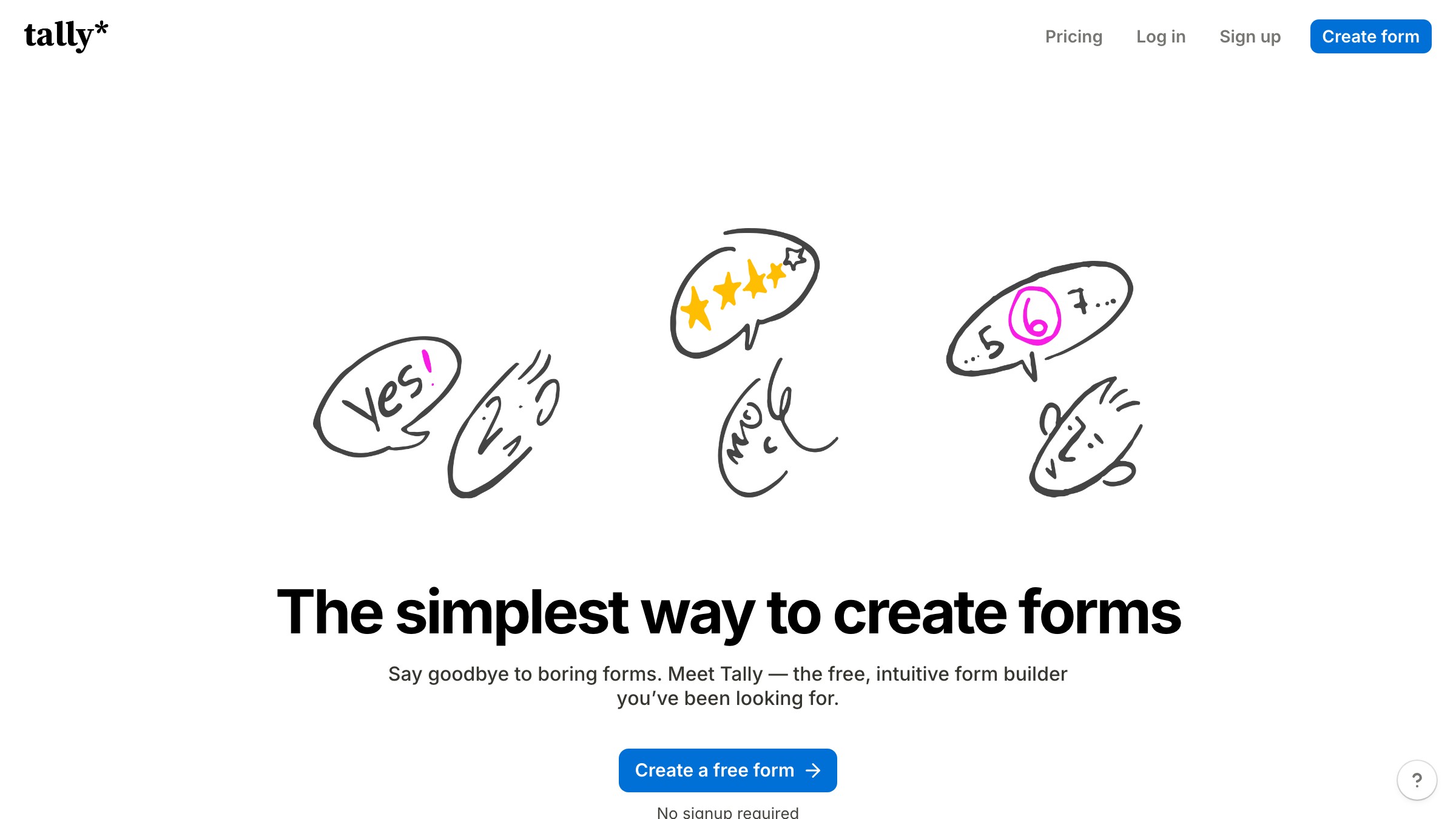
Tally takes a different approach for its embeddable forms: one question at a time with a persistent progress bar at the top, which consistently outperforms single-page long forms in their documented user testing.
Microcopy does the same work. "Step 2 of 4" is more honest than a bare progress bar. "We need this to verify your identity" is more useful than an unlabeled sensitive field.
Rule 7: Error messages are instructions, not accusations
Write error messages in the imperative, not the accusation.
"This field is required" is an accusation. "Enter your email address to continue" is an instruction. The user already knows something went wrong. What they need is the fix.
The best error copy names the exact condition and the exact action: "Password must be at least 8 characters and include one number." Stripe Checkout does this precisely. The message appears on blur, names the problem, and disappears the moment the condition is resolved.
There's no lingering red state. It just works.
Rule 8: Autofill is a feature, not an afterthought
The autocomplete attribute tells the browser exactly what to fill. Use it on every field.
A checkout form with correct autocomplete attributes takes about 12 seconds to complete on a phone with saved data. Without them, the same form takes two minutes because the user types everything manually. That 108-second gap is where most mobile checkout abandonment lives, and it costs nothing to close. The UI component library guide covers how to bake these attributes into your design system's form components so they're never missing.
| Field | autocomplete Value |
|---|---|
email | |
| First name | given-name |
| Last name | family-name |
| Phone | tel |
| Street address | street-address |
| City | address-level2 |
| Postal code | postal-code |
| Card number | cc-number |
| Card expiry | cc-exp |
Rule 9: The submit button decides everything
The submit button is the contract. Its label, state, and position signal whether the user can trust what happens next.
A grayed-out button with no explanation tells the user the form is broken but not why. That's a dead end. A button labeled "Submit" tells the user nothing about what they're agreeing to.
"Create my account," "Get my free trial," and "Start building" are all more honest. Disable the button only when you can explain the reason in the UI. Tally uses action-specific button copy on every step in its form builder, and it's a direct contributor to their above-average completion rates for embedded B2B flows.
Rule 10: Test with real thumbs, real data, real latency
Testing a form on a desktop browser over fast wifi tells you nothing meaningful about whether it works.
Test on a mid-range Android device on a 4G connection with real-length data in every field:
- A name with an accent character
- An address with an apartment number on line two
- A 22-character email
- A 1-character first name
Real-world edge cases break forms that look clean in Figma. Real latency reveals whether validation calls are blocking input or running asynchronously. That distinction is invisible in a browser simulator and catastrophic on a phone with two bars of signal.
Need a form audit on your sign-up, checkout, or onboarding flow? Brainy runs the full ten-rule audit on real screens, real data, and real conversion numbers.
Where designers still ship the worst forms
The worst forms in production today share three patterns:
- Enterprise sales lead forms: Salesforce-style 30-field qualification screens with mandatory "annual revenue" selectors and no inline validation
- Multi-step onboarding flows that don't save progress: a phone call on step 7 of 9 sends the user back to step 1
- Checkout flows built before mobile was primary, never rebuilt: every numeric field still uses
type="text"because "it works fine on desktop"
The error state choices in all three cases also tend to fail contrast requirements; accessible color contrast patterns fix that specific failure point.
The common thread in all three: the form was designed for the system, not the person filling it in. The fix is the same.
Run the ten rules. Start with mobile. Let the database sort out its own schema.

FAQ
How many fields should a form have?
As few as the outcome requires. The right number is the number where removing one more would break the product. Every field you add reduces completion rate. Start from zero and add only what is mandatory.
Should I use multi-step or single-page forms?
For more than five fields, multi-step almost always outperforms single-page. The requirement is visible progress. Without it, multi-step forms perform worse than single-page because the user has no idea how long the journey is. Name the steps and show where they are in the sequence.
What is the best way to mark required fields?
Mark optional fields, not required ones. If most fields are required (which they should be, given the rule above), marking every field with a red asterisk is visual noise.
Mark the exceptions. "Optional" beside a field is meaningful information. An asterisk beside every field is not.
How do I handle password requirements without punishing the user?
Show requirements before the user starts typing, not after they fail. A small checklist that activates as each condition is met performs better than a post-submit error wall. Apple ID and most current auth flows use this pattern. The feedback is live, positive, and never punitive.
Does field width communicate anything?
Yes, and users read it. Field width signals expected input length. A short field signals a short answer. A full-width field signals a longer one.
Match field width to expected input length where the layout allows. A zip code field at full width looks like a mistake. A text area for a street address looks like overkill. Match the container to the expected content.
What causes the most mobile form abandonment?
Wrong keyboard type is number one. Autofill not working is number two. Both are silent failures: the form looks correct, the user just can't complete it efficiently.
Fix both with two attributes per field. The investment is 15 minutes. The return is measurable in checkout conversion within the same sprint.
Need a form audit on your sign-up, checkout, or onboarding flow? Brainy runs the full ten-rule audit on real screens, real data, and real conversion numbers.
Get StartedGet new papers by email
New Brainy papers in your inbox. Confirm once, unsubscribe anytime.